Lolly’s Frozen Grapes are the perfect bite-sized treats to satisfy your sweet-tooth. An easy snack or dessert, simple ingredients, nothing artificial, and great with wine & cocktails. This creators behind this delightful product, born from two mothers’ culinary passion, craved a packaging refresh that mirrored its vibrant spirit. We answered the call with a design that’s as juicy and irresistible as the product itself.
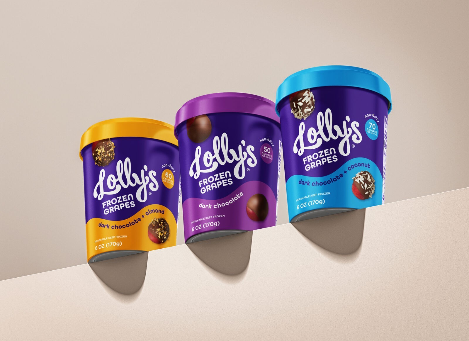
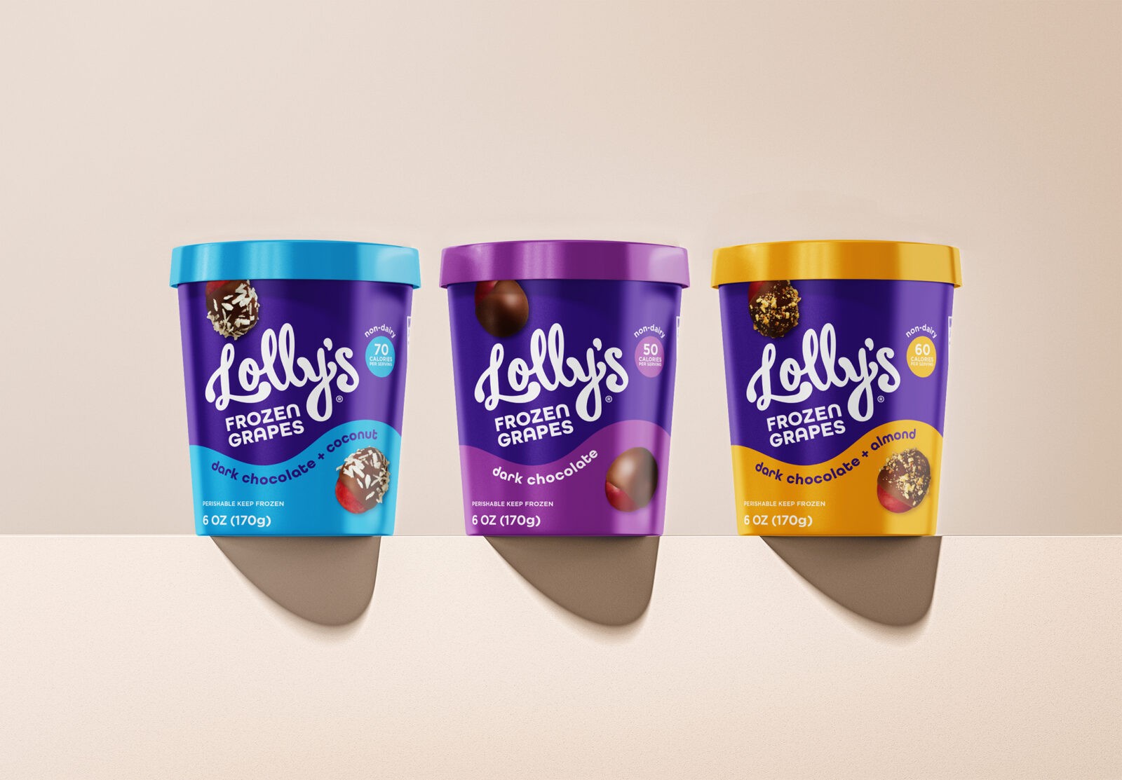
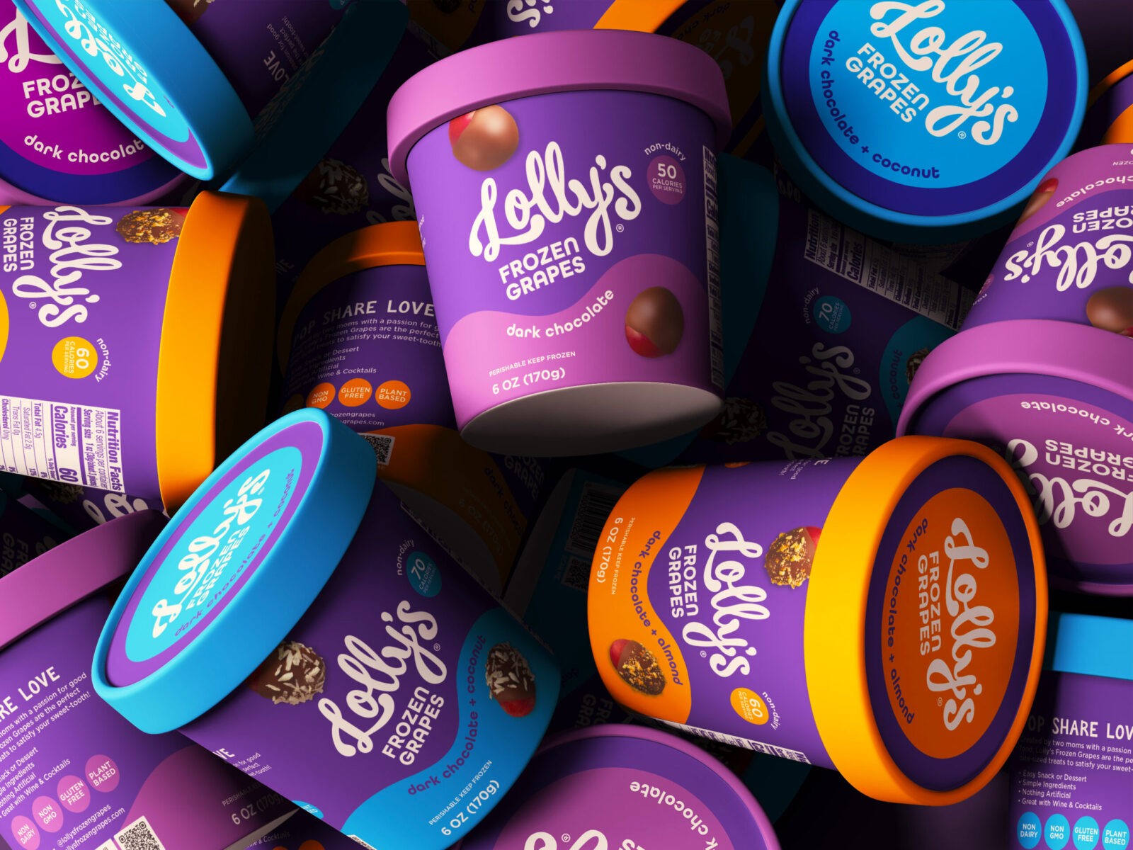
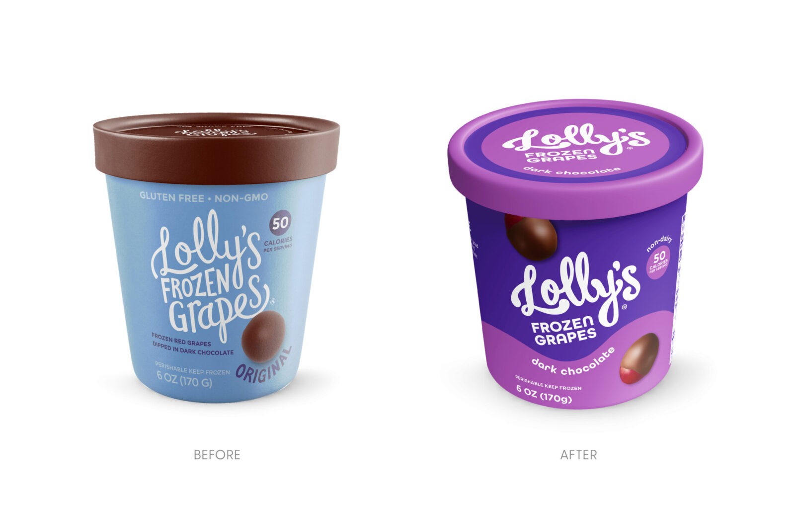
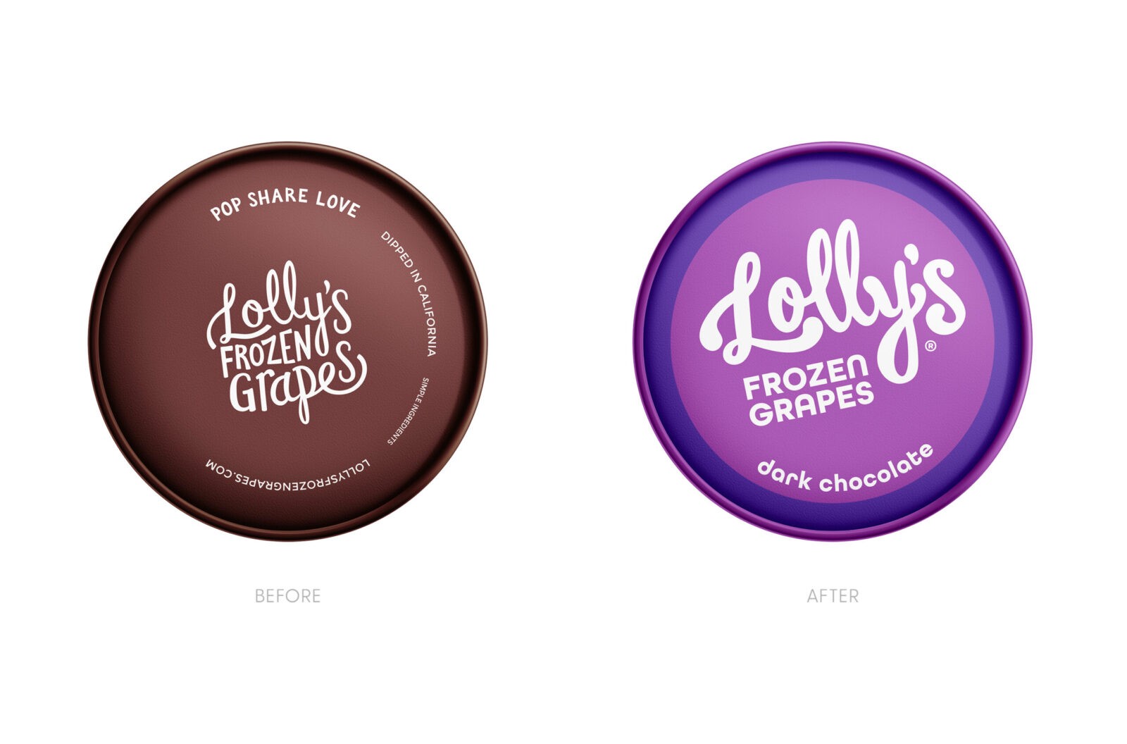
We embarked on a journey to infuse Lolly’s with a vibrant personality while preserving its endearing spirit. The logo, once timid, now commands attention with a bold, handwritten flourish. A daring departure from the original brown, our design embraces a captivating purple—a nod to the grape’s essence and a playful wink at the brand’s lighthearted nature. This vibrant hue, coupled with strategic color blocking, creates an eye-catching on-shelf presence, shouting “Lolly’s” from across the aisle.
We introduced a colorful dynamic wave that’s as smooth and decadent as the product it represents. It mimics the melted delicious dark chocolate that enrobes the frozen grapes. This playful element dances across the packaging, harmonizing with the brand’s spirited nature. The logo nicely tucks in above the wave being the first thing one reads on pack. The secondary color of the wave compliments the Lolly’s purple and are color coded by flavor. All these elements add a delightful touch, further enhancing the package’s visual appeal and shopability.
To tantalize taste buds and drive purchase decisions, we showcase mouthwatering images of the product. By artfully revealing the grape enrobed in chocolate, we offer a transparent glimpse into the delightful surprise awaiting consumers.
The result? A refreshing brand transformation. Lolly’s is no longer blending in; it’s the star of the freezer aisle. Our design is a bold, confident statement that perfectly captures the brand’s essence and makes Lolly’s Frozen Grapes impossible to ignore.
CREDIT
- Agency/Creative: The Creative Pack
- Article Title: Lolly’s Colorful Packaging Refresh by The Creative Pack
- Organisation/Entity: Agency
- Project Status: Published
- Agency/Creative Country: United States of America
- Agency/Creative City: Los Angeles
- Market Region: North America
- Project Deliverables: Brand Redesign, Brand Rejuvenation, Food Photography, Graphic Design, Logo Design, Packaging Design
- Industry: Food/Beverage
- Keywords: WBDS Agency Design Awards 2024/25
- Keywords: WBDS Agency Design Awards 2024/25
-
Credits:
Creative Director: Danielle Kidney
Designer: Casey Chui
Designer: Emma Tung
Designer: Joshua Manalang
Logo Design: Shannon Sabbag
Photography: Heather Winters


