


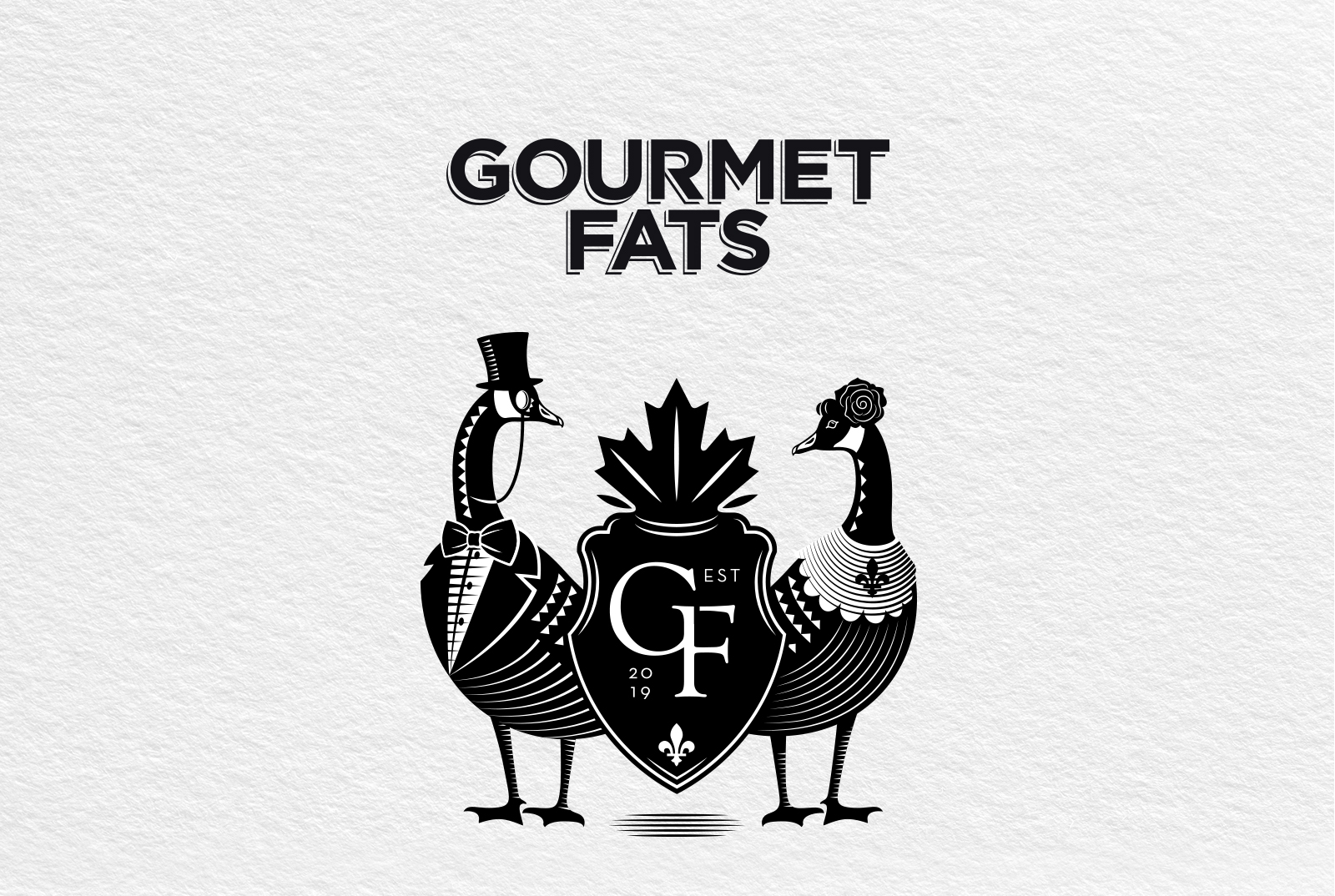
The aim was to design a logo for keto products that, when first seen, would give the same luxurious feel as the product. Do you think Black? So did we! If you want to be viewed as modern or sophisticated, there’s nothing as classic and effective as black. Adding a little class and grandeur, the monochrome direction was exactly what we needed. Stripping down your palette to just two elements might seem restrictive at first but as far as black and white are concerned, it always turns out to be a powerful and incredibly versatile dialogue. The dynamic that they offer in a design is impossible for the observer to ignore.
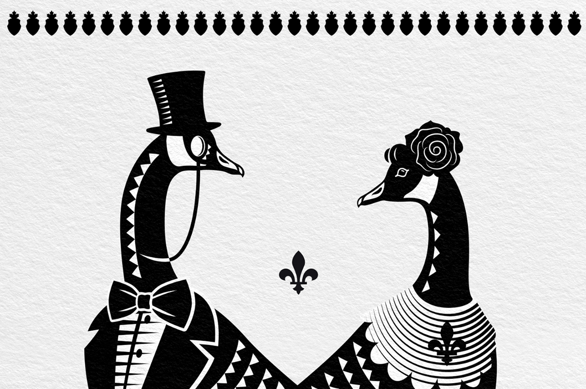
Creating shapes and patterns that demand attention was the second step.
The design also features additional elements that provide a distinct link to Canada; Do you fancy our Goose? That’s how we delivered a classic but contemporary identity for today’s audience.
CREDIT
- Agency/Creative: A.S. Antonia Skaraki
- Article Title: Logo Design for Keto Products From Canada
- Organisation/Entity: Agency, Published Commercial Design
- Project Type: Identity
- Agency/Creative Country: Greece
- Market Region: North America
- Project Deliverables: Brand Advertising, Brand Identity, Brand Strategy, Branding, Graphic Design, Illustration, Research, Tone of Voice
- Industry: Food/Beverage
- Keywords: keto, logo, ducks, illustration, canada, black and white, vintage


