


![]()
YG – Hilbing Gin
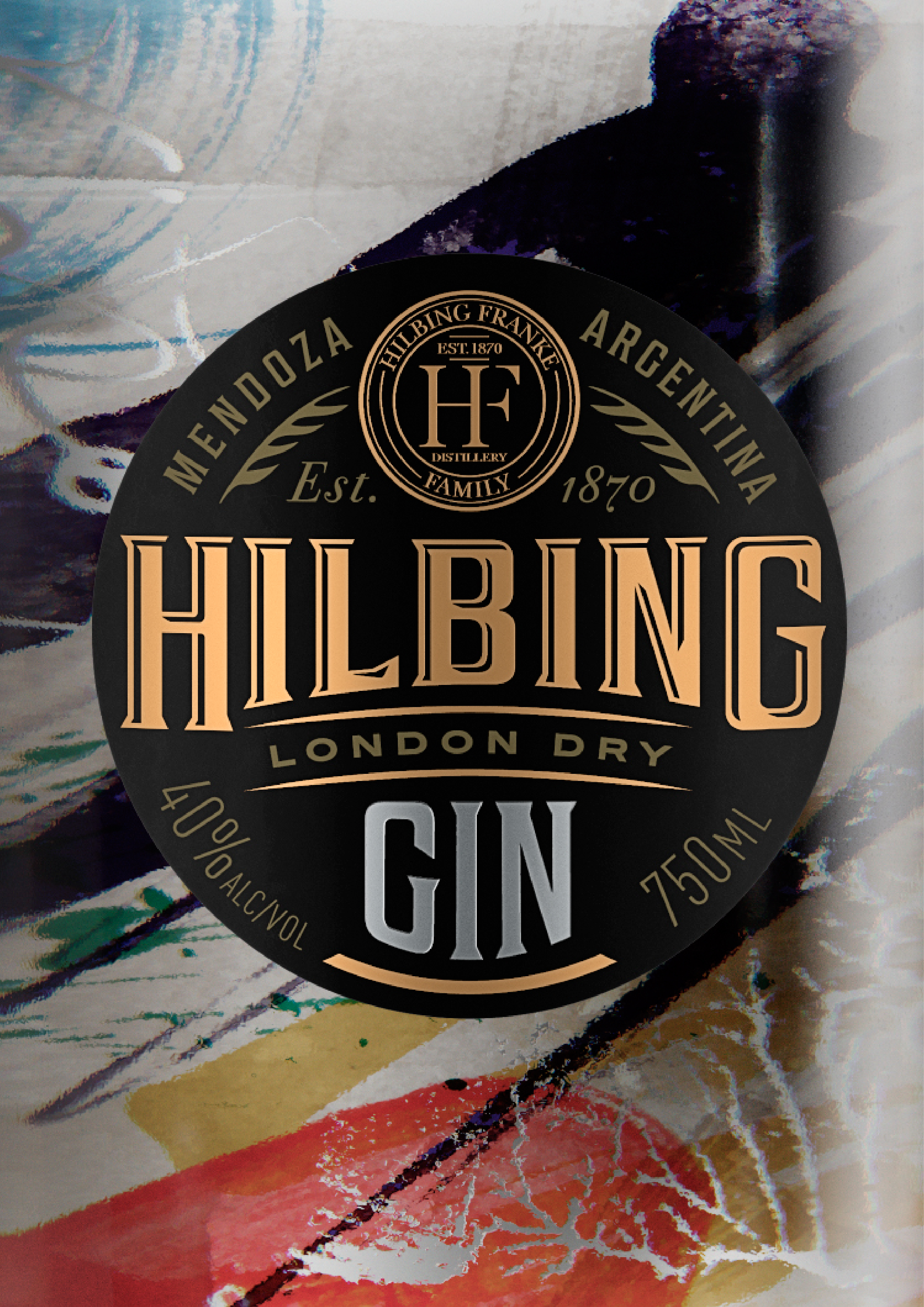
“The aim was to create a gin that was modern, striking, individual and abstract. Taking advantage of the brand’s phonetics, the label was given a European tone – without being traditional. A new product which at the same time transmitted a sense of history.
A printed back label was used on both sides, in order to see the art inside the bottle. The art is contemplated, complete and amplified when the liquid is in the bottle, generating a magnifying glass effect.”
![]()
![]()
CREDIT
FEEDBACK
Relevance: Solution/idea in relation to brand, product or service
Implementation: Attention, detailing and finishing of final solution
Presentation: Text, visualisation and quality of the presentation


