


In 2020, the private company NVK bought one of the oldest enterprises, VRK-2, from Russian Railways. Under the management of the combined team of two strong players, a new brand, NVRK, appeared.
The client tasked our team to develop an identity that would match the scale of the company, talk about the synergy of the merger and be clear to every employee, from the mechanic to the top manager, as well as to all NVRK’s clients and partners.
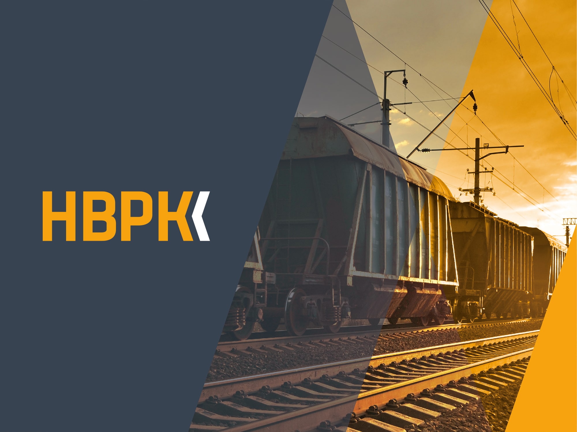
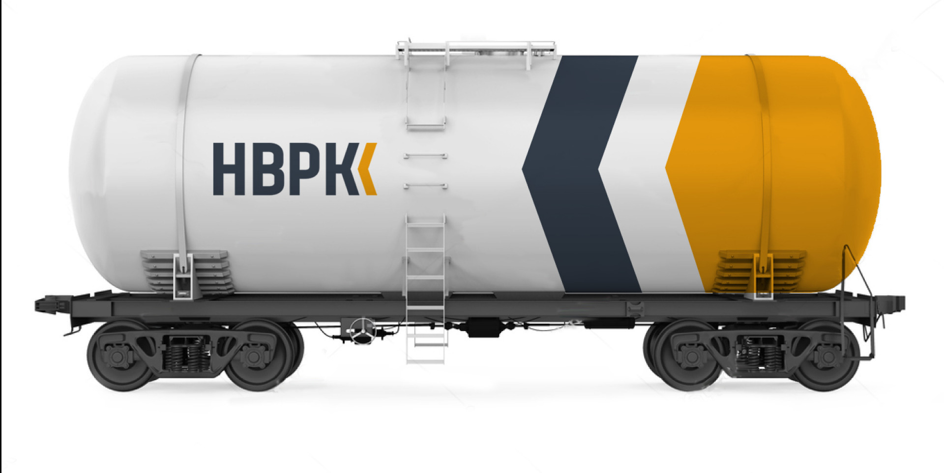
Colour, logo and identity: We decided to keep the colours of the founding companies, but found more rich shades. Bright orange is a symbol of leadership and energy, while rich gray reflects a serious approach to business, stability, and reliability. These expressive colors differentiate the company from its leading competitors, most of whom use shades of blue and red.
Continuity is preserved by the shape of the arrow and the recognizable font. At the same time, the new logo looks modern and laconic, which is different from the previous ones.
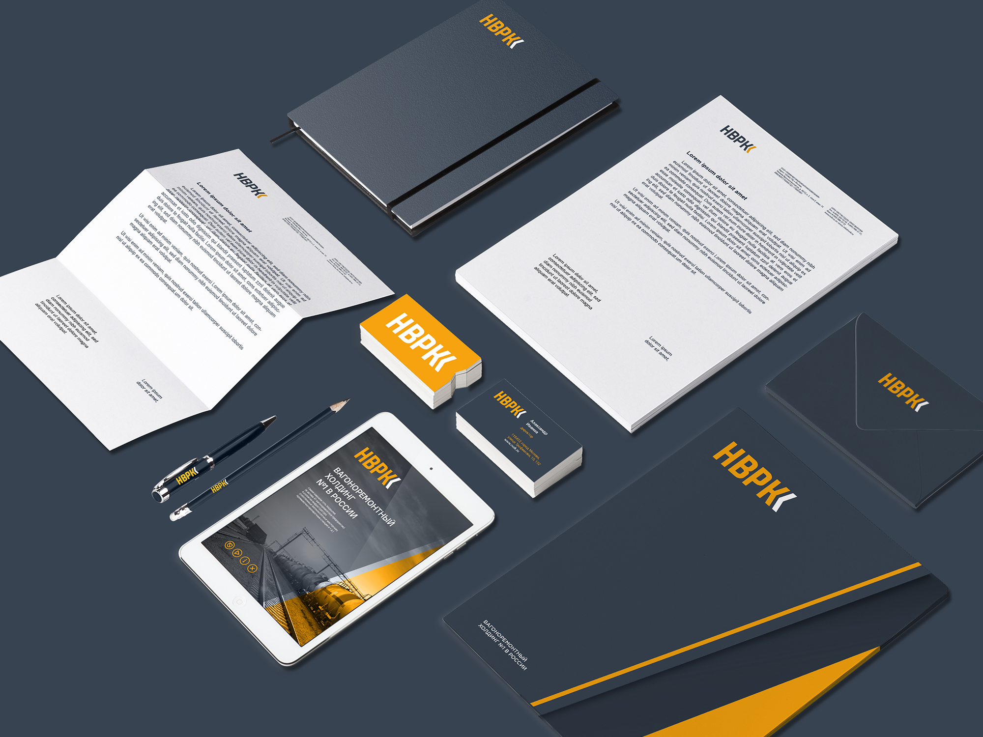
The main colour palette is used in the development of printing, souvenir products, signage and all materials that are given to clients and partners of the company. There is also an additional palette – for designing office space, posters, letterheads and other internal corporate materials, as well as for highlighting and creating a focus in any kind of layouts.
Diagonals, triangular shapes, and color accents were the main elements of the identity. Their combination makes the style look recognizable on different media. Diagonals and arrows can be interestingly used in the design of folders and business cards. The identity looks laconic and serious without being boring: contrasting accents and diagonal lines add dynamics to it, helping to create a modern and memorable brand image. Today, NVRK represents a new beginning in the industry. Therefore, the brand identity reflects the theme of continuity to the founders, but focuses on new meanings: energy, movement, development.
CREDIT
- Agency/Creative: Studio Deza
- Article Title: Logo and Corporate Identity For a Wagon Repair Holding in Russia
- Organisation/Entity: Agency
- Project Type: Identity
- Project Status: Published
- Agency/Creative Country: Russia
- Agency/Creative City: St. Petersburg
- Market Region: Europe
- Project Deliverables: Art Direction, Brand Design, Brand Identity, Brand Strategy, Branding, Design
- Industry: Transport
- Keywords: Design, Branding, Logotype, Identity, Guidelines, Logo, Russia
-
Credits:
Art Director: Sergey Samofalov
Strategist: Irina Mokrousova
Designer: Olya Lyashenko
Designer: Sergey Koger
Project Manager: Anna Artemova


