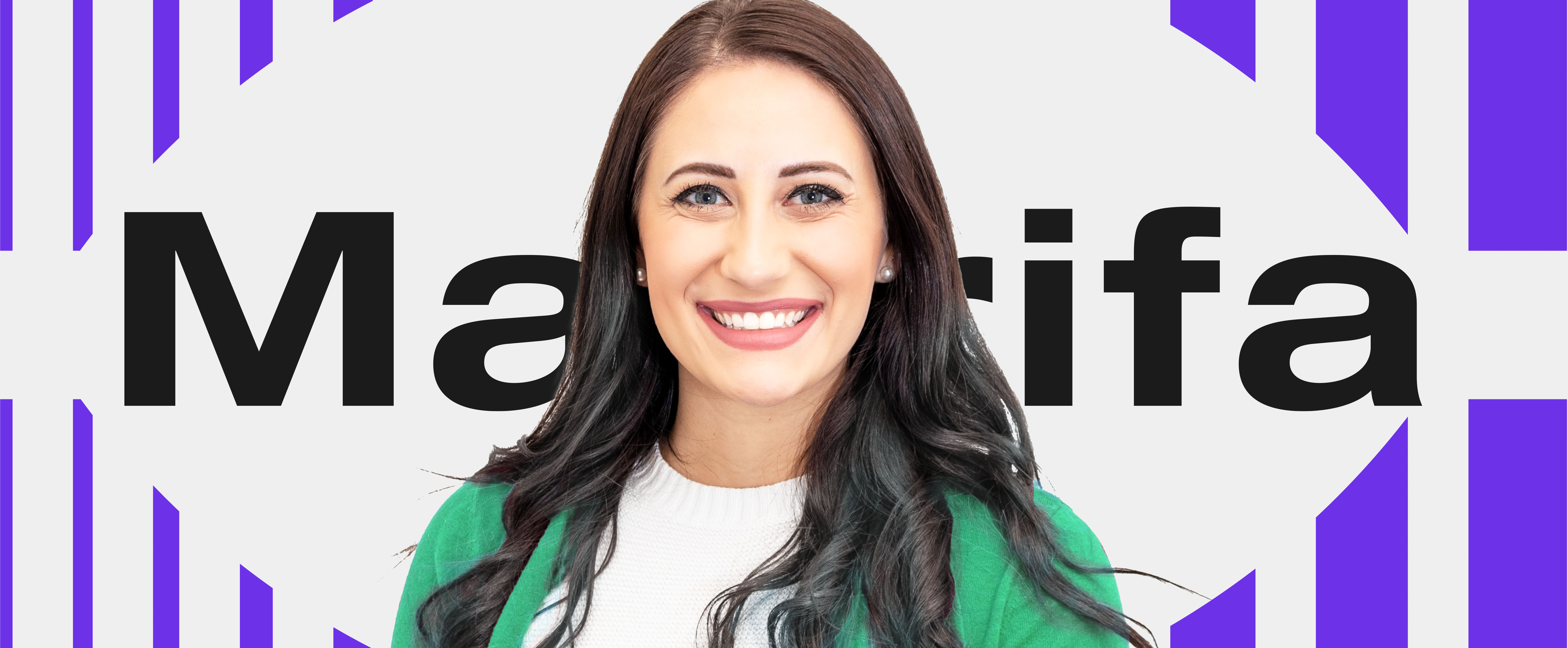
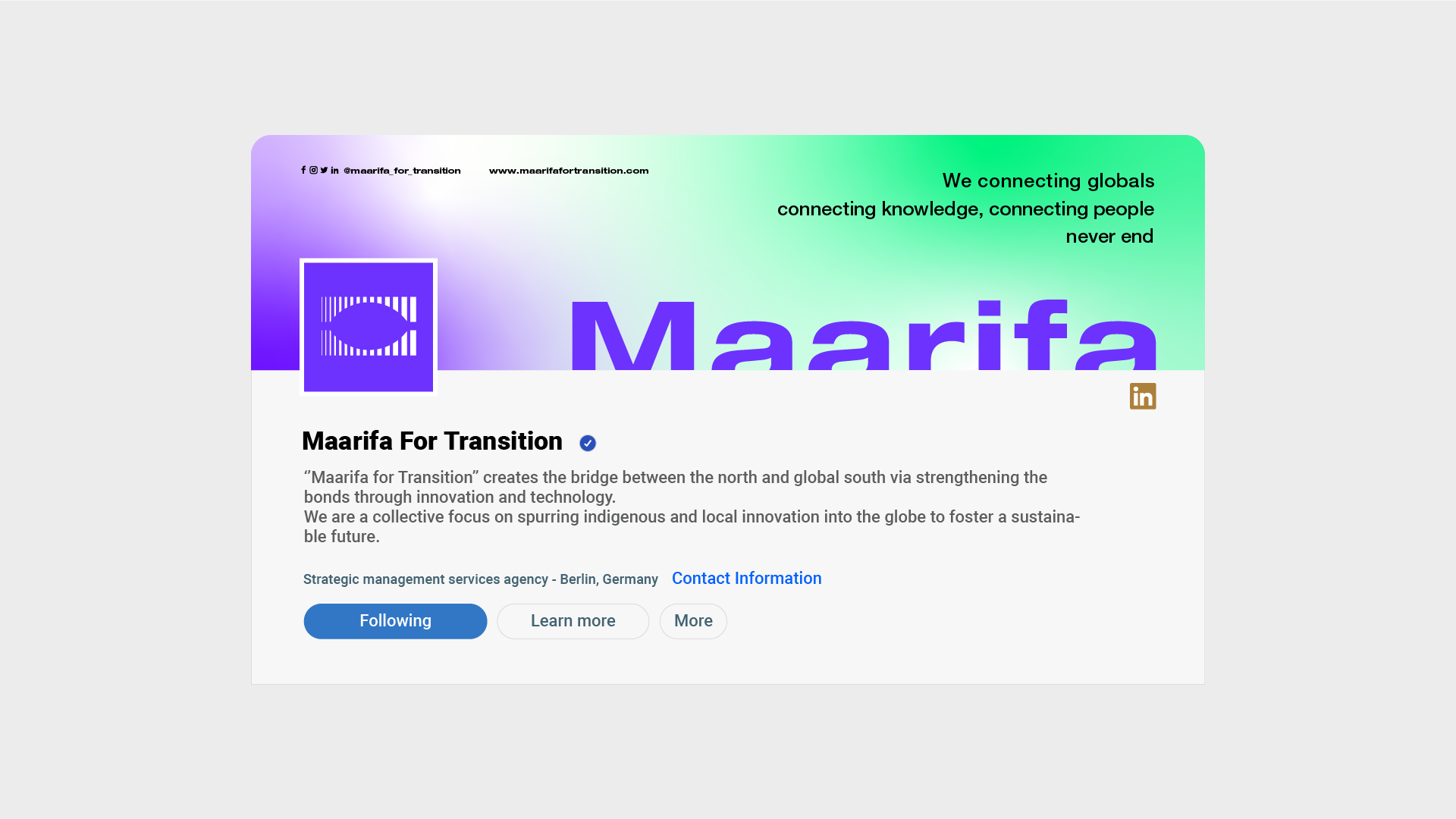
Maarifa For Transition is strategic management services agency based in Germany. The brand’s name “Maarifa For Transition” means “Knowledge For Transition” in Arabic.
” Maarifa brand mission is to create the bridge between the global north and south via the innovation and technology. Which would create a sustainable future by using the indigenous / tradionnal and appreciating both culture that will creating a healthy exchange of expertise. ”
” Maarifa brand vision is to be the leading agency in linking the global North and the South via the innovation and technology ”
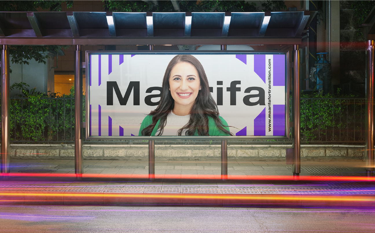
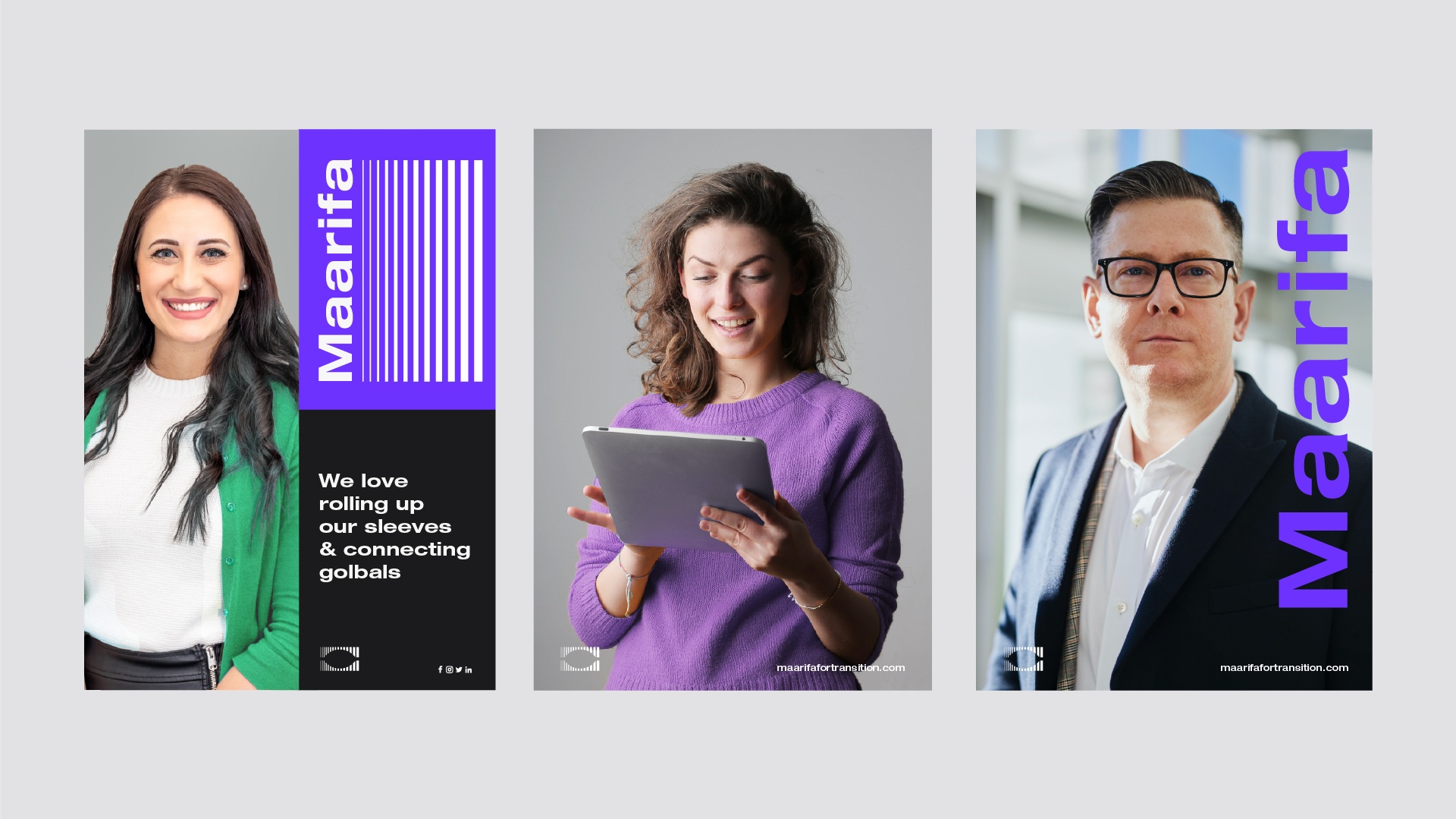
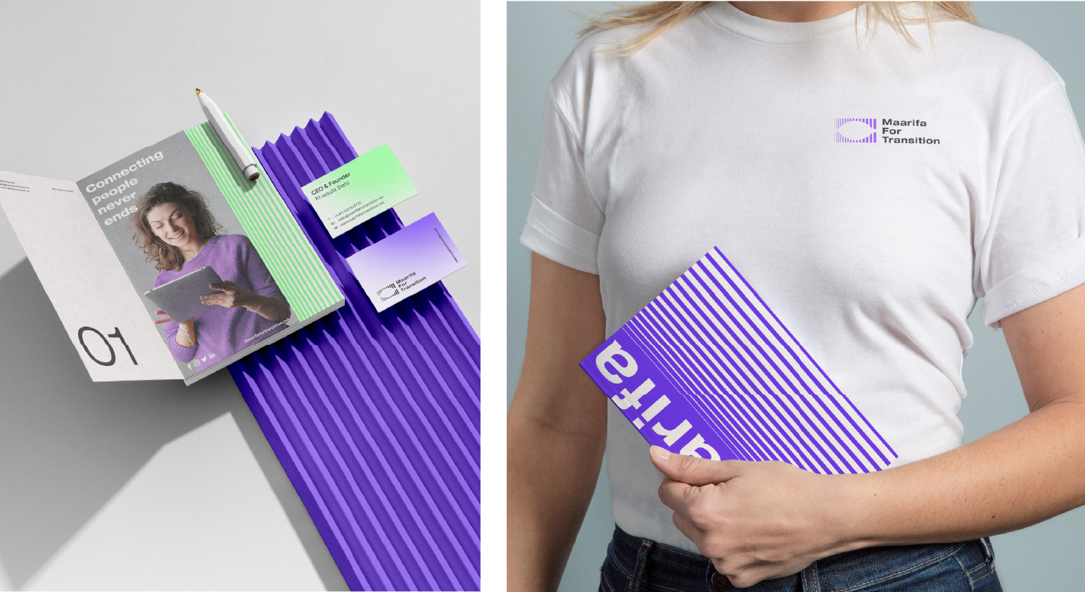
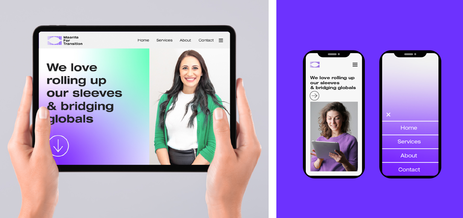
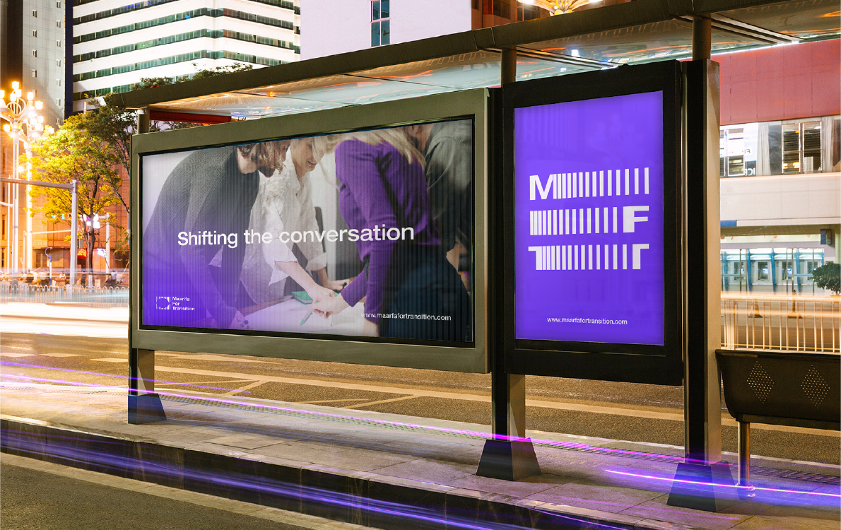
Given the role that Maarifa will play in linking two different worlds in many respects, we created a strong brand that is professional yet cutting-edge, just like the ideas they help come to life.
The result was a simple and functional identity that is easy to remember and approachable identity that allows target audience to understand and digest the content.
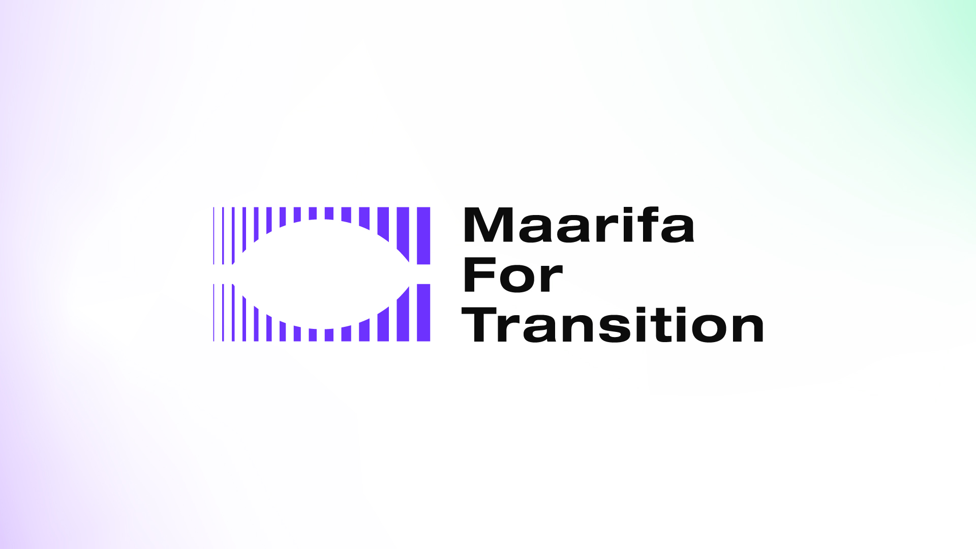
Logo: When working on the logo, it was necessary to adhere to the brief that confirms Maarifa For Transition Agency’s mission to create a bridge between the south and global north. This in turn helped us find the inspiration to reflect Maarifa’s mission and role in a simple and functional logo.
Logo attributes: Professional, Simple, Modern/Futuristic, Dynamic, Bold, Geometric
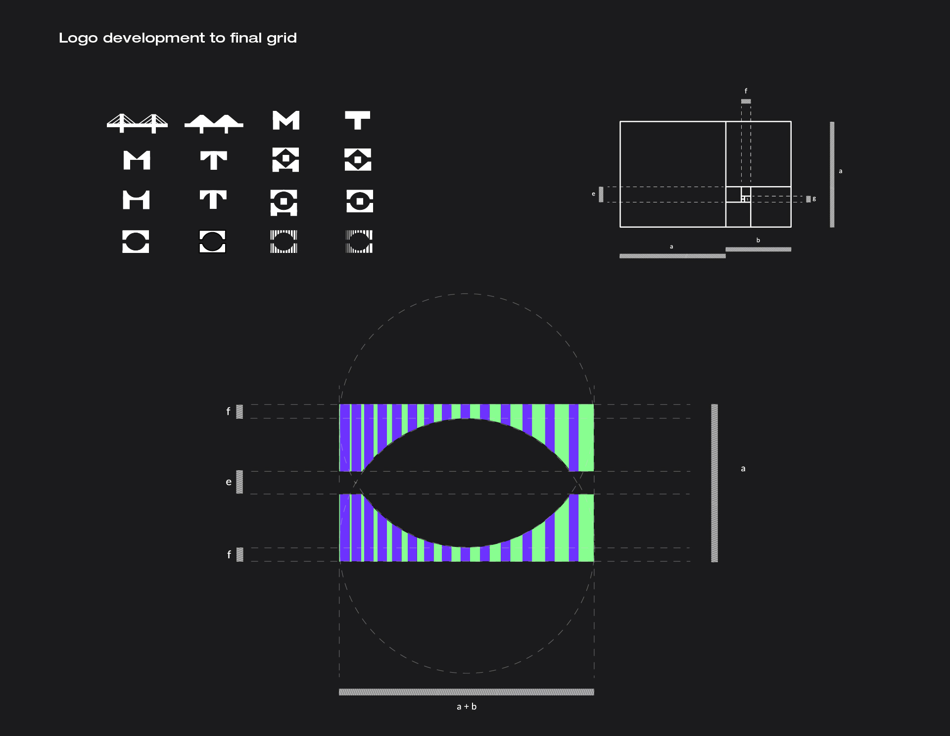
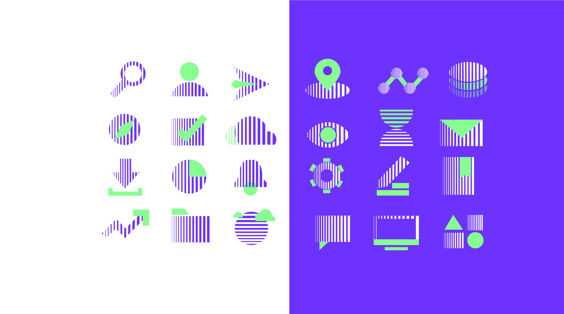
Logo developing: When starting to brainstorm, we were able to create a compatibility between the shape/the structures of the letters “M” and “T” with the shape of the bridge laying the groundwork for the final symbol. In order to achieve the meaning of movement, transition and dynamism in the logo, we have adopted vertical lines (stripes), which are typical of the agency’s mission. in the end this process resulted in a wonderfully negative space that showed the shape of the eye, which reflects the concept of knowledge.
Helvetica Neue LT Pro was chosen to be the logotype because it is flexible enough and to be an extension of the logoicon – giving the logo a bit more width and dynamism.
To make this happen by a professional way we used the golden ratio dimensions to determine the height and width of a logo as well as the proportions of the internal elements to the entire design. Also to define the best composition that is most pleasing to the eye.
To define what brand personality should be we settled on “Diversity” and “Growth” – two values that we felt captured the essence of the Maarifa For Transition.
“Diversity” because the basis of connecting between the global north and south depends on the diversity of indigenous and local knowledge. “Growth” because we have always prided of our interest in creating an atmosphere in which our customers opportunities to achieve their successes grow.
The use of purple (a bold color because it embodies strength, supremacy and he is distinguished by his leadership qualities) has been retained but lightened. Also light green has been used – a colour that’s bright and all about growth and sustainability.
CREDIT
- Agency/Creative: Habib Bouallgui
- Article Title: Logo and Brand Identity for Strategic Management Agency Maarifa For Transition by Habib Bouallagui
- Organisation/Entity: Freelance
- Project Type: Identity
- Project Status: Published
- Agency/Creative Country: Germany
- Agency/Creative City: Tunisia
- Market Region: Europe
- Project Deliverables: Art Direction, Brand Guidelines, Brand Identity, Brand Mark, Icon Design, Logo Design
- Industry: Technology
- Keywords: #Strategic_managment_agency #agency #Brand_identity #logo_design #brand_system #Brand_guidelines
-
Credits:
Creative director: Habib Bouallagui
Graphic designer: Habib Bouallagui


