


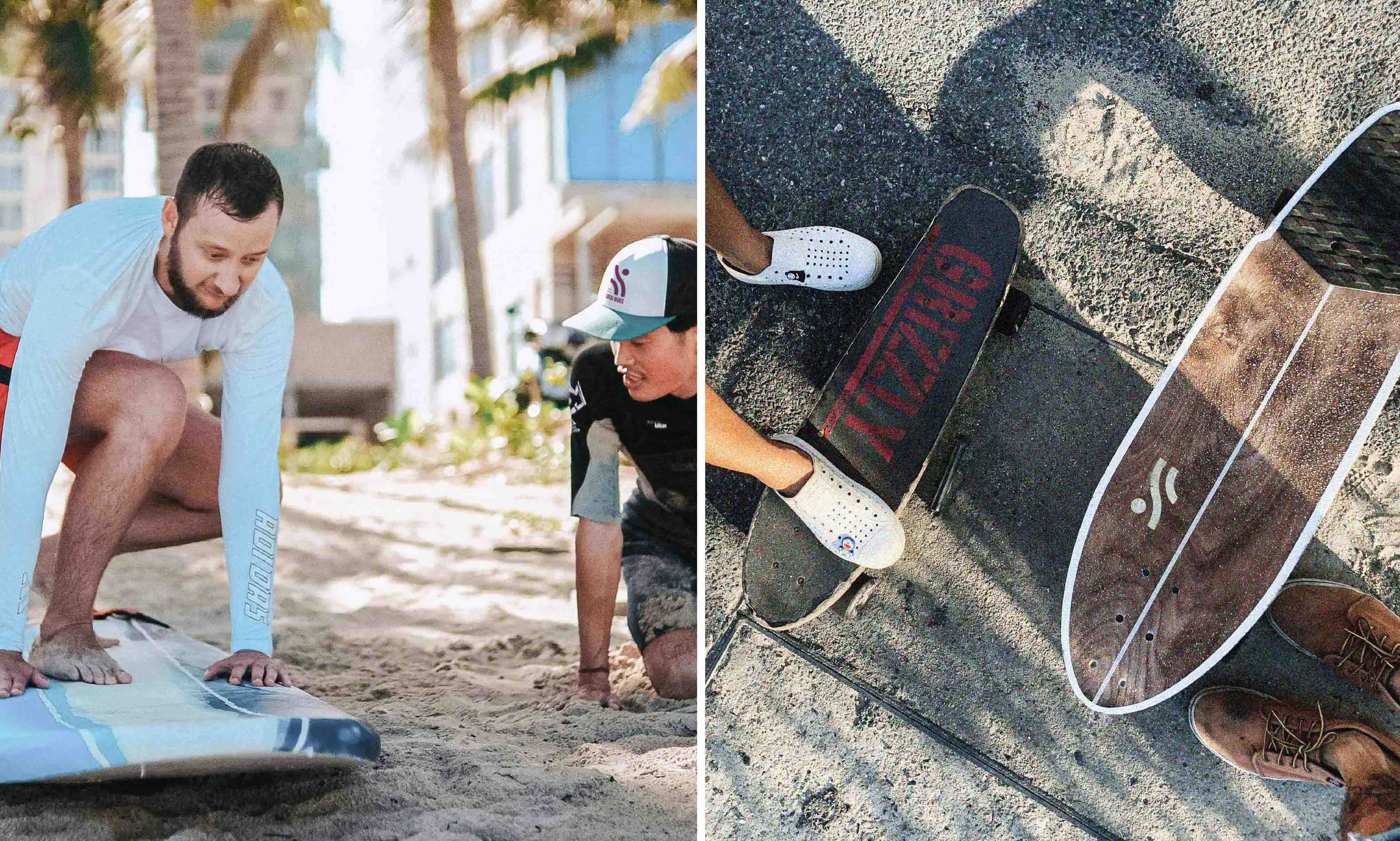
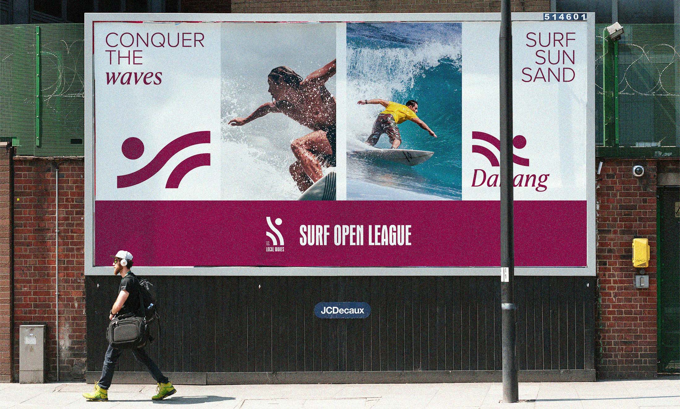
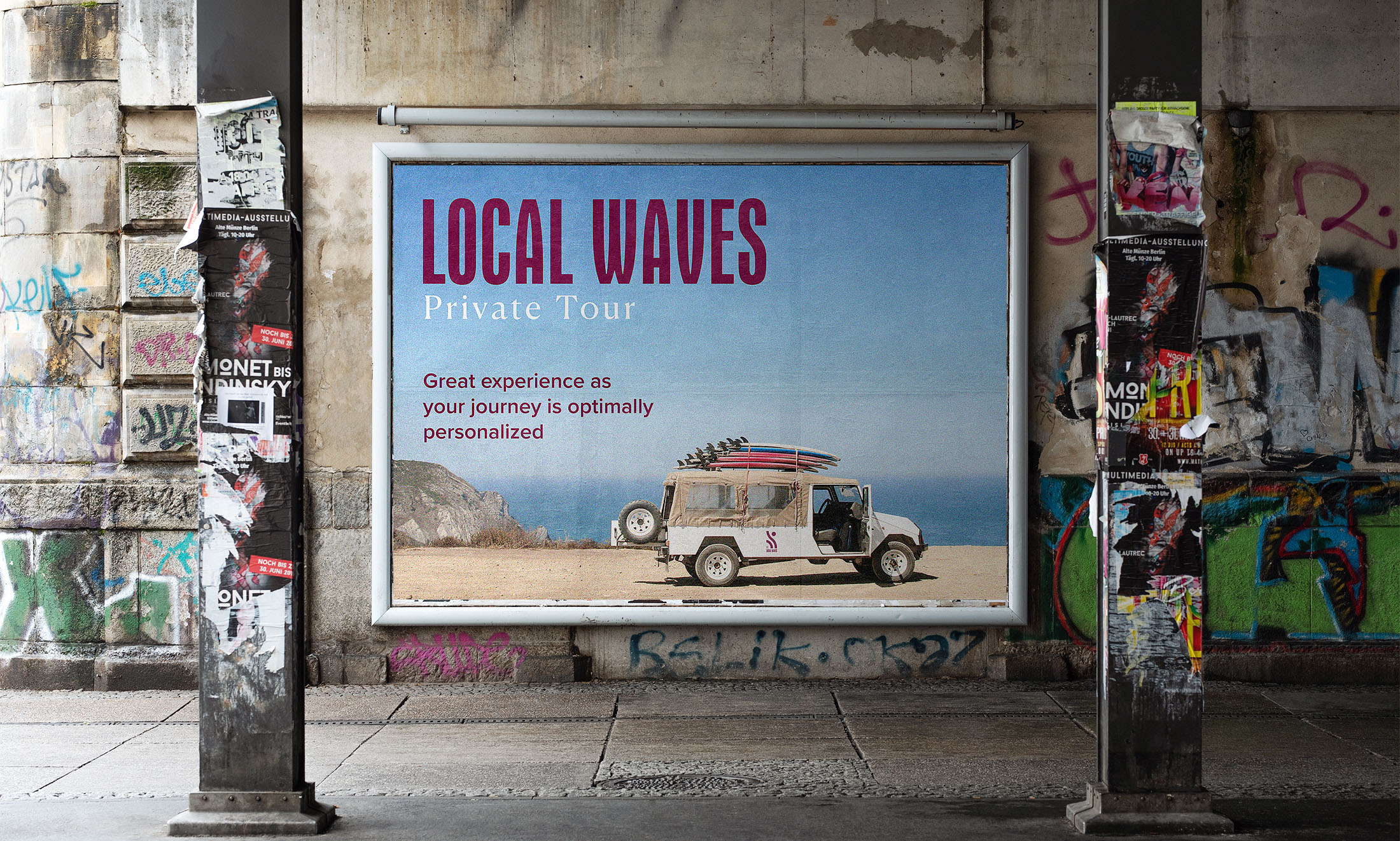
Local waves is a brand that provides entertainment services in the coastal city of Da Nang with surfing courses and personalized local exploration tours. Inspired by images of surfers, Local waves are aimed at the spirit of freedom of discovery, freely roam around to have the most memorable experiences. The light from the sun, the attraction from the ocean waves, sparkling golden sand with the magnificence of local nature, all will create a wonderful concert that resonates forever in the minds of those passionate about discovery.
The logo design form is modern, simple, but integrates many elements to create the meaning that the brand wants to convey. With free personalities, open minded, strongly surpassing all frameworks chosen as the logo’s expression style, it is the first thing that is felt when seeing the logo.
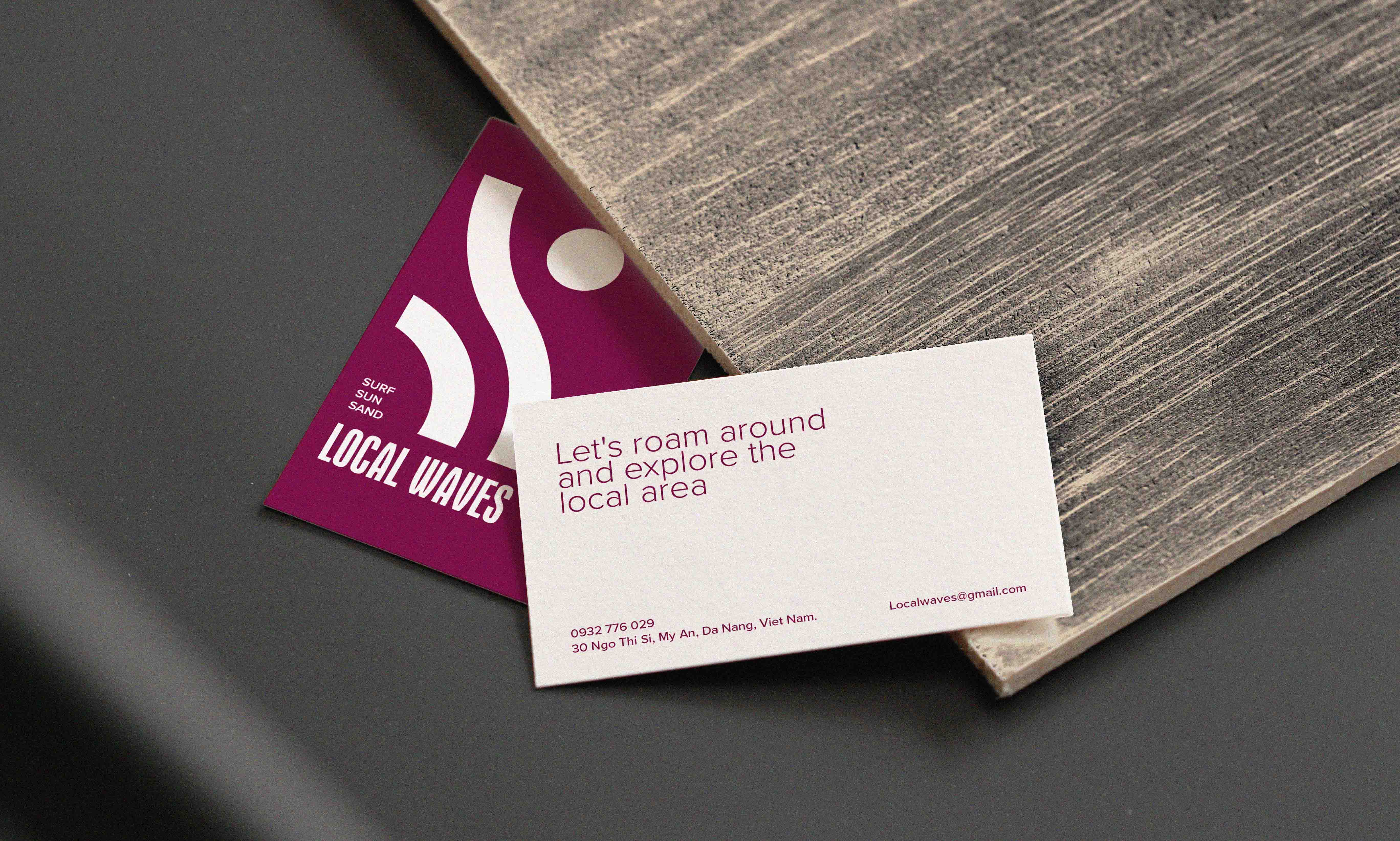
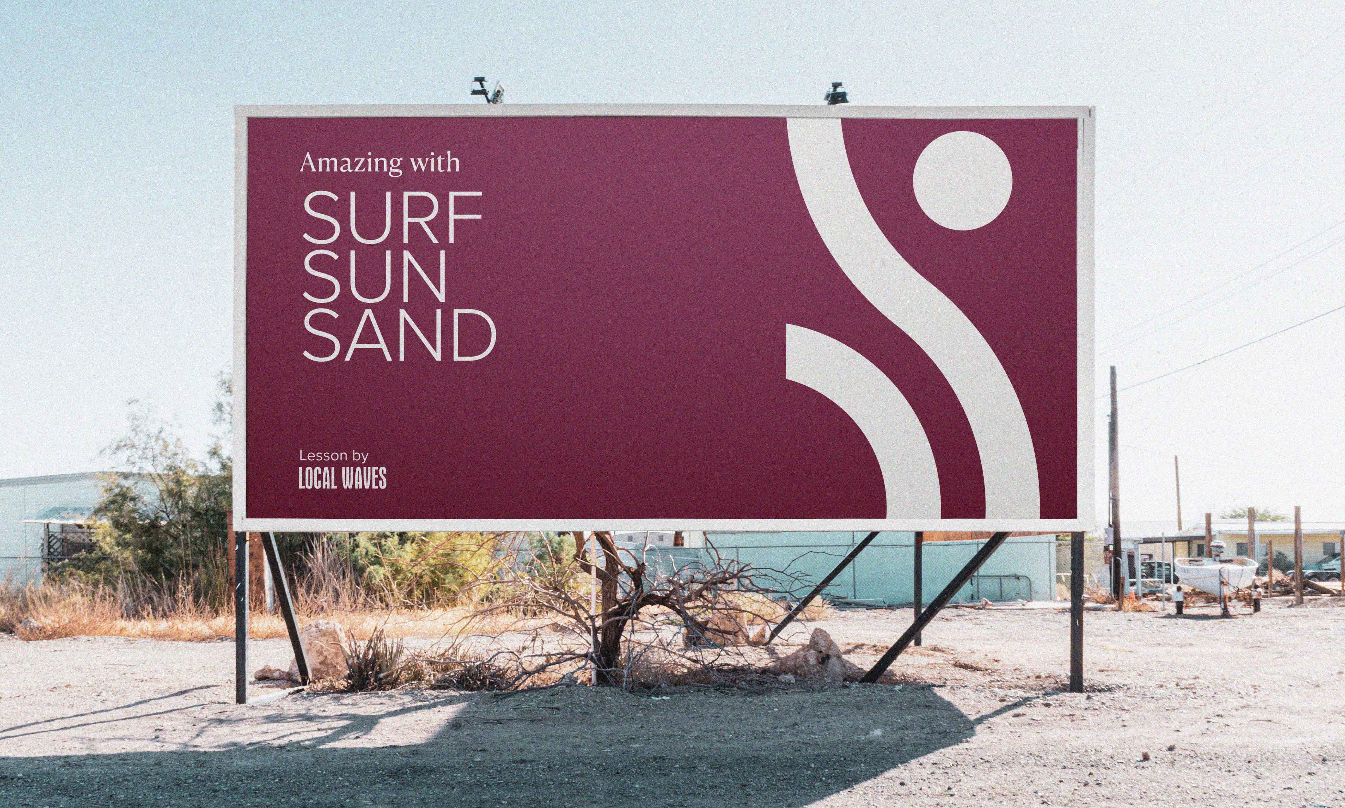
The typical symbolic elements that the brand wants to include in the logo are integrated harmoniously, nature includes the sun, the ocean waves, and the surf rudder (fin surf). All of the above elements are arranged together to create the shape of an athlete surfing on the sea, is the image chosen to represent the brand. While the logo’s shape is full of freedom and open minded, the text part (logotype) in the logo system is solid, safe, creating high prestige. This also shows the commitment to quality values that the brand brings in its services are: safety, quality, perseverance, accompanying each other. Overall look at the whole logo, we see a balance between freedom, open minded and safety, certainty. This creates excitement and satisfaction in the feeling customer’s eyesight when approaching brands in the first time seeing the logo.
The color system is deployed with two main colors are white and purple red has a bit of direction Merlot color. The color white is represented by ocean waves, for constant movement and innovation, very suitable for adding color to a free-spirited personality, discover newness. In another direction, purple red represents deep meanings well that the brand wants to target, which are sustainability, safety, attachment, serving and accompanying customers long-term, is the depth of feeling that settles in the mind of the customer after experiencing the service. Colors are also chosen according to the criteria of creating balance for each other.
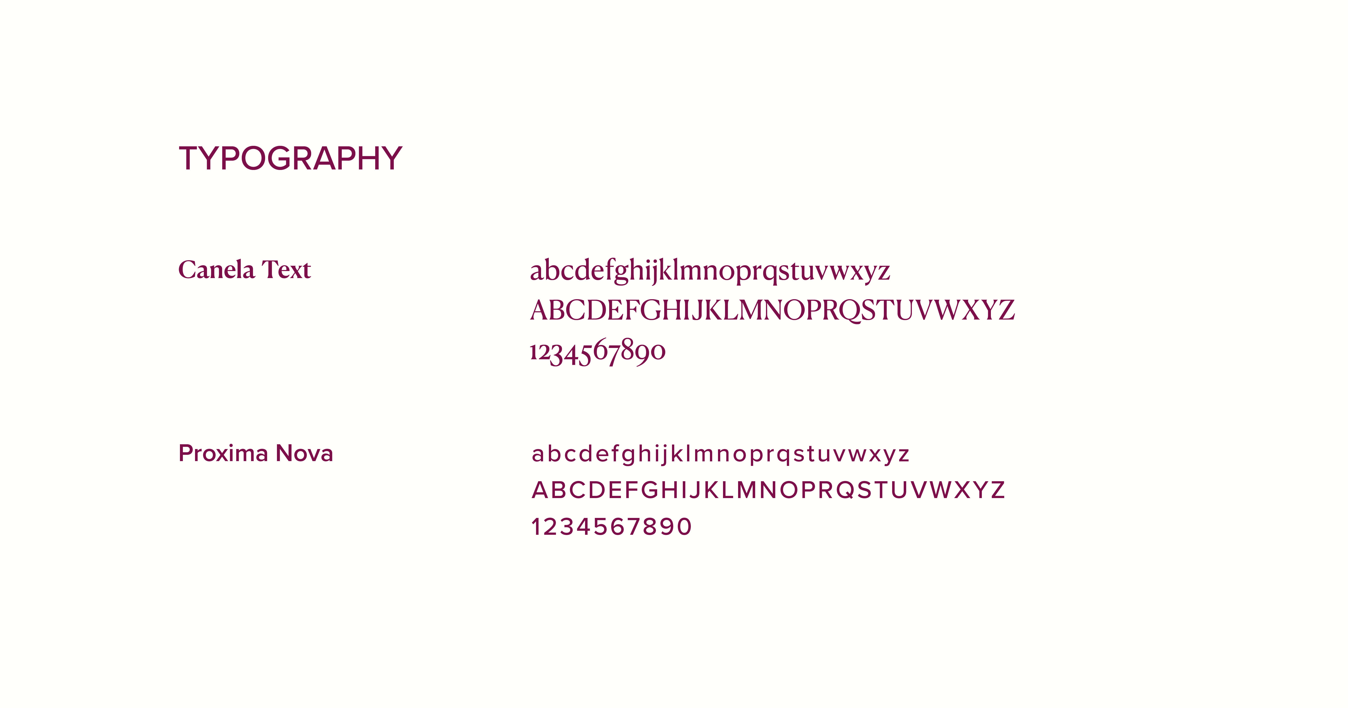
Typography is harmony between Proxima Nova và Canela Text fonts. Freedom, open minded, roundness of Proxima Nova like adding brand personality in harmony with the logo shape. Meanwhile, Canela Text shows poetic features, the artist always hides in the soul the customer’s portrait, are enthusiasts of discovery.
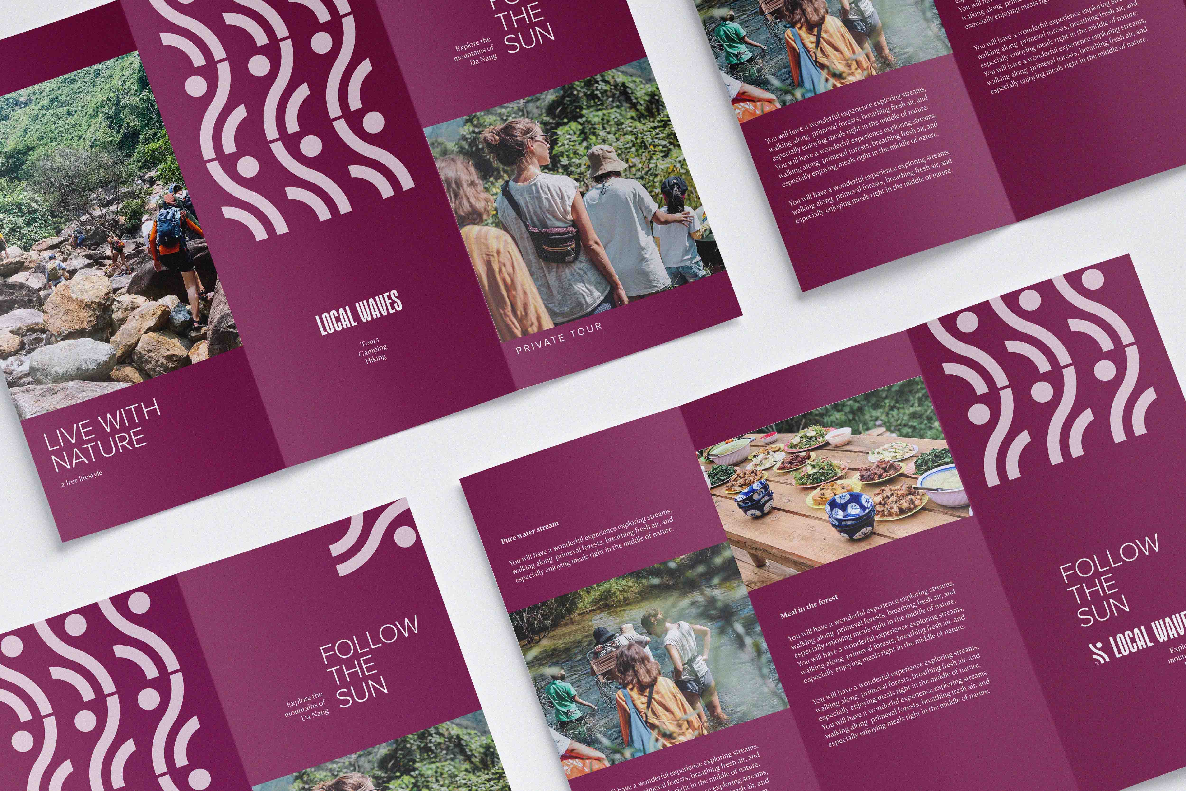
Visual identity brand recognition also comes from the main logo. Just flip left, flip right or reverse the logo, we will immediately have athlete shapes gliding in different directions, or the image of mountains and hills with sunlight, stream, when needed to describe camping services to explore local mountains and forests.
The overall design for Local waves is a design based on balance, exactly what a surfer must have.


CREDIT
- Agency/Creative: Tu Nguyen
- Article Title: Local Waves: Surfing into Discovery with Modern Simplicity and Tu Nguyen’s Harmonious Design
- Organisation/Entity: Freelance
- Project Type: Identity
- Project Status: Published
- Agency/Creative Country: Vietnam
- Agency/Creative City: Da Nang
- Market Region: Asia
- Project Deliverables: Brand Design
- Industry: Entertainment
- Keywords: Surf
-
Credits:
designer: Nguyen Minh Tu


