


What was the task:
The task was to create a packaging design for newly introduced, Norwegian-made small batch hot sauces with a philosophy centered around enhancing food with great taste rather than merely adding heat. The market is cluttered with hot sauces competing on the intensity of their heat.
Our challenge was to redefine what hot sauces could represent in the Norwegian market: transforming them from being perceived as merely a painful challenge to an enriching flavor experience. The objective was to confront and shift away from the stereotype perpetuated by cultural phenomena such as Chili Klaus, Hot Ones, and numerous YouTube challenges, which often focus on the heat level rather than the culinary experience. The design needed to emphasize the craftsmanship behind fermentation and the use of unique ingredients, thereby highlighting the sauces’ quality and flavor depth.
The aim was to position Lloyd & Melón as a gourmet choice for food enthusiasts, intending to broaden the perception of hot sauce beyond traditional stereotypes. The packaging design was tasked with conveying this philosophy, prioritizing quality and taste, to establish the brand as a preferred selection for both food enthusiasts and hot sauce connoisseurs.
What choices did we take:
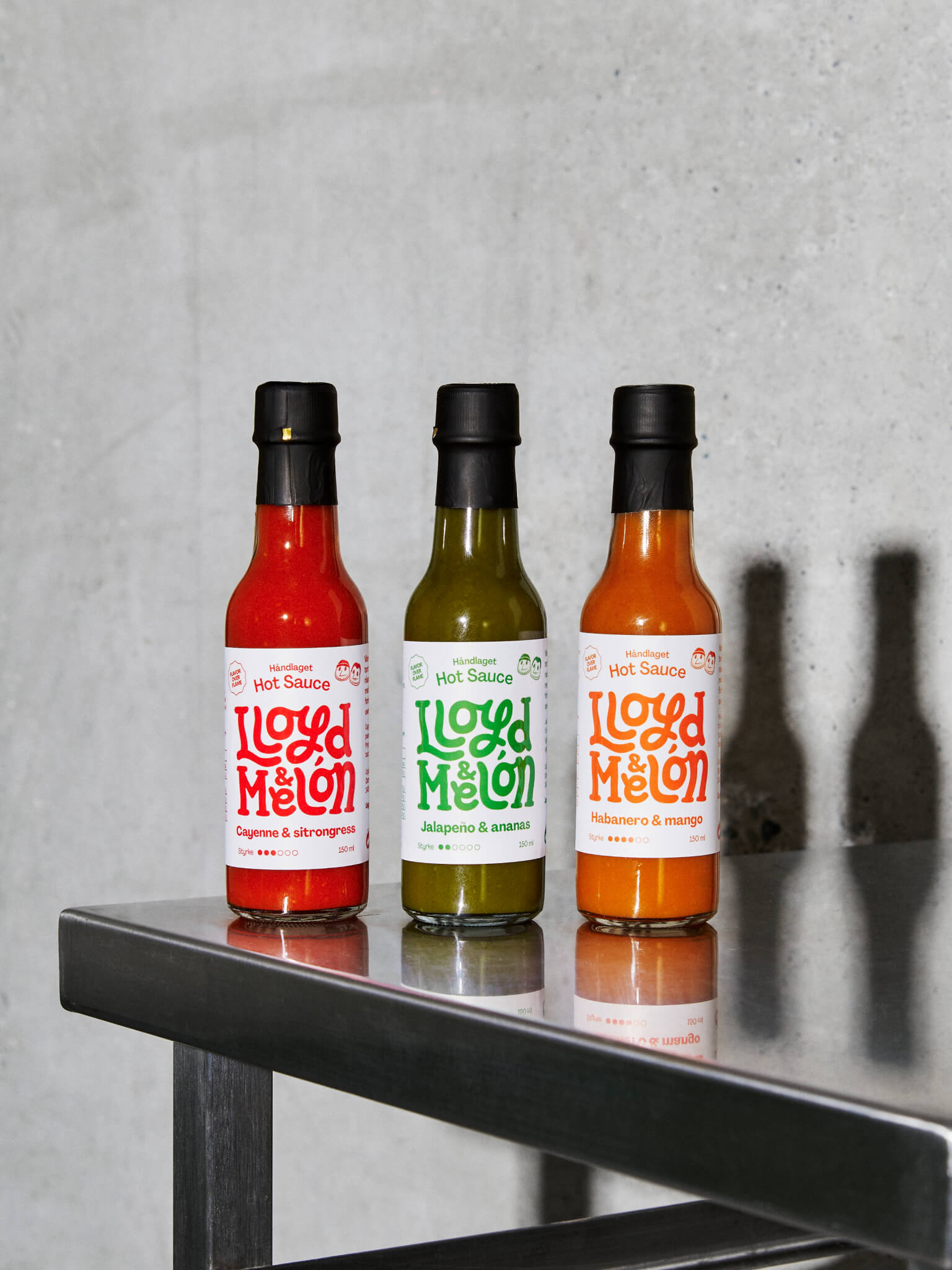
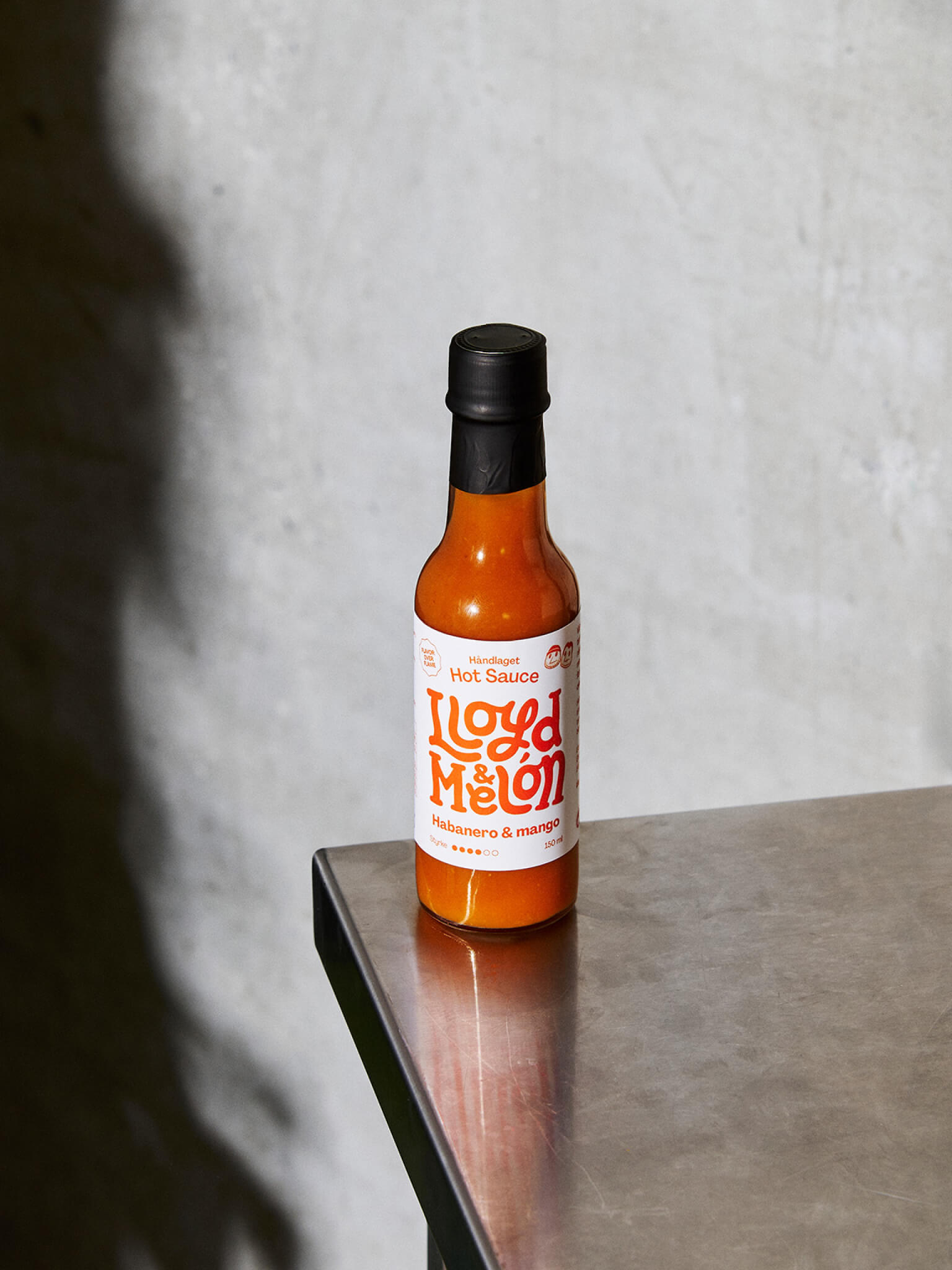
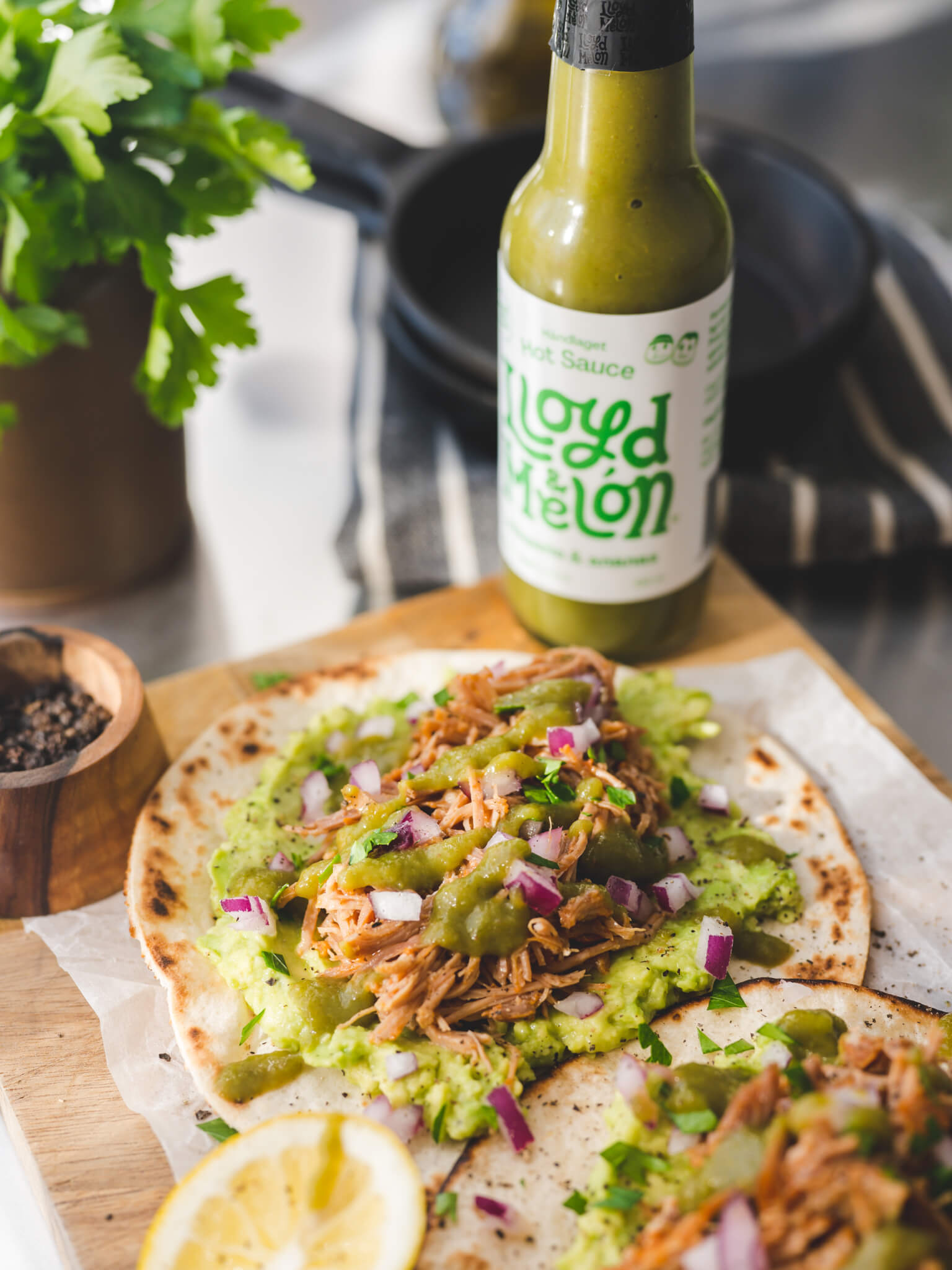
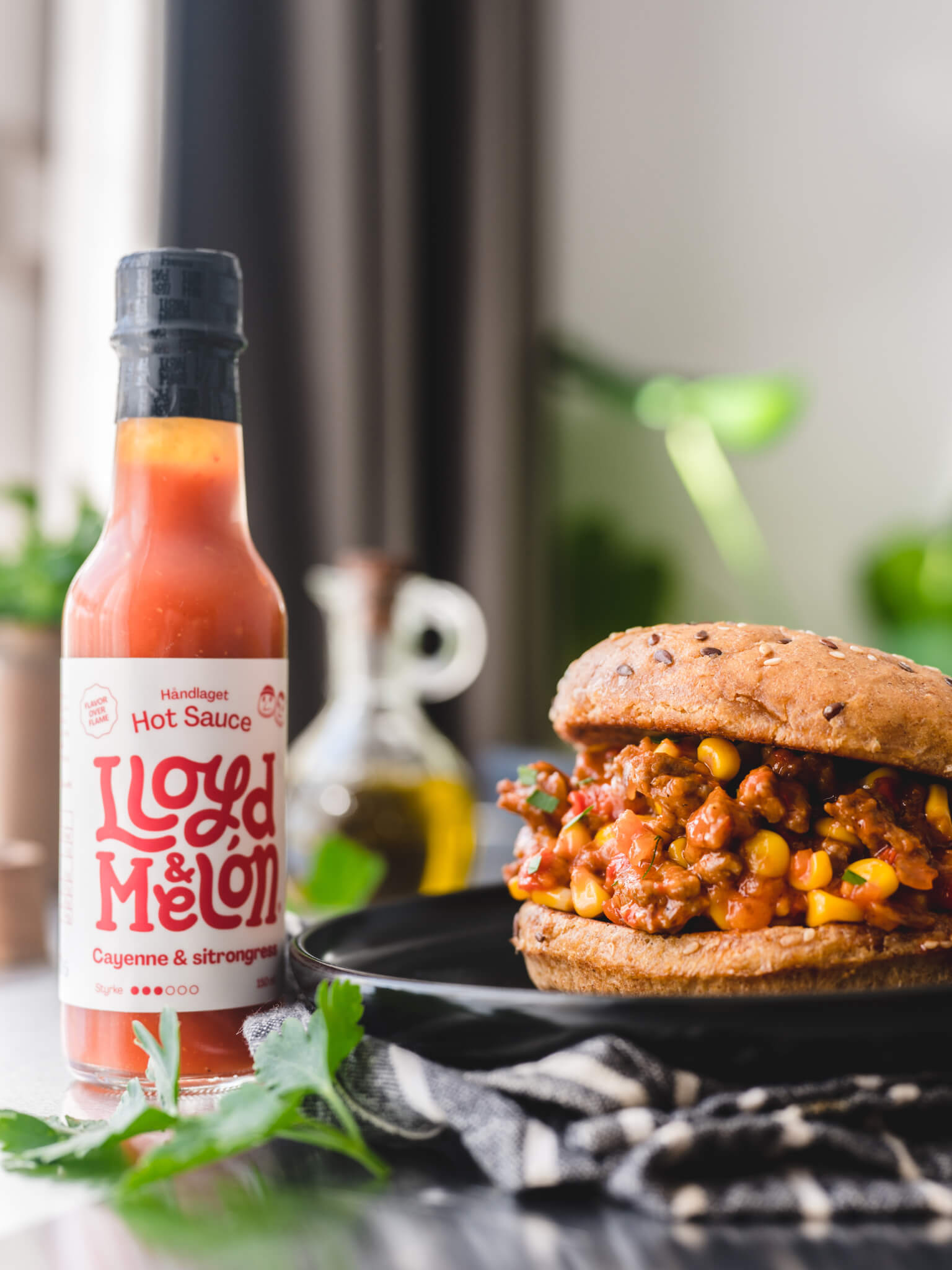
The logo is prominently placed on the bottles to clarify the sender and ensure visibility on shelves, while also establishing the brand. The main series’ labels have a strong clean series character, standing out in a category often dominated by skulls, chilies, flames, and a generally maximalist expression. The logo’s color matches the sauce color for each bottle to enhance variant communication, and play on the beautiful colors of the sauce.
Periodic limited edition variants differ from the main series by using strong color combinations that align with the experimentation in flavor production.
The overall design is jovial and playful, with vibrant colors for vibrant tastes. The PP Agrandir font was chosen for its unique and quirky shapes that celebrate humanity and convey rich flavor, reflected in the sauces where each batch is unique, showcasing meticulous craftsmanship. Lloyd & Melón celebrate imperfection.
Simple illustrations of the founders, along with badges for ‘Flavor over Flame’ and ‘Mouth-watering Guarantee,’ emphasize the message about taste and the duo behind it. Traditional 150 ml bottles were chosen to align with the category standard. Clear transparent bottles was chosen so that the color and texture of the sauces is clearly visible for the buyer.
The 3-pack features a window on the front so that the colors of the sauces and labels are clearly visible.


CREDIT
- Agency/Creative: Lloyd & Melón
- Article Title: Lloyd & Melón In-House Design for Their Fermented Hot Sauce
- Organisation/Entity: In-House
- Project Type: Packaging
- Project Status: Published
- Agency/Creative Country: Norway
- Agency/Creative City: Oslo
- Market Region: Europe
- Project Deliverables: Brand Creation, Brand Identity, Brand Naming, Brand Tone of Voice, Packaging Design
- Format: Bottle, Box
- Industry: Food/Beverage
- Keywords: hotsauce, sauce, chili
-
Credits:
Designer: Stig Melón-Bratvold
Designer: Marius Wathne
Product photography: Andris Søndrol Visdal
Food photography: Zhoro Apostolov
Chef: Kaneyn Lloyd Allen


