


Depot agency has developed the design concept for rebranding wellness products.
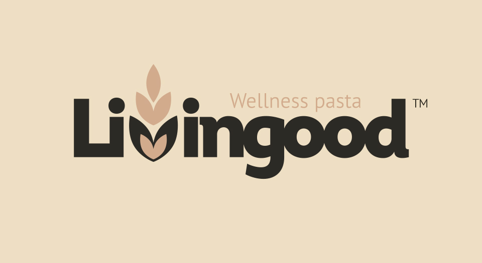
The concept began with the selection of a name reflecting the brand’s wellness positioning. The Livingood option has become a favorite for the client, both in harmony and ideology. In addition, the meaning of the name is closely related to the brand architecture and values that are significant for the consumer who prefers natural and healthy products.
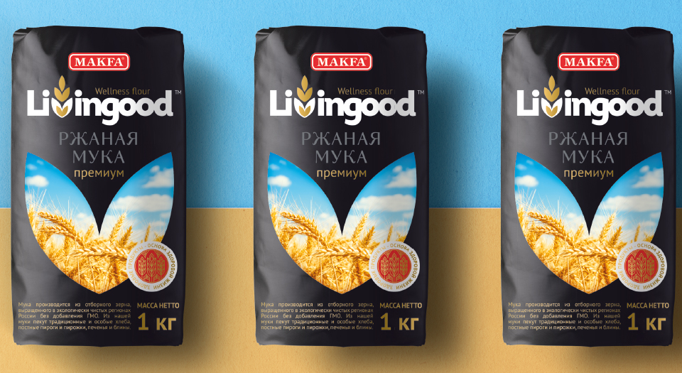
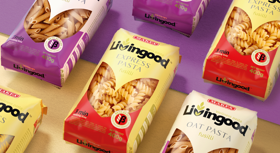
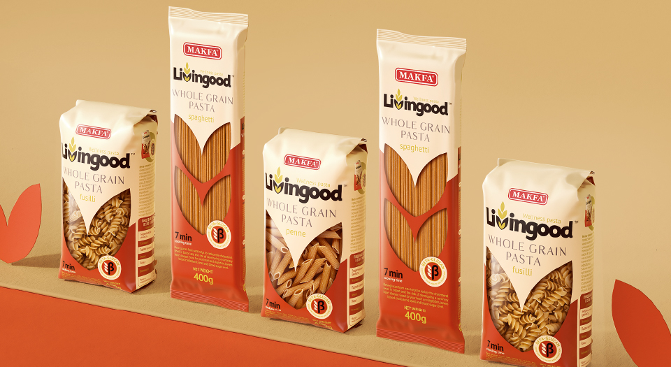
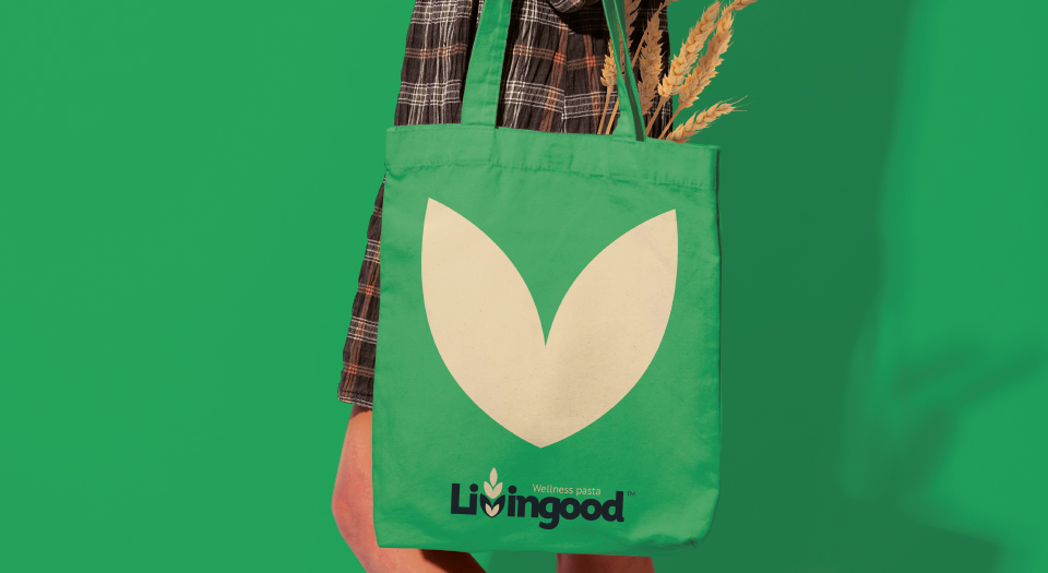
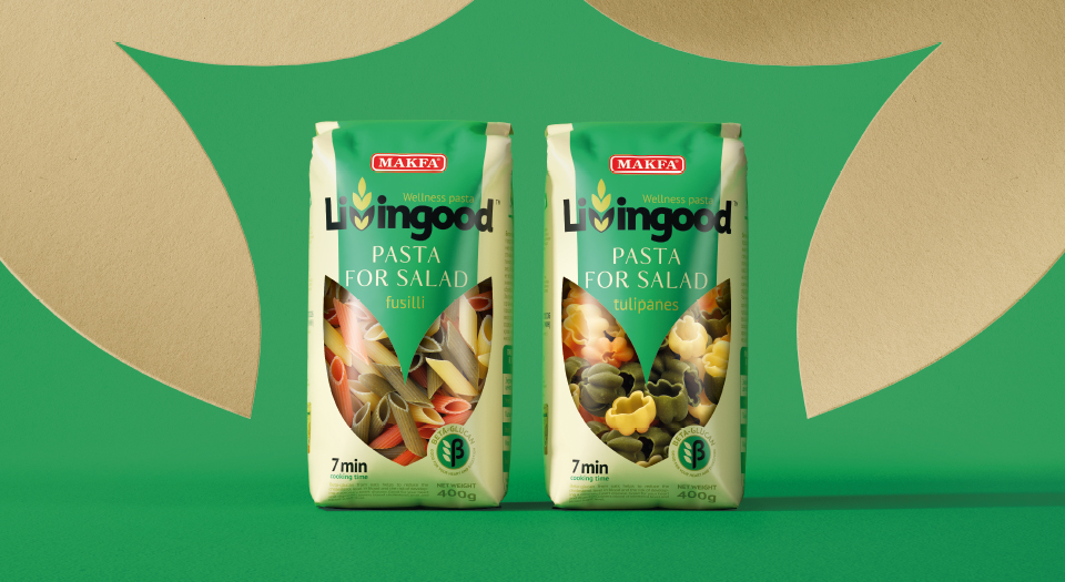
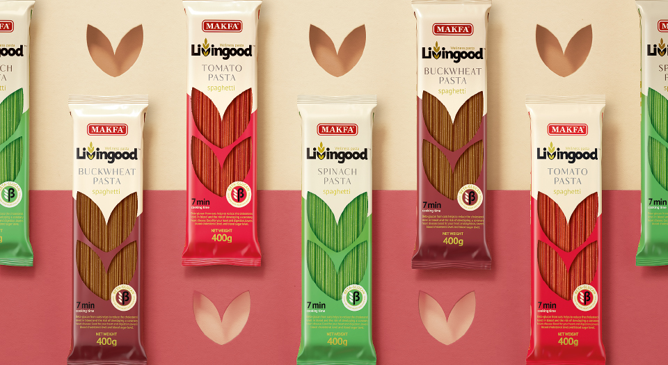
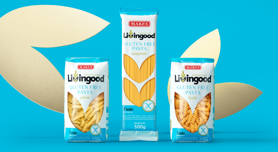
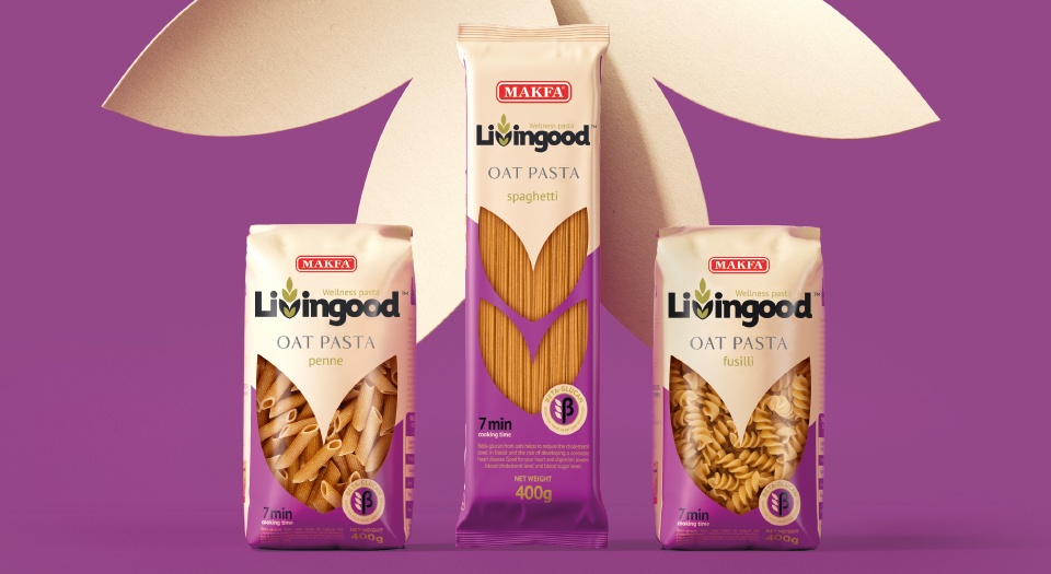
To create a complete image of a natural and healthy product that would be equally well received in different countries, we used the «craft» approach. The key element of the packaging was two wheat grains forming the letter V. In design, it occurs several times: both in the font of the logo, and as an independent icon, and as a cut-out window in the package itself.
The line variety is realized through the color and the changing shape of the bar, which is also a functional element: it contains information about a particular product.

CREDIT
- Agency/Creative: Depot branding agency
- Article Title: Livingood Wellness Pasta
- Organisation/Entity: Agency, Published Commercial Design
- Project Type: Packaging
- Agency/Creative Country: Russia
- Market Region: Middle East
- Project Deliverables: Brand Creation, Brand Guidelines, Brand Naming, Branding, Graphic Design, Illustration, Packaging Design, Product Naming, Retail Brand Design, Tone of Voice
- Format: Flow-Pack, Sleeve
- Substrate: Plastic, Pulp Paper


