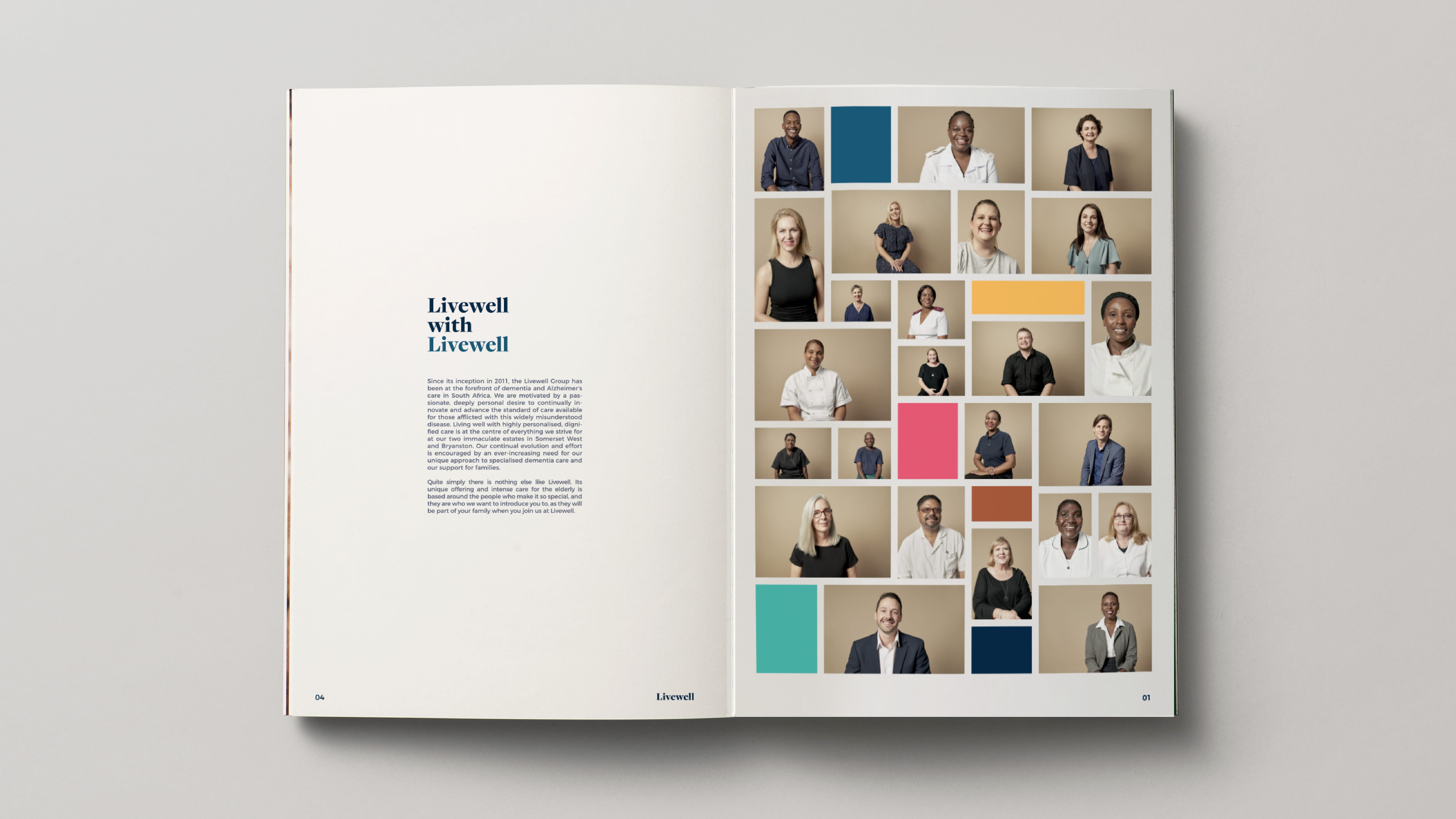
North’s Rebrand of Livewell Estates by redefining a category through the eyes of the people who define the organisation. Livewell Estates, pioneers in dementia care in South Africa, commissioned independent brand design consultancy NORTHVCA for a complete rebrand. This project was brought into being through extensive collaboration with Candice Erasmus of CEC, (Candice Erasmus Consulting), a regular partner of North. The challenge was, while Livewell had a unique product offering they were perceived as being the same as other old age homes with dementia care capabilities. Their visual language and the way they addressed the challenges of this disease needed to be completely changed to differentiate what is a very different product. To find Livewell’s truth to inform their Brand Story, North’s Immersion phase involved extensive interviews with board members and employees as well as tours of the facilities. This led to the realisation that it is the incredible people who dedicate themselves to working at Livewell that made it truly special, combined with their unique stimulus-based treatment of this widely misunderstood disease. Subsequently, the central idea of the Brand Story became “Livewell with Livewell”. The “Livewell with…” construct for the copy and design system allowed flexibility to speak to the many different aspects of the business, while providing a platform for the great people who make up the Livewell team to speak from the heart about what it meant to help people with dementia. As this is such a personal and momentous decision for families to make for their loved ones, it made sense to turn the lens on the people who will become like family by caring for your loved one. The design language needed to be fresh and modern to visually separate Livewell from the myriad of perceived competitors, who all seem to look and speak in a very similar way. The grid system created a fluid editorial style which could contain text and portraiture and the key messaging of the multiple unique offerings Livewell has, through the “Livewell with…” prefix. Studies show that colour can have a significant impact on the psyche of patients and we wanted to use the vibrant palette to inject energy into the brand, making it positive and approachable while maintaining their high level of professionalism around this very serious disease. The impacts of the rebrand, which launches soon, have already been felt internally with various teams within the organisation selecting their representative colour from the colour palette and embracing the Livewell with Livewell philosophy. Holding a mirror up to these incredible people and their stories created a new brand identity that will stand boldly apart from their competitors while dealing with a hypersensitive manner in a simple, honest and human manner.
CREDIT
- Agency/Creative: NORTH VCA
- Article Title: Livewell with Livewell
- Organisation/Entity: Agency, Published Commercial Design
- Project Type: Identity
- Agency/Creative Country: South Africa
- Market Region: Africa
- Project Deliverables: Brand Advertising, Brand Architecture, Brand Design, Brand Experience, Brand Identity, Brand Redesign, Brand Refinement, Brand Rejuvenation, Brand Strategy, Brand World, Branding, Graphic Design, Identity System, Photography, Rebranding, Tone of Voice
- Industry: Health Care
- Keywords: Dementia Care Facility, Rebrand, Elderly Care


