


Nutrifresh is a cutting-edge hydroponics company that aims to revolutionize how fresh produce is cultivated and consumed in India. As a brand deeply rooted in sustainability, purity, and innovation, Nutrifresh turned to us at Littlemore Services Pvt. Ltd. (LMS) to create a bold and differentiated brand identity that would visually communicate its values while appealing to a new generation of conscious consumers.
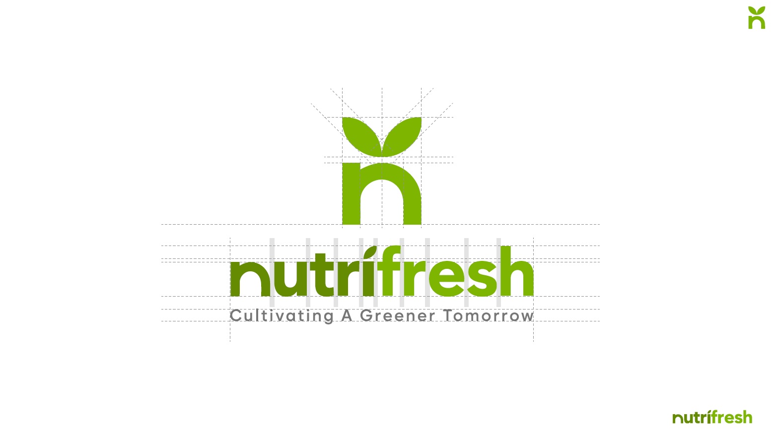
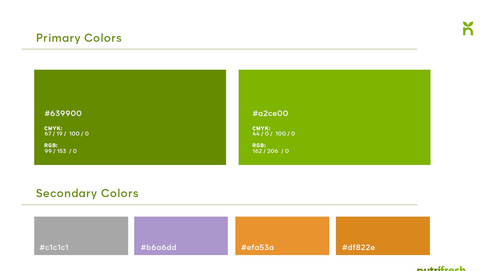
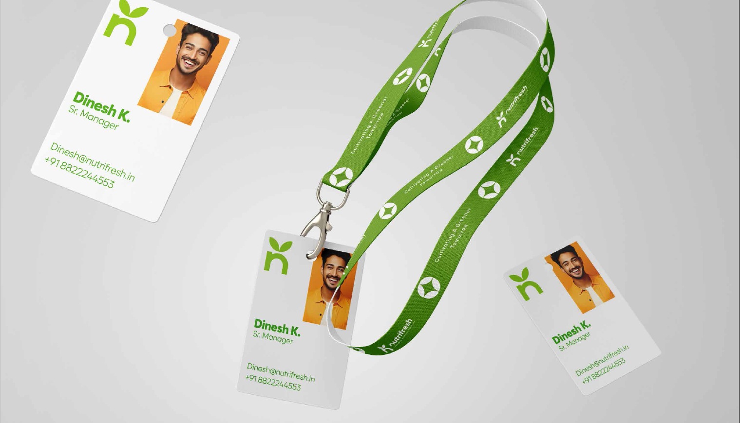
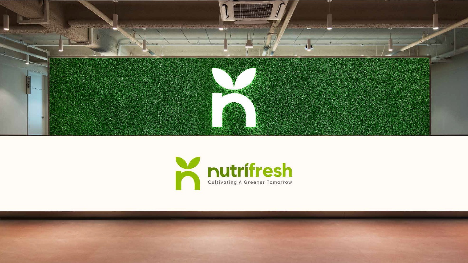
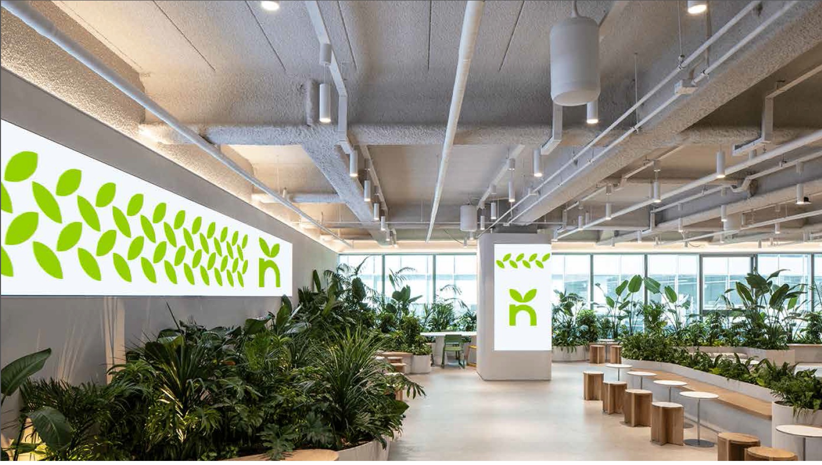
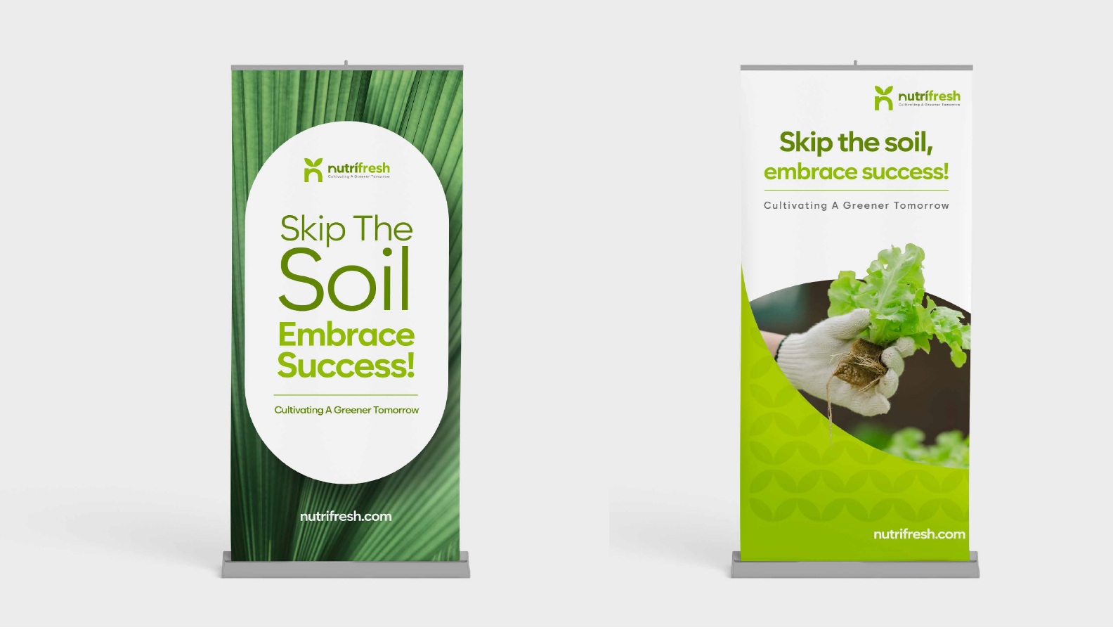
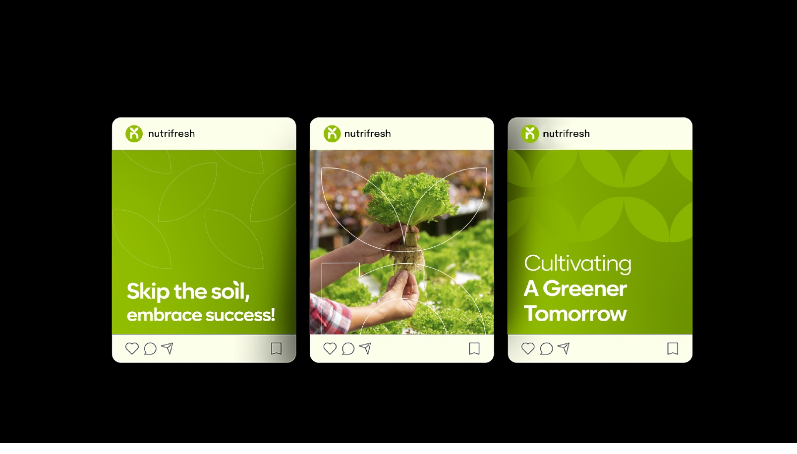
We developed a cohesive visual identity that is minimal, clean, and powerful in its symbolism. At the heart of the identity is a stylized ‘N’ that forms a subtle ‘V’ with two upward-arching leaves — a strong yet gentle nod to growth, nourishment, and nature’s cycle. The use of dual tones of green — a richer hue for “Nutri” and a brighter, fresher tone for “Fresh” — reflects the brand’s promise of nutrient-rich, fresh produce. Additionally, a single leaf atop the lowercase “i” adds an elegant detail that reinforces the brand’s organic ethos.
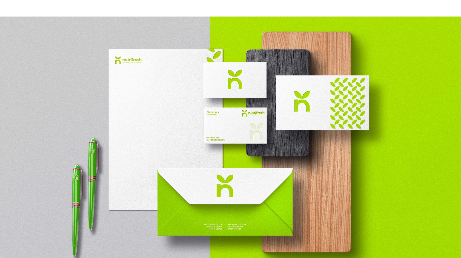
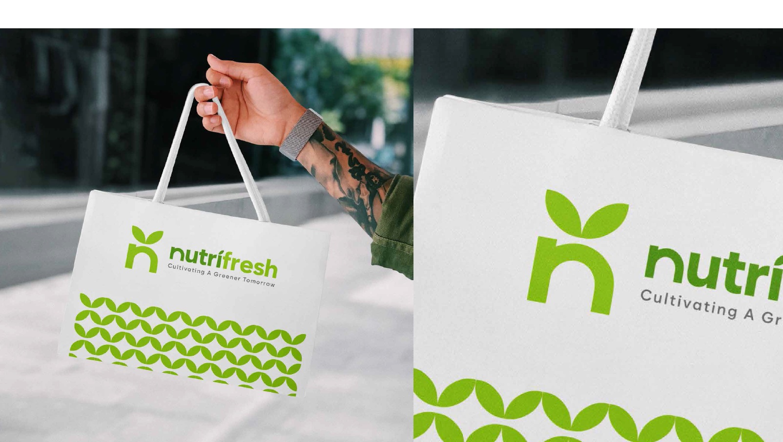
Typography was carefully chosen to strike a balance between strength and accessibility. The modern and geometric Zabal font family was paired with Optima for warmth and flexibility. This created a system that could be extended fluidly across all brand touchpoints — from brochures, office branding, social media, and digital templates to outdoor media and packaging.
Our creative direction emphasized clarity and restraint — two principles that align with the sustainable and efficient practices of hydroponic farming. We designed the brand to breathe — with plenty of white space, clear typographic hierarchy, and natural colors that evoke trust and vitality. Every piece of collateral, whether a standee at a trade show or a digital presentation, carries the same visual DNA.
What sets this project apart is its adaptability and resonance. Nutrifresh needed to appeal to both the B2B and B2C segments, and our identity system achieved just that — professional, scalable, and full of life. The brand today proudly stands as a visual benchmark in India’s agritech space, and we’re proud to have partnered with them to bring it to life.
CREDIT
- Agency/Creative: Littlemore Services Pvt Ltd
- Article Title: Littlemore Services Redefines Agritech Branding with a Fresh Identity for Nutrifresh
- Organisation/Entity: Agency
- Project Type: Identity
- Project Status: Published
- Agency/Creative Country: India
- Agency/Creative City: Mumbai
- Market Region: Asia
- Project Deliverables: 3D Design, Advertising, Brand Architecture, Brand Design, Brand Guidelines, Brand Identity, Brand Redesign, Branding, Design, Logo Design, Packaging Design, Rebranding
- Industry: Food/Beverage
- Keywords: Hydroponics, Sustainability, Fresh Produce, Minimal Design, Nature-Inspired Branding, Clean Typography, Farm-to-Table, Green Living, Organic, Wellness, Visual Identity, Brand Strategy, Natural Colors, Modern Agriculture, Indian Agritech
-
Credits:
Founder and Creative Head: varon bawa


