


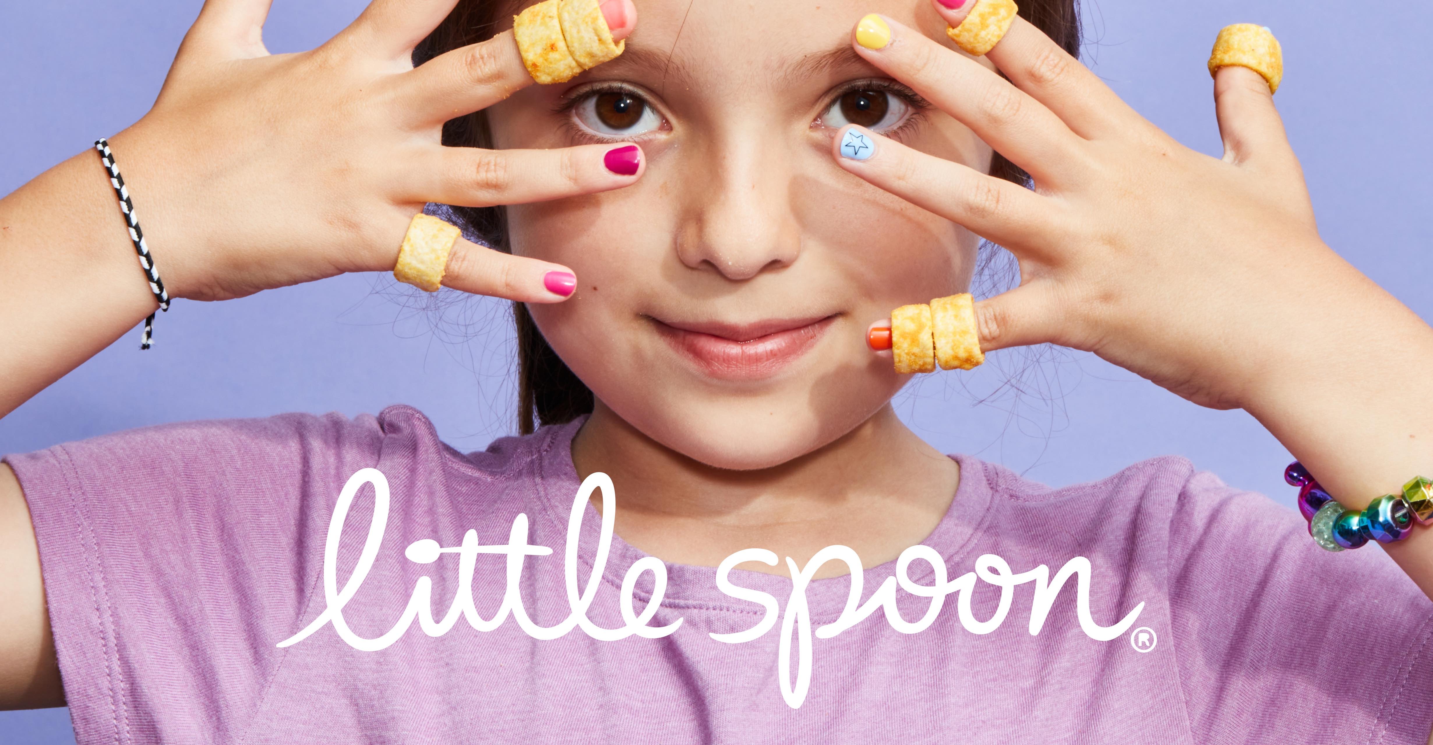
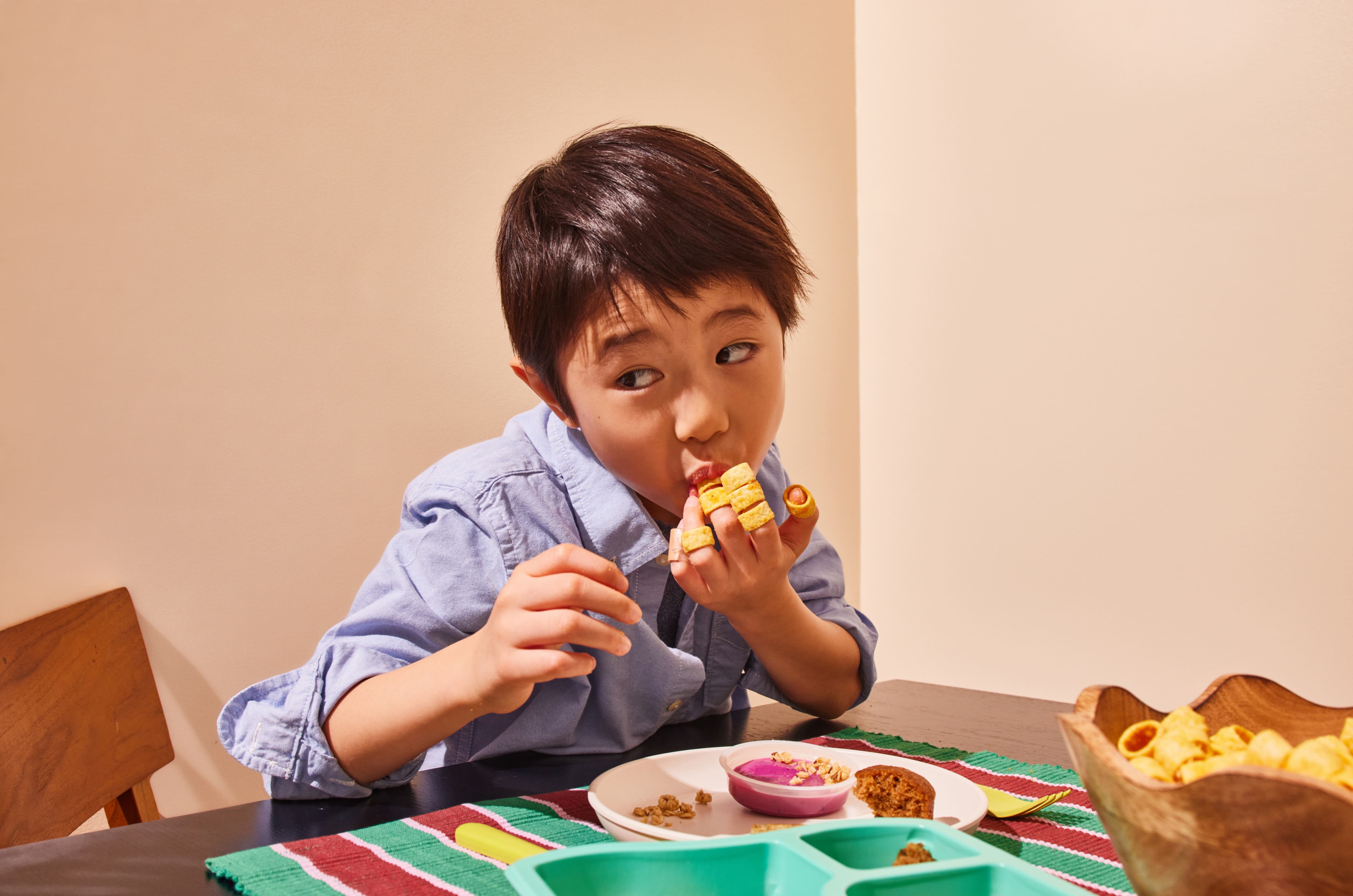
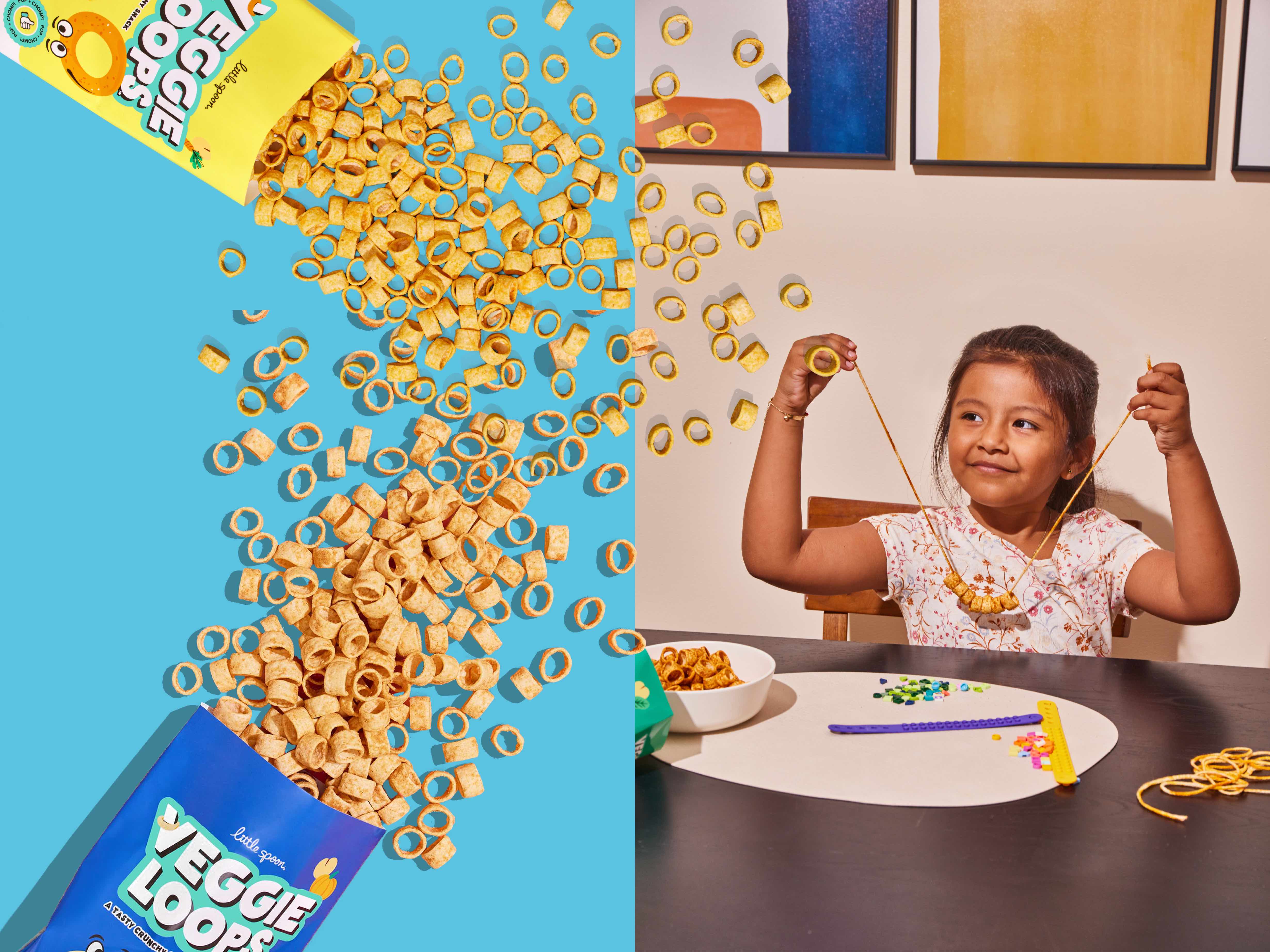
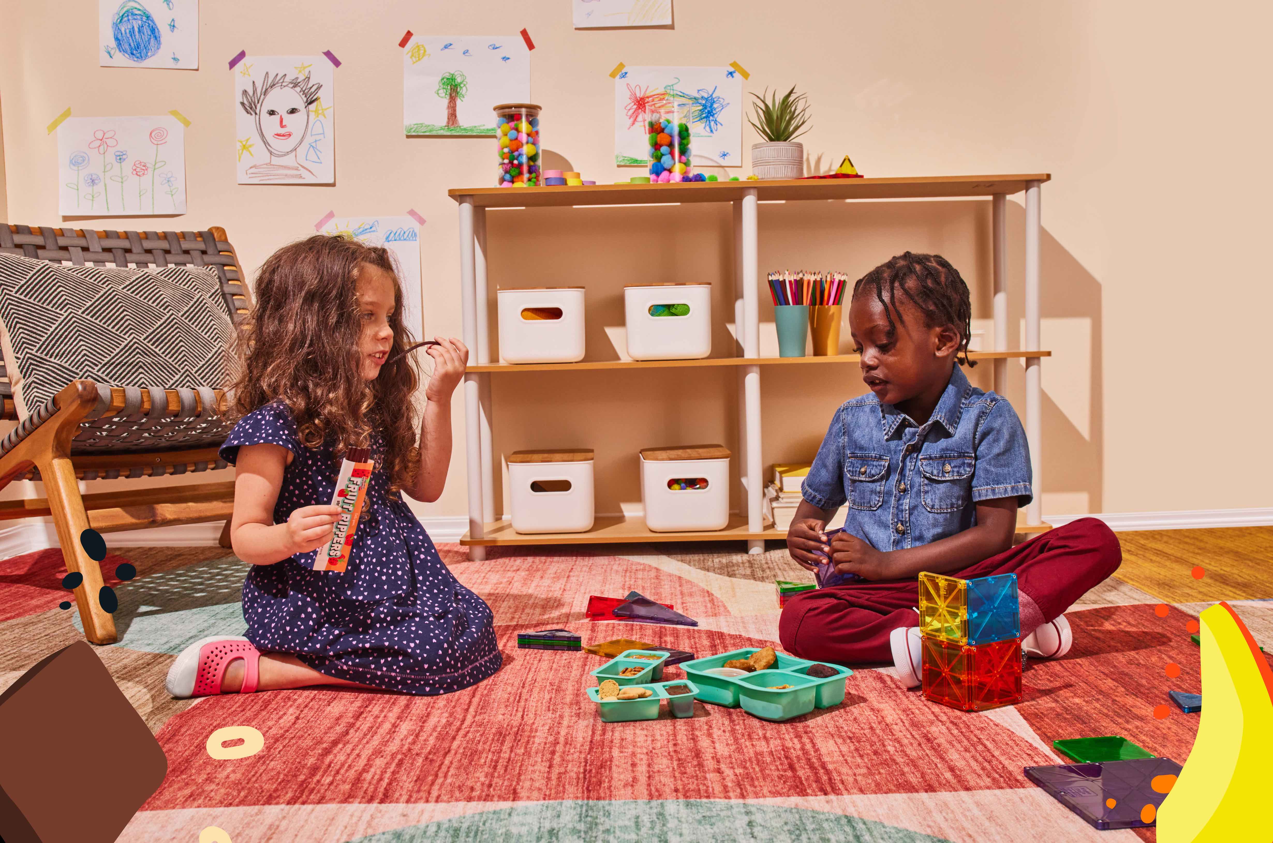
You’ve changed since the 90’s and early 00’s, so why hasn’t your kid’s food? Expertly crafted to the modern parent standard, in typical Little Spoon form, the brand’s new Lunchers and Snacks assortment offers nutritious, junk-free, and high-quality products (for the 4–7 age range) in a category often plagued with outdated, artificial-filled options.
Early in developing the new line, Little Spoon partnered with branding and marketing agency Smakk. Rethinking everything from naming to packaging to messaging, the Smakk team adapted the visual ID of the beloved baby and toddler brand for big kids (and their parents) to satisfy their ever growing customer needs as they age.
Little Spoon is the largest DTC kids food brand in the United States on a mission to make parents’ lives easier and kids healthier. Servicing hundreds of thousands of millennial and Gen Z parents across the country, their online community boasts more than 1.5M subscribers and the brand has won countless awards for its innovation, quality and standards. As Little Spoon embarked on the journey to expand its end-to-end platform into the 4+ demo, they realized the need to evolve their approach while staying true to the brand mission above.
“At Little Spoon we aim to create mealtime experiences that grow with our customers. Our new products cater to big kids, who play a major role in household purchasing decisions, so we knew we needed to consider their taste in our packaging designs. We were thrilled to partner with Smakk on designing fun and delightful branding for our new Lunchers and Snacks assortments,” said Co-Founder and Chief Product Officer, Angela Vranich.
“Little Spoon came to us with a desire to define an aged up evolution to their brand ID, authentic to who they are today but establishing an understanding of the dual audience for parent/child in the big kids space,” explains Smakk Founder Katie Klencheski. “They needed our help in establishing a design solution that was flexible enough to adapt to their current vis ID and could easily be applied to other products as the line grows.”
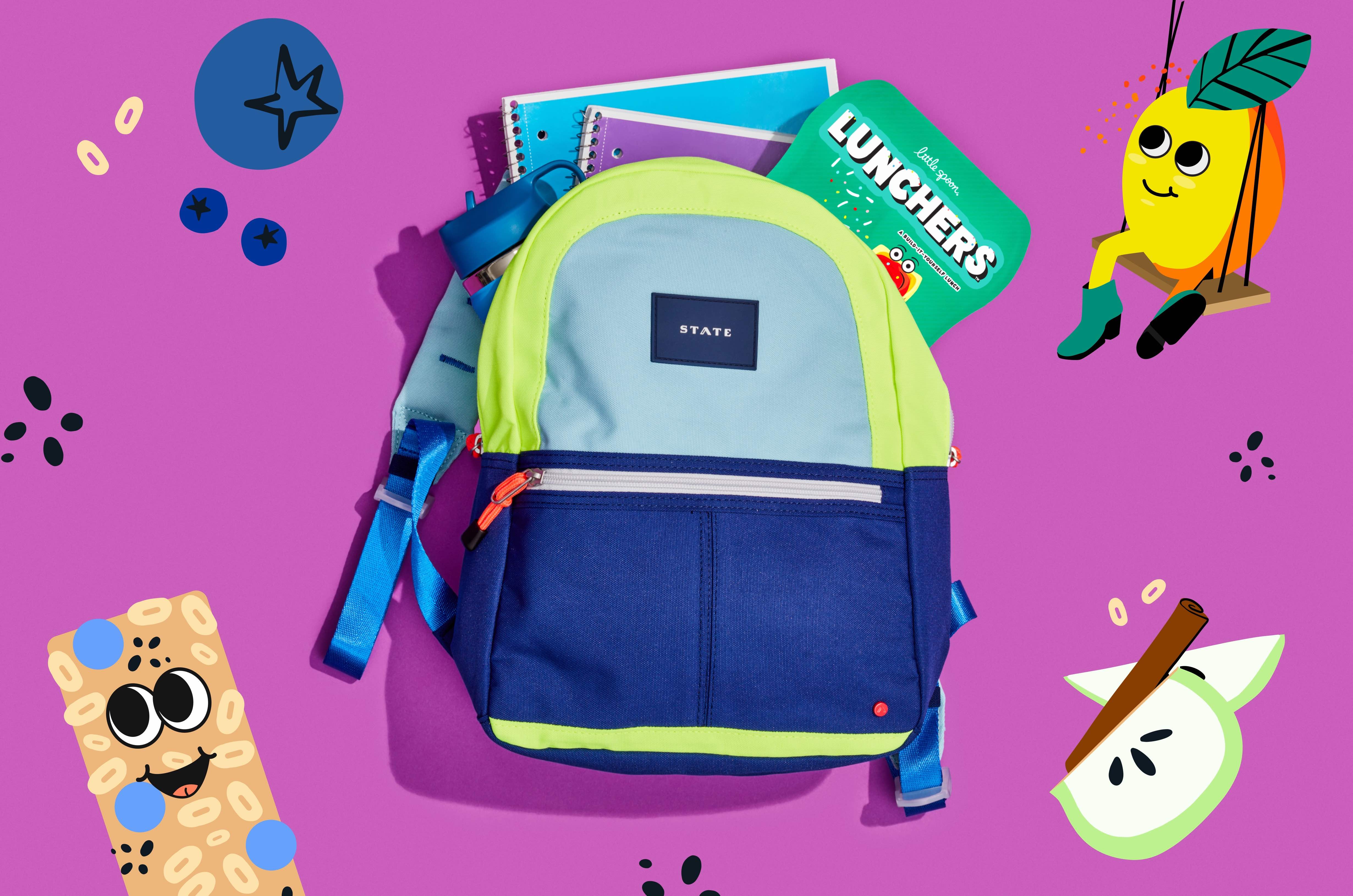
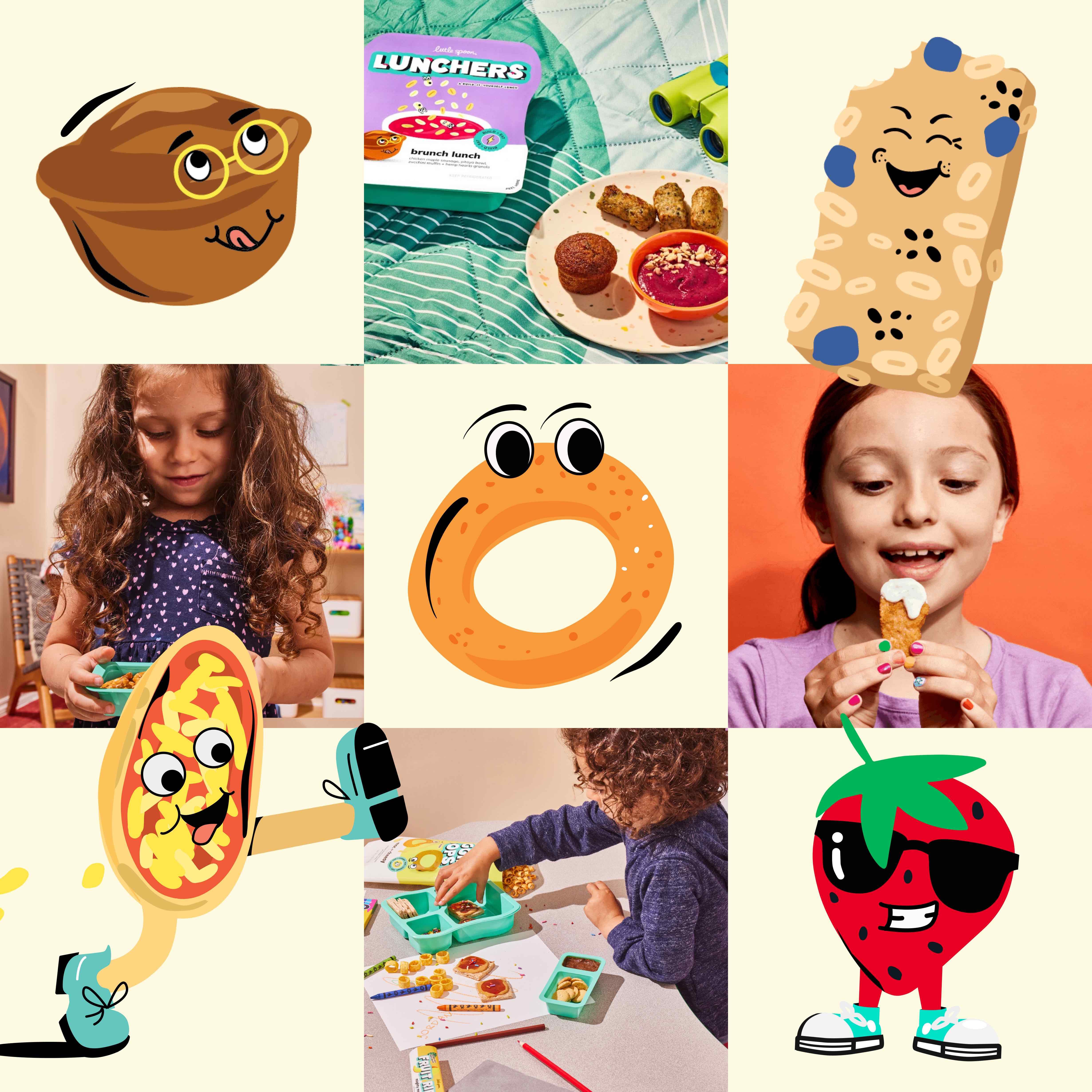
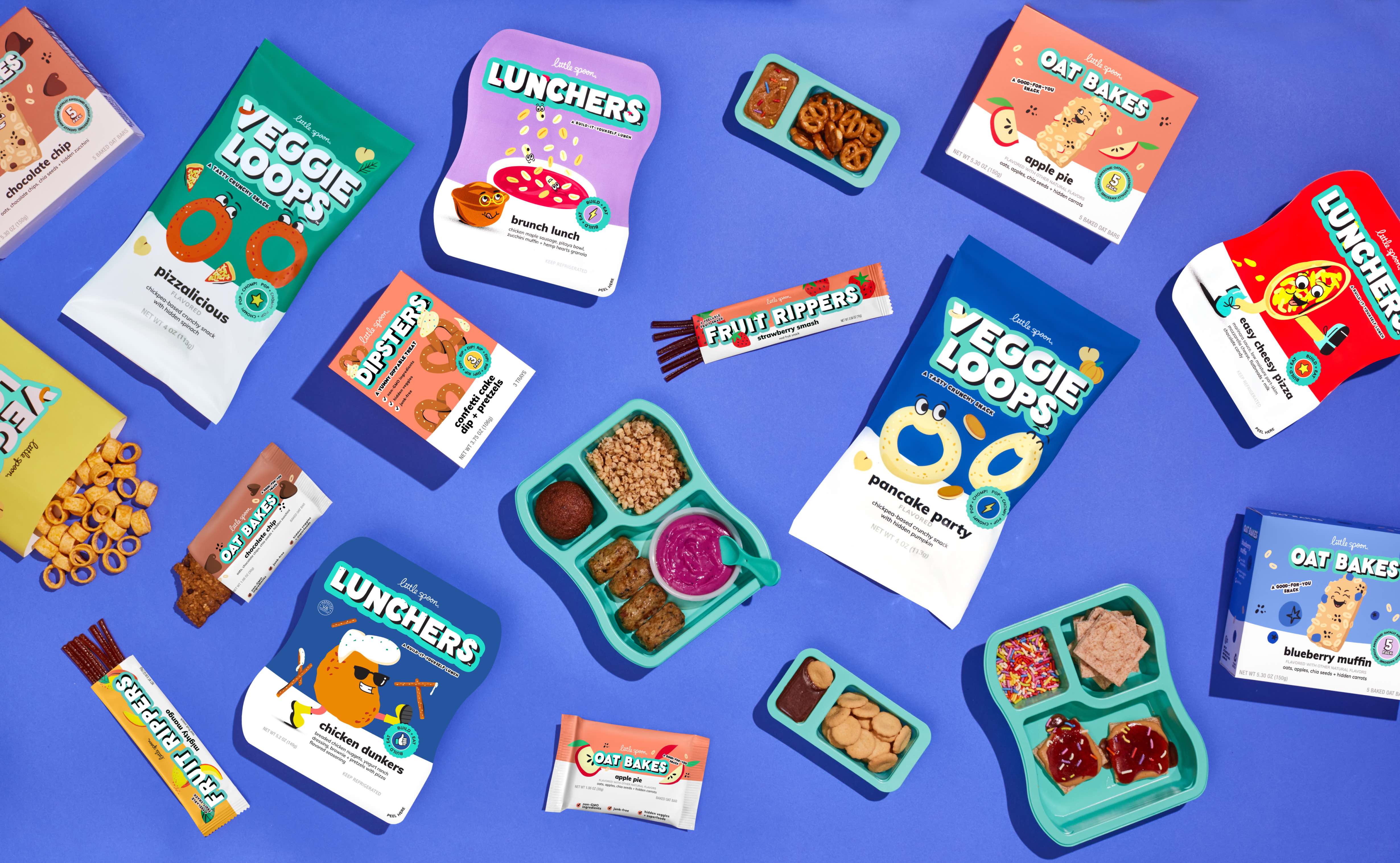
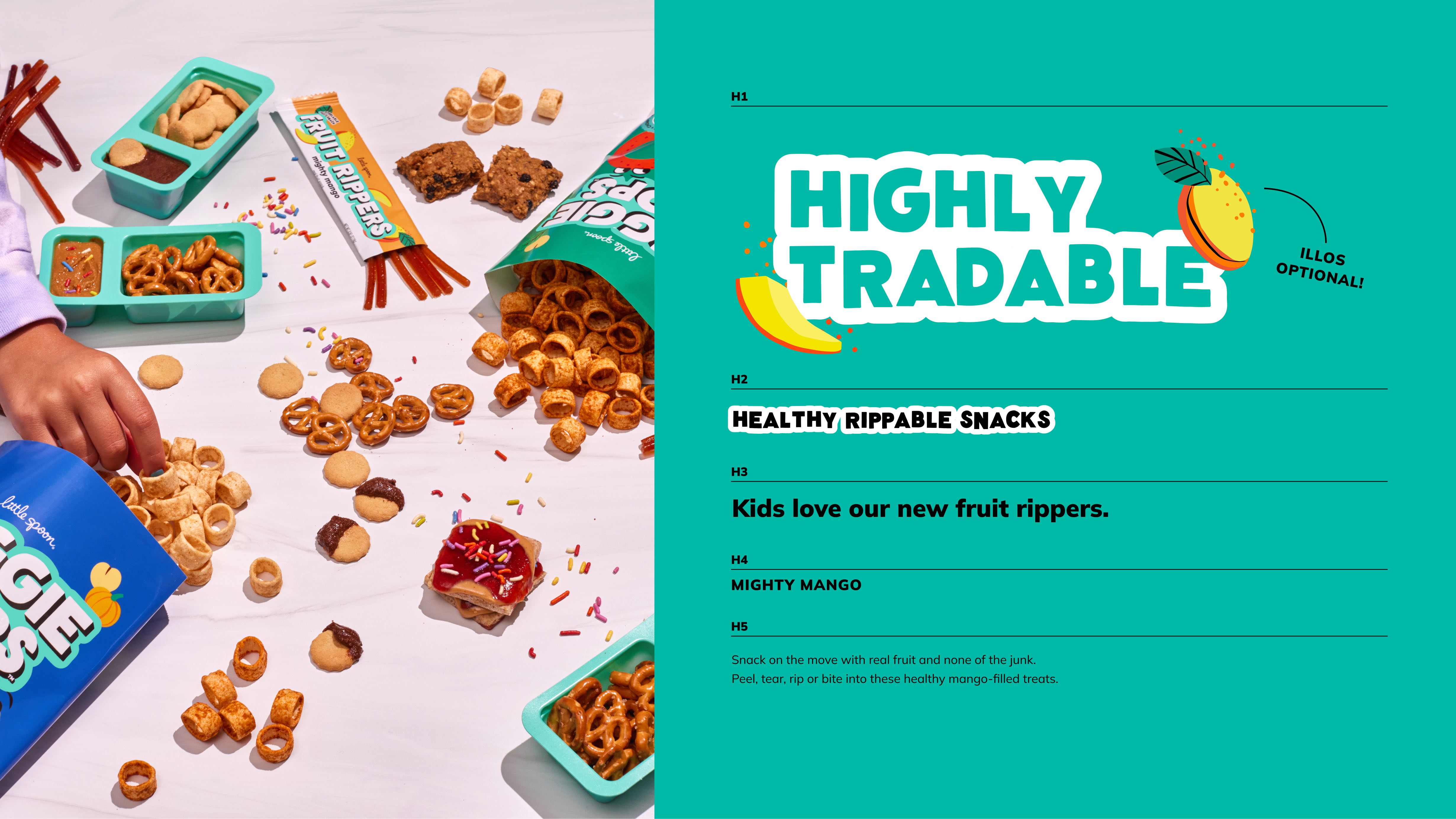
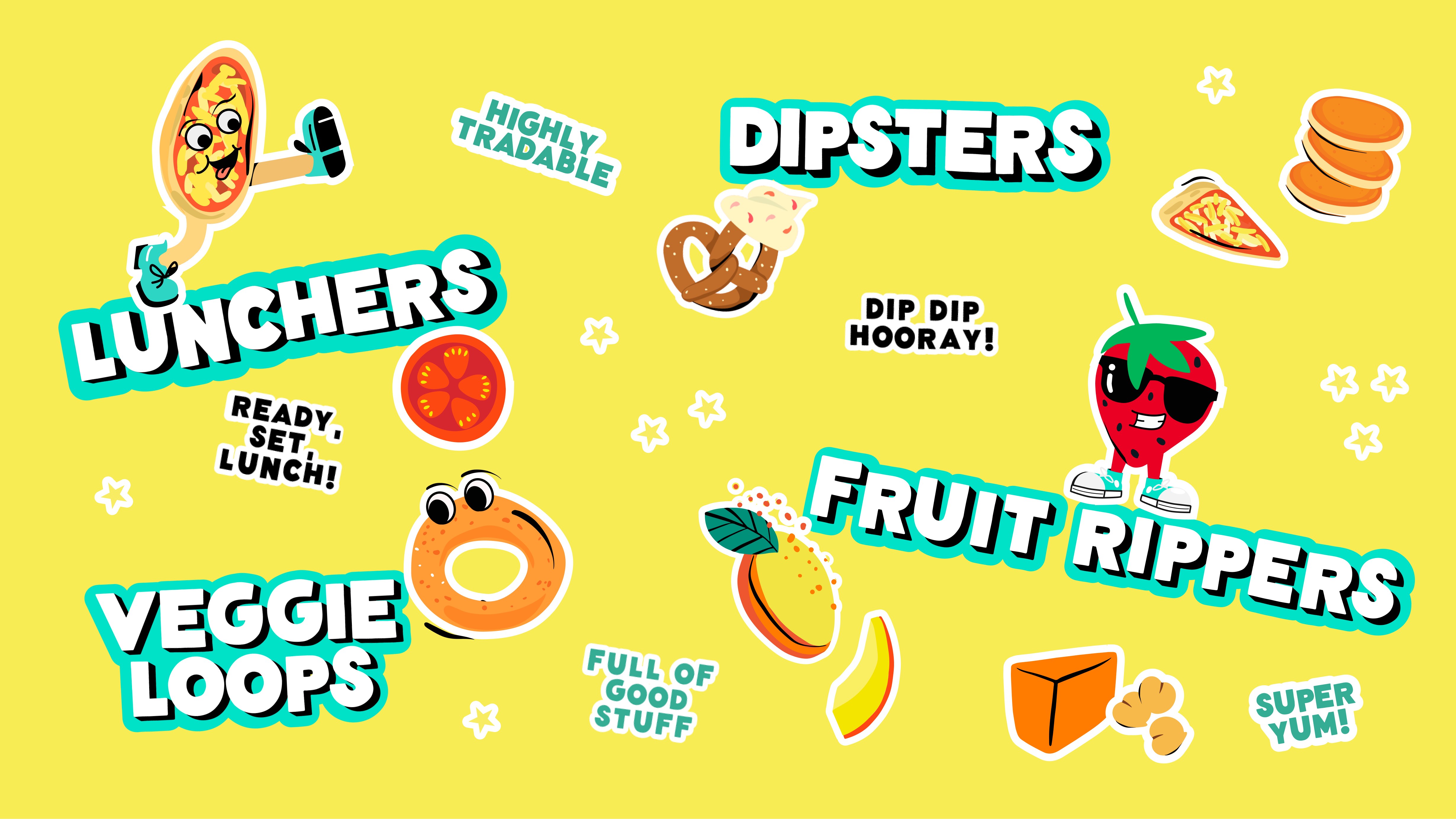
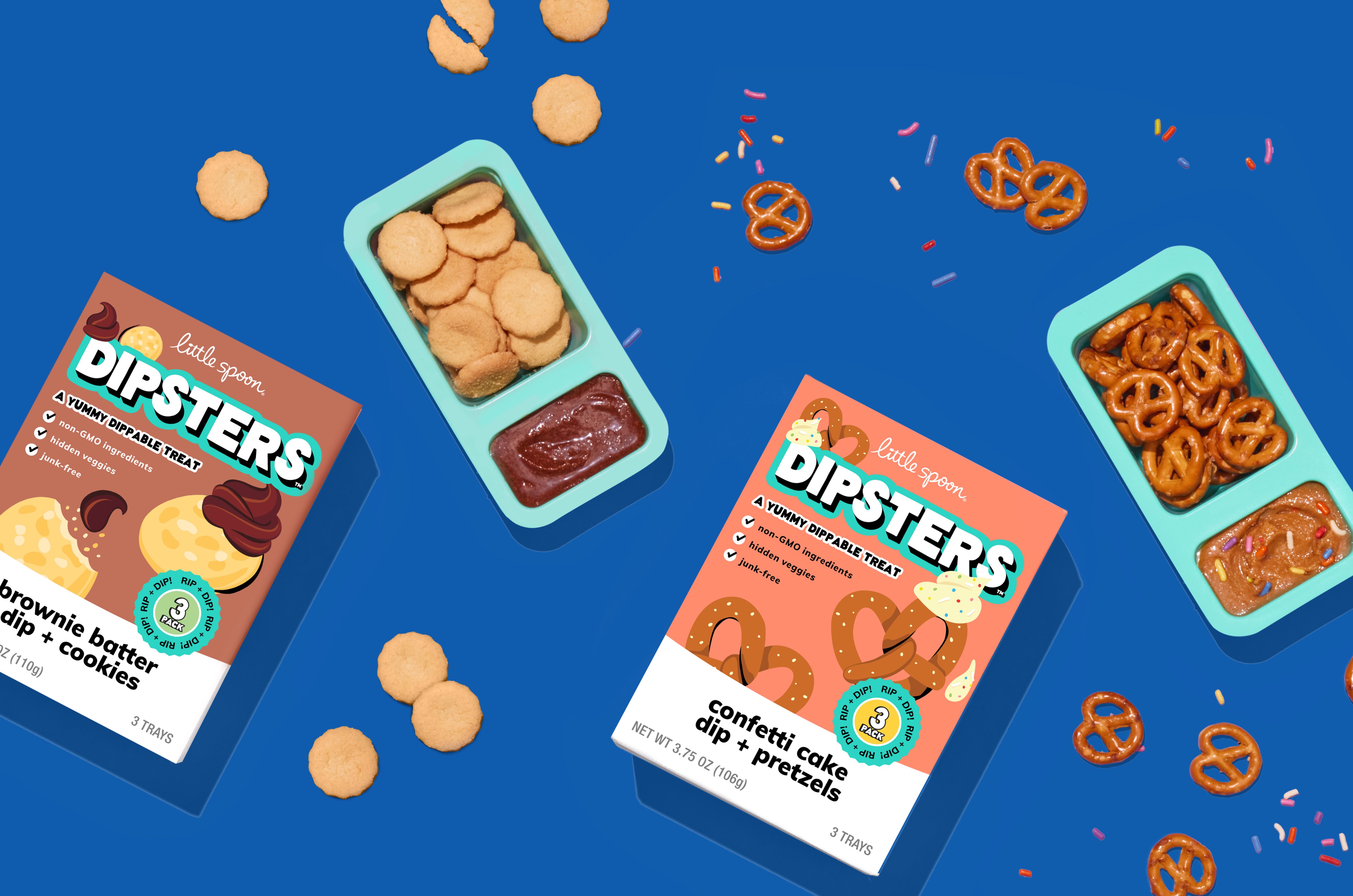
Smakk helped to develop the look and feel, establish product names and articulate how this new branding could be incorporated into the broader brand architecture for Little Spoon and across key channels. Making playful creative choices — bold, playful fonts, joyful category and product names, “power badges” on each SKU and a bank of illustrated ingredient-based characters that the brand was able to expand upon across broader SKUs – the brand identity boasts a “cool” factor that makes each meal or snack memorable – an important distinction for older kids that compare lunches at school with their friends.
“The age of the kids meant that they probably weren’t reading the product benefits in the fine print on pack. So, the challenge became about making the food seem cool and tasty, while still assuring the parents that the food is healthy, nutritious and something their kids will actually eat,” continues Klencheski.
Beginning with the product language, Smakk created strong category names that were ownable to Little Spoon that kids could ask for by name – Lunchers, Veggie Loops, Dipsters, and Oat Bakes – as well as flavor names to build familiarity and understanding across the products. Still, the packaging also includes healthy callouts — like hidden vegetable ingredients — that only parents would notice and get excited about.
This attention to detail also extended to considering how the new line would appear across the website, emails and social media to ensure the extended visual identity remained cohesive across all product lines. The result is a new product line as distinct and singular as Little Spoon’s mission.
“Little Spoon has been such a leader in championing a new standard for kids food with a brand that has earned them loyalty and acclaim from kids and their parents,” says Klencheski. “We know these new additions to the brand look and feel will fit seamlessly into the brand’s existing visual identity while giving Little Spoon’s ‘big kid’ fans meals that feel like they are just for them, not their younger siblings.”
CREDIT
- Agency/Creative: Smakk
- Article Title: Little Spoon Teams Up With Smakk On New Aging Up Brand ID
- Organisation/Entity: Agency
- Project Type: Packaging
- Project Status: Published
- Agency/Creative Country: United States
- Agency/Creative City: New York
- Market Region: North America
- Project Deliverables: Brand Identity, Packaging Design
- Format: Box
- Industry: Food/Beverage
- Keywords: Little Spoon, SMAKK, packaging, kids
-
Credits:
Founder and CEO: Katie Klencheski


