


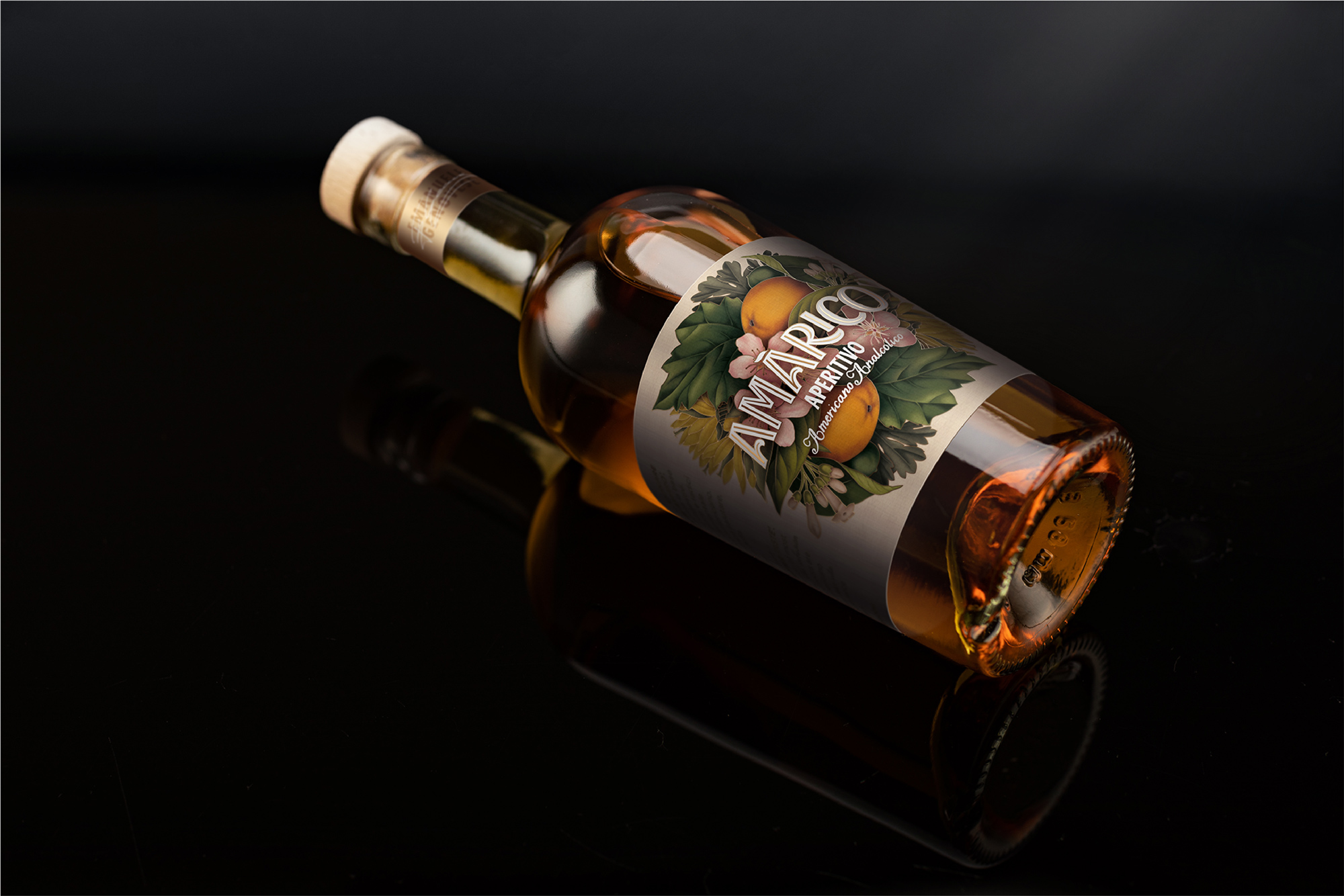
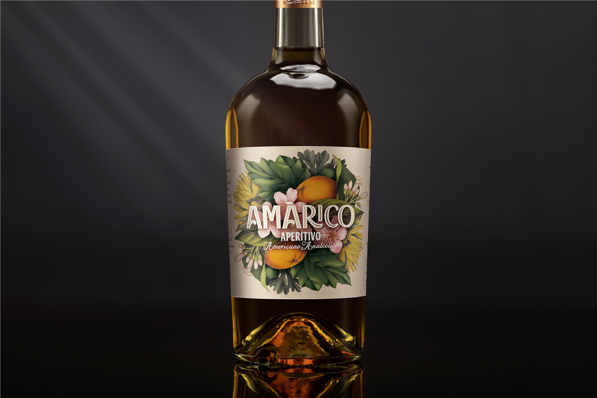
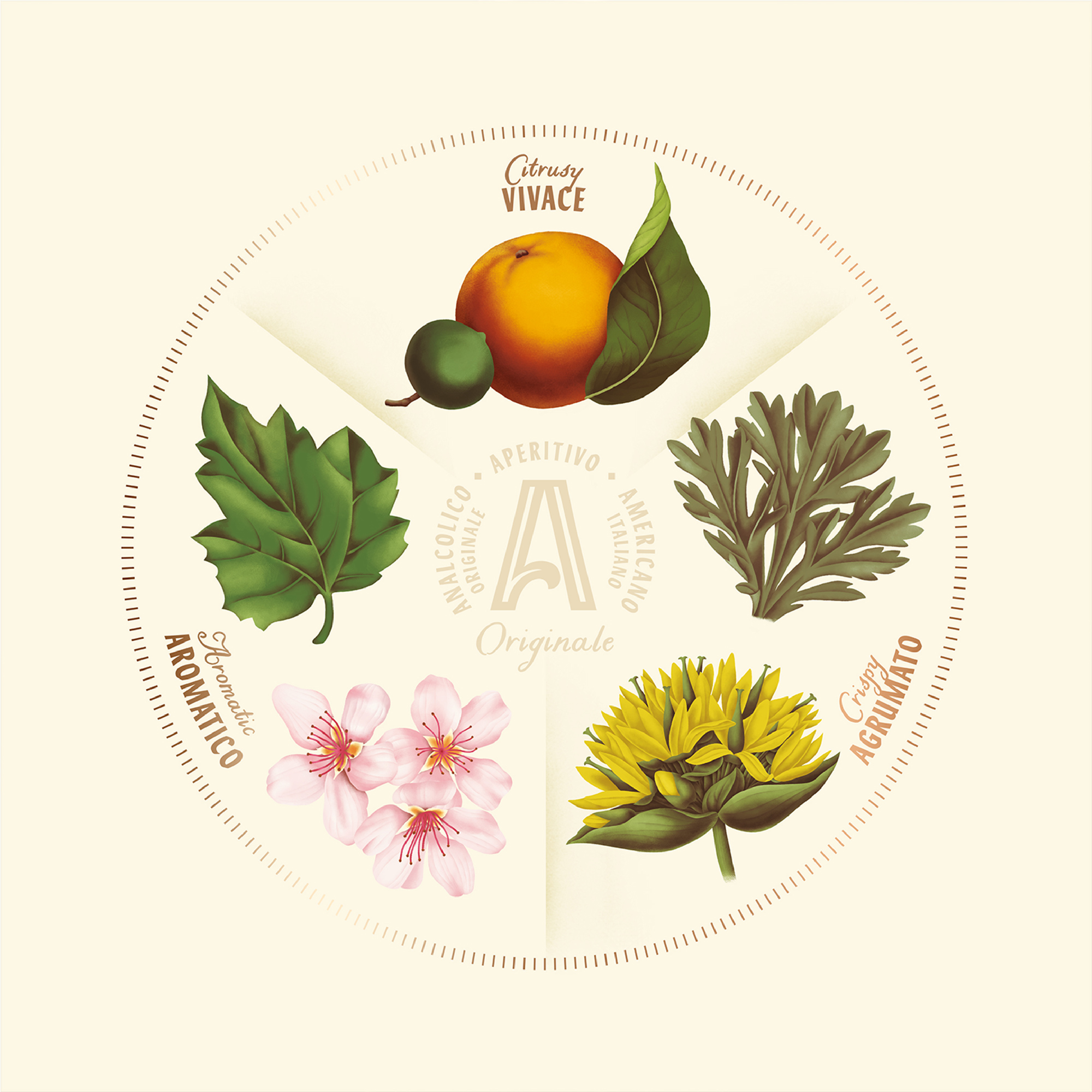
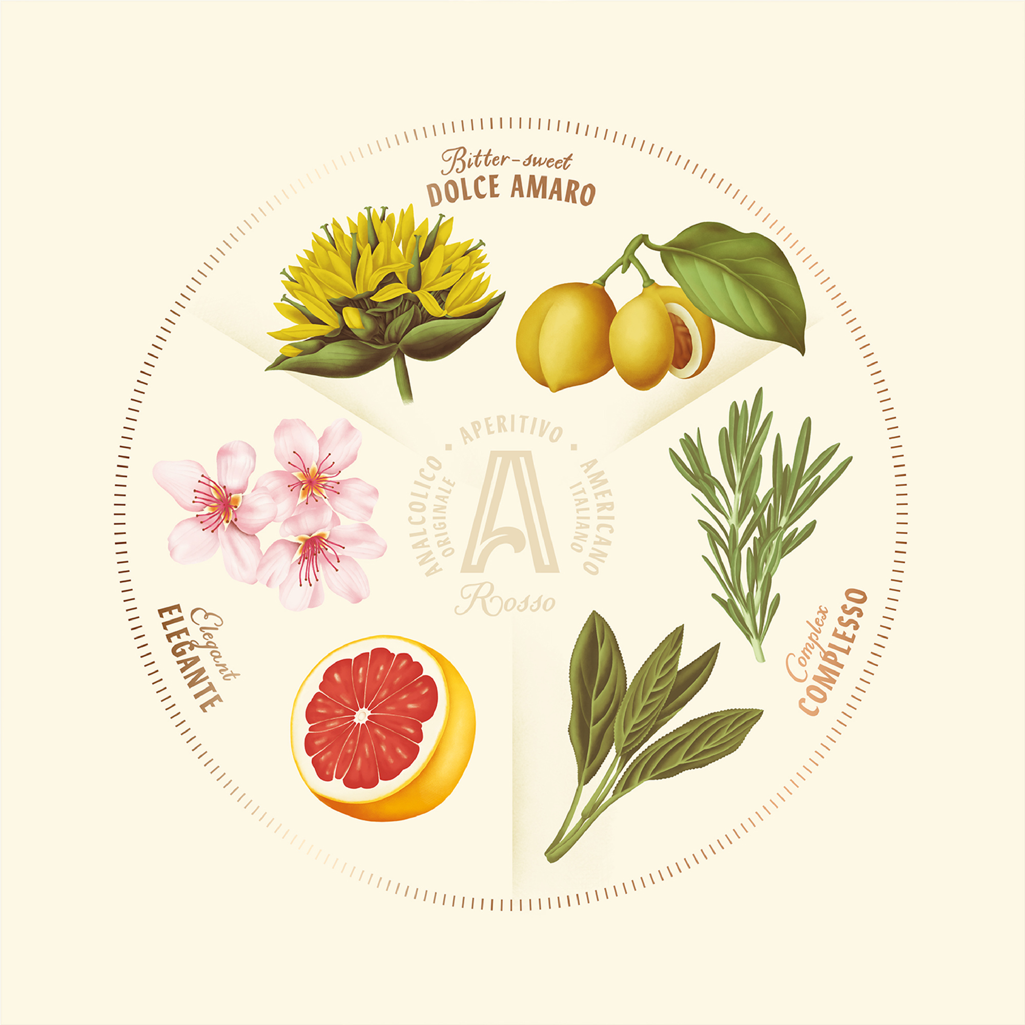
The design channels the inherent aesthetic properties of the product, through careful use of botanical motifs which instinctively channel its fragrant, complex and natural ingredients. These are encapsulated in the elegant illustrations and contemporary hand-made fonts which augment and harmonise the aperitif’s essence and ambience.
The design was inspired by the product’s complex aromas and piquancy, which simultaneously infuse and inform the fundamentals of its very essence. At its heart, the devotion to “La Dolce Vita”, reimagined in an uber-modern approach to the aperitif. For our team, naturally this entailed an all-consuming deep-dive into the philosophy of “the Sweet Life” concept, and collectively coalescing our thoughts on how to present this timeless blend of indulgence and pleasure.
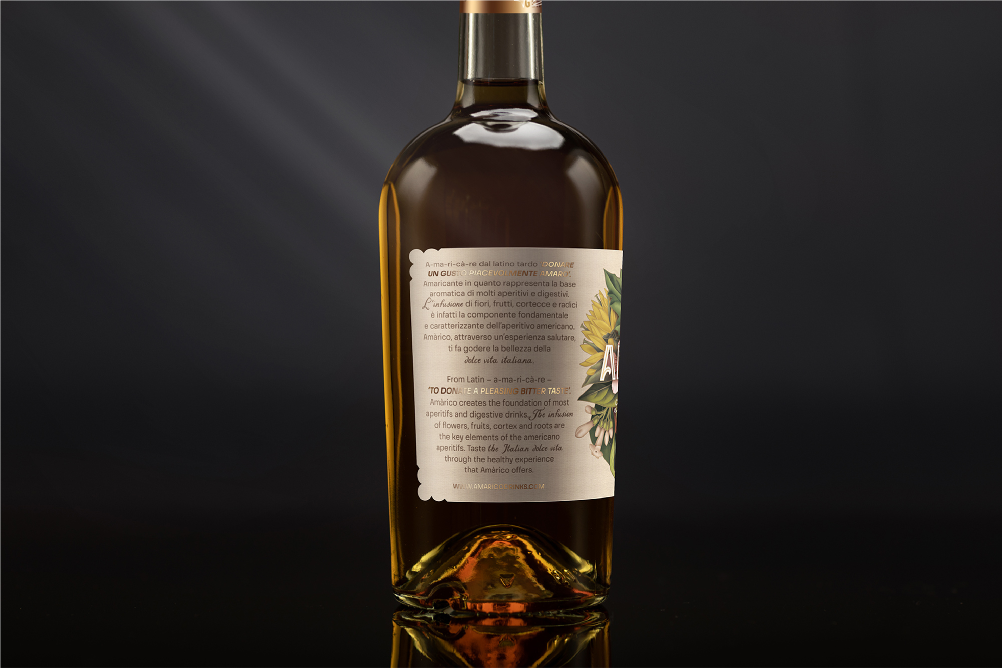
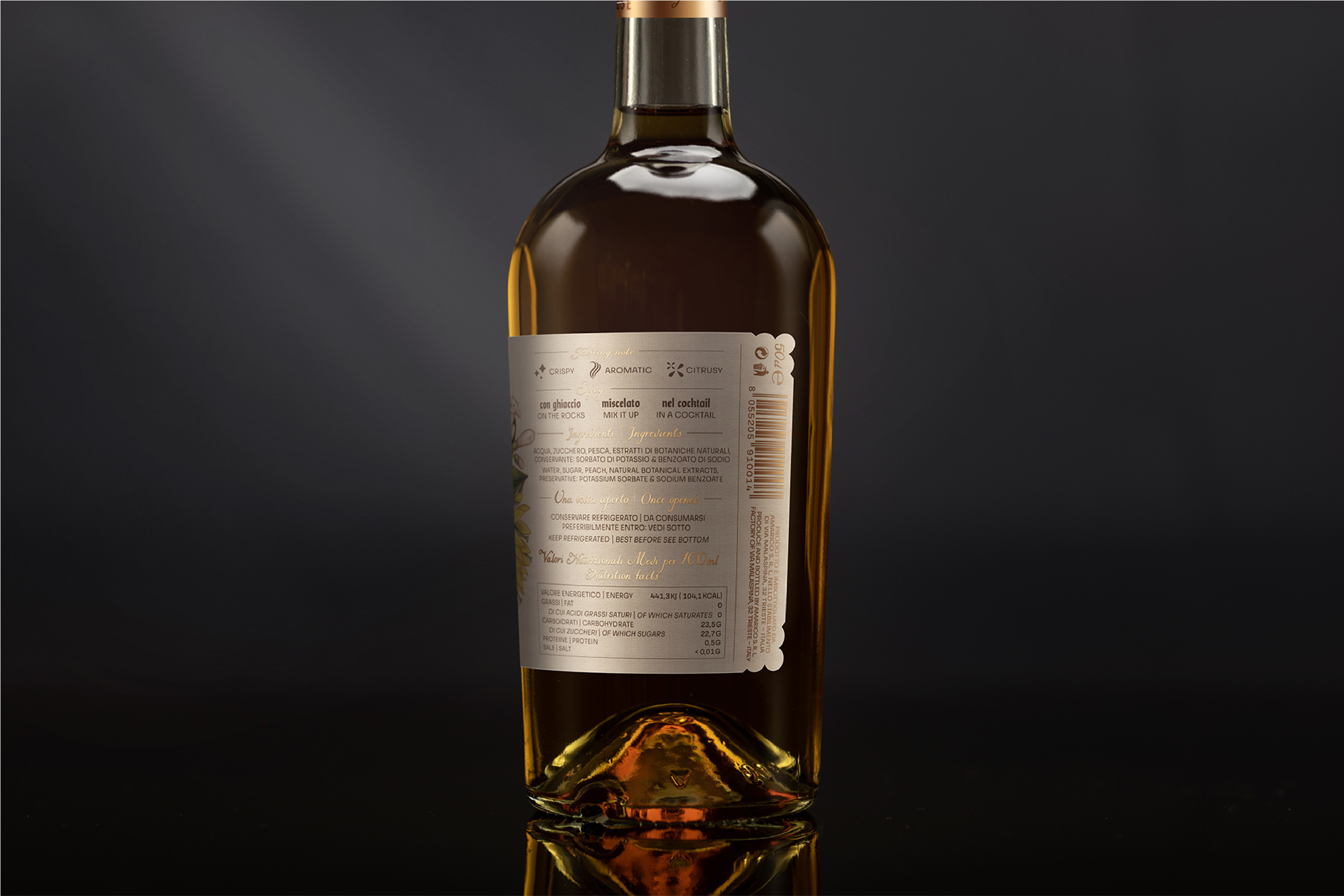
When we began conceptualising materials, our thoughts progressed to the product’s sensory essence. After contemplating its lightness in taste and aromatic natural ingredients, we decided on the similarly ethereal medium of digital crayons. Individual herbs were assembled into a mirror composition inspired by decorative art. Meanwhile, many texts led to us creating one label to embrace the bottle, with gilded outlines of individual herbs, joining logos and highlighted parts of text.
The conceptualisation, design and illustration has been carefully crafted to evoke a deep sense of “La Dolce Vita” between brand and customer interactions. The vivacious imagery, typeface and colours characterise the natural and authentic methods used to create the product, helping to set it apart from others occupying similar spaces in the market. The project started between Prague and the north of Italy (where Amarico is produced) in December 2019, and finished in December 2020, followed by its global launch.
Research involved exploring the roots of the product’s brand, its symbiosis with the “La Dolce Vita” concept, and immersion into the ancient Italian infusion methods. This entailed storyboarding with the product owners, to gain insights about the recipe, and the types of emotions it engenders. It also involved analysing current trends, insights and impacts around aperitif consumption in society, in particular the popularity of other Italian beverages such as Aperol.
The creative challenge was around how to marry the multiple elements and characteristics into one prestigious, evocative and authentic brand. Regarding external factors, the product is of course alcohol-based so required careful positioning, which we achieved by balancing with the use of natural ingredients and eco-friendly packaging. As development evolved, we used these differing elements to bring together the social spirit of fun, the deep sense of wellbeing, and the rich tapestry of history.
CREDIT
- Agency/Creative: Little Greta
- Article Title: Little Greta Creates Label Design and Illustration for Amàrico Aperativo
- Organisation/Entity: Agency
- Project Type: Graphic
- Project Status: Published
- Agency/Creative Country: Czech Republic
- Agency/Creative City: Little Greta
- Market Region: Europe
- Project Deliverables: Design, Graphic Design, Packaging Design
- Industry: Food/Beverage
- Keywords: Conceptualisation, packaging, packaging design, design, graphic, graphic design, illustration, aperitif, historical, authenticity, food & beverage, traditional
-
Credits:
Art Director: Radoslav Dostal
Photographer: Julius Filip


