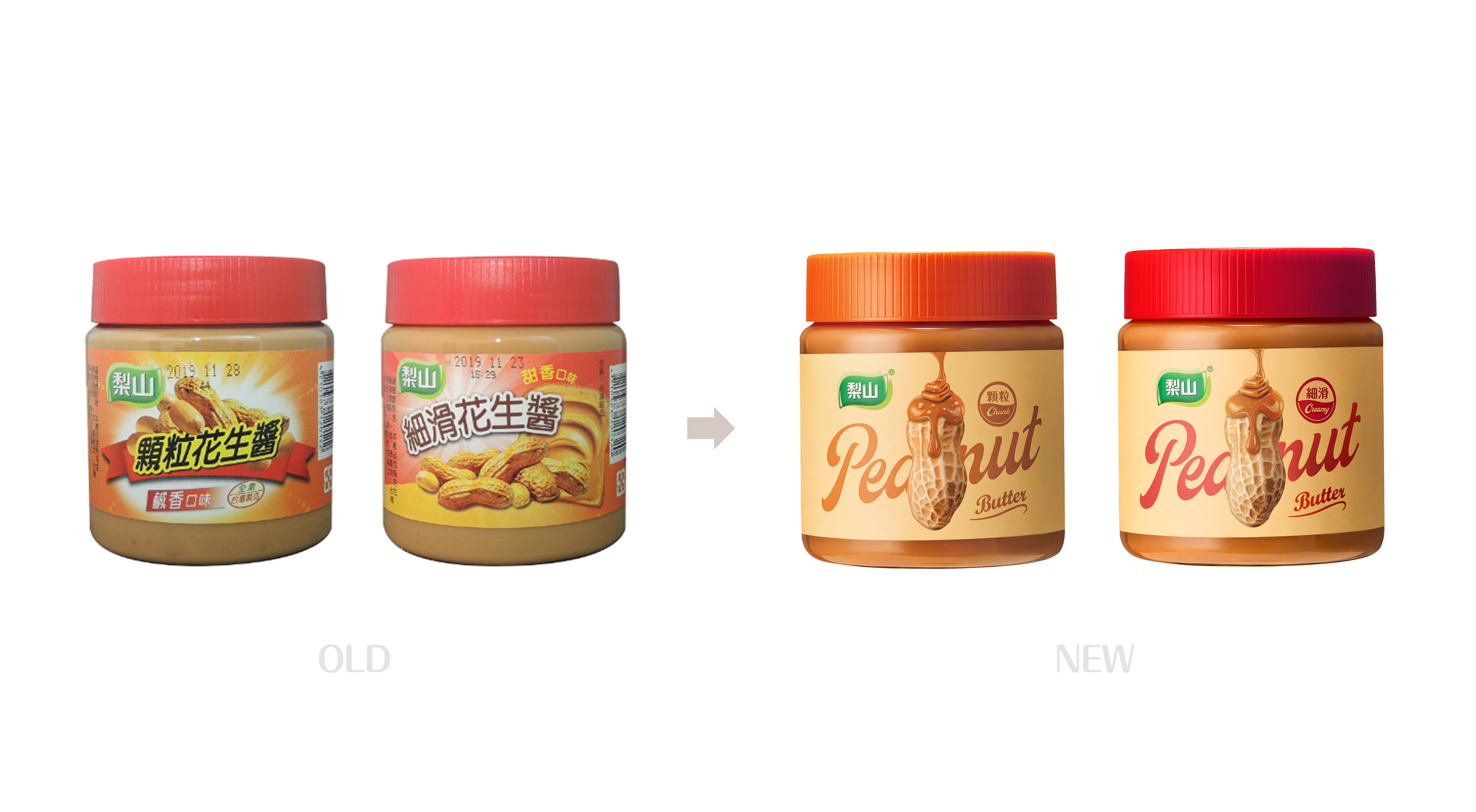
Lishan flower sauce has been a hot-selling product of Wuhui Food Factory for many years. In the Taiwan market, it has a stable sales volume and a loyal customer base. However, due to the outdated packaging and the trend of younger consumers in the market, it has become more and more difficult to operate in China. During many discussions and communications, we clearly needed a new packaging design that could resonate with mainstream consumers.
In the new phase of the brand, we understand that the market has increasing demands for health complaints, so we adjusted the sweetness of pear mountain flower sauce according to the needs of the market, providing a healthy and delicious choice. In order to analogize the characteristics that should reduce sugar, we have adopted a simple arrangement and discarded the rich information in the old packaging. This design choice not only improves awareness, but also forms a clear distinction from the competition, attracting the attention of young consumers.
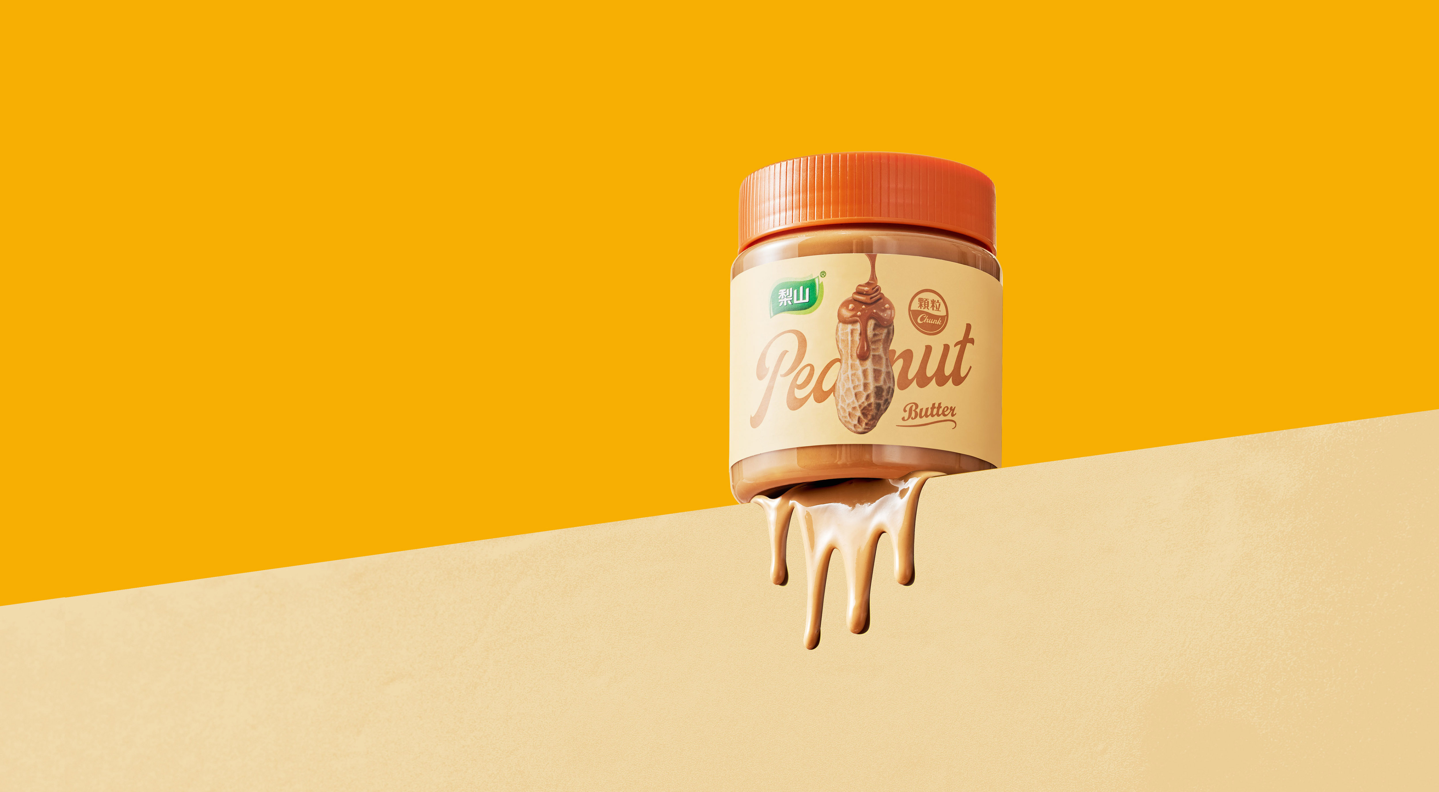
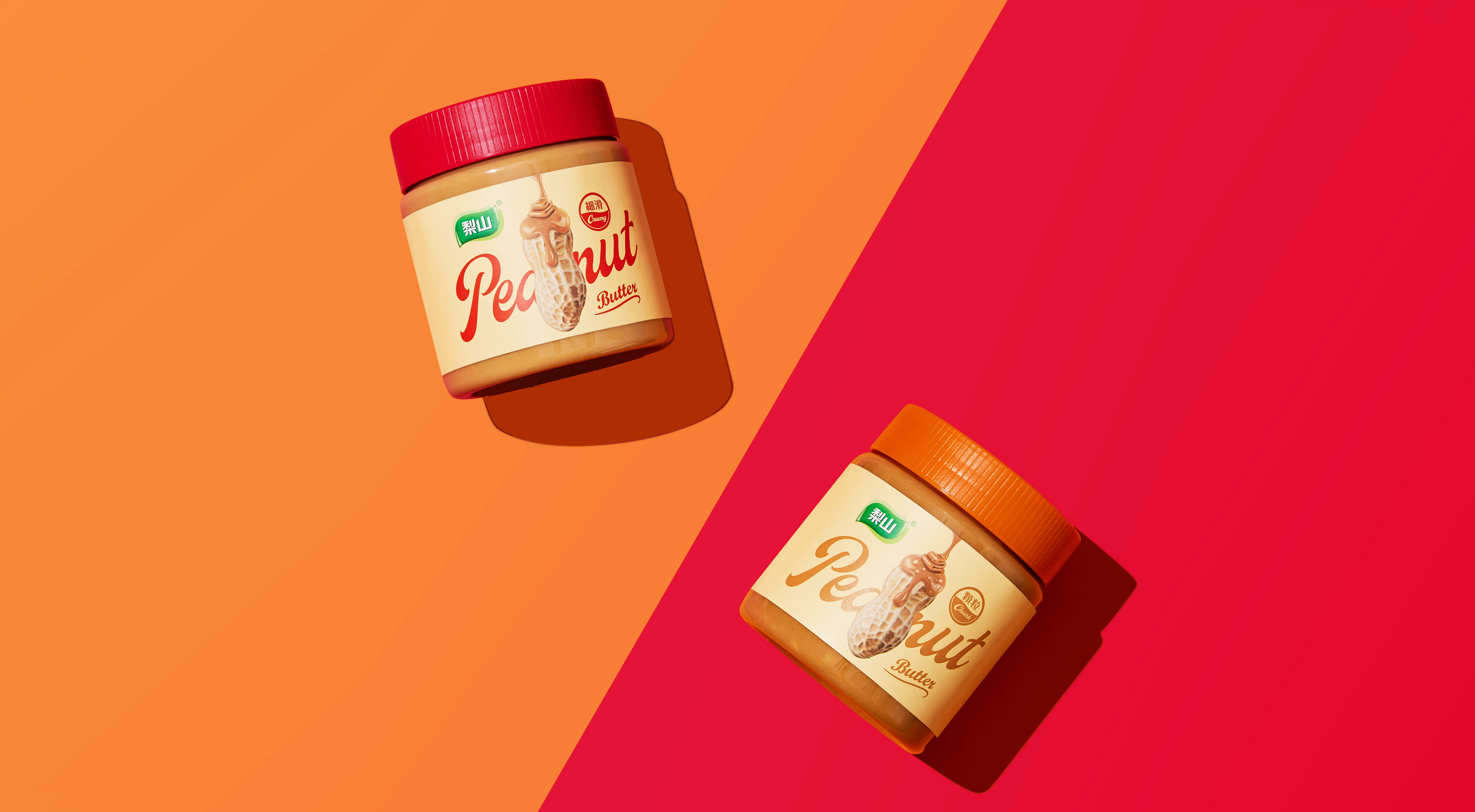
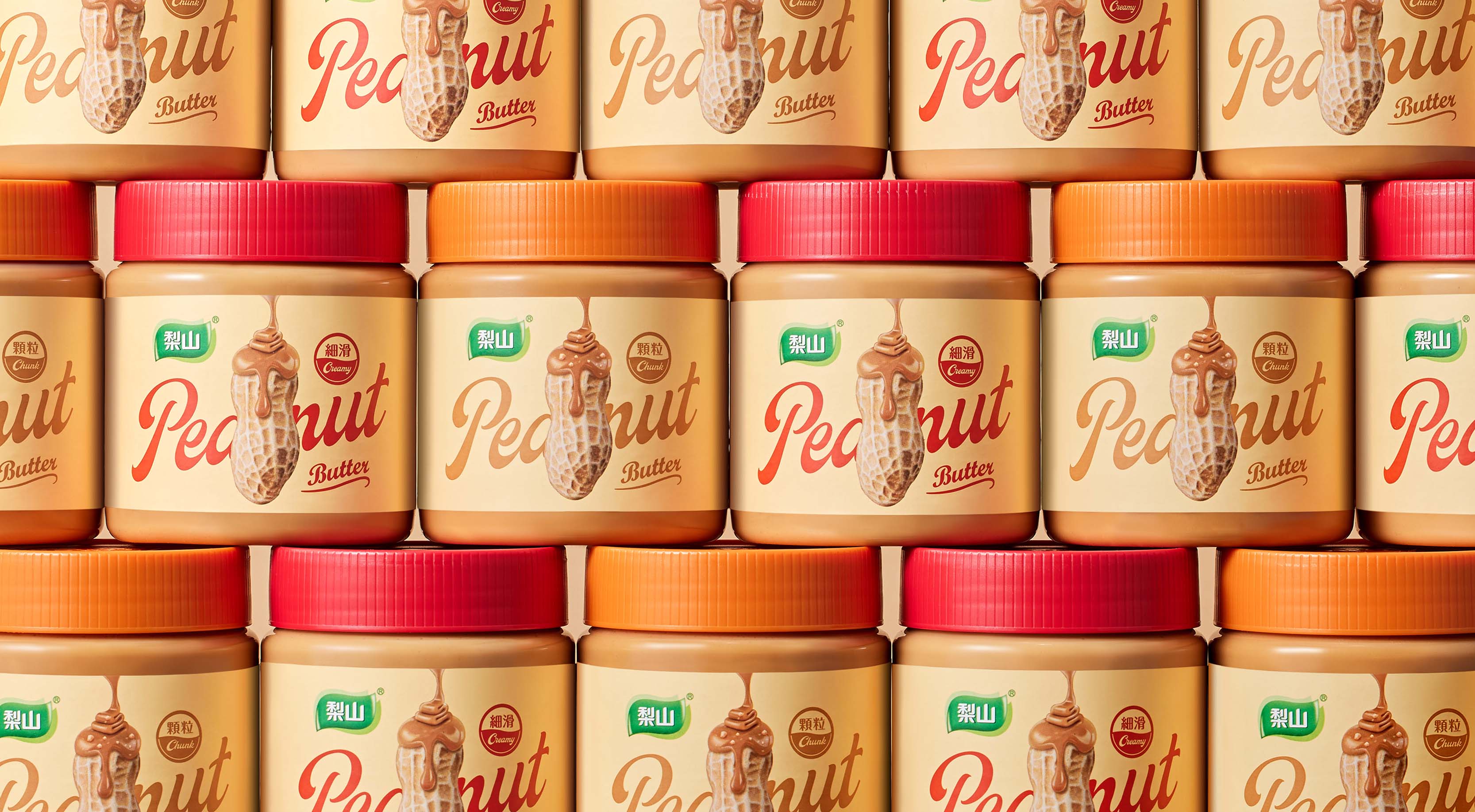
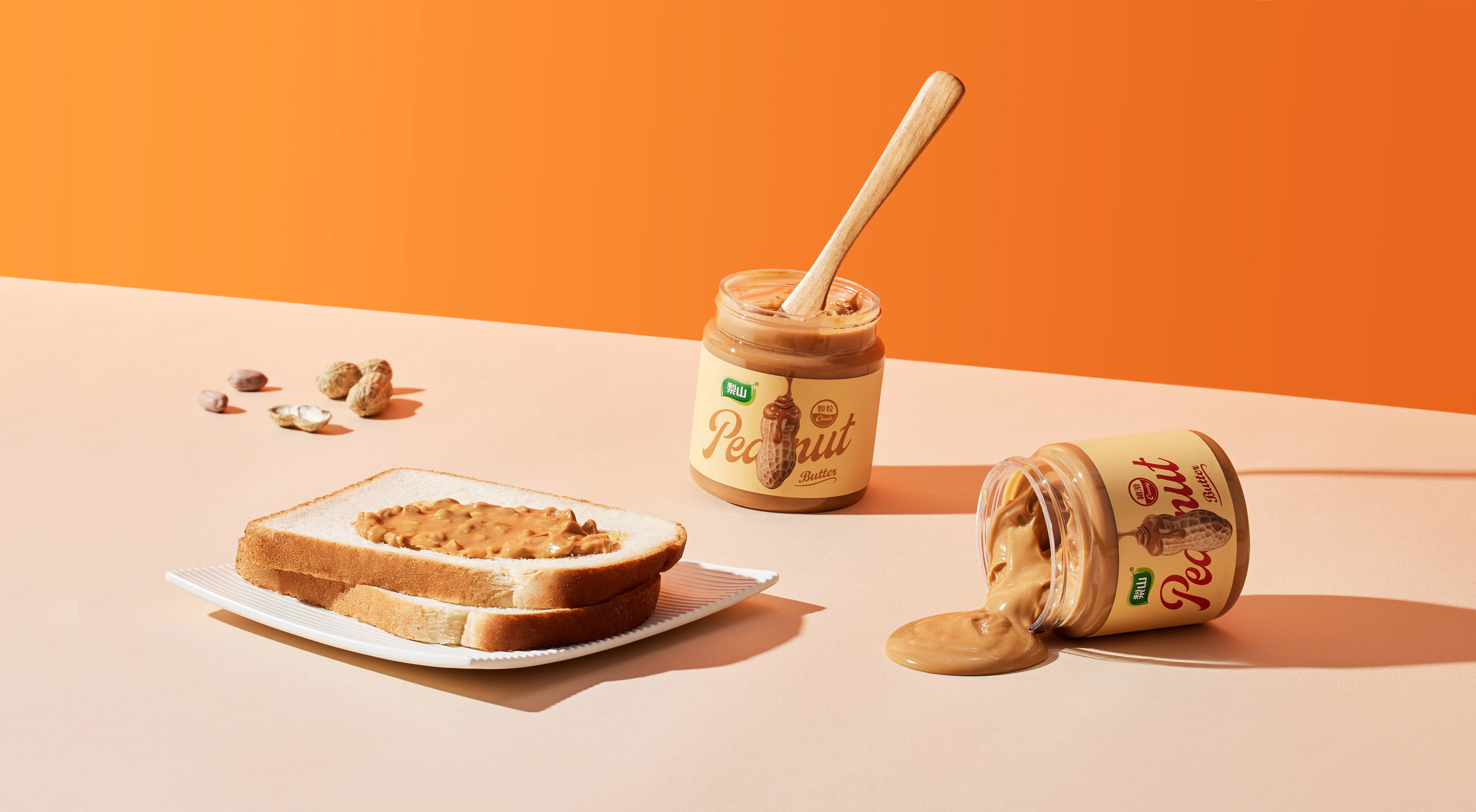
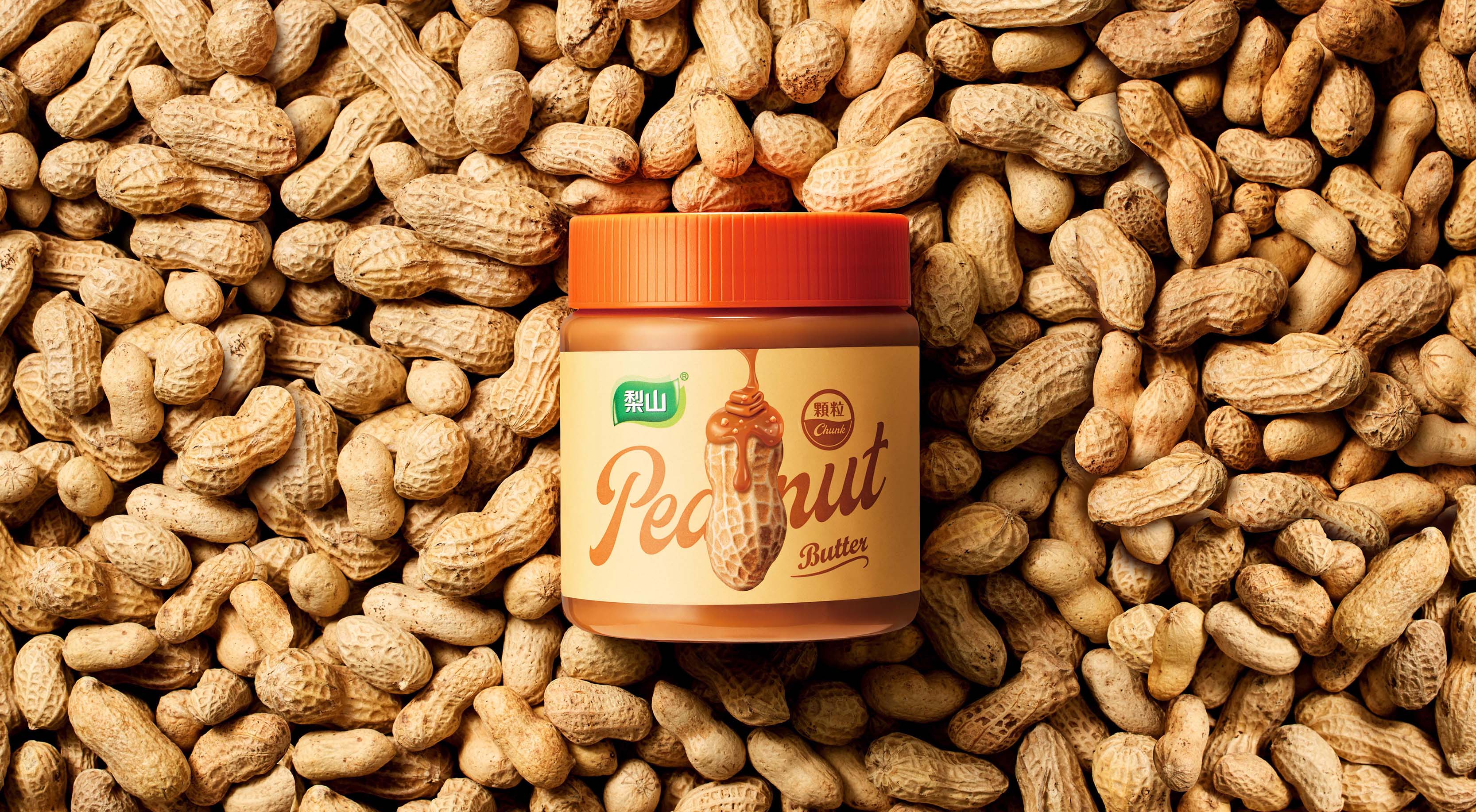
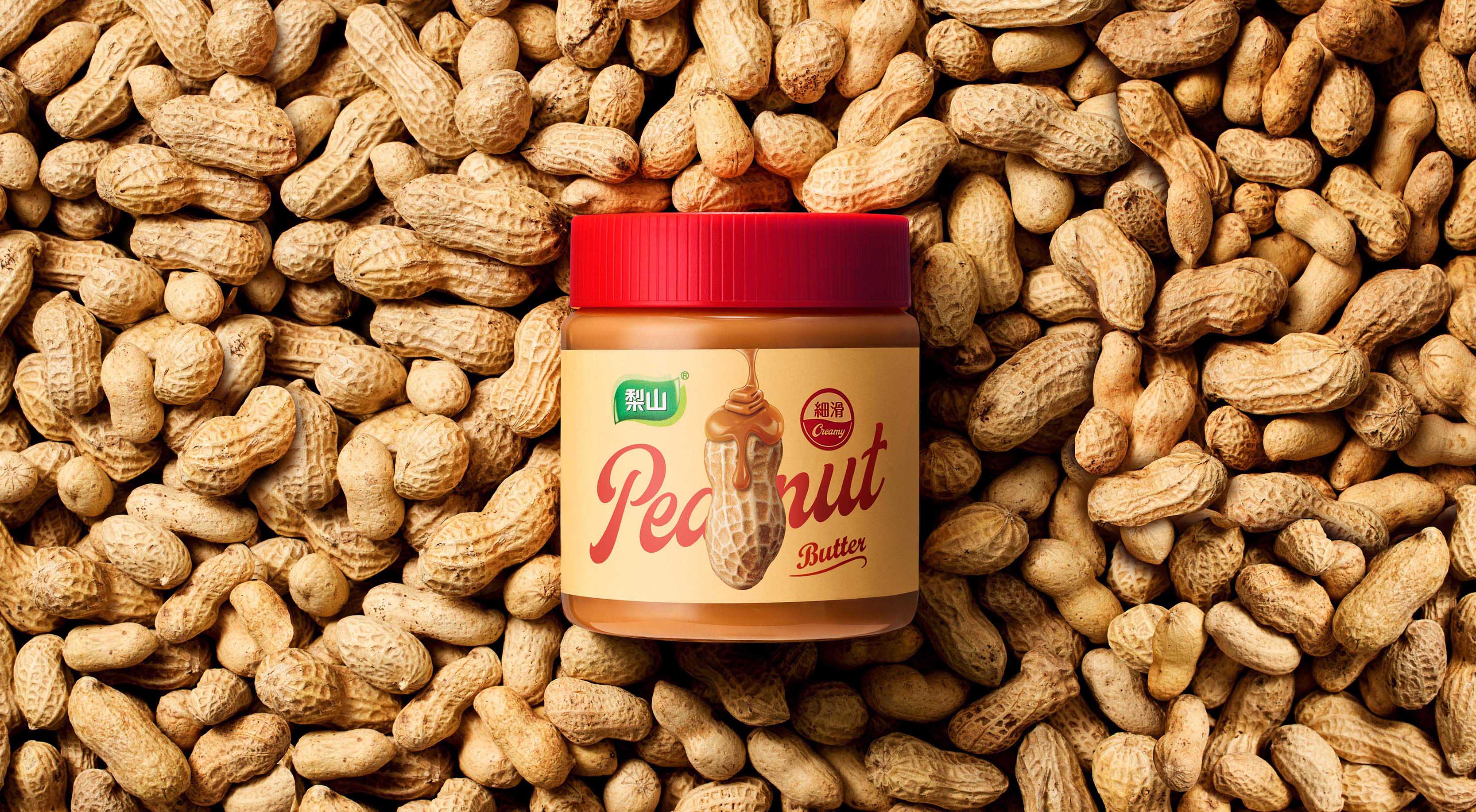
The new packaging design features monochrome colors and images of peanuts with their English names for a minimalist yet modern feel. This design style is unique in the market, making Lishanhua sauce stand out in a highly competitive environment. Our goal is to take into account the new ethnic groups at the same time, and expand the purchase of Lishanhua sauce to the younger generation, so that more people can enjoy this delicious food.
The new packaging design will show a new look of Lishan Huajiang, bringing new vitality and charm to the brand. We look forward to giving full play to the existing loyal consumer base after the new product is launched, and at the same time attracting the attention of more young consumers. This design change will not only increase the popularity of Lishanhua sauce, but also allow consumers to incorporate it into their daily life and become their healthy and delicious choice.
All in all, our packaging design concept is based on simplicity, modernity and healthy taste. We will discard redundant information and adopt a design method of monochrome and peanut image plus English name, so that the new packaging of Lishan Huajiang will be different from the crowd in the market. We believe that such a design will be able to absorb the resonance of mainstream consumers, and at the same time expand the brand’s audience, so that more people can fully taste the beauty of Lishanhuajiang.

CREDIT
- Agency/Creative: onebook design studio
- Article Title: Lishan Peanut Butter Packaging Redesigning
- Organisation/Entity: Freelance
- Project Type: Packaging
- Project Status: Published
- Agency/Creative Country: Taiwan
- Agency/Creative City: Taichung
- Market Region: Asia
- Project Deliverables: Brand Design, Brand Rejuvenation, Graphic Design, Product Design, Product Photography
- Format: Bottle
- Substrate: Plastic
- Industry: Food/Beverage
- Keywords: Lishan Peanut Butter.onebook design studio.wu hui foods co.,ltd
-
Credits:
design studio: onebook design studio


