


Today the UK’s highest rated ready-to-eat meal delivery subscription, Lions Prep, unveils a name change to Frive, together with a full rebrand as it looks to broaden appeal and reach new audiences. Created in partnership with London creative agency Among Equals, it is the start of its mission to change how we eat for the better.
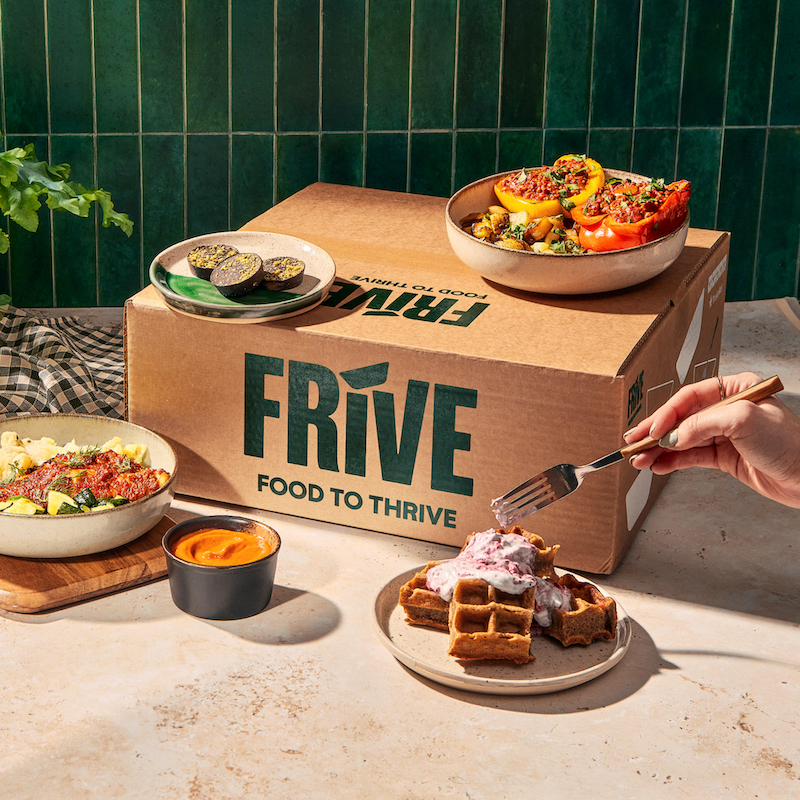
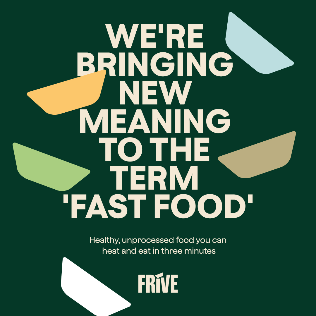
Lions Prep launched in 2016 to challenge the ready-to-eat food delivery market, targeting gym-goers and fitness lovers by providing healthy options conveniently. The subscription service offers 100% fresh, chef-prepared meals, ready to eat in three minutes. It quickly became the UK’s highest rated ready-to-eat meal delivery subscription, a social media sensation (particularly in the fitness world), and has attracted rave reviews from the likes of Vogue, GQ, and Cosmopolitan.
The rebrand, which has been in development since last year, aims to bolster the company’s strong position in the ready-to-eat category by expanding beyond its current audience to give more people a new way to eat well. Too often, this has involved a compromise. Quick but ultra-processed. Natural but boring. Healthy but time consuming. Frive sets out to change that.
An abbreviation of ‘food to thrive’, Frive is more than a name, it’s a guiding principle.
“Lions Prep has been hugely successful in generating interest and orders from healthy and fitness conscious consumers.” Says George Taylor, founder and CEO of Frive. “However, we recognised that to take our brand to the next level, we need to embrace a proposition that works for millions of people who want to eat well and look after their holistic health, but who don’t have the time to sacrifice convenience. We needed an agency that could help us make this leap. Among Equals was the obvious choice.”
Emily Jeffrey-Barrett, co-founder and creative director at Among Equals adds, “Frive is no longer for just the gym regulars. It’s also for the busy nurses working a night shift and needing a healthy option, the parents who want something quick and nutritious at the end of a hard day. Frive is a revolutionary service that can make millions of lives easier and healthier. It needed a brand that would make it appeal to as many people as possible. That’s what we built”.
In order to find a way to communicate this unique product in a saturated market, Among Equals decided to be bold while tapping into the health-conscious and purposeful elements of the company.
Making people care, by design
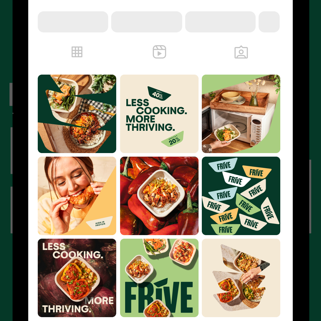
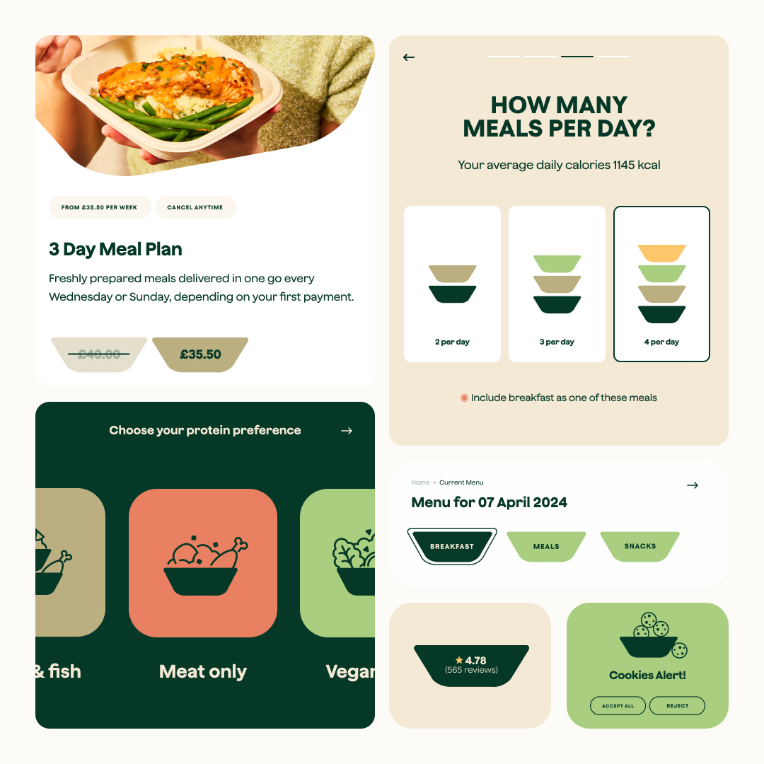
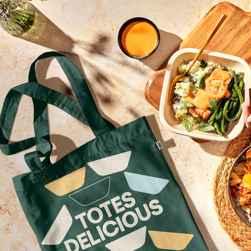
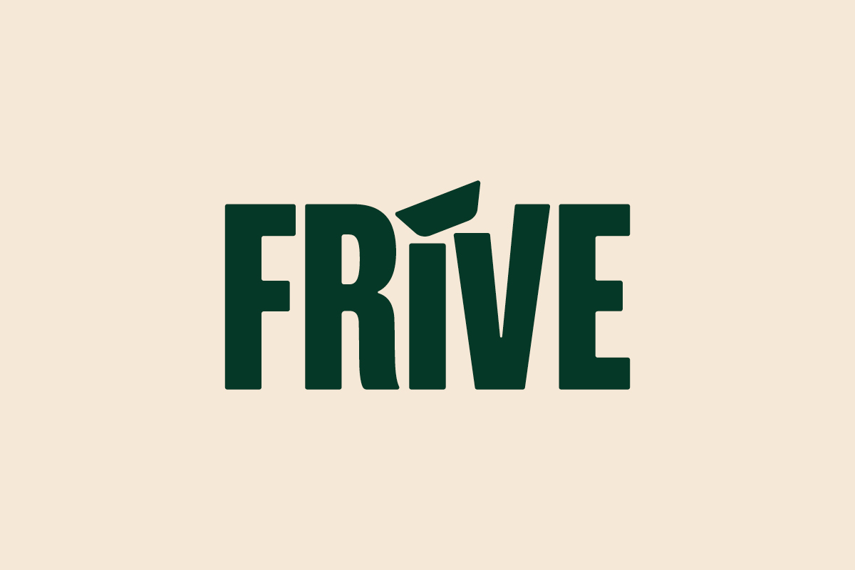
At the heart of the rebrand is a new distinctive asset for the brand: a simple food tray, based on the ones it uses for delivery, designed to create cohesive and standout visuals. Forming the basis of a comprehensive, easy-to-use graphic system, this distinctive asset will be visible through all of the brand’s platforms, from social templates to UI elements – it even dots the ‘i’ in the logotype.
“Distinctive assets, that a brand can use again and again to make people remember them, are at the core of our brand design approach. This tray device works throughout the entire brand system – helping to build mental availability, as well as making the identity easy to implement.”, says Jeffrey-Barrett. The graphic also differentiates Frive as a ‘ready-to-heat’ meal brand and not a meal prep business, which some could mistake it for.
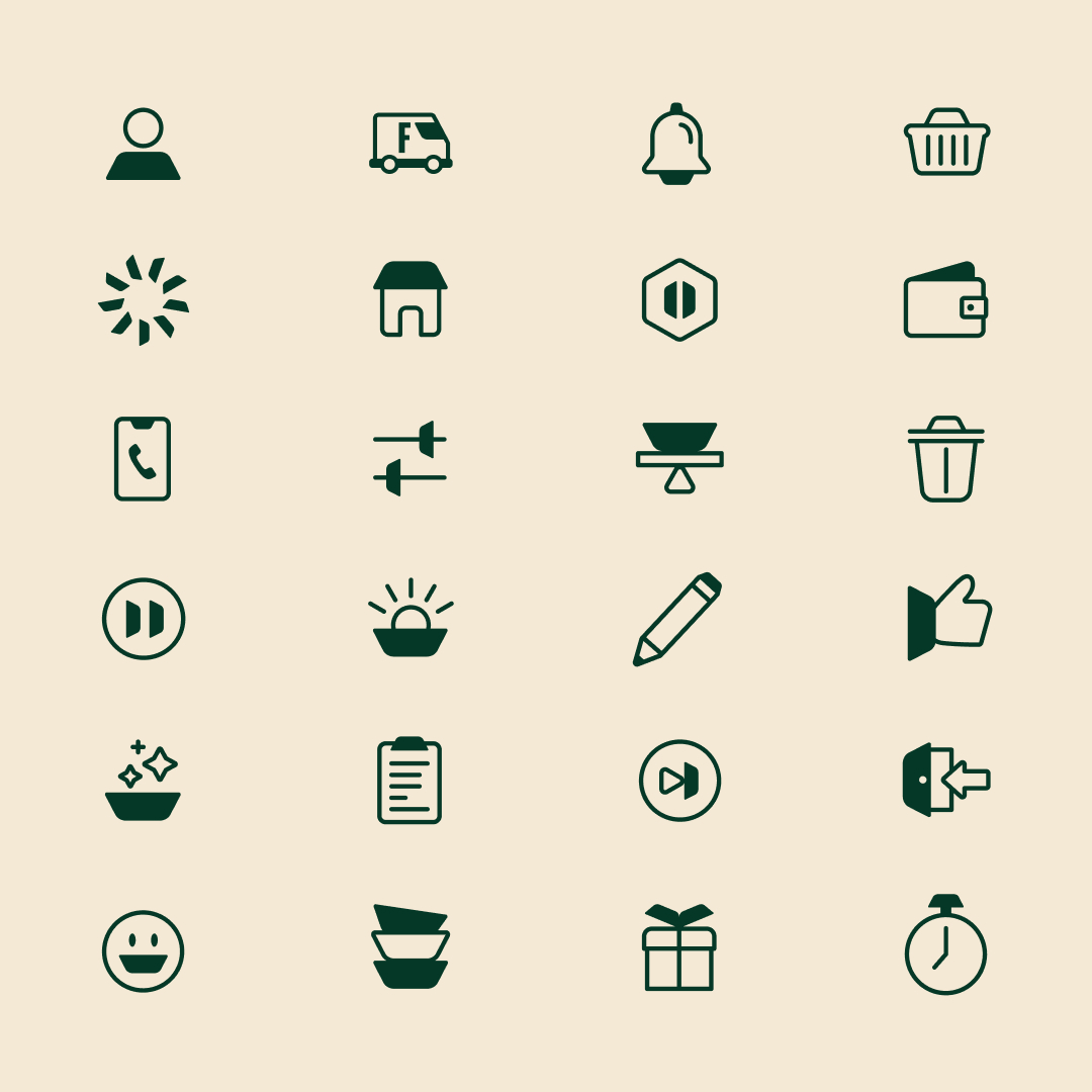
The tray features as a core distinctive element in the logo, then is used throughout the system. As a cropping device to hold imagery and messaging, as patterns across social and packaging, as the basis for a flexible, playful icon set, as information call-out elements and as UI elements that build brand into functionality.
Iconography is also key to the rebrand. Injecting both personality and convenience into short-hand communications, these icons help guide users through navigation and highlight key features, serving as intuitive visual cues to ensure a seamless user experience. All of the iconography contains the distinctive tray graphic, linking back to the brand’s identity. These purposeful icons are designed to communicate information quickly and effectively across various digital platforms as well as packaging sleeves, outer packaging, email templates among other touchpoints.
Overhauling the formerly-stark colour palette, the new identity is much more earthy and delicious for a broader audience. “The primary palette is fresh, natural and sophisticated, evoking an organic but modern aesthetic: predominantly Dark Green (Kale), Cream and White brand, with pops of other colours to add variety to visual assets. These secondary colours include Tomato, Earth, Aqua, Mint and Squash,” says Jeffrey-Barrett. The art direction for photography also brings a sense of the sun, with distinctive shadows to evoke a sense of movement and speak to the freshness of the product.
These sunny, earthy colours combine with a daring tone of voice to empower Frive. Cutting through the noise and drawing attention to its wider mission – creating a food system that’s fair and transparent, where everyone has access to ethically-sourced, quality food. This has been elevated by an attention-grabbing primary typeface, chosen to stand out in a category dominated by serifs – Frive Jokker.
“We’re really pleased to finally announce this rebrand, after months of collaboration with our partners
at Among Equals,” says Danny Barry, Head of Brand at Frive. “This marks the beginning of an exciting, brand-focused era for our company. With Frive, we now have an enhanced platform to forge deeper, more meaningful connections with our consumers, and we can’t wait to get started.”
CREDIT
- Agency/Creative: Among Equals
- Article Title: Lions Prep Aims to Revolutionise How We Eat with Frive Rebrand by Among Equals
- Organisation/Entity: Agency
- Project Type: Identity
- Project Status: Published
- Agency/Creative Country: United Kingdom
- Agency/Creative City: London
- Market Region: Europe
- Project Deliverables: Brand Design, Brand Tone of Voice, Copywriting, Creative Direction, Identity System, Packaging Design
- Industry: Food/Beverage
- Keywords: #fooddesign #fooddelivery #health #healthyeating #mealdelivery #mission #quality #subscription
-
Credits:
Brand design: Among Equals
Client: Frive


