


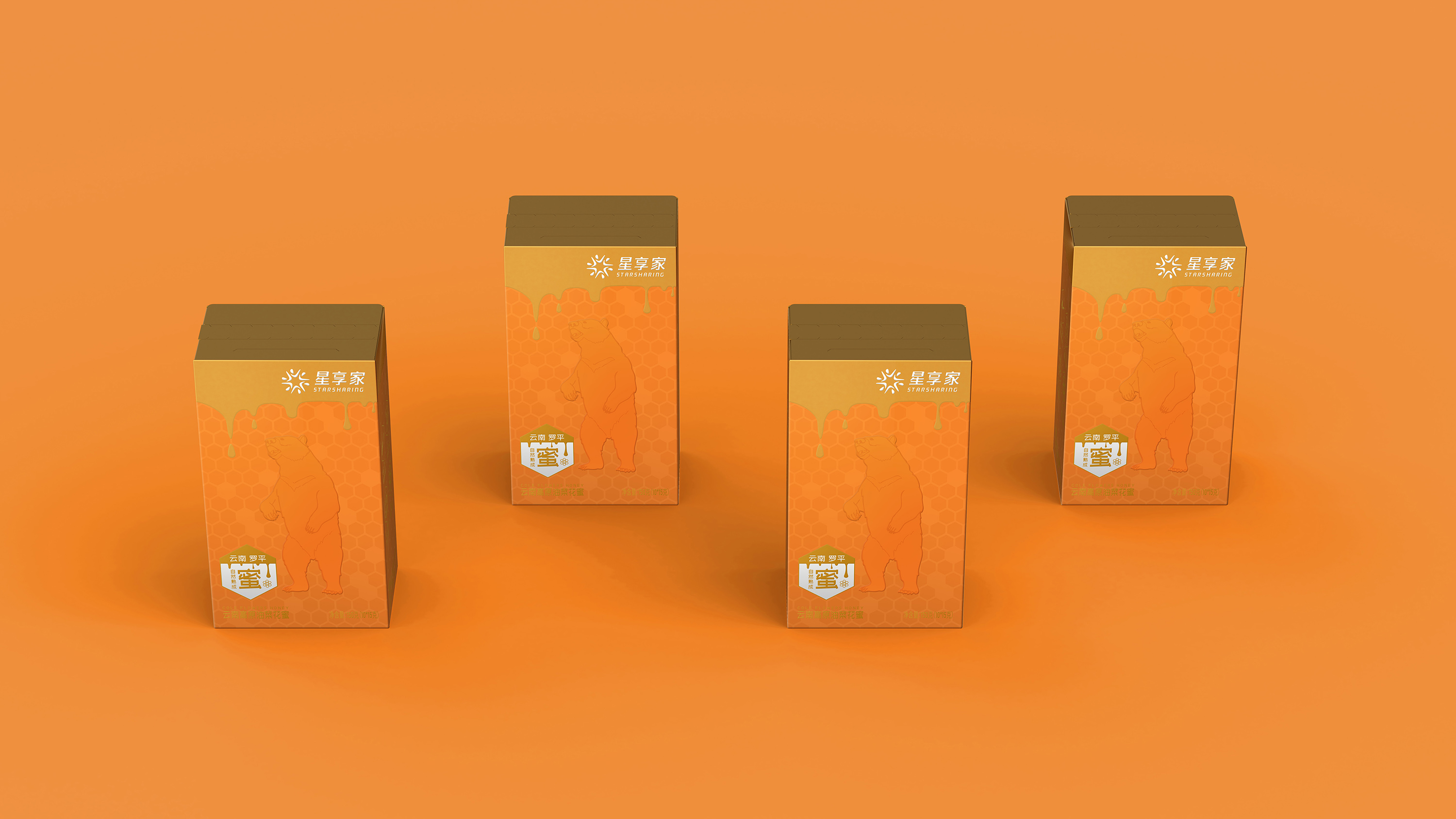
This is a spoonful of honey produced in Luoping, Yunnan, China, designed for rural revitalization. The background story tells that every spring, Luoping in southwestern China will present a large area of bright yellow, with millions of cauliflower plants blooming. These flowers produce about 20% of the total global rapeseed oil. Every year at this time, beekeepers gather fragrant honey. They flocked from all over and arrived in Luoping during the flowering season. Luoping Rapeseed Flower Sea, as the earliest blooming and largest bee spring breeding base in China, produces over 2000 tons of raw honey annually.
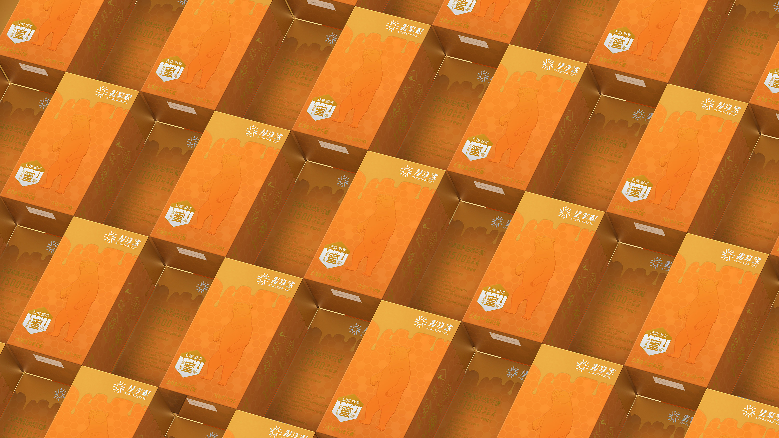
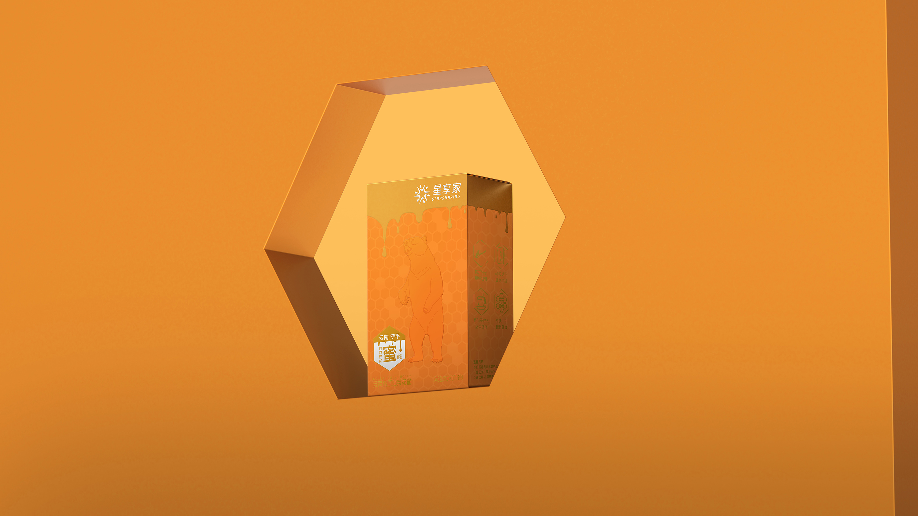
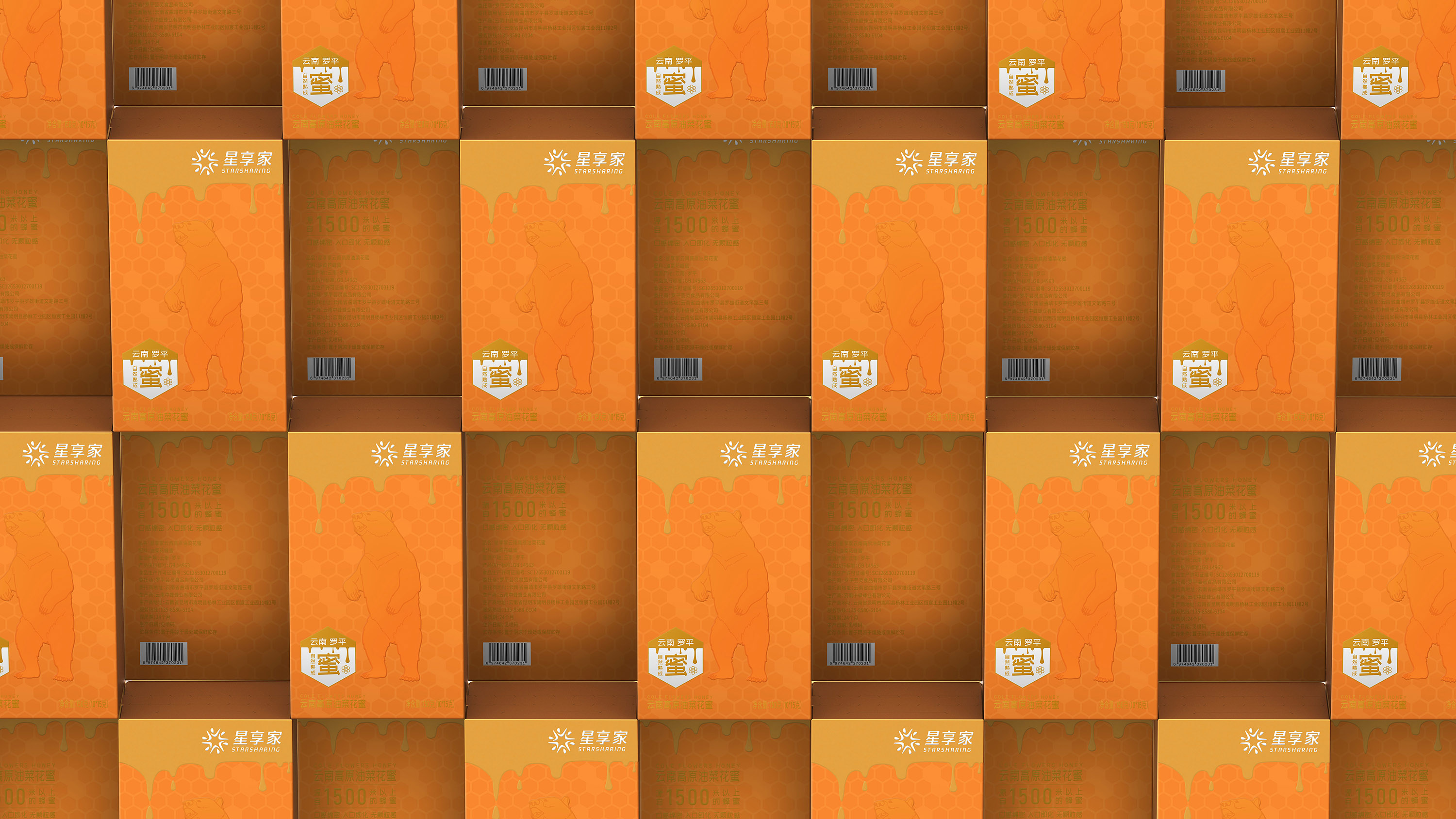
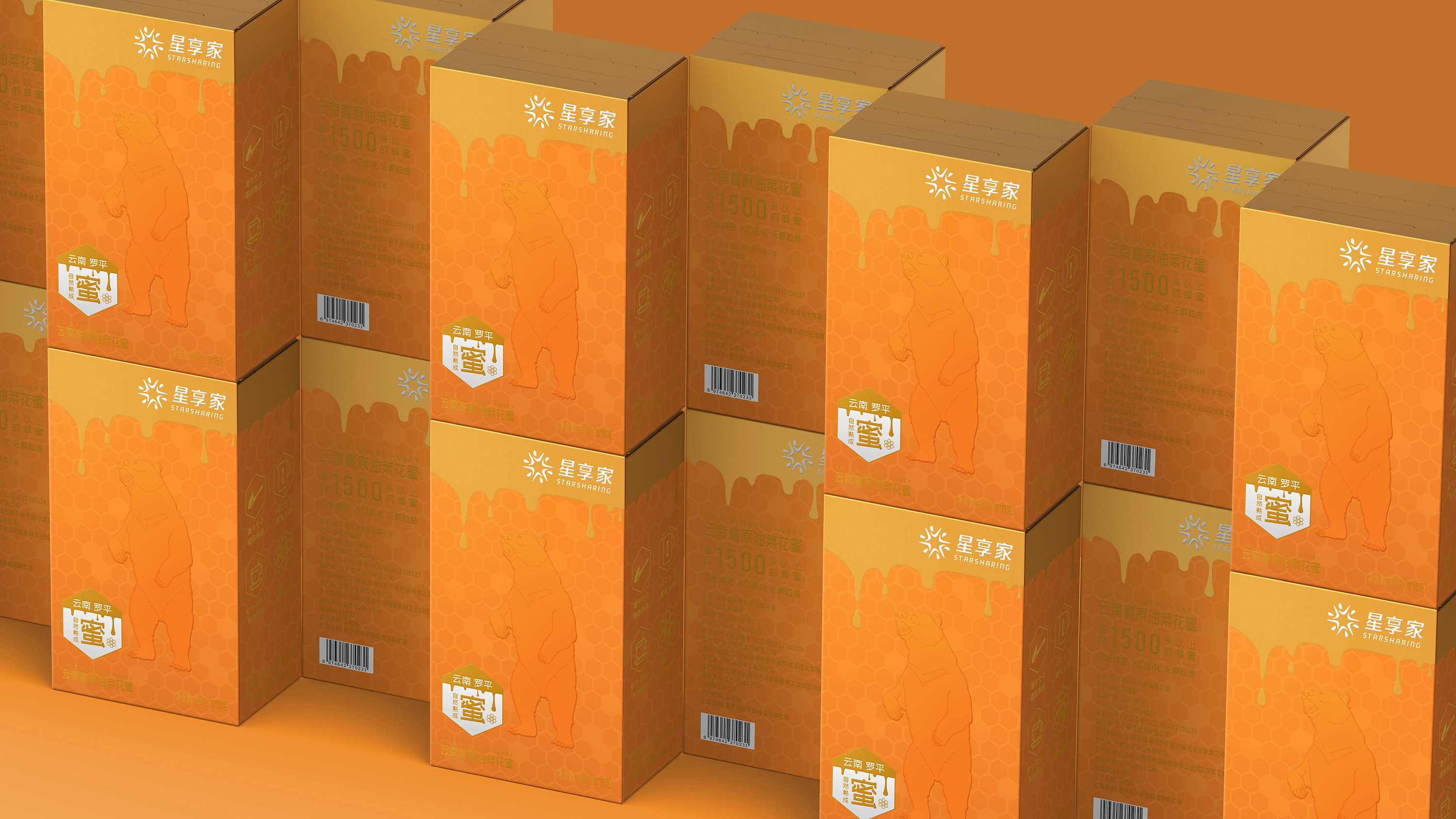
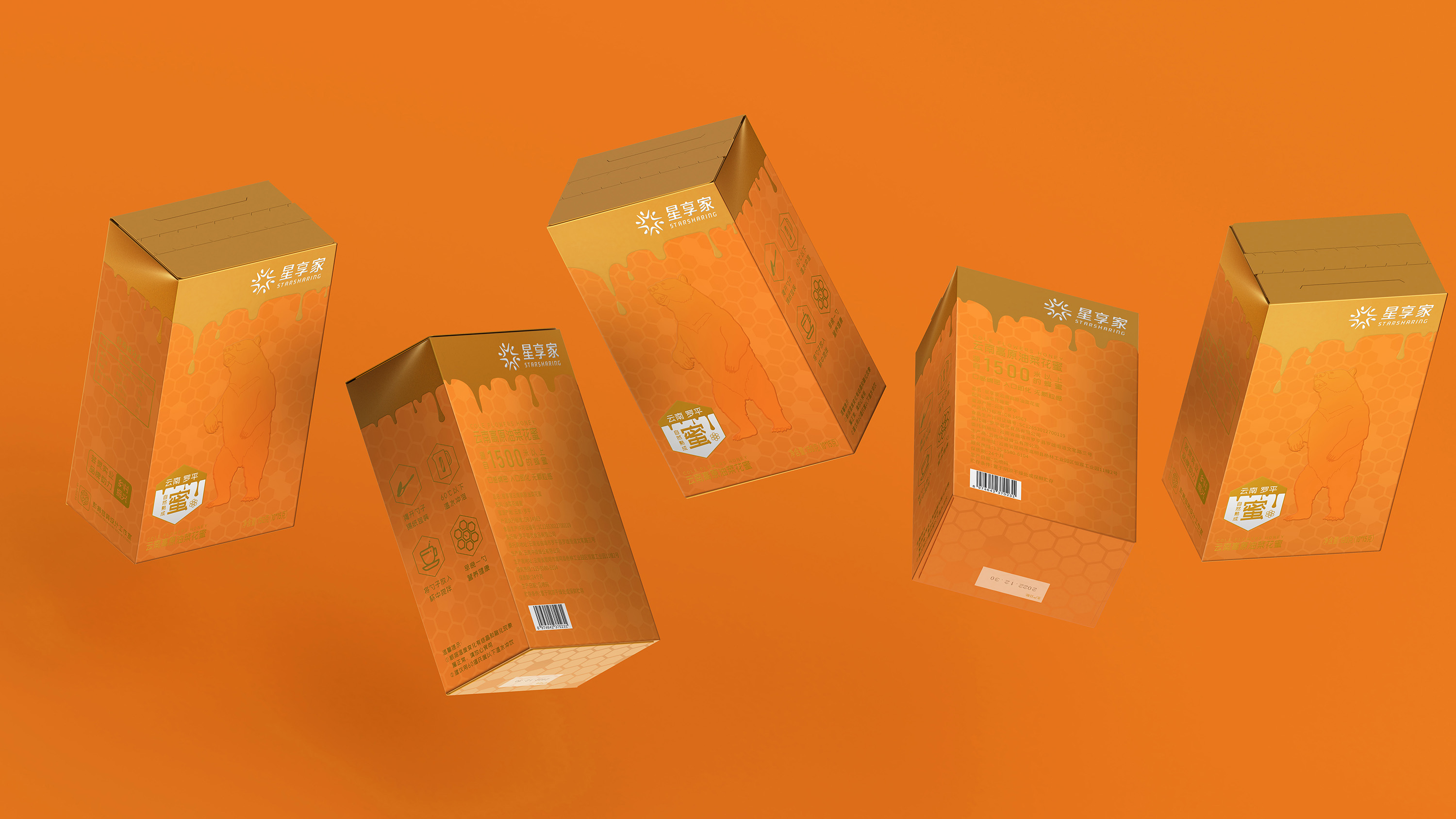
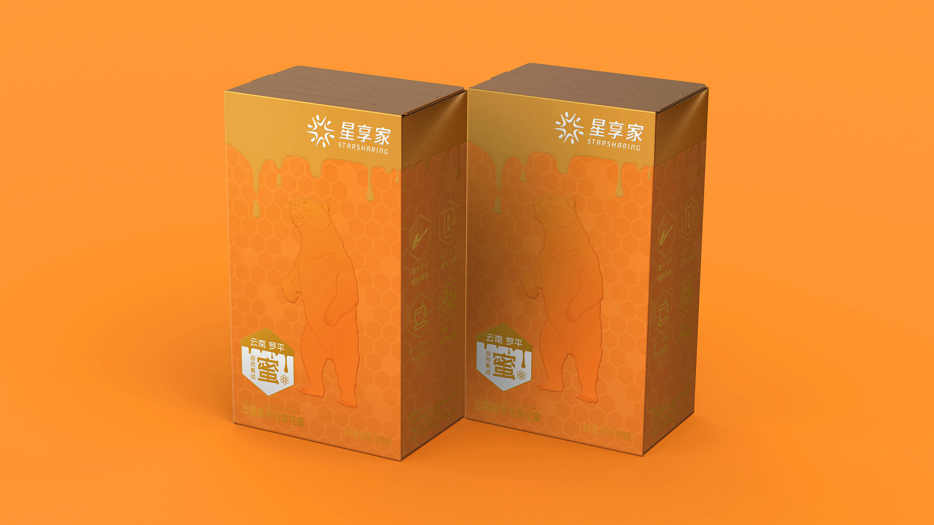
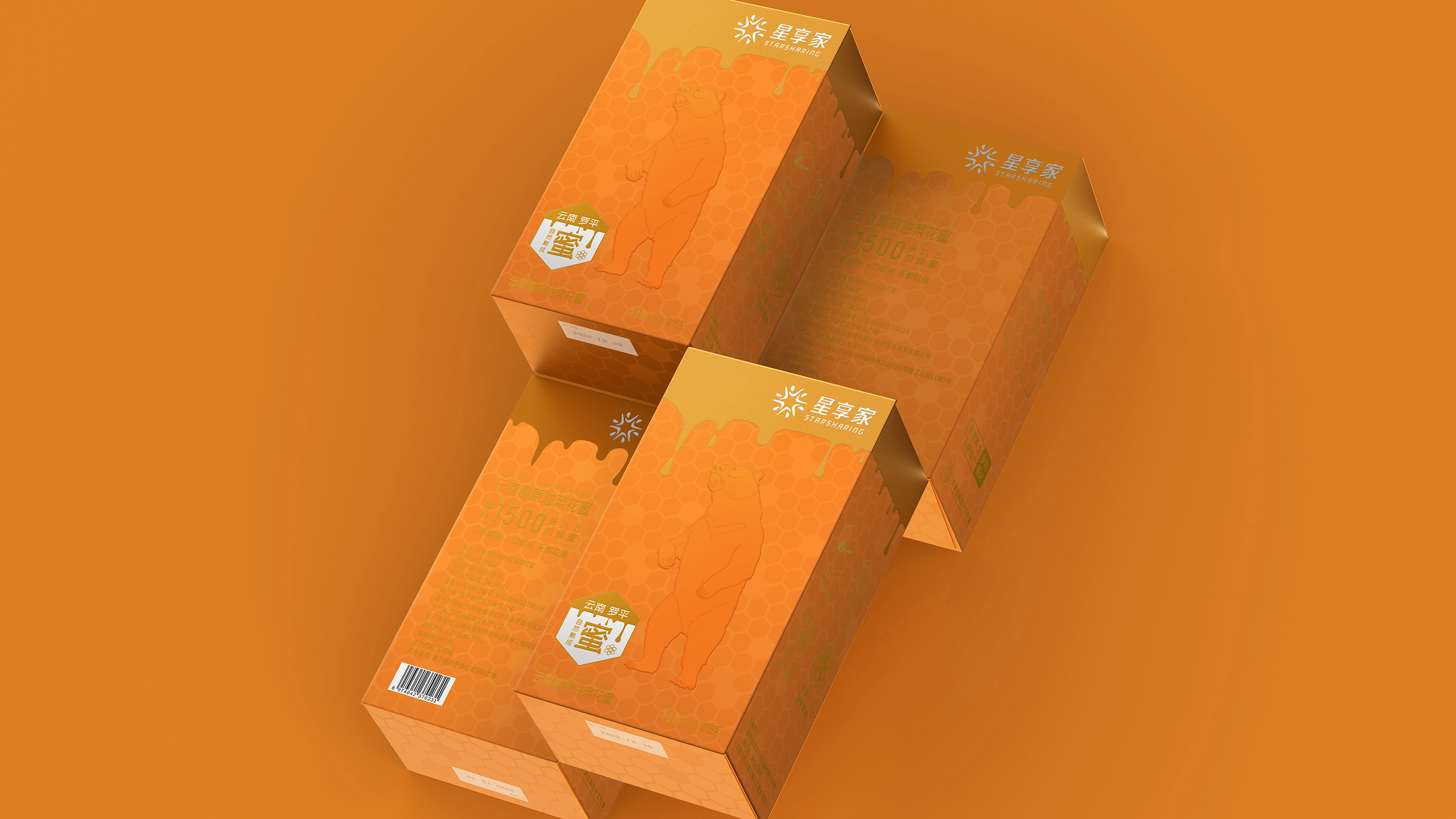
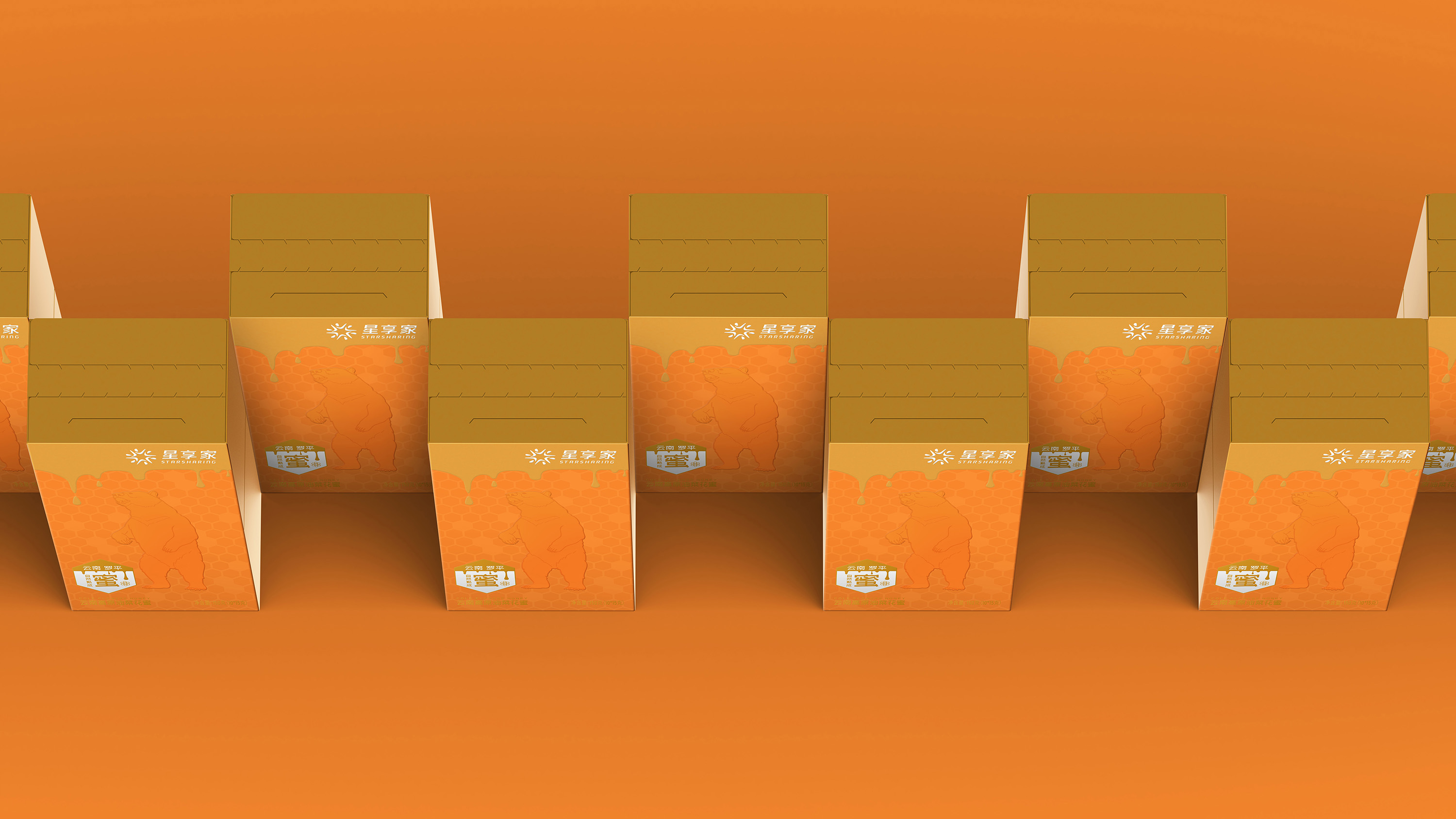
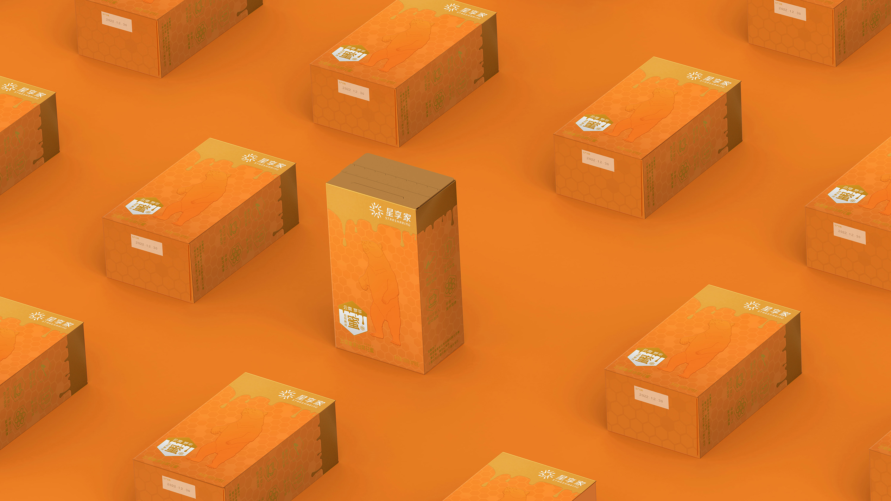
The design is based on a bright honey amber orange color, which visually reflects the purity of naturally matured honey. High quality is the foundation of the product, and sales promotion is the source of rural revitalization. The first impression is to attract consumers, and the specially drawn gluttonous and honest lazy bear highlights the emotional value of the high affinity of high-altitude rapeseed nectar. Luoping is known as the “largest natural garden in the world”, and its geographical value has been recognized by consumers. The next step is to break through the psychological level and generate an order demand. Its background adds a honeycomb pattern to further highlight its identity, and the golden honey droplets flow down, visually producing a psychological suggestion of “nutritious and delicious”. Design tear off seals on the packaging structure for easy opening and storage.
In the dimension of brand endorsement, Yunnan Luoping geographical text logo has been added to complement the brand impression of “high quality”. The overall packaging is closely related to the color matching and design techniques of honey, giving the packaging a delicate sense of “high quality” and providing consumers with high emotional value. The overall design is elegant, simple, and efficient in conveying, providing consumers with clear purchasing logic and laying a good foundation for conveying brand impressions.
CREDIT
- Agency/Creative: Lionpeng Packaging Studio
- Article Title: Lionpeng Packaging Studio Revitalising Rural Heritage: Luoping’s High-Quality Honey Packaging Design for Sustainable Branding
- Organisation/Entity: Agency
- Project Type: Packaging
- Project Status: Published
- Agency/Creative Country: China
- Agency/Creative City: Shanghai
- Market Region: Asia
- Project Deliverables: Packaging Design
- Format: Box
- Industry: Food/Beverage
- Keywords: honey
-
Credits:
Design Director: Wei Peng


