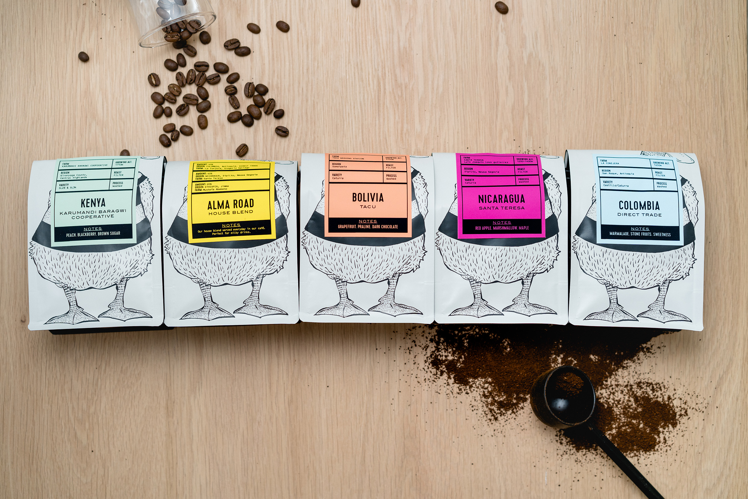
Three years after Lindfield coffee works opened their doors, the business has grown beyond all expectations – seeing 60% growth. What started as an exciting opportunity has turned into a new way of life for owner Kris Whelan. Customers had grown to love not only the coffee but the vibe of the cafe. With a vibrant, welcoming atmosphere it was time to give the brand a bit of a refresh to better represent its core values.
Studio Parr, creative directors of the brand since its creation, oversaw the interior refit, seeing a brighter colour palette, mixing the industrial nature of the building with more modern statements.
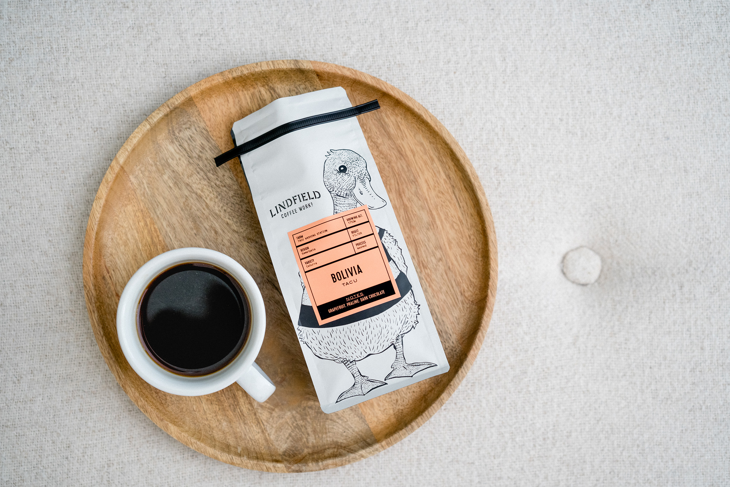
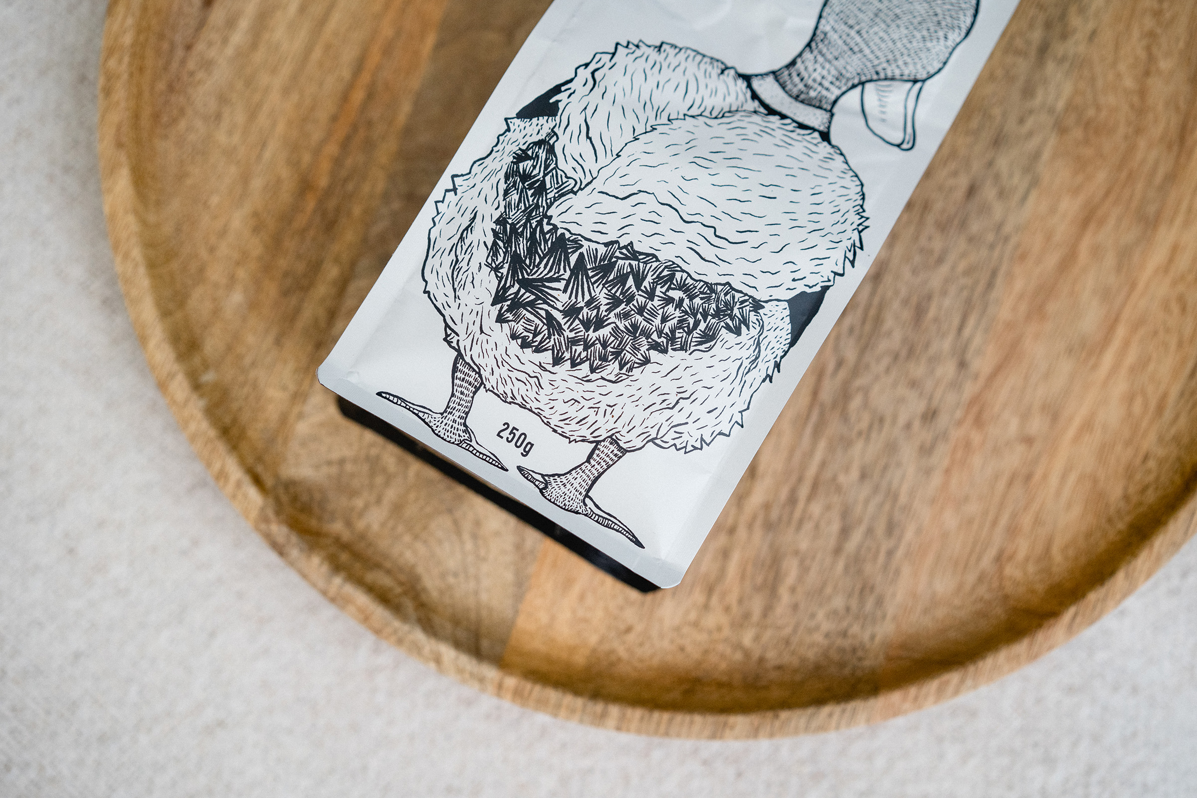
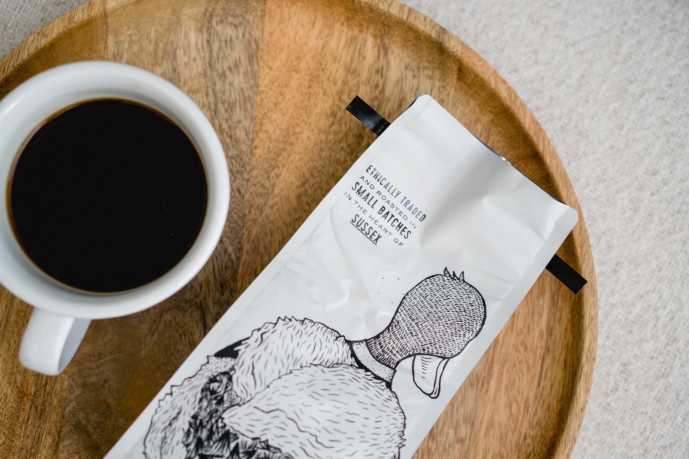
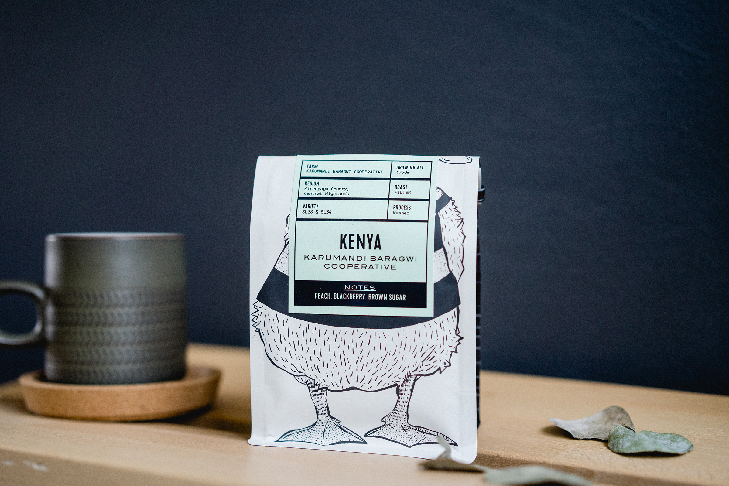
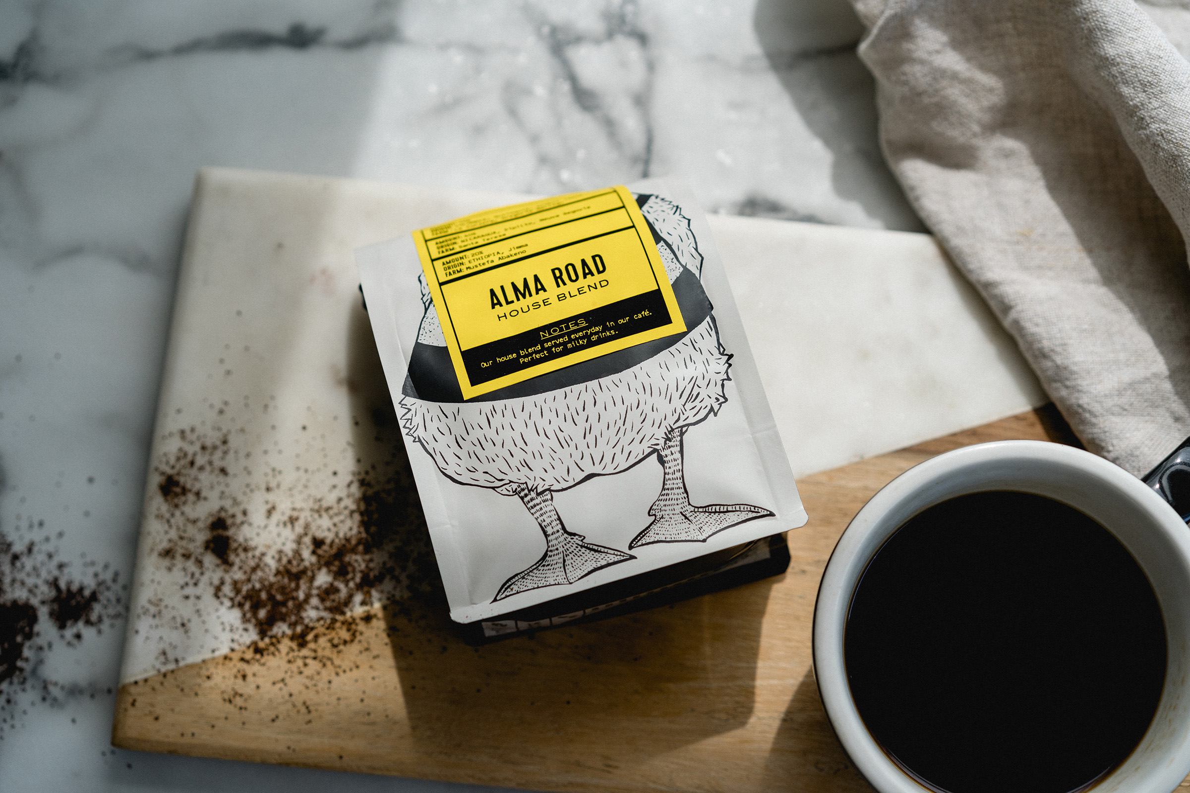
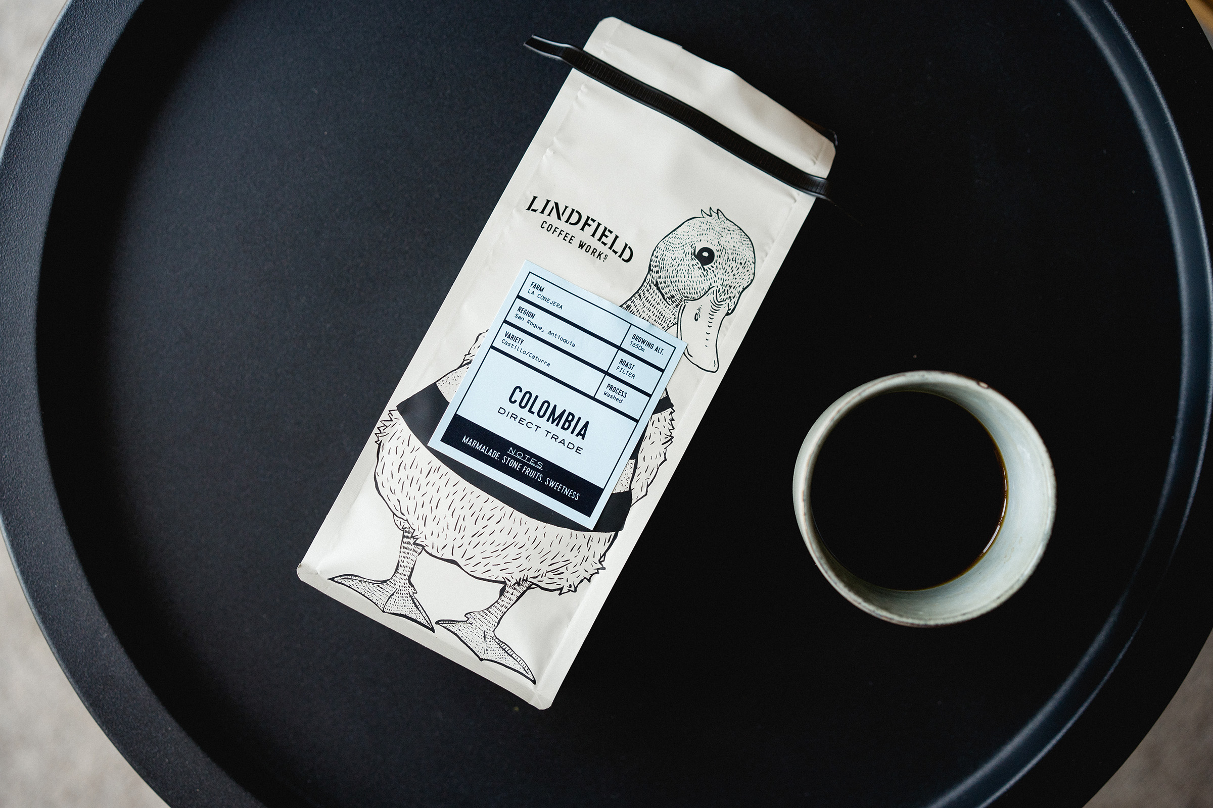
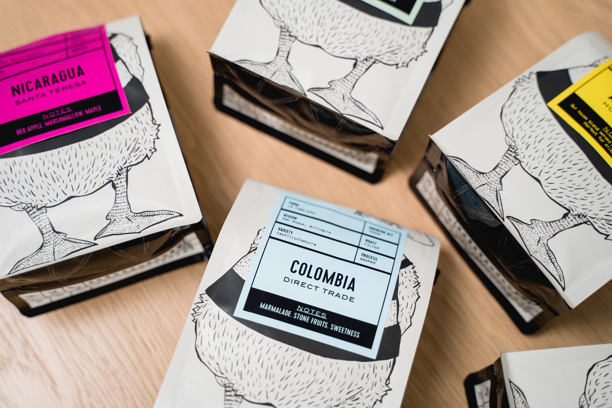
Along with the refit, it’s was time to give the coffee packaging a complete refresh. The Lindfield ducks have become synonymous with the brand, and it felt right to give life to a new mascot for the brand to better reflect the personality of the Roastery.
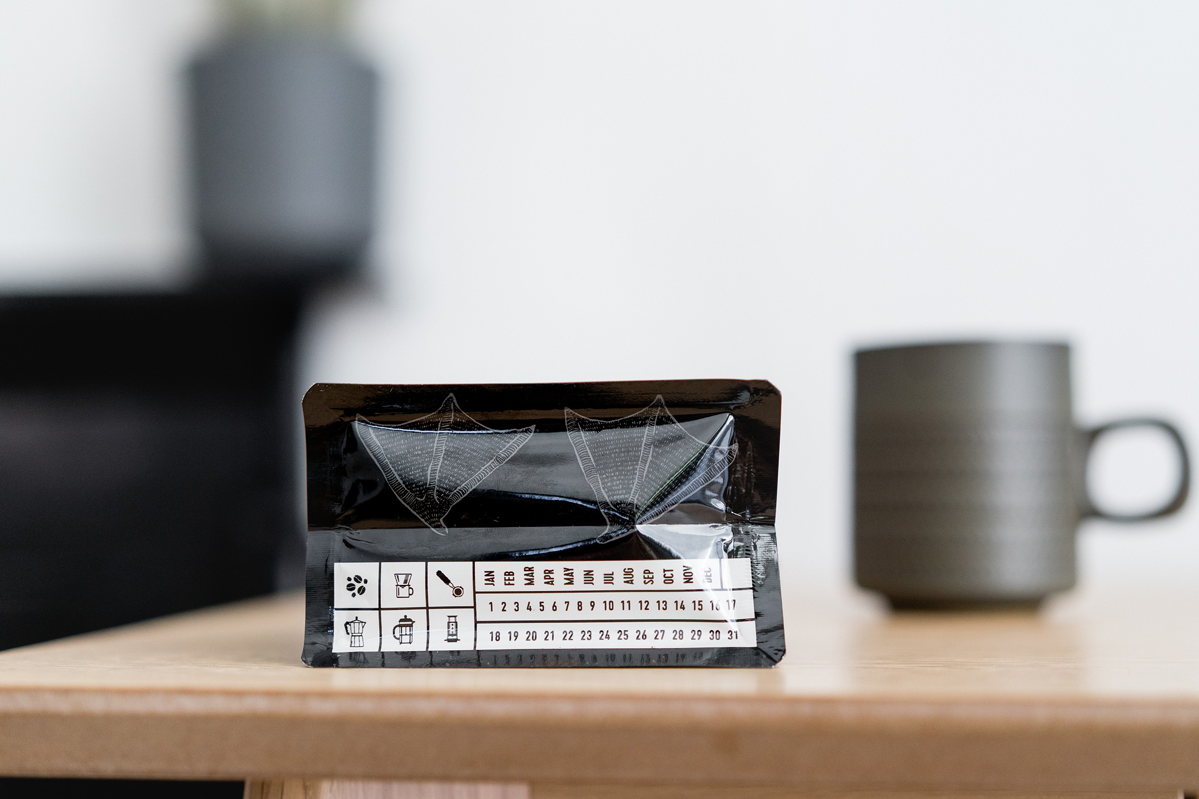
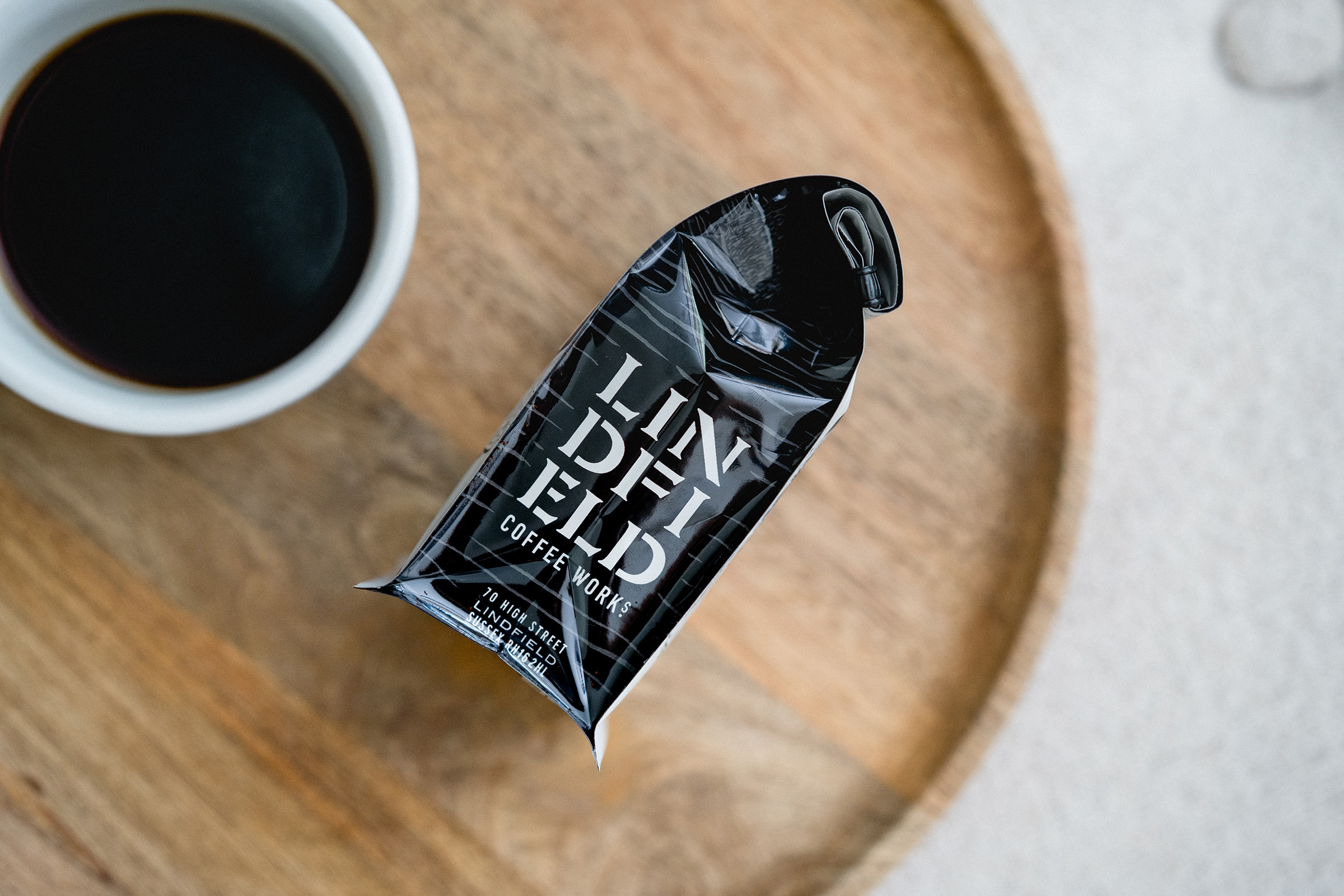
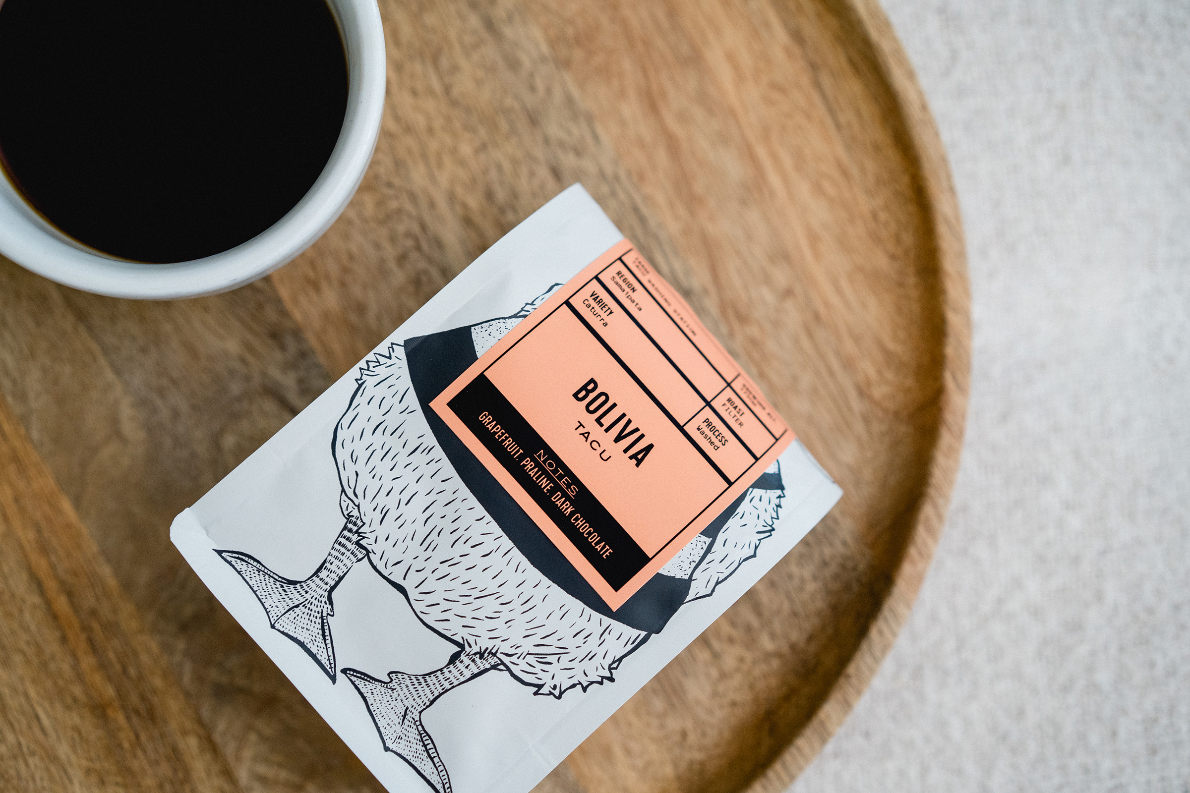
Lenny (our new duck) now features front and centre on the bags, with a cheeky smile, the bags are rolled to give a fun front in retail, not taking itself too seriously. Perfectly reflecting the personality of the brand. The world of small batch coffee can sometimes feel a little serious. The bags themselves look to change this, and paired with more formal labels still retain the attention to detail and passion that goes into these small batch, single origin coffees.


CREDIT
- Agency/Creative: Studio Parr
- Article Title: Lindfield Coffee Works gets a Fresh New Look with a Little Help from Studio Parr and Lenny the Duck
- Organisation/Entity: Agency, Published Commercial Design
- Project Type: Packaging
- Agency/Creative Country: United Kingdom
- Market Region: Europe
- Project Deliverables: Brand Experience, Brand Identity, Brand Redesign, Brand Refinement, Brand Strategy, Brand World, Branding, Graphic Design, Illustration, Packaging Design, Tone of Voice
- Format: Bag
- Substrate: Metal, Pulp Paper


