Overview
Peeps is an interactive tool designed to help students study, connect with tutors, and collaborate with peers as they navigate through school. The platform’s primary goal is to bridge the gap between students and tutors, fostering academic success through affordable and personalized tutoring tailored to each student’s unique needs. Peeps also provides an opportunity for college students to earn money as tutors during their final years of school, creating a mutually beneficial ecosystem for both students and tutors.
Solution
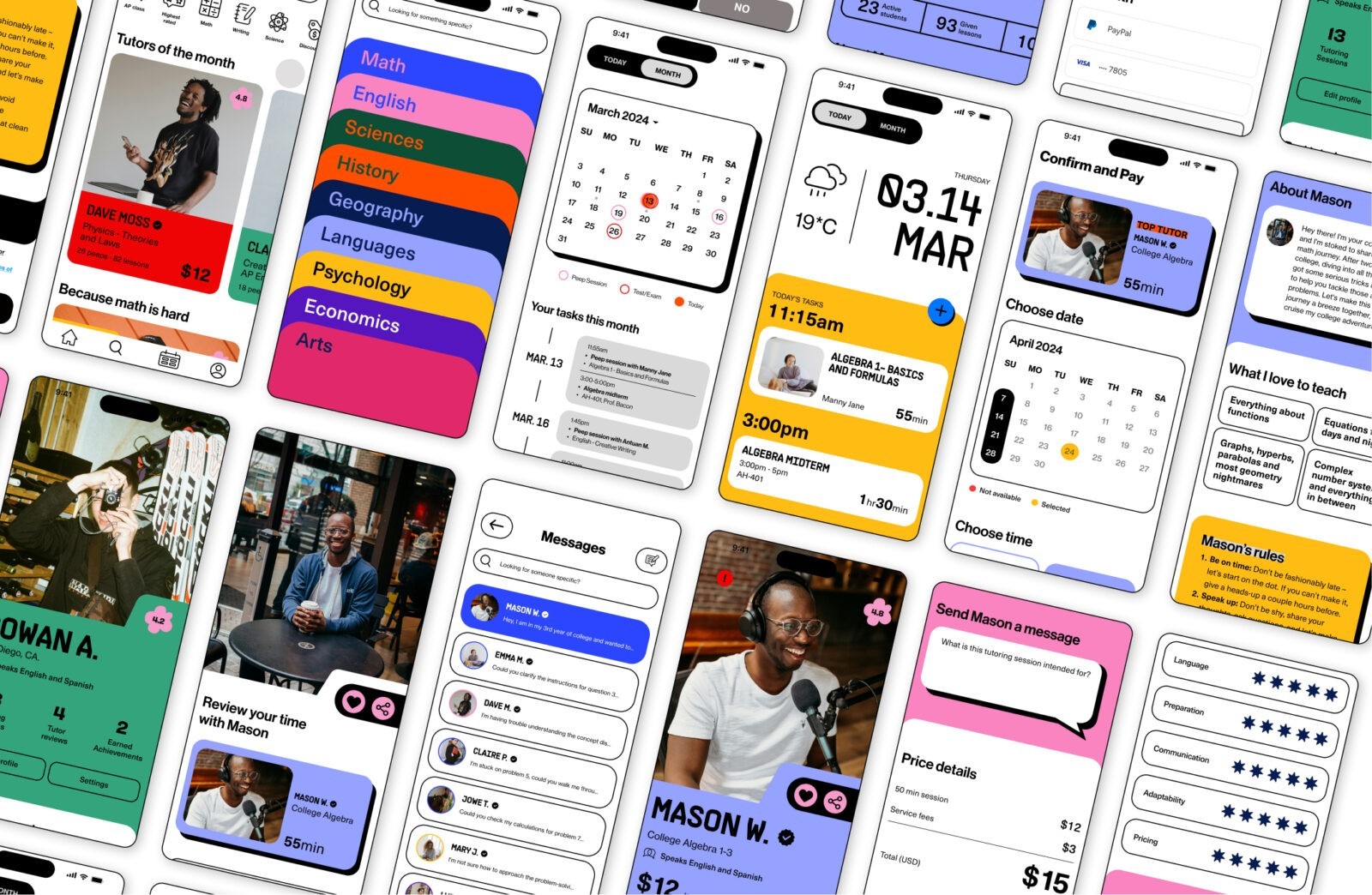
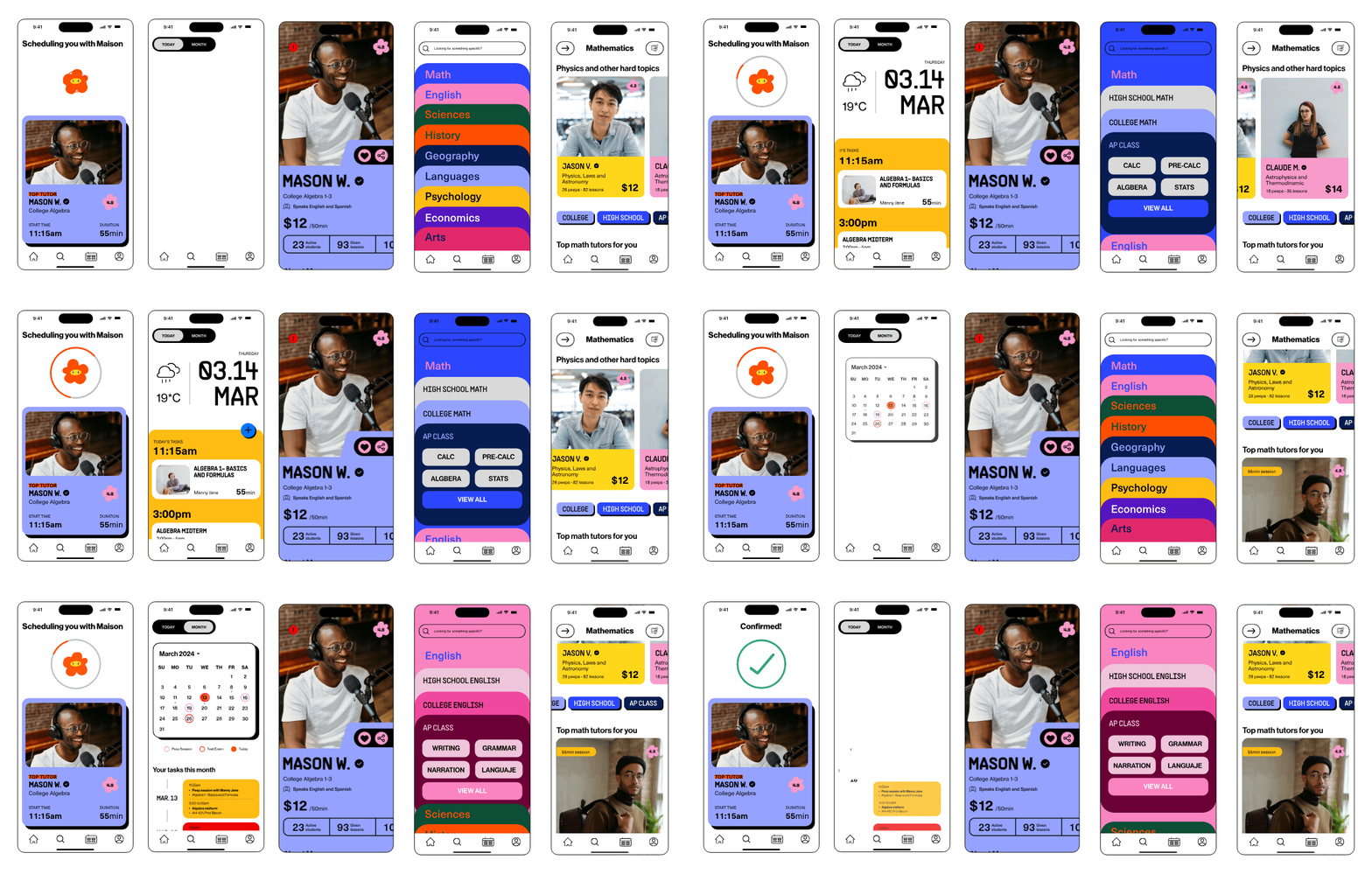
The development of Peeps began with extensive discovery research, including user interviews that informed the creation of two key personas: one representing the student and the other the tutor. These personas were essential in guiding the design and functionality of the app, ensuring that it meets the specific needs and preferences of its users.
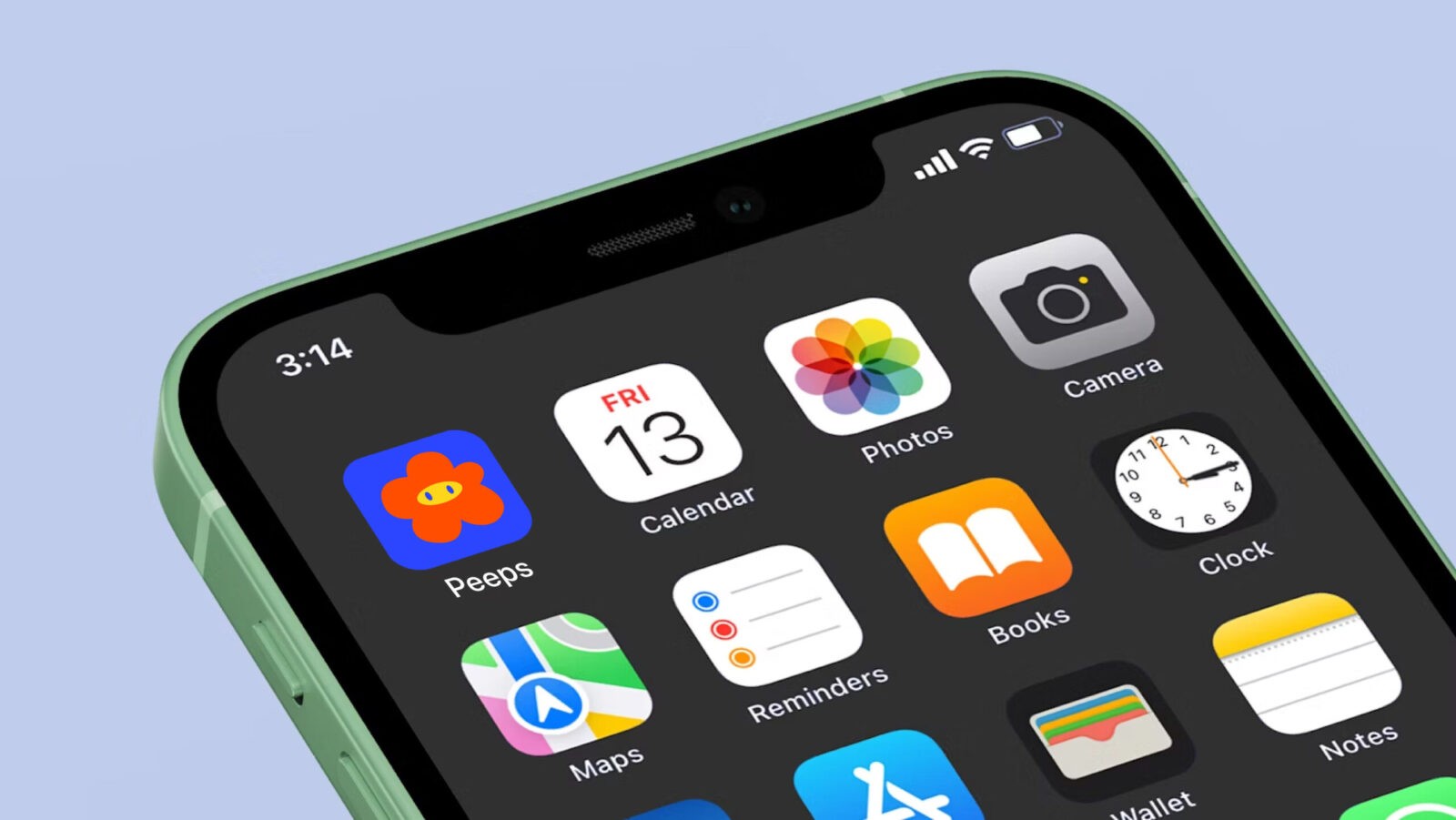
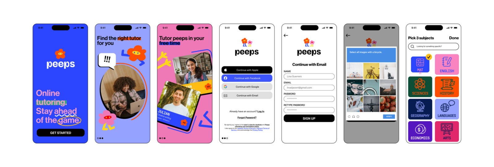
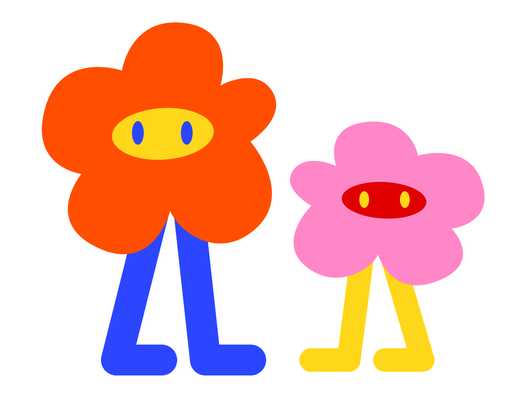
The branding of Peeps is tailored to appeal to young students and those in school, particularly Gen Z. The logo is characterized by bright colors, a fun personality, and playful ink-traps, giving the brand a fresh and contemporary look. The flower app icon is a central element of the brand, symbolizing progress and growth. Just as a flower needs water, attention, and connection to thrive, Peeps is all about growing together, building bridges between students and tutors to achieve better academic outcomes. This icon also serves as a mascot, adding a delightful and engaging element to the app’s marketing and user experience.
The app interface is designed to be easy and intuitive, using a bold and extensive color palette that enhances the visual appeal without compromising usability. Colors are used to identify subjects, making navigation straightforward, while the pricing and expectations for each study session are clearly presented upfront. This transparency ensures that users have all the information they need before booking a session, contributing to a smooth and stress-free experience.
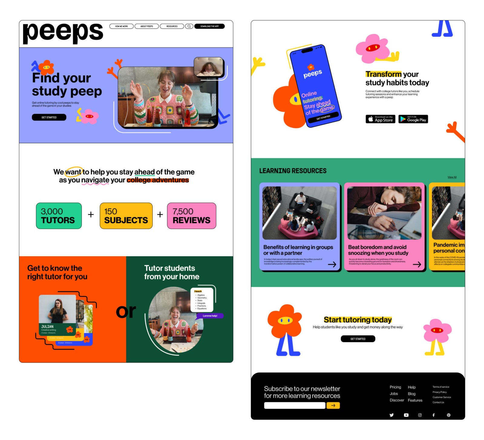
Typography plays a crucial role in Peeps’ branding, with a blend of Neue Haas Grotesk and Supply Sans used for the type palette. This combination strikes a balance between readability and character. Messaging within the brand is further enhanced with colored highlights, annotations, and scribbles, which not only add a playful touch but also assist with visual hierarchy and emphasis.
The marketing strategy for Peeps takes a humorous approach, using purposely contrived stock images to poke fun at the often inauthentic visuals used in educational spaces. The campaign also playfully critiques AI tools by intentionally misspelling words in the images, adding a layer of wit and personality to the brand’s language.
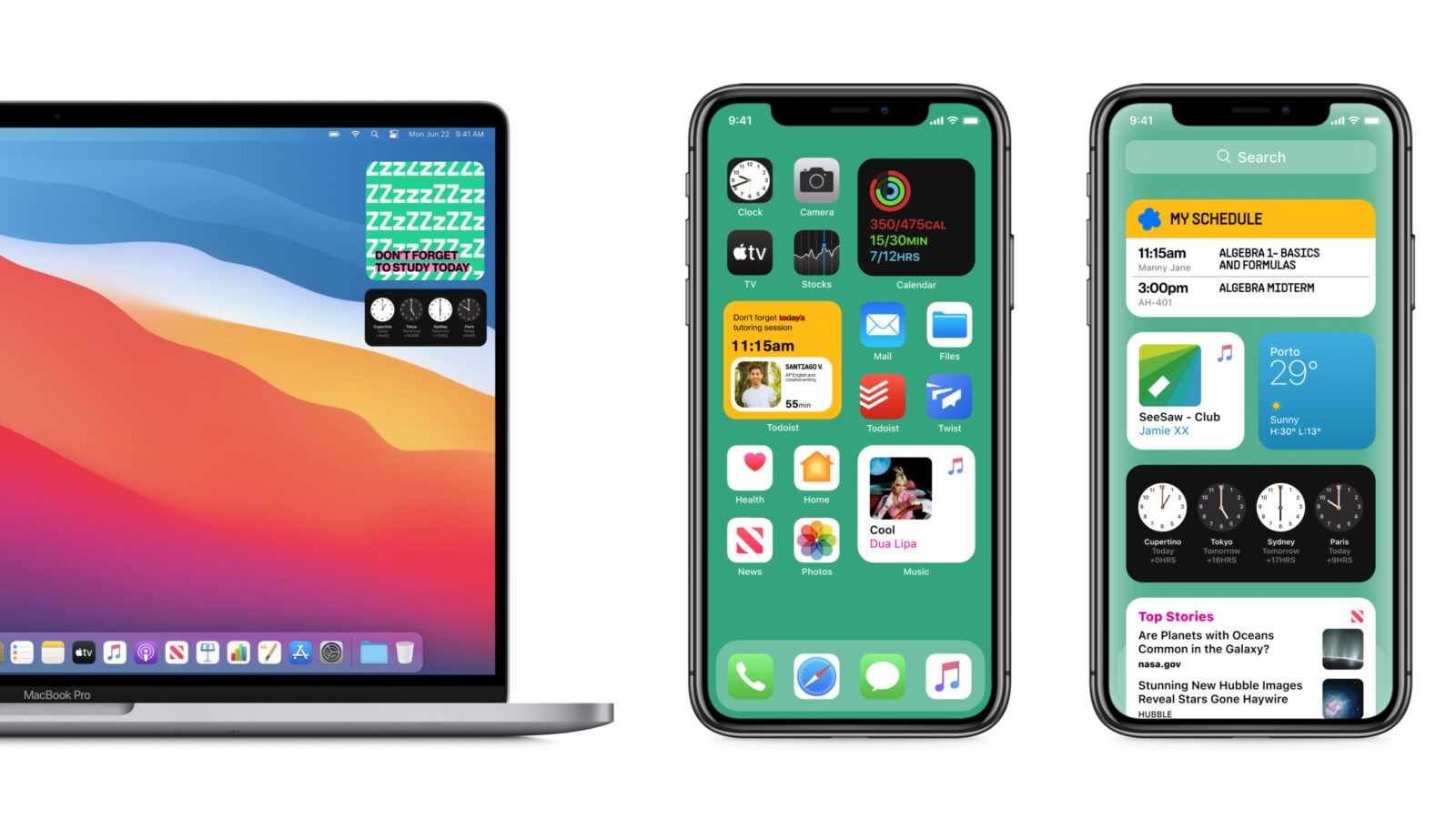
To further support students in their academic journey, the Peeps UI package includes widgets for iOS, which help keep students on track with their studies and remind them of upcoming tutoring sessions. These widgets are designed to be as functional as they are visually appealing, reinforcing the brand’s commitment to enhancing the learning experience.

CREDIT
- Agency/Creative: Lina Guerrero
- Article Title: Lina Guerrero’s Digital Design for Peeps App Connects Students and Tutors
- Organisation/Entity: Student
- Project Status: Non Published
- Agency/Creative Country: United States of America
- Agency/Creative City: San Diego
- Project Deliverables: App Design, Digital Application
- Industry: Education
- Keywords: WBDS Student Design Awards 2024/25 , Digital Design , Mobile Application
- Keywords: WBDS Student Design Awards 2024/25
-
Credits:
Educational Institution: San Diego City College
Educator's Name: Sean Bacon & Bradford Prairie


