Reynolds & Reyner – Borjomi Georgian Water
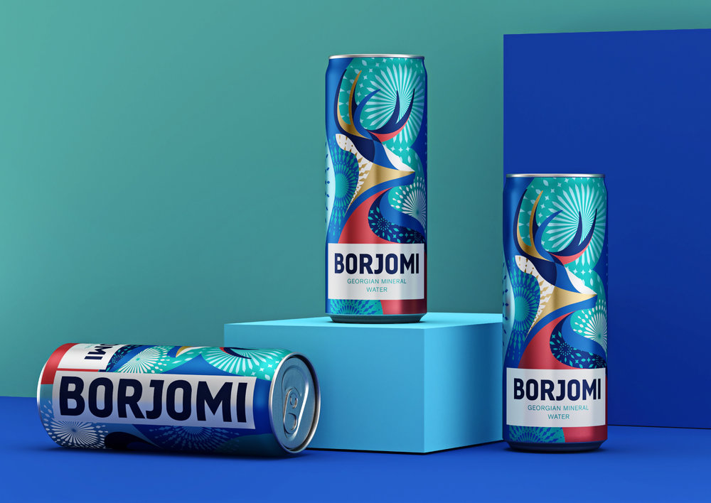
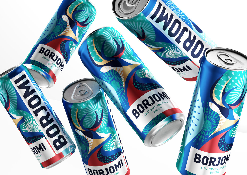
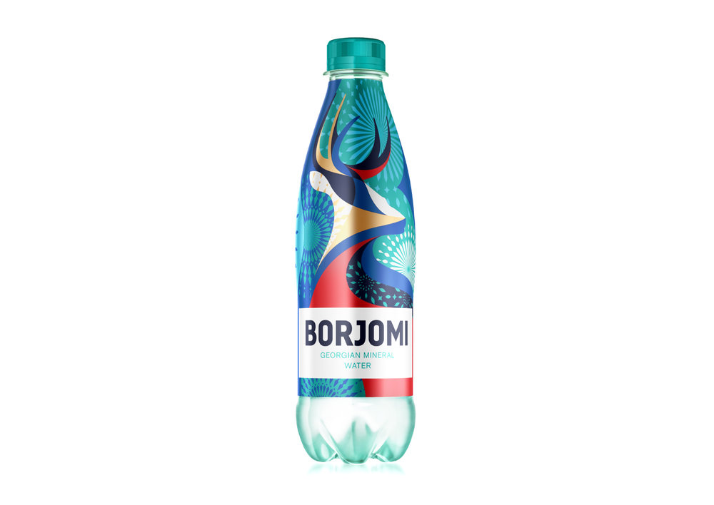
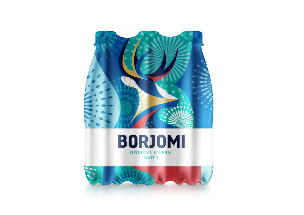
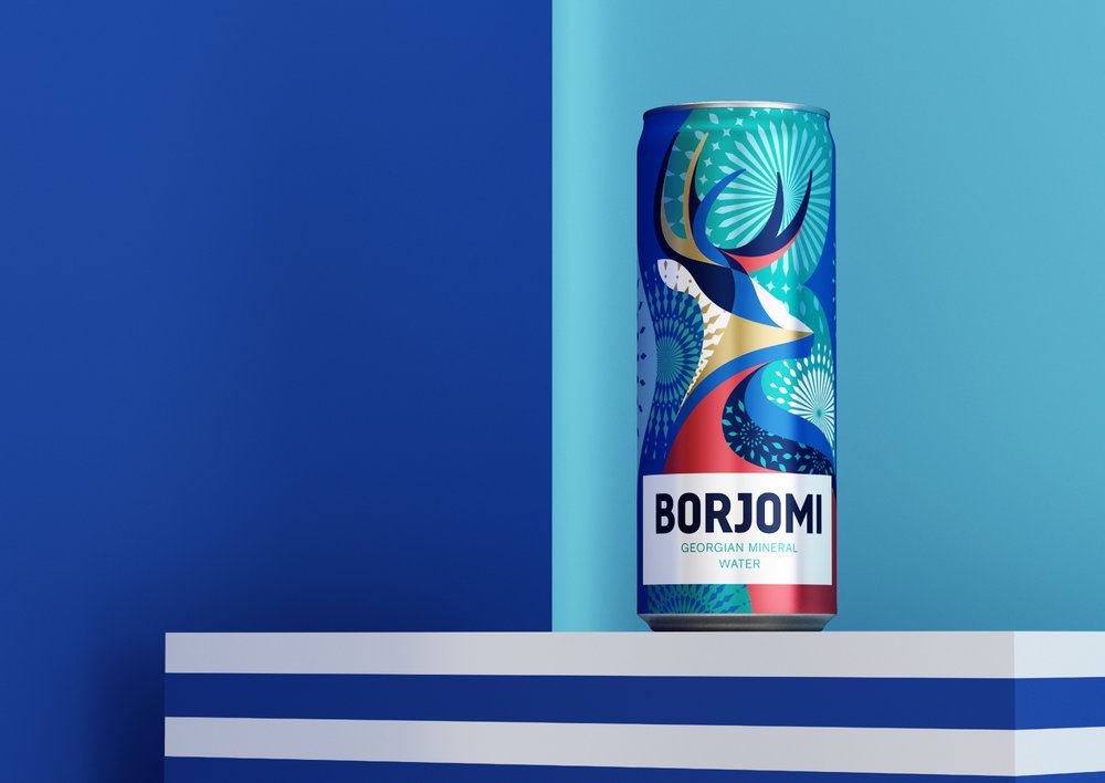
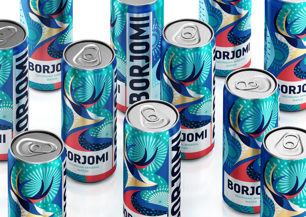
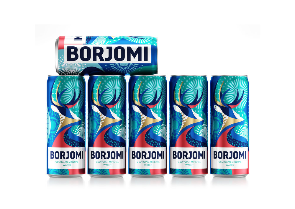
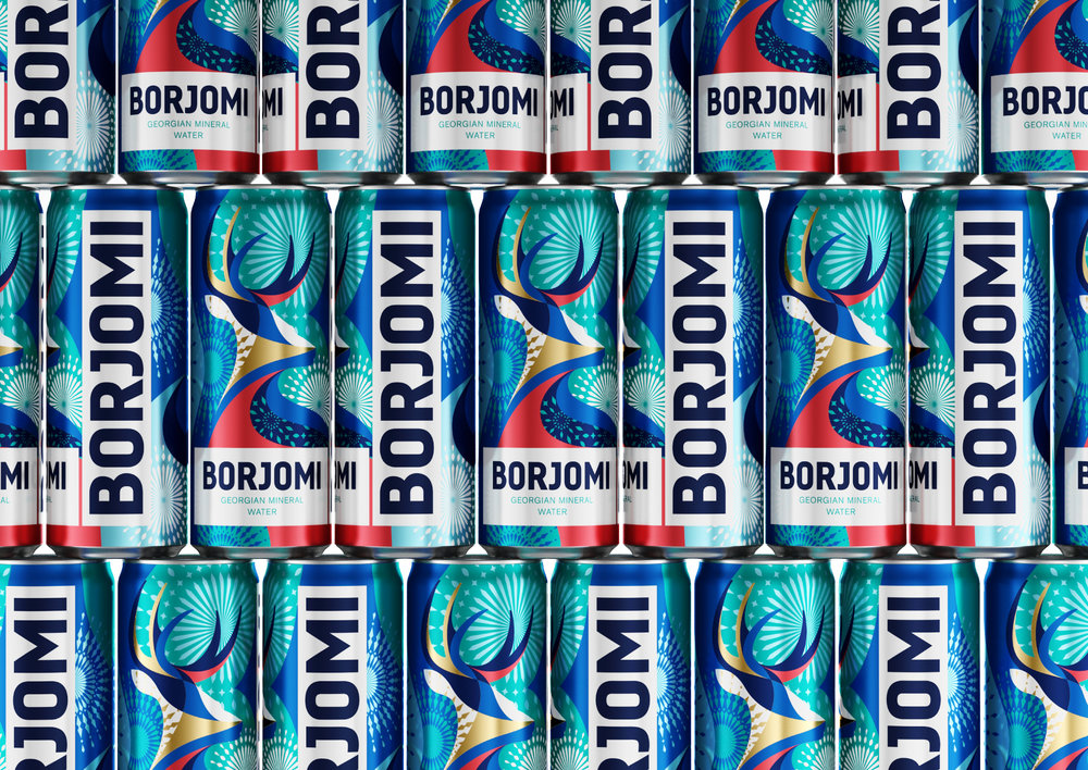
The holiday season is a special time, magic is in the air and any detail in everyday life can lift your spirits and charge you with positive emotions. As part of the New Year campaign, “Holiday is to Borjomi” limited holiday packaging and an updated “Borjomi” label were issued. “Fancy” packaging will help consumers to immerse themselves in the atmosphere of a holiday and set up a long fun.
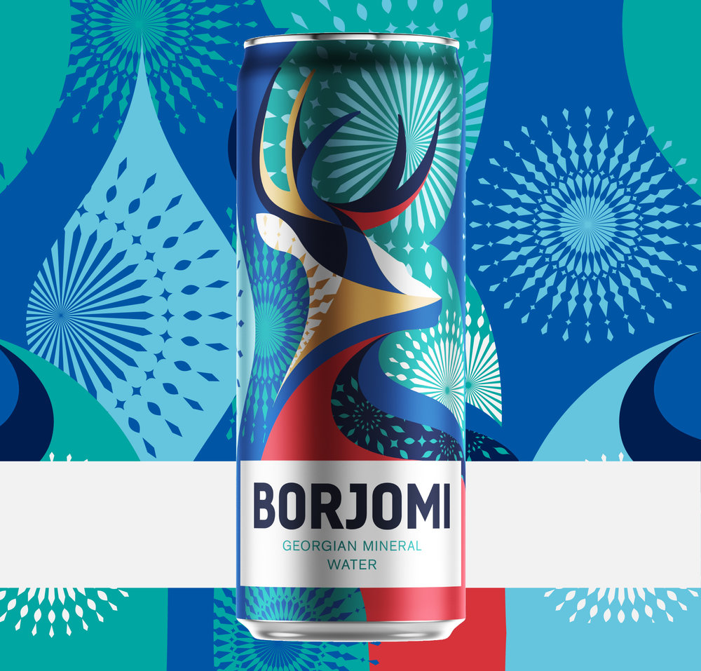
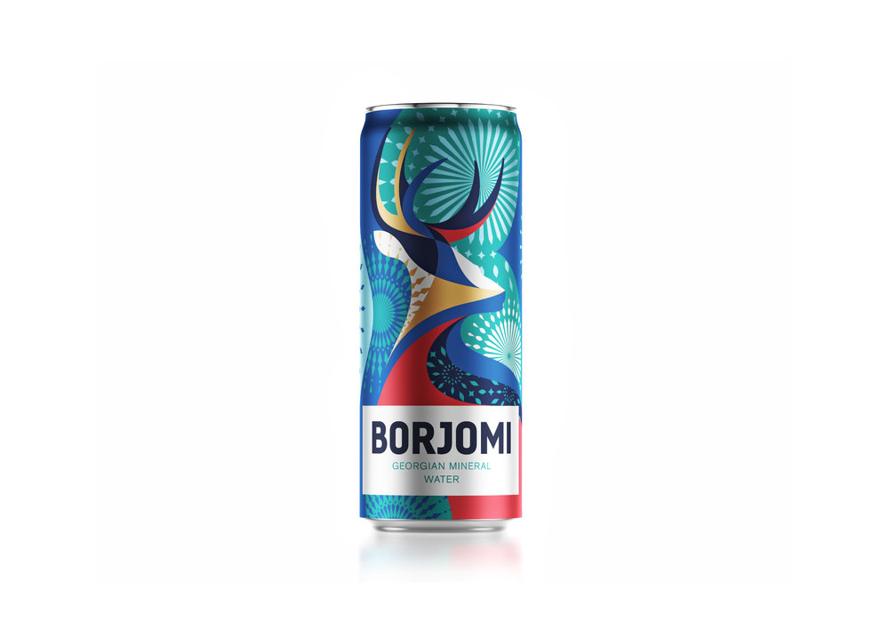
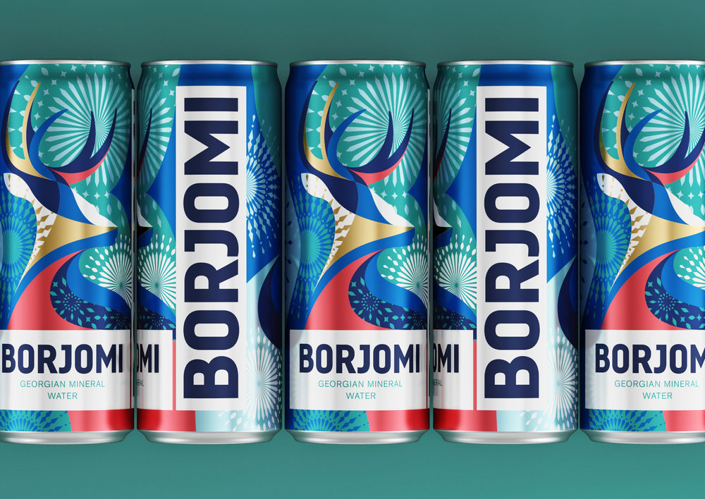
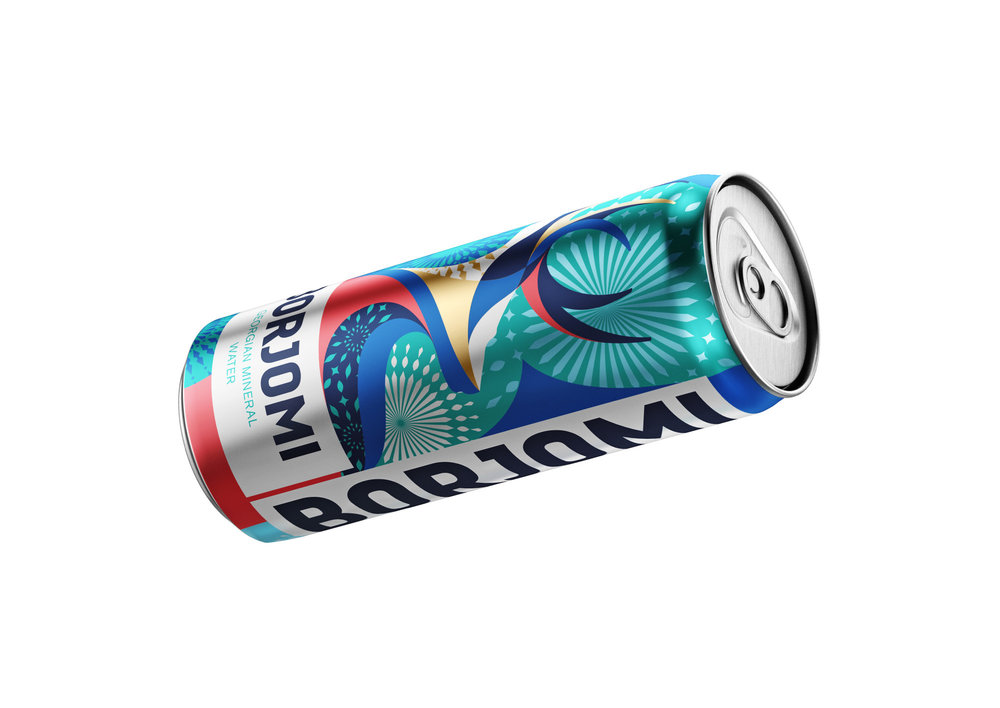
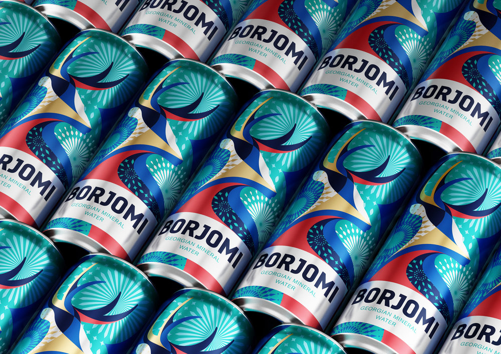
The symbiosis of bright and harmonious colors, including the unchanged brand color Georgian Green, draws attention to the new product line and makes it stand out on the shelf. The focus of the design is made on modern stylized figure of a noble deer, which is one of the key elements of the brand. Salutes and fireworks, which remind of the coming magical period, complete the illustration.
The symbiosis of bright, dense colors of the brand is a winning composition and makes it stand out among competitors. Holiday fireworks complement the illustration, which gives a feeling of the onset of holidays. ‘Borjomi’ is a lifestyle enjoying life a hundred percent or more. Volcanic water supports the body during the holidays, giving lightness and strength to new achievements with every sip.
CREDIT
- Agency/Creative: Reynolds & Reyner
- Article Title: Limited Collection of Winter Designs for Borjomi Georgian Water
- Organisation/Entity: Agency Commercial, Published
- Project Type: Packaging
- Agency/Creative Country: Ukraine
- Market Region: Europe
- Format: Bottle, Can, Sleeve
- Substrate: Metal, Plastic


