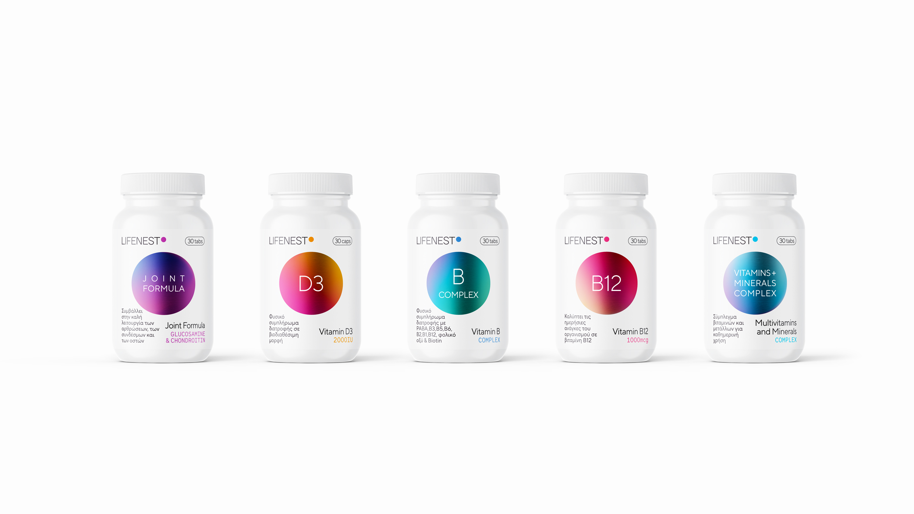
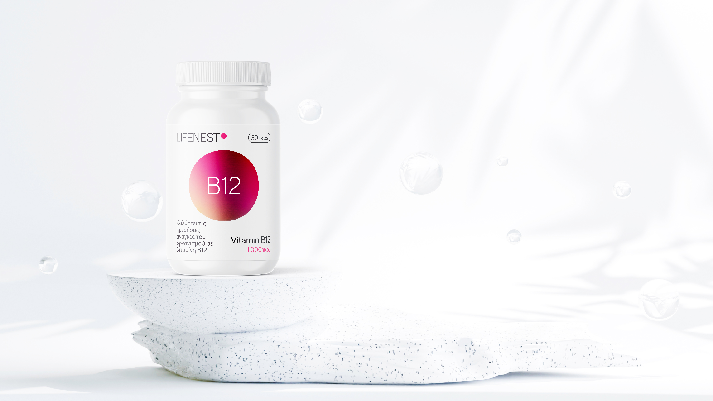
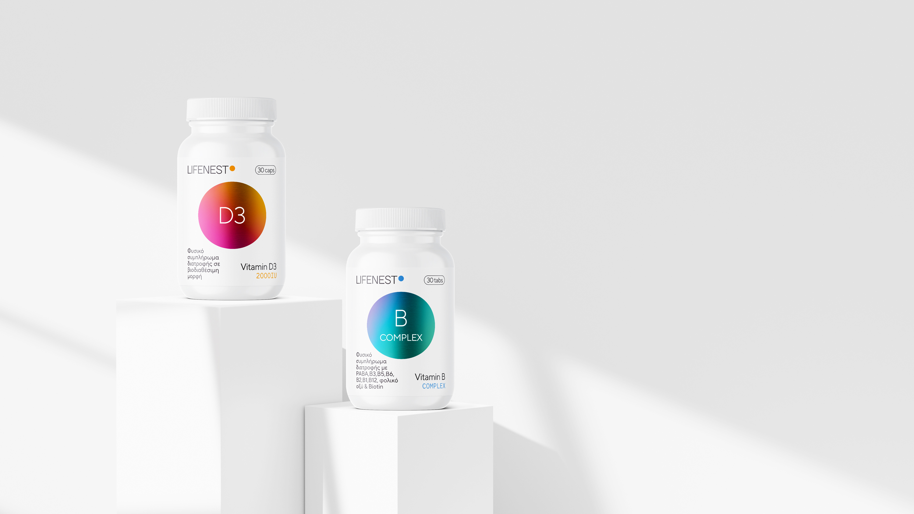
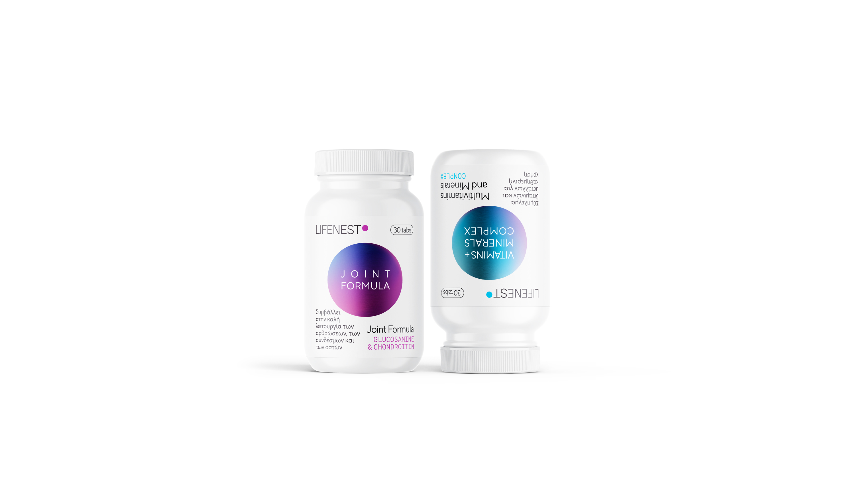
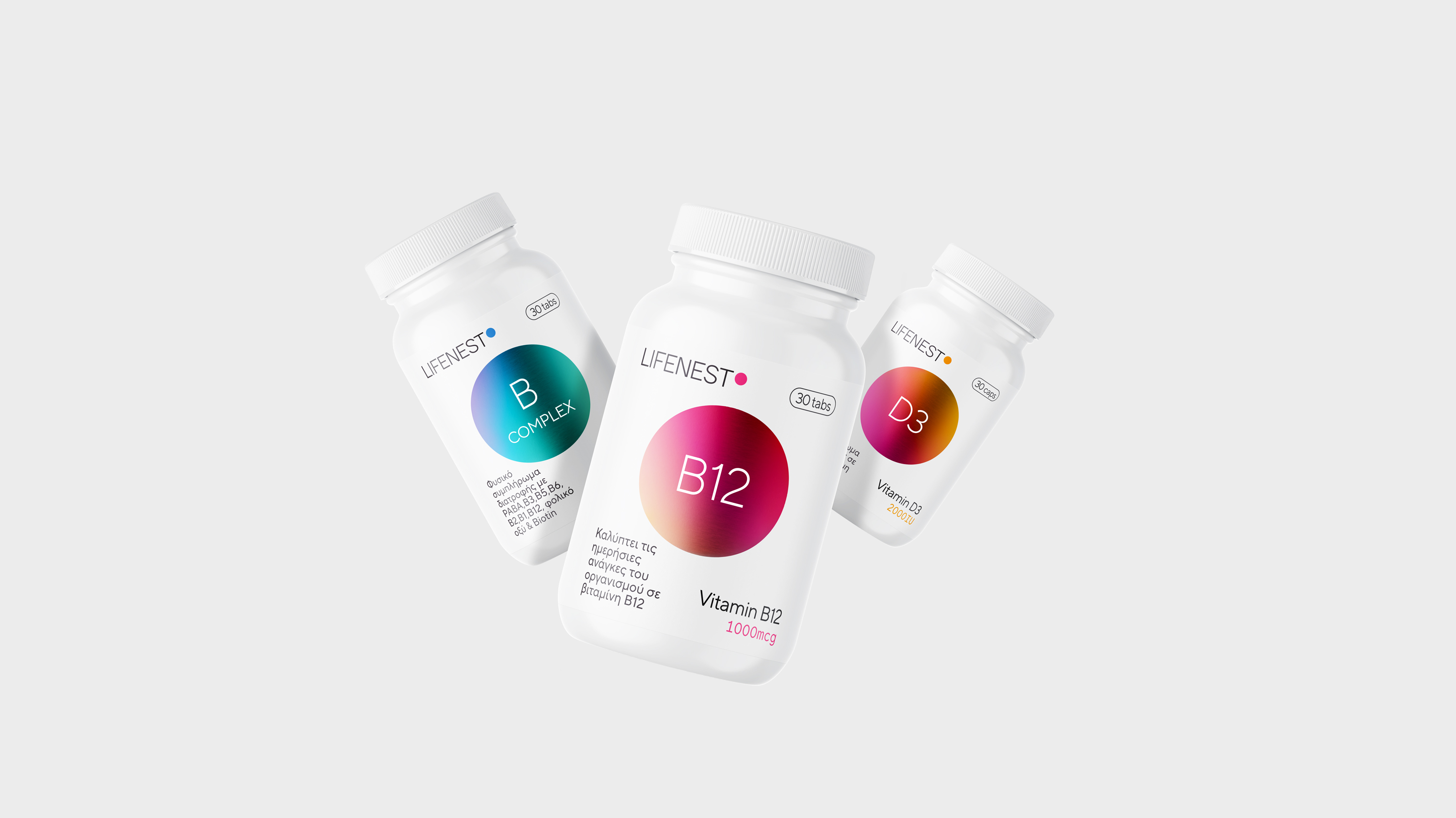
At Lifenest , nature meets science in a range of premium supplement products that enhance how we live, think, and feel. The Lifenest series comprises a rich array of products designed to elevate different facets of our overall well-being. From vitamin D3 and B Complex, supporting the immune system and mental resilience, to B12 promoting energy and the smooth functioning of the nervous system. Key to our design is the geometric shape of the circle, symbolising vitality and dynamism. It serves as the key graphic element that generates a powerful sense of liveliness and movement, embodying the vibrant core of our products.
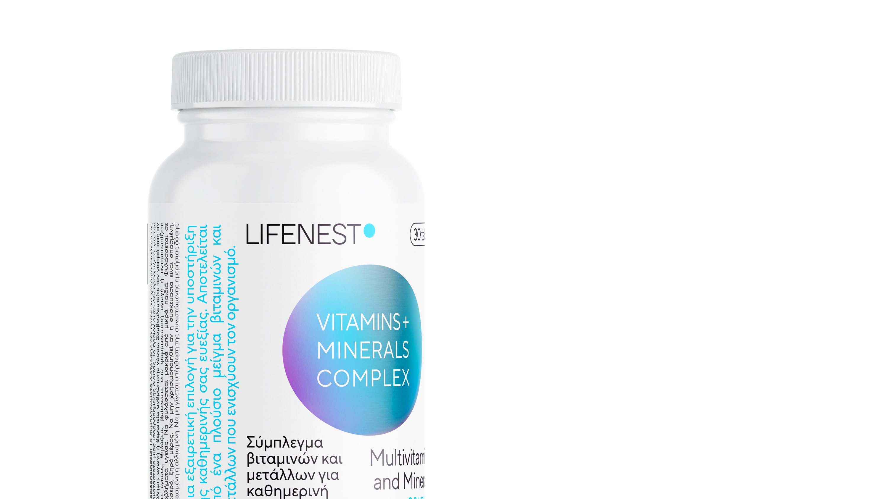
The choice of white as the primary color for packaging, in conjunction with the multicoloured foil circle, was a thoughtful one. White represents purity and efficiency, values inherent to our brand that we want to reflect in every aspect of our packaging. Furthermore, the multicoloured circle confirms the lively and dynamic nature of our products, creating a contrast that captivates the eye and underscores their uniqueness.
The vivid, expressive colours that transform depending on each product emphasise the distinctiveness of each item. Each color combination within the circle corresponds to one of Lifenest’s products, giving it a unique and recognizable identity. This not only enhances the series’ distinctiveness but also helps consumers identify the product that suits their individual needs. Thus, our design provides a visual guide and facilitates consumers in choosing the right product for their well-being.
In summary, our design isn’t merely superficial decoration but an additional means of communication and promotion for our products, enhancing the competitiveness of the series in the market.
CREDIT
- Agency/Creative: Pecora Nera Design Studio
- Article Title: Lifenest Premium Supplements Packaging Design Range
- Organisation/Entity: Agency
- Project Type: Packaging
- Project Status: Published
- Agency/Creative Country: Greece
- Agency/Creative City: 2023
- Market Region: Europe
- Project Deliverables: Art Direction, Branding, Packaging Design
- Format: Bottle
- Industry: Health Care
- Keywords: supplements, packaging, Greece, foil, white
-
Credits:
Art Direction: Andronikos Deligiannis


