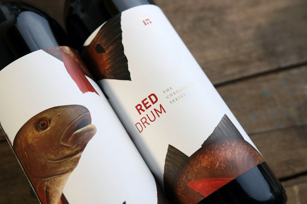
Watermark Design – Chesapeake Series Wine Label Redesign
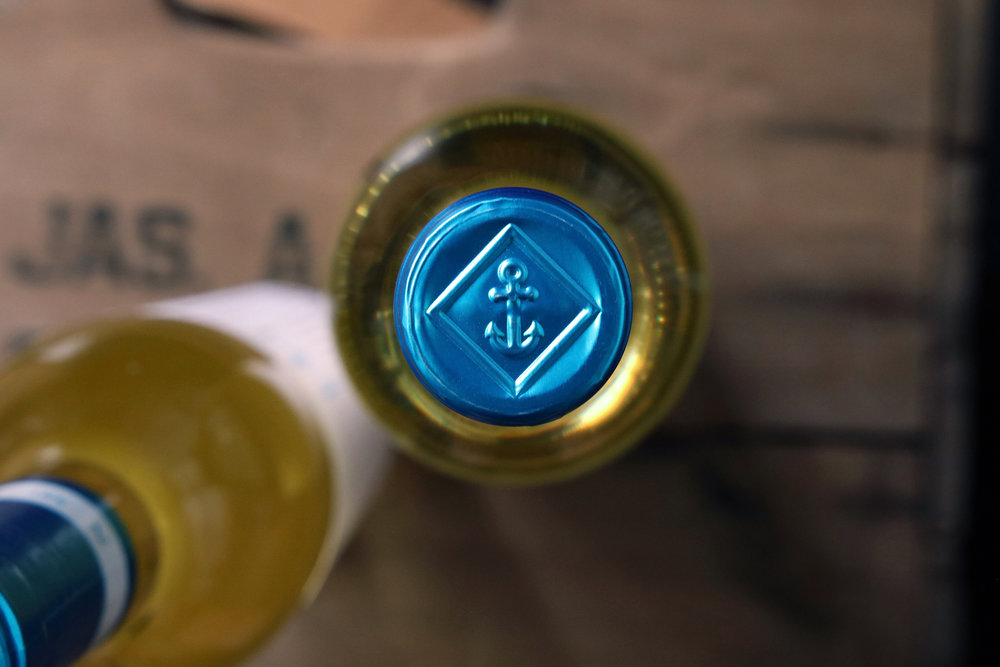
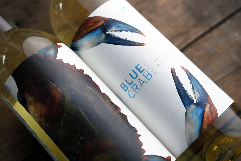
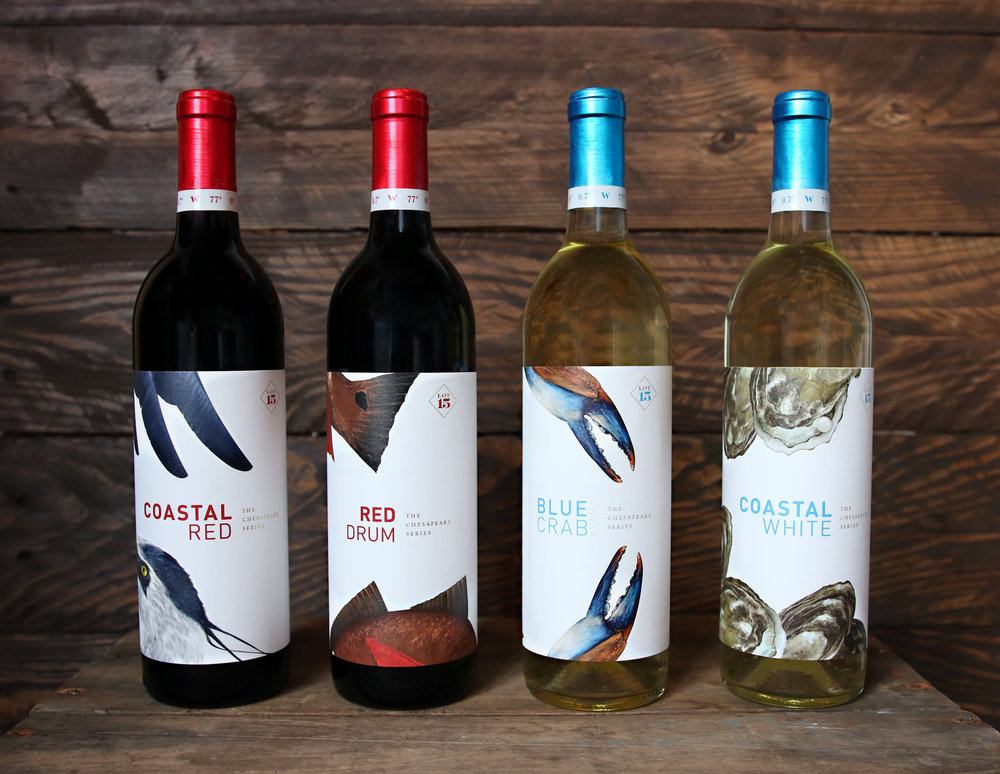
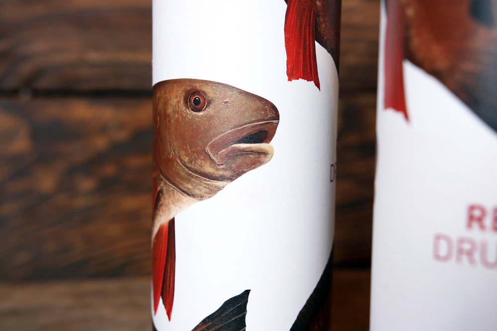
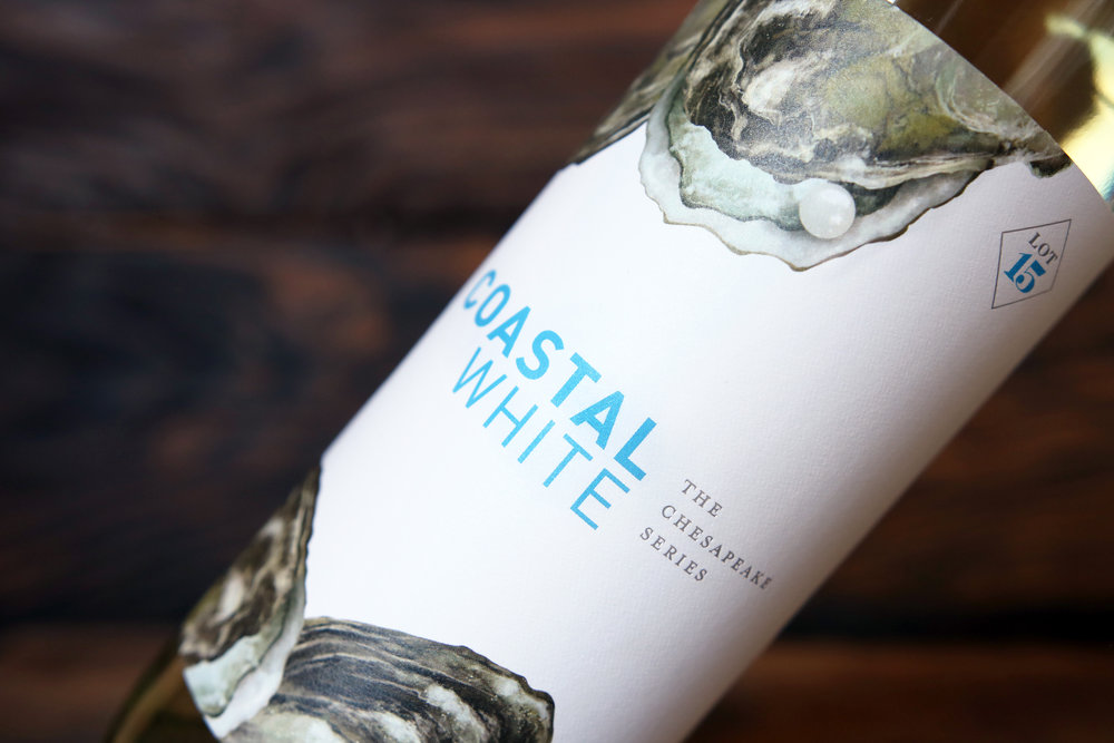
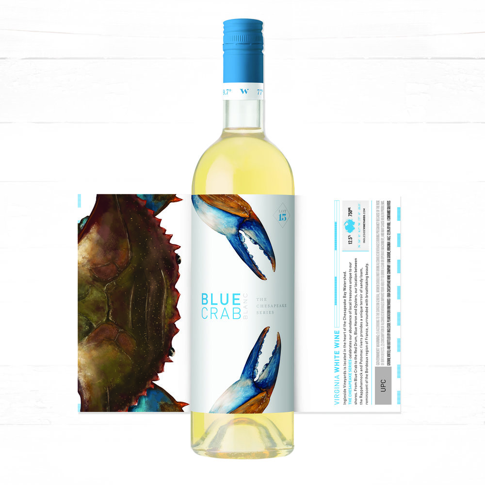
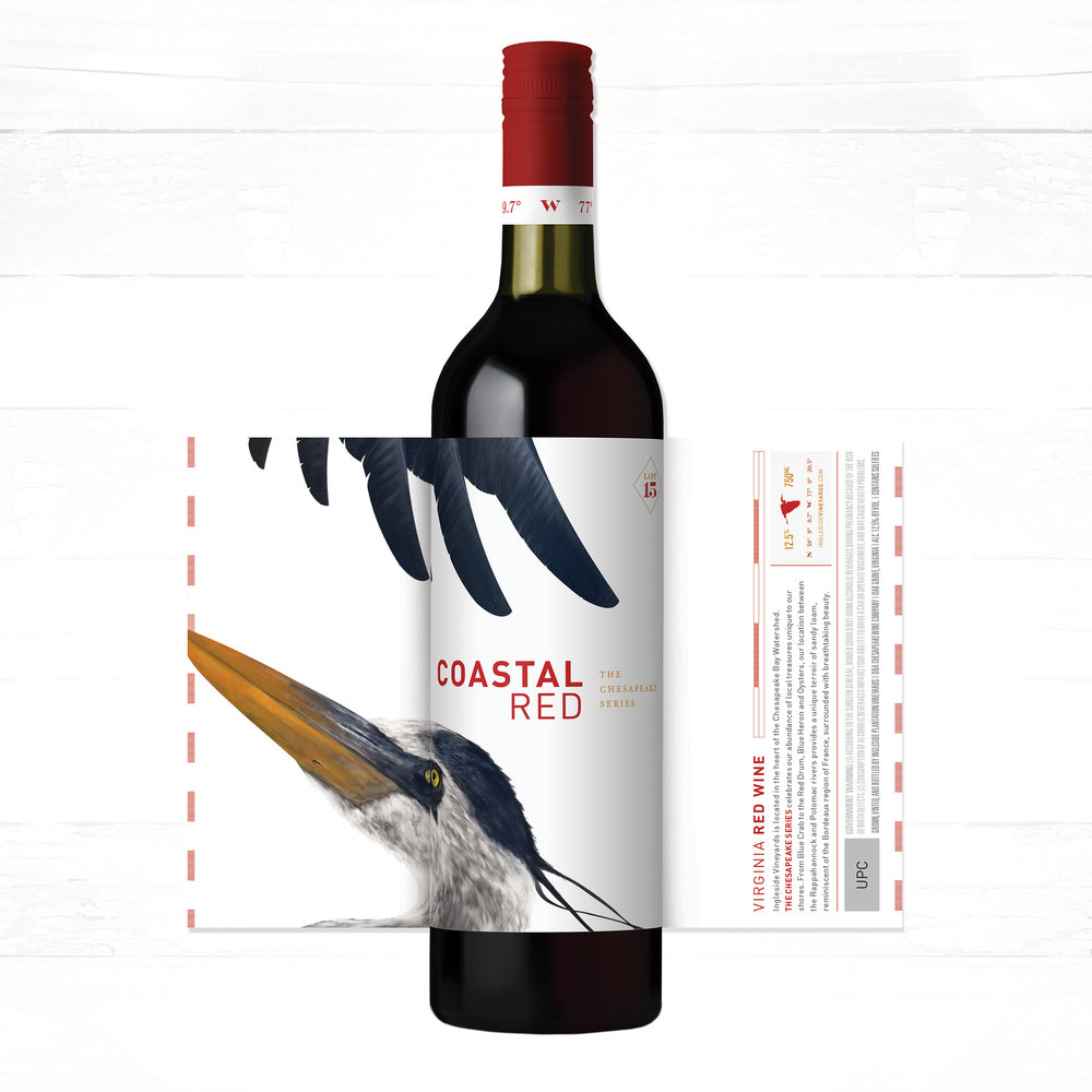
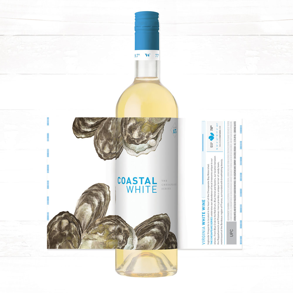
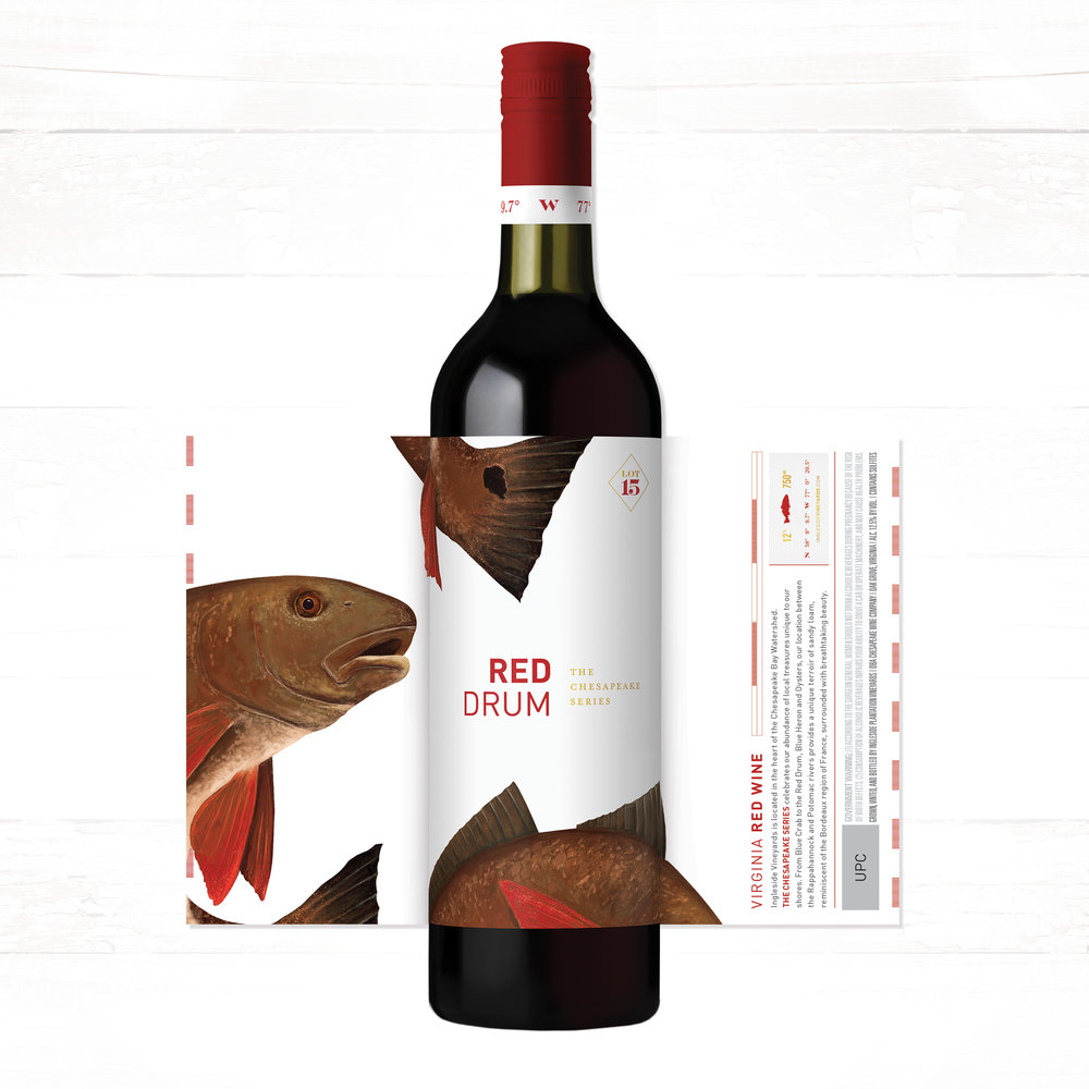
“Nestled between the Rappahannock and the Potomac Rivers, and edging Virginia’s Chesapeake Bay, Ingleside Vineyards is centered within a rich, beautiful ecosystem. Watermark Design was tasked with re-designing their ‘Chesapeake Series’ with a fresh, modern direction. From the Red Drum to the Blue Crab, each label features a different facet of the Chesapeake’s flora or fauna, custom-painted with life-like detail. The package design continues upward, highlighting Ingleside’s coordinates on the custom capsule, and is topped with a nautical emboss. Faced forward on-shelf, you are presented with a clean, minimal design, only hinting at the experience you will receive with a turn of the bottle, encouraging you to pick it up.

CREDIT
- Agency/Creative: Watermark Design
- Article Title: Life-like Paintings Evoke The Fauna of the Chesapeake Bay
- Organisation/Entity: Agency Commercial / Published
- Project Type: Packaging
- Agency/Creative Country: United States America
- Market Region: North America
- Format: Bottle
- Substrate: Glass
FEEDBACK
Relevance: Solution/idea in relation to brand, product or service
Implementation: Attention, detailing and finishing of final solution
Presentation: Text, visualisation and quality of the presentation


