As the world undergoes rapid changes, brands are encountering new demands, particularly from the younger generations. Gen Z approaches shopping differently and sets novel standards for visual appeal, entertainment, and product experiences. When it came to Liavince, a healthcare brand, we embarked on a journey to create a brand design that resonates deeply with Gen Z consumers in the digital retail landscape.
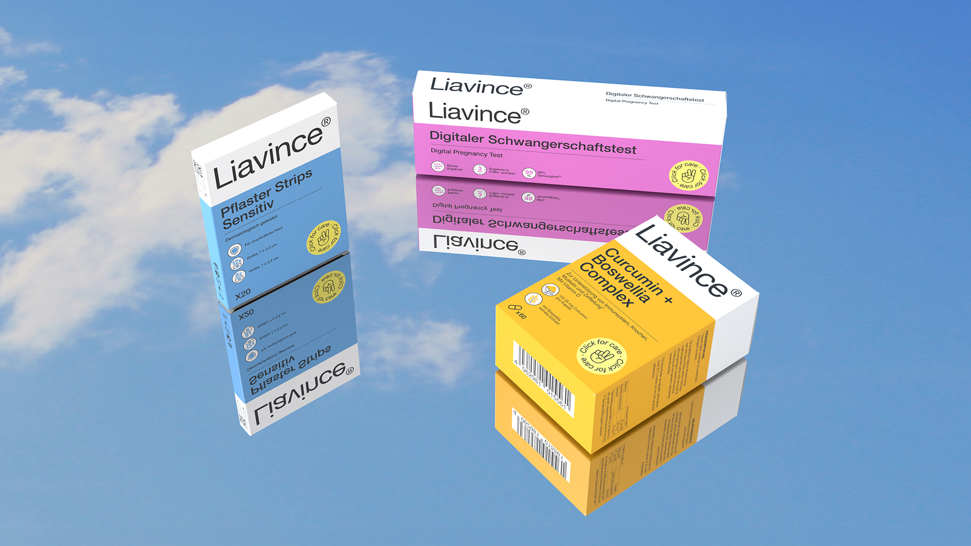
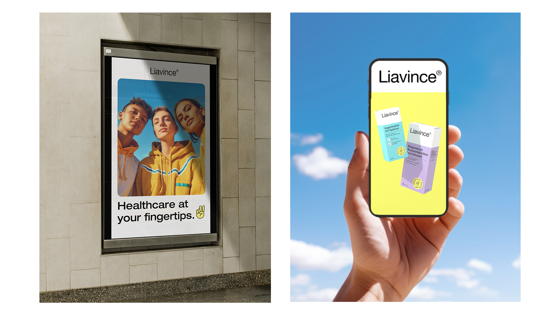
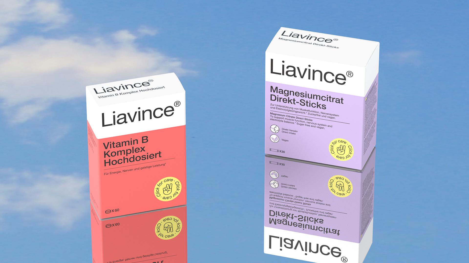
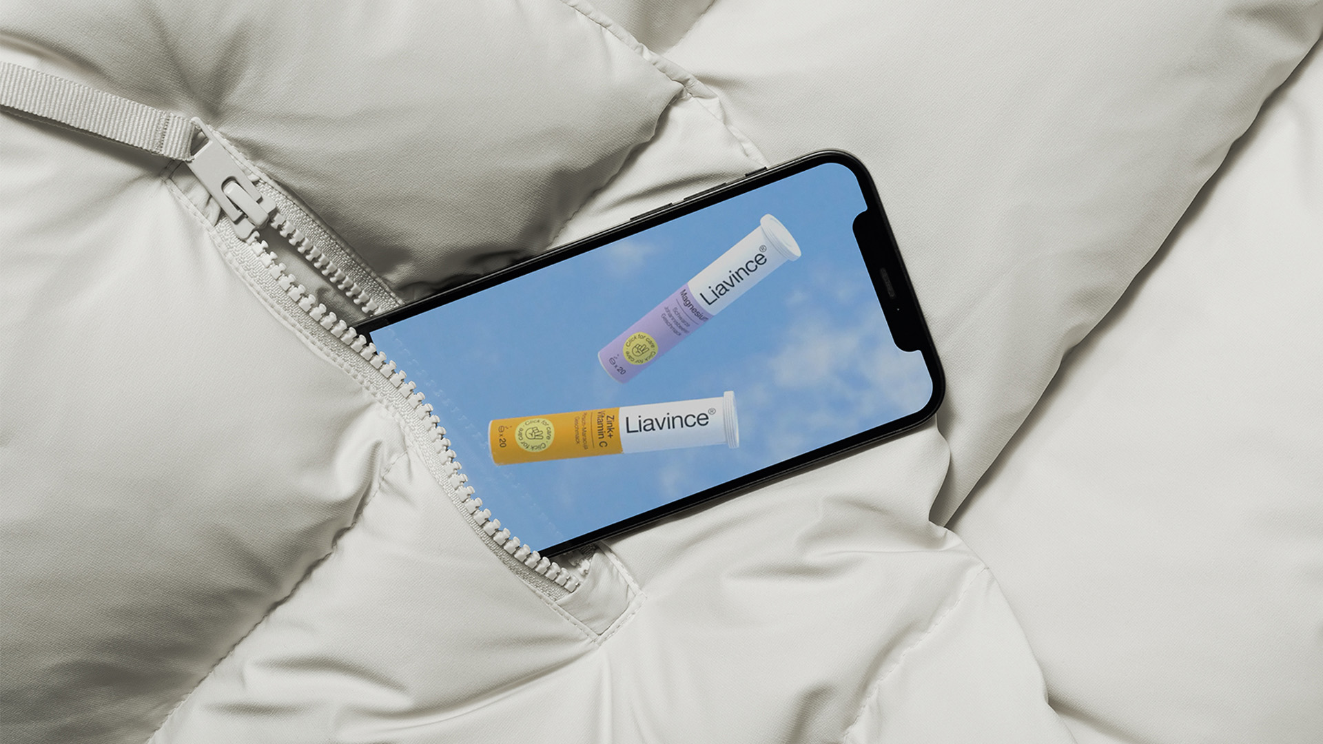
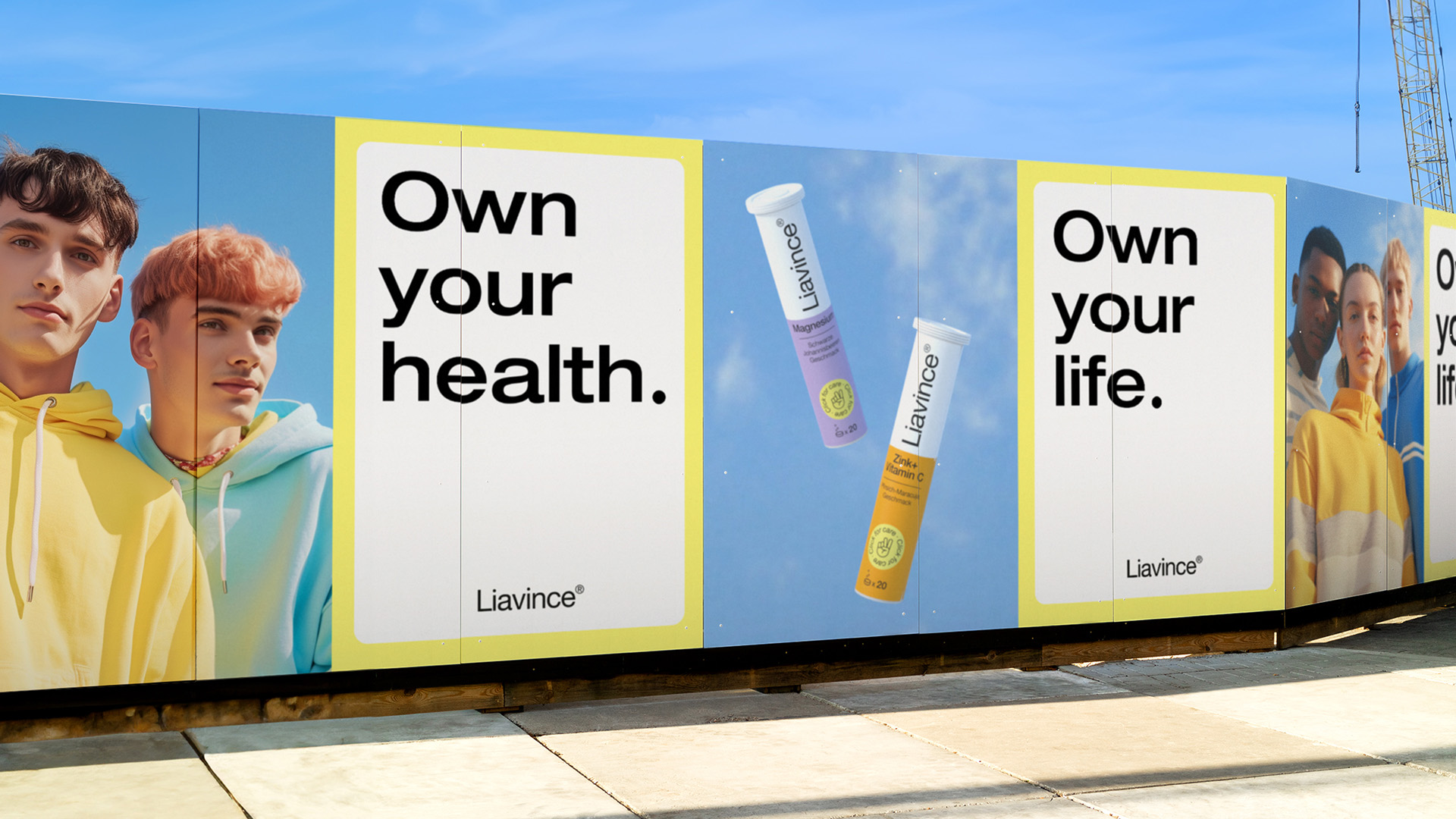
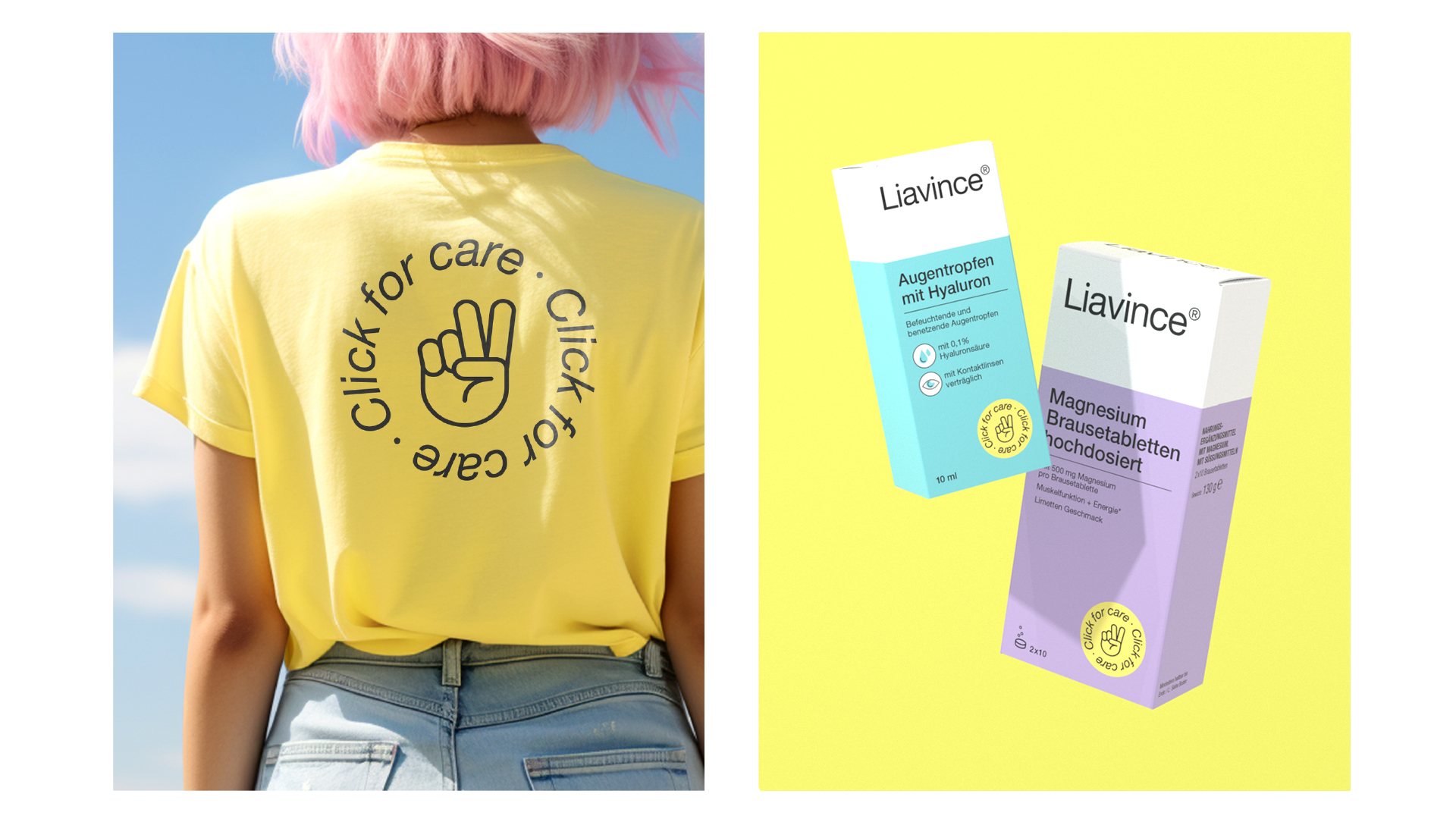
Our mission was to craft a brand identity seamlessly blending holistic health awareness with the allure of Instagram-worthy content. We deliberately broke the established norms of the healthcare industry. Vibrant colors and peace symbols elegantly merged with the sleek aesthetics of the Over-The-Counter (OTC) world. The clarity of the design exudes a strong presence on the digital shelf. Our intelligent system effortlessly adapts to diverse formats, international production standards, and varying text volumes, all while preserving design integrity. The result? A revitalized brand identity infusing fresh, positive energy into a category gradually losing its appeal.
In a world in constant flux, consumer dynamics evolve at an unprecedented pace. Generation Z, a driving force behind this change, redefines the rules of engagement in the marketplace with unique expectations for visual appeal, entertainment, and product experiences. Liavince, a healthcare brand, recognized the need to adapt to this shifting landscape. In response, we embarked on a journey to reinvent its brand identity, crafting a design deeply resonating with Gen Z consumers in the digital retail arena.
Our mission was clear: develop a brand identity seamlessly integrating holistic health consciousness with Instagram-worthy content’s allure. To captivate Gen Z, we shattered the established norms of the healthcare industry. In pursuit of our vision, vibrant colors and peace symbol merged with the sleek aesthetics of Over-The-Counter (OTC) products. The result defied expectations, capturing attention and inspiring engagement on the digital shelf. Our design language ensured Liavince’s products exuded a great presence digitally.
To enhance adaptability, we developed a smart design system conforming to various formats, international production standards, varying text volumes and amount of languages on front of pack, while preserving design integrity. This adaptability maintained a consistent and compelling brand image across diverse channels and markets.
The outcome was transformative. Liavince emerged with a revitalized brand identity that reinvigorated a stagnating category, resonating deeply with Gen Z and reigniting passion for holistic health consciousness.
In a world where change is constant, Liavince’s journey exemplifies the power of innovation and adaptability. As the healthcare industry evolves, Liavince stands as a beacon of fresh, positive energy, reminding us established categories can be reinvigorated with creativity and vision.
CREDIT
- Agency/Creative: Das Kreative Studio
- Article Title: Liavince — Positive Vibes in Health Care
- Organisation/Entity: Agency
- Project Type: Identity
- Project Status: Published
- Agency/Creative Country: Germany
- Agency/Creative City: Hamburg
- Market Region: Europe
- Project Deliverables: 2D Design, 3D Modelling, Art Direction, Brand Architecture, Brand Design, Brand Guidelines, Brand Identity, Brand World, Creative Direction, Icon Design, Logo Design, Packaging Design, Packaging Guidelines
- Industry: Health Care
- Keywords: Health Care, Positive Vibes, GenZ, Liavince, Pharma, OTC, Pharmacy, Digital Brand
-
Credits:
Creative Director: Ann Kalkschmidt
Creative Director: Robert Bork
Senior Creative: Susann Berger
Design Director: Clara Sonntag


