


Ashton is the oldest poutine chain in the country. It’s been proudly serving real poutine since 1969, but the brand’s image and restaurants have remained frozen in this era. In 2022, two young entrepreneurs with a vision of expansion acquired the 23 branches of the beloved Quebec chain. With this came a series of daunting challenges: sales were stagnant, the restaurants were outdated, the clientele was aging and recruiting younger generations was difficult. The brand needed some new life, so we completely revamped its brand universe.
The entire experience was updated with a perfect blend of modernity and traditions rooted in Ashton’s history.
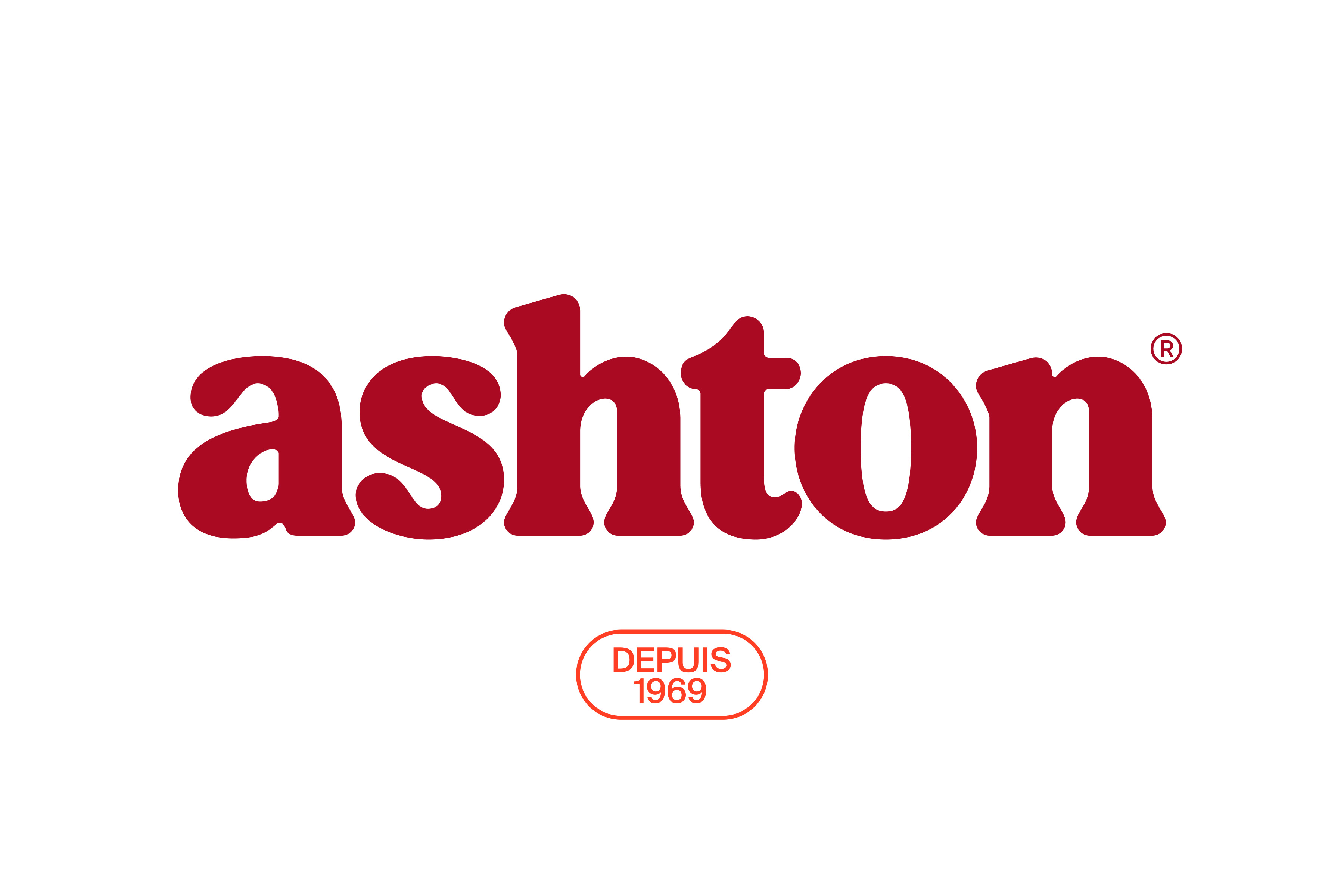
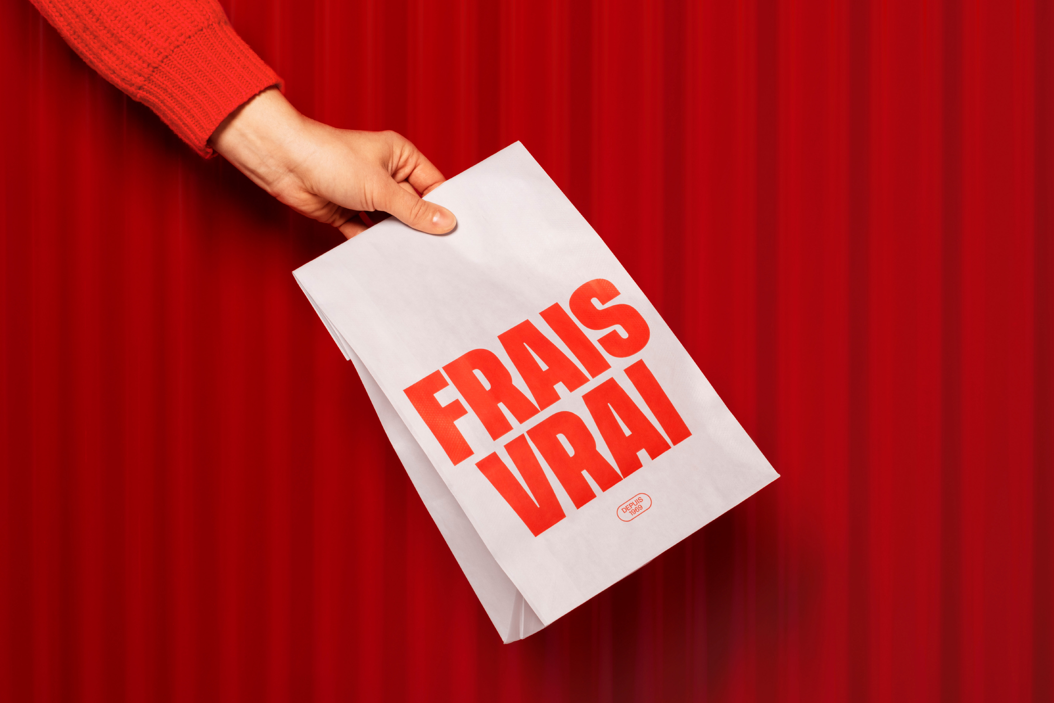
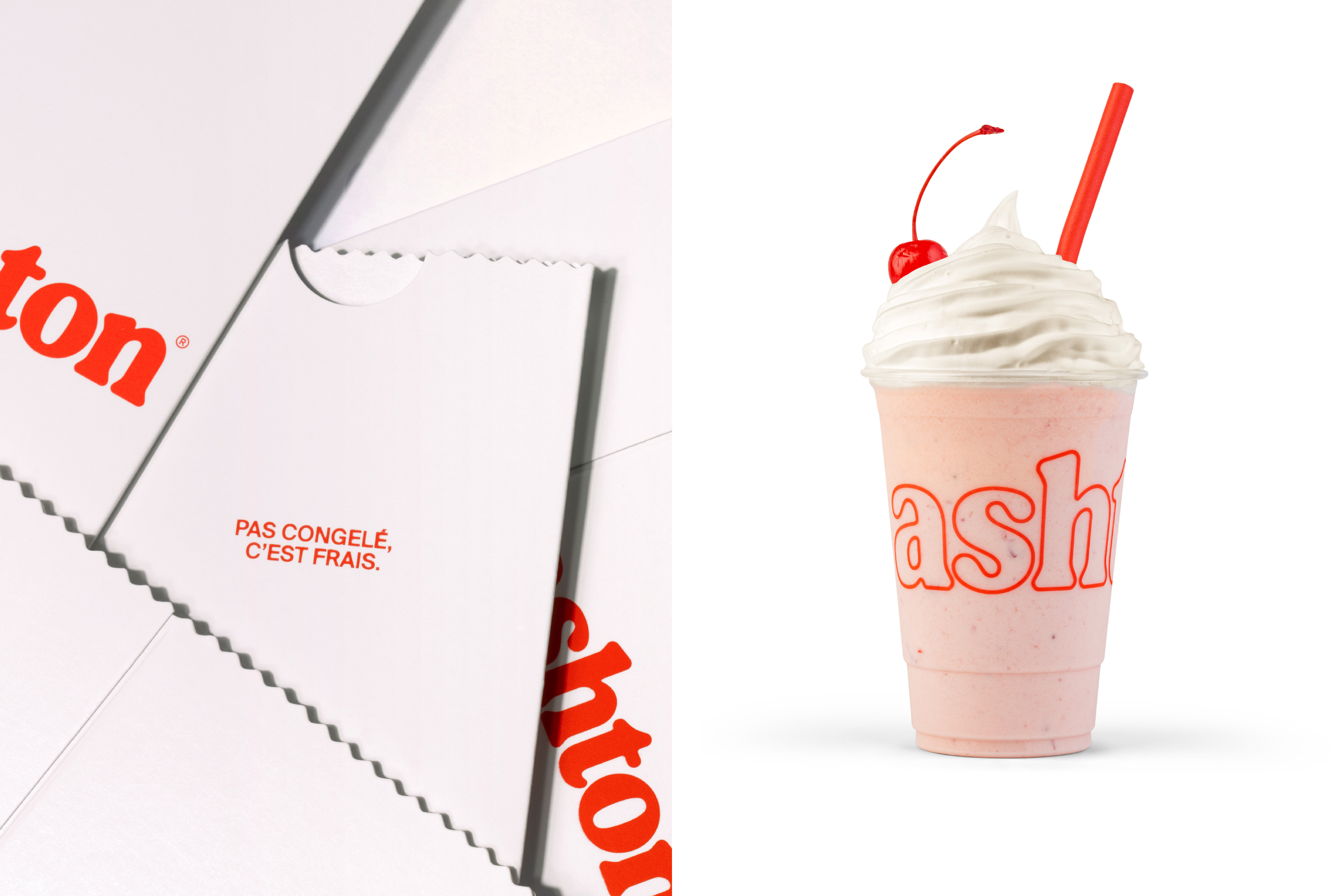
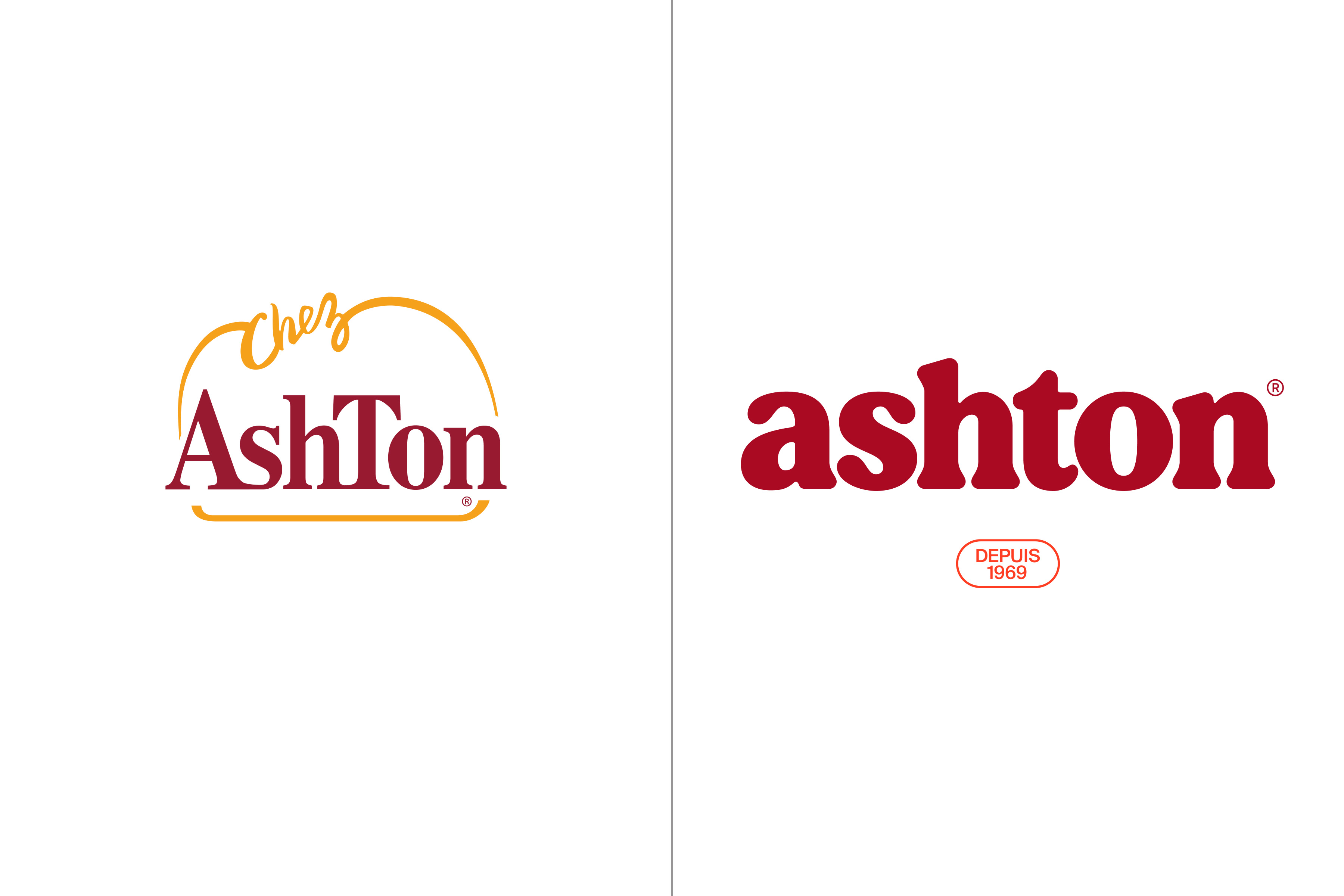
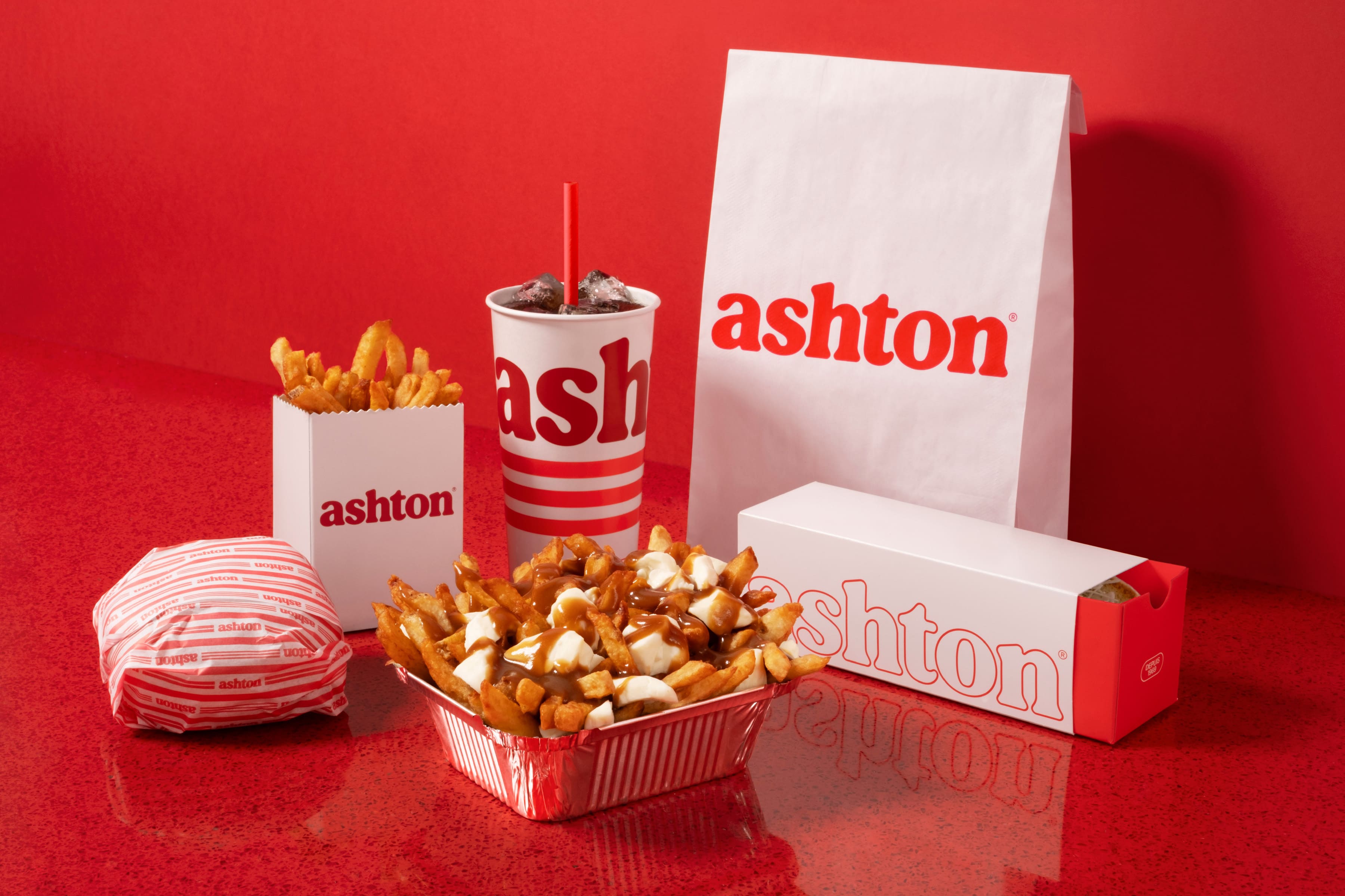
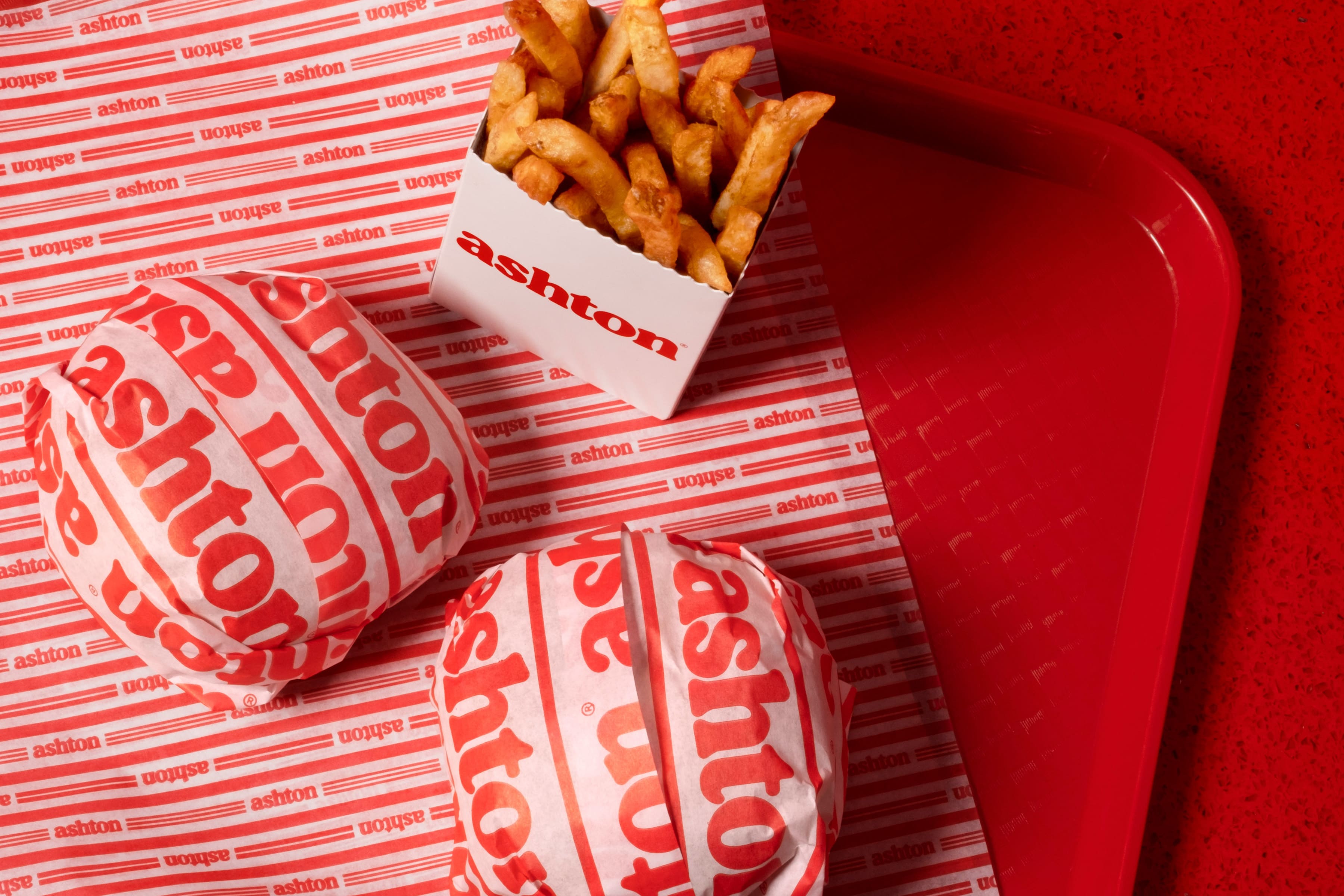
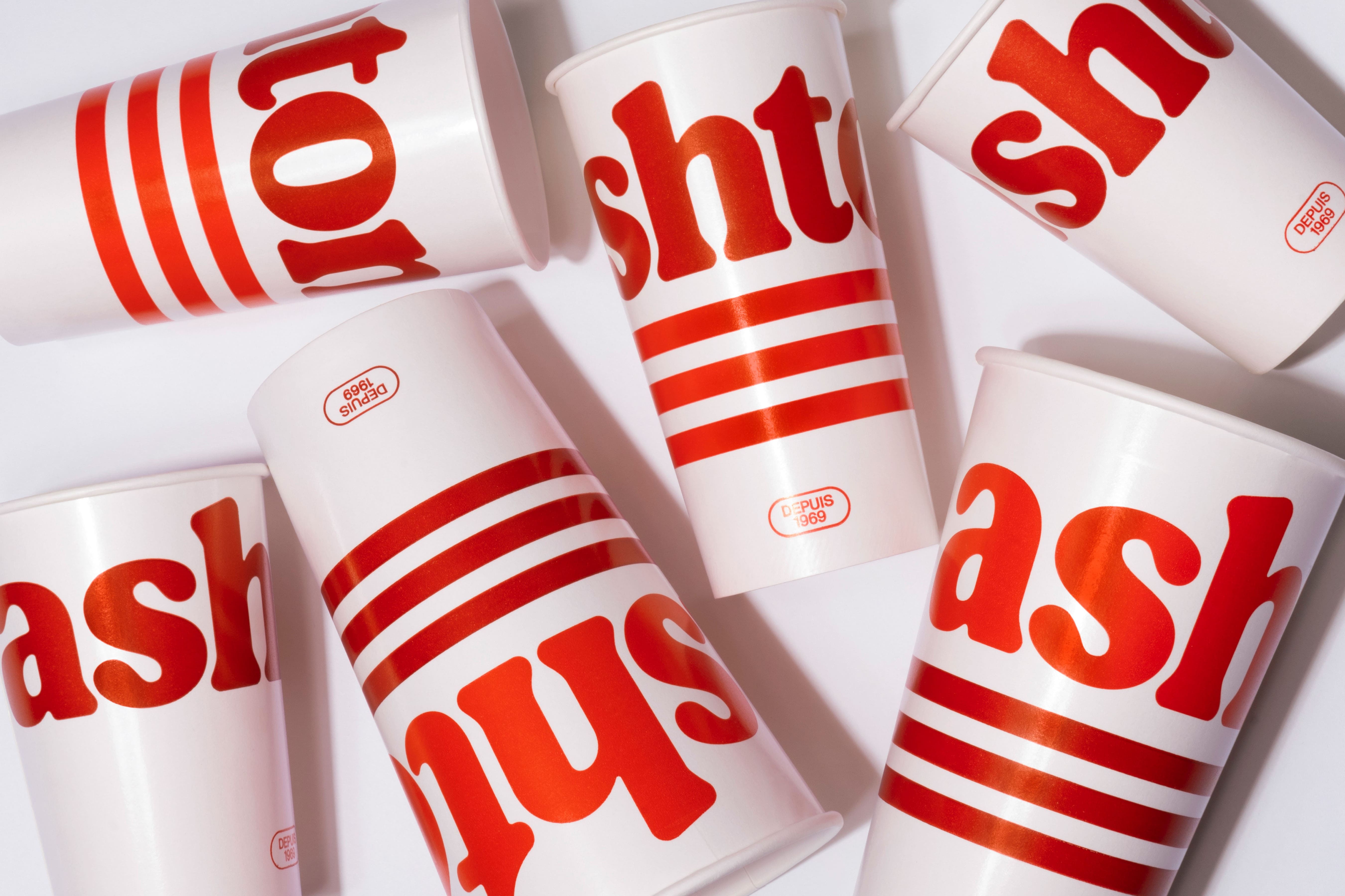
In tribute to snack bar culture, all the classic codes of diners were integrated with a modern twist. We created a bespoke typographic signature inspired by the generous, indulgent nature of Ashton dishes, refreshed the brand’s signature red colour and updated the menu while paying homage to the chain’s origins. A touch of nostalgia also comes through in new merchandise emblazoned with illustrations inspired by an early Ashton logo. The colours are rich, the shapes are flowing and curved, and the triple stripes inspired by the brand’s iconic neon lighting connect the system’s touchpoints, from new packaging to stripes on socks.
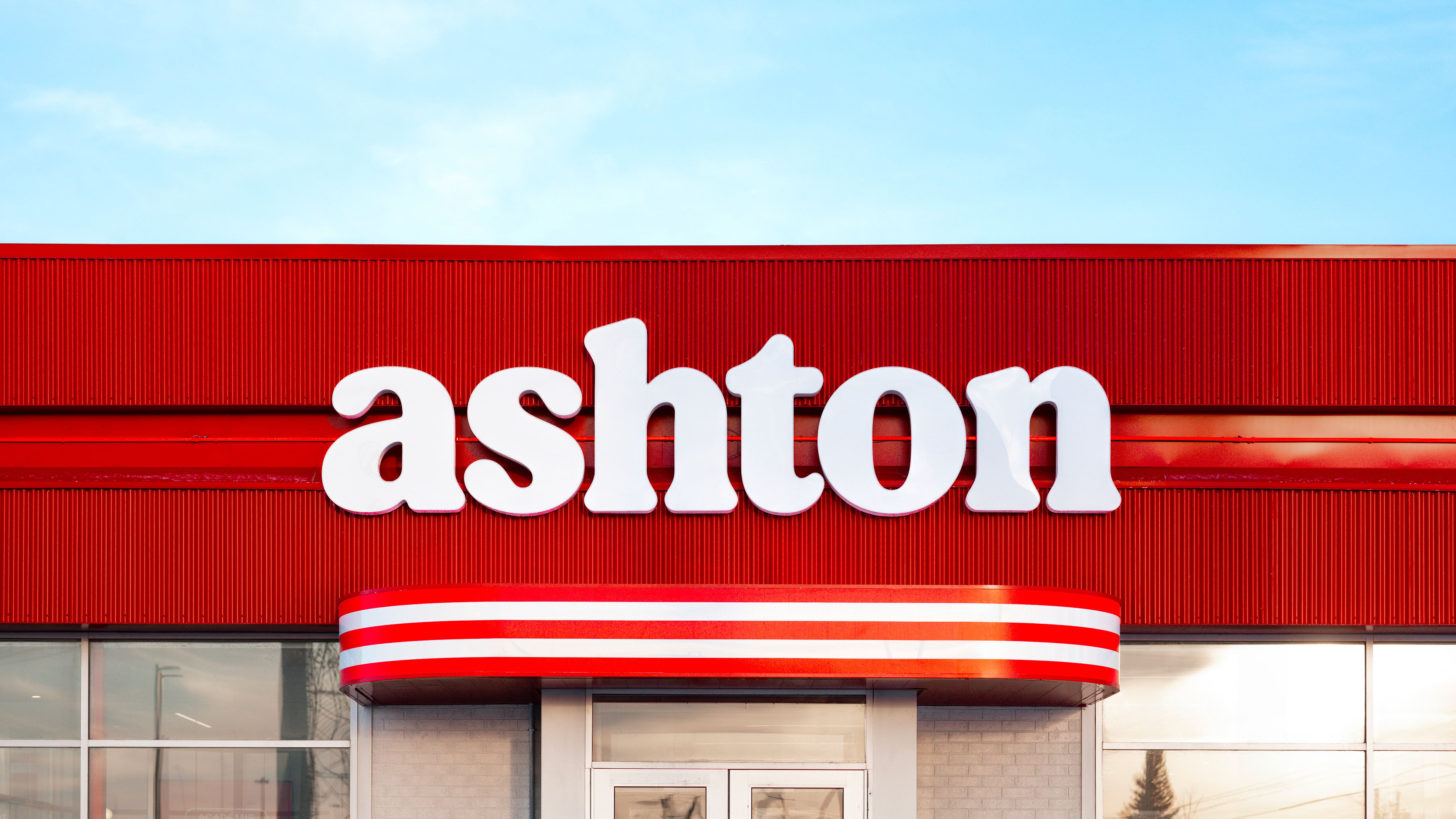
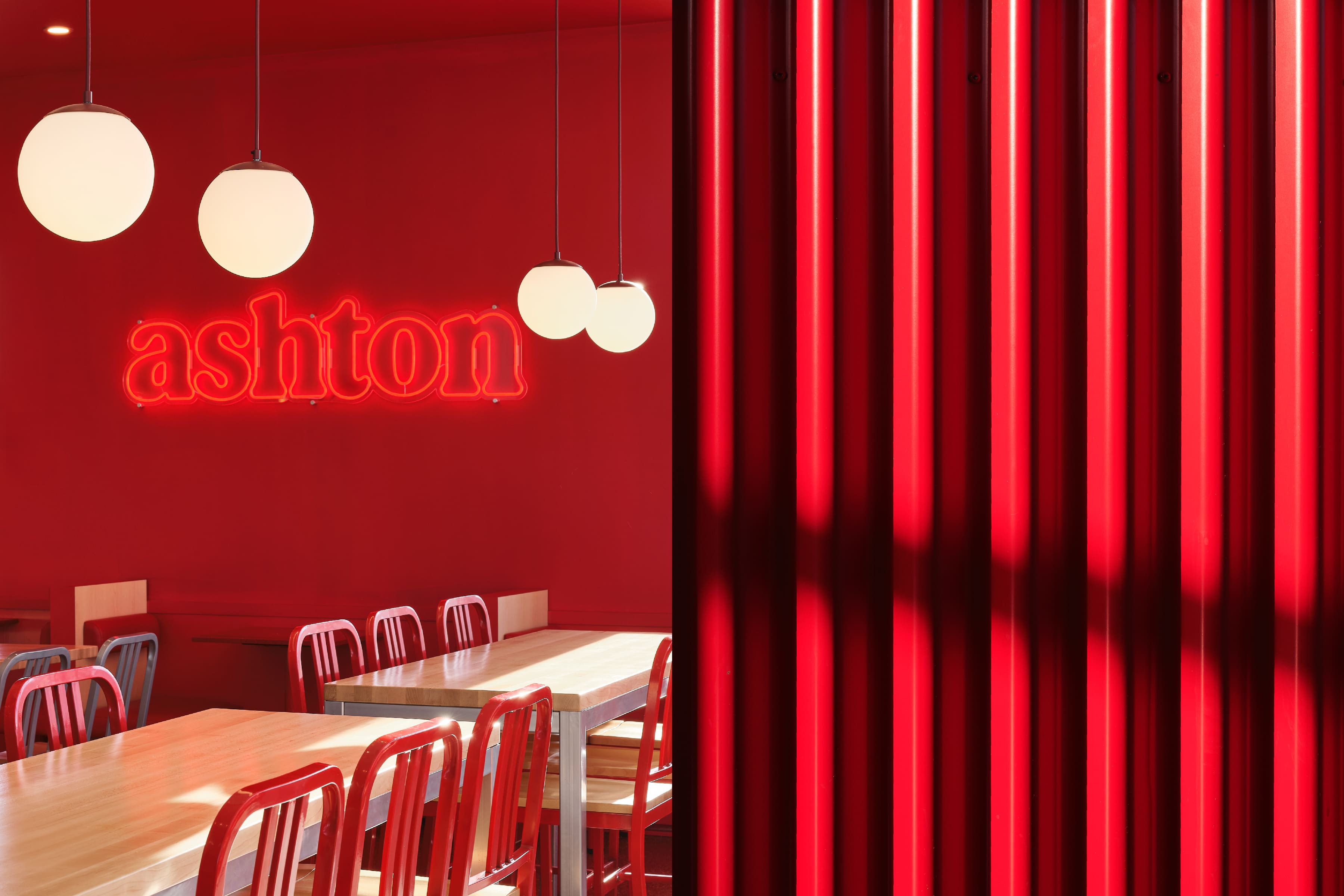
And a fresh image deserves a fresh experience: to fully embrace Ashton’s new era, the customer experience was completely rethought. This transformation is evident from the exterior design to the interior details, which reflect the brand’s roots. The pervasive curves, the triple red stripe that runs along the customer path and furniture, the neon lighting and the red tin roof are all reminiscent of Ashton’s original 1969 food trailer. To create an atmosphere as comforting as its dishes, a monochrome red border lines the dining room, echoing the oval outline found in the brand’s signature. A variety of seating options are offered in the centre of the restaurant, with the famous banquettes remaining a key feature. The new brand identity is expressed in the selection of materials, colours, signage and imagery that captures the great classics of the menu. This easily reproducible layout will extend to other restaurants undergoing the same transformation over the next few years.
The result: a 100% refreshed image that retains its authenticity and appeals to even the most die-hard fans. The figures speak for themselves:
35% increase in traffic at the first renovated branch (Vanier branch in Quebec City)
34% increase in sales at the first renovated branch (Vanier branch in Quebec City)
40% increase in visits to the Ashton website within 30 days of launch
Ashton found the winning recipe for retaining loyal customers while attracting new fans looking for a retro yet contemporary experience.
CREDIT
- Agency/Creative: LG2
- Article Title: LG2 Revamps Ashton: A Modern Take on Canada’s Oldest Poutine Chain Brand
- Organisation/Entity: Agency
- Project Type: Packaging
- Project Status: Published
- Agency/Creative Country: Canada
- Agency/Creative City: Québec, Québec
- Market Region: North America
- Project Deliverables: Architecture, Architecture Concept, Architecture Visualisation, Brand Architecture, Brand Design, Brand Experience, Brand Identity, Brand Redesign, Brand Refinement, Brand Rejuvenation, Brand Strategy, Calligraphy, Design, Interior Design, Logo Design, Packaging Design, Packaging Guidelines, Product Architecture, Product Design, Rebranding, User Experience
- Format: Box, Cup
- Industry: Food/Beverage
- Keywords: packaging, branding, design, new, brand
-
Credits:
CHIEF CREATIVE OFFICERS: Marc Fortin
CHIEF CREATIVE OFFICERS: Luc Du Sault
CHIEF CREATIVE OFFICERS: Josh Stein
VICE-PRESIDENT, EXECUTIVE CREATIVE DIRECTION: Nicolas Boisvert
VICE-PRESIDENT, EXECUTIVE CREATIVE DIRECTION: Jacques De Varennes
CREATIVE DIRECTION: Mira Moscatel Gauthier
ART DIRECTION: Anthony Verge
ART DIRECTION: Mira Moscatel Gauthier
COPYWRITING: Béatrice Lachance
STRATEGIC PLANNING: Christine Larouche
STRATEGIC PLANNING: Alexandre Normand
NUMERIQUE ART DIRECTION: David Boivin
ACCOUNT MANAGEMENT: Gabriella Côtes
ACCOUNT MANAGEMENT: Anne-Renée Turcotte
ACCOUNT MANAGEMENT: Laurie Slater
MOTION: Daniel Martinez-Mendoza
EDITING: Daniel Martinez-Mendoza
GRAPHIC PRODUCTION: Sylvain Grégoire
PHOTOGRAPHER: Virginie Gosselin
ILLUSTRATION: Charles Turcotte
GRAPHIC ARTIST: Sylvain Grégoire
GRAPHIC ARTIST: Marc Rivest


