


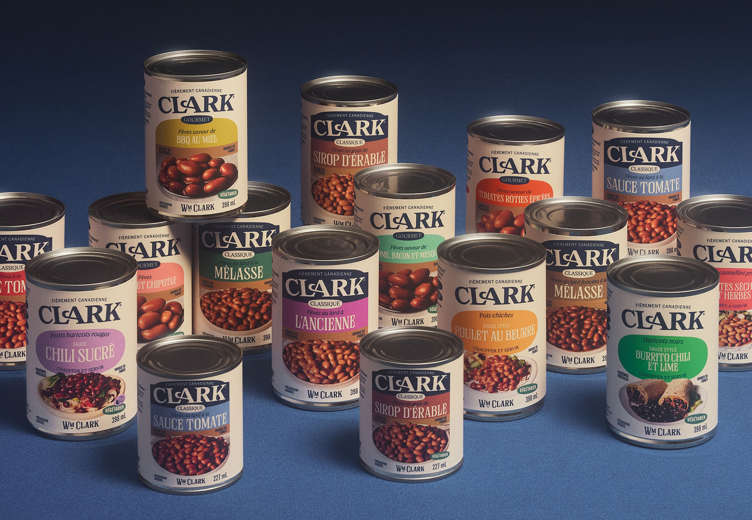
Since 1877, Clark has been a classic in Quebecers’ pantries. Aliments Ouimet strived for innovation in its category by introducing new gourmet flavors and new dishes showcasing legumes, an increasingly popular food. The challenge was significant: finding the right balance between tradition and modernity to attract new clientele, while allowing the brand to evolve into two distinct sections of the grocery store. The goal was to clearly differentiate itself from existing commercial offerings, especially outside Quebec.
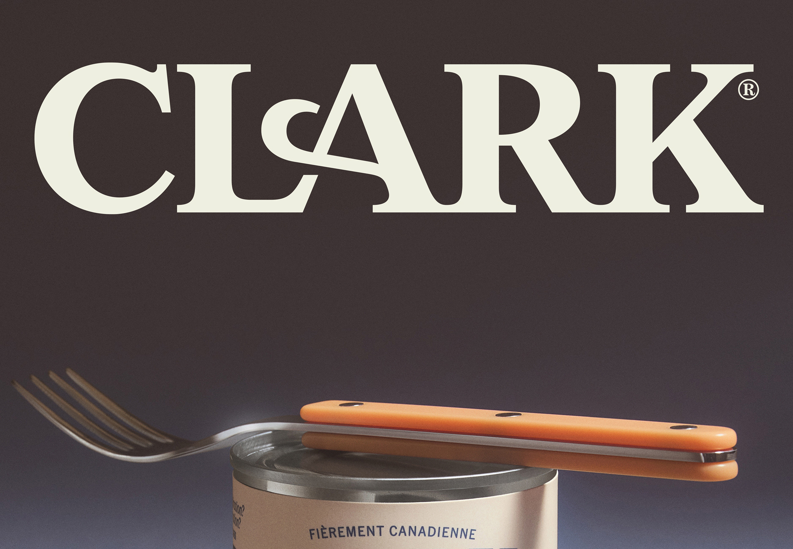
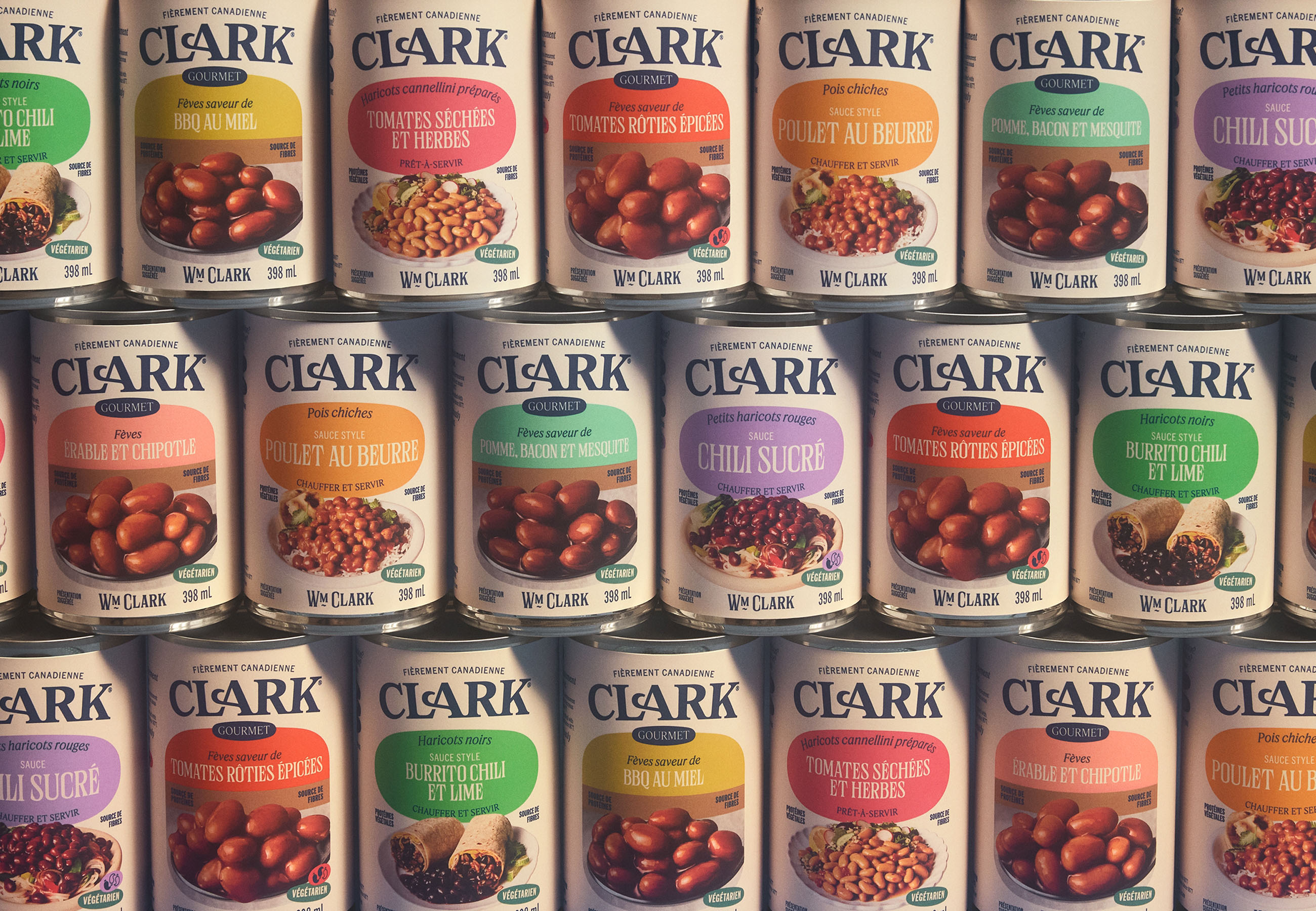
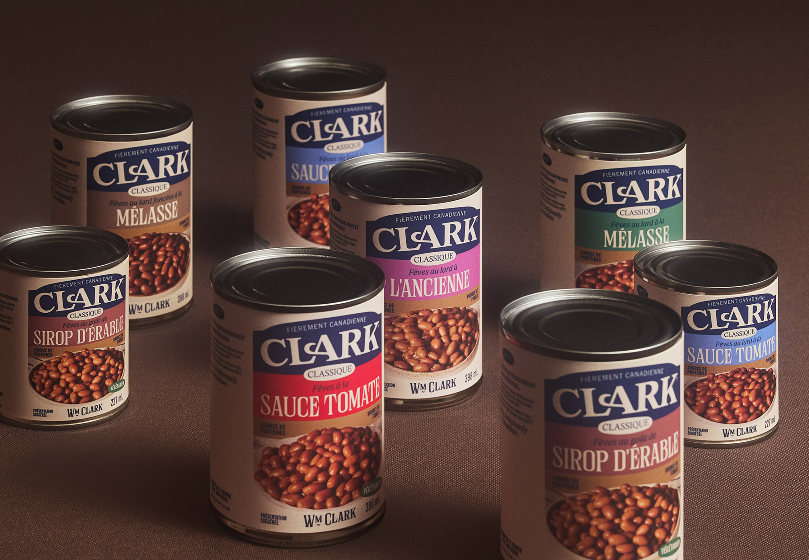
LG2 developed a clear design solution to allow the sub-brands to coexist. Every element was revisited. The logo evolved into a streamlined horizontal (oblong) shape, and William Clark’s signature was integrated, reaffirming the brand’s heritage. The colour palette was expanded to ensure optimal navigation across the brand’s various ranges and flavors.
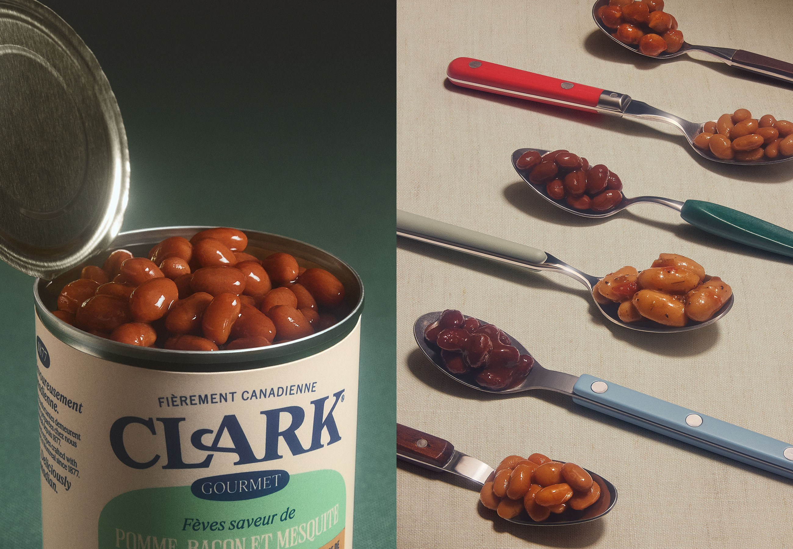
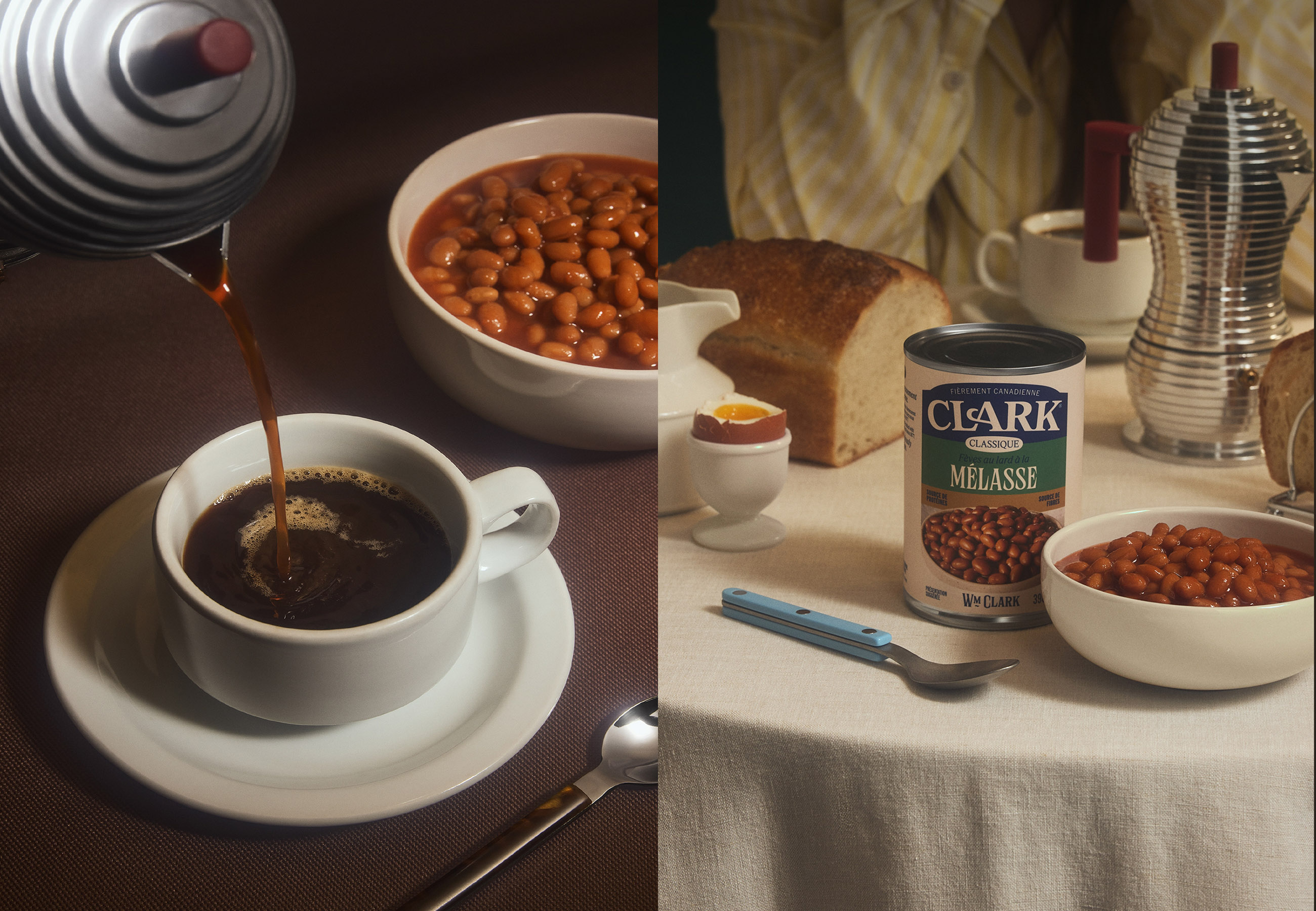
The photographic direction, with its soft and comforting ambiance, is reminiscent of recipe books from the 1970s. The approach is playful and witty with label shapes that are inspired by beans—white beans, to be exact—and clever copywriting sprinkled with puns such as “savoir-fève” (a play on savoir-faire or expertise).
This Clark rebrand reasserts its relevance for consumers and allows for the introduction of innovative products. A beautiful balance between modernity and heritage, this evolution positions the brand as a timeless culinary innovator, ready to attract new generations of consumers while honoring its status as a Canadian icon.

CREDIT
- Agency/Creative: LG2
- Article Title: LG2 Refreshes Clark With a Heritage Led Packaging System Built for New Gourmet Legume Ranges
- Organisation/Entity: Agency
- Project Type: Packaging
- Project Status: Published
- Agency/Creative Country: Canada
- Agency/Creative City: Montréal
- Market Region: North America
- Project Deliverables: Brand Redesign, Brand Strategy, Copywriting, Logo Design, Packaging Design
- Format: Can
- Industry: Food/Beverage
- Keywords: Clark rebrand design
-
Credits:
Creative Direction: Marie-Pier Gilbert
Copywriting: Geneviève Jetté
Art Direction: Sophie Valentine
Design: Sophie Valentine
Layout Artist: Carmen Labonne
Strategic Planning: Nathalie Houde
Client Services: Ingrid Roussel
Project Management, Production: Anita Khieu
Agency Production: Vincent Boivent
Photography: Virginie Gosselin
Mac Artists: Julie Hotte


