Let’s Chill – Pretty. Punchy. Poured to Chill.
Let’s Chill is an unapologetically bold canned cocktail brand designed with today’s modern, confident woman in mind. More than just a drink, it’s an invitation — to unwind, to celebrate, to show up exactly as you are. With a fresh take on ready-to-drink (RTD) culture, Let’s Chill delivers stylish, flavor-forward cocktails that fuse sophistication with spontaneity. Think effortless elegance in a can — with a wink, a twist, and a whole lot of personality.
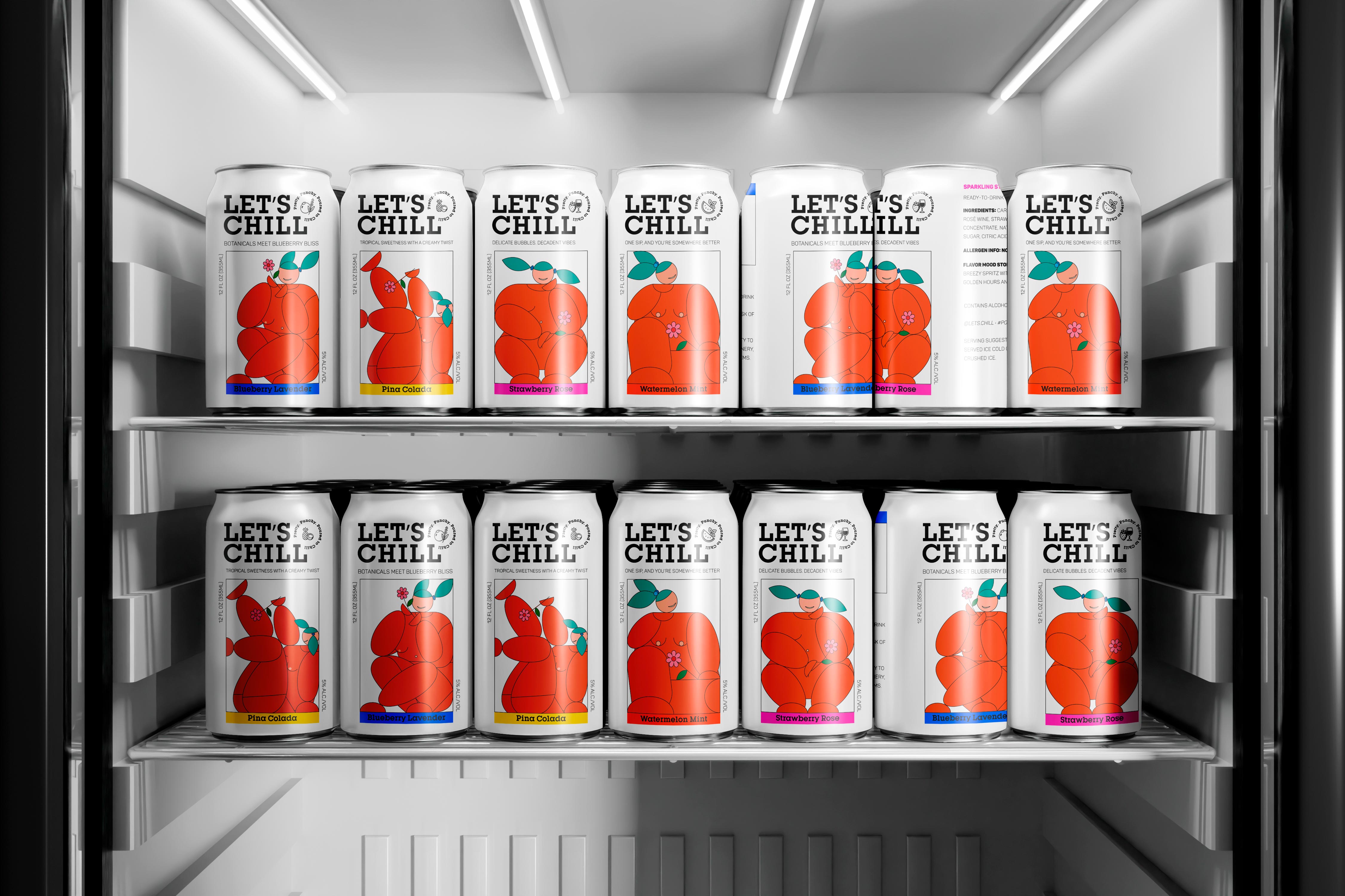
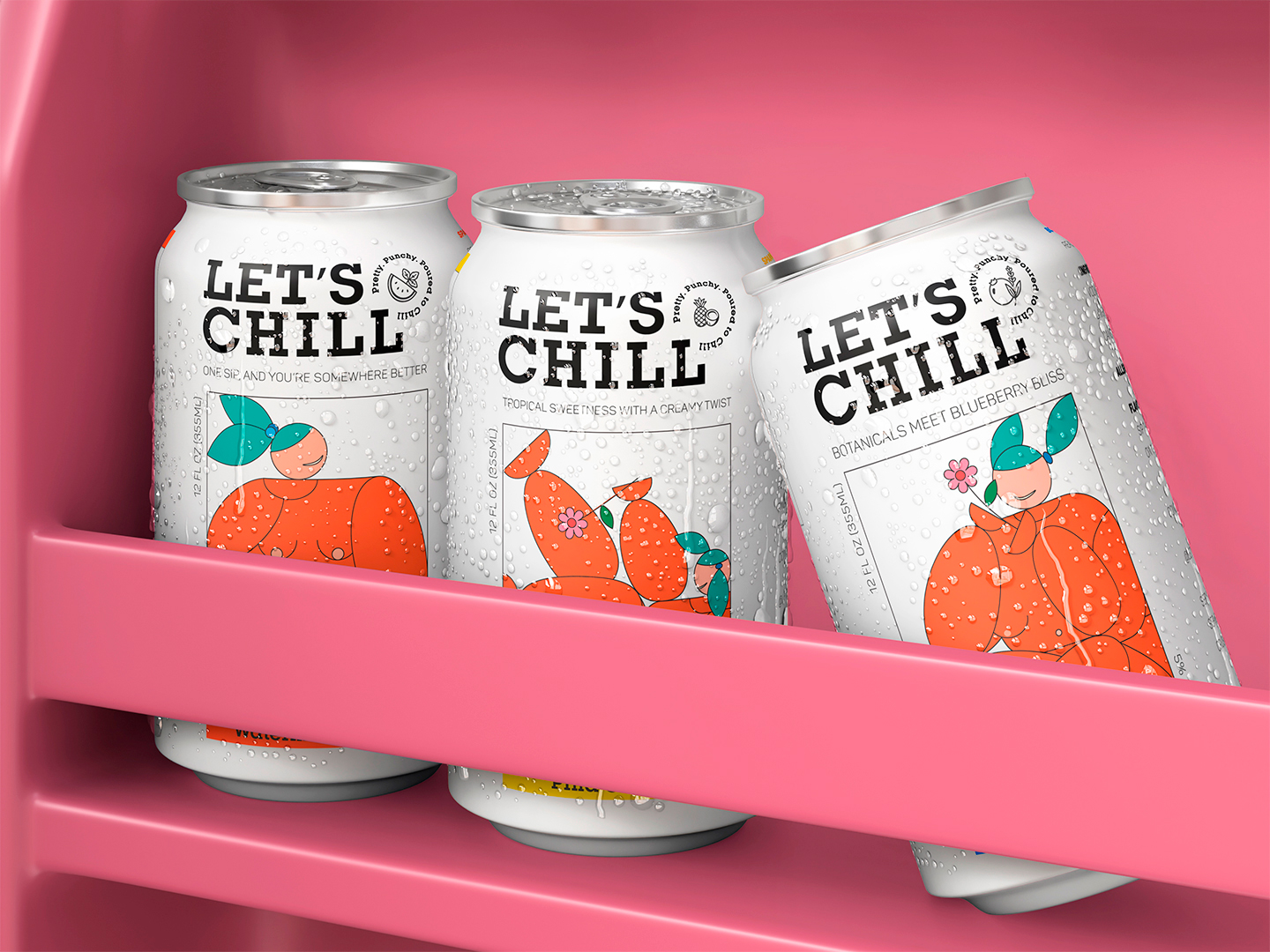
Whether it’s a sun-drenched brunch, a rooftop golden hour, or an impromptu beach day, Let’s Chill was made to be part of those memory-making moments. Each cocktail is crafted to be deliciously sippable, perfectly portable, and always photo-ready. With a strong visual identity, cheeky product names, and refined design choices, this brand doesn’t just sit pretty on the shelf — it demands attention and starts conversations.
The Challenge
In an increasingly saturated RTD market, we knew Let’s Chill had to break through the noise. Our goal was to develop a cocktail brand that:
Speaks directly and authentically to a female-first, style-conscious audience
Balances playful energy with premium sensibilities
Differentiates itself through design, flavor, and voice
Pops off both the retail shelf and the Instagram feed
Clearly communicates taste, mood, and moment with just one glance
The challenge was to develop a brand that feels as good as it tastes — one that’s visually magnetic, emotionally resonant, and intuitively modern.
The Solution
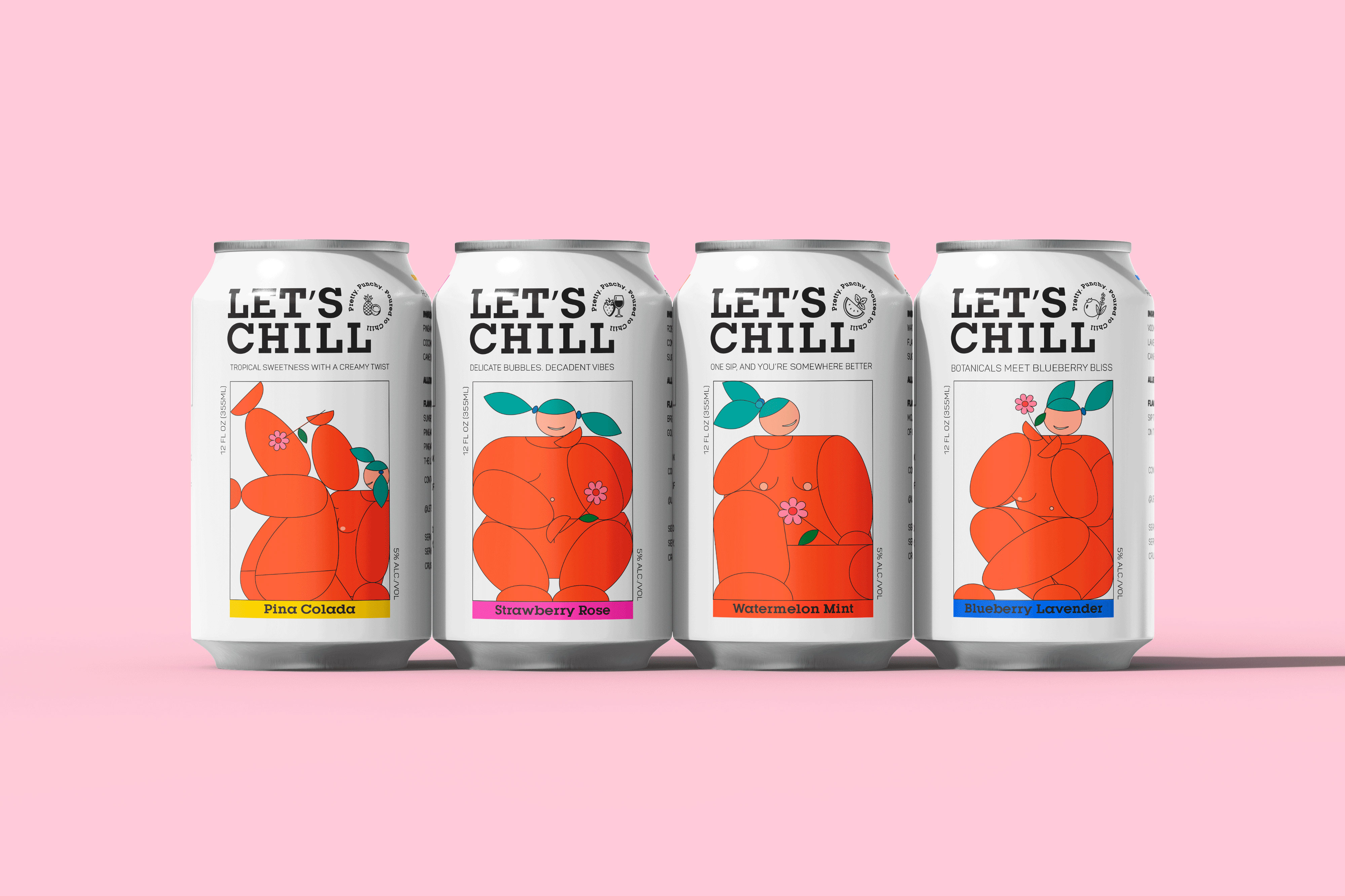
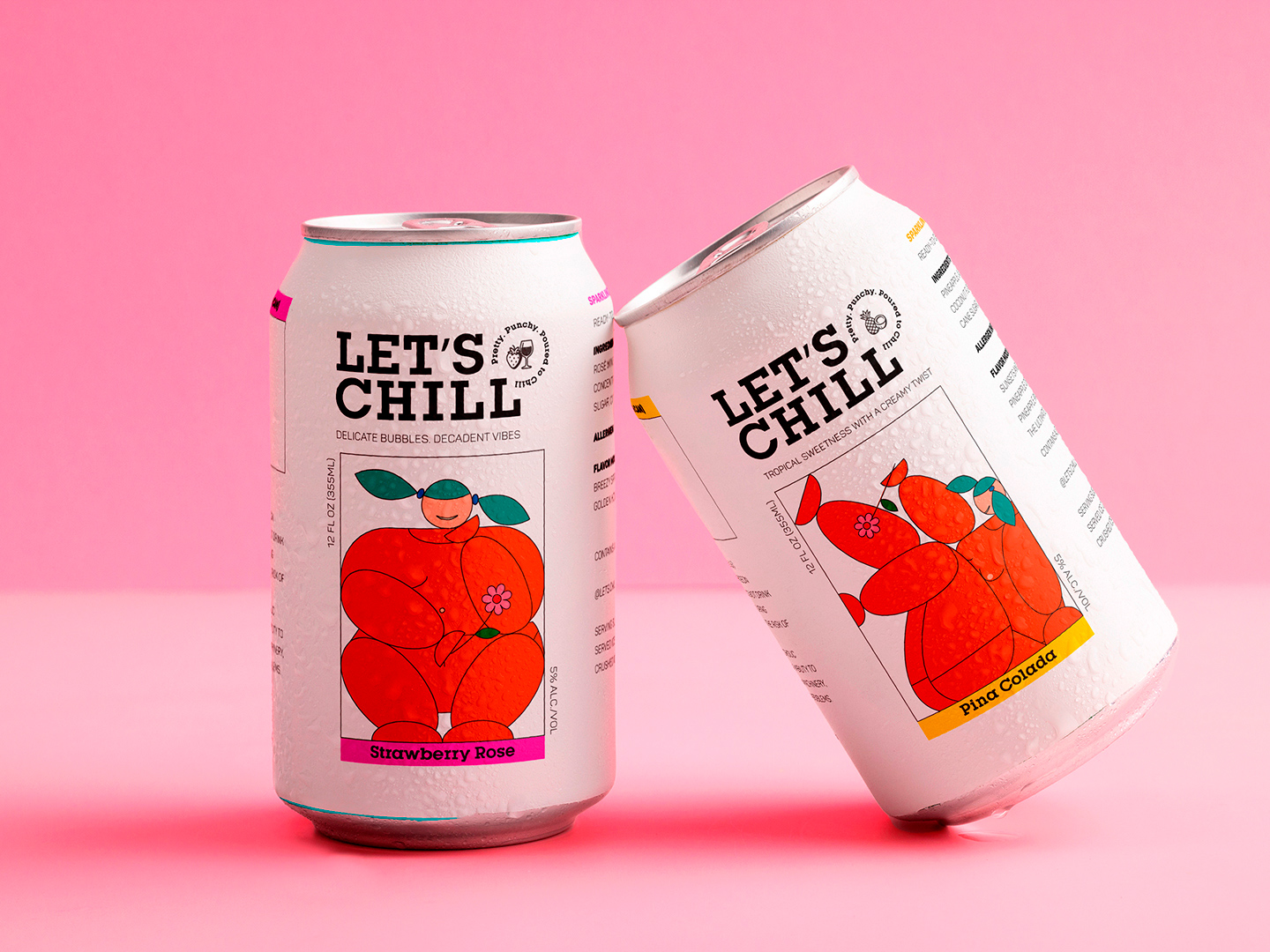
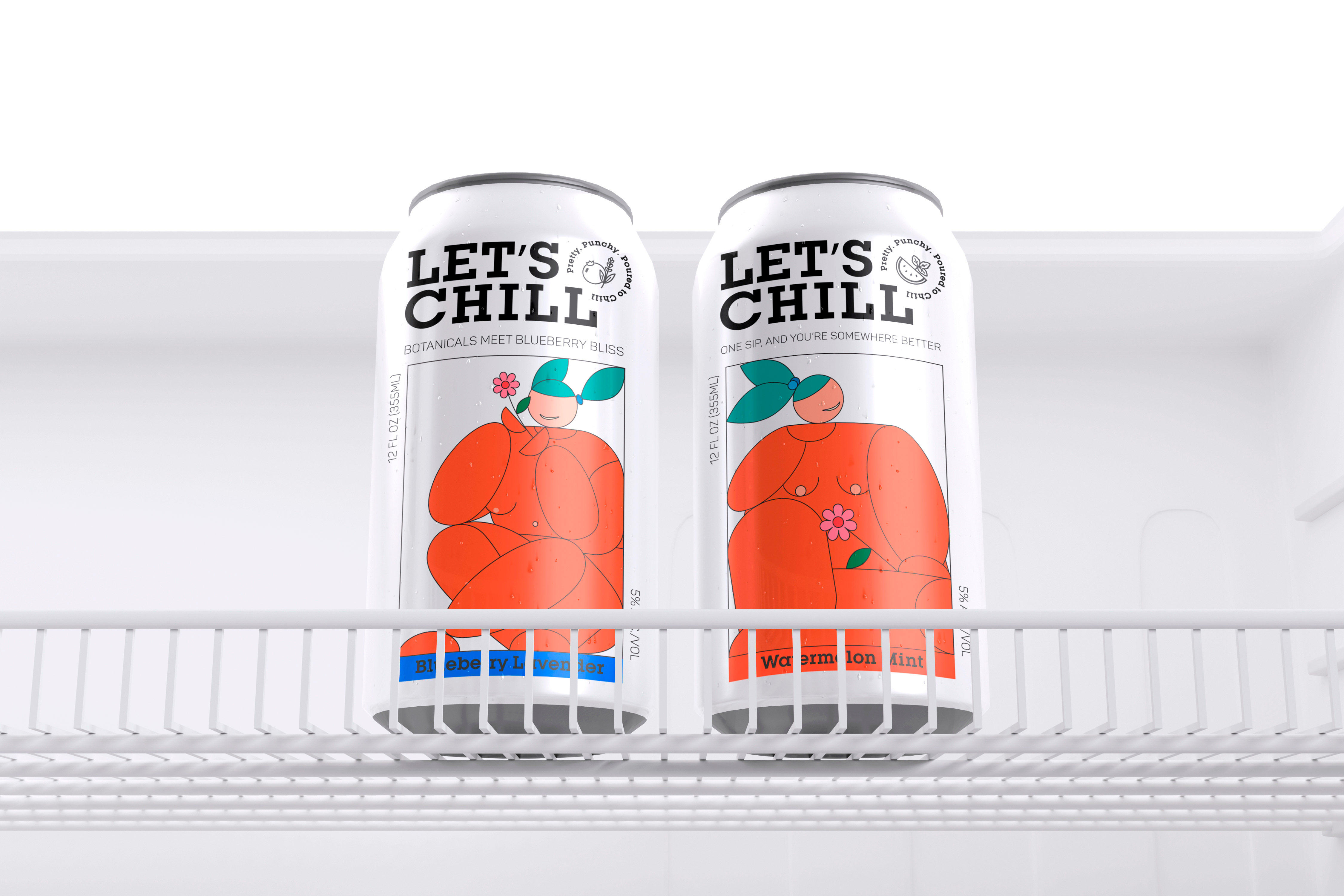
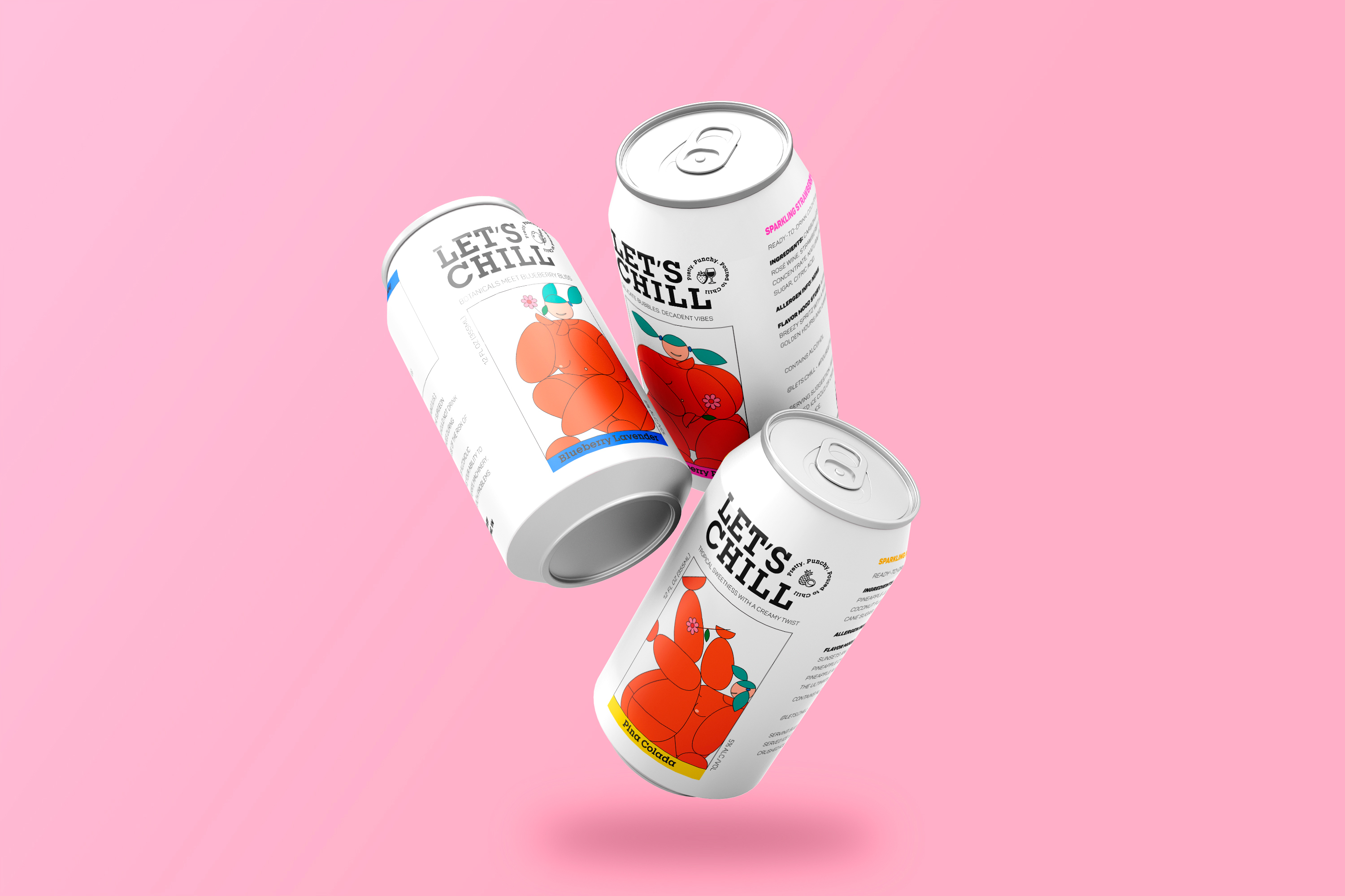
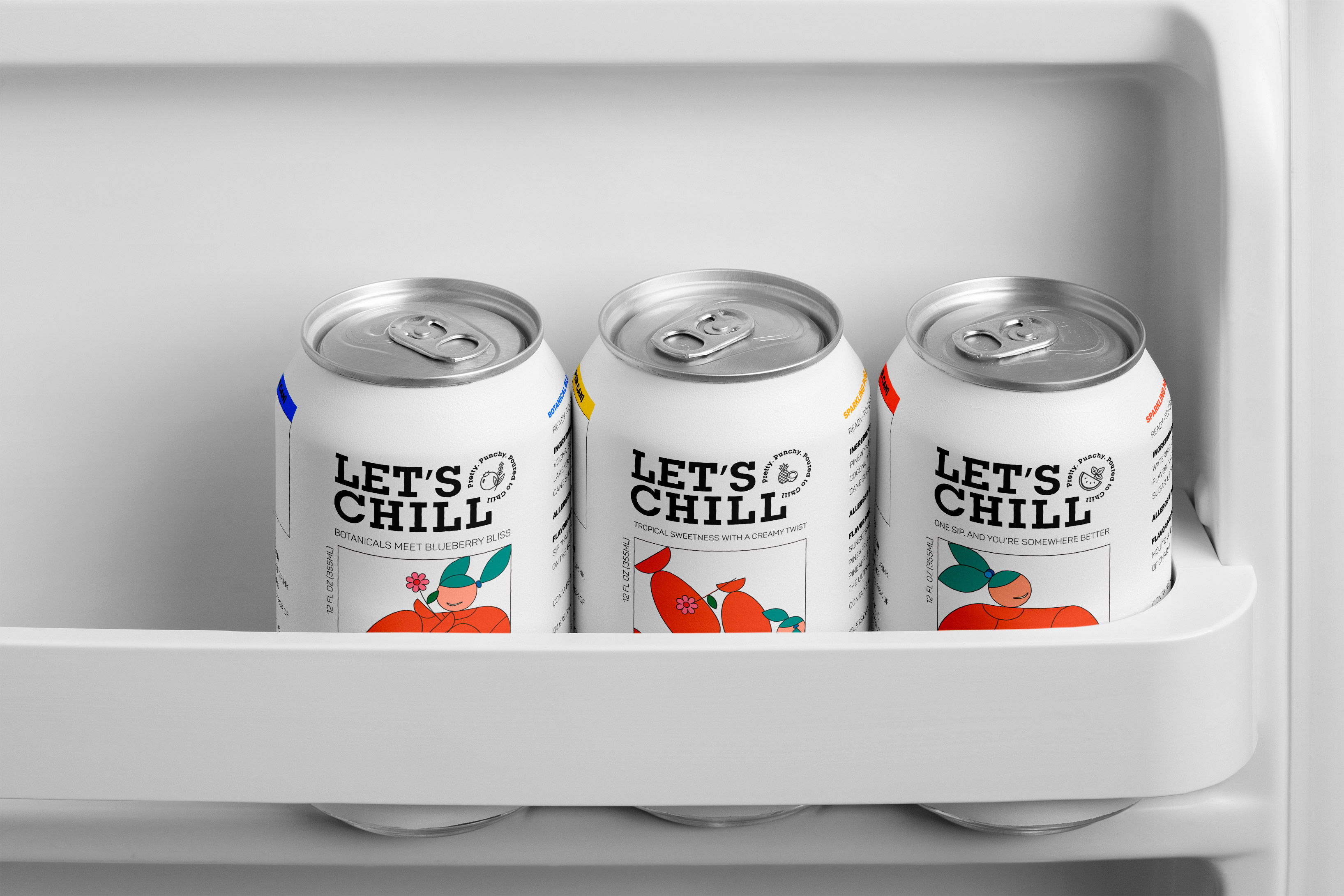
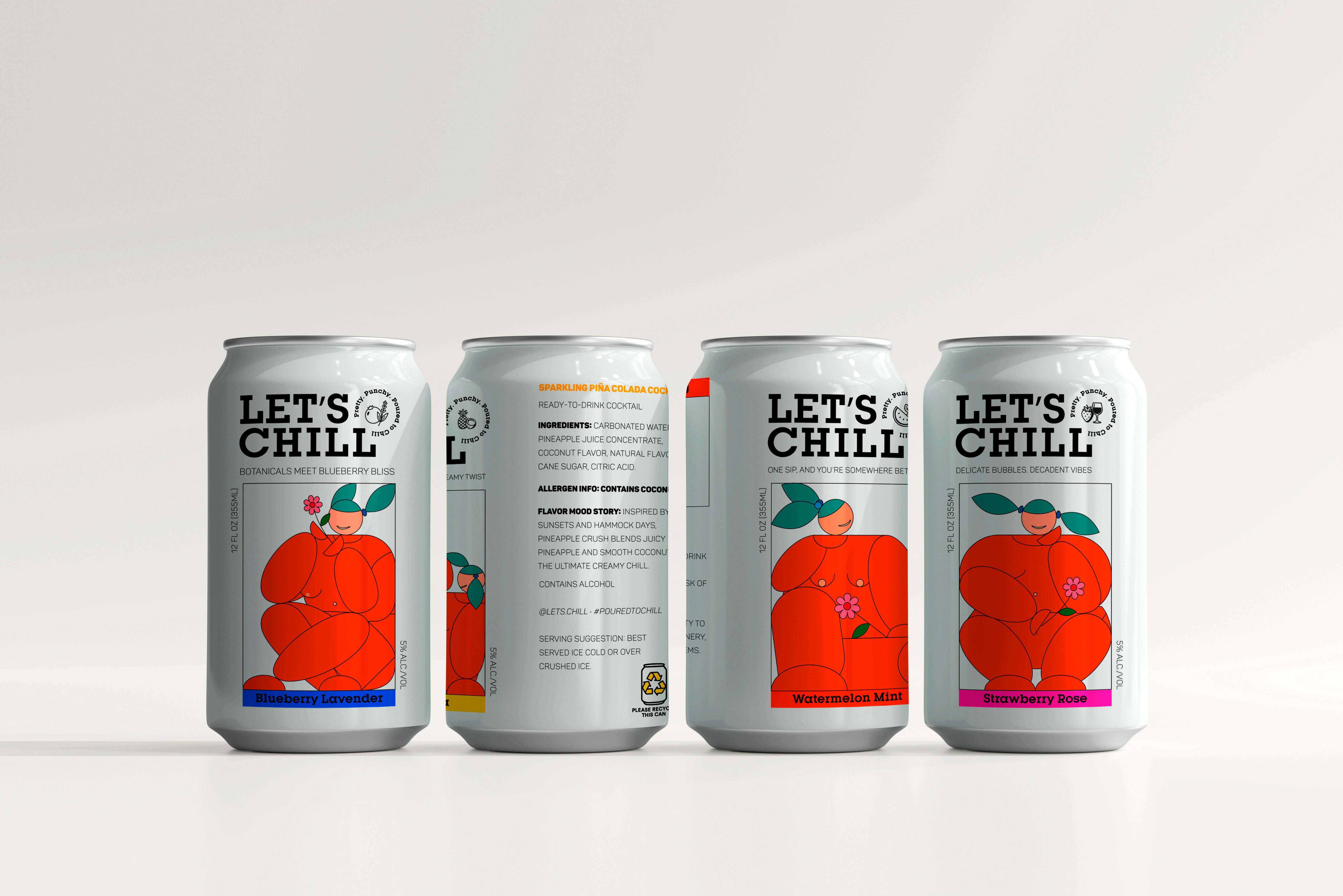
We introduced a four-flavor lineup, each with its own distinct character — reflected through naming, color, and mood-driven storytelling. From citrusy and bright to smooth and sultry, every SKU brings something different to the table, yet they all sit together as a cohesive, covetable collection.
Key design decisions included:
Whimsical, custom illustrations that encapsulate flavor and personality
Mood-specific taglines that cue vibe and occasion
Bold, feminine names that feel fresh, memorable, and fun
Color-coded palettes and a shared design system to unify the brand family
Matte finishes and elegant, high-contrast typography for a modern luxe feel
Compact, scroll-stopping packaging that looks just as good poolside as it does on your bar cart
At the core of the brand is the slogan: Pretty. Punchy. Poured to Chill. It’s more than a tagline — it’s a philosophy. One that celebrates femininity as strength, simplicity as style, and chill as a state of mind.
CREDIT
- Agency/Creative: Tuyen Lam
- Article Title: Let’s Chill Hits the Shelf with Personality-Driven Packaging by NeO Studio
- Organisation/Entity: Freelance
- Project Type: Packaging
- Project Status: Non Published
- Agency/Creative Country: Vietnam
- Agency/Creative City: Tuyen Lam & Duong Dzai
- Market Region: Asia
- Project Deliverables: 2D Design, Brand Design, Illustration, Packaging Design
- Format: Can
- Industry: Food/Beverage
- Keywords: cocktail, can, packaging, pina colada, mojito, alcoho
-
Credits:
Packaging design: Tuyen Lam
Illustration: Duong Dzai


