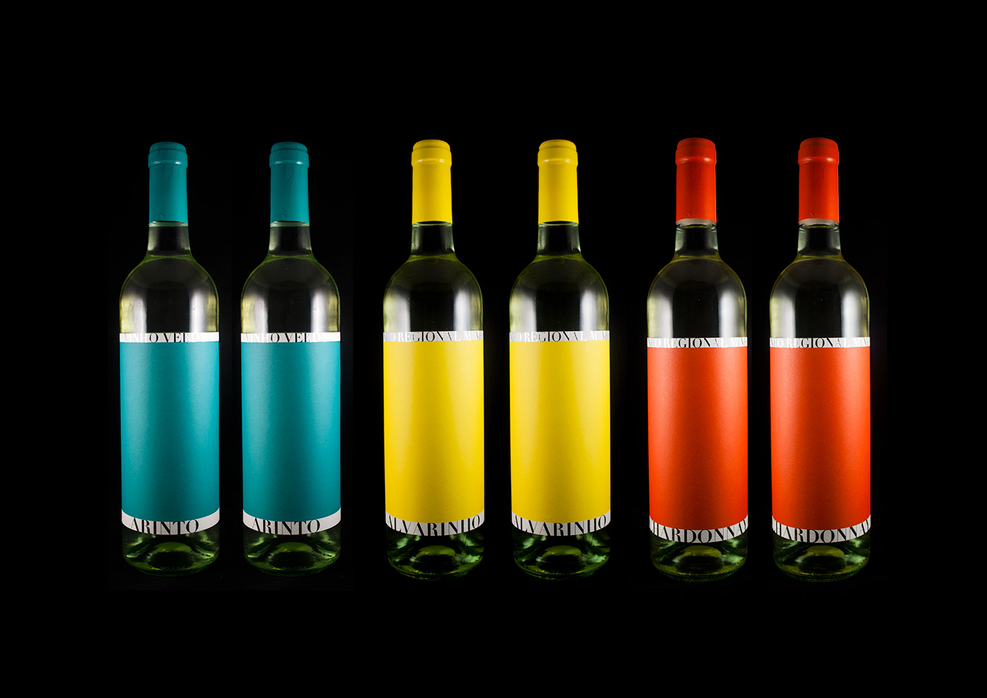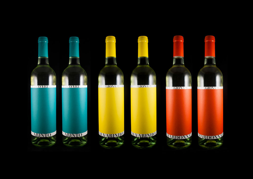
César Moura – BH – Wine Label
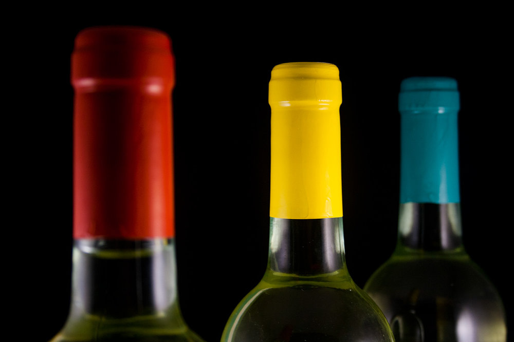
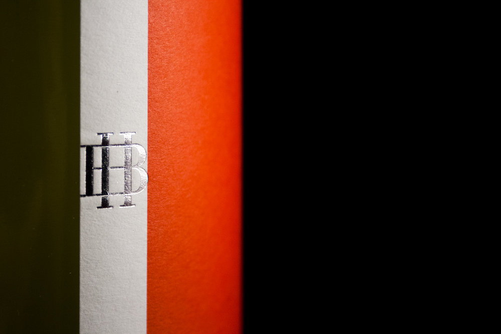
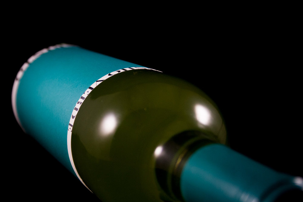
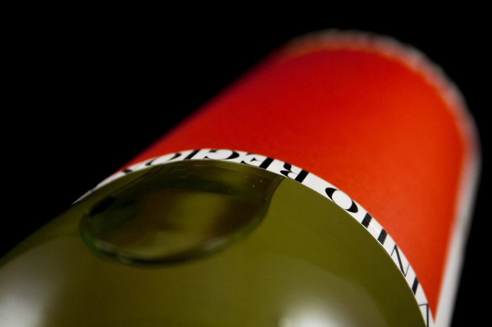
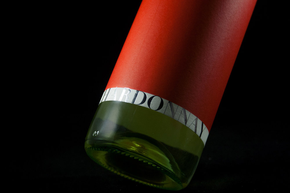
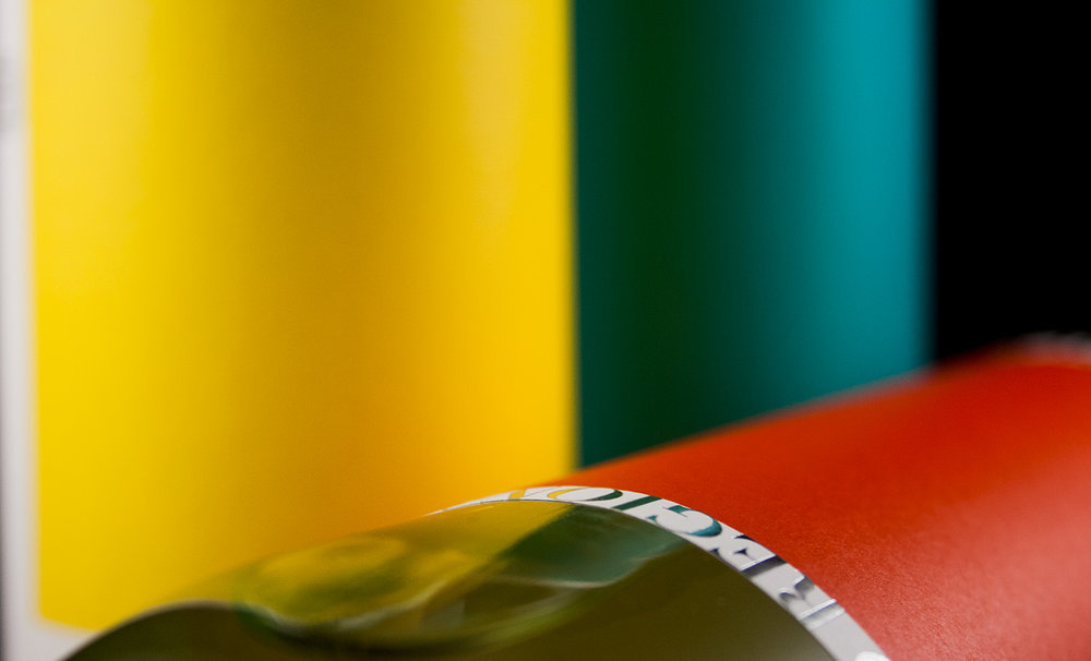
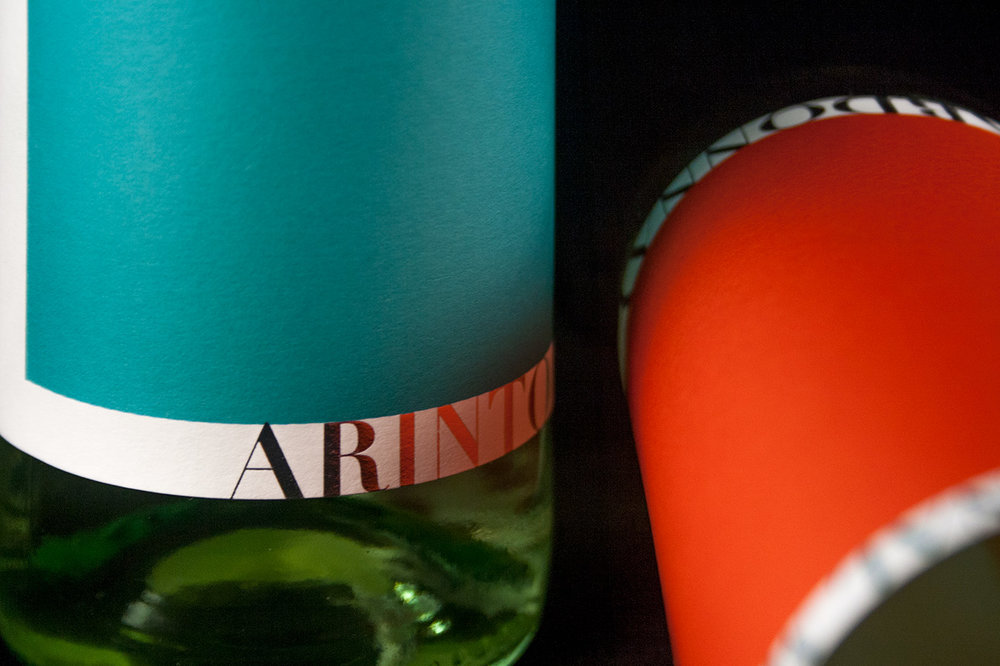
“This was the base concept for this project. In a world where the wine tasters decide which one is good or bad, the public opinion is put aside.This wine aims, in a way, to be a manifesto against the canonical approach in which wine is appreciated these days. Nowadays, a “good wine” needs a white label with a serif font, gold details, lots of information and all the media praising the points given by this or that.This project represents exactly the opposite. It is “nothing” but at the same time “everything”. The “Less is More” is in the roots of this project. These wines have the quality and the perfect image to go along with a romantic dinner or a very sunny summer afternoon.

CREDIT
- Agency/Creative: César Moura
- Article Title: Less is More is in the Roots of this Wine Label Project
- Organisation/Entity: Agency Commercial / Published
- Project Type: Packaging
- Agency/Creative Country: Portugal
- Market Region: Global
- Format: Bottle
- Substrate: Glass


