


LesBonsPlans – A Bold Local Identity Serving Everyday Opportunity
Introduction
In Francophone Africa, millions of people seek to buy, sell, or learn new skills every day — yet very few digital platforms truly address their needs in a reliable, accessible, and modern way. The LesBonsPlans project was born from this observation. More than just a classified ads platform, LesBonsPlans is a bold, community-driven initiative aiming to transform how local communities engage with the digital economy.
This project presented an exciting challenge, blending strategy, design, branding, and deep cultural understanding of the West African market. Here is the story of an identity built to be useful, joyful, accessible, and deeply rooted in the local reality.
The Context: An Underserved Yet Promising Market
Most classified ad platforms in Francophone Africa are either poor adaptations of Western models or outdated, cluttered interfaces that inspire little trust or engagement. Users feel lost. Offerings are unclear. And the experience is often frustrating.
Our initial findings were clear:
Classifieds exist but lack emotion and identity.
Trust between individuals is fragile.
Most users are young, mobile-first, and underserved.
No platform speaks their visual or emotional language.
We were asked to completely rethink the experience, from the visual identity to brand communication, with one strong belief: bring dignity, clarity, and trust to local opportunities through a modern and engaging platform.
The Objective
Our goal was to develop a full brand identity for a new online classified ads platform targeting Francophone Africa, built to convey trust, simplicity, and positive opportunity.
Our mission included:
Designing the logo and full graphic system
Establishing the art direction for web and digital presence
Creating custom templates, icons, and illustrations
Defining the brand tone and strategic positioning
The Name: LesBonsPlans
“Les Bons Plans” literally translates to “The Good Deals” in French. It’s simple, optimistic, and instantly understood by French-speaking audiences. It evokes affordable opportunities, useful discoveries, and practical tips.
The decision to keep the name in French was intentional — paying tribute to the Francophone digital community, while remaining easily pronounced and remembered locally.
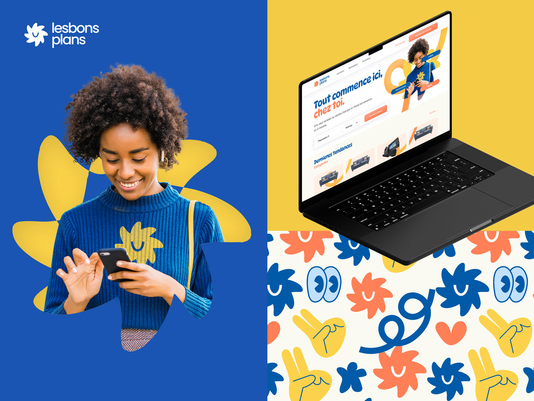
The Logo: A Symbol of Optimism and Action
The logo is inspired by a stylized star, formed from a universal hand gesture — one that suggests celebration, interaction, or pointing toward something exciting. It captures the joy of discovery and the active, vibrant nature of the platform’s community.
The symbol is part of a modular system, designed to be used across print, digital, merchandise, and motion graphics.
The chosen typography is round, friendly, and highly legible, reinforcing an accessible yet structured tone, perfectly aligned with the digital-first use of the brand.
The Colors: Bold, Warm, and Culturally Resonant
The color palette is built around three bold tones:
Deep Blue – for trust, structure, and clarity
Ochre Yellow – for energy, warmth, and optimism
Coral Orange – for emotion, proximity, and joy
These colors evoke the atmosphere of local markets, textiles, and landscapes, while remaining bright and web-friendly to support a modern interface and strong visual presence.
The Patterns: A Visual Language Rooted in Culture
We developed a set of custom patterns and illustrations that form a dynamic visual language. These include:
Abstract hand gestures (peace, okay, thumbs up)
Playful typographic icons (eyes, hearts, stars)
Stylized local references and symbolic elements
These motifs are used across backgrounds, print materials, social media, and more, giving the brand personality, cultural depth, and emotional connection, without overloading the design.
The Tone of Voice: Friendly, Direct, and Community-Focused
The editorial tone breaks away from the cold, corporate language seen in many platforms. At LesBonsPlans, the voice is warm, casual, and inclusive. It says:
“Here, everything starts at home.”
“This is your chance.”
“Together, we grow.”
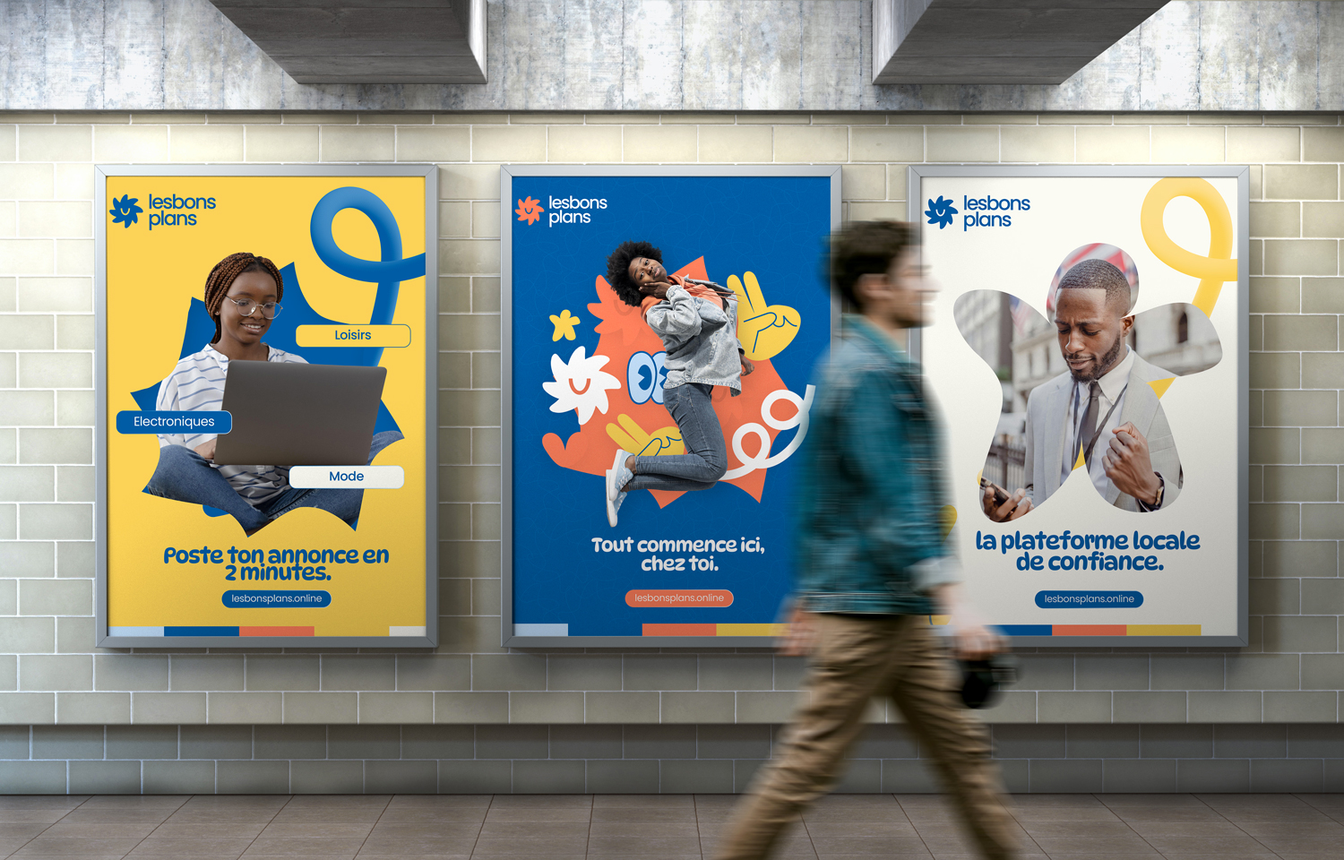
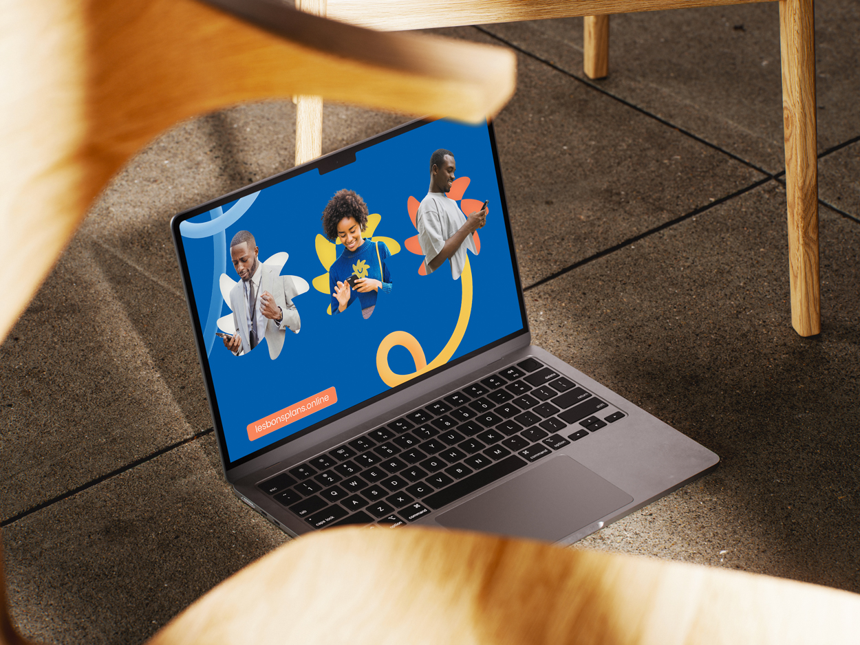
Using direct language and second-person voice (you) builds immediate connection. The slogan, “Tout commence ici, chez toi” (Everything starts here, at your place), is both a promise and a manifesto: transformation begins locally, with you.
Rollout and Deliverables
To ensure a seamless, consistent brand presence, we delivered a comprehensive set of assets:
Social media visuals and content templates
Web and mobile banners
Business cards and digital identity kits
UI design guidelines
Printable posters and promo kits
Editable Canva templates for internal teams
Every asset was built to be easily adaptable, ensuring longevity and usability as the platform scales.
The Website: Designed for Clarity and Action
The user interface was built around three key principles:
Clarity – intuitive design, clear categories, and fast loading
Accessibility – mobile-first, lightweight, and inclusive
Trust – verified listings, clear contact flows, and guidance
Calls-to-action are prominent. Forms are short and simple. The identity comes to life through playful backgrounds, colorful illustrations, and user-centric design.
Impact and Vision
LesBonsPlans is more than a technical product. It’s a local innovation tool, a community builder, and a catalyst for economic empowerment. It provides access to:
Local jobs and services
Product resellers and trusted individuals
Educational opportunities and freelance missions
Future ambitions include:
Expansion across Francophone Africa
Launching a learning and skills section
Creating a loyalty reward system for active users
Conclusion
With LesBonsPlans, we’ve proven that a modern, colorful, and culturally grounded brand can emerge from local insight and bold vision.
This brand was not built in a vacuum — it is deeply embedded in local values, real needs, and everyday behaviors.
It speaks with joy and precision, bringing together trust, design excellence, and social impact.
We believe every digital user in Africa deserves platforms that reflect their identity and ambition.
LesBonsPlans turns simple clicks into connection, discovery, and opportunity.

CREDIT
- Agency/Creative: Malnux
- Article Title: Lesbonsplans Brand Identity by Malnux
- Organisation/Entity: Freelance
- Project Type: Identity
- Project Status: Published
- Agency/Creative Country: Niger
- Agency/Creative City: Niamey
- Market Region: Africa
- Project Deliverables: Art Direction
- Industry: Retail
- Keywords: E-Commerce, Classified Ads, Buy,Sell,Retail
-
Credits:
Art Direction: Abdoul Malik Hamidou Idi


