


The Client
Leone Consulting Group is a professional group rooted in tax expertise, aiming to integrate IT technology into existing tax services to not only enhance business efficiency but also elevate customer satisfaction through an all-in-one service solution. By expanding to include tax firms, IT firms, and HR consulting around the consulting group, we strive to grasp the diverse needs of customers comprehensively and propose high-satisfaction solutions tailored to their current situations.
The Objective
LEONE Consulting Group needed a distinctive identity and image to develop and secure its competitiveness in the market. To appeal to customers with the brand’s unique value proposition, a clear concept considering both functionality and emotion was developed. Trustworthy naming, appealing to professionalism and service strengths intuitively, along with a differentiated look and feel from traditional tax firms, through friendly and trendy BI design, aims to engrave the brand as authentic to customers.
The Solution
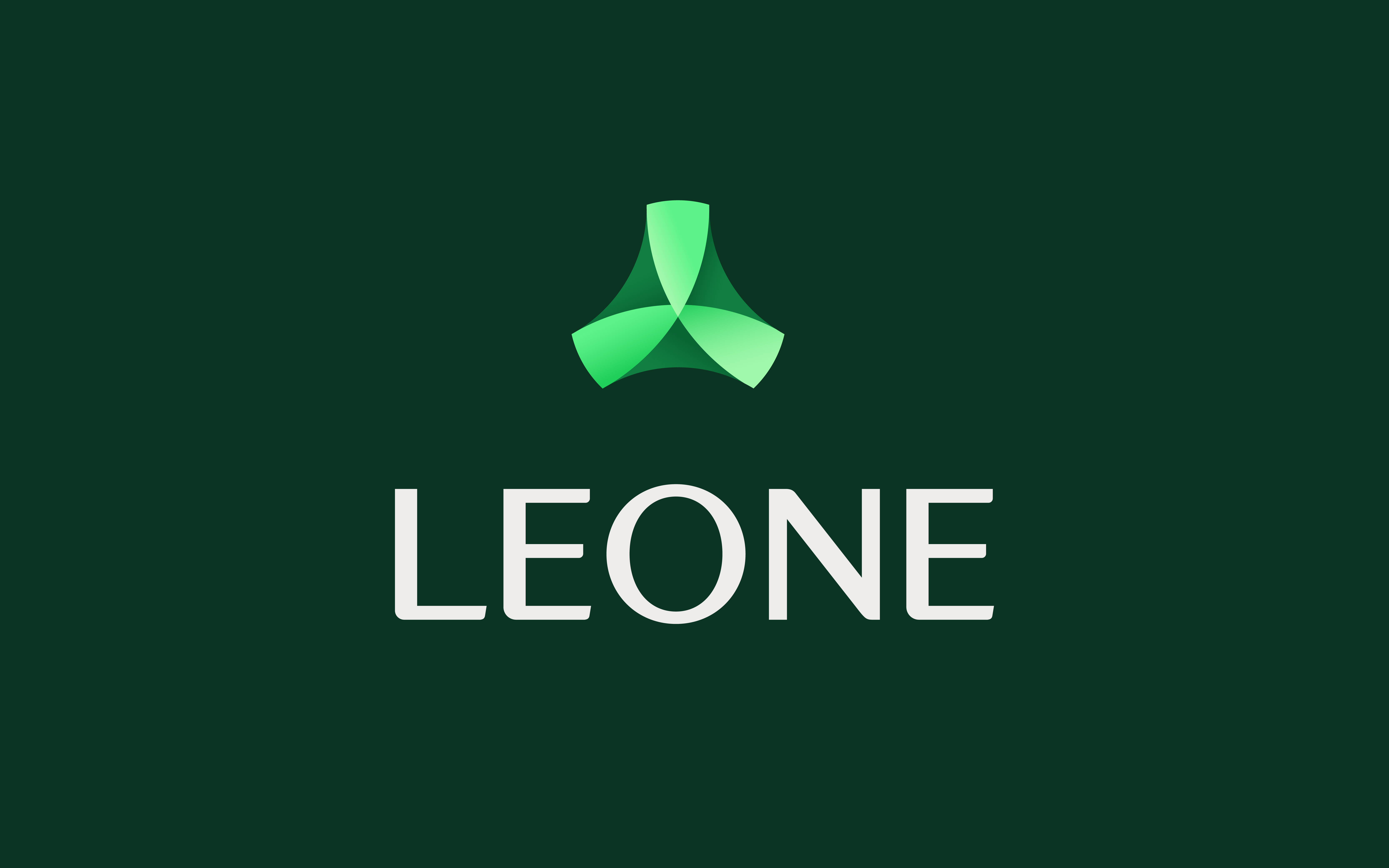
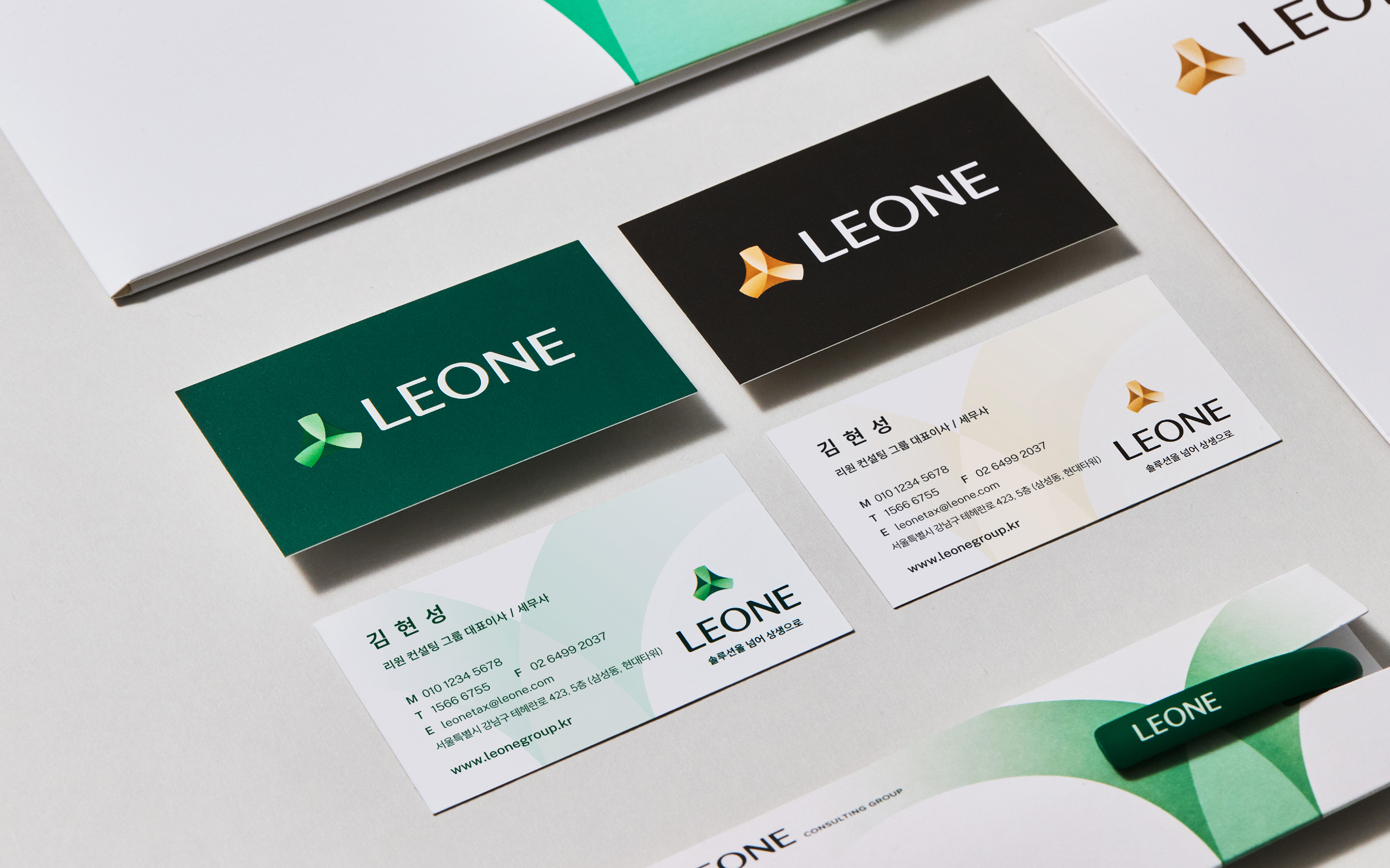
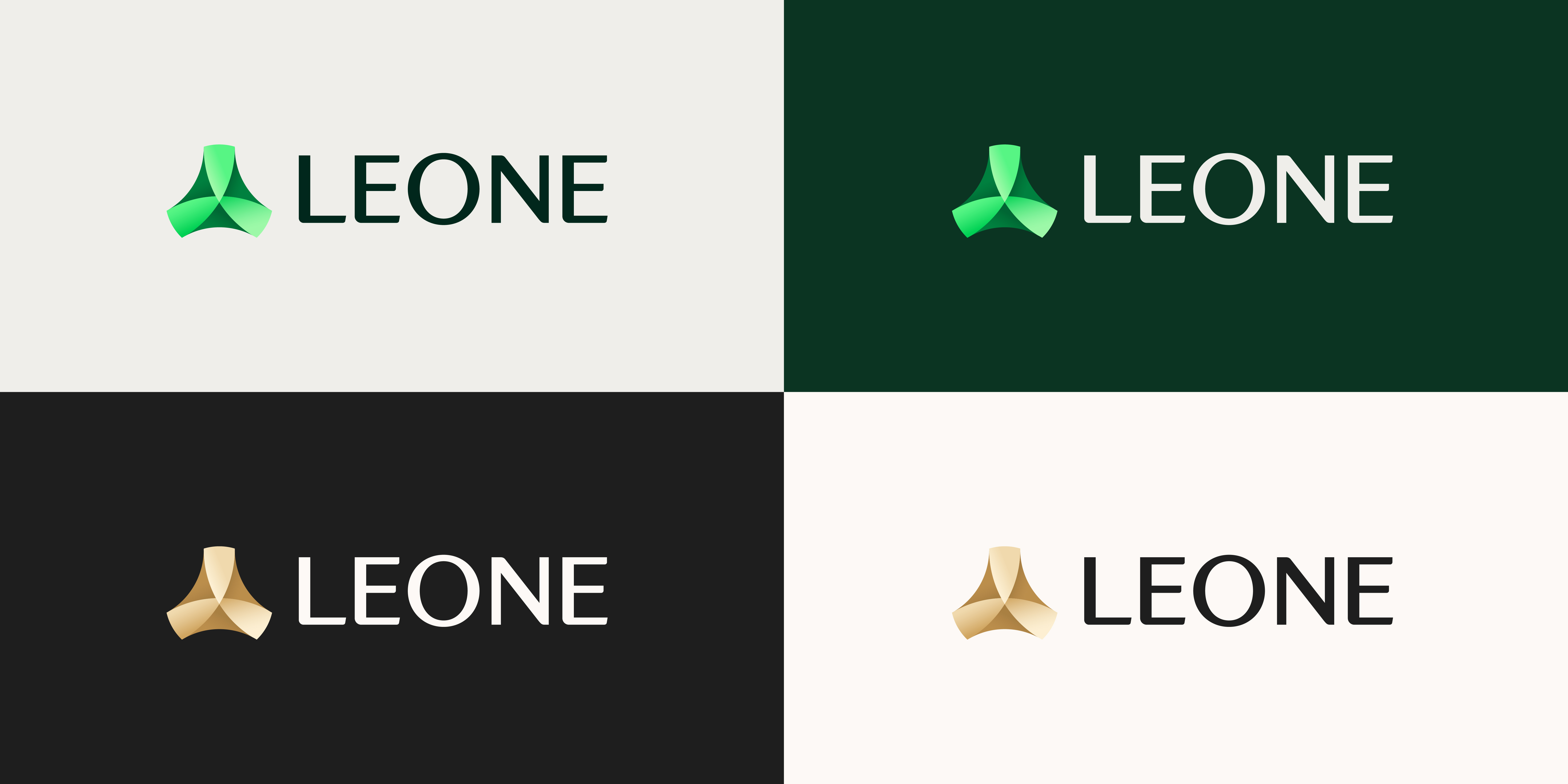
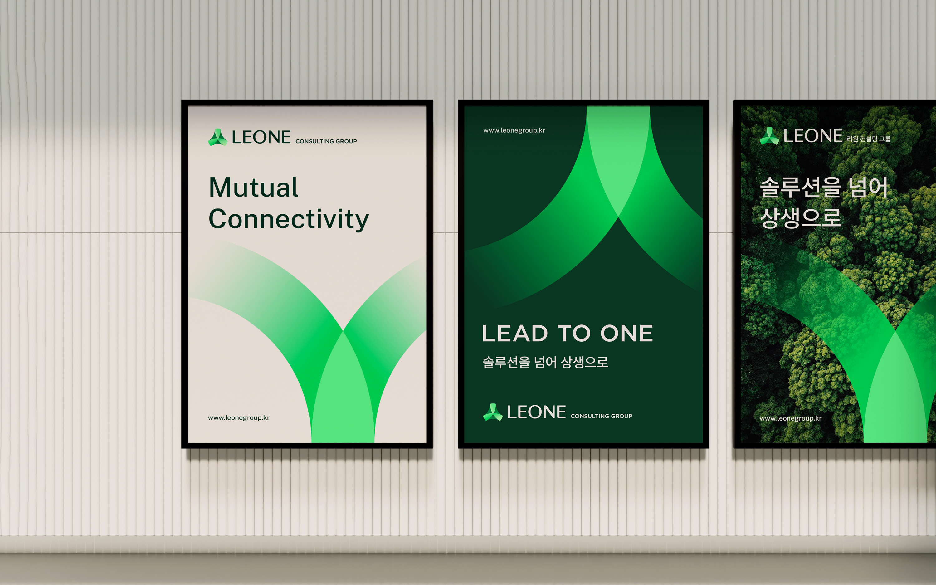
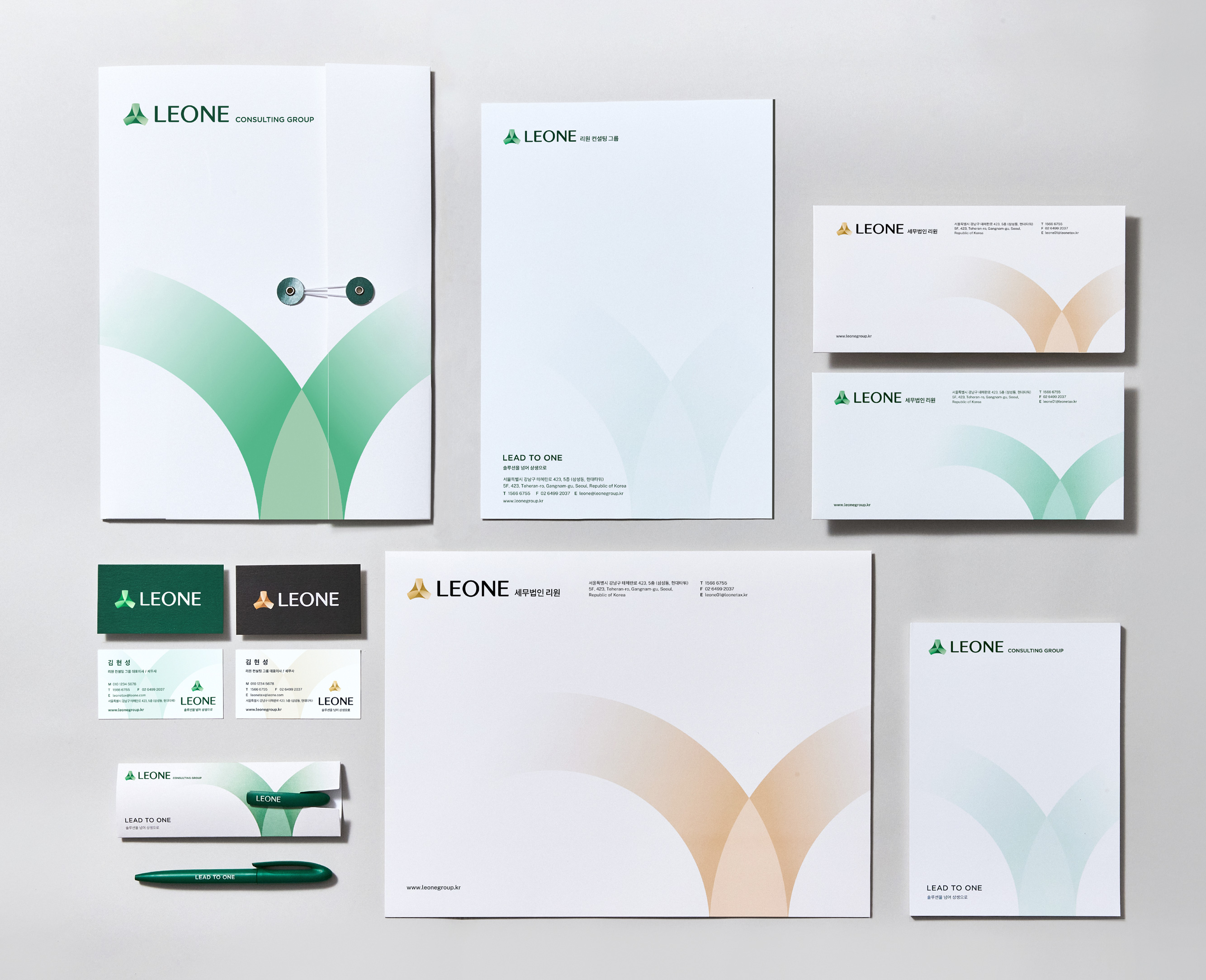
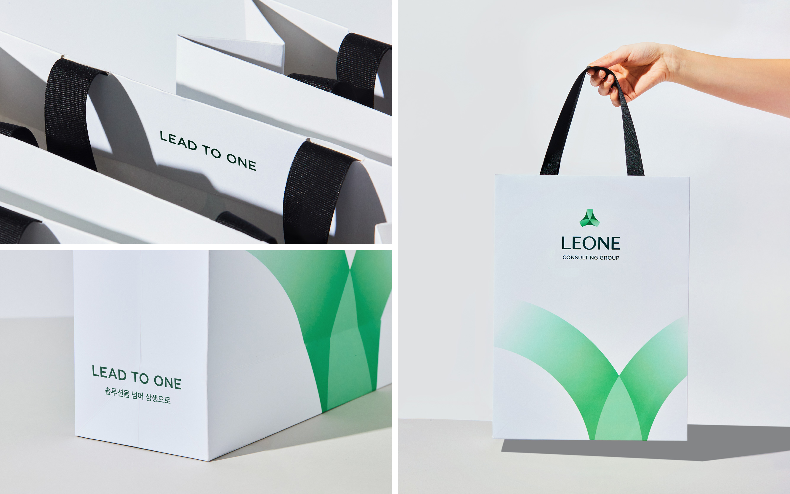
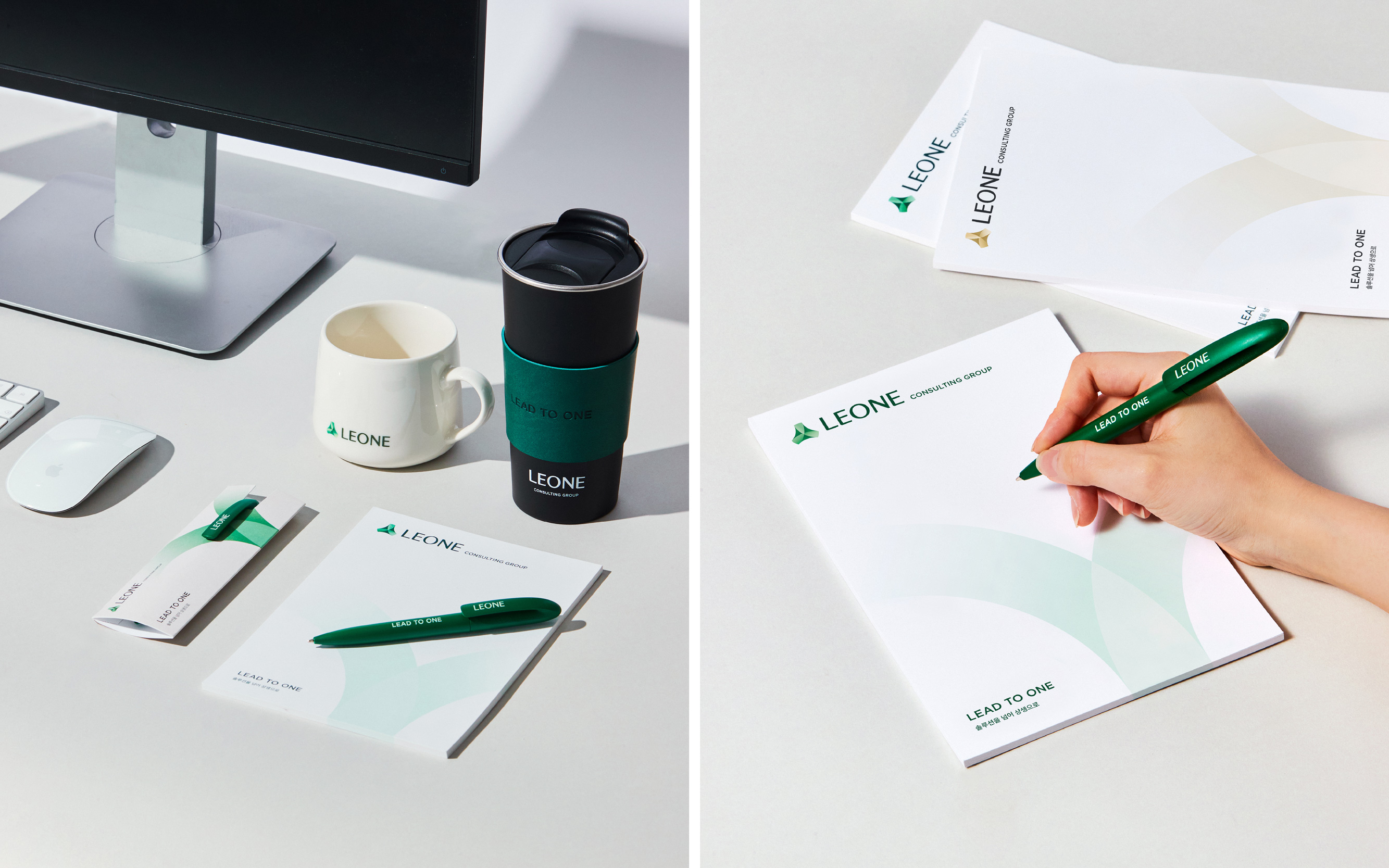
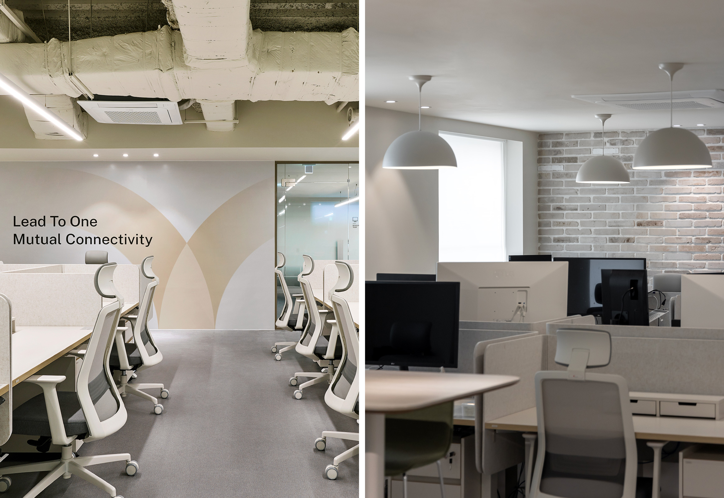
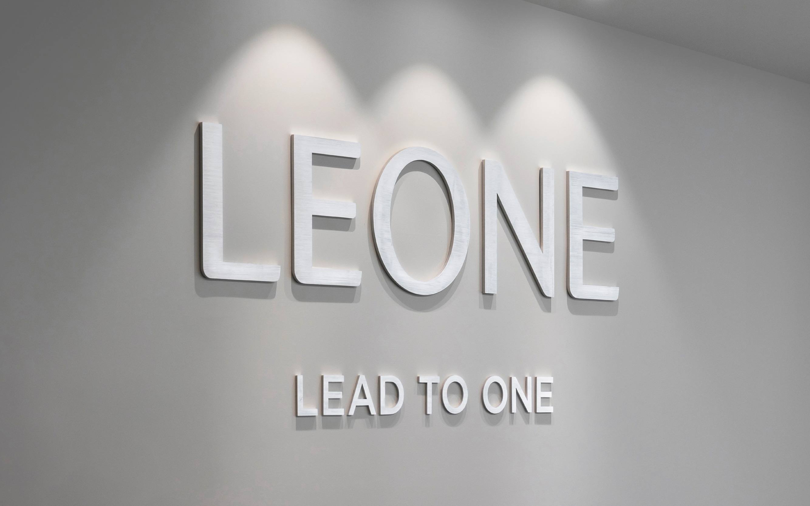
YNL Design defined Leone Consulting Group as a sincere comprehensive consulting group embodying the value of mutual prosperity, and developed a brand identity that realises values of co-prosperity along with customer growth through the slogan ‘LEAD TO ONE’. The name ‘LEONE’, derived from Lead to One, expresses the group’s authenticity in aiding customer growth with outstanding solutions. The logo type, based on the modern sans-serif font of Leone Consulting Group, expresses a contemporary representation of the consulting group’s image, combining approachability with professionalism and trust. The symbol embodies three interconnected circles representing customer-centric service, IT-based systems, and the synergy among customers, members, and partner companies, creating Leone’s unique value. The motif extends from the symbol to convey the value of co-prosperity, symbolising growth and elevation alongside Leone. Leone Consulting Group’s colour system consists of bronze and green. The dignified and trustworthy bronze color system conveys the image of a premium group delivering the best services, while the vibrant green color system communicates a warm image of being future-oriented and pursuing values of co-prosperity.
CREDIT
- Agency/Creative: YNL Design
- Article Title: Leone Consulting Group’s Distinctive New Identity by YNL Design
- Organisation/Entity: Agency
- Project Type: Identity
- Project Status: Published
- Agency/Creative Country: South Korea
- Agency/Creative City: seoul
- Market Region: Asia
- Project Deliverables: Brand Design, Brand Identity, Brand Naming, Brand Strategy, Identity System, Logo Design
- Industry: Financial
- Keywords: Creative Strategy / Branding(CI) / Verbal Identity / Web(UX&UI)
-
Credits:
Art Direction & Design: Liz Yoona Lee
Verbal Identity & Brand Design: Kwangsu Shin
Verbal Identity & Brand Design: Jiwon Lee


