Rooted in tradition. Leo! Leo! brings forth knowledge and process of artisan gelato making from their family ties to their home region of Florence, Italy. After many years of summer trips from California to Florence perfecting the craft from the world’s most skilled gelatiers, Leo! Leo! owner & founder Niccolo Lekai returned to the states to build a brand committed to continuing the 500-year-old Italian tradition of handcrafting fine gelato on the golden coast of California using only the finest ingredients from its local community.
With ten years of business behind them, Leo! Leo! approached Studio Ethur Ethur for a rebranding exercise to become a consumer-facing brand that was approachable first from a regional perspective but scaleable to a national relatability. The main focus of this rebrand was not to depart from its Italian heritage, artisan quality, or locally sourced roots but to bring emotion, youthfulness, and approachability to the brand while keeping intact its core values of supporting its local economy at any cost.
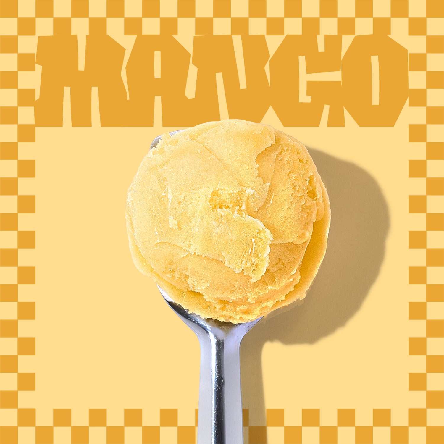
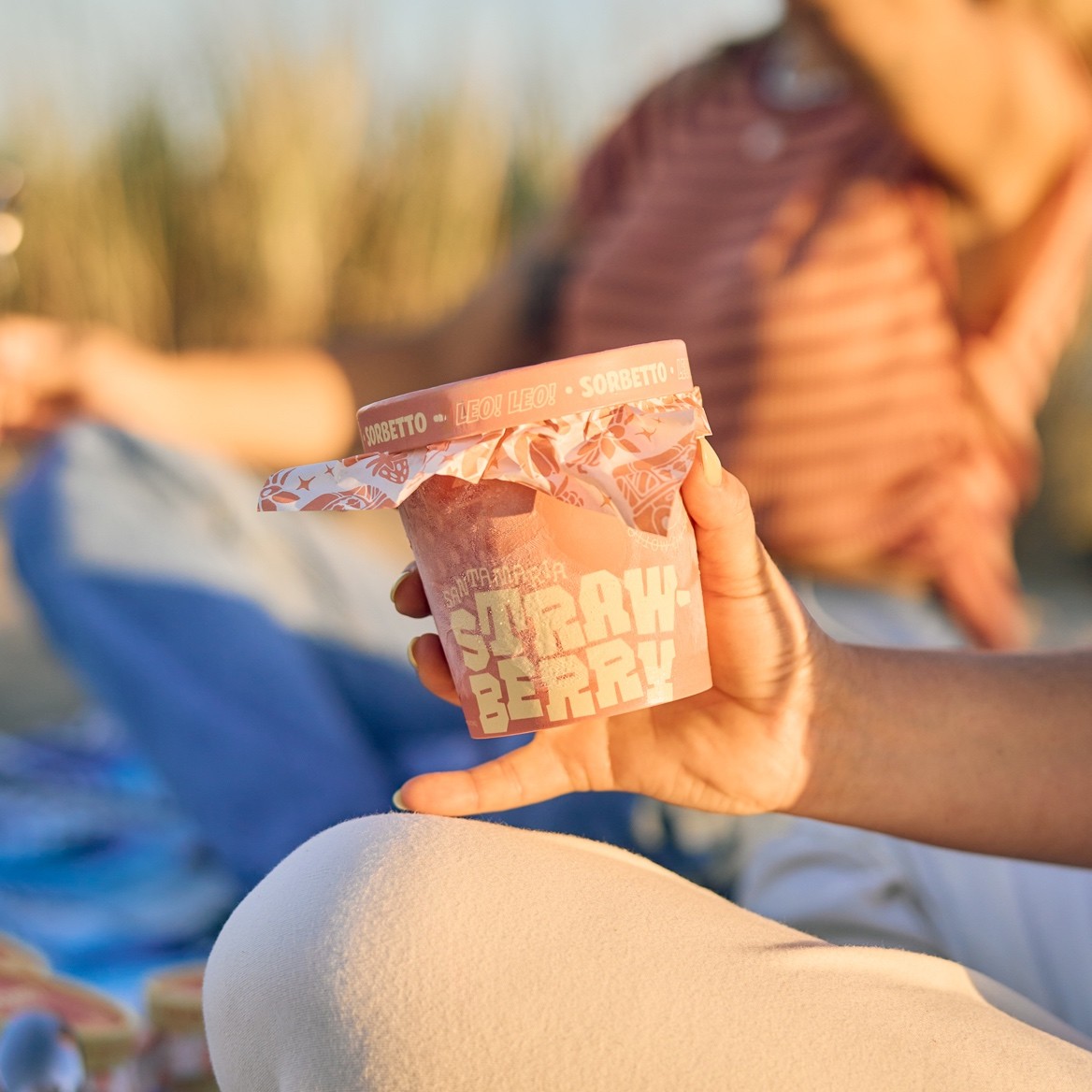
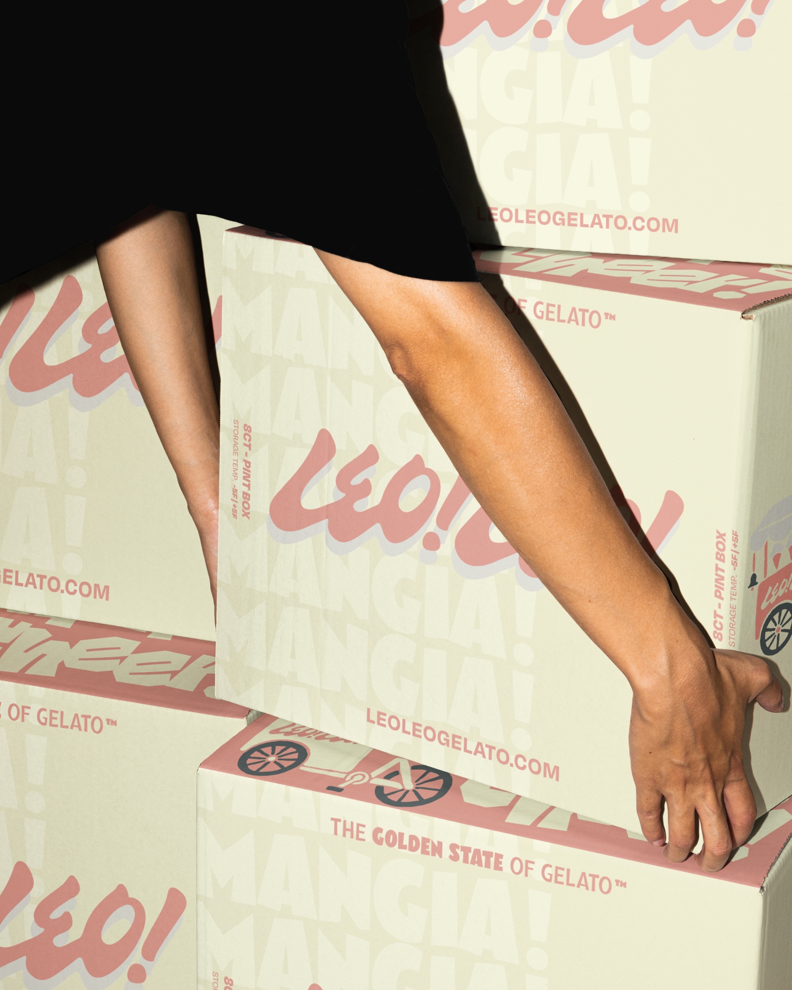
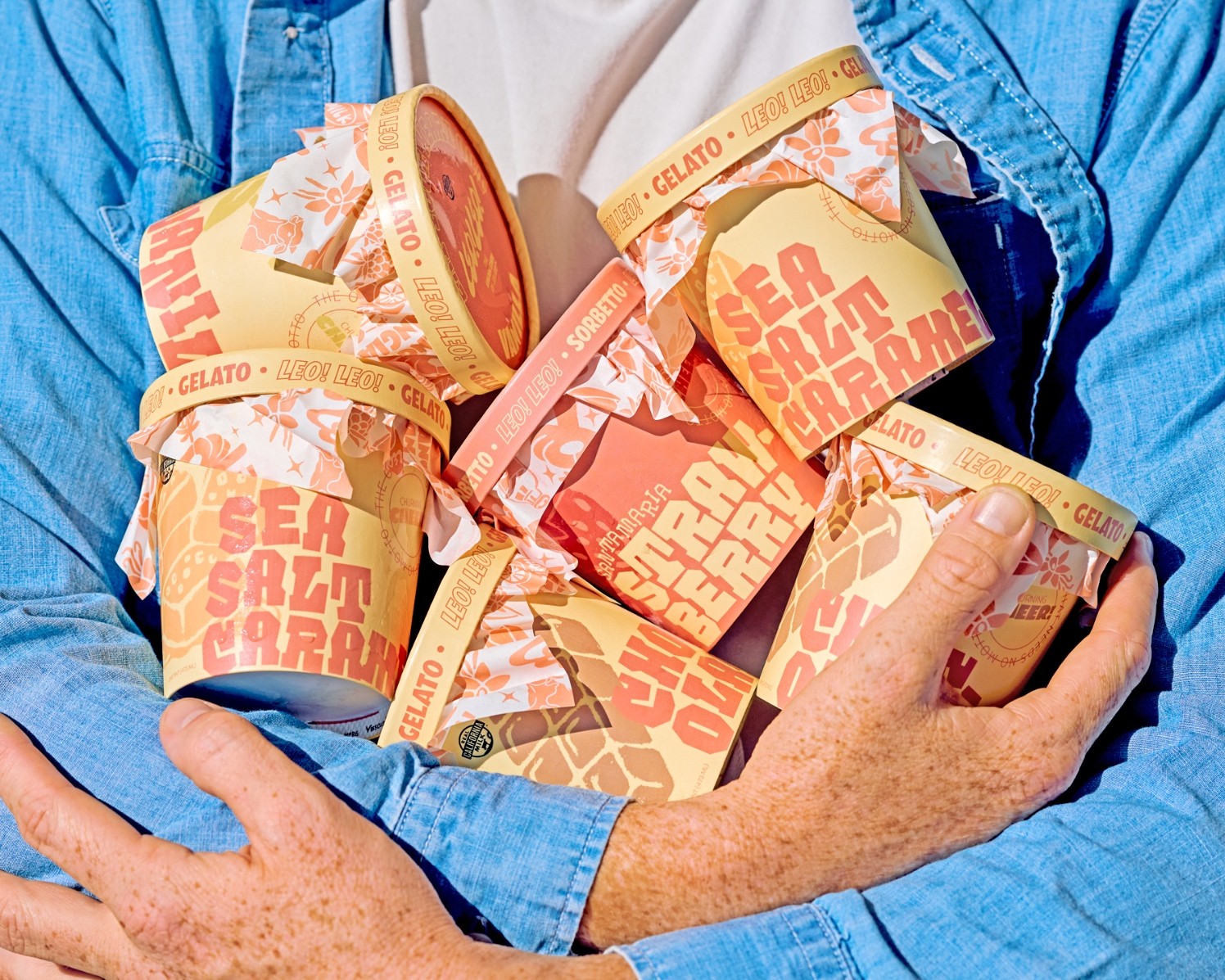
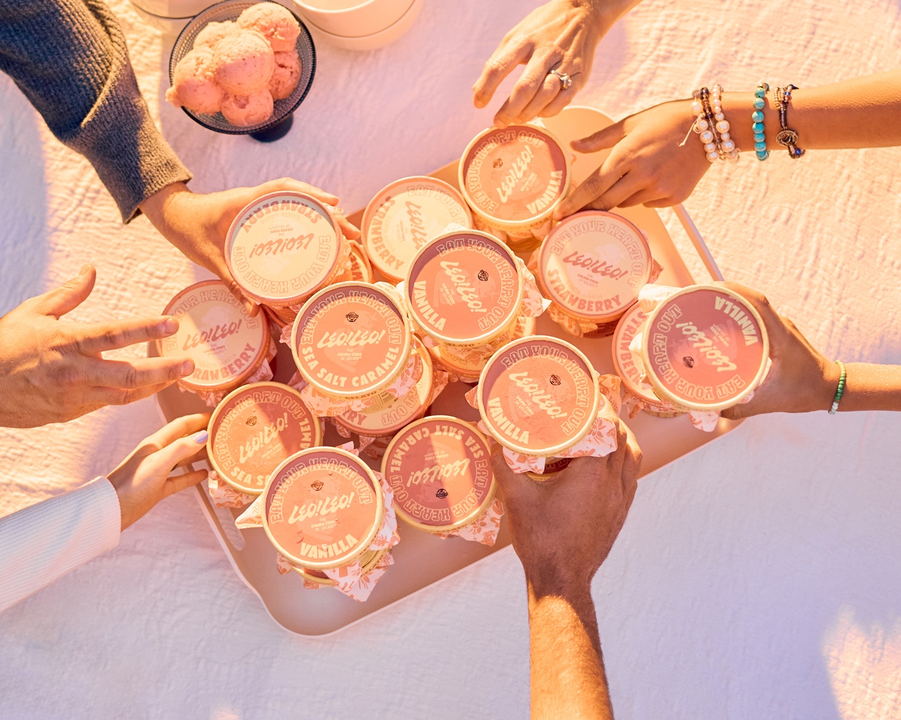
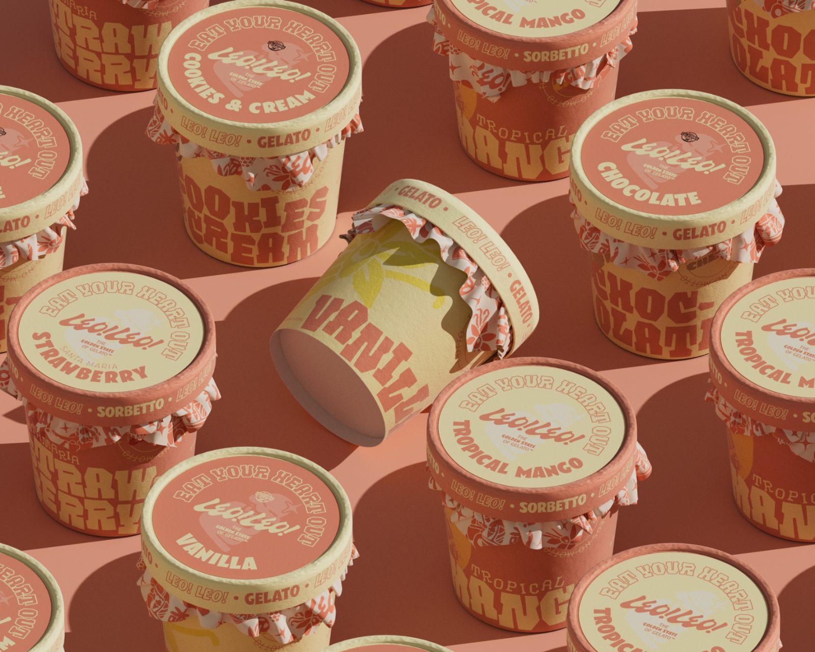
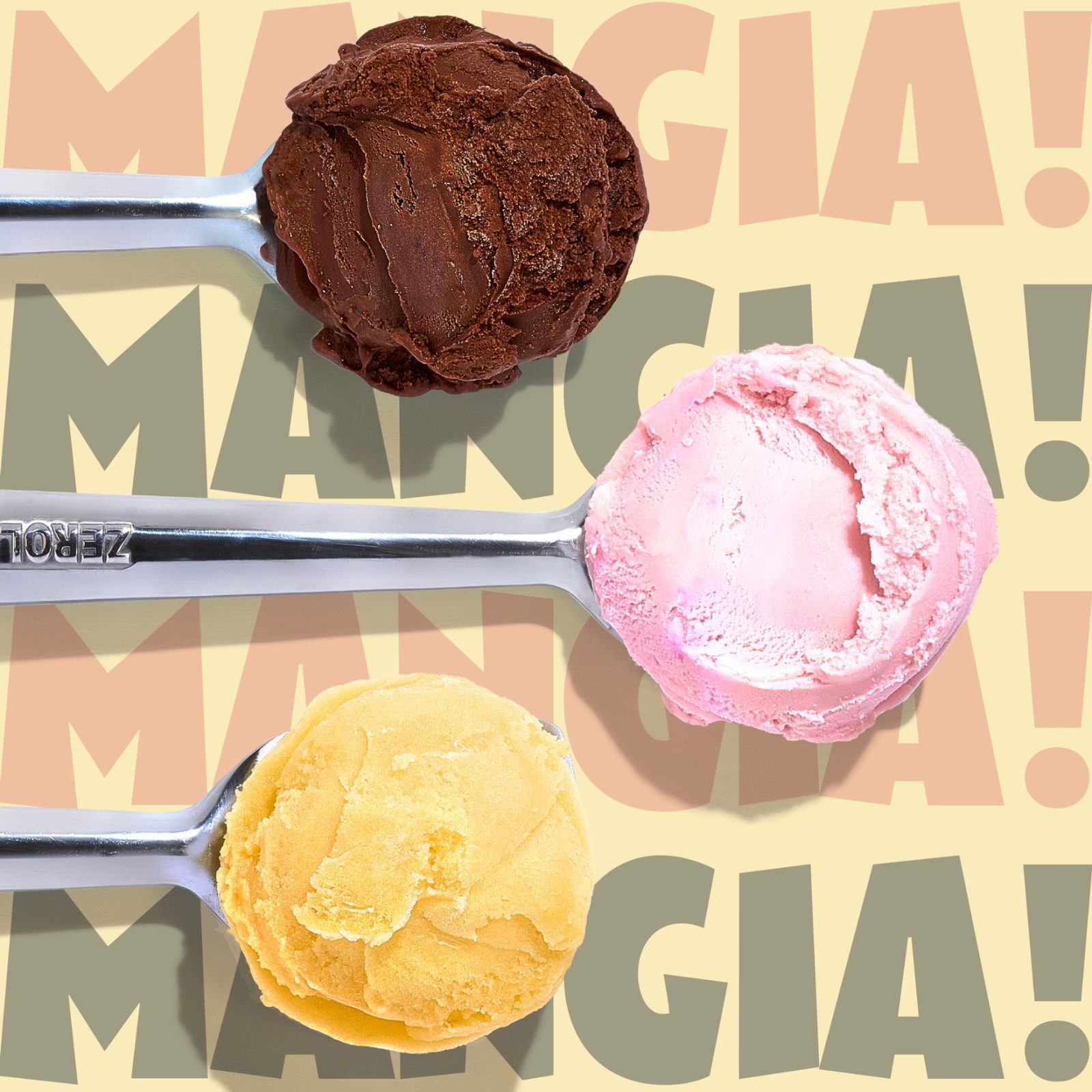
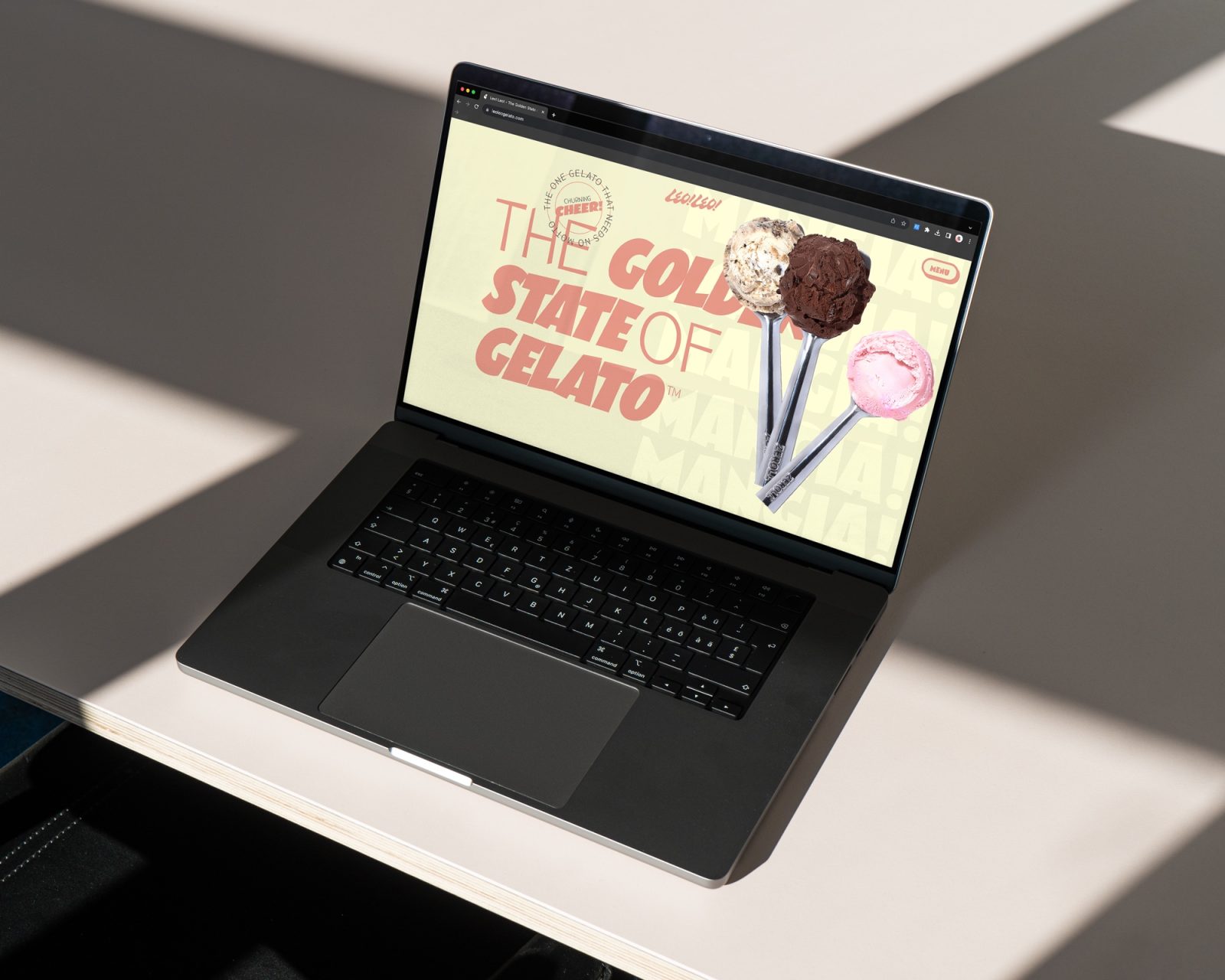
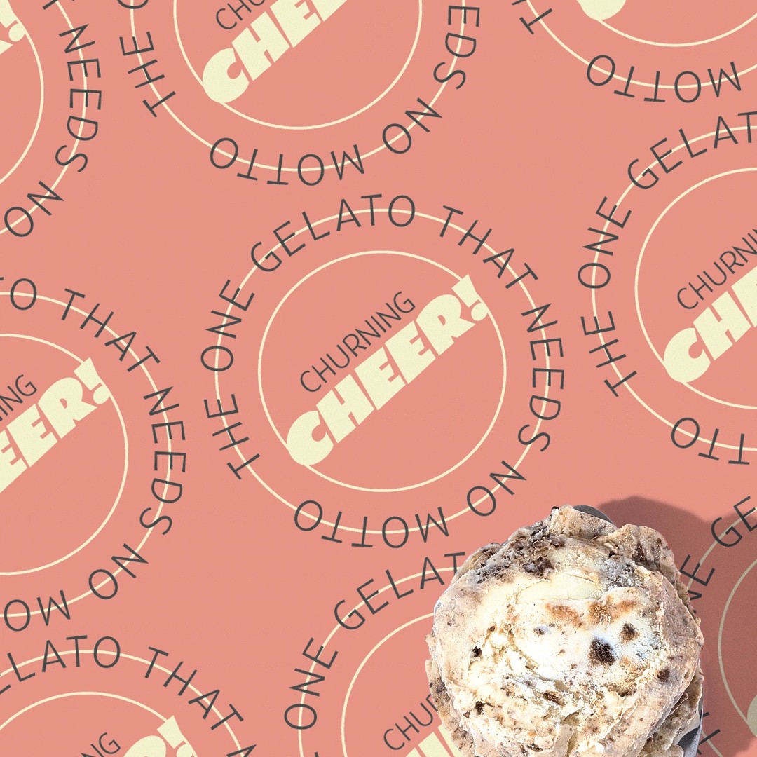
Strategizing its re-entry into the CPG confectionery market, Studio Ethur Ethur crafted a comprehensive brand identity with a primary focus on ownable brand language, emotional motivators, and feeling approachable to a wider audeince while maintaining an Italian-American tone of voice. Recognizing the power of visual identity in consumer perception, we strategically developed a contemporary and relatable persona that extended seamlessly across new naming, branding, packaging, apparel, digital, web, and print collateral. The intent was not only to offer an evocative, transparent, and relatable brand experience but also to establish a visually own-able shelf presence. Every element was thoughtfully curated to ensure immediate recognition and association, fostering a connection with consumers that transcends the crowded shelf space from its competitors . This deliberate emphasis on visual cohesiveness underscores the objective of carving out a unique and memorable space within the competitive confectionery market.






CREDIT
- Agency/Creative: Studio Ethur Ethur
- Article Title: Leo! Leo! by Studio Ethur Ethur
- Organisation/Entity: Agency
- Project Type: Identity
- Project Status: Published
- Agency/Creative Country: United States
- Agency/Creative City: San Luis Obispo
- Market Region: North America
- Project Deliverables: Advertising Photography, Brand Identity, Brand Mark, Branding, Creative Direction, Food Photography, Illustration, Packaging Design, Web Design
- Industry: Food/Beverage
- Keywords: WBDS Agency Design Awards 2023/24
- Keywords: Brand Identity, CPG, Branding, Packaging design, ice cream packaging, illustration, consumer packaged goods, brand agency, studio ethur ethur
-
Credits:
Agency: Studio Ethur Ethur


