The german family enterprise bahlsen is an international sweet biscuit manufacturer. In germany bahlsen is the most successful manufacturer in this market and with the brands bahlsen and leibniz market leader. Also throughout europe, bahlsen is one of the most successful sweet biscuit companies. The company’s roots go back to 1889, when hermann bahlsen founded the “hannoversche cakes-fabrik h. Bahlsen” and employed ten people. Today, more than 130 years later, the company has an international presence with its biscuits, waffles, chocolate bars and cake, employing 2,750 people, with a turnover of 540 million euros in 2019.
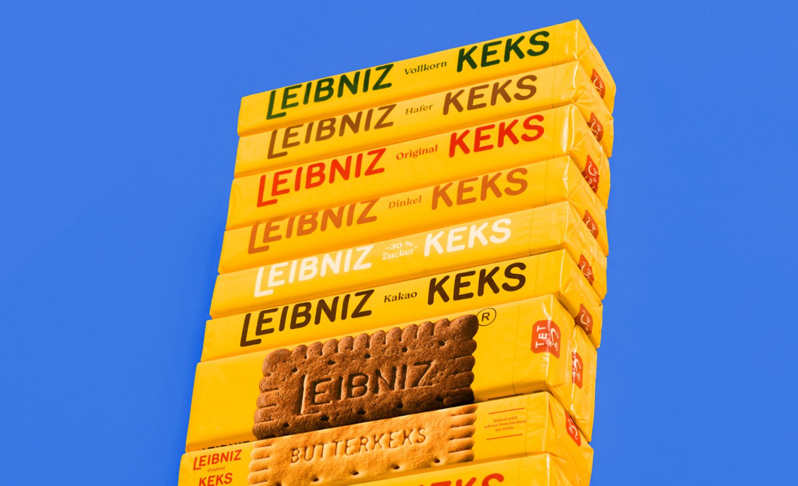
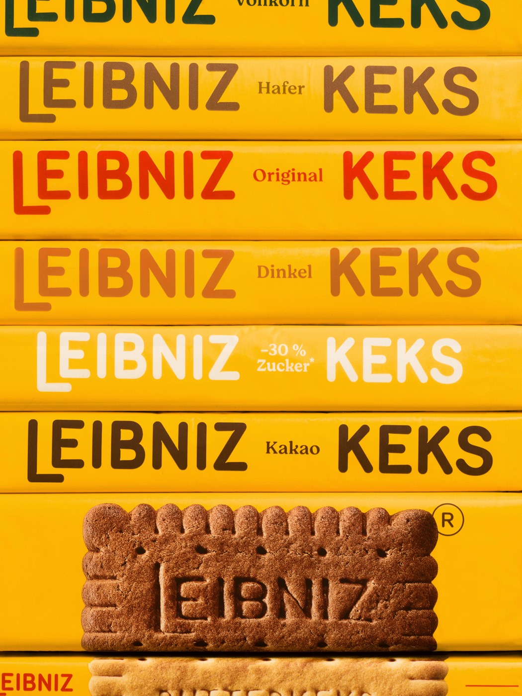
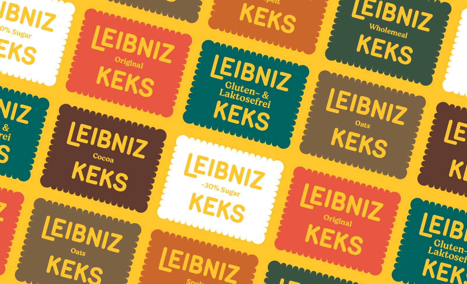
We were asked to revamp the branding and packaging design by creating a fresh, new language able to talk to the new generations, kids and young families and delivering the naturalness and goodness of the product. Always remember the iconicity and warm attitude of the brand.
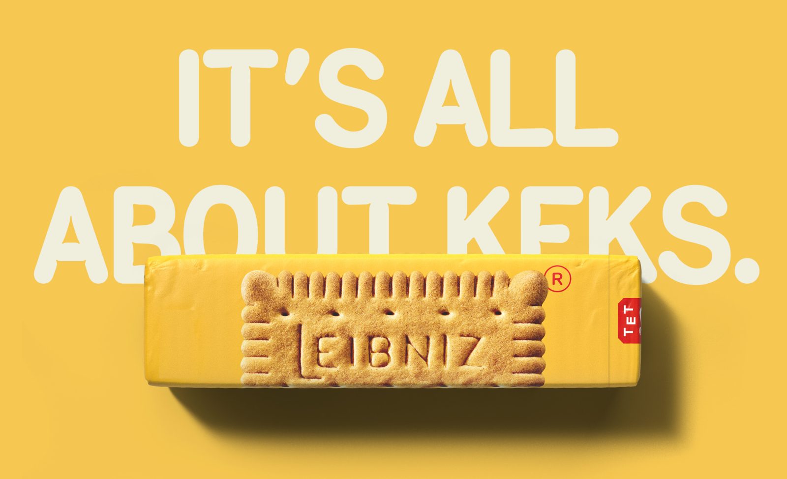
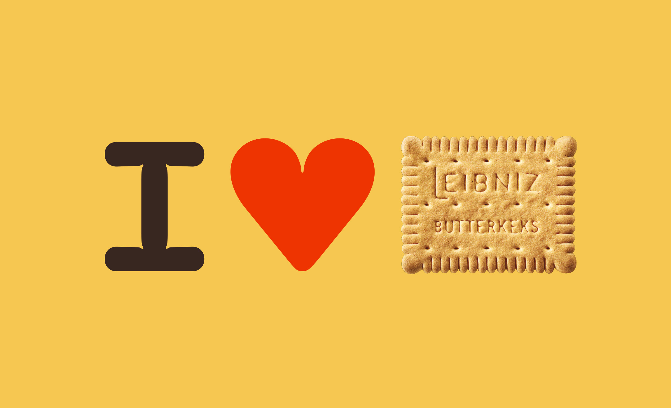
The original leibniz biscuit has a simple and distinctive design, fifty-two “teeth” frame the rectangular field on which “leibniz butterkeks” is imprinted in capital letters. This was hermann bahlsen’s original 1891 design. The biscuit has been featured in a series of “monuments of german design” by the süddeutsche zeitung. And this was exactly our starting point, the strength of a shape that manages to embody all the necessary information on the product by itself, the ultime hero product.
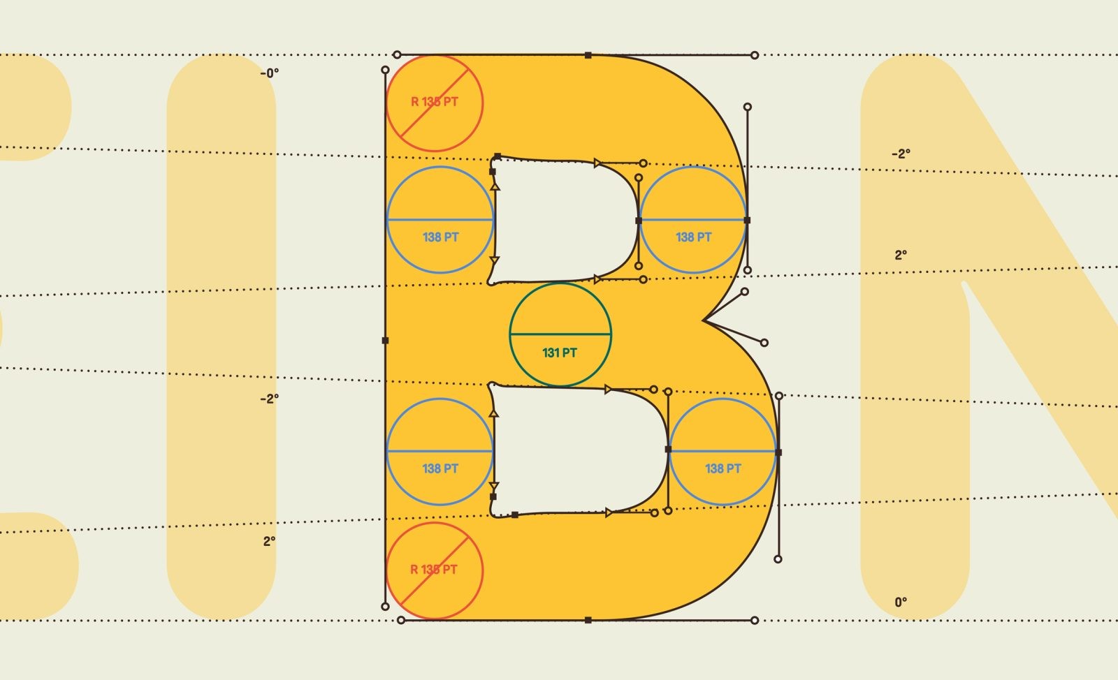
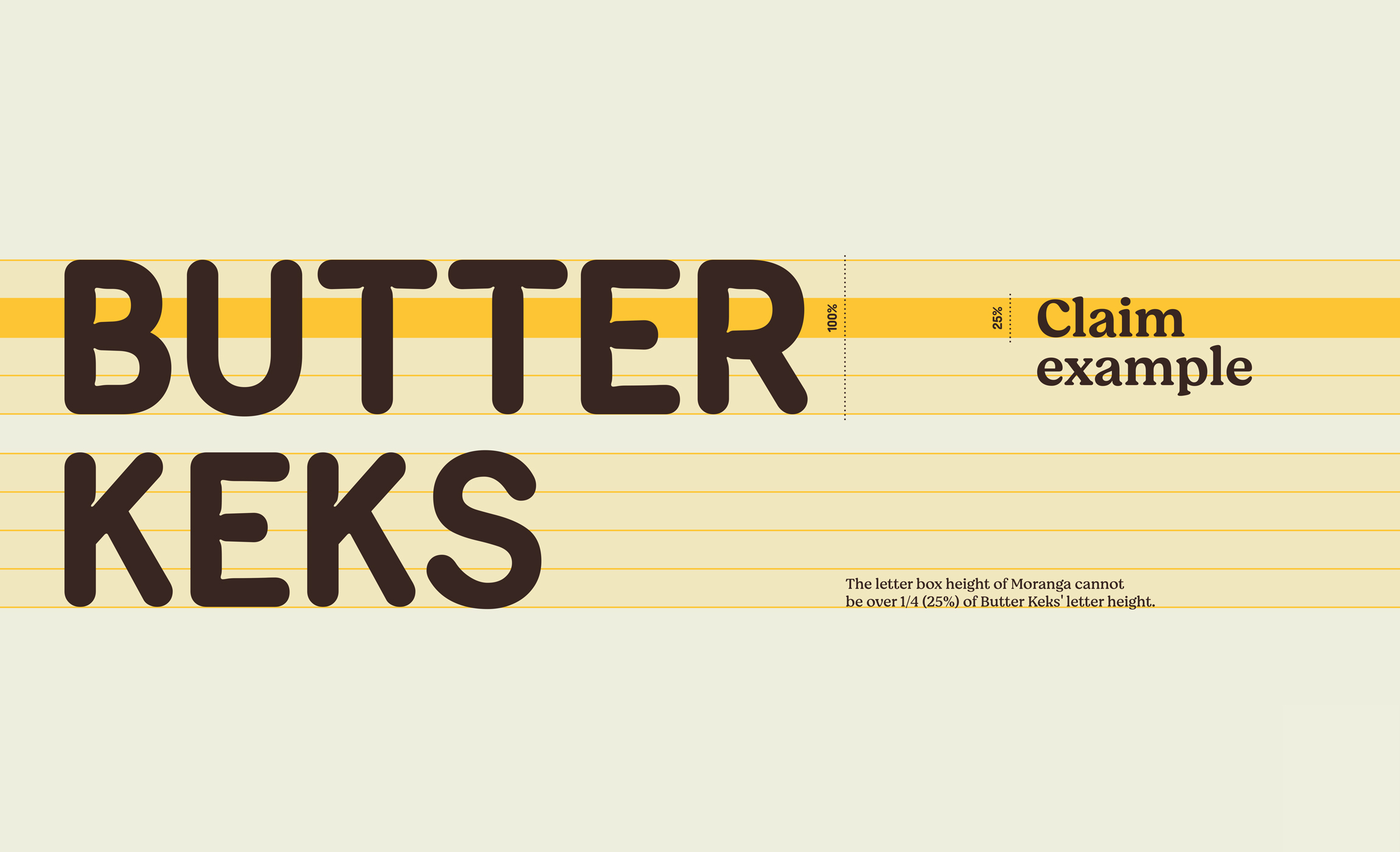
The whole identity look and feel is based on the iconicity of this world famous 52teeth Biscuit, which was taken as a statement in the developing of the design elements, especially, the designed typeface.
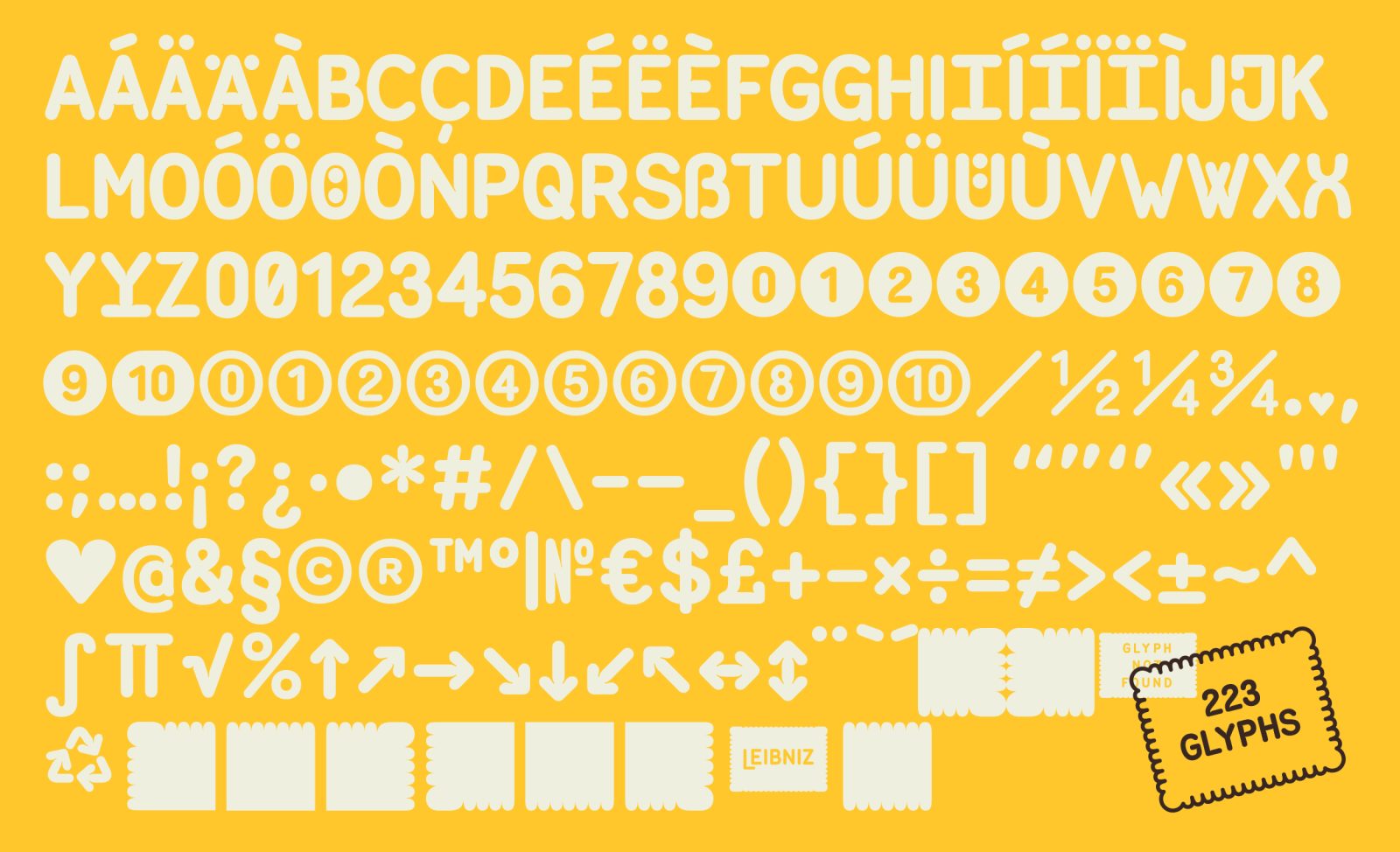
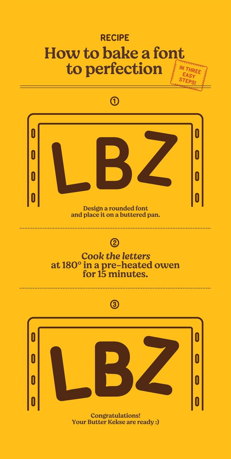
The process consisted in developing the rounded typeface in use on the previous logo into an entire custom font whose concept is the cooking of the letter, treated as it was baked in an owen. Conceptually, the heat would dilate the letters’ shapes turning it into a bold and soft typeface, ornated with inktraps stressing the idea. We call it “The butterkeks display”.
CREDIT
- Agency/Creative: Auge Design
- Article Title: Leibniz ButterKeks Display Typography for Packaging Design
- Organisation/Entity: Agency
- Project Type: Typography
- Project Status: Published
- Agency/Creative Country: Italy
- Agency/Creative City: Florence
- Project Deliverables: Typography
- Industry: Food/Beverage
- Keywords: WBDS Agency Design Awards 2022/23
-
Credits:
Executive Creative Director: Davide Mosconi
Associate Creative Director: Miriam Frescura
Designer: Giovanni Stillittano
Designer: Federico Landini


