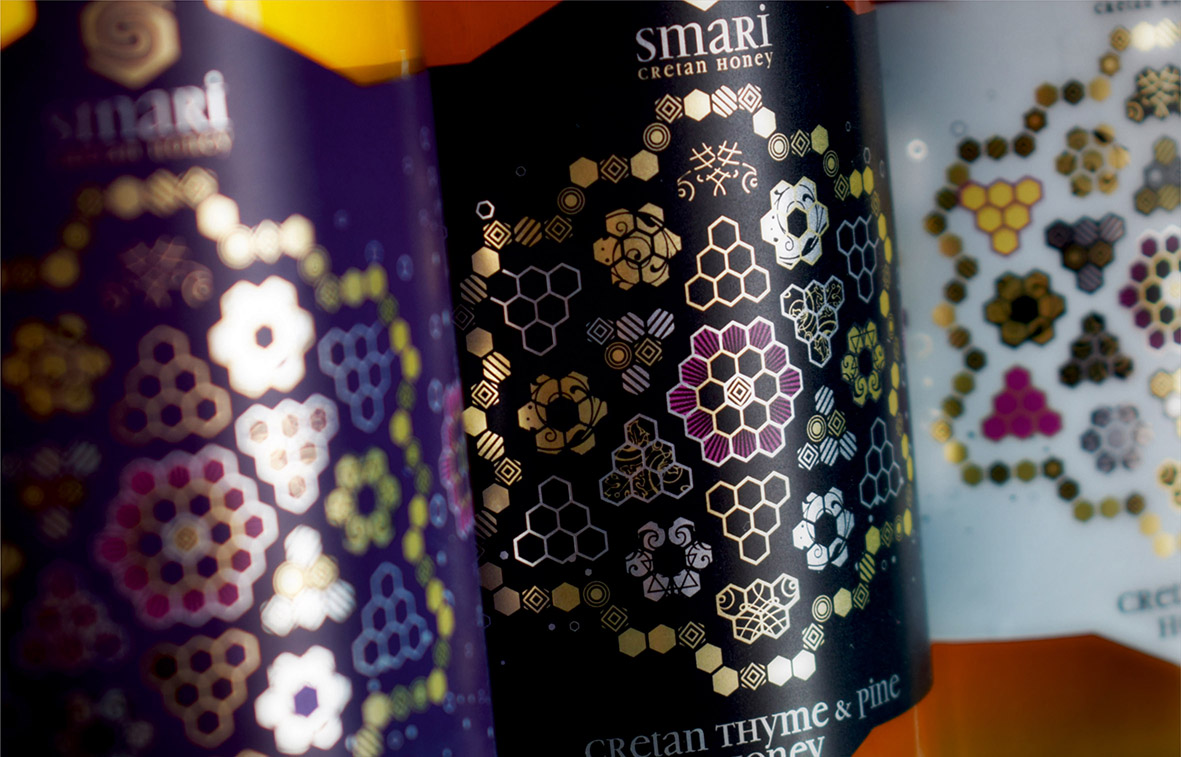
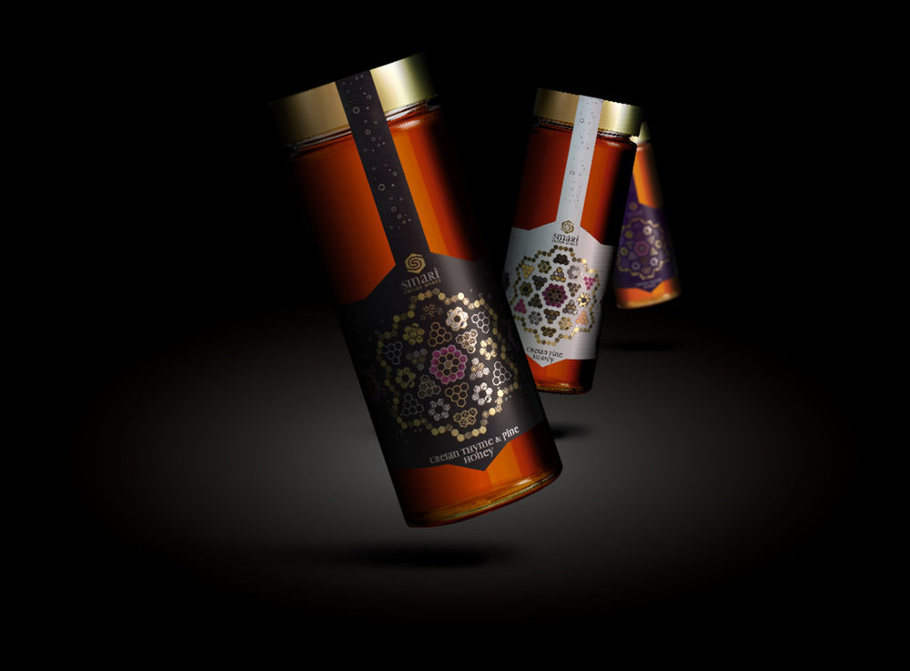
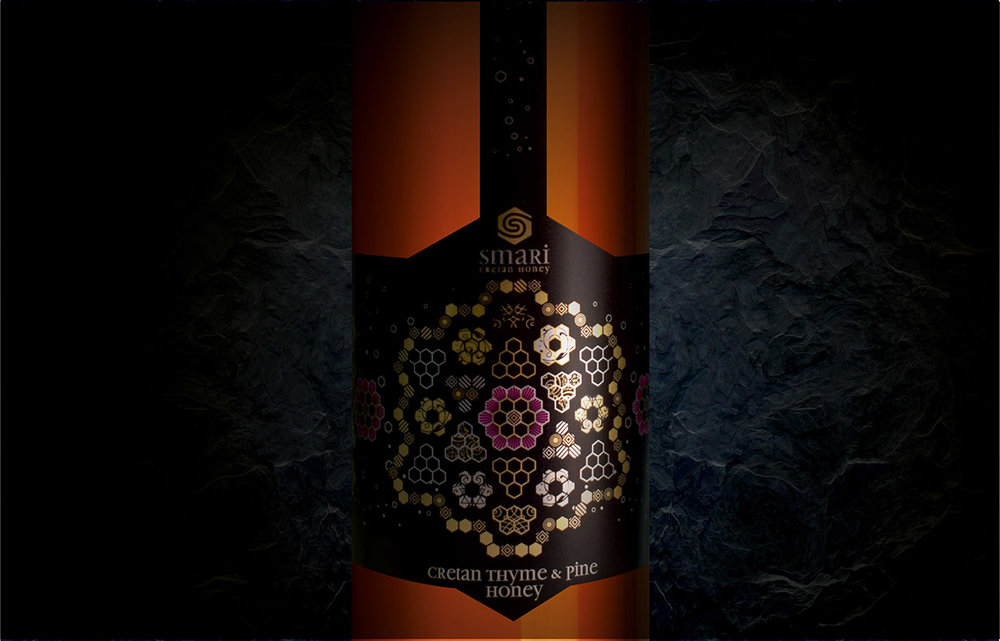
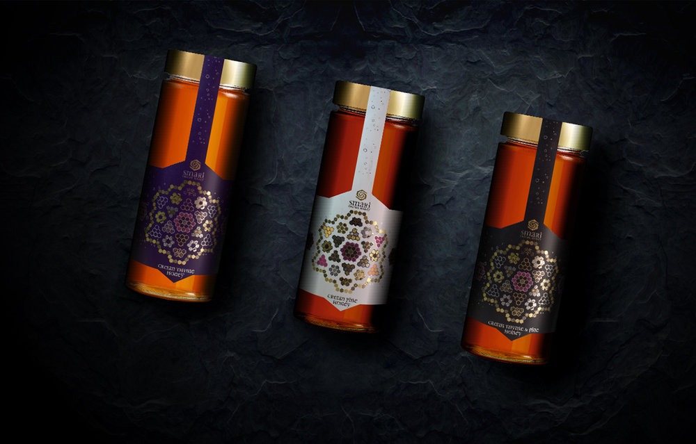
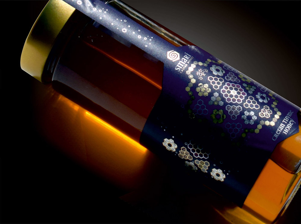
” Smari Cretan Honey company has asked us to design the packaging for their new product, which has high nutritional value, with respect to local culture.
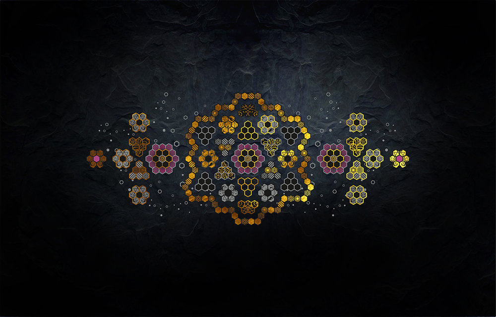
The inspiration for the design was the very name of the product. Smari is called the flock formed when the queen and her followers leave a hive to create a new one. The hexagons that move freely in space symbolize the bees, which gather together to form a new hive. At the centre of the hive, there is the queen. Perfect symmetrical shapes suggest a well-organized bee society. The hexagon, using motifs from the Cretan textile industry, captures the new hive and the result is right! ”
CREDIT
- Agency/Creative: Leftgraphic , Lefteris Panagoulopoulos
- Article Title: Leftgraphic – Smari Cretan Honey
- Project Type: Packaging
- Format: Jar
- Substrate: Glass
FEEDBACK
Relevance: Solution/idea in relation to brand, product or service
Implementation: Attention, detailing and finishing of final solution
Presentation: Text, visualisation and quality of the presentation


