


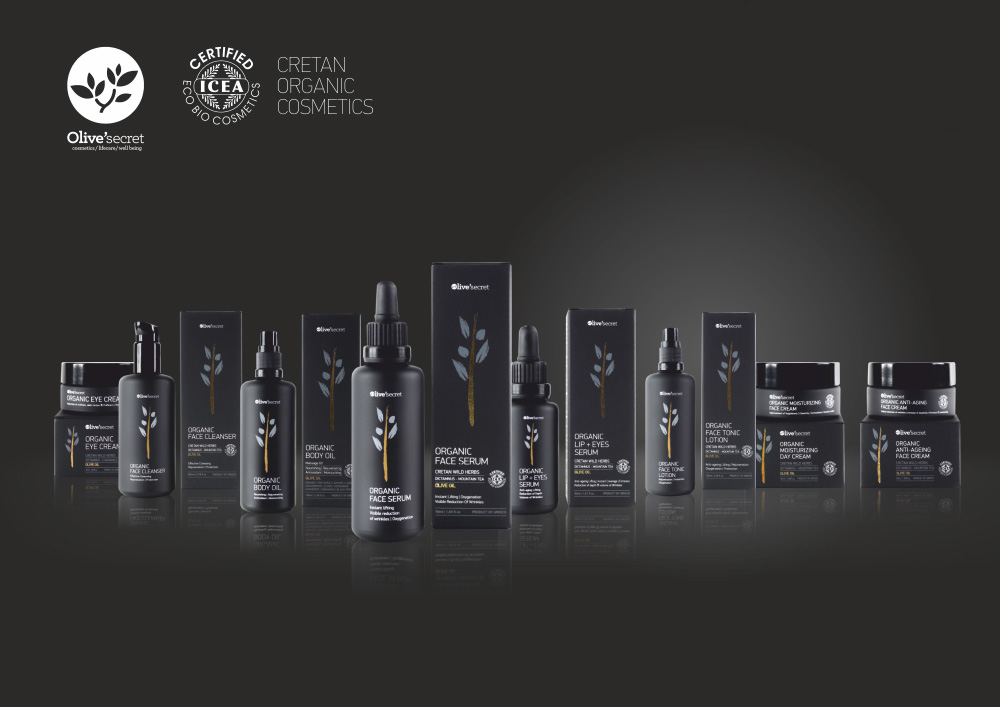
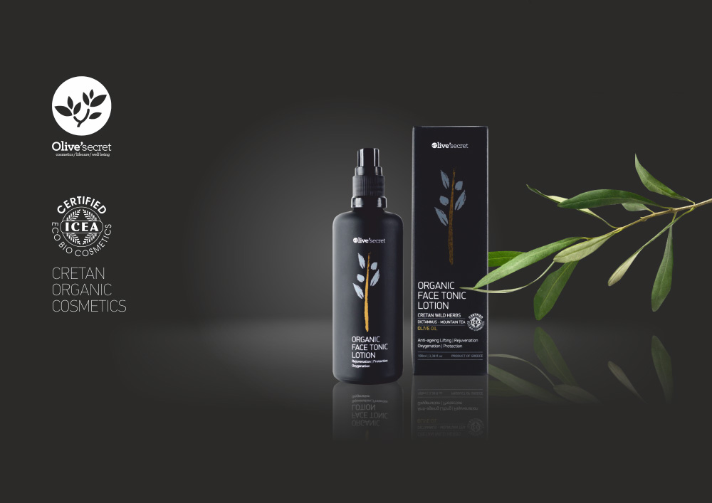
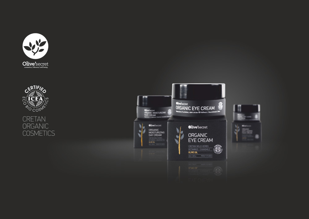
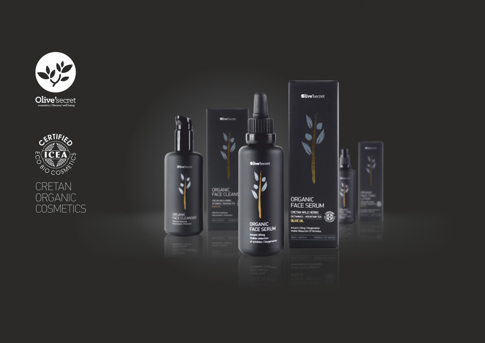
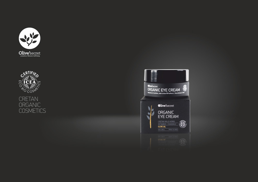
“Olive’secret visual identity and packaging had one and only element of inspiration. That is its basic ingredient: organic olive oil. The idea behind this creation is simple. Our agency decided a design approach which emphasizes that same ingredient in a simple, modern and direct way. Using the olive tree branch combined with clean typography elements we achieved an elegant result. The gold color gives the whole package a sense of exclusiveness and it reminds us of the oil element too.”
CREDIT
- Agency/Creative: Leftgraphic
- Article Title: Leftgraphic – Olive’s secret
- Project Type: Packaging


