


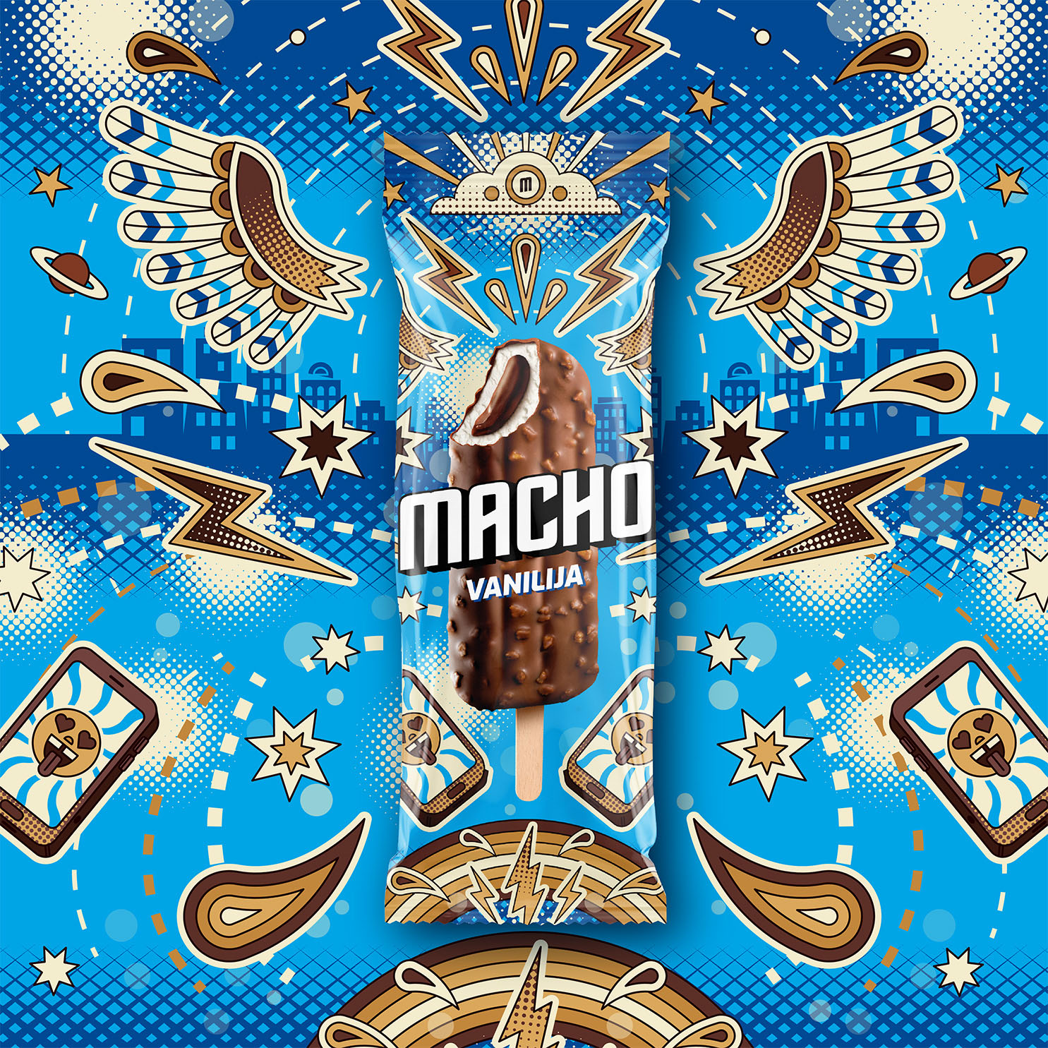
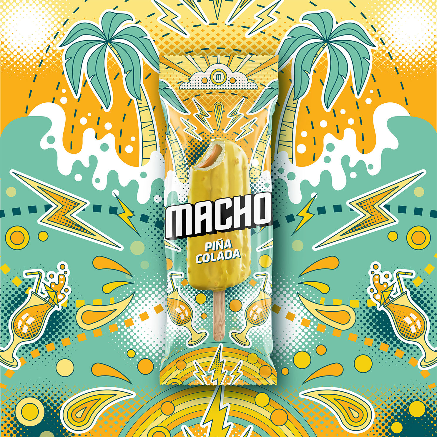
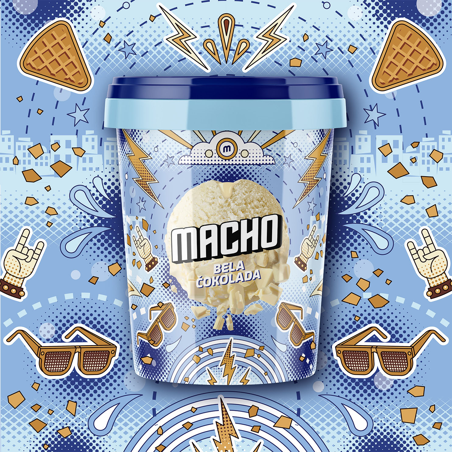
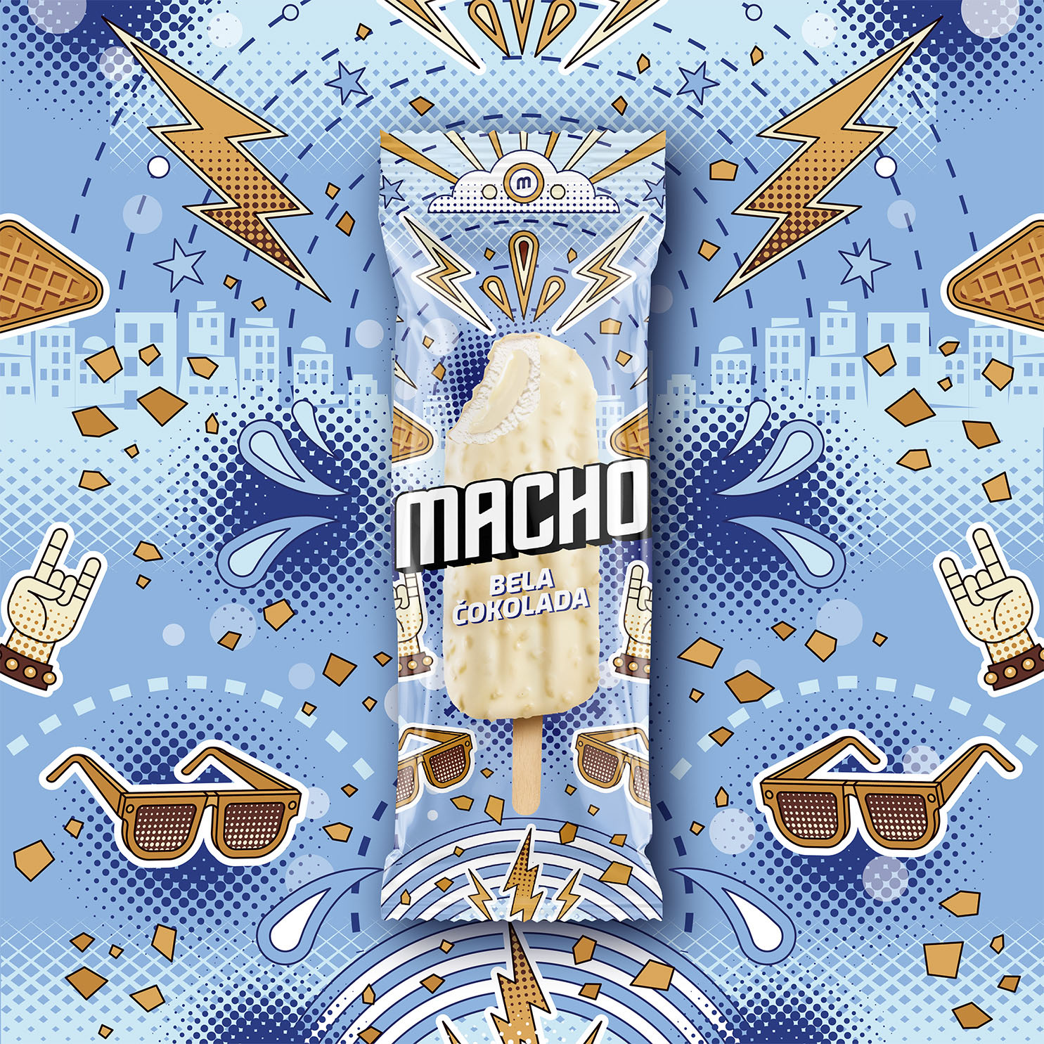
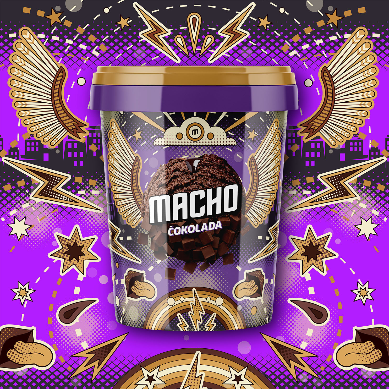
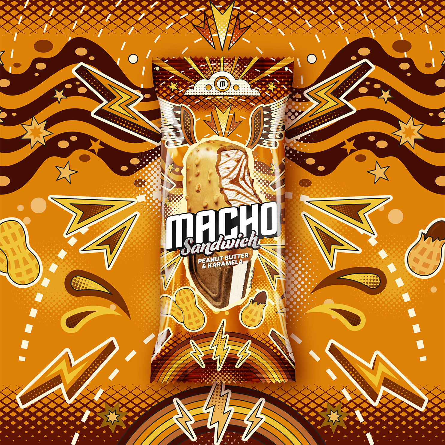
With the new visual identity of Macho ice cream, we aimed to create a design that is appealing, urban, fun, unique, recognizable, and contemporary – tailored for Generation Z. Through the design, we successfully established an emotional connection between consumers and the Macho brand, while also introducing innovations within the Macho line (such as new popsicle flavors and a new ice cream sandwich).
The unique Macho backgrounds, inspired by POP Art style, reflect the lifestyle of the target audience. At the heart of the illustrations is the glorified Macho ice cream, surrounded by various motifs related to flavor: Macho lightning bolts, snowflakes, sunglasses, drops of freshness, microphones, boomboxes, white chocolate cubes, orange slices, peanuts, disco rollers, “rock on” hand gestures…
Ledo Macho has been a beloved household name in the CEE region for decades, boasting a rich legacy of delivering delectable ice cream experiences. However, recognizing the evolving tastes and preferences of a younger audience, we embarked on a mission to rejuvenate the brand’s image while preserving the cherished essence of Macho. Our goal was to infuse the packaging with a fresh, contemporary appeal that exudes intricacy, playfulness, and attention to detail. Each time you indulge in a Macho, we wanted the experience to be akin to unwrapping a delightful surprise, with intricate designs revealing themselves with every glance. By revitalizing the look and feel of Macho, we aimed to forge a deeper connection with the younger generation while maintaining the authenticity and charm that has made Macho a timeless favorite.


CREDIT
- Agency/Creative: Spellcaster
- Article Title: Ledo Macho Ice Cream Packaging Redesign Created by Spellcaster
- Organisation/Entity: Agency
- Project Type: Packaging
- Project Status: Published
- Agency/Creative Country: Croatia
- Agency/Creative City: Zagreb
- Market Region: Europe
- Project Deliverables: Packaging Guidelines
- Format: Sachet
- Industry: Food/Beverage
- Keywords: Ice Cream Ledo Macho Packaging
-
Credits:
Creative Director: Tonci Klaric
Art Director: Neven Crljenak
Project Manager: Ines Matulic
Illustrator: Dejan Kralj
Marketing Dev Manager: Krunoslav Stancic


