


L+D Archatelier is an architecture studio founded by Leonid and Daria, a family of architects creating contemporary residential and public spaces. Their work has always stood out for its precision, structure, and attention to detail, but the previous identity failed to reflect the studio’s depth, philosophy, and personality. The rebrand was not just about updating visuals – it was about expressing the essence of their practice and the way they communicate with clients.
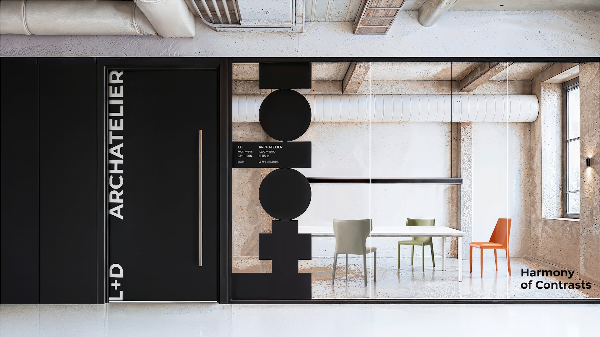
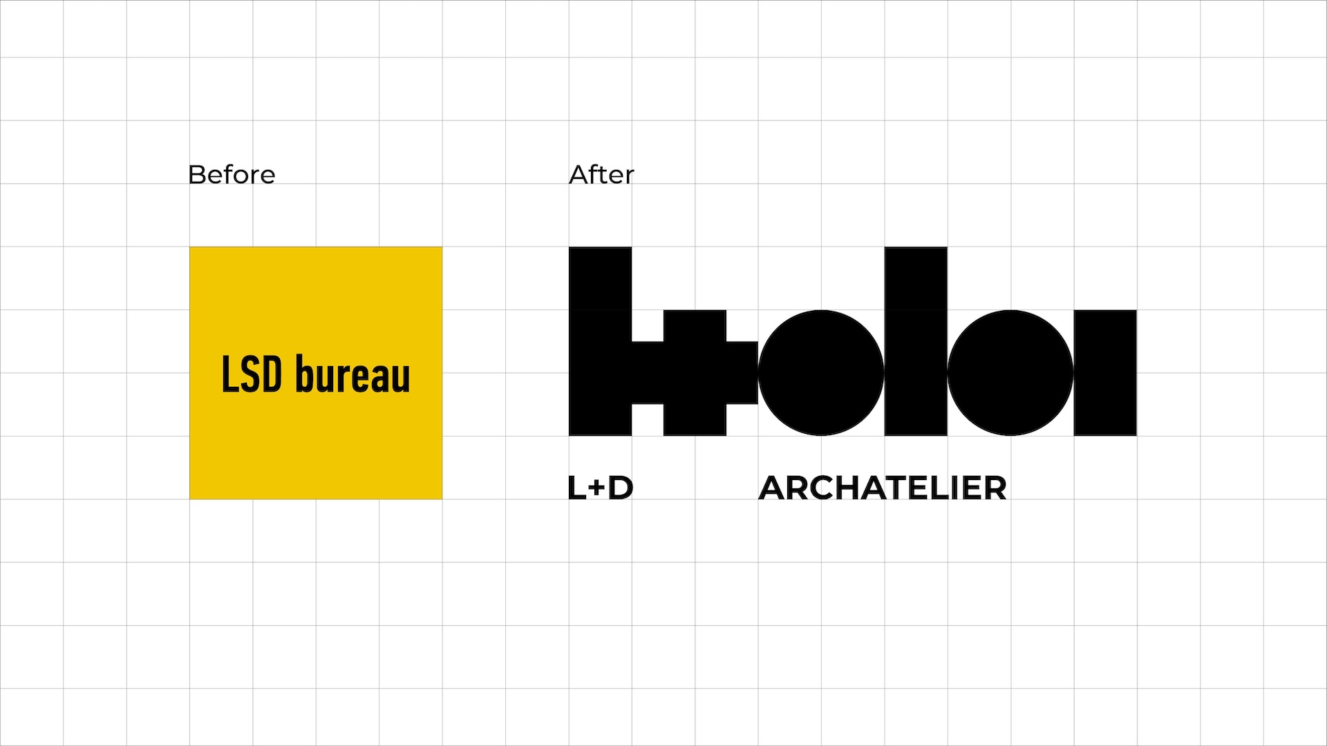
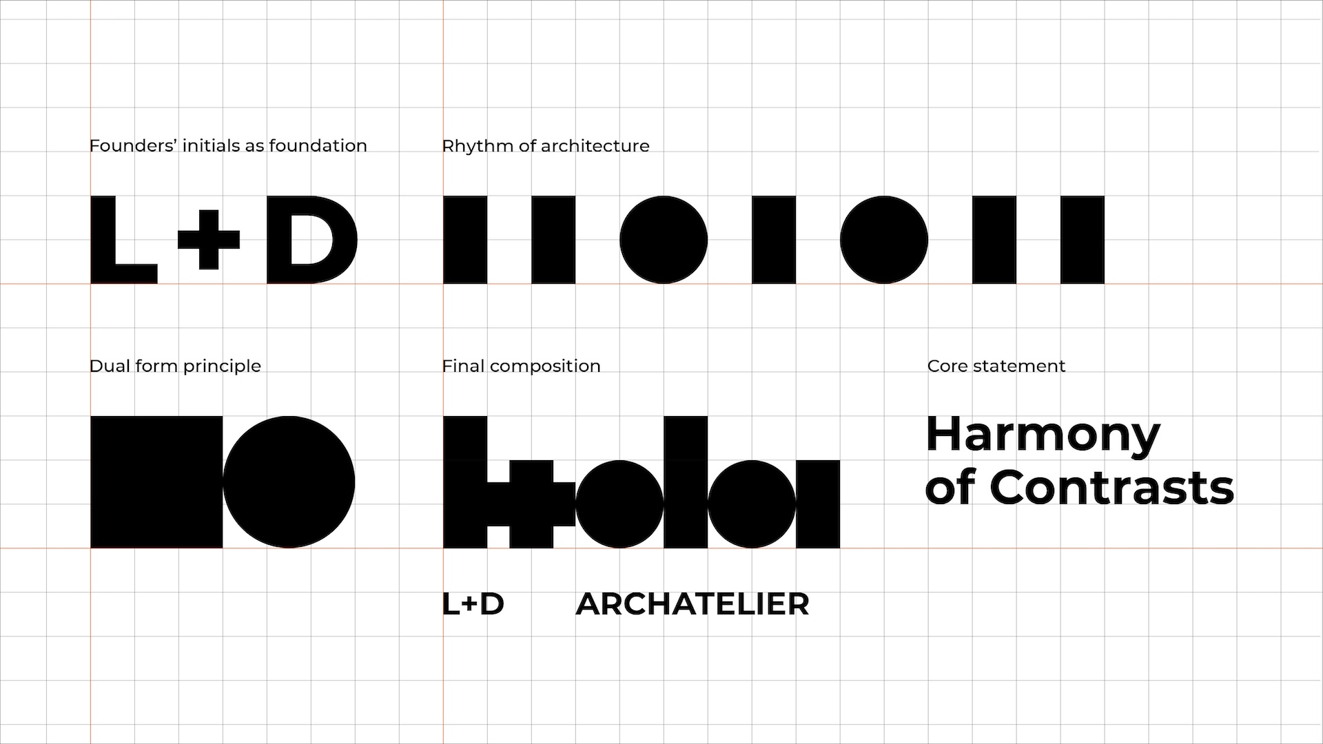
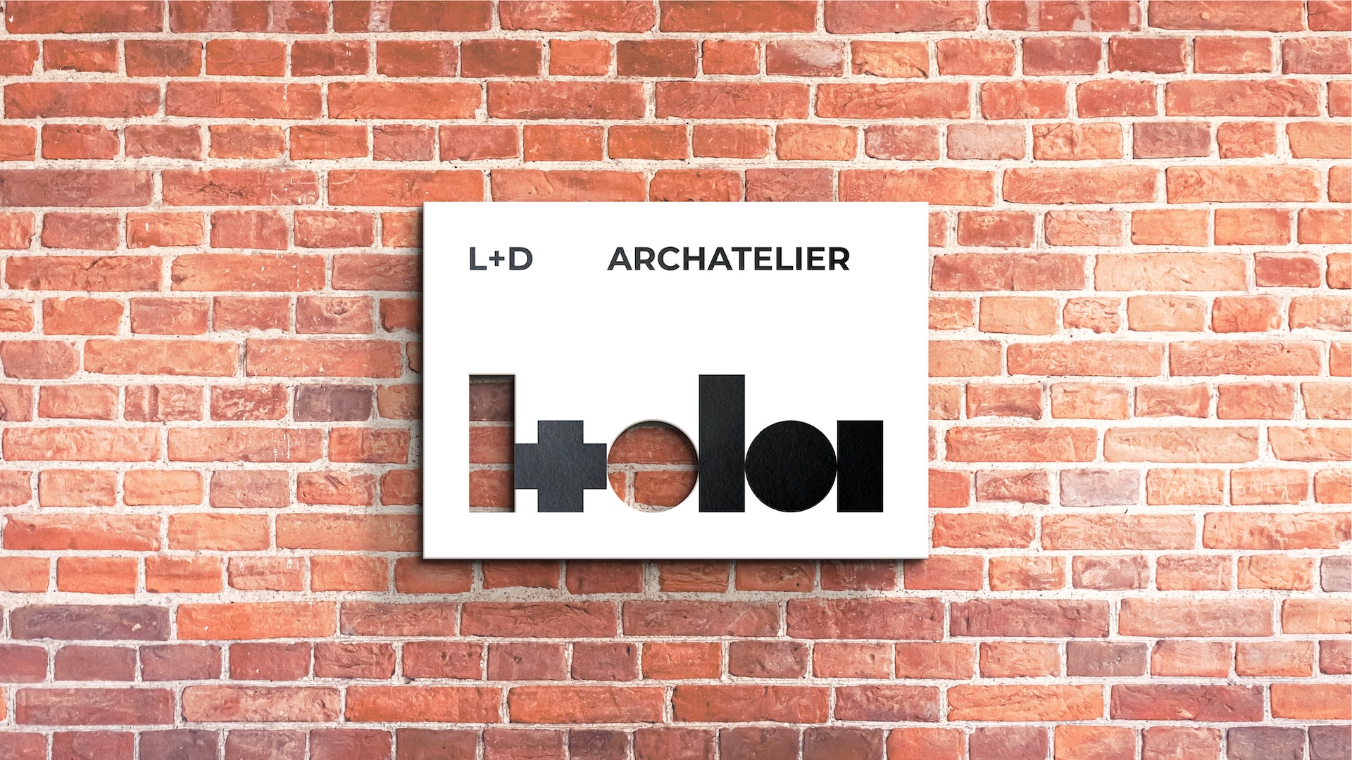
At the core of the new identity lies the philosophy of duality – a constant dialogue between opposites. Rationality and emotion, square and circle, system and art: these contrasts form the foundation of both the studio’s architecture and its communication. The new name, L+D Archatelier, combines the founders’ initials with the intimacy of an atelier – a place of care, craft, and attention. Unlike the word “bureau,” “atelier” emphasizes an individual approach and turns the boutique scale of the studio into its advantage.
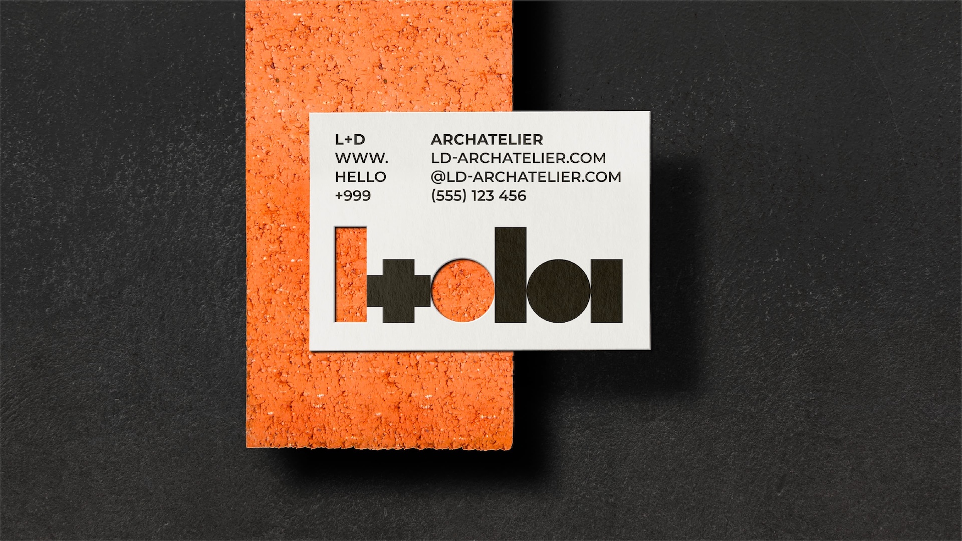
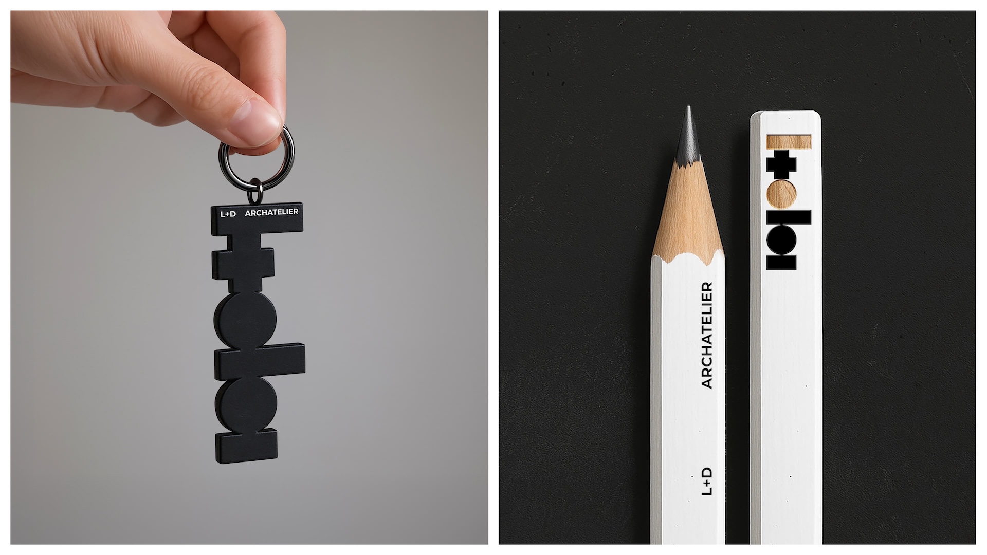
The logo builds on a rhythm of contrasting forms: the square and the circle merge into a dynamic composition that encodes the studio’s acronym while also functioning as a standalone symbol.
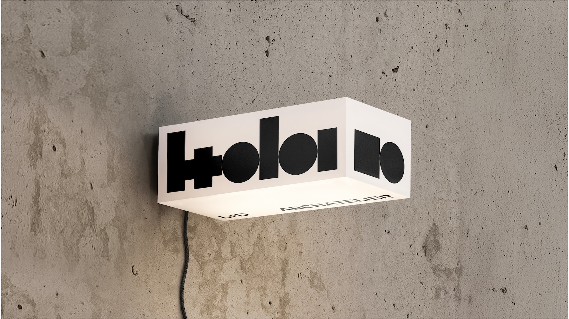
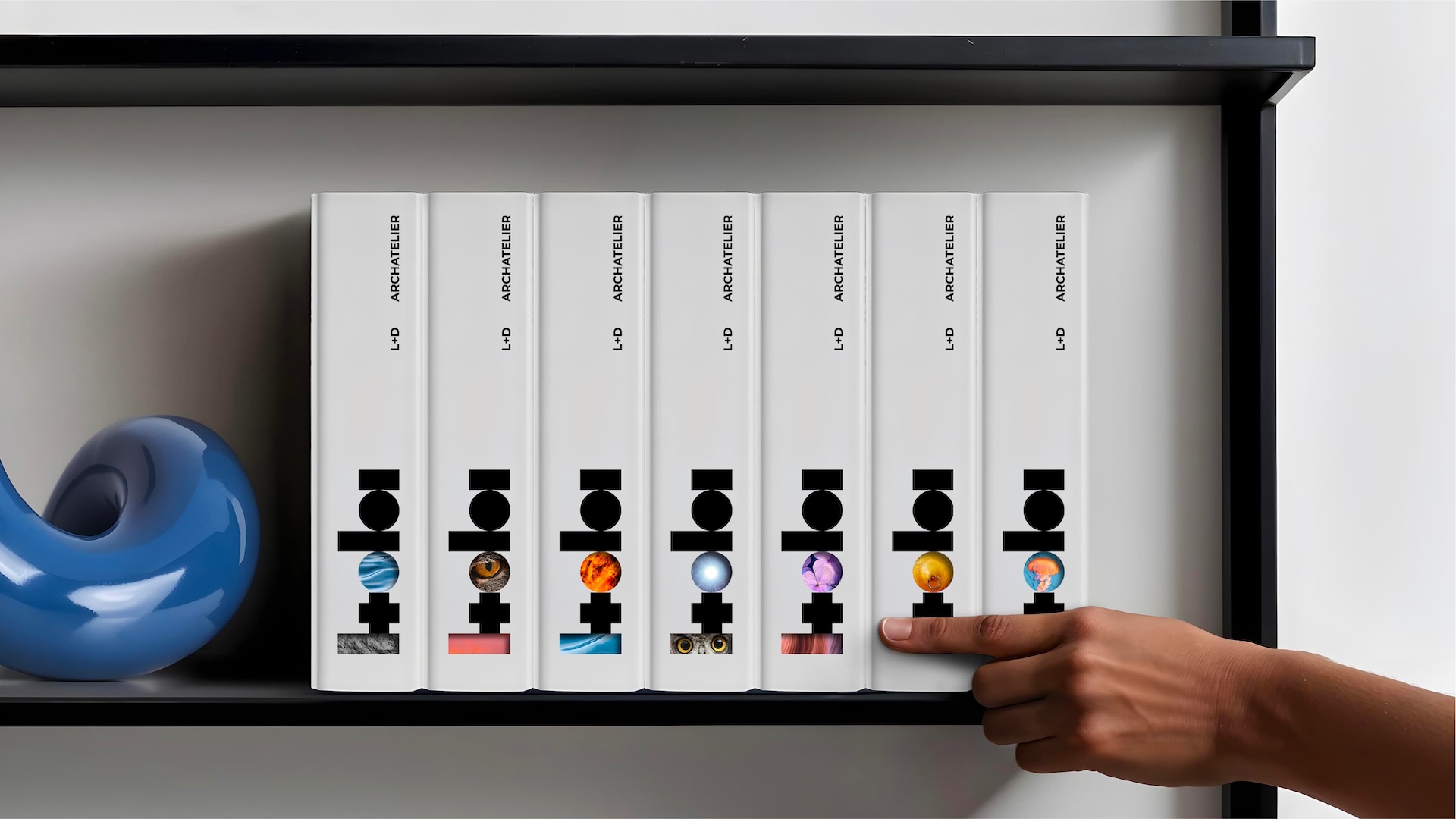
To reinforce the idea of duality, we introduced a second layer of identity – both literal and metaphorical. In the logo, key elements are cut out: the “L” and the circular part of the “D.” Through these forms, the context begins to speak. Sometimes it is the texture of real materials – concrete, wood, brick, metal – and sometimes images or visuals that continue the idea of duality expressed in the naming system. This makes the brand dynamic: it shifts with its surroundings, gaining texture, depth, and emotional resonance. The identity becomes closer to architecture itself, where architects also work with layers, materials, and context.
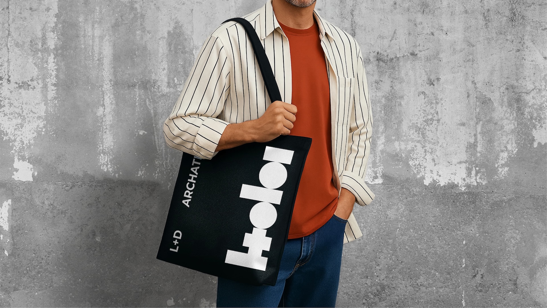
This multilayered approach extends across applications: architectural drawings, project documentation, branded merchandise, and digital communication. Even the naming system for projects follows the same principle of pairing opposites (e.g., Air+Earth, Energy+Calm), reinforcing the central idea.
The result is an identity that mirrors the architecture of the studio – functional yet deeply personal, precise yet emotional. It is alive, layered, and dynamic: a system that not only accompanies projects but grows with them, filling them with depth, warmth, and meaning. L+D Archatelier creates a harmony of contrasts, turning spaces into shared stories between architects and their clients.
CREDIT
- Agency/Creative: Vonk Agency
- Article Title: L+D Archatelier Brand Identity for an Architectural Studio
- Organisation/Entity: Agency
- Project Type: Graphic
- Project Status: Published
- Agency/Creative Country: Spain
- Agency/Creative City: Valencia
- Market Region: Europe
- Project Deliverables: Brand Architecture, Brand Identity, Brand Mark, Brand Naming, Brand Strategy, Identity System, Logo Design
- Industry: Real Estate
- Keywords: branding, rebranding, brand identity, visual identity, logo design, identity system, architecture branding, design system, creative direction, graphic design
-
Credits:
Creative Director / Branding: Viktor Ostrowsky
Concept Development / Naming: Vad Bunkoff
Brand Guidelines / Design Support: Tanya Ponomarenko


