


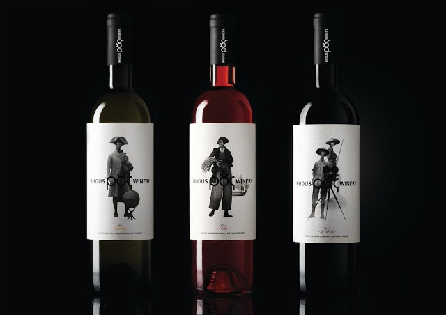
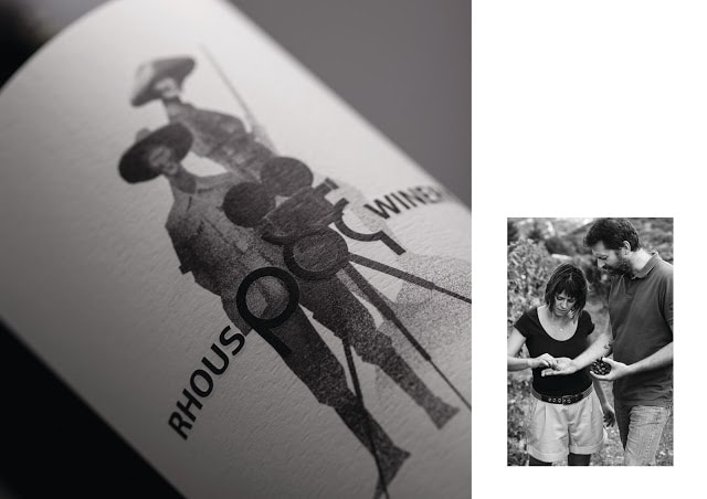
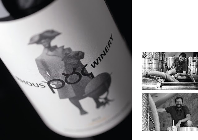
“As Cretan winery Tamiolakis was passed down to the new generation of winemakers, Maria Tamiolaki and Dimitris Mansolas, a new identity was needed. The new name and the labels tell their stories. Rhous stands for flow in ancient Greek, reflecting the stream of events that brought the two together in wine making.
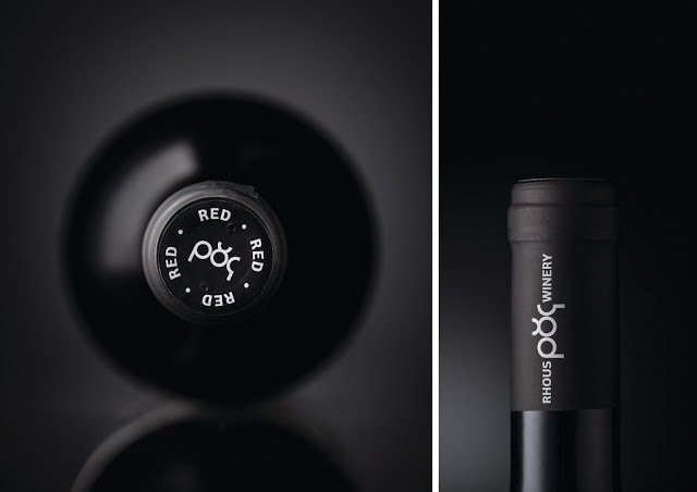
The logo was designed using the characteristic ligature of the Greek letters ο and υ, implying the maturity of the winery without looking dated.The labels demonstrate the winery’s new and international outlook, while maintaining a sense of origin.
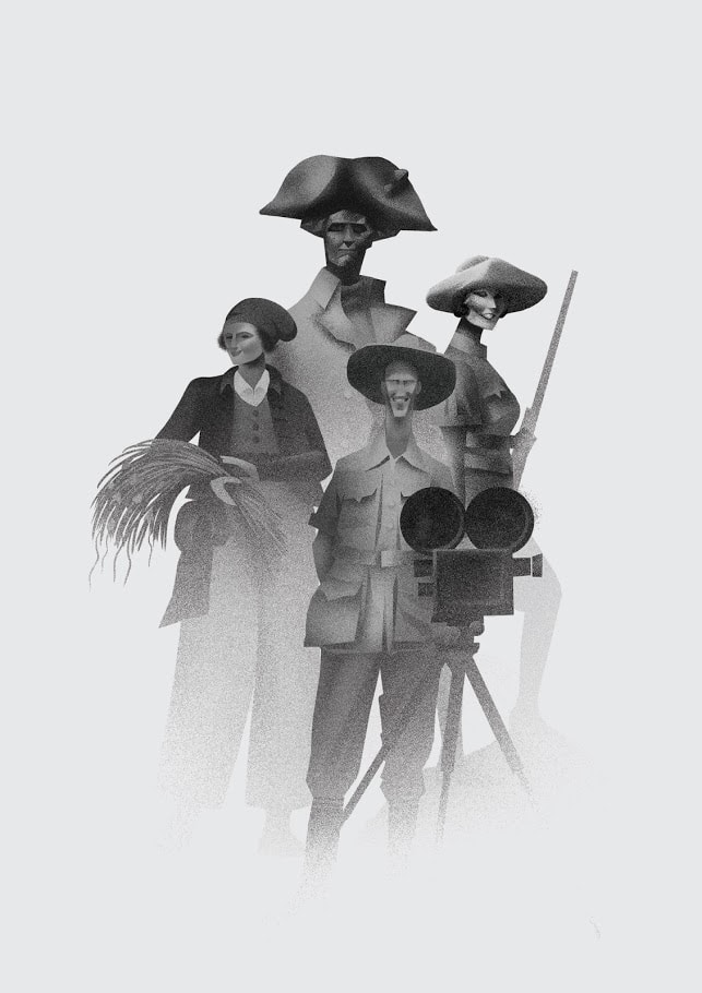
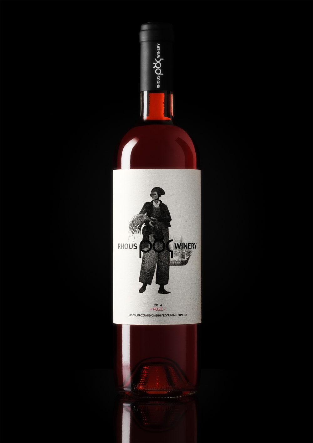
Rhous White signifies Dimitris’ journey from northern Greece to Crete, through James Cook, one of the first explorers to cross the Antarctic Circle. Rhous Rose represents Maria’s journey from Crete to France and back, through botanist Jeanne Baret, the first woman to circumnavigate the world. Rhous Red symbolises the convergence of their paths in Rhous Winery, through documentary filmmakers Martin and Osa Johnson who studied the wildlife of Africa and South Pacific Islands.
To complete the fifth sense, touch, uncoated paper and debossing technique were used.”
CREDIT
- Agency/Creative: Lazy snail
- Article Title: Lazy snail – RHOUS WINERY
- Project Type: Packaging


