


The Transformation of Parva’s Brand
Parva is a small but agile management consultancy with a pan-European perspective. After 20 years in business, the firm sought a brand refresh that would better reflect its deep financial expertise, collaborative approach, and commitment to excellence, while remaining true to its roots.
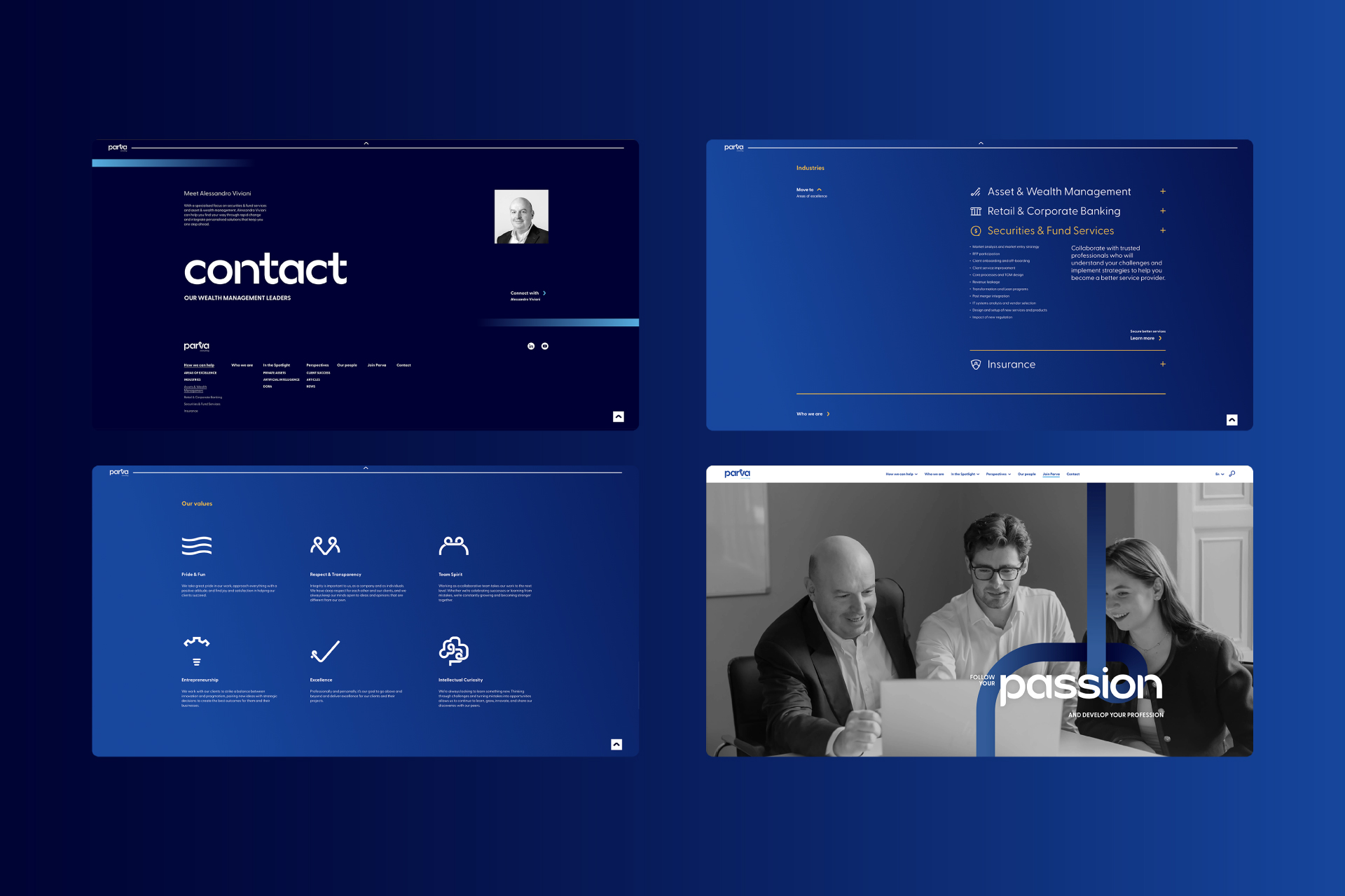
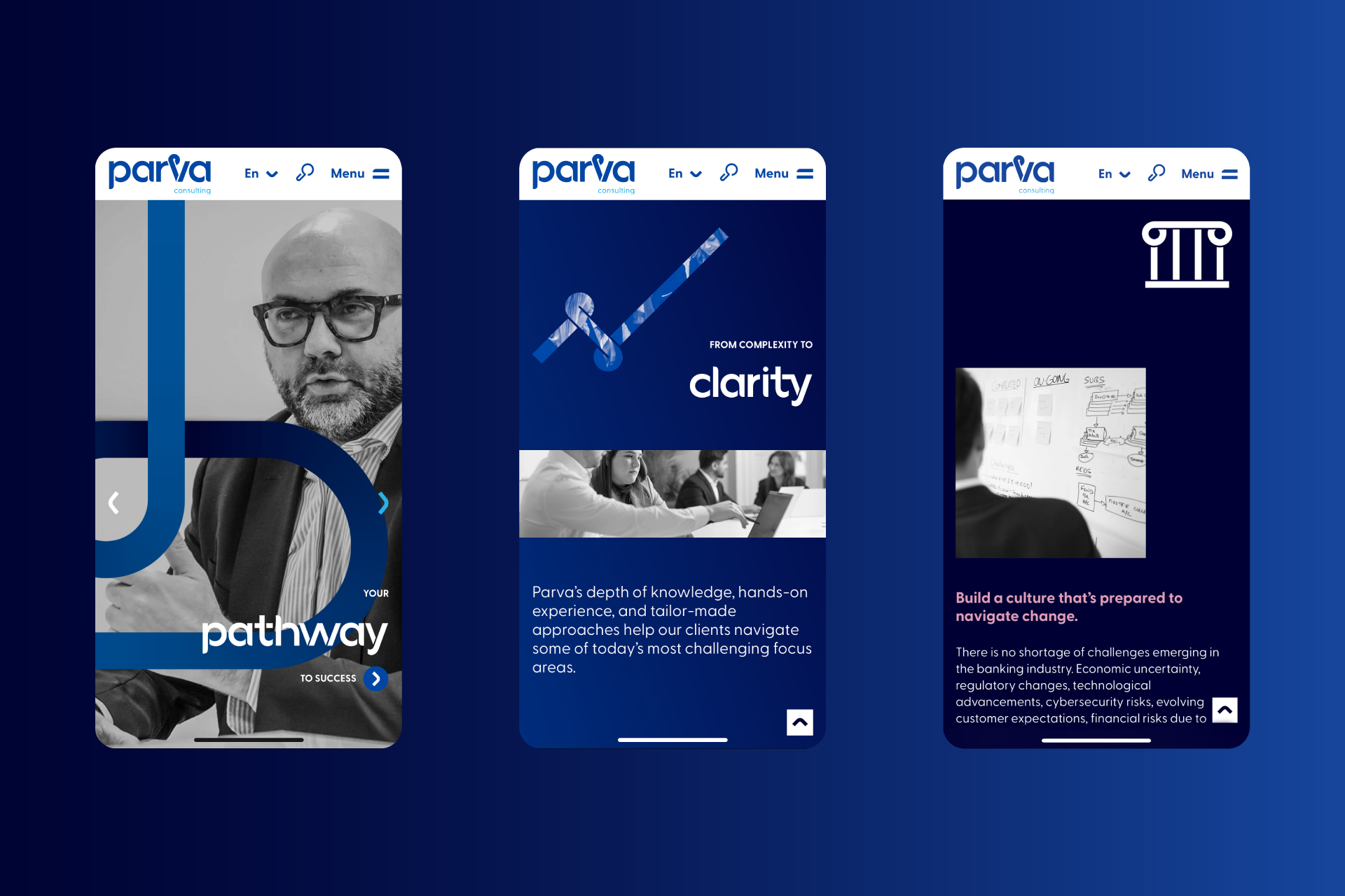
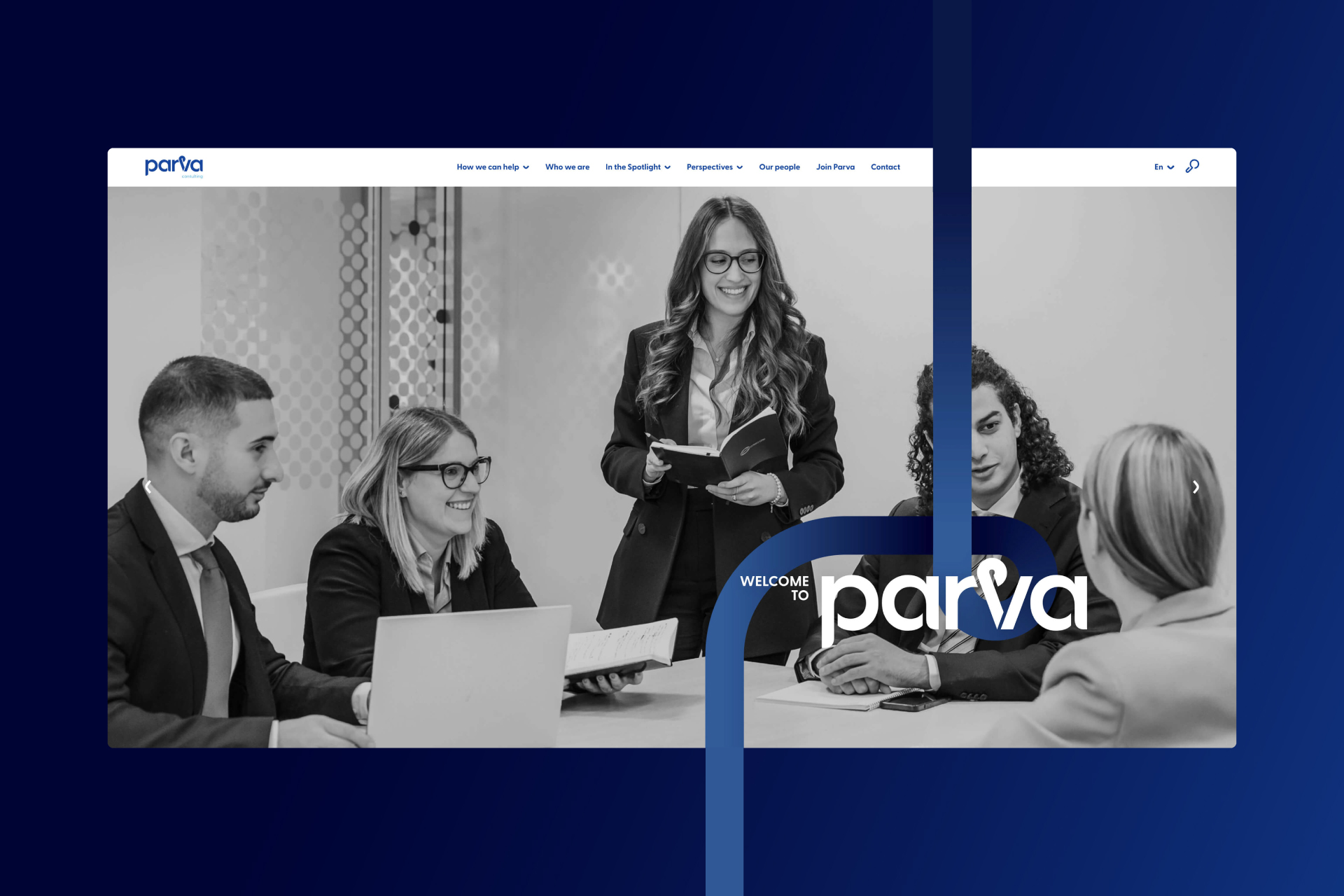
The challenge was to evolve the brand in a way that felt authentic rather than disruptive. Working closely with the Parva team, the process focused on balancing heritage with future ambition. The result is a new identity, website, and communications system that reinforces Parva’s role as a trusted advisor, supporting clients on their individual pathways to transformation.
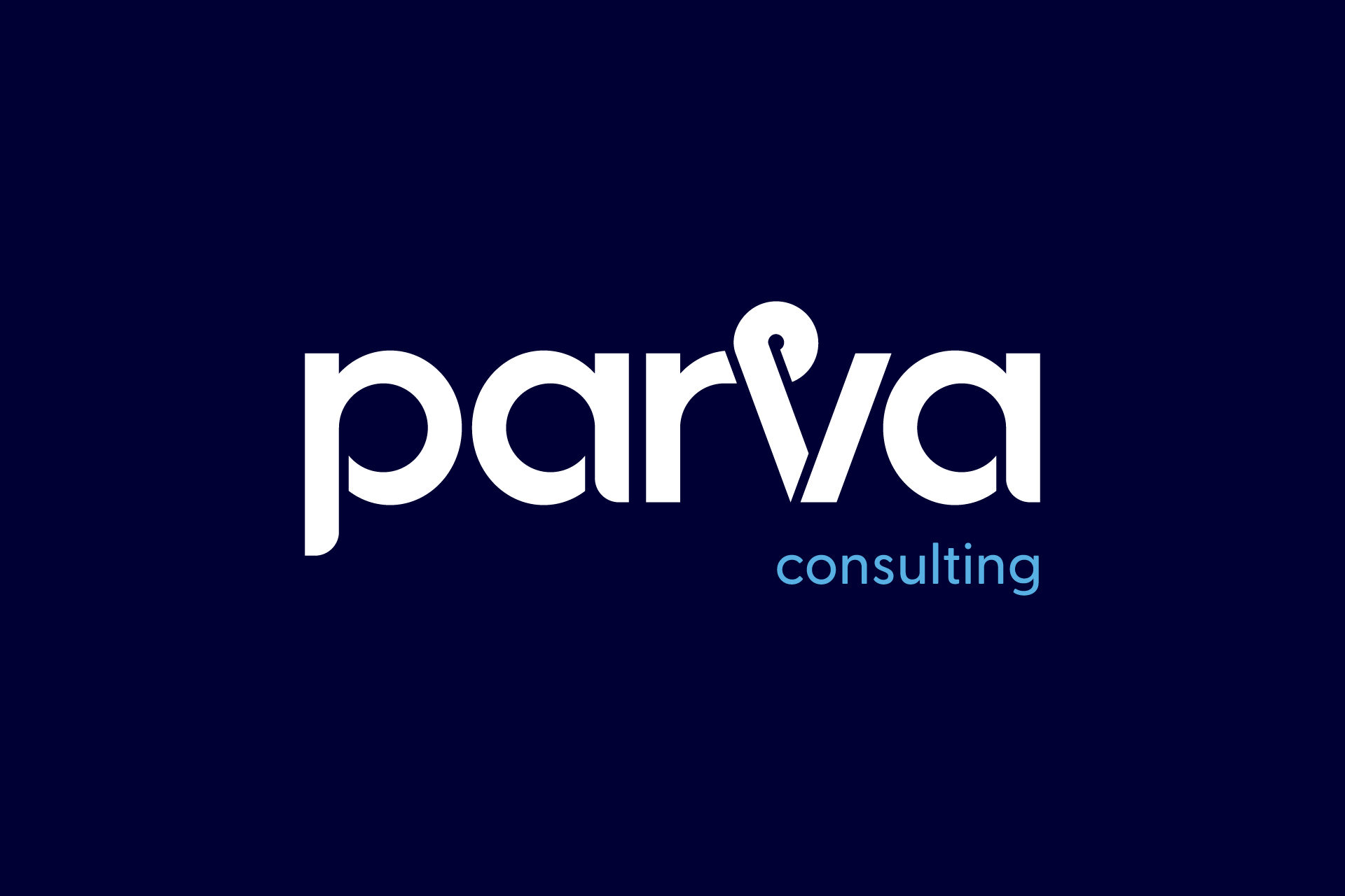
There was hesitation to move away from the original logo, which had been part of the business for decades and was well loved. Instead, the approach focused on refinement, using the logo as a foundation to build something more expressive and aligned with the brand today.
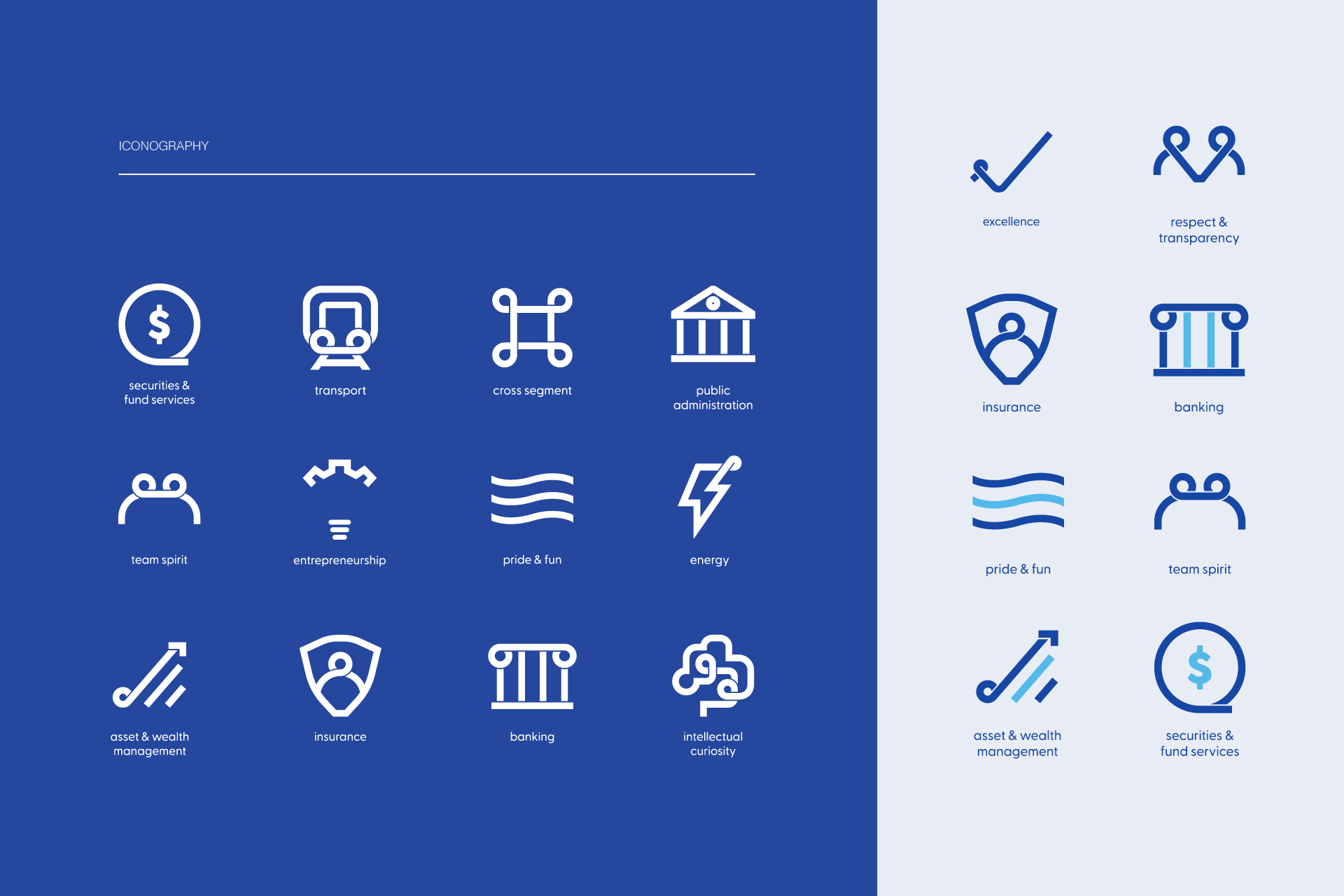
Parva’s name comes from the Latin phrase parva sed apta mihi, meaning “small but perfectly formed.” This became a key idea behind the new identity. Drawing on both the name and the circular forms in the original logo, a visual language was developed using small connected circles arranged in a continuous, flowing line.
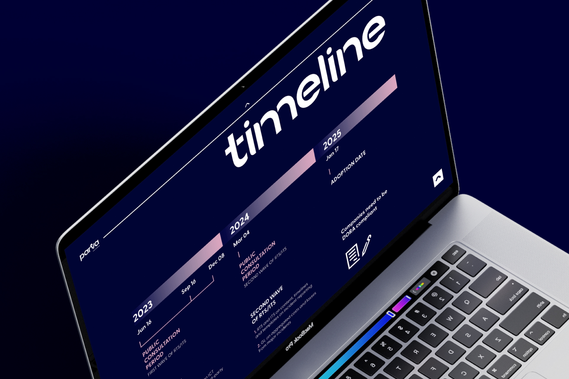
This “Parva pathway” became a central element of the brand, symbolising navigation, clarity, and guidance. It reflects how Parva supports clients through complex challenges. From this system, a new logo emerged, evolving the original mark while keeping its essence intact.
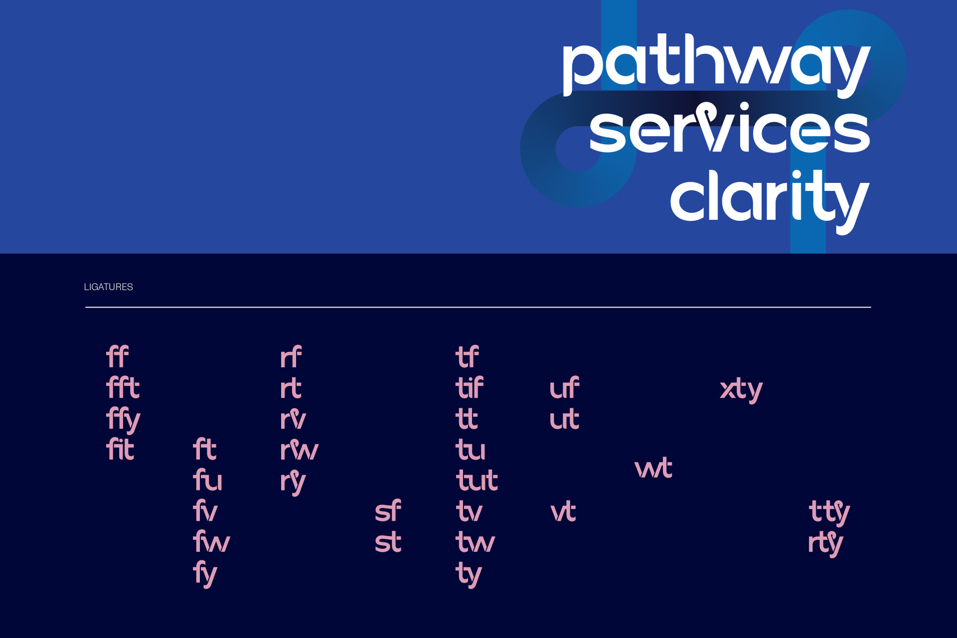
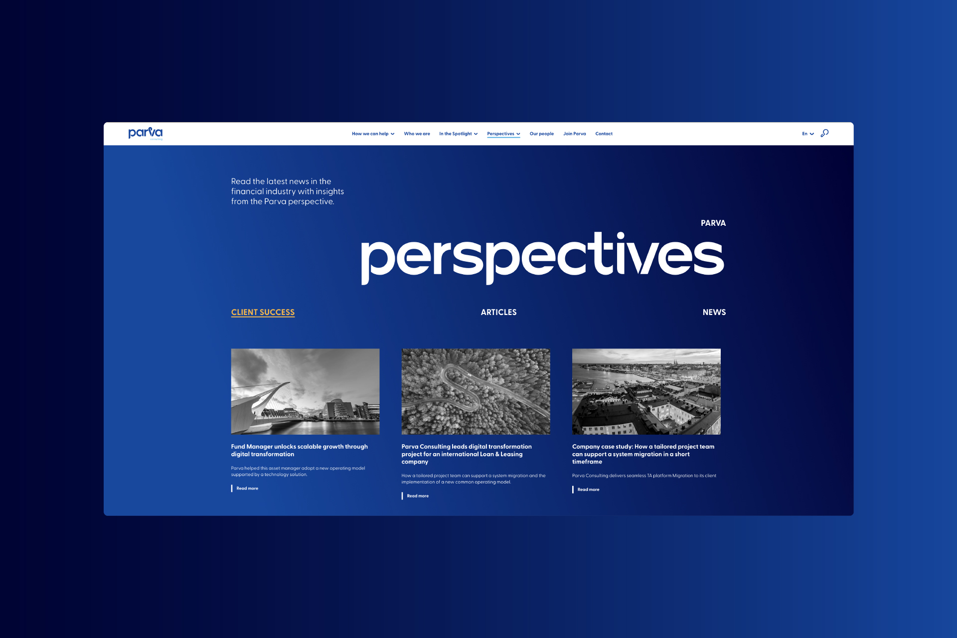
Building on this idea, a bespoke typeface was designed to echo the same sense of flow. Each letter follows the logic of the pathway, creating a typographic system that feels cohesive, open, and forward-looking.
Flowing strokes and custom ligatures introduce rhythm and cohesion, helping content move smoothly across applications. Clean geometric structures are softened with subtle curves, reflecting Parva’s expertise alongside its human approach.
The typeface plays a key role in shaping the brand’s voice, ensuring consistency while giving Parva a distinctive and recognisable expression across every touchpoint.
CREDIT
- Agency/Creative: Lazy snail Design
- Article Title: Lazy Snail Design Develops Parva With a Refined Brand Identity Balancing Financial Expertise Heritage and Future Vision
- Organisation/Entity: Agency
- Project Type: Identity
- Project Status: Published
- Agency/Creative Country: Denmark
- Agency/Creative City: Copenhagen & Heraklion, Greece
- Market Region: Europe
- Project Deliverables: Brand Design, Brand Rejuvenation, Brand Tone of Voice, Copywriting, Identity System, Lettering, Web Design
- Industry: Financial
- Keywords: brand transformation, bespoke typeface, web design, copywriting
-
Credits:
Ioanna Drakaki: Head of Design
Eleni Pavlaki: Creative Director
Serafim Stroumpis: Senior Art Director
Joanna Poupaki: Art Director
Maro Tsagkaraki: Project Manager
Mallory Staub: Copywriter
Mayra Metaxa: Developer


