


Lay’s, the world’s favorite potato chip, is unveiling its most significant global brand transformation in nearly a century with a new visual identity and packaging that will roll out across global markets.
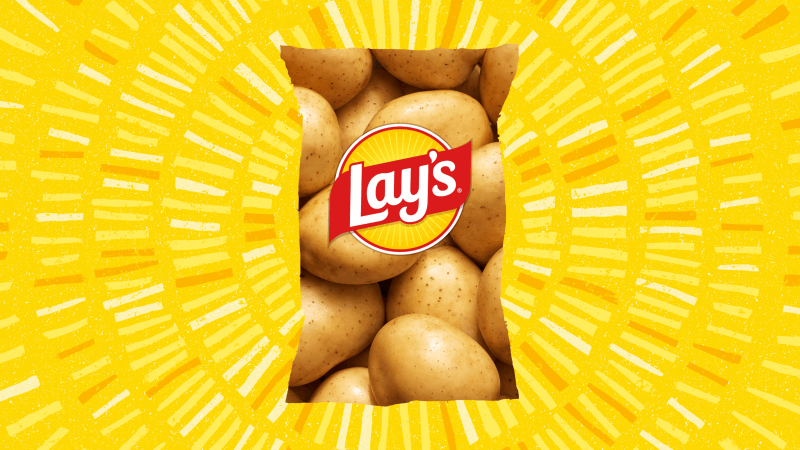
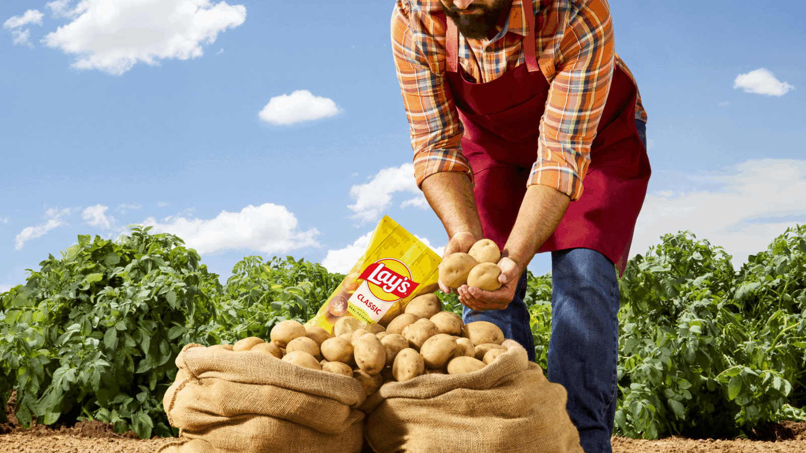
Here’s a surprising statistic: nearly 42% of consumers don’t realize that Lay’s potato chips are made with real potatoes. To address this, the new design changes – spanning the logo, packaging, photography and color palette – spotlight the farm-grown potatoes and quality ingredients used to make the world’s No. 1 chips.
This is more than a brand refresh for Lay’s. It is a visual story that speaks to Lay’s legacy of authenticity— honoring the journey from farm to bag, commitment to using only the best ingredients, and the unmatched taste and flavor that consumers know and love.
Updated design elements that are ushering the next era of the brand include:
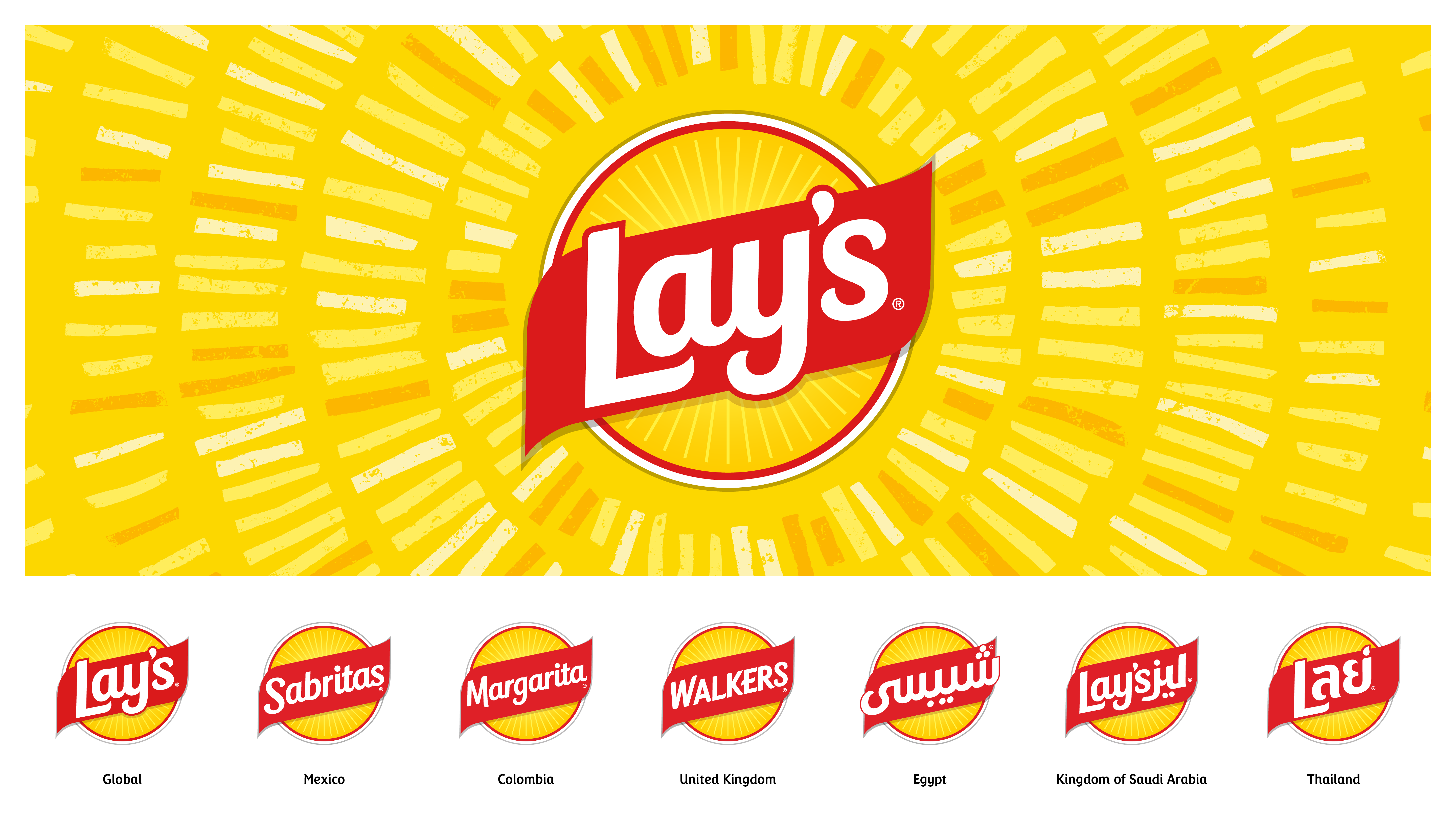
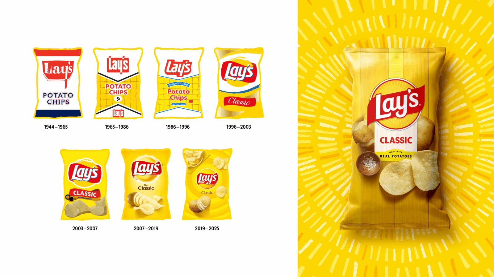
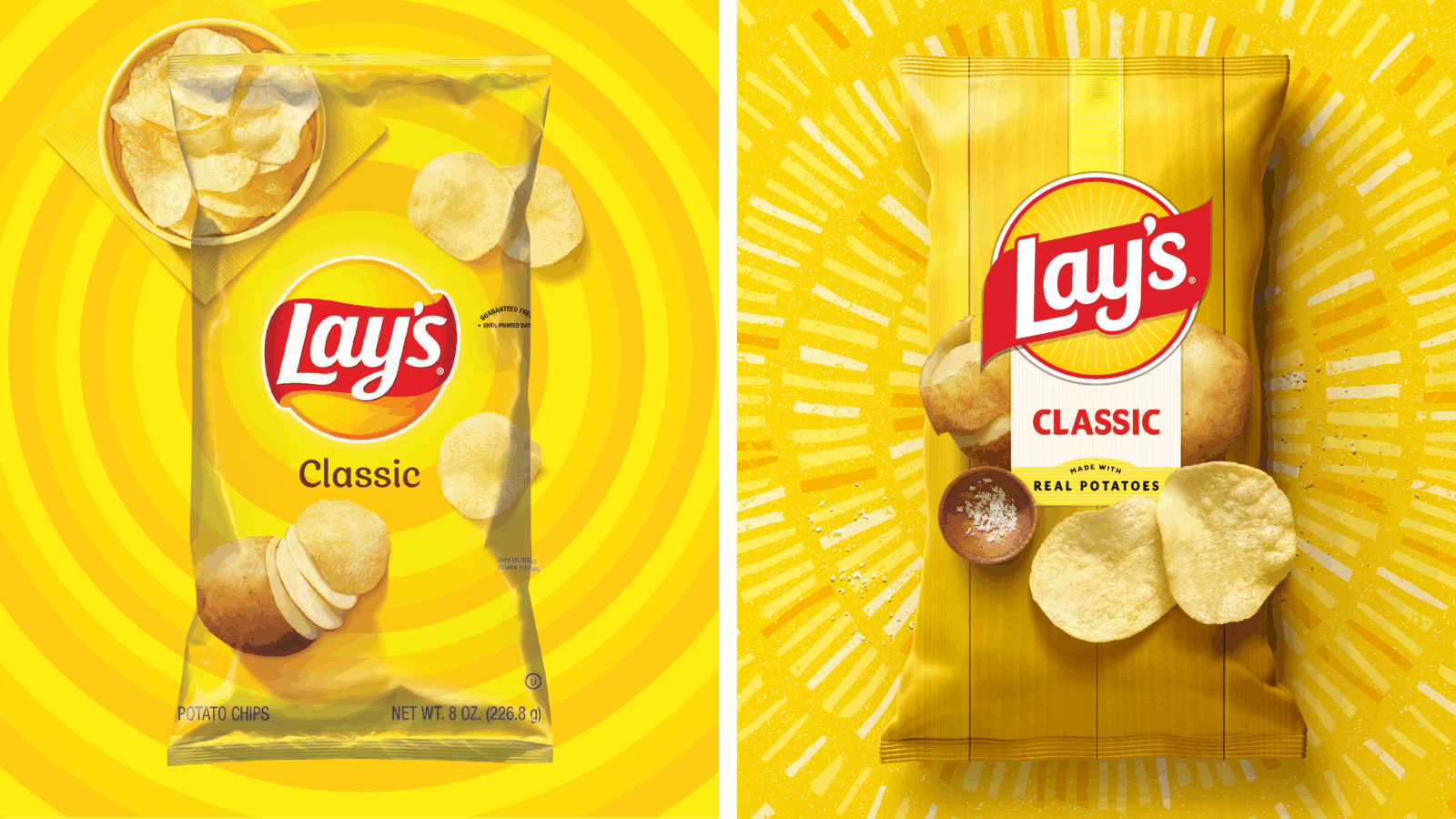
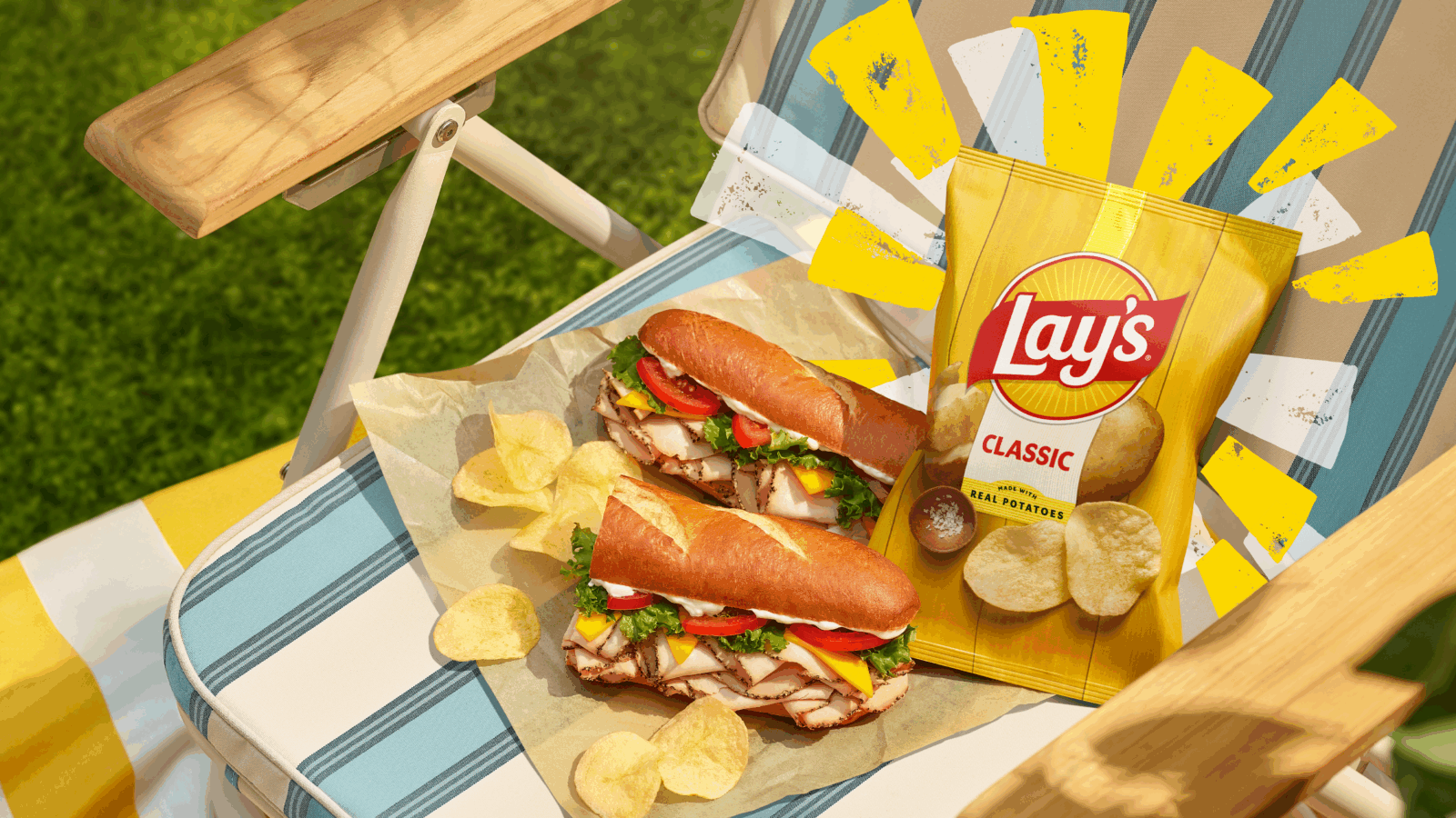
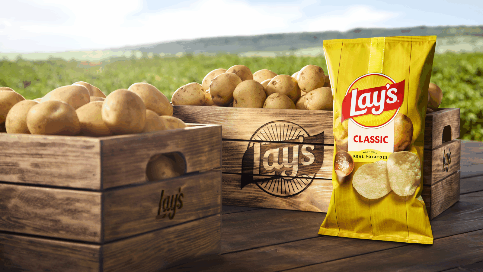
Lay’s Rays: The beams of light exuding from the Lay’s logo – known as Lay’s Rays – bring focus and energy to the heart of the new visual identity, paying homage to the sun that powers the quality ingredients inside every bag. Some rays, like those that appear on retail displays, advertisements, and more, were handmade using a potato stamping process, speaking to the brand’s core ingredient and offering natural texture and energy.
Typeface: The debut of a new custom typeface perfectly pairs with the iconic logo. Designed to echo the Lay’s modern, yet joyful character, the handcrafted type unifies every touchpoint and drives the bold new visual identity forward.
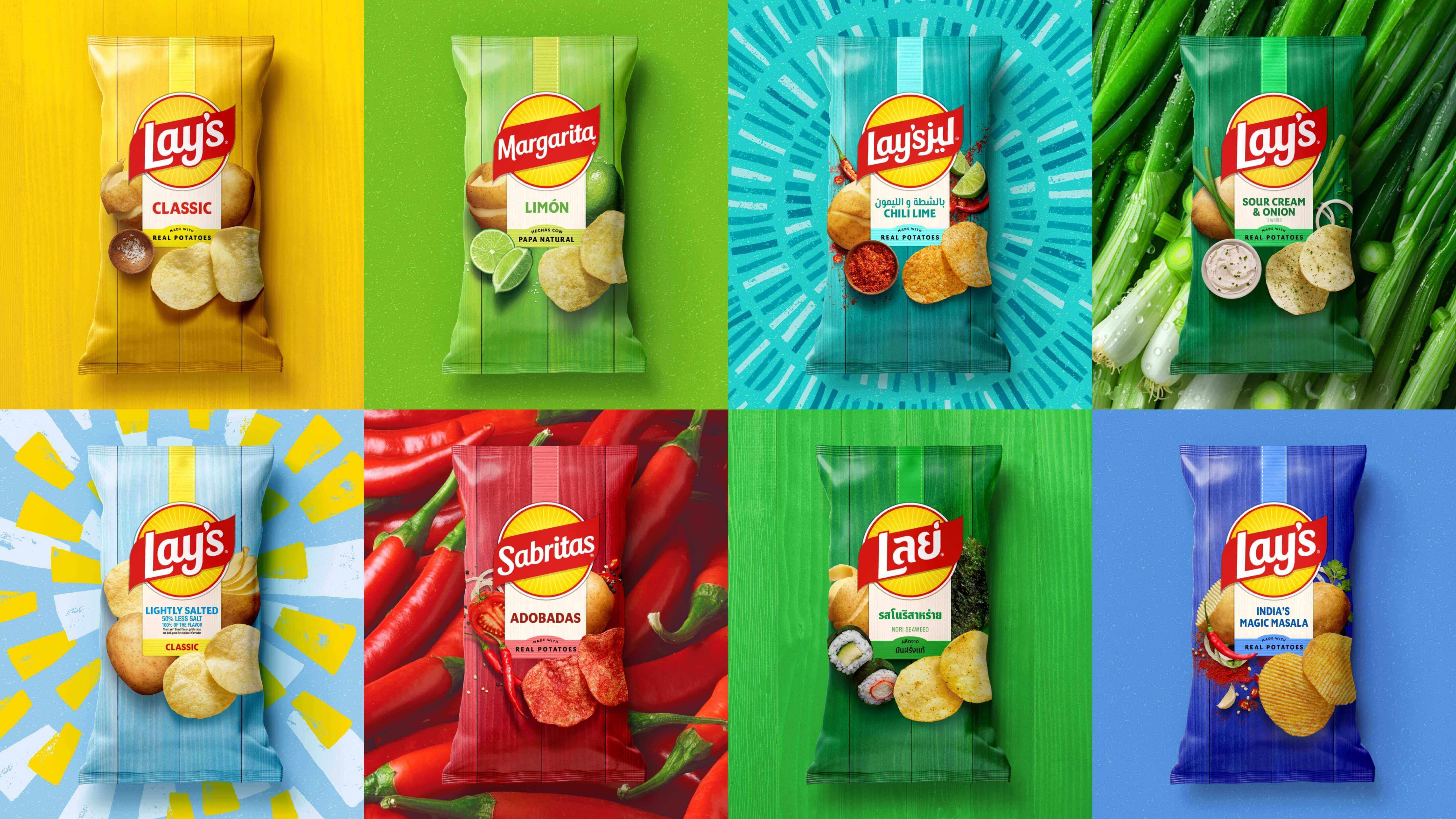
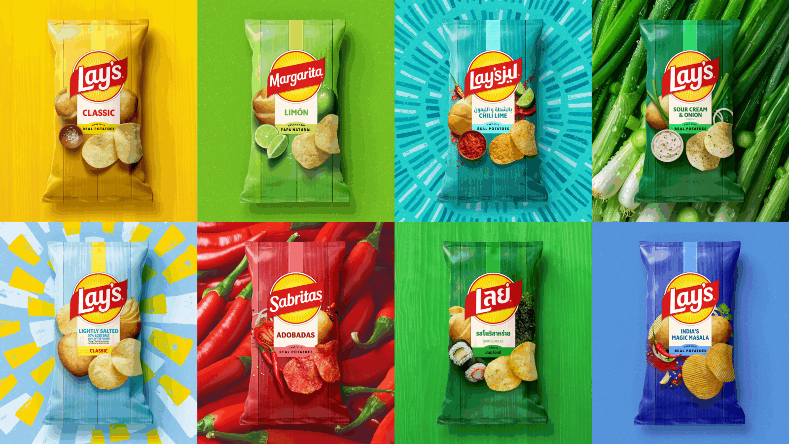
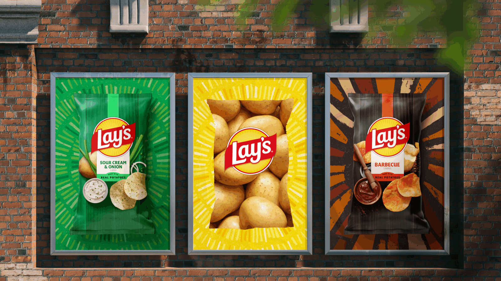
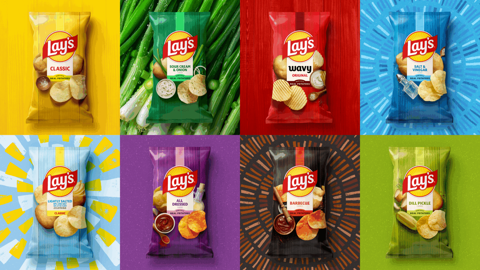
Color palette: In addition to Lay’s signature sunny yellow, a refined color palette pulls hues from the ingredients of Lay’s recipes, including savory red, hickory brown, pickle green, and more.
Backdrop: In the pack’s backdrop, the potato and other ingredients are positioned against wood grain slats, a nod to the farm crates that house Lay’s ingredients and the picnic tables where bags are often shared and enjoyed by friends and families.
Chip Imagery: Against this inviting backdrop, enhanced photography showcases the quality and flavor of every Lay’s variety. Vivid, close-up visuals highlight the golden color, crisp texture, and seasoning of each chip, celebrating Lay’s quality from farm to shareable moment. Even the flavor panel feels hand-applied, reinforcing the care behind every bag.
This global rebrand is anchored in Lay’s commitment to quality ingredients and sustainable agriculture. Working with more than 100 family farms in North America and supporting potato growers in over 25 countries, the refreshed identity unifies Lay’s iconic brand presence while allowing for local market relevance, ensuring the story of real potatoes and real people resonates wherever Lay’s is enjoyed.
Lay’s invites global consumers to experience a new chapter where great design, unbeatable flavor, and superior ingredients come together to deliver joyful snacking moments.
Executive Quote from Richard Bates, Chief Design Officer at PepsiCo:
“Leading PepsiCo’s design team as Chief Design Officer is an incredible opportunity to reaffirm and elevate the distinctive visual identities and personalities that make each PepsiCo brand unique. With the Lay’s redesign, we are combining our team’s strength in creating meaningful moments of joy with this iconic global brand, ensuring a lasting, meaningful connection with the brand people love for generations to come.”
CREDIT
- Agency/Creative: Lay's
- Article Title: Lay’s Launches Global Brand Refresh Spotlighting Heritage and Quality Ingredients
- Organisation/Entity: In-House
- Project Type: Campaign
- Project Status: Published
- Agency/Creative Country: United States
- Agency/Creative City: Purchase
- Market Region: Global
- Project Deliverables: Advertising, Label Design, Logo Design, Packaging Design
- Industry: Food/Beverage
- Keywords: Lay's Rebrand


