


Overview
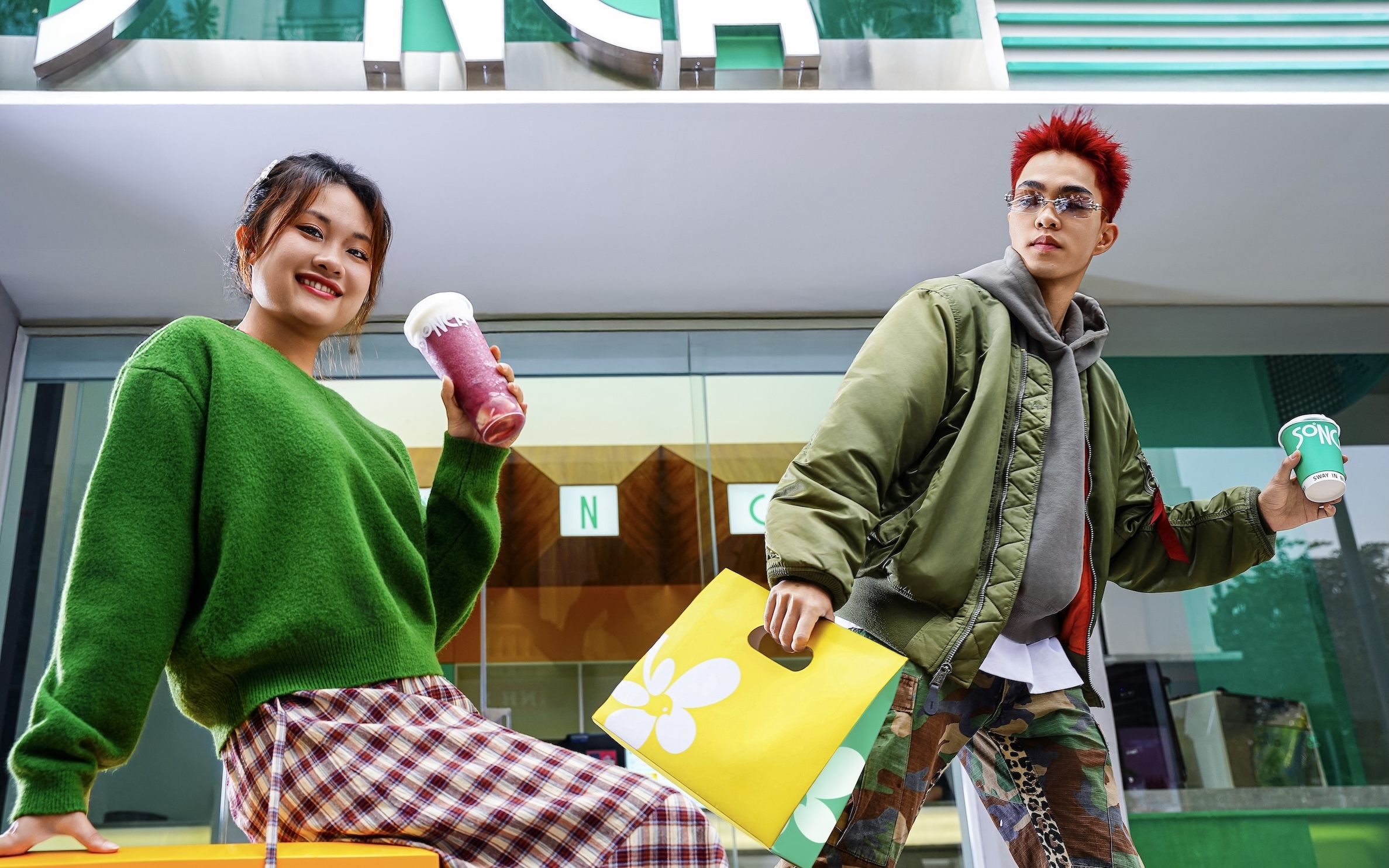
SONCA is an urban lifestyle F&B brand created for young consumers who value individuality, energy, and self-expression. More than a milk-tea brand, SONCA positions daily tea rituals as a way to express personal identity.
Challenge
Despite strong credibility, the brand landscape showed that many established brands felt overly corporate and emotionally distant from younger audiences. In a fast-moving and highly competitive market, the challenge went beyond aesthetics. The rebrand needed to modernize the brand, unify its system, and humanize its presence—building emotional connection while preparing the brand for long-term scalability and global relevance without losing its Vietnamese roots.
Strategy & Concept
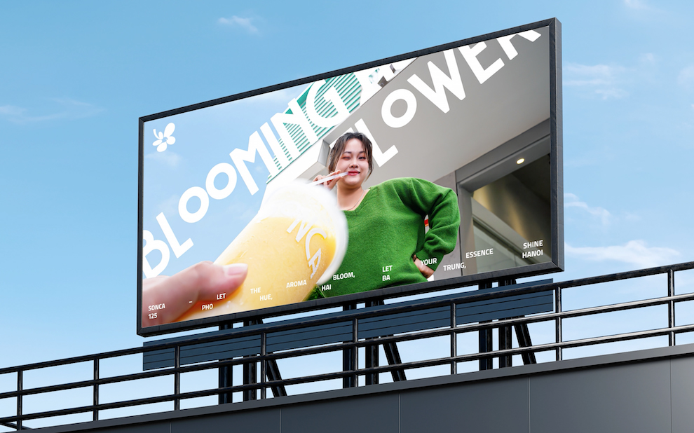
Layơ Lab developed SONCA’s core concept around “Bloom Your Inner Energy”, positioning the brand as a lifestyle expression rather than a conventional milk-tea shop. The narrative draws inspiration from the skylark—a symbol of personal voice, presence, and freedom—encouraging young people to express who they are through small, everyday tea moments.
Rather than relying on literal illustration, the story is conveyed through a structured visual language where form, negative space, and typographic rhythm communicate youth energy, passion, and individuality.
Scope of Work
Brand Direction
Core Identity (Logo, Color System, Typography)
Brand Applications
Visual Identity
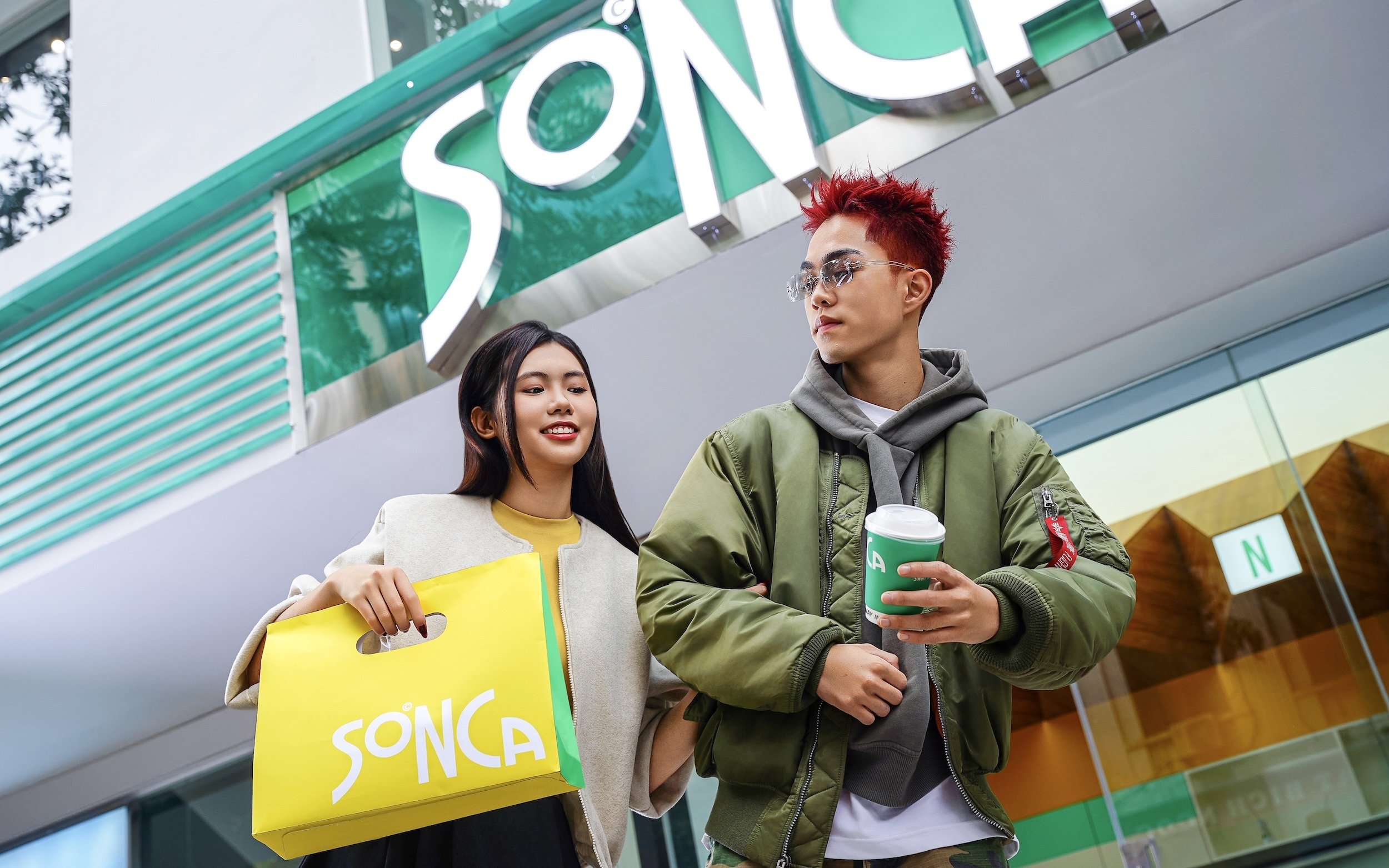
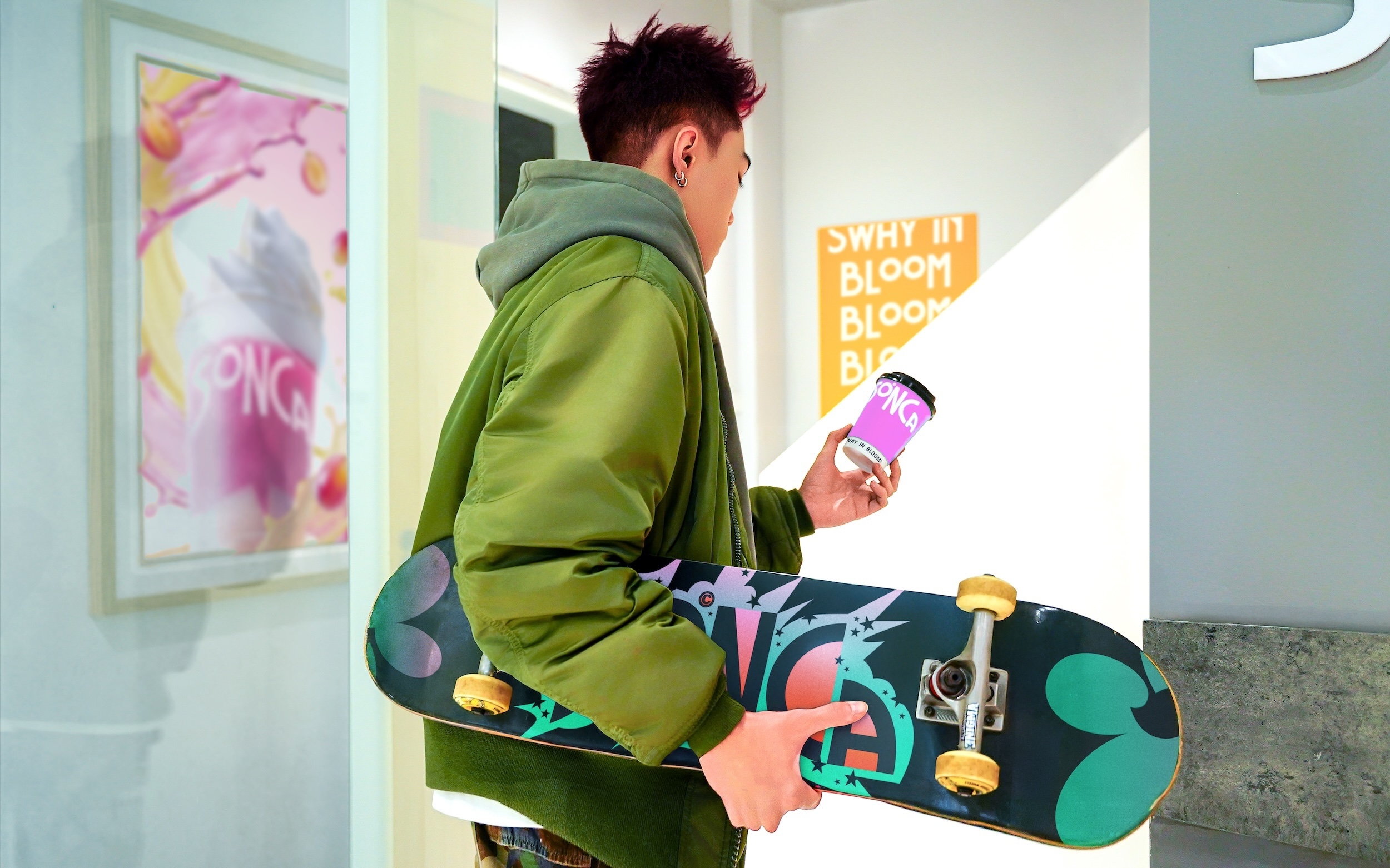
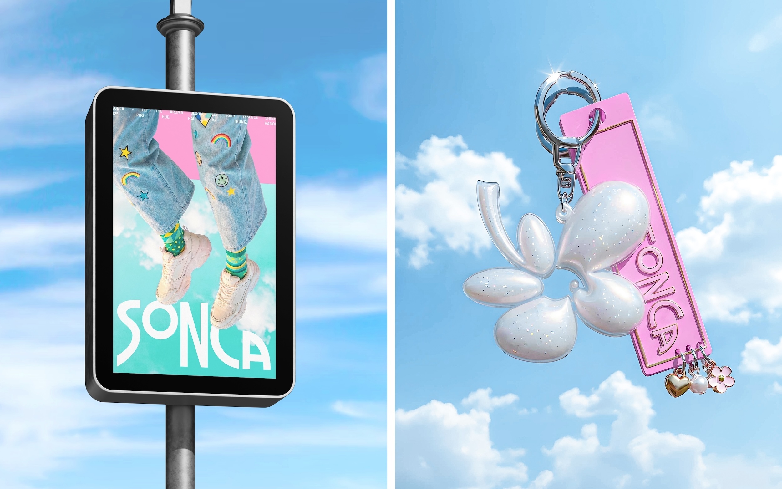
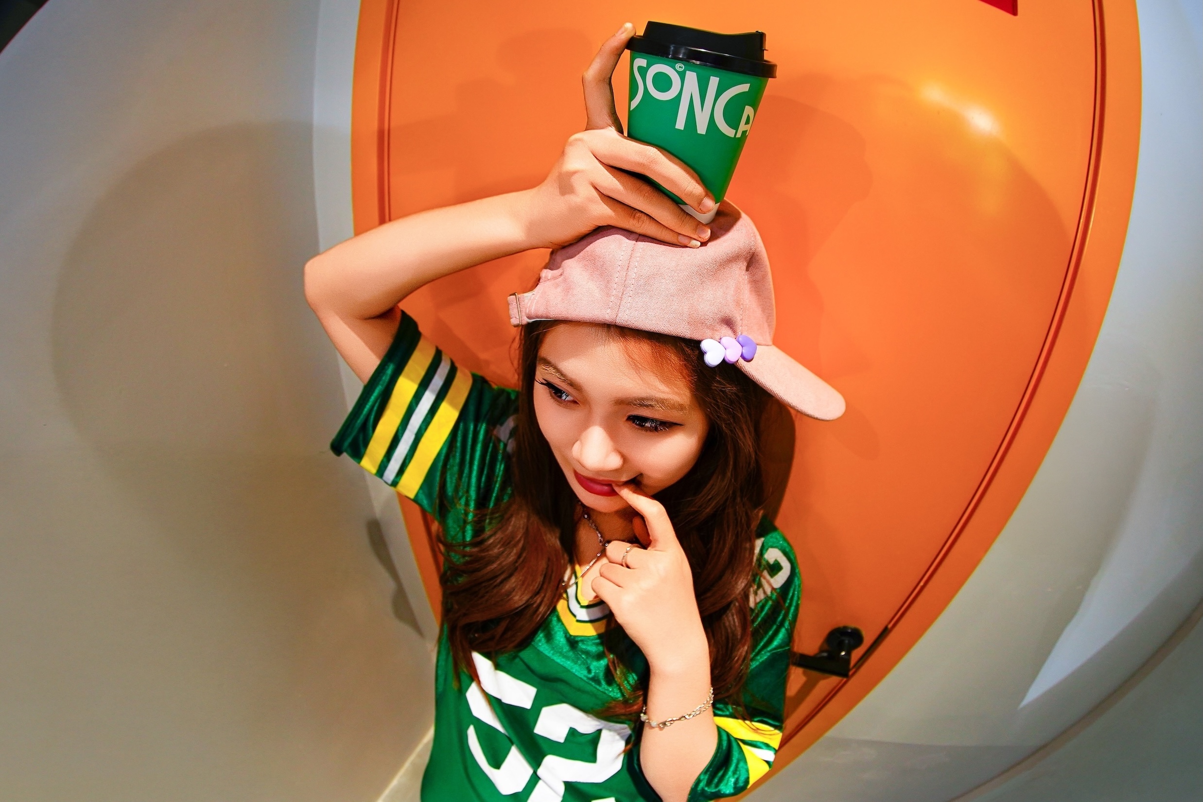
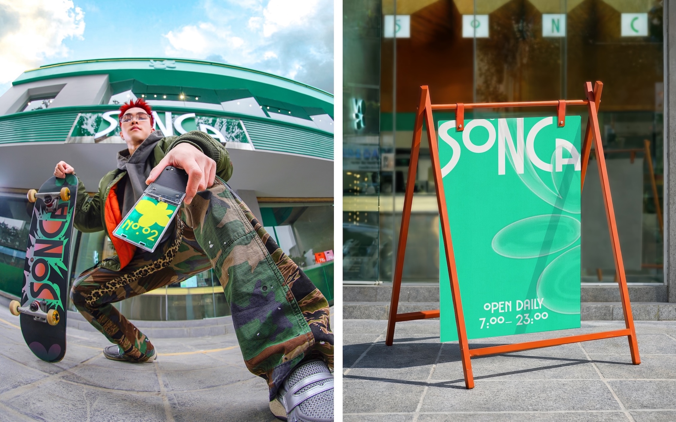
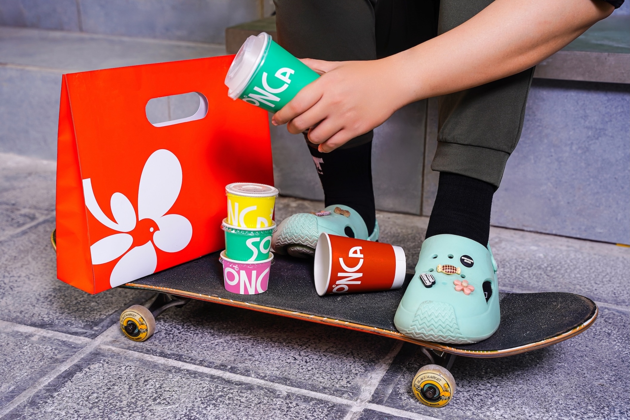
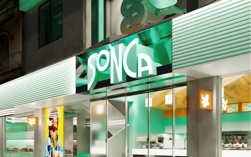
The logomark employs an abstract visual language built on rhythm, contrast, and yin–yang balance, evoking the image of a skylark emerging from blooming fields. This approach allows the mark to be instantly recognizable while forming an emotional connection with the audience. The system is designed to scale naturally into patterns, key visuals, and spatial applications.
The logotype and typography system are rooted in a contemporary Art Deco foundation, infused with street-level Post-Modern energy. Subtle details—such as SmallCaps vowels, cap-height alignment, and colored counters—add rhythm and depth without compromising legibility, reflecting the free-spirited and expressive mindset of a new generation.
Key Features
Abstract negative-space logomark
Art Deco–inspired logotype and typography
Post-modern counter coloring
Dual-typeface system balancing expression and clarity
Spatial Experience
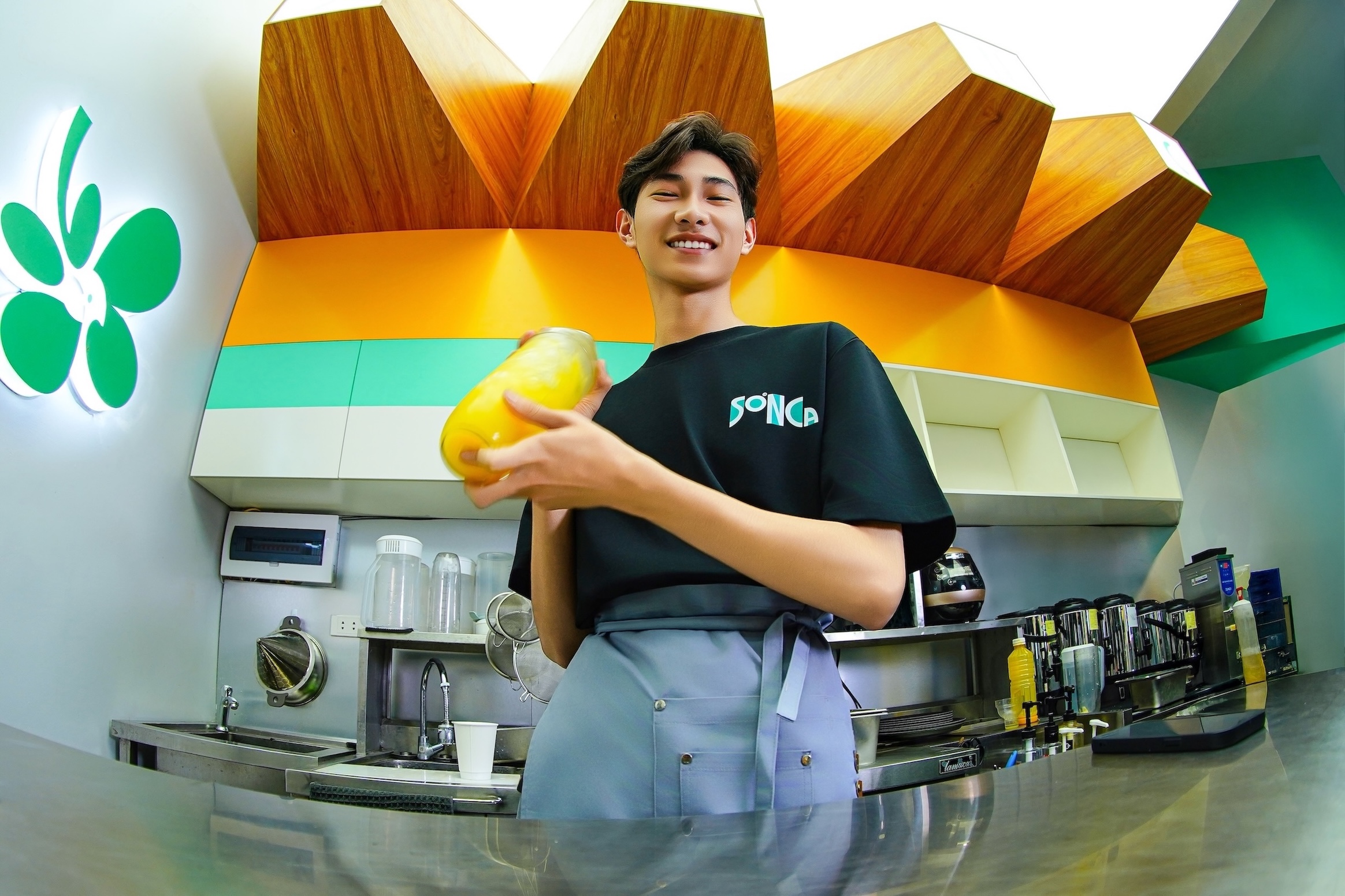
SONCA’s brand identity extends seamlessly into physical space through collaboration with Lepoint DE. The interior concept emphasizes clarity, structure, and visual breathing room—mirroring the balance between solid forms and negative space found in the identity system. Graphic elements derived from the logomark translate into wall patterns and environmental cues, while typography ensures clear navigation and consistent hierarchy. The result is a contemporary, urban environment designed for scalability across future locations.
Conclusion
Layơ Lab positioned SONCA as a lifestyle F&B brand anchored in strategic visual thinking. From a logo built for instant recognition to a typographic system optimized for both digital and urban environments, SONCA is designed to stand out in a saturated market while maintaining long-term clarity and consistency.
CREDIT
- Agency/Creative: Layơ Lab
- Article Title: Layơ Lab Repositions Sonca as a Lifestyle Driven Urban Tea Brand
- Organisation/Entity: Agency
- Project Type: Identity
- Project Status: Published
- Agency/Creative Country: Vietnam
- Agency/Creative City: Layơ Lab
- Market Region: Asia
- Project Deliverables: Brand Identity, Packaging Design, Photography Styling
- Industry: Food/Beverage
- Keywords: FNB, Milktea, Energy,Art Deco
-
Credits:
Creative Director: Alex Dang
Designer: Danson Vu
Designer: Thanh Nguyen
Designer: Minh Duc
Account Manager: Krist Luw
Copywriter: To Huy
Interior Design: Lepoint DE. Concept
Photography: Layơ Lab
Photography: SONCA


