Latte e Luna is an Italian brand of natural eco-dermo-compatible cosmetics.
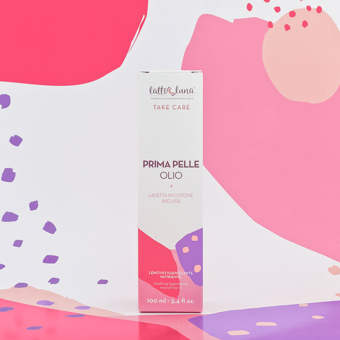
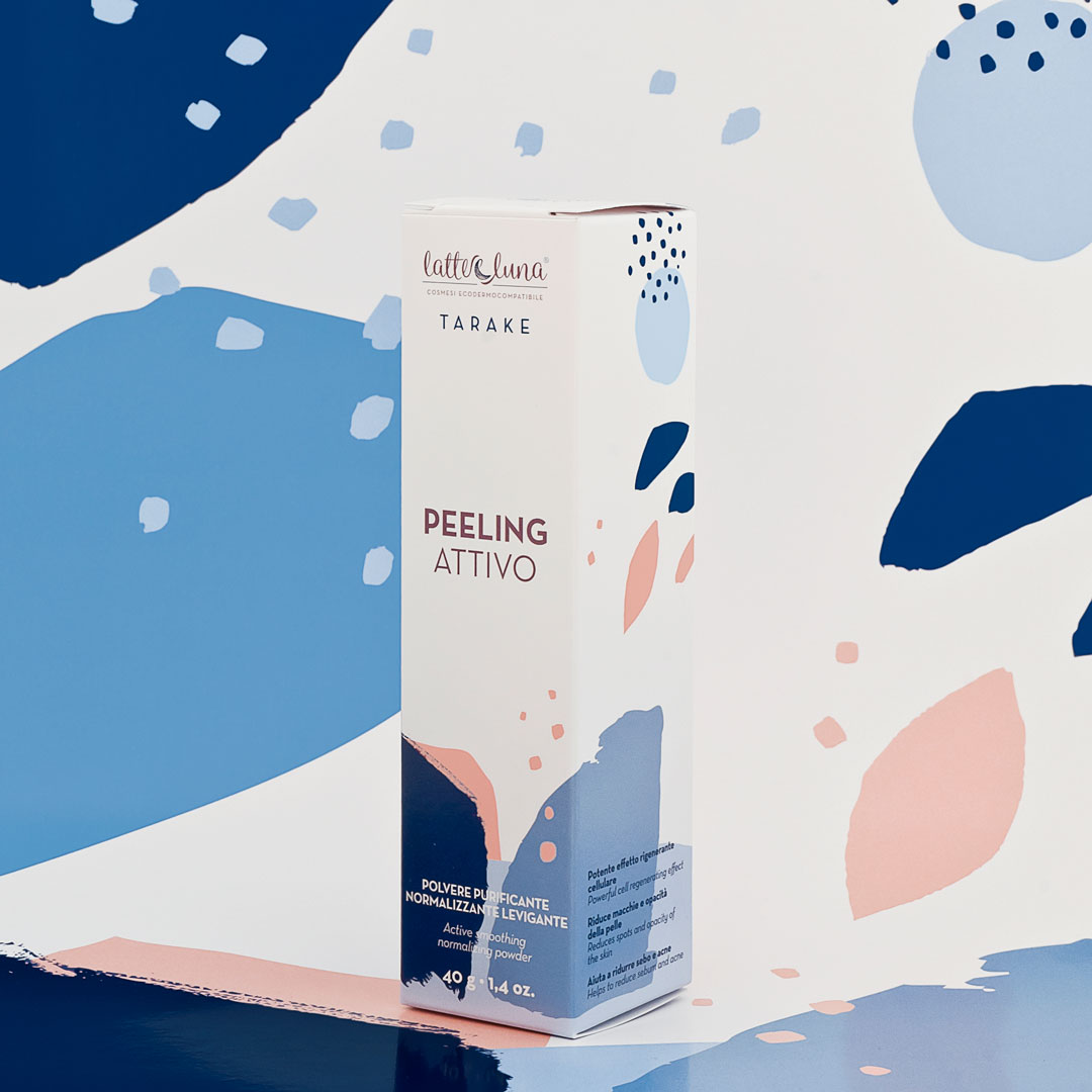
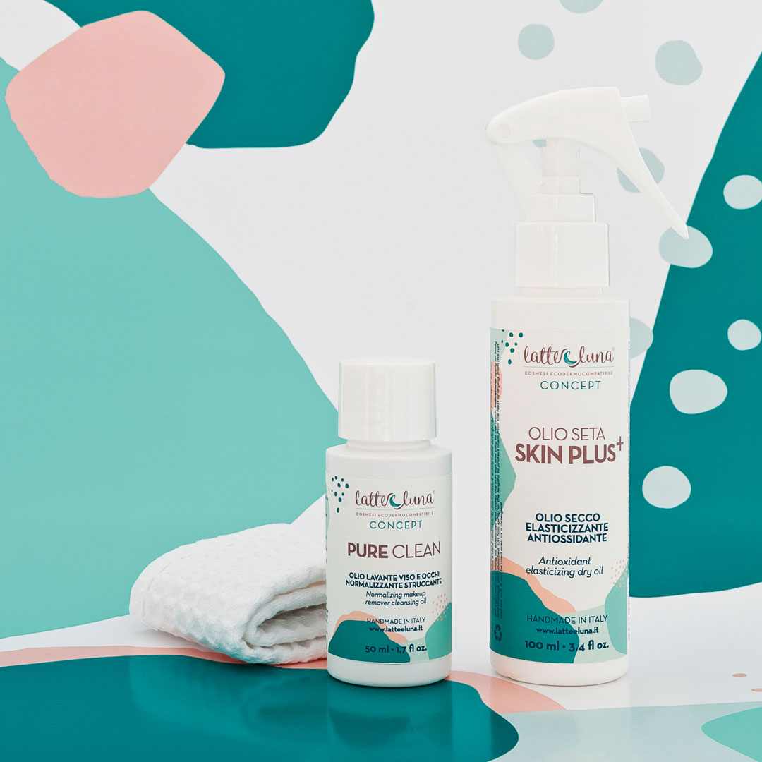
This brand has been completely restyled with new logo, labels and product packaging. The concept was born from the idea of putting the skin in the foreground, creating a visual abstraction. The image was developed by decomposing the layers of the skin and the pores, and reinterpreted in the form of coloured spots, distinguishing three sub-categories with different shades (blue, red and green) and leaving the skin colour as the common element.
The final product resembles a small abstract work of art, with hand-made brushstrokes that feature the craftsmanship of the cosmetics production process.


CREDIT
- Agency/Creative: Mol Design Studio
- Article Title: Latte E Luna Natural “Eco-dermo-compatible” Cosmetics
- Organisation/Entity: Freelance, Published Commercial Design
- Project Type: Packaging
- Agency/Creative Country: Italy
- Market Region: Europe
- Project Deliverables: Brand Identity, Graphic Design, Packaging Design, Rebranding, Research
- Format: Bottle, Box
- Substrate: Pulp Carton
FEEDBACK
Relevance: Solution/idea in relation to brand, product or service
Implementation: Attention, detailing and finishing of final solution
Presentation: Text, visualisation and quality of the presentation


