


Summary
Bodegas Salado wish to highlight the uniqueness of a variety native to Seville’s Aljarafe region: Garrido Fino. A winery with over two centuries of history closely linked to the development of dressage, and with its own stud farm which serves to project the Salado family name beyond the winery.
A white wine destined to be the most emblematic of the winery, and which will serve to compete in a higher category due to the special nature of this grape variety.
A wine to enjoy while letting yourself be captivated by the Sevillian imagery. A wine which connects with their sparkling wine range.
Objectives
To leverage the untamed, natural, and attractive aesthetics of the equestrian world.
To create a link with the rest of the product range, creating a common thread throughout the portfolio.
To provide a visual narrative to this new proposal which clearly transports us to the Aljarafe of Seville, freshness, festivity, and a certain sophistication.
Proposal
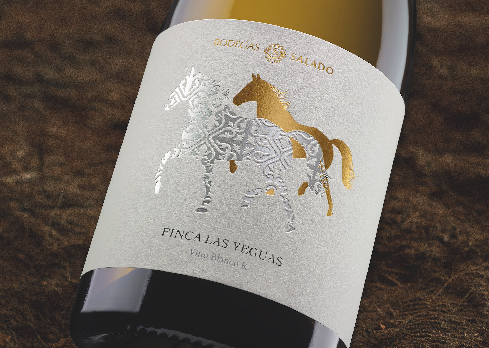
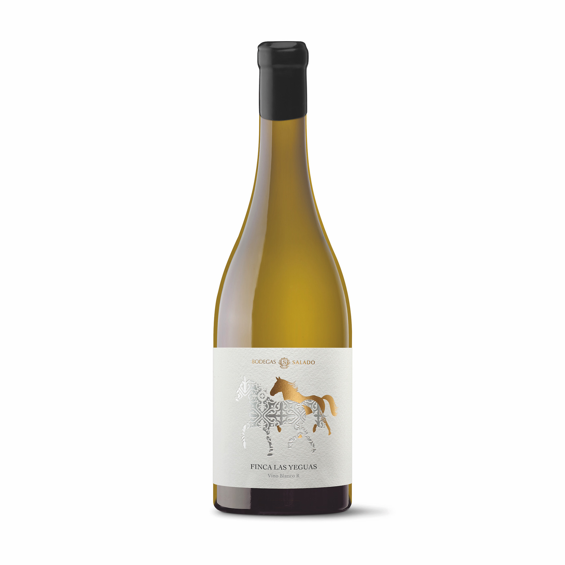
A silhouette of a horse, which serves as a visual representation, symbolising the landscape, people, lifestyles, memories, sensations, in addition to a distinctive pattern which is recognisable from the Reserva Familiar sparkling wine: the winery’s most premium sparkling wine.
At the same time, we appropriate the rich meaning of the equestrian world: optimistic and sociable, highly independent, with a strong temperament which leads them to act somewhat uncontrollably in certain situations.
The natural texture, feel and sensations of the materials transport us to the naturalness and craftsmanship of the work, and to the detail with which they master the vineyards.
This project should also serve to synthesise the wine tourism project they have in mind, which is based on the pillar of the indigenous grape variety. A young wine and a white crianza, both of which surprise and please.
We aim to reach the consumer who is looking for a different, non-classical proposal. A consumer seeking surprise and a story to tell, who is interested in discovering new things, unique varieties.
Graphic Solution
Few elements, but highly recognisable, which, thanks to a minimalist composition, make the end result truly memorable. The purity of form and the silhouette of the horse ensure it is highly distinguishable when placed on a shelf next to other wines. The comparison is a visual parenthesis in a sea of impacts.
A typeface which summarises, like a stud iron, the clear inspiration of this wine: classic yet modern, different yet recognisable; a duality which enhances the idea we are aiming to express.
Production
We use materials with a cottony texture to convey the delicate care with which Garrido Fino is mastered. Embossing and counter-blocks give volume to the label, making it attractive, and enticing the consumer to touch it to discover all its details.
Social Media
Garrido Fino is a native variety from the Aljarafe region of Seville which produces young, fresh wines for early consumption. Medium acidity. Wines which are slightly aromatic, smooth, light, and pleasant: like the trot of a mare.
CREDIT
- Agency/Creative: TSMGO
- Article Title: Las Yeguas Estate Label Design
- Organisation/Entity: Agency
- Project Type: Packaging
- Project Status: Published
- Agency/Creative Country: Spain
- Agency/Creative City: Logroño
- Market Region: Europe
- Project Deliverables: Design
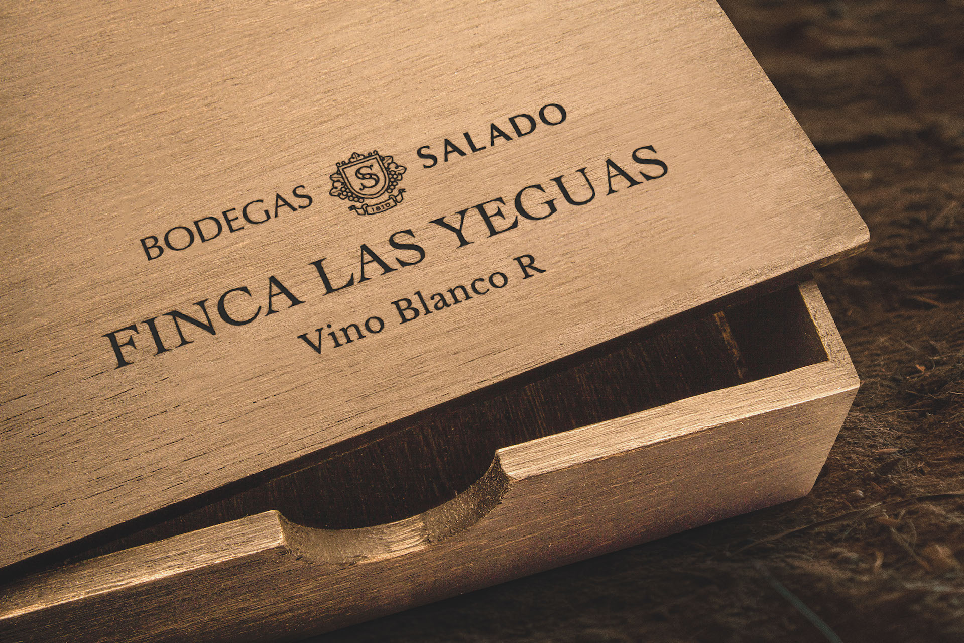
- Format: Bottle, Box
- Substrate: Glass Bottle
- Industry: Food/Beverage
- Keywords: Wine, winery, wine label, horse, seville, spain, design, packaging
-
Credits:
Agency: TSMGO


