Originally from Malaga – where everything is an invitation to enjoy life’s simple pleasures – Larios was looking to define its brand universe based on the Buena Vida spirit: the Good Life in Spanish.
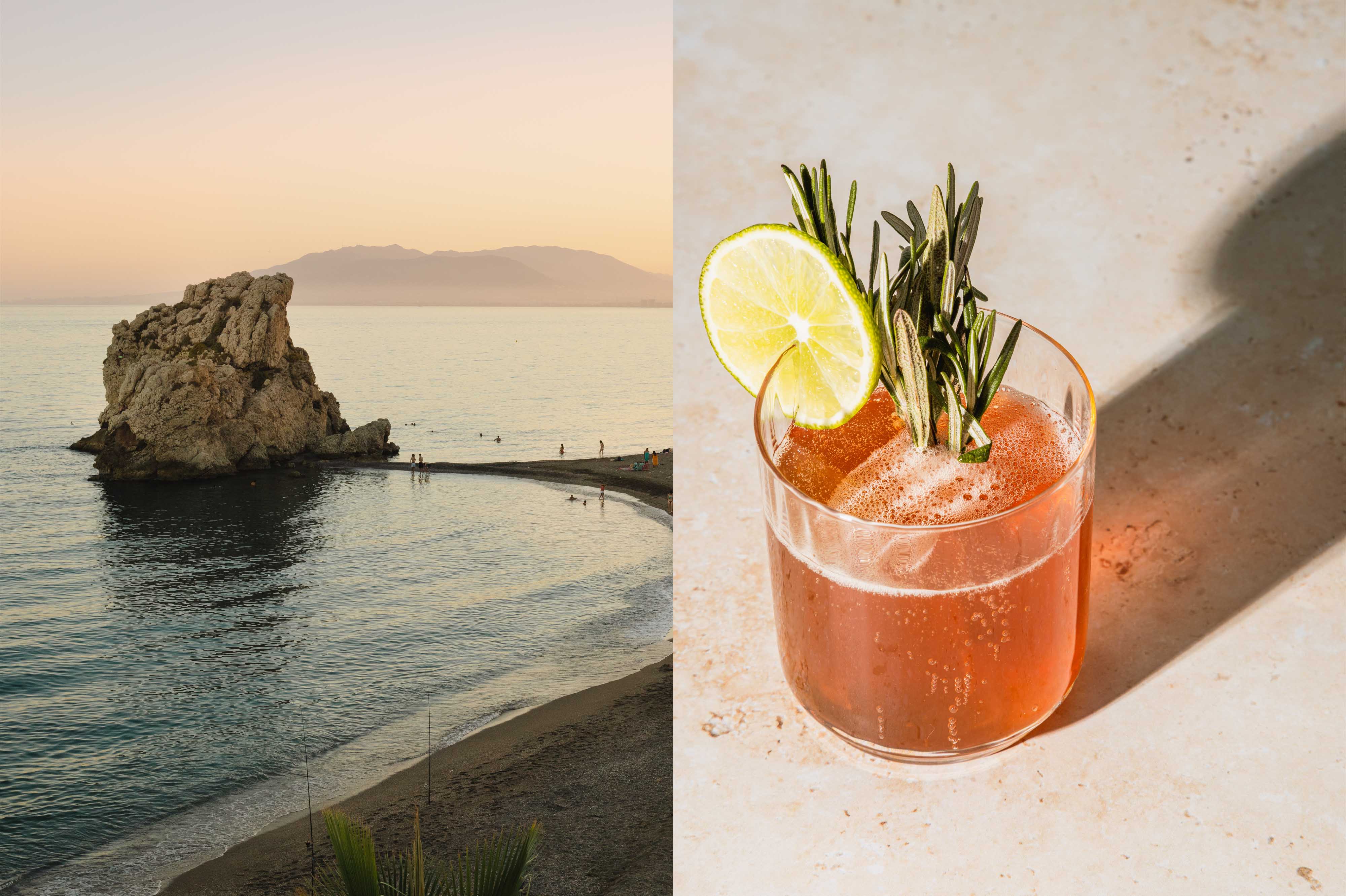
With the purpose of creating a proprietary universe for Larios, we travelled to Malaga to feel its natural rhythm and the warmth of its people. We immersed ourselves in the unmistakable fragrance of orange blossom to identify all the unique elements of its birthplace in the heart of the Mediterranean.
Inspired by the mood of the Buena Vida (The Good life), which represents a philosophy of relaxed and aspirational living, reminding us of the true meaning of living well and appreciating the beauty of small, everyday pleasures, we defined the design principles that would guide the new visual brand’s ecosystem, revealing Malaga’s Mediterranean spirit, with its colours and lights, its fragrances, and ingredients. The goal was to create a brand world that would inspire a relaxed energy, inviting everyone, everywhere to let it flow and let go.
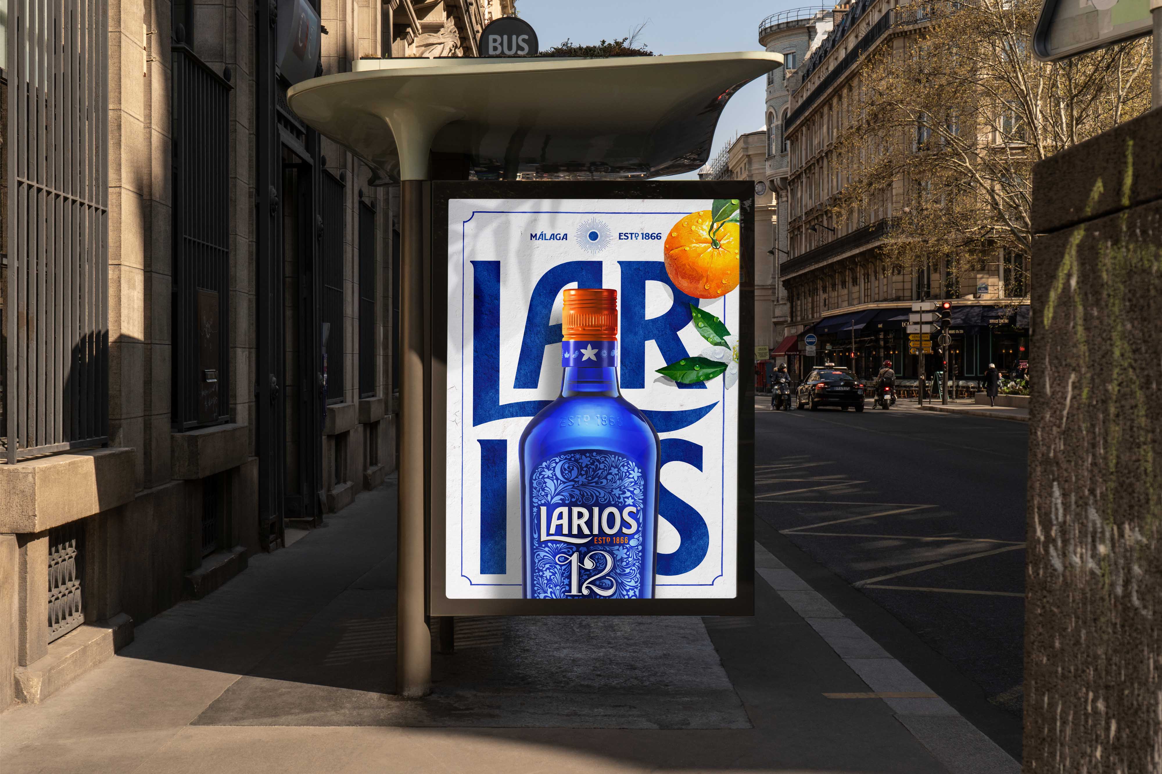
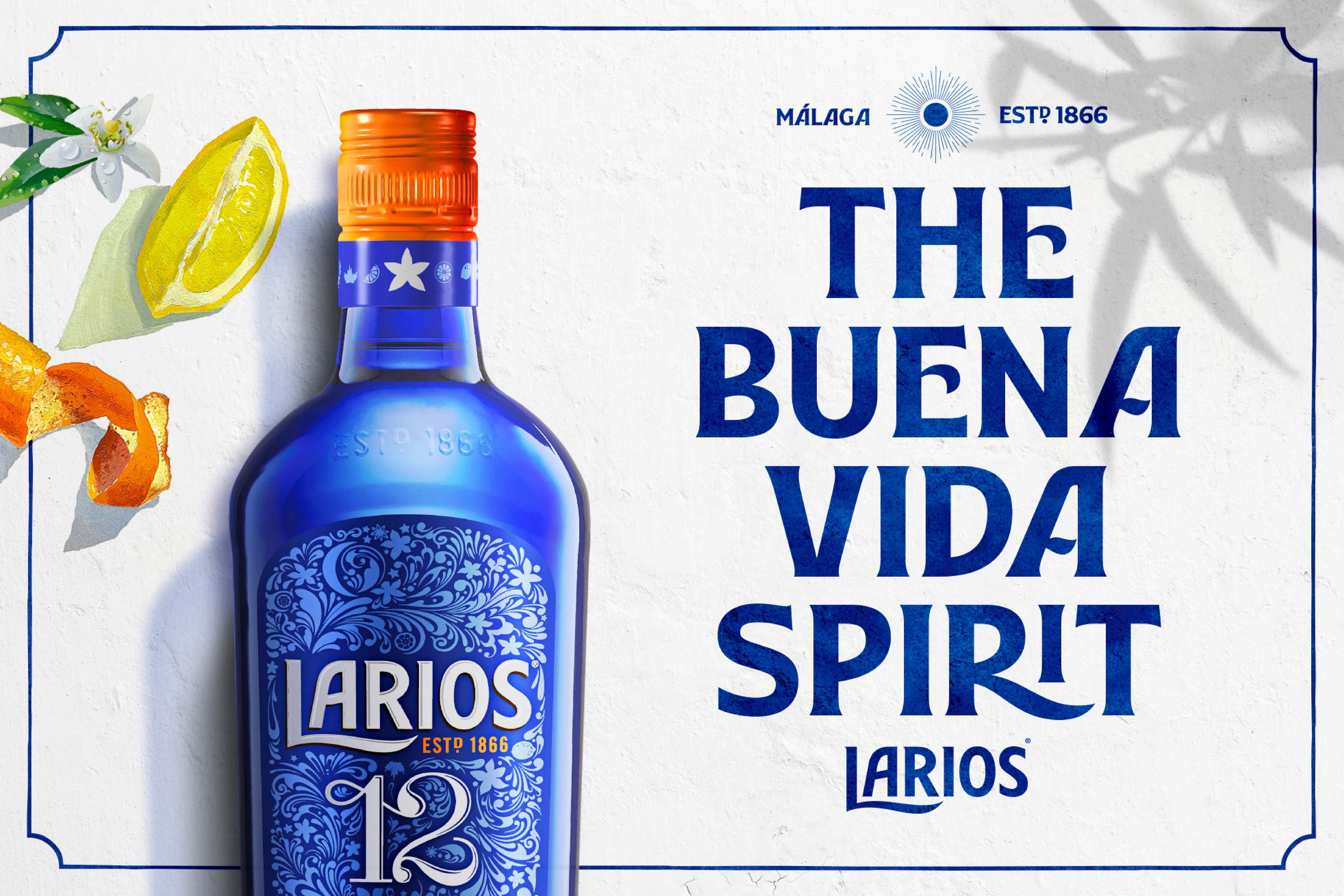
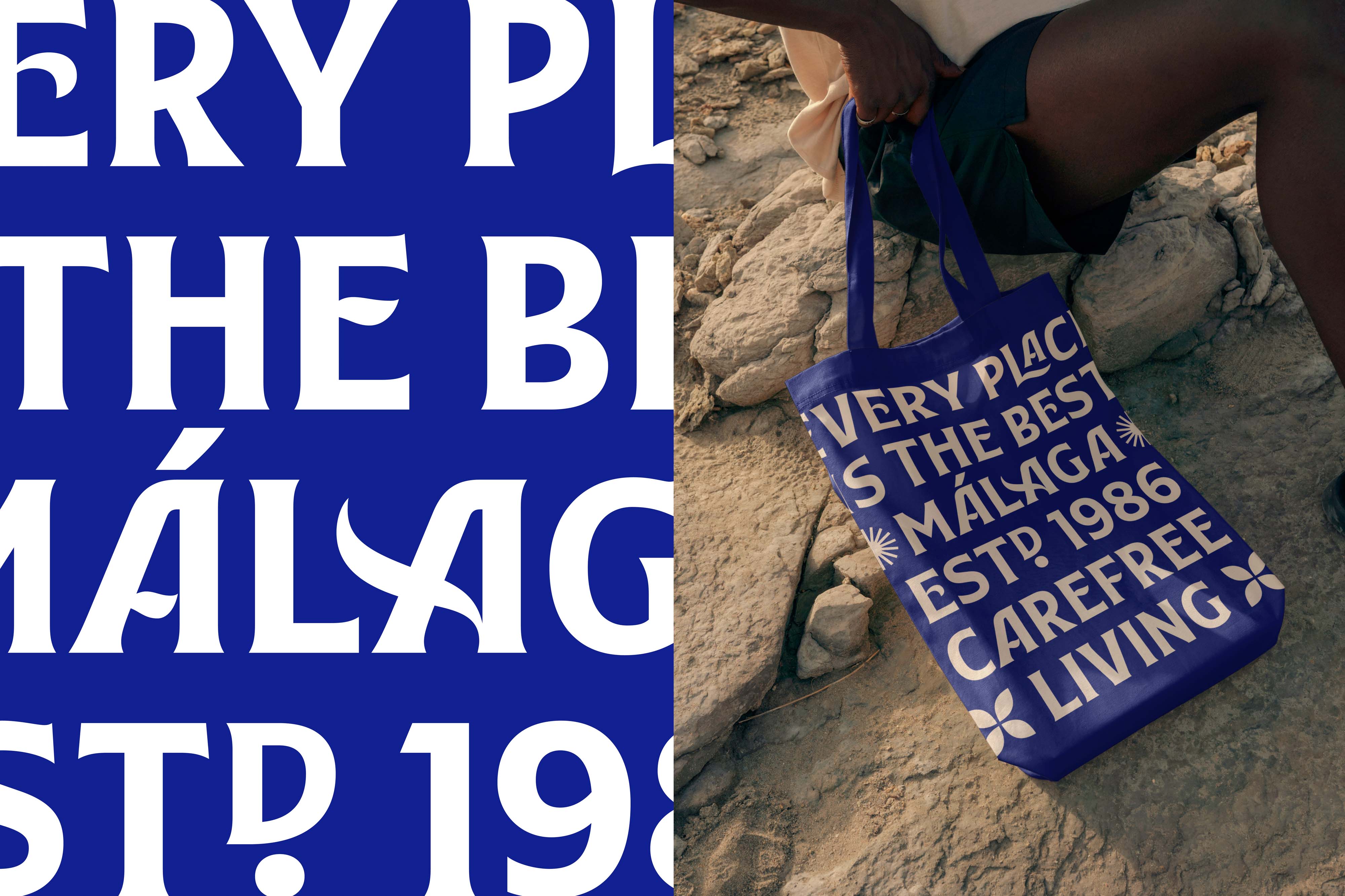
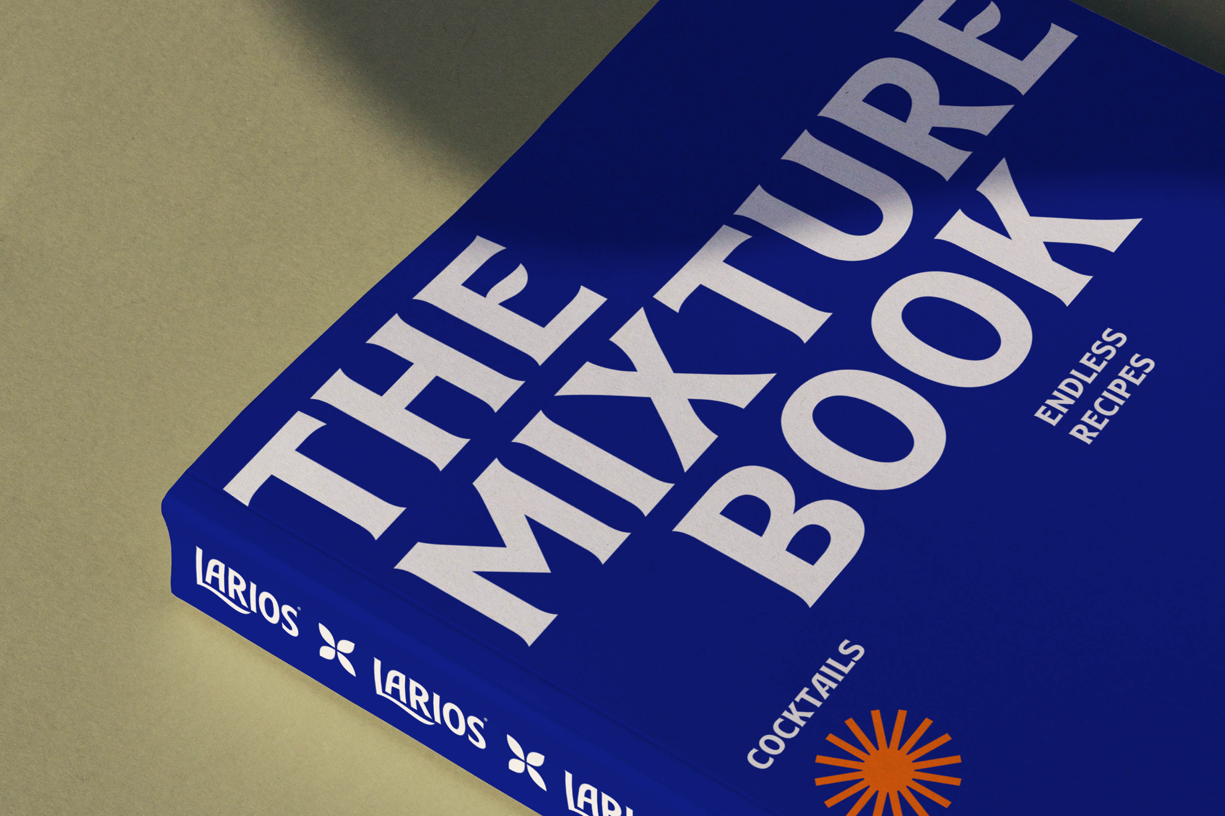
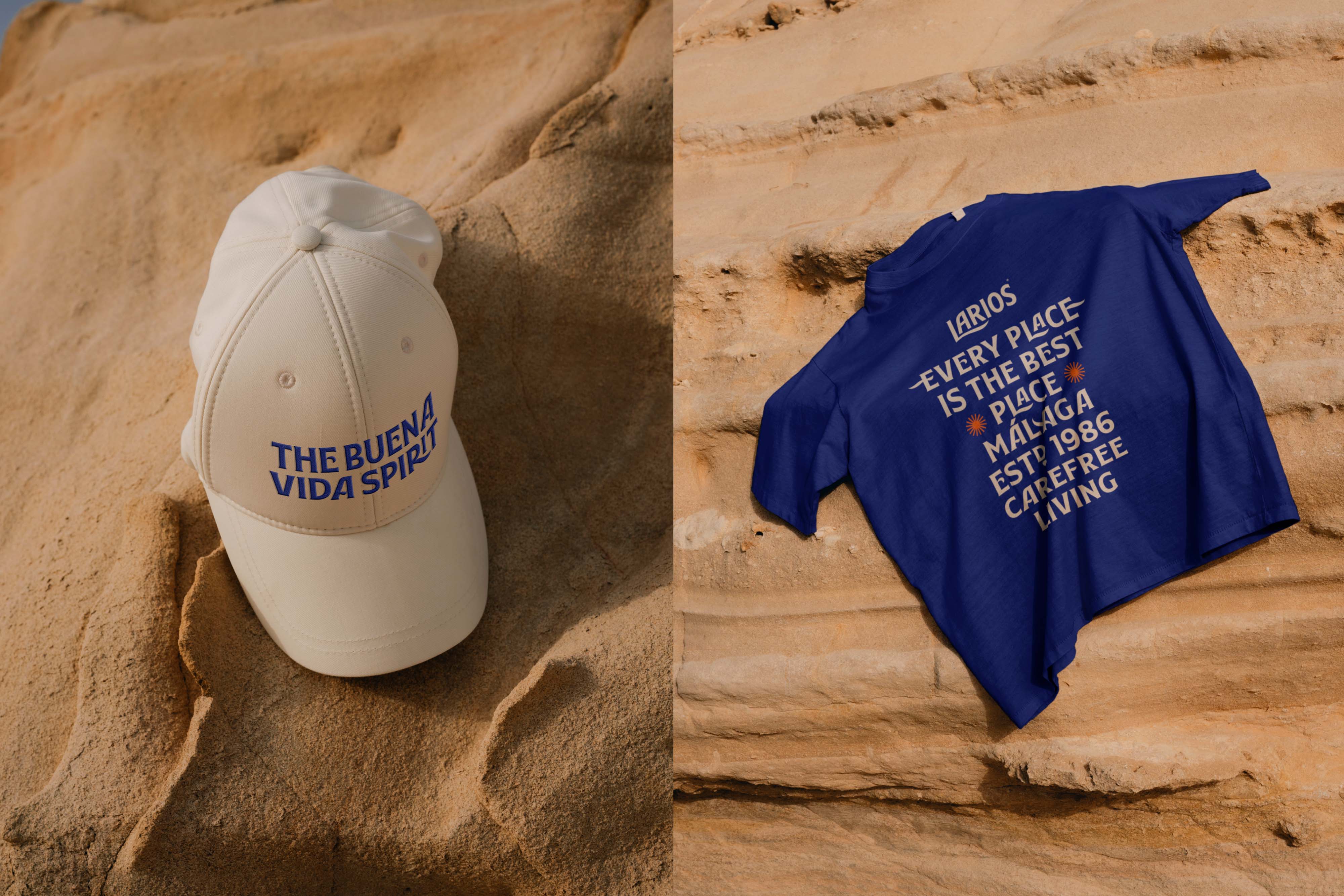
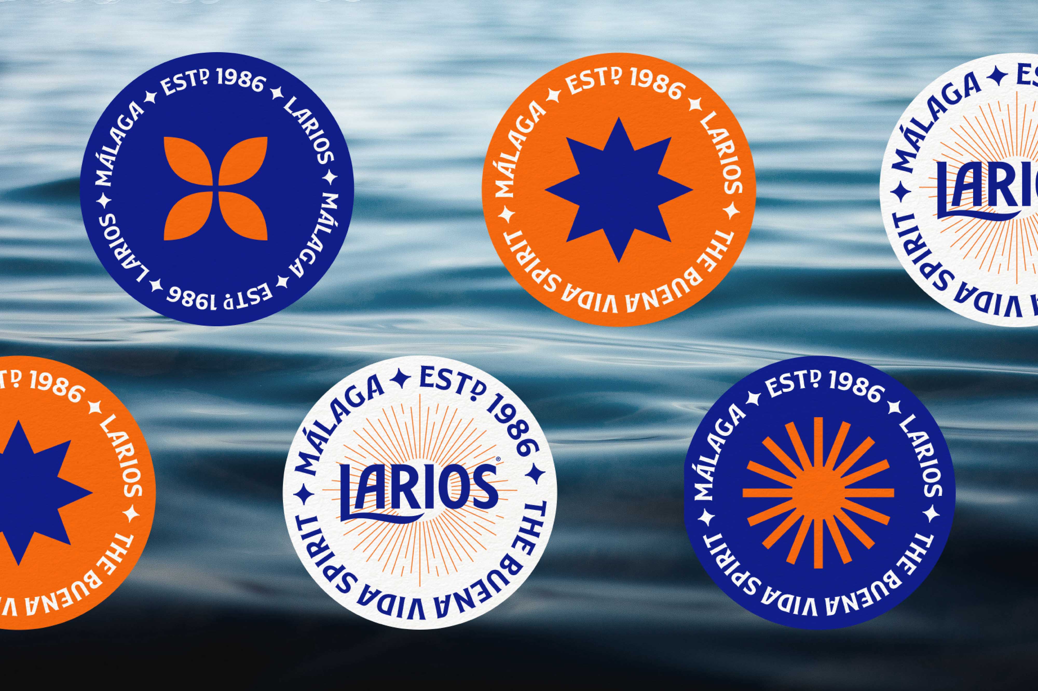
The universe needed a consistent proposal for the brand, one flexible enough to evolve and adapt to different needs building a unique perception of this corner of the Mediterranean, still unknown to many. So, we started by shaping a simplified version of the Larios logo with a single ink, progressing to a textured version with a water-based paint finish to add freshness and evoke the traditional essence of Malagan ceramics and tiles. We extracted the iconic L from the Larios logo and turned it into an icon inspired by the fluidity, colours, and soft undulating shapes typical of this part of the Mediterranean.
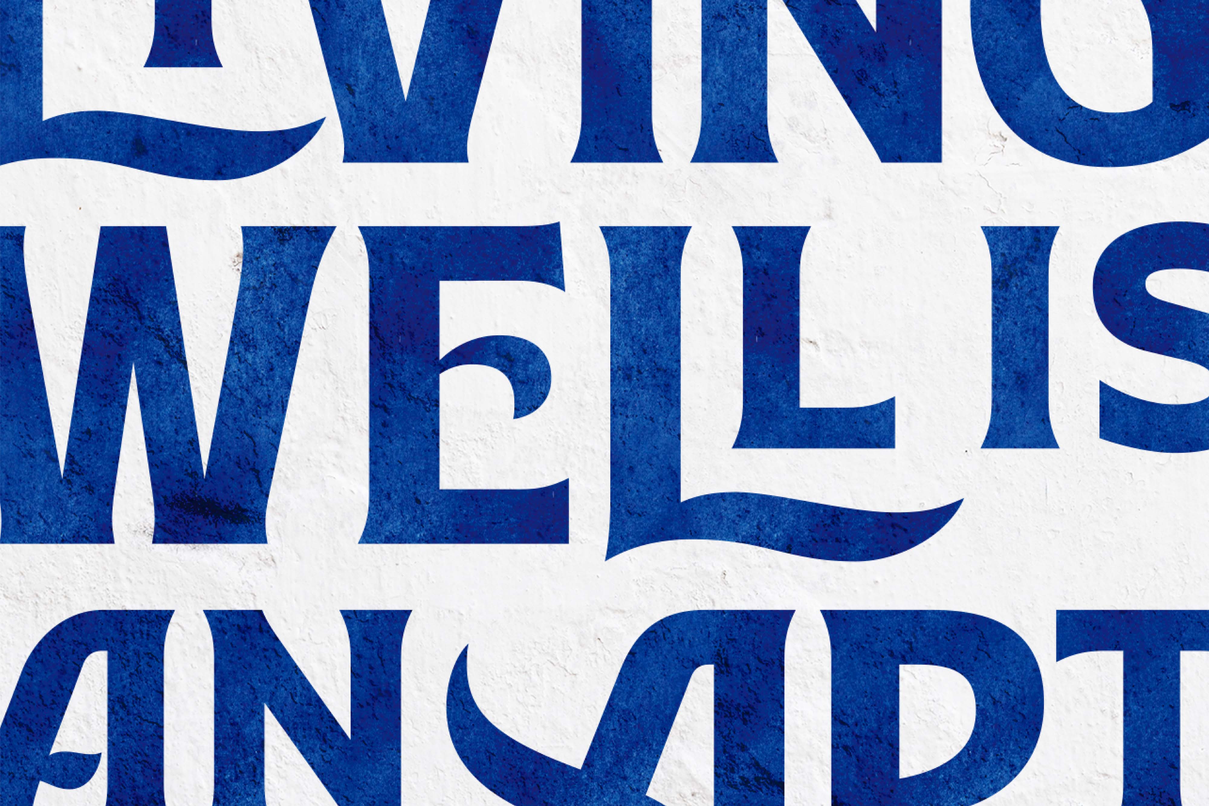
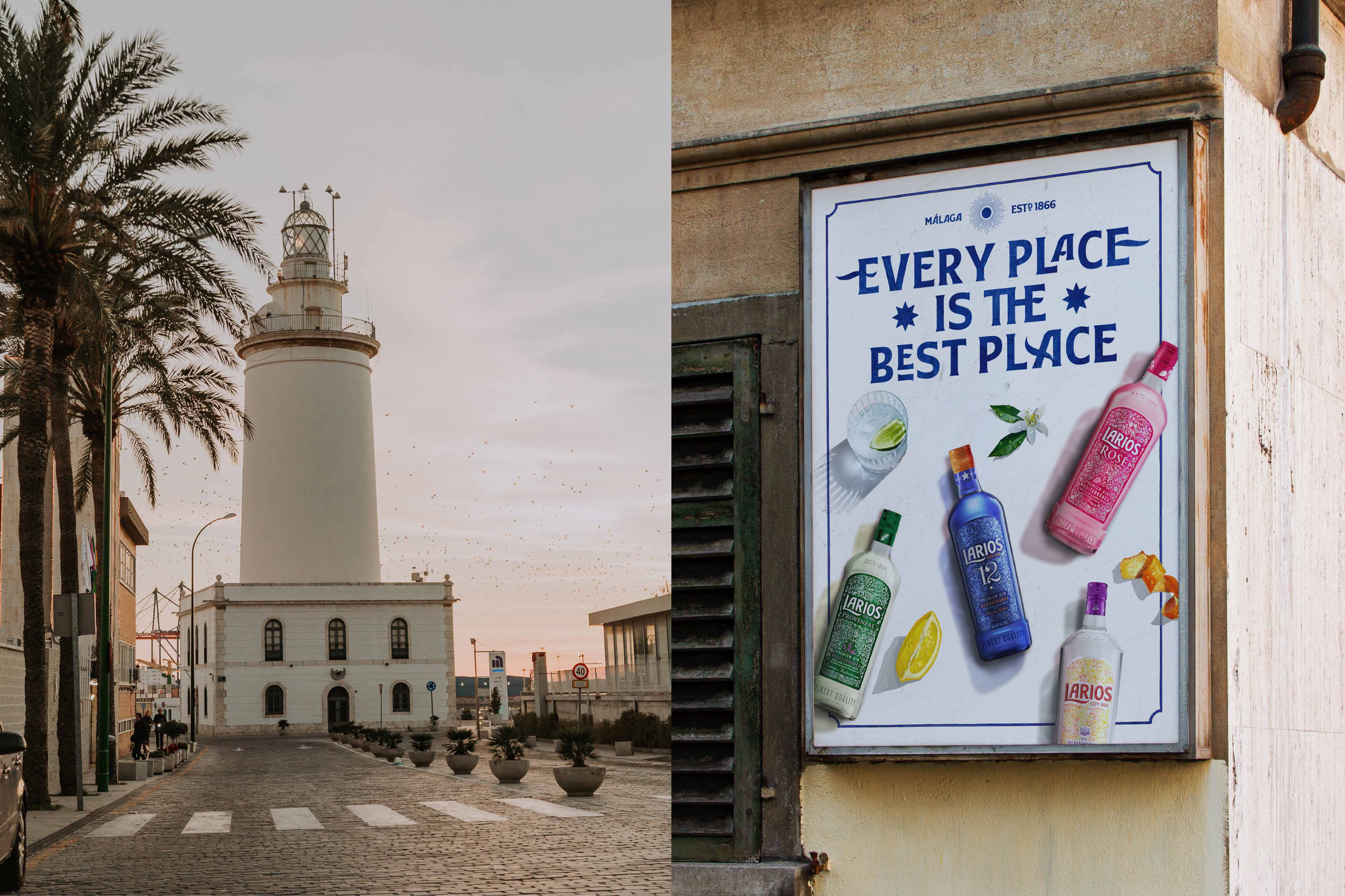
Inspired by the logo and designed by Pedro Arilla Studio, Larios Display is a Bespoke typeface with a strong personality that echoes the traditional style of Malagan street signs.
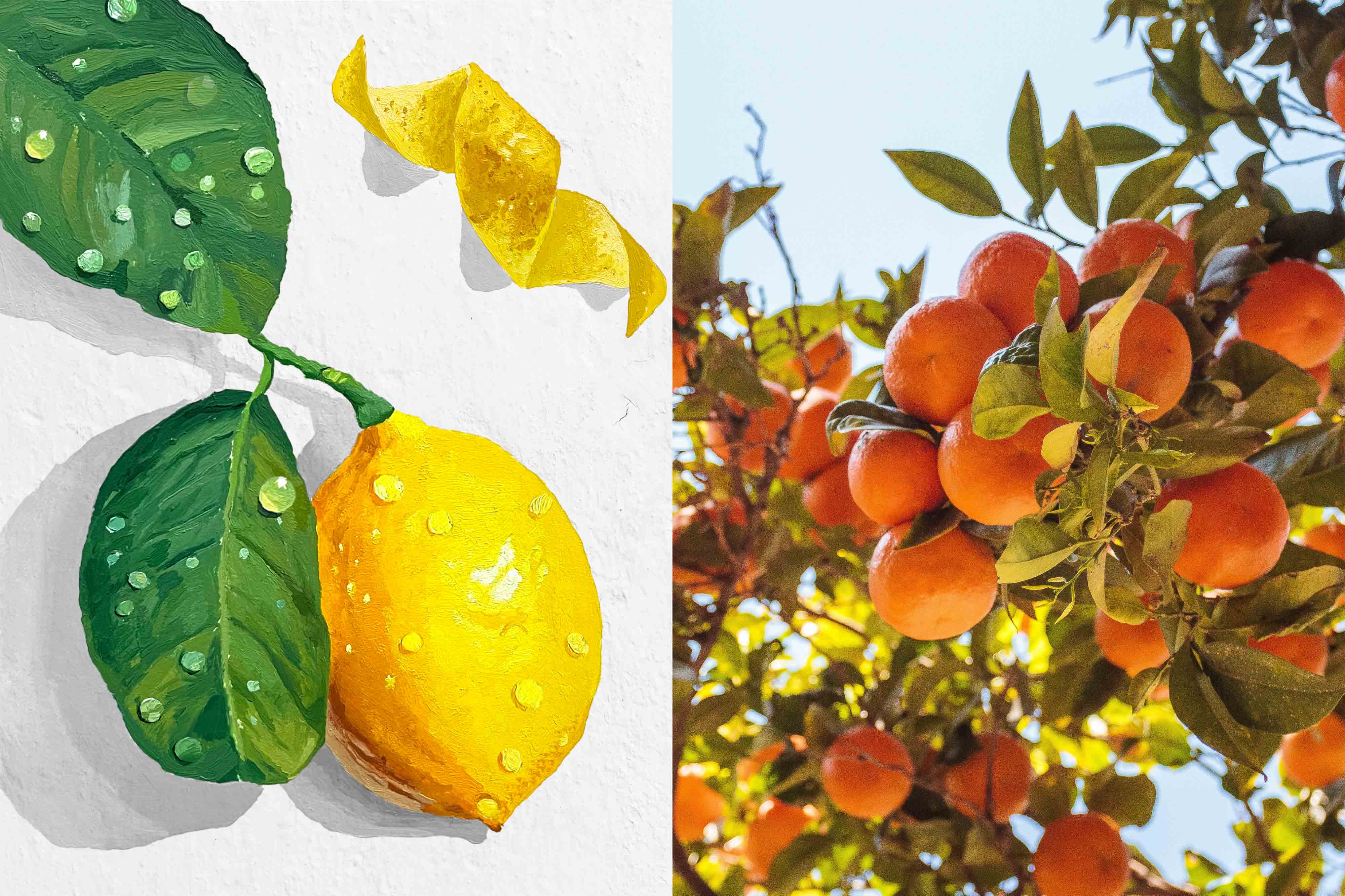
We explore different materials to inspire future brand activations, so we turned to Antonio Barahona to bring unique artistic touches to the 12 botanical ingredients that star in the Larios visual universe. These oil-painted illustrations not only bring value and sensoriality to the design, but also help to enhance the quality of the product and showcase the organoleptic nuances of the different Larios blends.
The natural lighting and the shadow-play in the visuals and in the representation of the botanicals transfer the unique light of Malaga to the brand universe and transport the consumer to a relaxed state of mind, as well as representing the mild climate of this part of the Mediterranean, and conveying the uniqueness of this spirit: the Buena Vida way of life.
A new universe that fuses past and present, to write Larios’ future.
CREDIT
- Agency/Creative: Morillas
- Article Title: Larios 12: Pure Mediterranean Essence by Morillas
- Organisation/Entity: Agency
- Project Type: Graphic
- Project Status: Published
- Agency/Creative Country: Spain
- Agency/Creative City: Morillas
- Market Region: Global
- Project Deliverables: Advertising, Art Direction, Brand Guidelines, Brand World, Creative Direction, Design, Graphic Design, Identity System, Illustration, Industrial Design, Poster Design, Type Design, Typography
- Industry: Food/Beverage
- Keywords: WBDS Agency Design Awards 2023/24
- Keywords: #morillas #createsomethingextraordinary #larios #lariosgin #VivirBienEsUnArte #Malaga #Espiritumediterraneo #branduniverse #brandidentity #branding #typeface
-
Credits:
Strategic definition: Picnic
Campaign: Rosas Agency
Illustrations: Antonio Barahona
Typography: Arilla Type


