


L’Arche is a new cultural establishment in northern Lorraine, located in Villerupt, in a cross-border territory conducive to exchanges, with a historical, cultural and geographical particularity, at the crossroads of artistic practices and plural cultures, of the digital transition and of the creative industries. It is a space of discovery, a place of life and sharing. Built around creation and playful education in media and image in all its forms, encouraging awakening and creativity, L’Arche is a cultural laboratory promoting links and interferences between the arts and new technologies. It is a place dedicated to artists engaged in the creation of new imaginary and sensitive experiences, borrowing as much from the performing arts, the visual arts, as from science and technology.
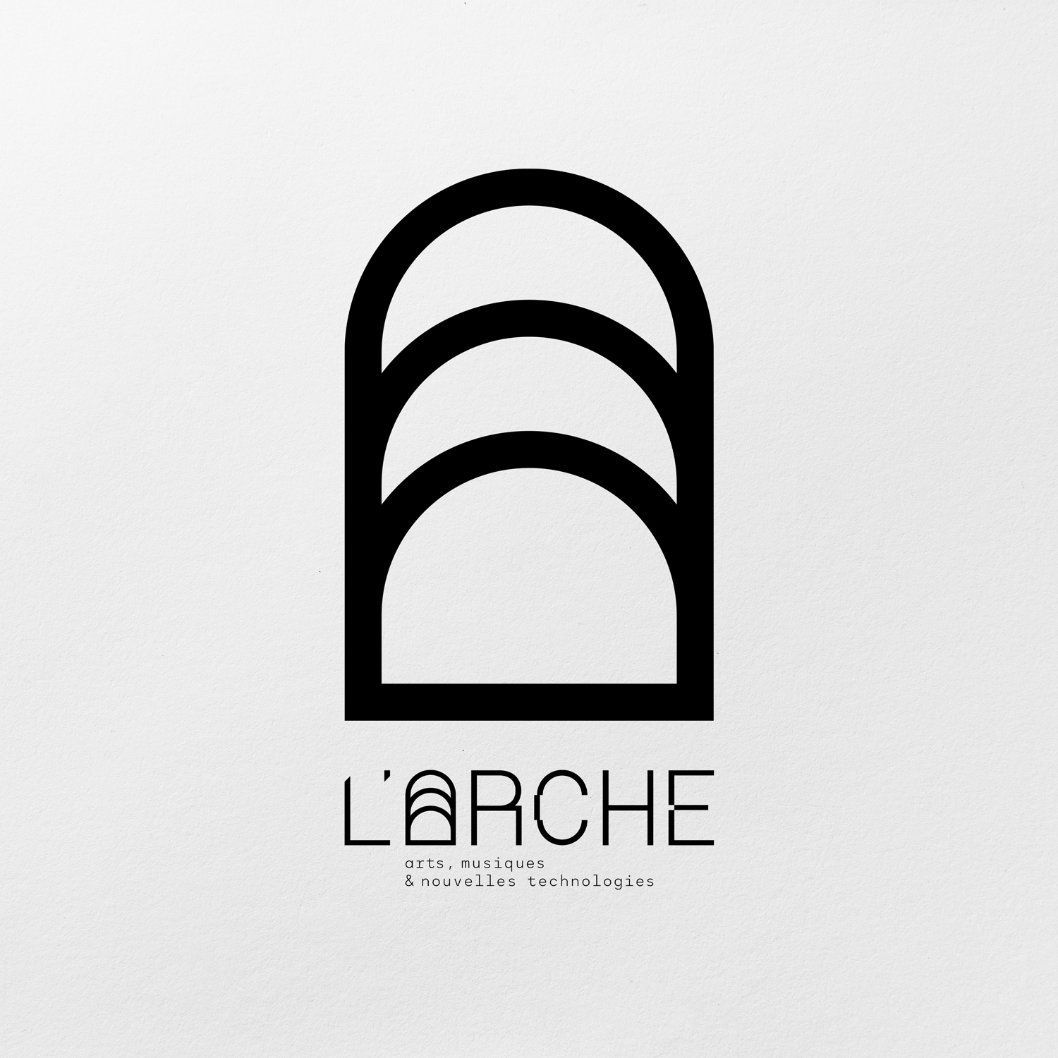
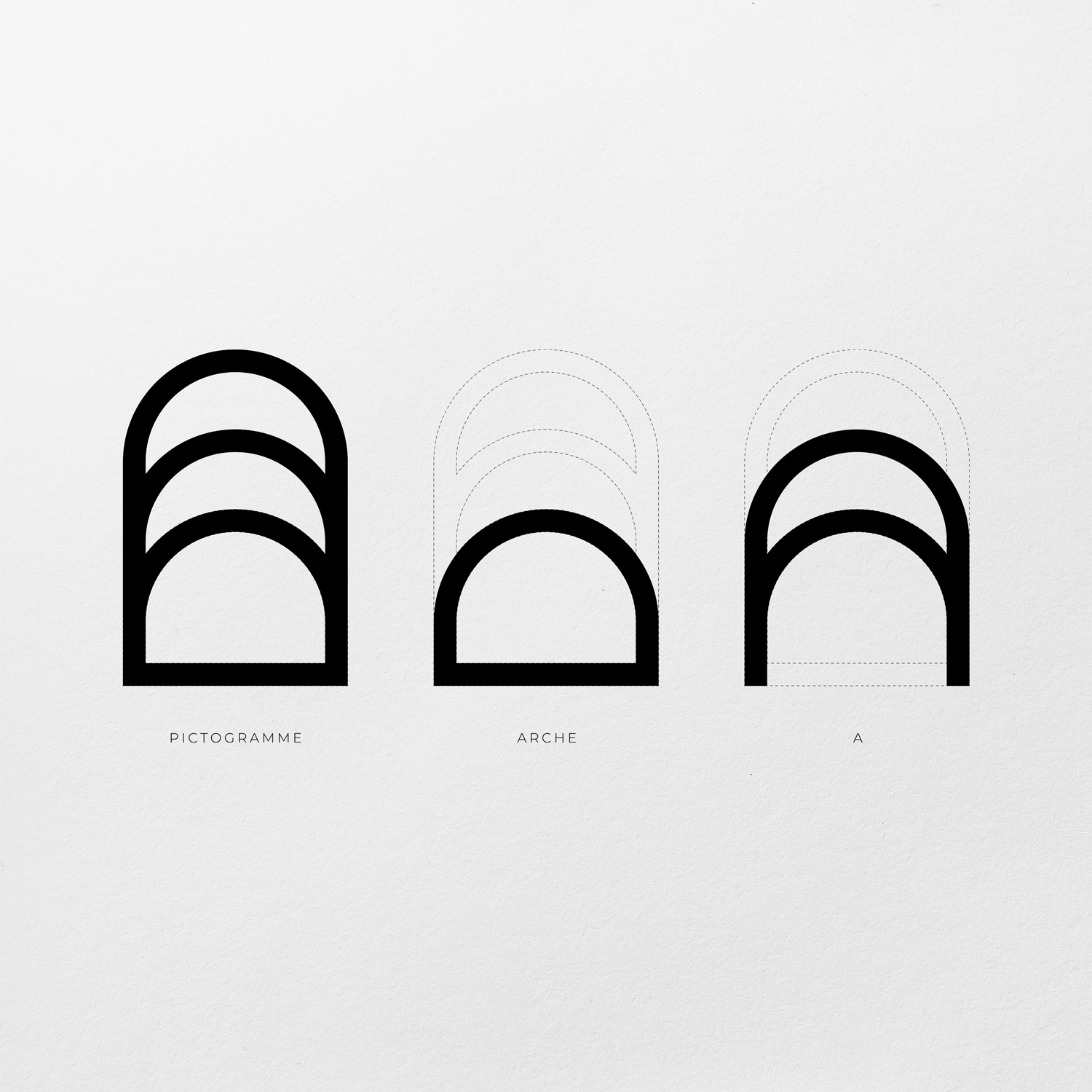
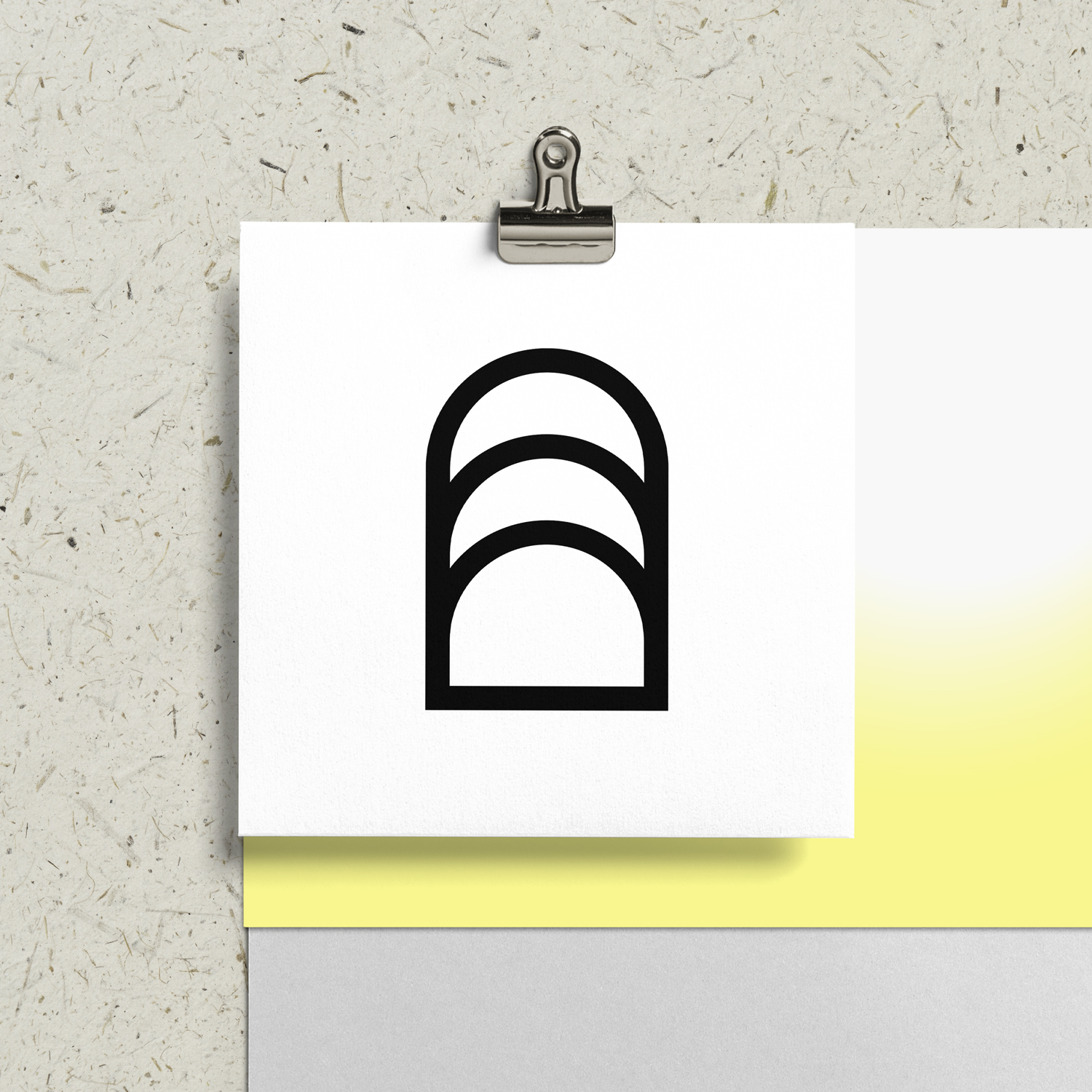
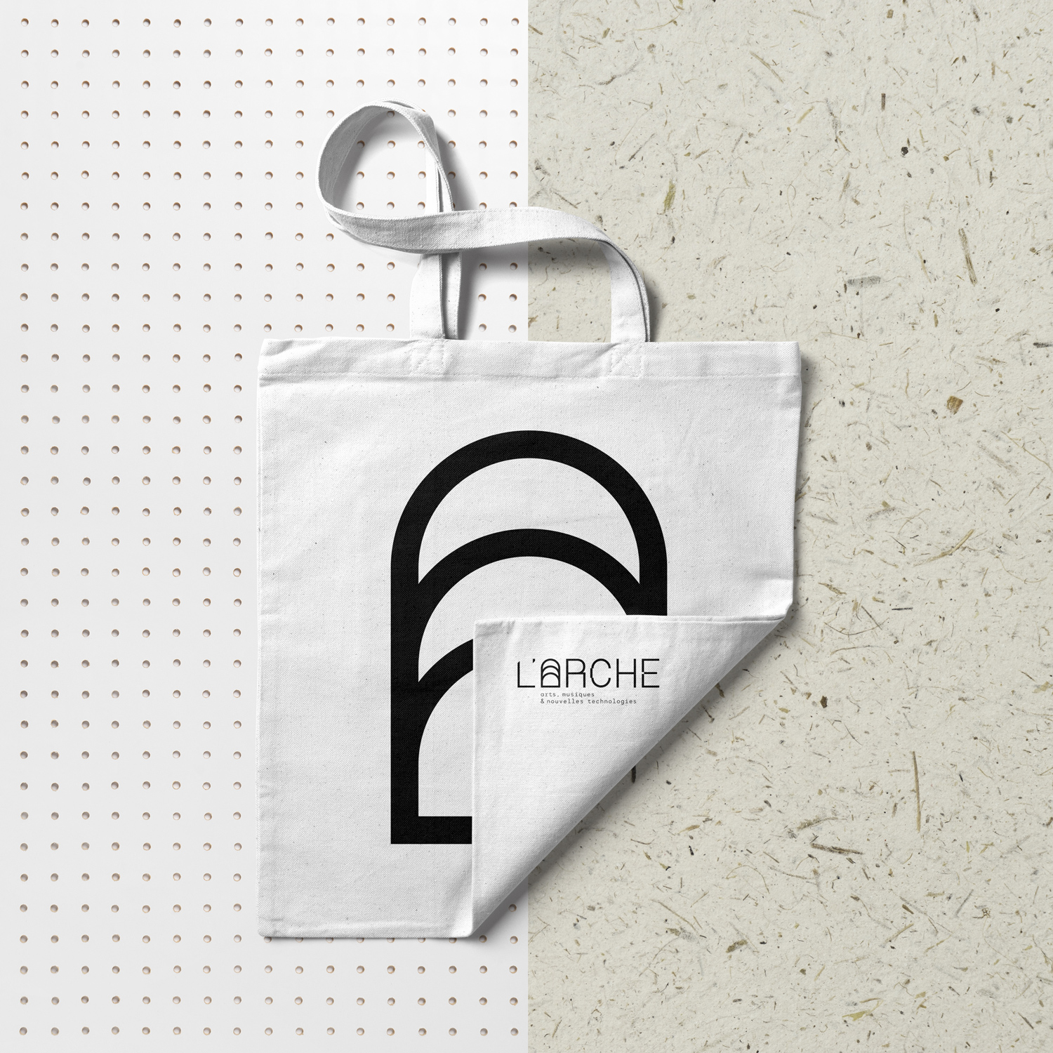
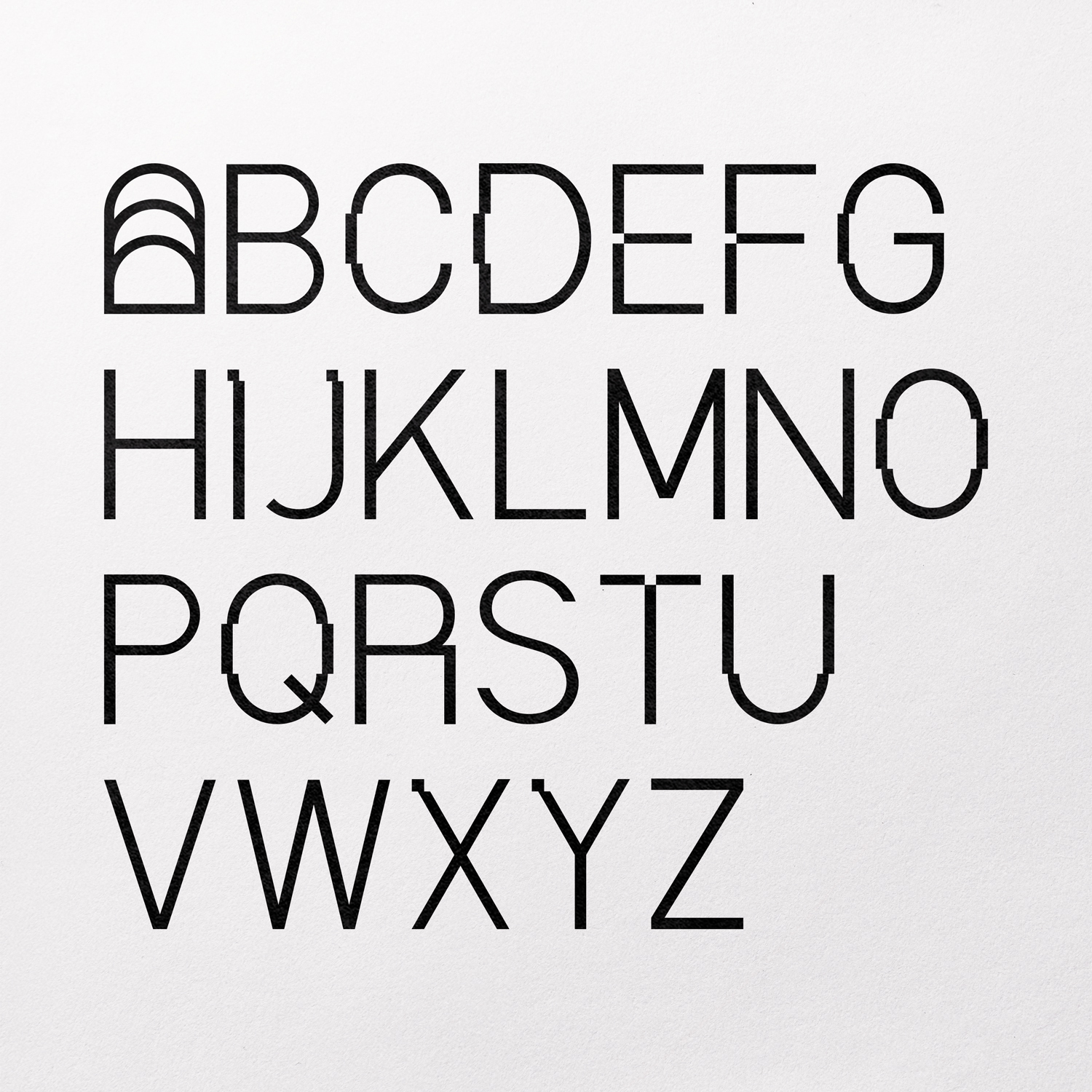
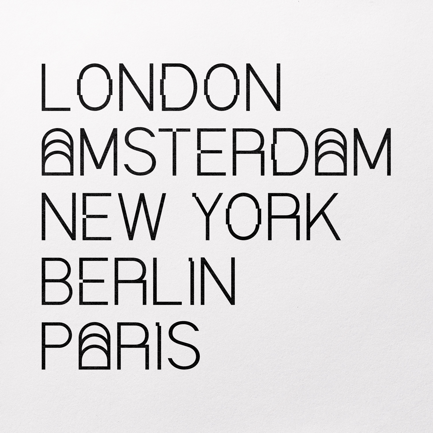
L’Arche invites all audiences to dialogue and anticipate the world of tomorrow in a common and committed space. A bridge between past and future in which the present is alive. For the creation of the identity, the main idea was to create a strong symbol “an arch” present in multiple places on the architecture of the building. This very simple graphic symbol was multiplied by 3 in relation to the 3 specificities of the place: arts, music and new technologies.
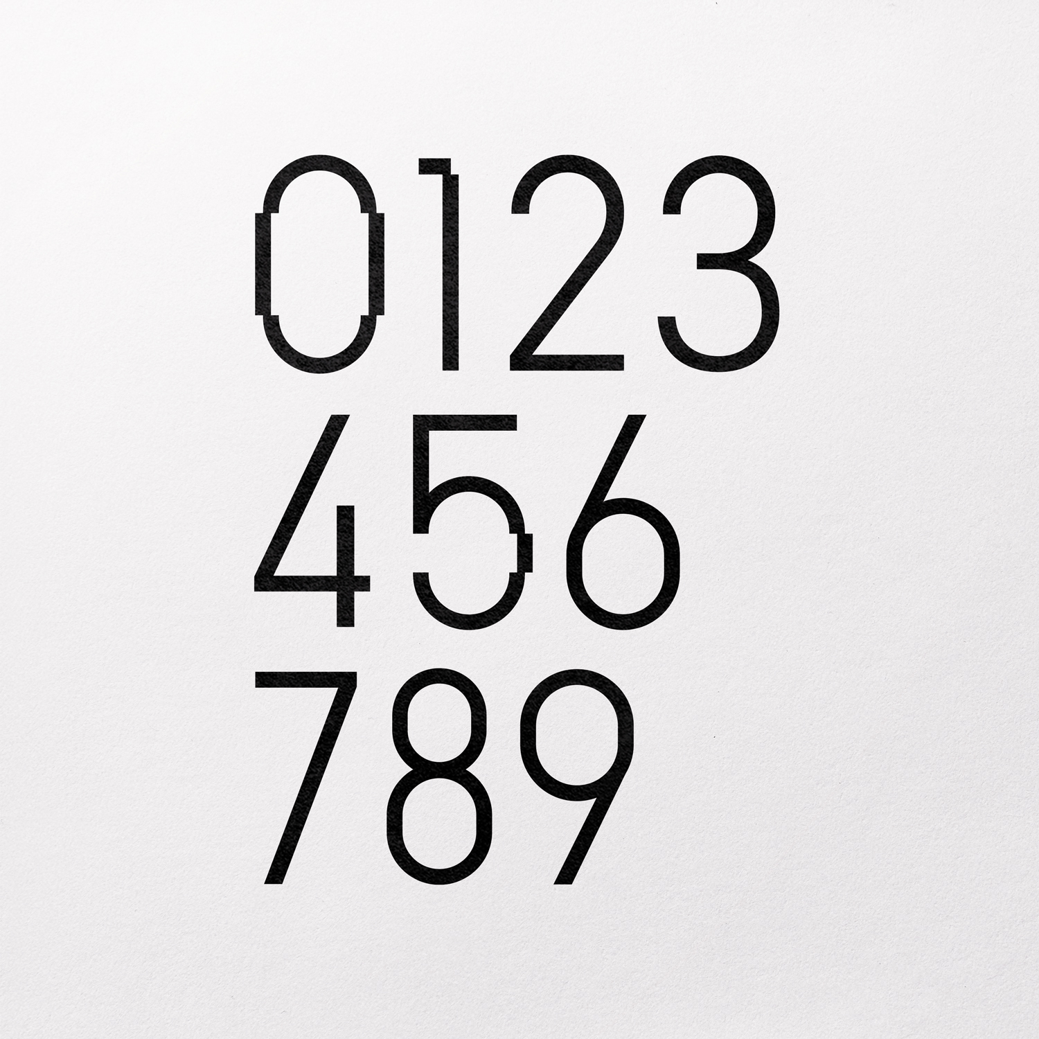
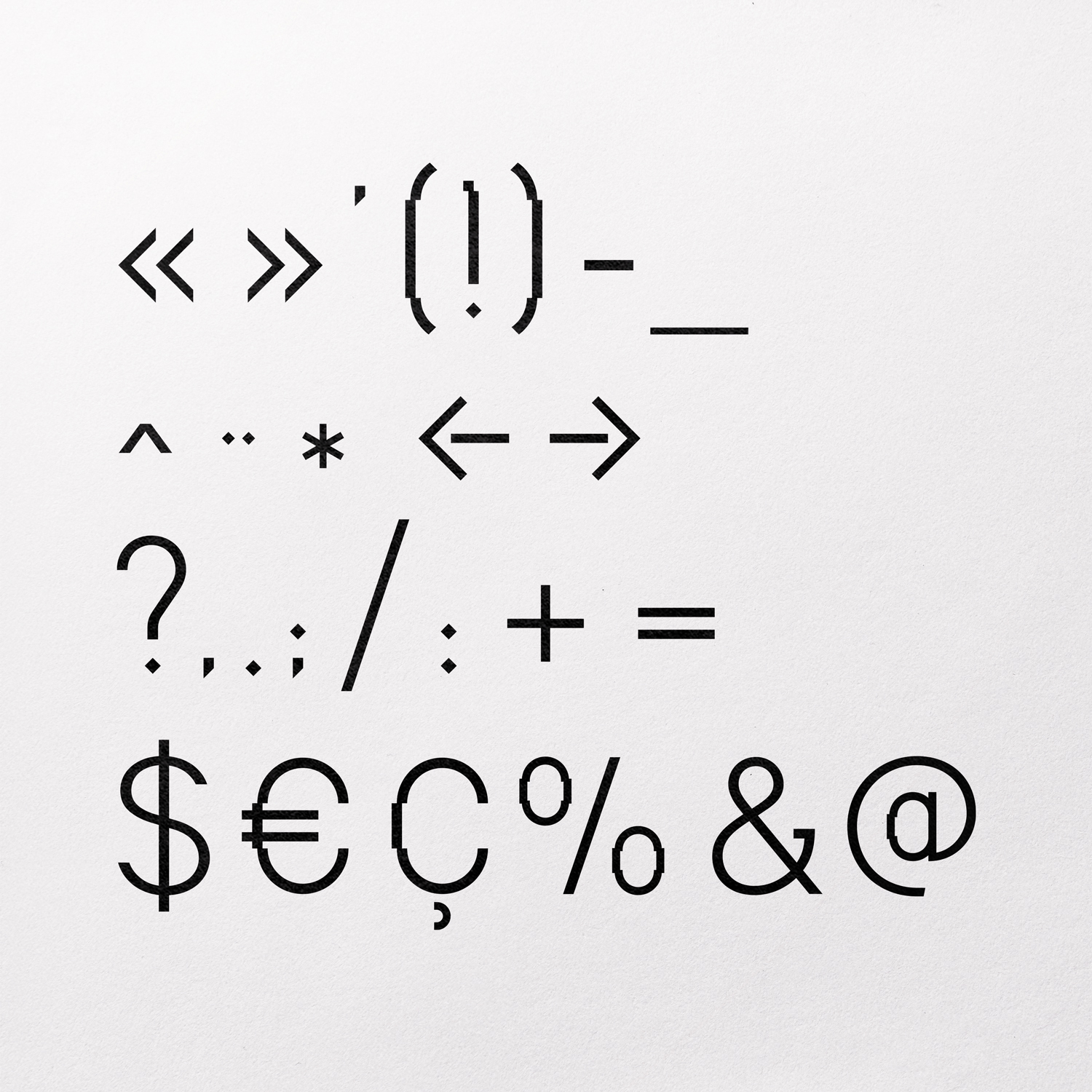
From this symbol, a complete typography was designed “l’Arche Sans” to be developed on all the print and web documents as well as for the signage of the place. This identity, which seems simple at first glance, is destined to be in constant evolution.
CREDIT
- Agency/Creative: Buckwild
- Article Title: L’Arche Logotype and Typography Created by Buckwild
- Organisation/Entity: Freelance
- Project Type: Graphic
- Project Status: Published
- Agency/Creative Country: France
- Agency/Creative City: Strasbourg
- Market Region: Europe
- Project Deliverables: Art Direction, Brand Identity, Type Design, Typography
- Industry: Public Utility
- Keywords: numeric technology art music typography brand identity design
-
Credits:
Art Director: Christophe Lombard


