


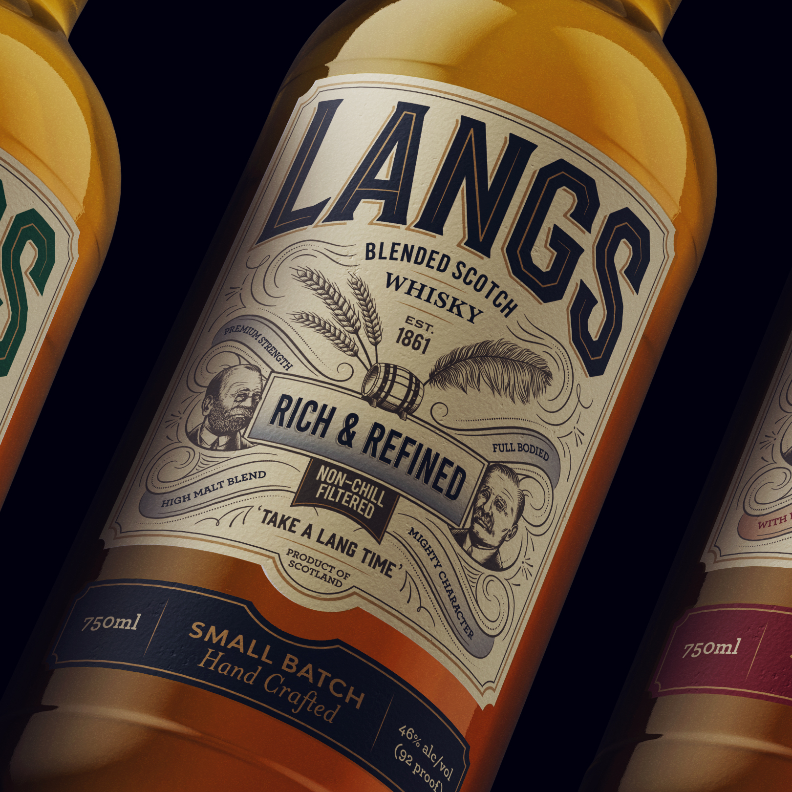
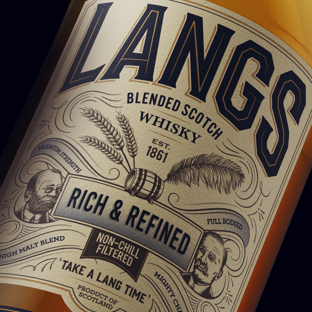
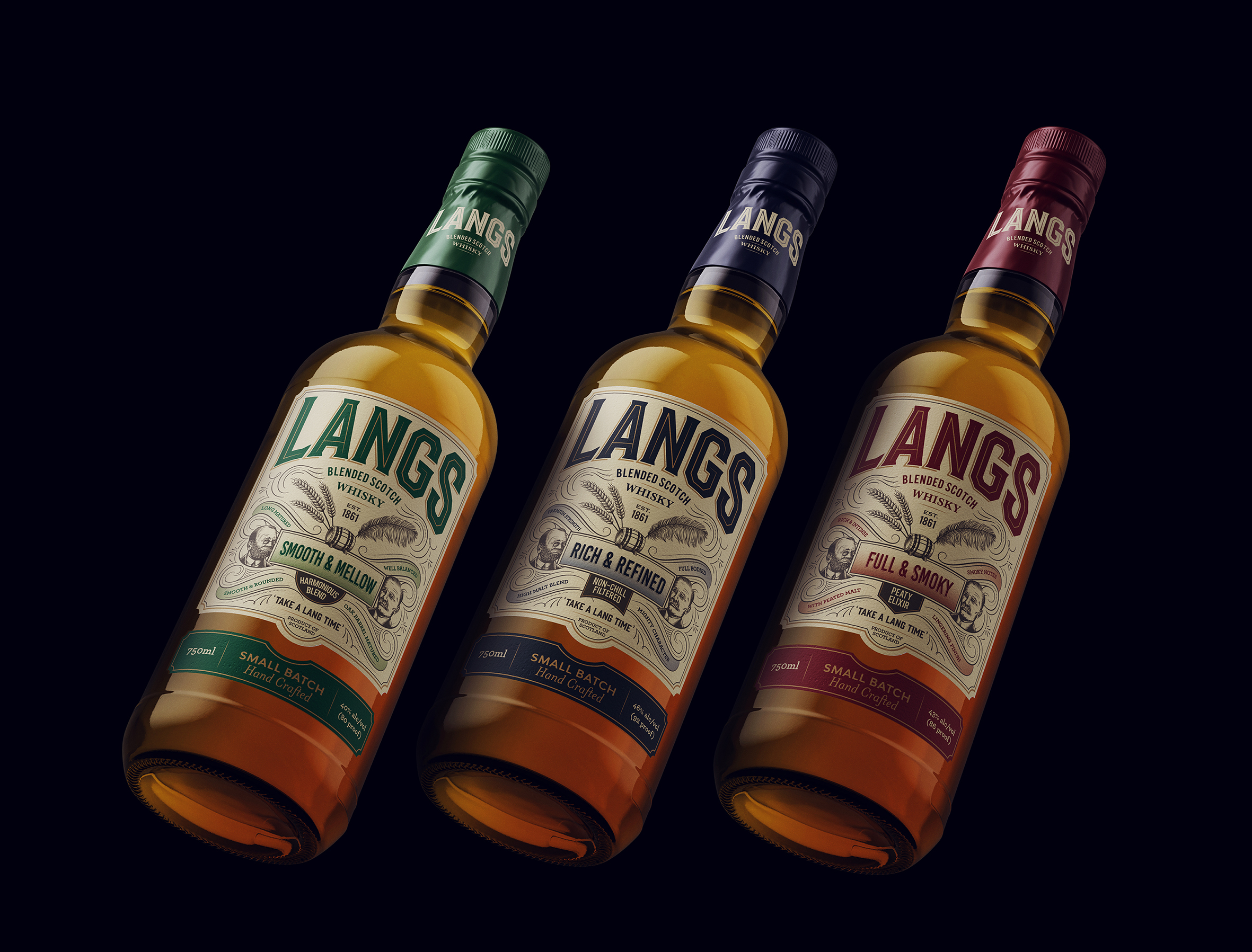
Langs is a very well respected 157 year old Scottish whisky brand. It needed some care and attention as whisky drinkers are changing. Many are younger and want more diversity when it comes to their whisky, from cocktail mixer to straight up. The usual rules no longer apply. We were asked by Ian Macleod Distillers to refresh the brand, tell the brand’s story and develop three different flavour expressions, all to entice a younger international market, whilst still appealing to their traditional customers.
We put the two Glasgow born Lang brothers, Gavin and Alexander, at the centre of the label and the story. The renowned lettering artist, Rob Clarke, refined the logo and line illustrations of the two brothers were also created. The three expressions are Smooth & Mellow, Rich & Refined and Full & Smoky, each linking to the individual characters of each brother with colour referencing for differentiation.
The range is now successfully launched overseas.
CREDIT
- Agency/Creative: Fun Agency
- Article Title: Langs Blended Scotch Whisky Rebrand by Fun Agency
- Organisation/Entity: Agency, Published Commercial Design
- Project Type: Packaging
- Agency/Creative Country: United Kingdom
- Market Region: Multiple Regions
- Project Deliverables: Brand Architecture, Brand Naming, Brand Redesign, Brand Refinement, Brand Rejuvenation, Brand Strategy, Brand World, Branding, Illustration, Packaging Design, Rebranding, Tone of Voice
- Format: Bottle
- Substrate: Glass Bottle, Pulp Paper


