


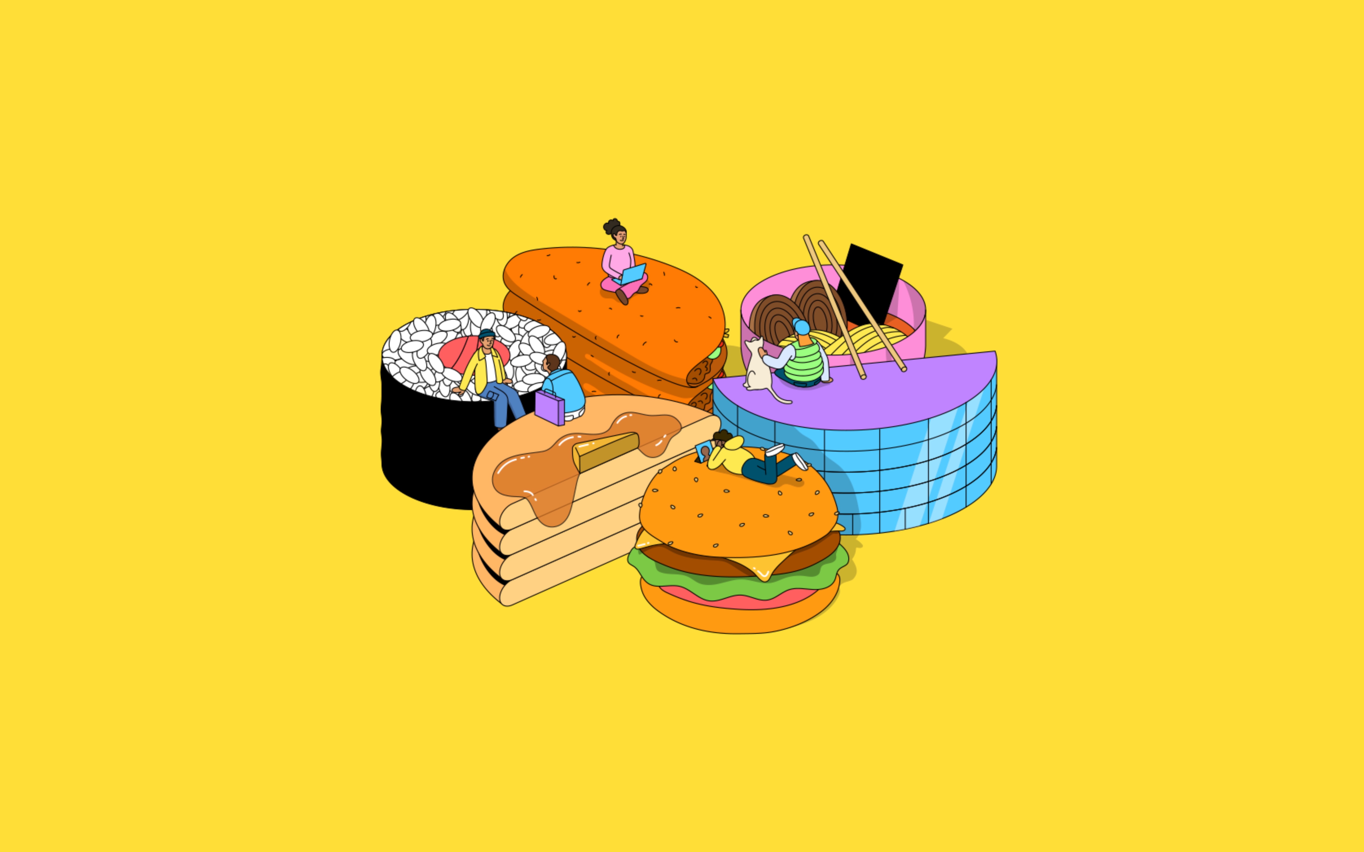
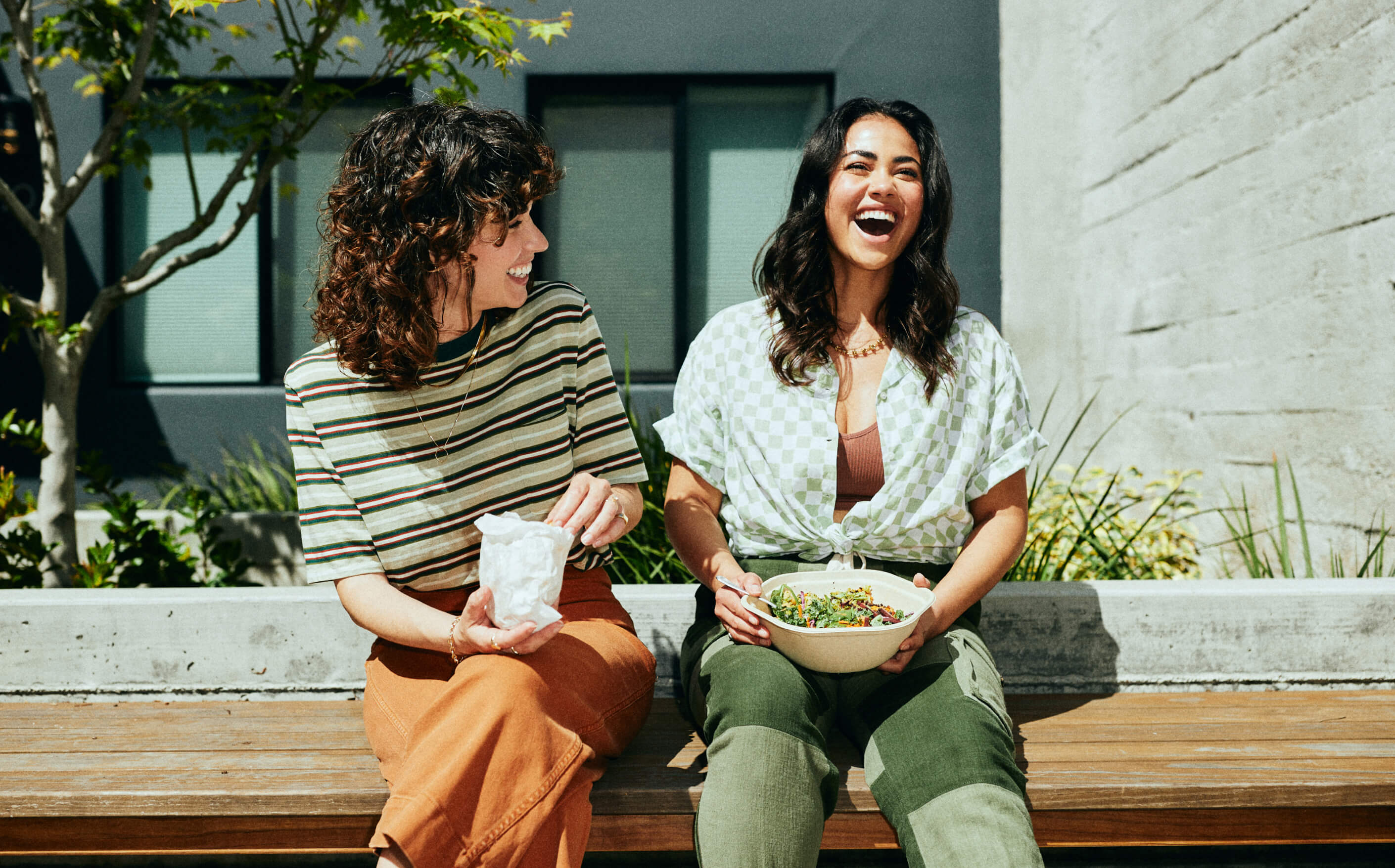
Landscape has partnered with Sharebite, the leading corporate food benefits platform, to create an identity that takes a new twist on an increasingly popular employment perk. Made up of vibrant colors, joyful original animations, and FOMO-inducing photography of office lunches, the new brand expresses the power of free meals at work to fuel productivity, creativity, and culture. Good food is a big draw for employees to return to the office, and for those who remain remote, it can create a sense of connection to colleagues and loyalty to the company.
Sharebite sought to evolve its visual identity to more closely align with its brand promise of driving greater employee engagement and well-being. Lunch breaks provide mental clarity and re-energize people to innovate. Put simply, eating makes people happy and happy people are more productive. Landscape applied these insights to identify new food-inspired brand colors, wordmark, logo, motion graphics, lifestyle photography, illustrations, and animations that evoke joy, diversity, and togetherness.
Dilip Rao, CEO and co-founder of Sharebite says: “We’re proud to launch an evolved Sharebite brand that celebrates what makes us unique and reinforces our position as the leader in corporate food benefits. The original graphics depict the power of food to forge connections which is what humans crave, now more than ever. The photography conveys variety, diversity, and flexibility, which are top priorities for companies. It’s been a privilege working with Landscape to bring our new brand identity to life.”
Adam Weiss, Executive Creative Director and founder of Landscape says: “Sharebite is the most powerful food ordering platform designed for today’s hybrid workforce—whether they’re onsite, remote, or global. The new brand we’ve created for Sharebite expresses that flexible and forward-thinking proposition, and brings to life the vibrant and dynamic attitude of the Sharebite team.”
Best in business
Founded in 2015 by Dilip Rao and Mohsin Memon, Sharebite is the most comprehensive U.S. corporate food ordering platform. Sharebite empowers leading companies such as Activision Blizzard, WeWork, Neuberger Berman, and Harry’s, by centrally managing employee food ordering and facilitating contactless deliveries at designated drop-off points inside office buildings.
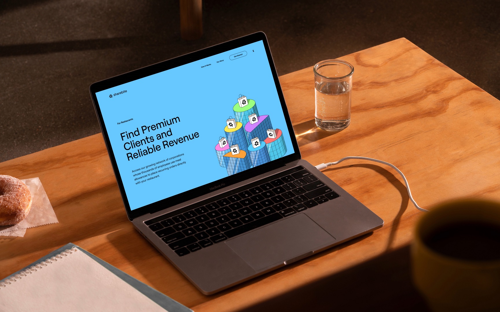
In early 2021, Sharebite launched its first fintech product called Passport which enables companies with hybrid work models to equitably provision meal allowances to employees so that they can purchase meals at any restaurant they choose. Sharebite restaurant partners benefit from the economies of scale associated with preparing and delivering large quantities of orders in batches ordered in advance.
Integral to Sharebite’s operation is a mission-led approach—every order placed through the platform results in a donation made to combat food insecurity in local communities, via partnerships with Feeding America and City Harvest. To date, Sharebite has donated over 4.2 million meals. Sharebite has been honored with numerous awards including Inc.’s Best in Business.
In 2021, Sharebite brought Landscape on board to create a new brand identity that would allow the company to build on its story, and elevate and articulate the company’s role in helping businesses and communities thrive through feel-good eating.
Good food in great company
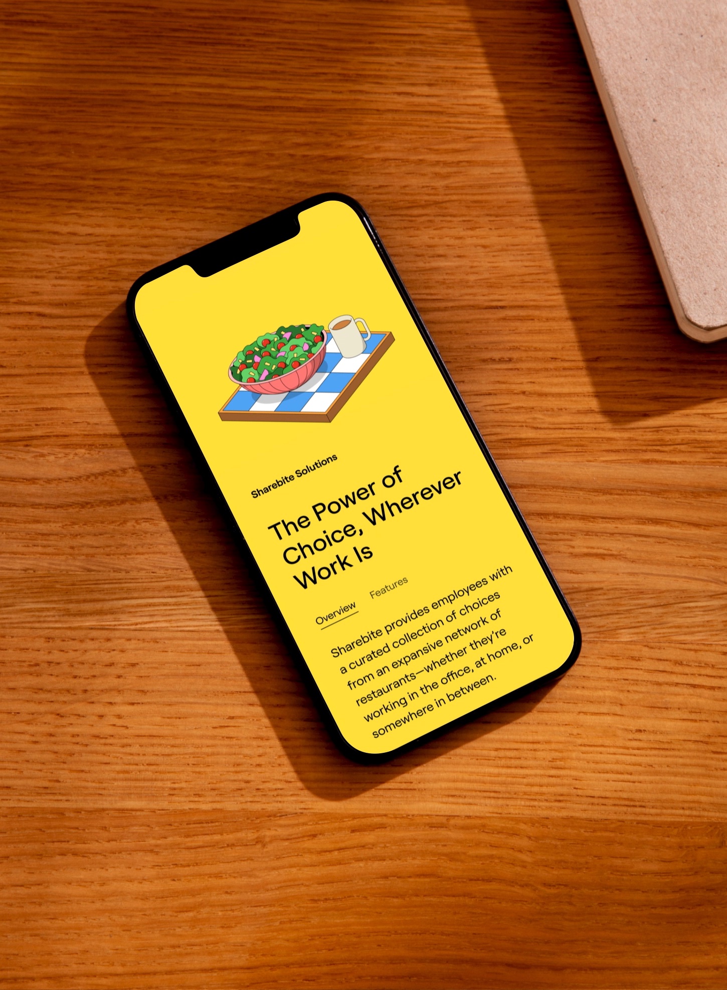
The new Sharebite identity captures the company’s ethos and proposition through a playful, optimistic, and people-first approach, leading with a new positioning statement developed in partnership with Landscape and Sharebite: “Good Food in Great Company.”
The simple but resonant statement underpins everything that Sharebite’s new brand does. It also offers the company room to grow at scale, because it doesn’t merely emphasize Sharebite’s commitment to doing good, it captures the impact that doing good can have in the short-term (a good, nurturing meal) and in the long-term (happy, productive people, or in other words, good company).
Mackenzie Brookshire, Creative Director at Landscape sums it up: “Every part of the brand – from photography to animations to copy – illustrates that it feels good to be a part of Sharebite, and the companies it serves. That people who work together and eat together are happier and more effective together.”
Better together
To support Sharebite’s evolved positioning, Landscape delivered a visual identity that brings the idea of good food and good company to life through dynamic illustrations, photography, motion graphics, and an ownable new brand symbol and wordmark for Sharebite.
Of particular note is the new symbol, which Landscape designed to flex through motion—cleverly capturing Sharebite’s flexible proposition for companies with hybrid workers and the uniting joy of a shared meal.
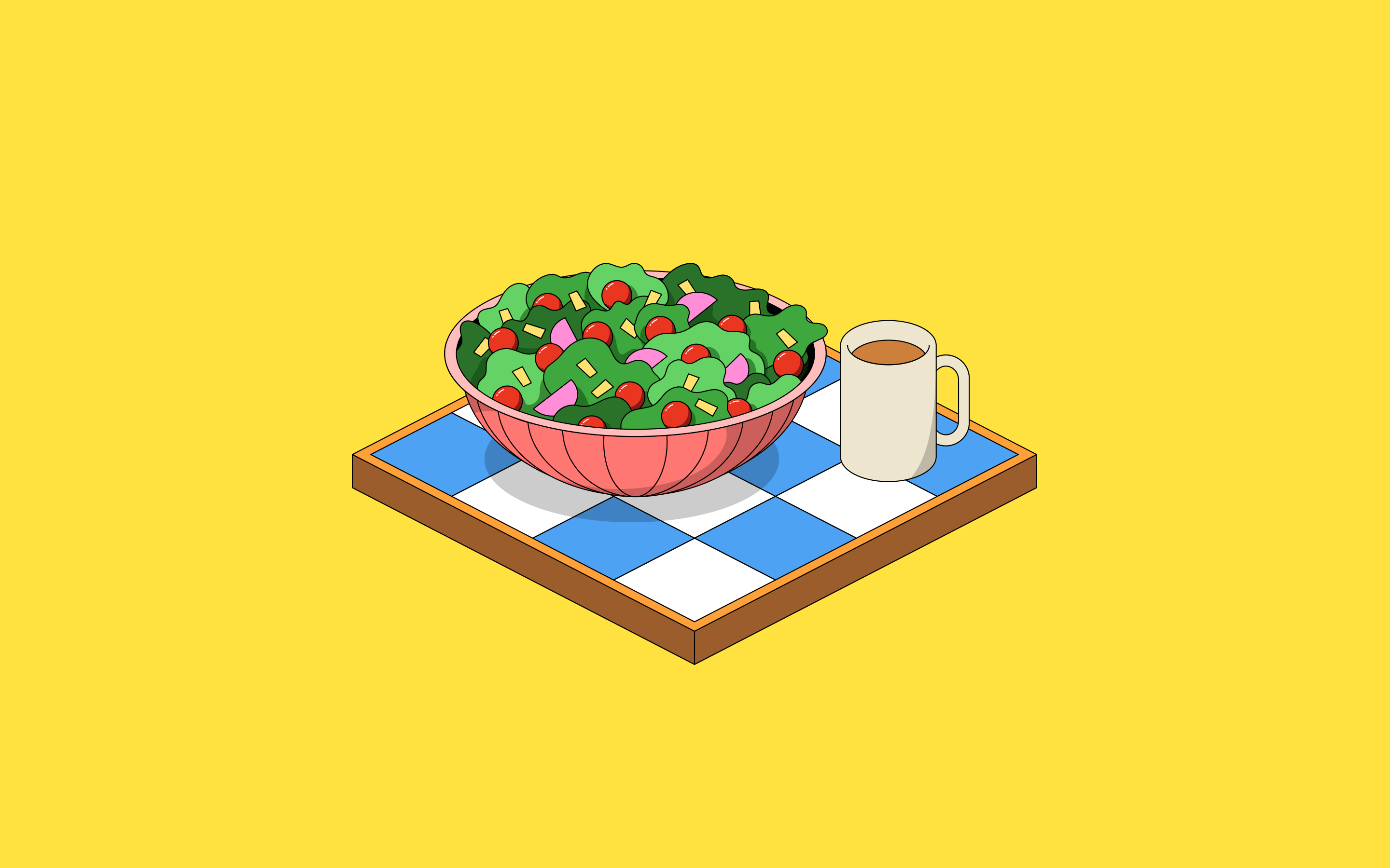
“The symbol is a joyful representation of abundance and the power of food to bring people together,” says Landscape’s Brookshire. “Its simple forms are visual metaphors: bowls and diverse foods, people, progress, and a circular economy—all united together through feel-good, do-good eating.”
The symbol can be paired with Sharebite’s new wordmark, but also stands alone for the app icon, and morphs into an iconic smile as a secondary iteration—cleverly capturing Sharebite’s flexible proposition for today’s workforce and the uniting joy of a shared meal.
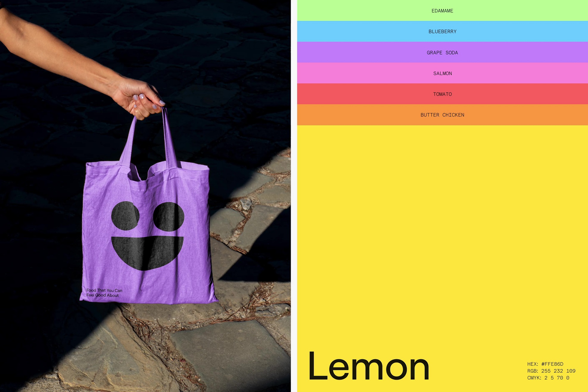
Another notable visual transformation for Sharebite is the company’s evolution beyond its orange-toned color palette towards a vibrant, much wider-ranging palette—a brave choice. “A lot of companies now feel like they need to own a single color to be distinct,” says Brookshire. But Sharebite and Landscape wanted to go a different direction with the brand’s color expression. Brookshire adds: “It’s exciting to see them embrace this really dynamic, varied palette that tells a story of diversity and joy, which perfectly supports the underlying premise of the company itself.”
Landscape also commissioned original illustration by Jaedoo Lee and photography by Arturo Torres and Rob Williamson to further capture Sharebite’s spirit visually.
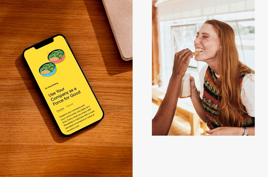
Sharebite’s new brand by Landscape is now live across Sharebite’s website and all touchpoints.
CREDIT
- Agency/Creative: Landscape
- Article Title: Landscape Evolves Sharebite’s Brand Identity to Express How Flexible Food Benefits Power Engagement, Connection, and Well-Being
- Organisation/Entity: Agency
- Project Type: Identity
- Project Status: Published
- Agency/Creative Country: United States
- Agency/Creative City: San Francisco, CA
- Market Region: Global
- Project Deliverables: Art, Brand Design, Brand Identity, Brand Mark, Brand Redesign, Brand Strategy, Graphic Design, Logo Design, Motion Graphics, Photography
- Industry: Technology
- Keywords: Flexible Food Benefits, Design, Motion Graphics, Illustration, Productivity, Well-being, Lifestyle Photography, Joy, Diversity, Togetherness
-
Credits:
Brand strategy and design studio: Landscape


