


The Barbearia André Paiva is a barber shop located in Tianguá, in the interior of Ceará, which is going through a moment of great changes and, one of the main changes was the need to modernize the brand, the old logo no longer accompanied the growth of the business and then the businessman André Paiva came to me with this mission.
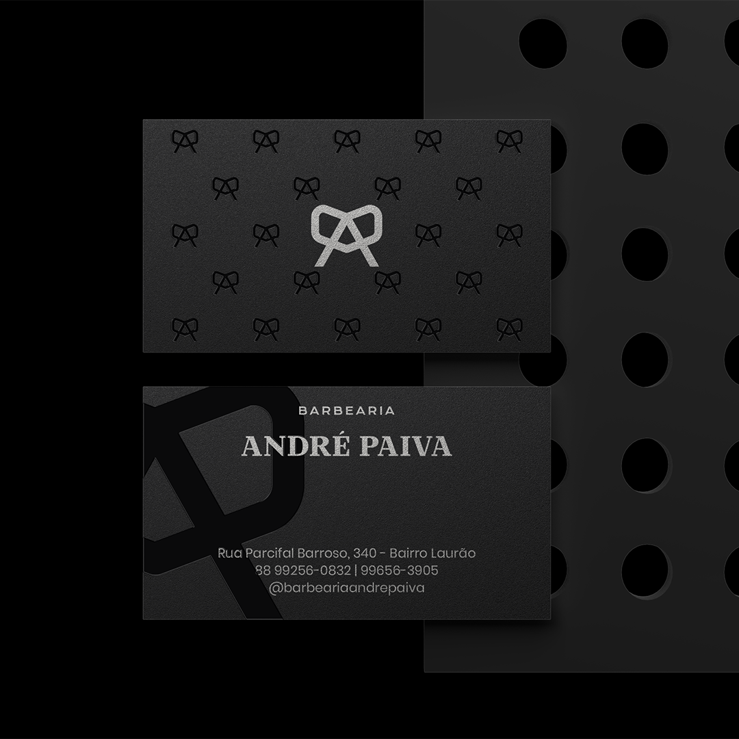
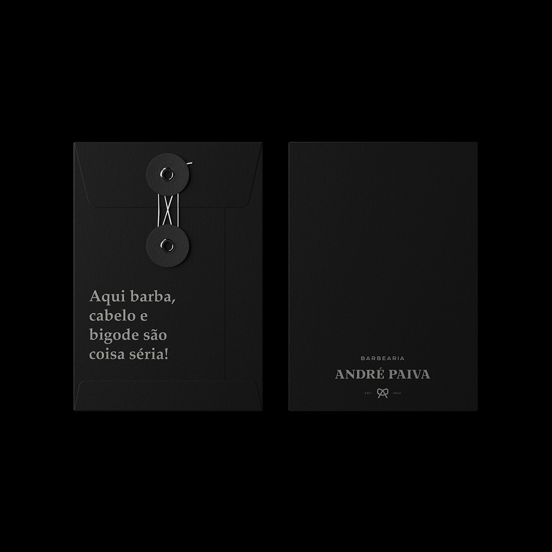
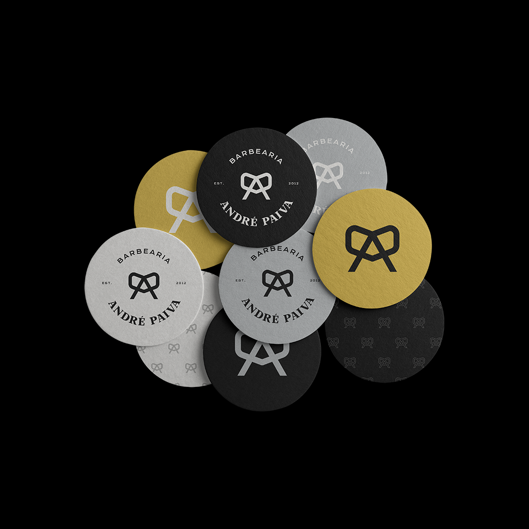
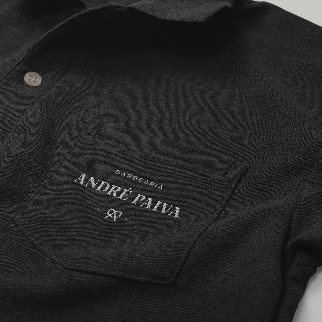
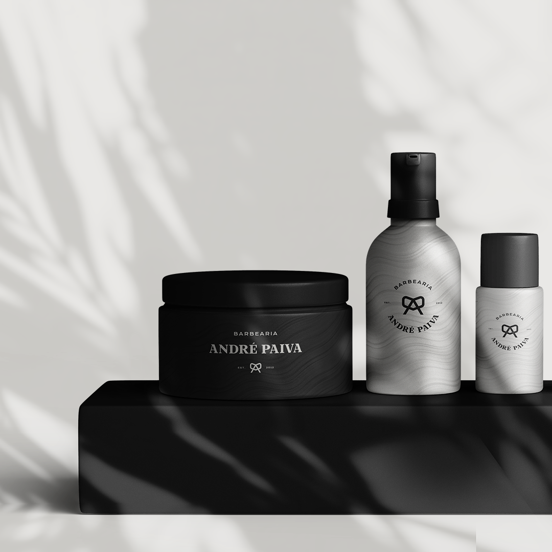
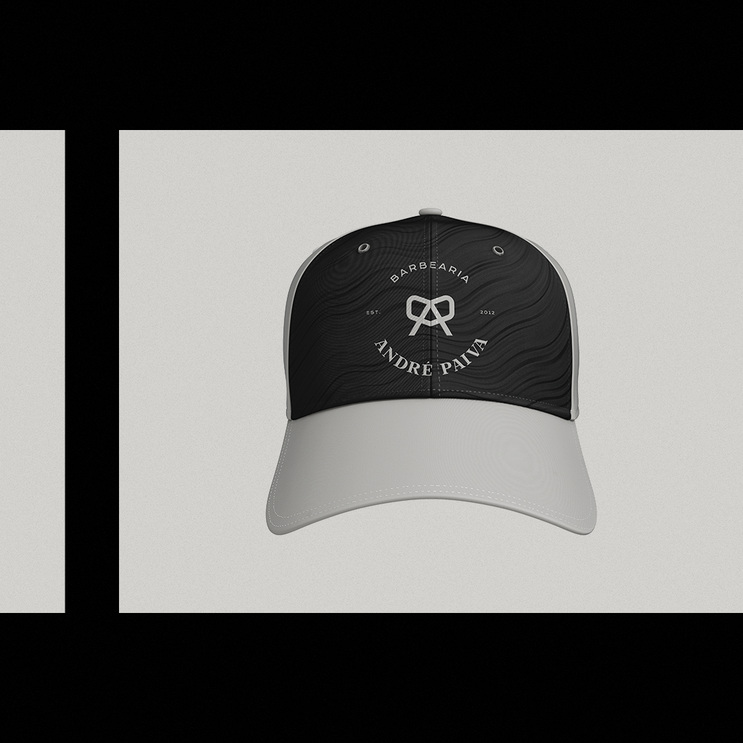
At first the idea was just to update the brand, but we took advantage of the moment to update all its visual identity, where different materials were made, such as masks, caps, mugs, bags, business cards, uniforms, store front and internal communication and a new layout of posts for social networks.
The main challenge was to develop a brand with new concepts and a new personality without losing the essence that the Barbershop already had.
From the beginning the research was done in the visual aspect, brands, identities and communications were sought from competitors and other companies in the segment, as the main concept was to further highlight the competitor’s company, the central idea was to bring something new to the segment, no a common brand with a simple design of scissors, razor or even a bearded man.
In conversations with the owner and with setting up the moodboard, it was clear that the brand would have to have a symbol that represented the “family link and the love for the profession” because, the barber profession is something more than a simple business, it is a dream that comes from childhood, it is a family inheritance passed from generation to generation.
The initial idea was to create a strong brand, with a modern look, but at the same time with a rustic and sober footprint, neutral main colors and a color to give a cheerful contrast in certain points of communication.
The barber shop is a serious brand, yet extroverted, it is a modern, mature, bold, leader and creative brand because it dictates a trend in the region where it operates. He has a lot of personality, an open mind and with a rustic footprint, only a rustic mixed with the modern.
It serves an audience mostly young people who attend the best places in the region, like to play sports and go to the party, like to feel good about the look.
There is a small proportion of older men, with an age range between 40 and 50 years, more conservative who like traditional cuts and a good shave.
The initial concept was based on the family bond because the profession of barber was passed from father to son, along came the love for the profession, the bond between parents and children, friends, relatives and etc …
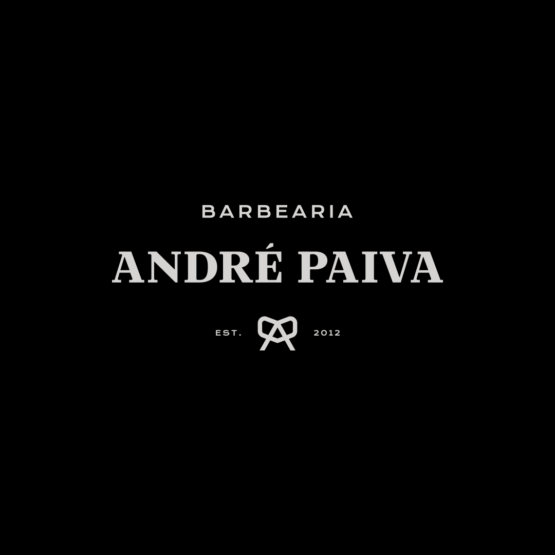
The symbol is light and full of personality, it represents scissors, a heart, a bow and the initials of the company name “B.A.P”.
The scissors represent the market segment, the heart the love for the profession, the bow represents the family link.
As type the brand is represented by a combination of serif and sans serif, the touch that mixes the rustic and the modern.
CREDIT
- Agency/Creative: Landerson Lineker - Brand Design
- Article Title: Landerson Lineker Creates a Brand for Barbearia André Paiva
- Organisation/Entity: Freelance, Published Commercial Design
- Project Type: Identity
- Project Status: Published
- Agency/Creative Country: Brazil
- Market Region: South America
- Project Deliverables: Brand Creation, Brand Digital Design, Brand Identity, Brand Strategy, Research / Insight
- Keywords: barber brand identity logo


