Terroir-based Tequila
Lágrimas Del Valle is as vibrant and unique as the concept it represents.
Lágrimas is a Vintage, “Rancho Unico” (Single Ranch) Tequila — celebrating the unique and distinctive characteristics of individual agave ranches. This results in every vintage being unique to the terroir it embodies, which is done intentionally, to demonstrate the rich complexity of the Blue Weber Agave.
All releases are distilled at Tequila Cascahuín, in collaboration with the Rosales family and is lead by current Master Distiller, Salvador “Chava” Rosales Trejo – the fourth generation of his family. Their distilling tradition dates back to 1904 in El Arenal, Jalisco; within the heart of the “Valley” of Tequila.
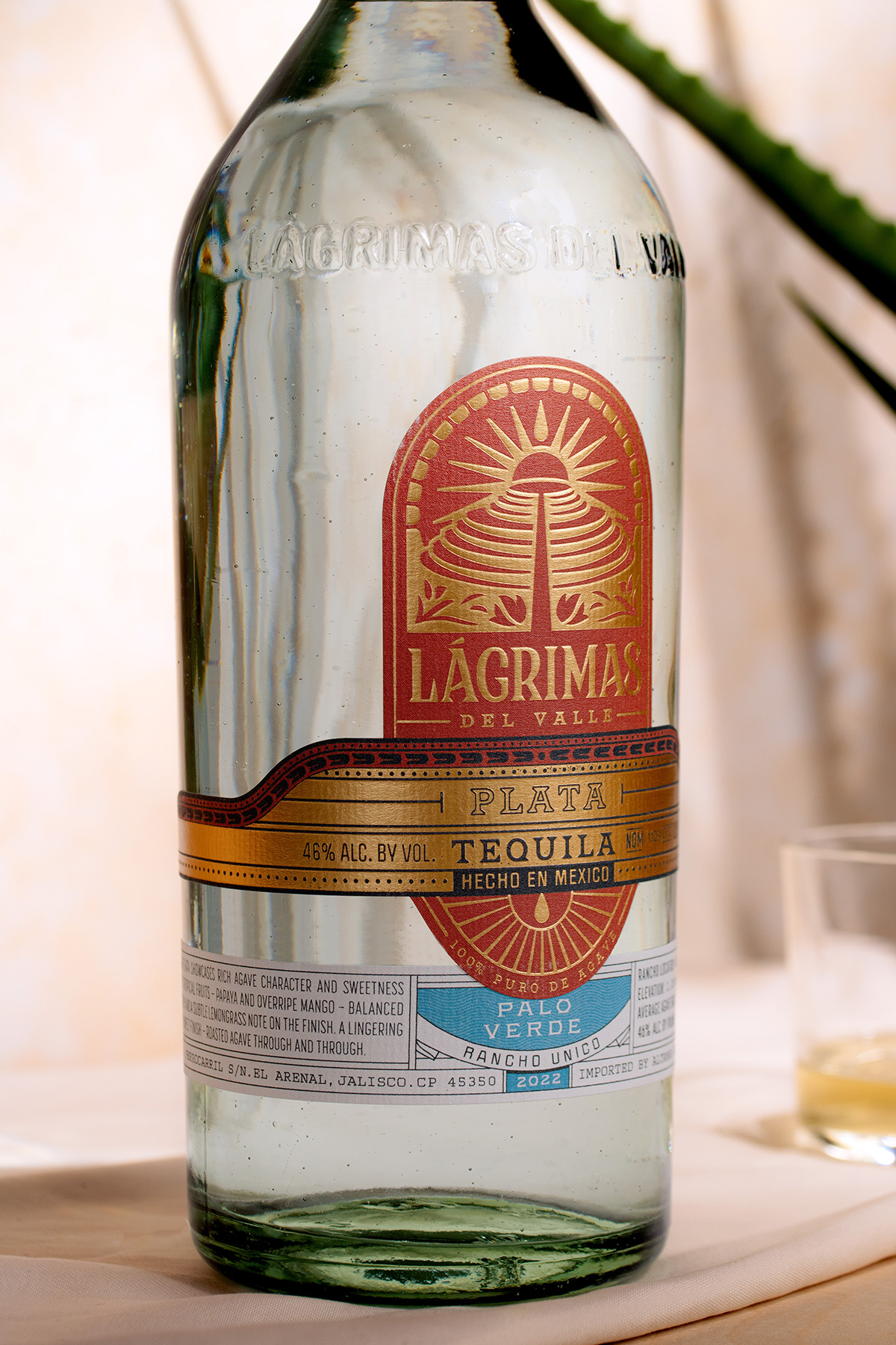
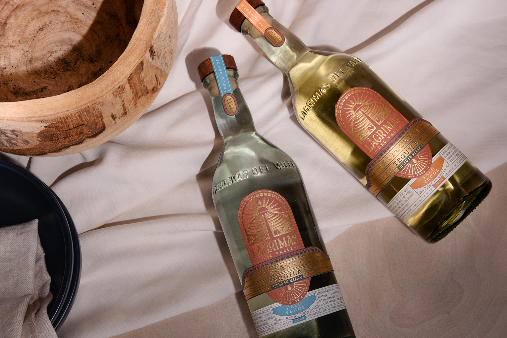
To represent this rich tradition and history, the Lágrimas identity needed to be rooted in the land that the liquid is drawn from. The logo design finds inspiration in the archeological sites outside the town of El Arenal. Round pyramids called guachimontones, can only be found at this historical site and are believed to be places of meaningful events. A monument just as unique as the individual fields Lágrimas del Valle is sourced from.
Lagrimas del Valle translates to “Tears of the Valley” – representing the tears that form both on a tasting glass from high quality Agave spirits, as well as the “tears” or condensed spirits falling into the still, the transformation of Agave into Tequila itself.
The name is visually represented through a small moment, found at the top of the logo design at the tip of the sun – a tear drops into the landscape.
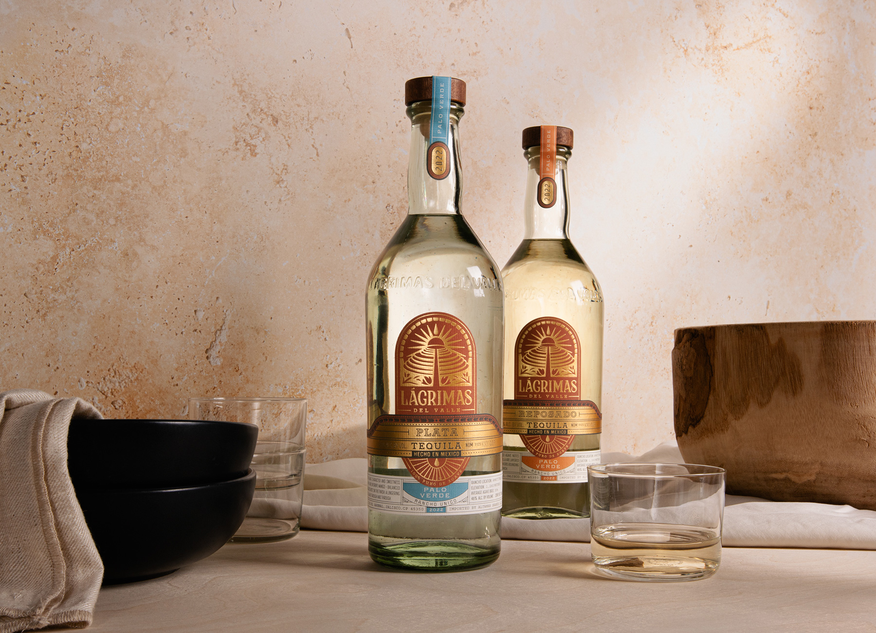
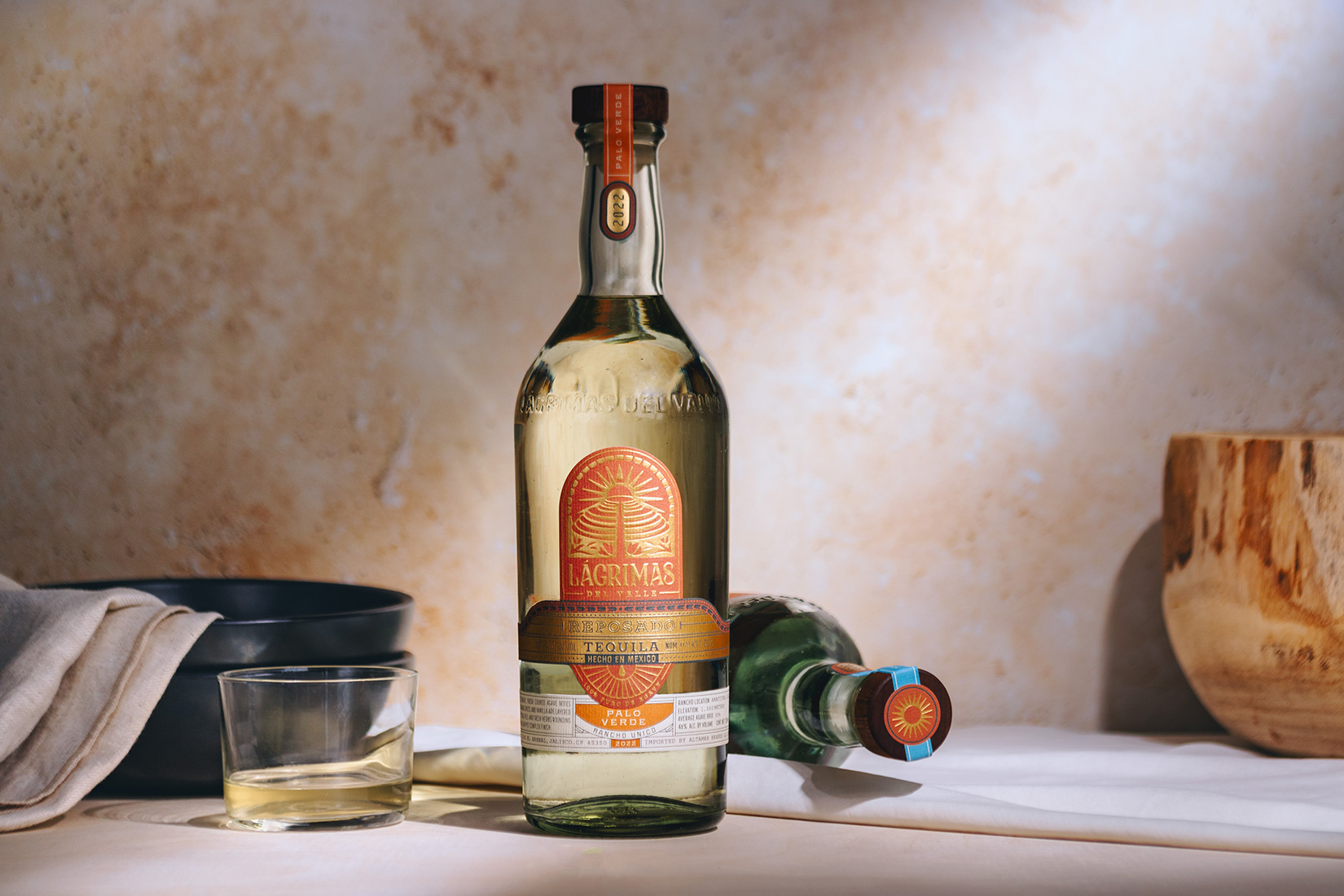
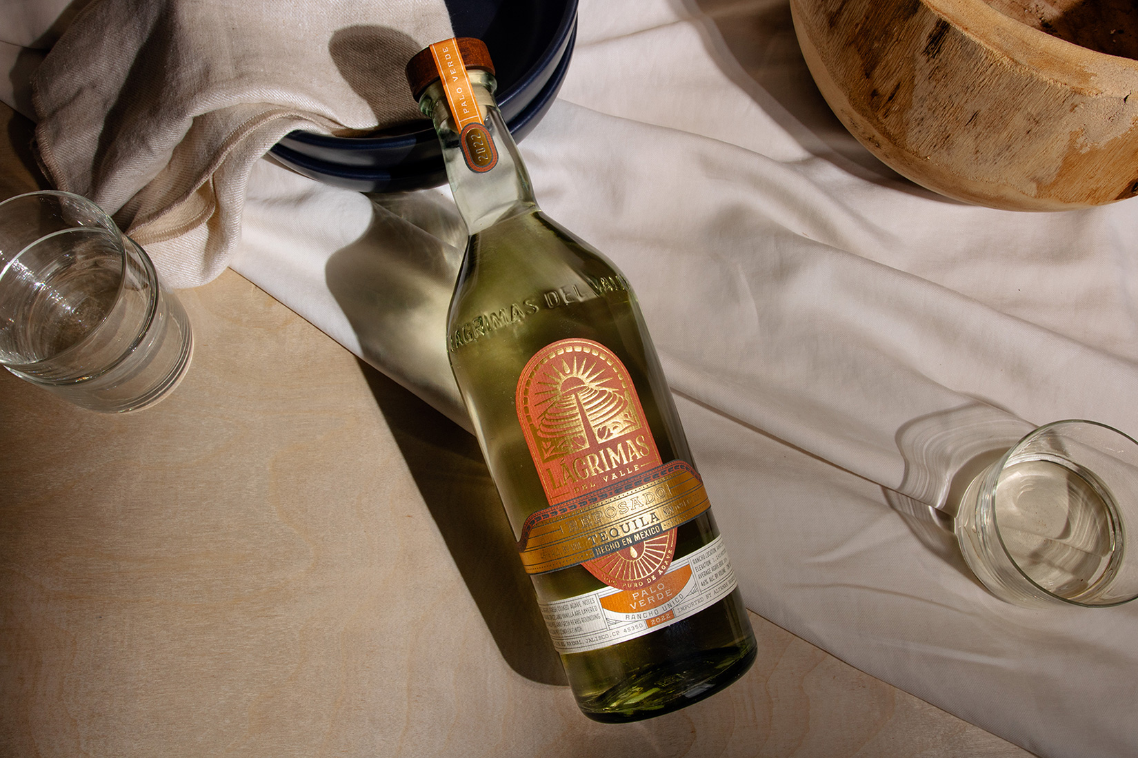
The primary label anchors the brand with swaths of eye catching foil representing the sun, backed by the rich red color of the soil in the Tequila Valley. The bottom label carries the story of each estate and notes about the terroir and tequila flavors it produces. Modular in nature, the label quickly adapts as each expression is released, with the “Rancho Unico” and vintage centered on the bikini label as well as on the tax tape at the top of the bottle.
Each component of the packaging was considered, from the reclaimed and imperfect glass to the custom molded bottle and the label design that reflects the rich cultural and ecological history of where the agave is sourced.
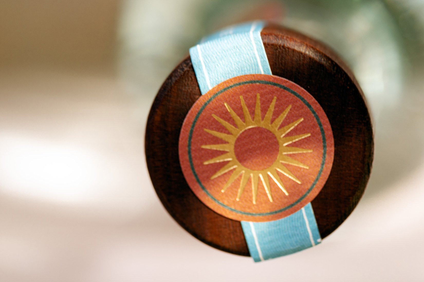
Small details complete the package, from the back printed label to the sun emblem found on the top of the closure.
CREDIT
- Agency/Creative: Watermark Design
- Article Title: Lágrimas Del Valle Brand and Packaging Design
- Organisation/Entity: Agency
- Project Type: Packaging
- Project Status: Published
- Agency/Creative Country: United States
- Agency/Creative City: Watermark Design / Virginia
- Market Region: Global
- Project Deliverables: Art Direction, Brand Design, Brand Guidelines, Brand Identity, Brand Mark, Branding, Creative Direction, Design, Graphic Design, Illustration, Label Design, Logo Design, Packaging Design, Type Design, Typography
- Format: Bottle
- Industry: Food/Beverage
- Keywords: WBDS Agency Design Awards 2023/24
- Keywords: Branding, Packaging Design, Logo Design, Label Design, Bottle Design
-
Credits:
Creative Director: Darcey Lacy, Watermark Design
Brand + Packaging Designer: Rebekah Seiler, Watermark Design
Brand + Bottle Designer: Seth McDuffie, Watermark Design


