KIND had redeveloped the brand and communication strategy for Byggmesteran to keep up with their rapidly expansion from a local to a national contractor.
The name: Lag
As the company has grown from a local to a national heavy weight, the old brand is outdated, the communication wrong and the old name Byggmesteran, a name in a local dialect, needed a big make over.
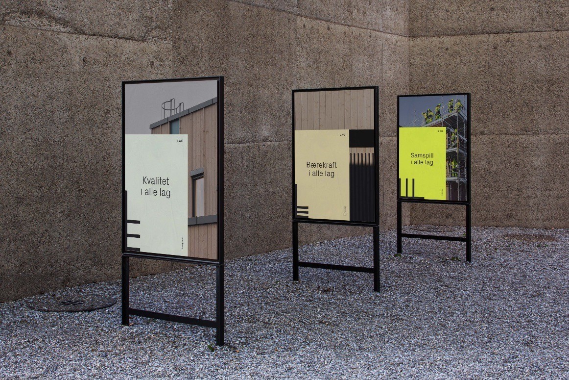
The new name Lag means both “layers” and “team” in Norwegian. The one (layers) underlines the work we do. We build, layer by layer with quality and sustainability in all. The latter meaning is imperative to achieve our goals, we do this as a team, as team players, both internally and outwards with our collaborators and clients. Teamwork and companionship have always been a key factor to Lag´s success and will be so even more in the years to come.
Changing the name to Lag establishes a platform to keep expanding on a national level.
We build to last, to realize dreams and to make a sustainable impact on our surroundings. An excellent delivery requires an excellent team spirit and an excellent work environment. Success and trust start within.
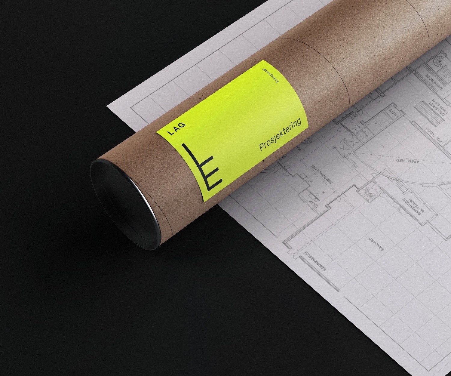
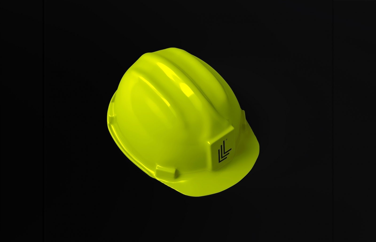
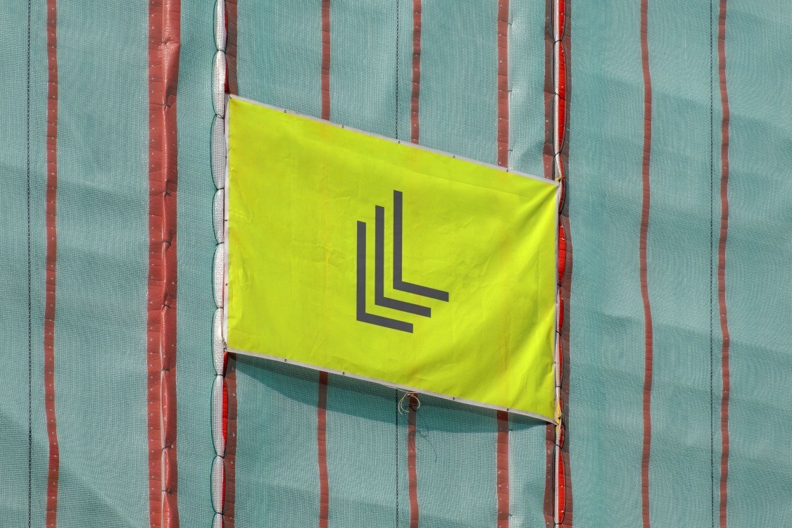
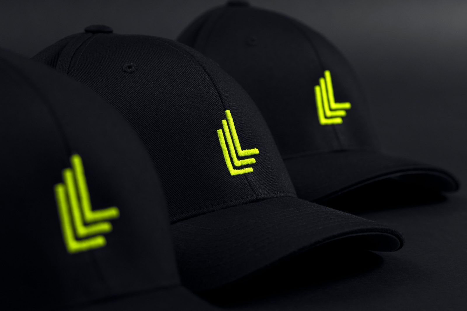
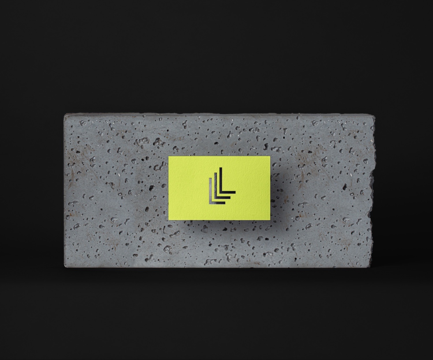
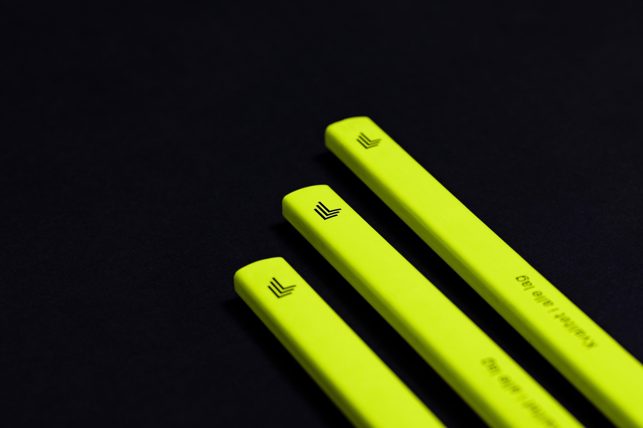
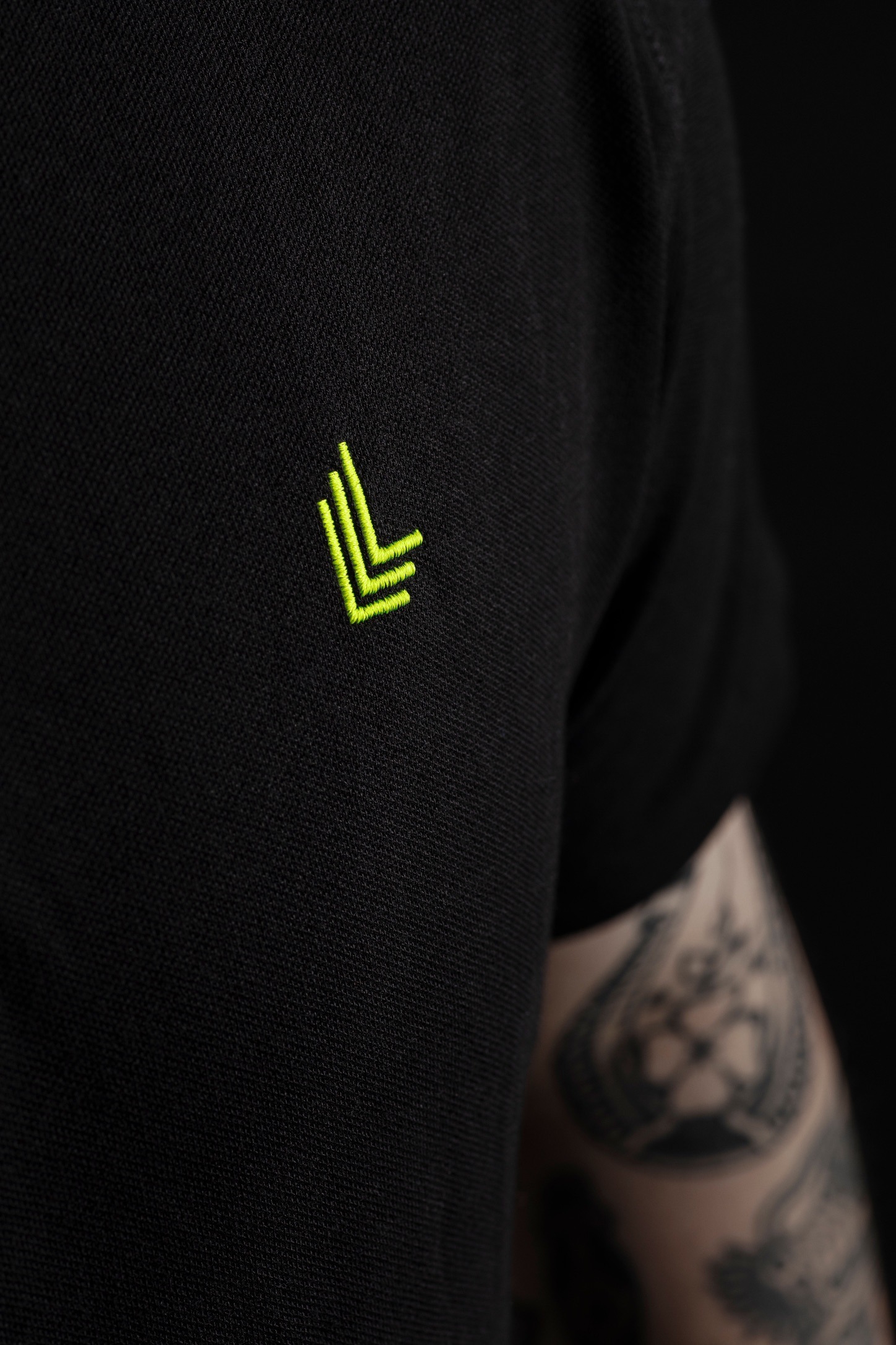
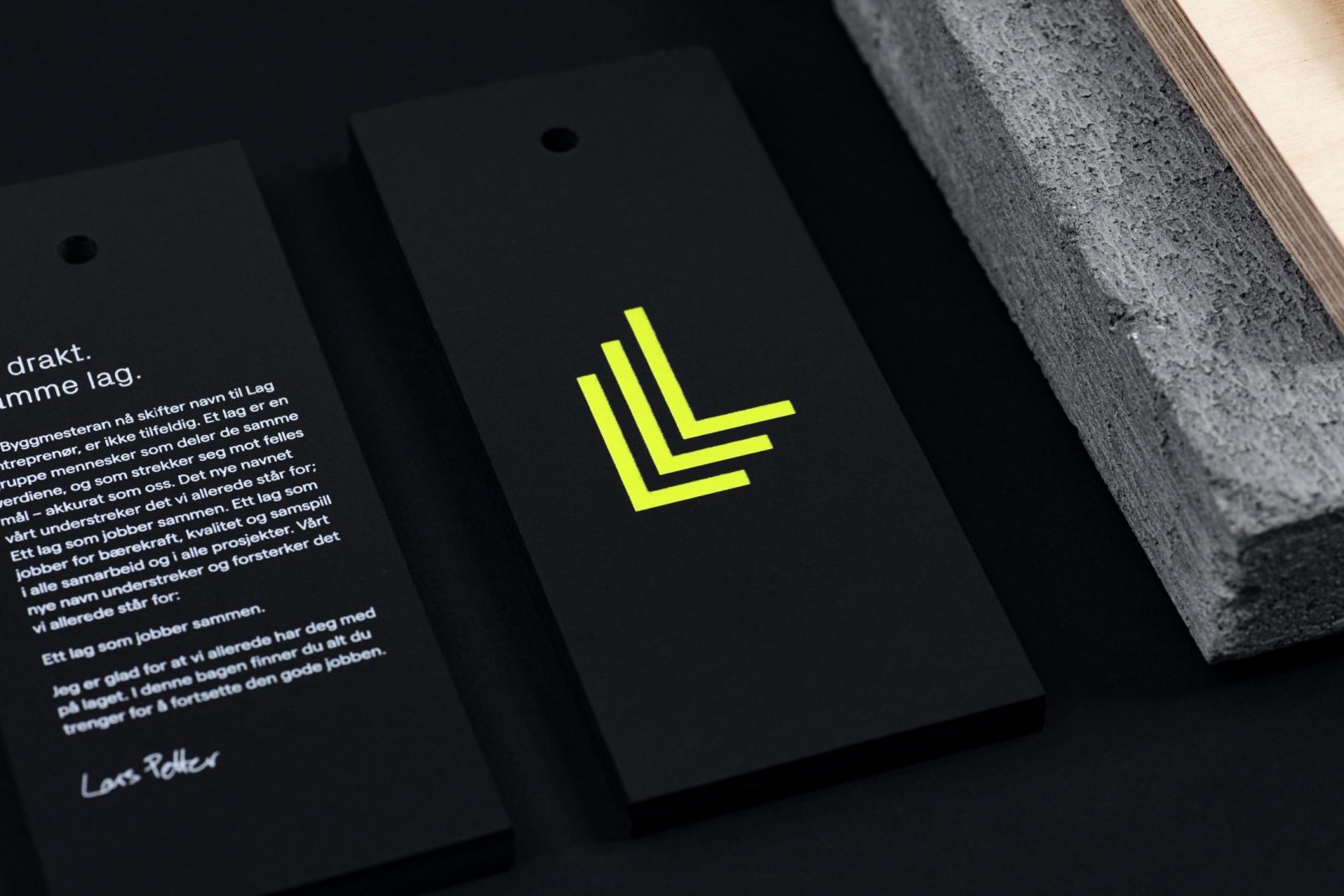
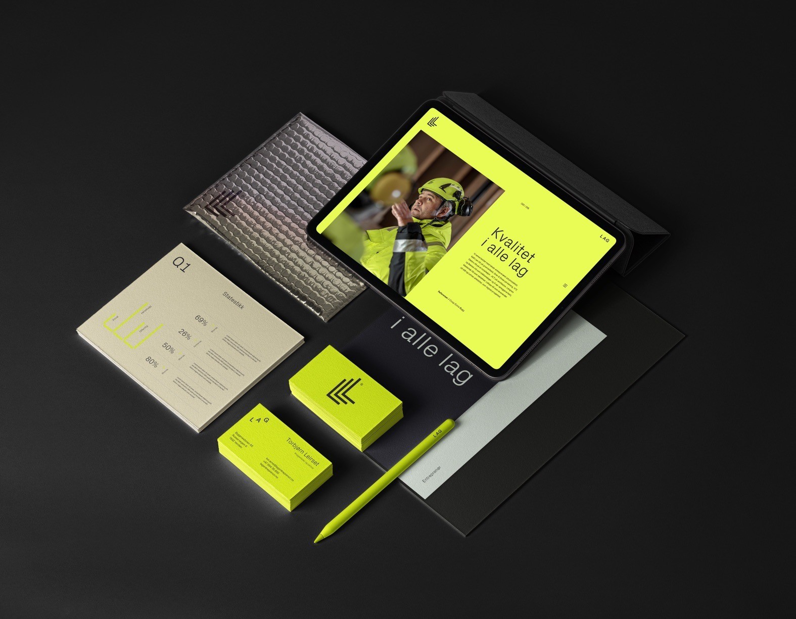
KIND has created a strong identity and clear communication strategy for Lag, that reflects the industry in a modern and flexible way. Lag´s focus is not only on the outcome of construction, but on the entire food-chain starting with the people involved, the employees and sub-contractors and a sustainable construction site. The logo reflects the name and the layers in construction. A strong and solid symbol to underline a strong name, in an industry that requires strength, stability and endurance.
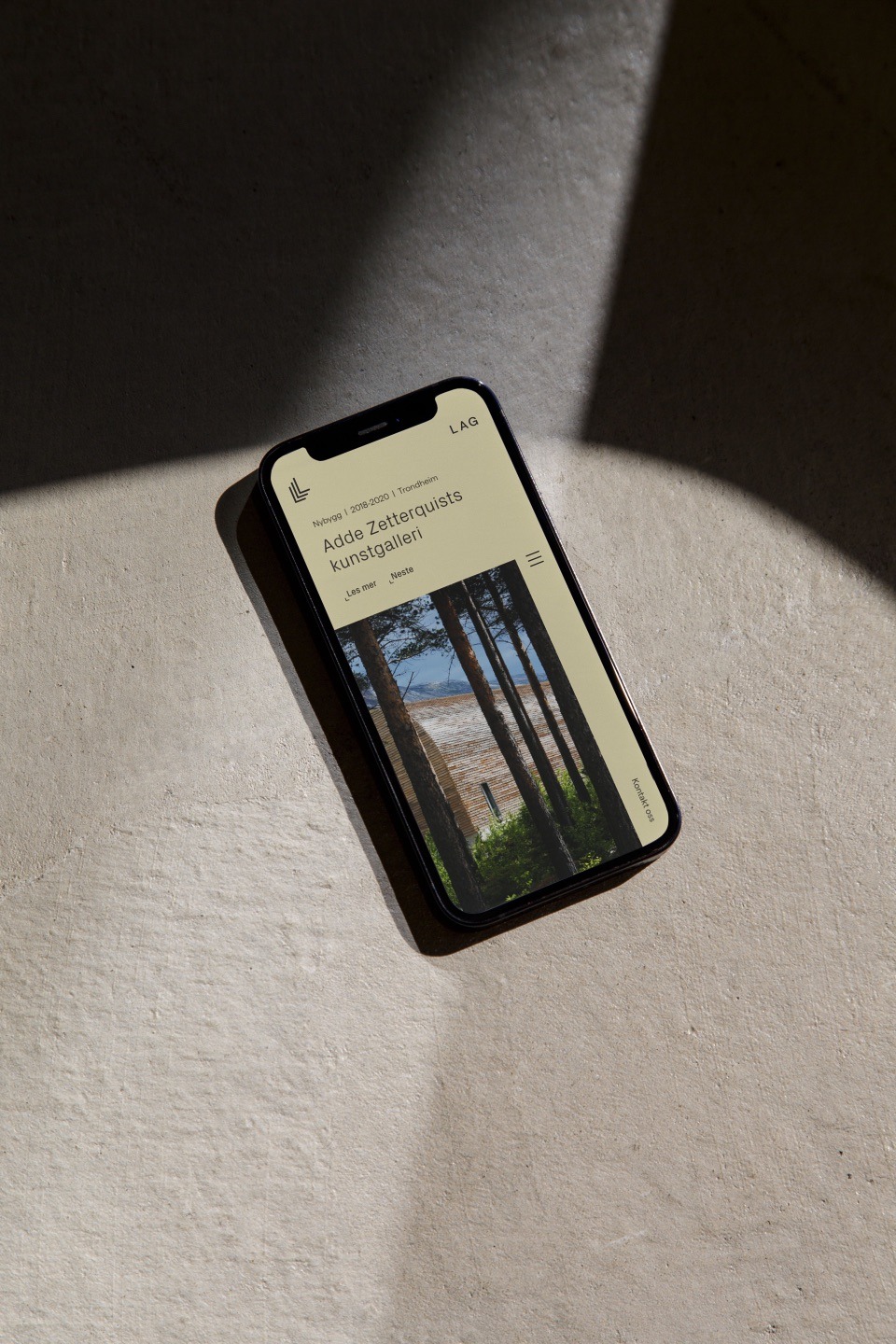
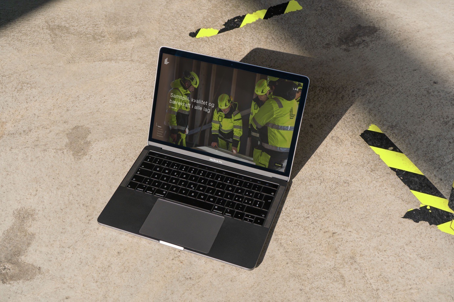
The symbol and logotype are designed to work just as well together as separate. Also dynamic versions for digital where the custom logo animations and transitions reflects the layers and movement of the logo symbol.
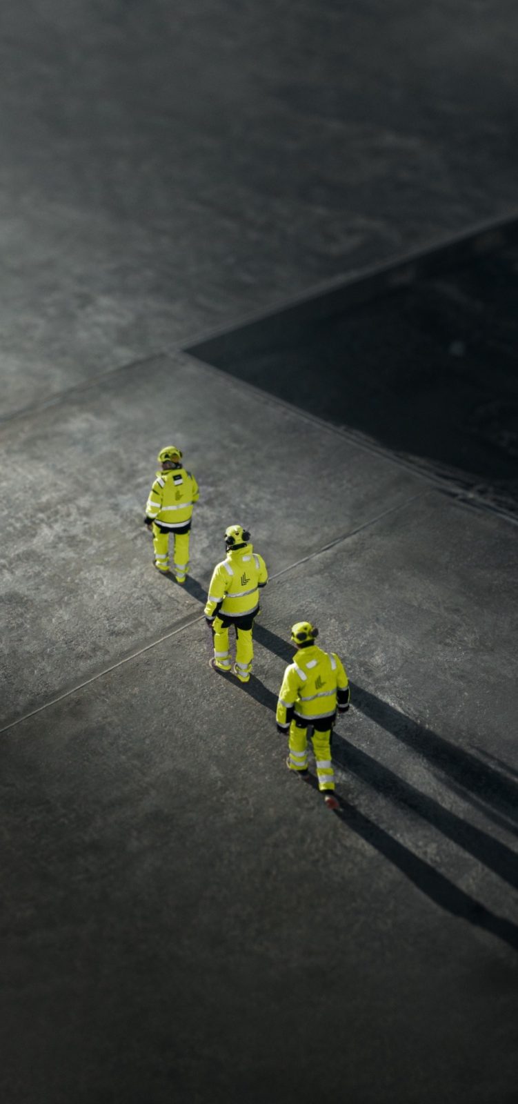
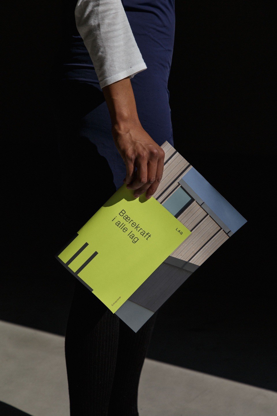
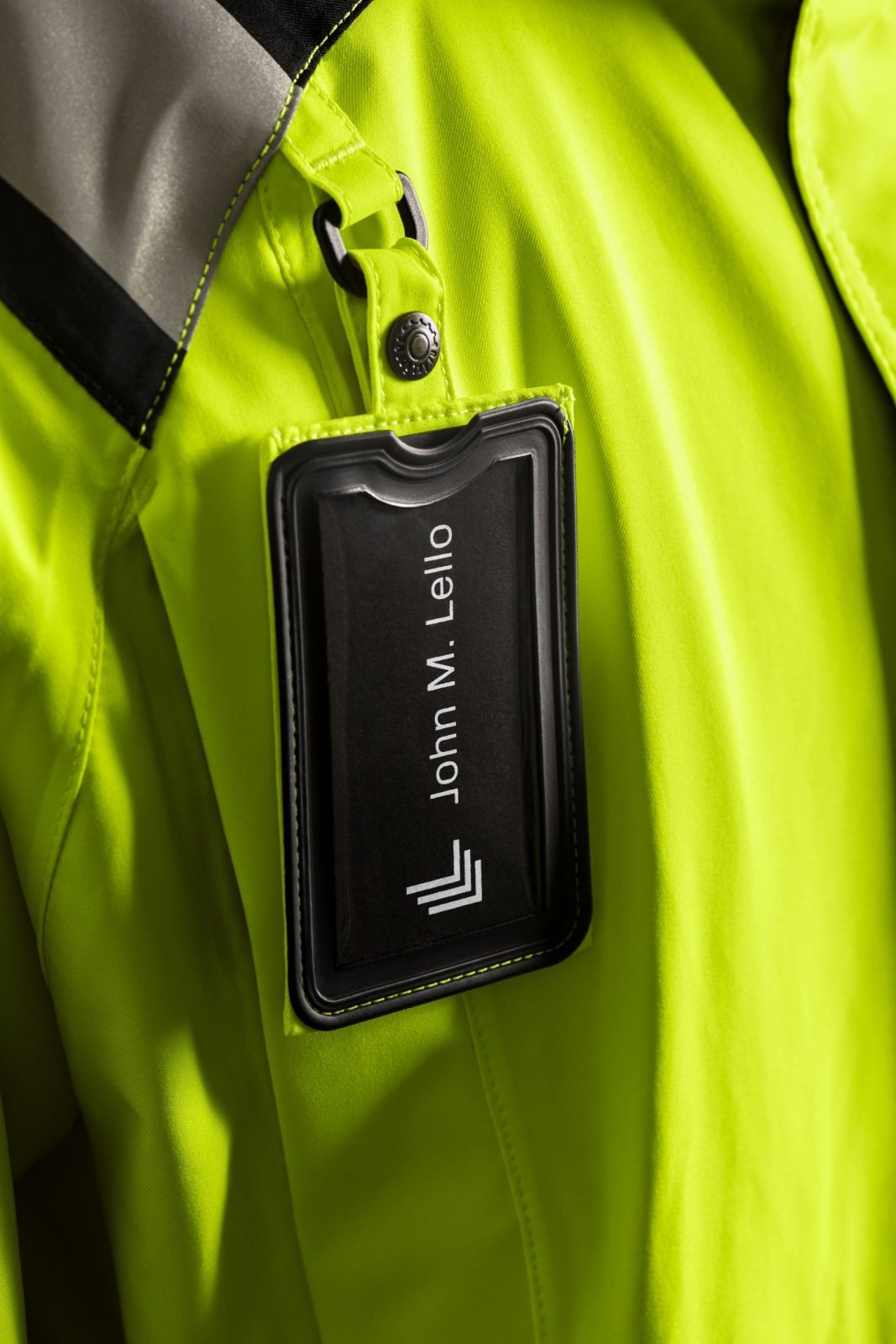
A powerful and vibrant color palette with neon yellow in its center links up with both the history, the industry and secures ownership to a color seen on construction sites across the country.
CREDIT
- Agency/Creative: KIND
- Article Title: Lag Brand Redesign – Reconstructing a National Contractor by Kind
- Organisation/Entity: Agency
- Project Type: Identity
- Project Status: Published
- Agency/Creative Country: Norway
- Agency/Creative City: Bergen
- Market Region: Europe
- Project Deliverables: Brand Design, Brand Identity
- Industry: Construction
- Keywords: WBDS Awards, Agency
-
Credits:
Creative Director: Tom Emil Olsen
Design Director & Senior Designer: Knut Harald Longva
Senior Designer: Bjørn Ivar Thomassen
Designer: Camilla S. Balulu
Designer: Emil Olsen
Photographer: Christoffer Meyer
Project Manager: Beate Myren Romslo
Project Manager: Marianne Erdal Holm
Strategic Brand Consultant: Jan Willy Skjøldberg


