


“All the best failures always end up in the bin.” This is the motto of the Lacorbeille Museum, and it perfectly expresses the vision behind the project. This slogan opens the door to a movement of thought, a way of life, an avant-garde vision of creation. With a theme such as “failure”, the identity of the Lacorbeille Museum must flirt with the limits. Illegibility is what comes closest to failure, so let’s create an illegible logo and graphic system.
The masterpiece of this project is at the heart of this photographic series.
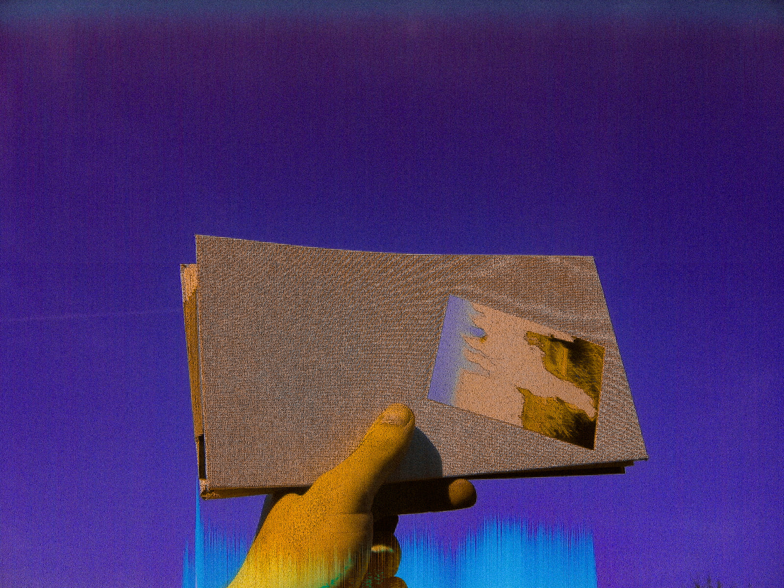
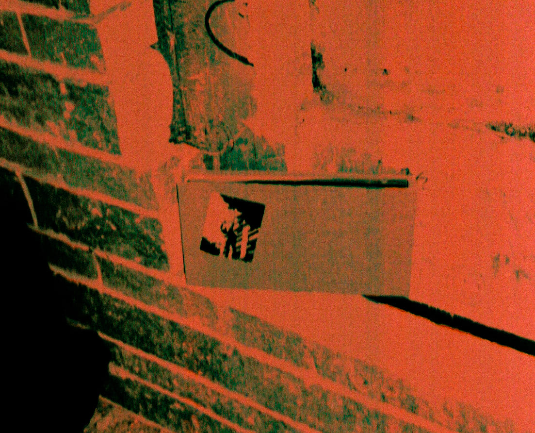
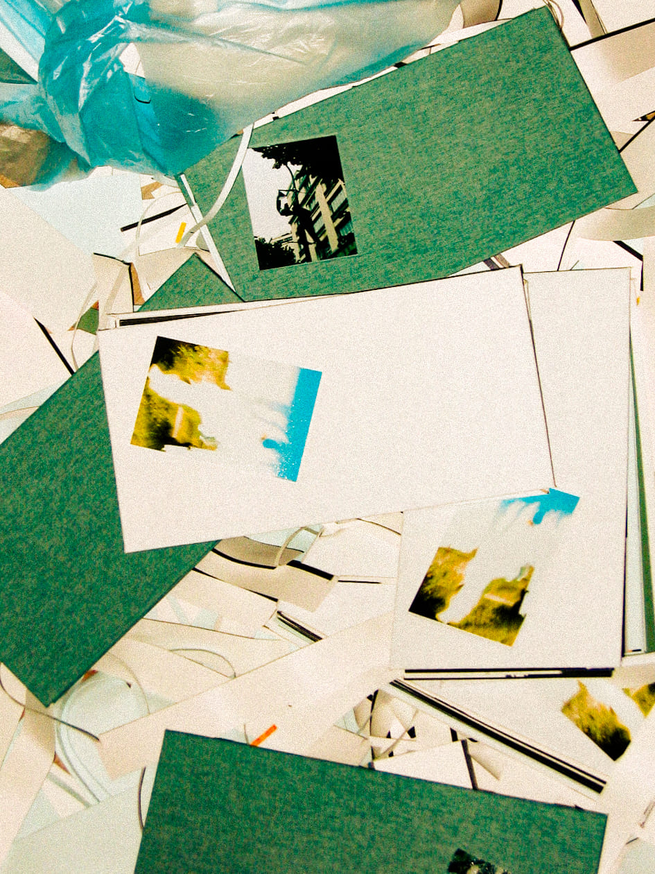
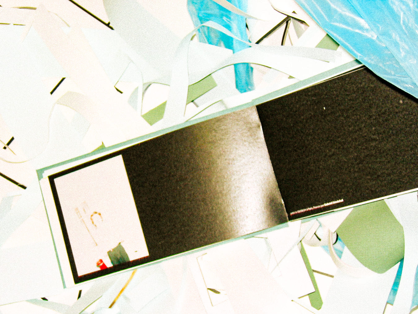
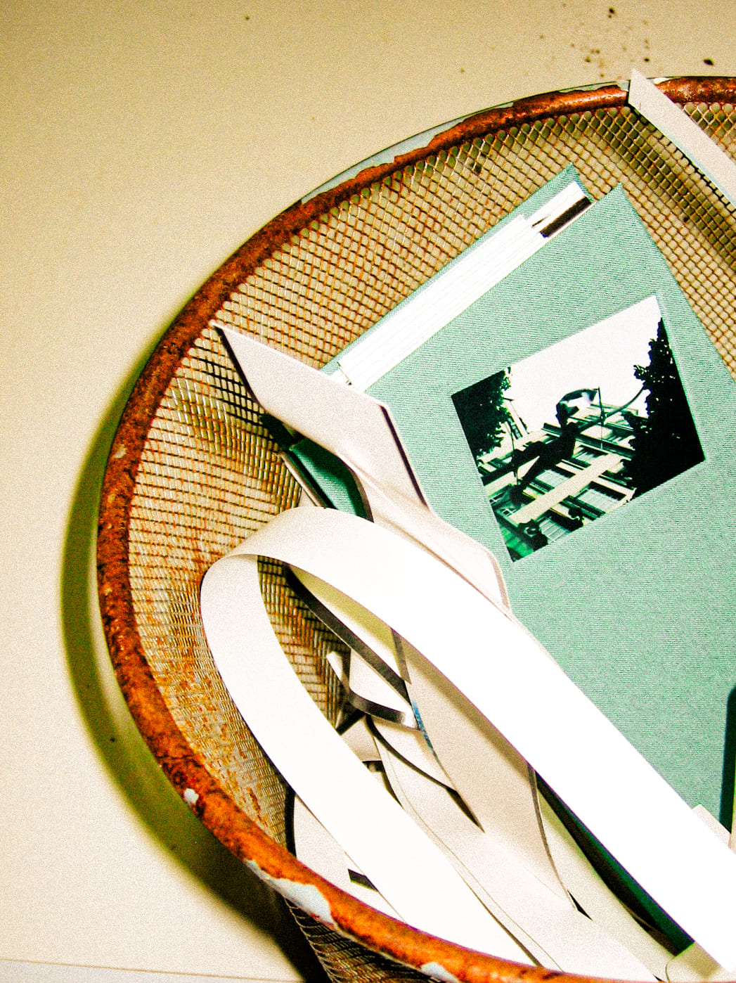
The retrospective book ra[re]té retraces the entire exhibition with a carefully crafted layout where errors enrich the reading experience. The book’s binding is made entirely of scraps of paper. Usually discarded, these scraps inspired the format, reinforcing the impact and story of the photographs. Two versions of this book exist to highlight the central themes of the exhibition: nostalgia and brutality. Entirely handmade, only six copies exist.
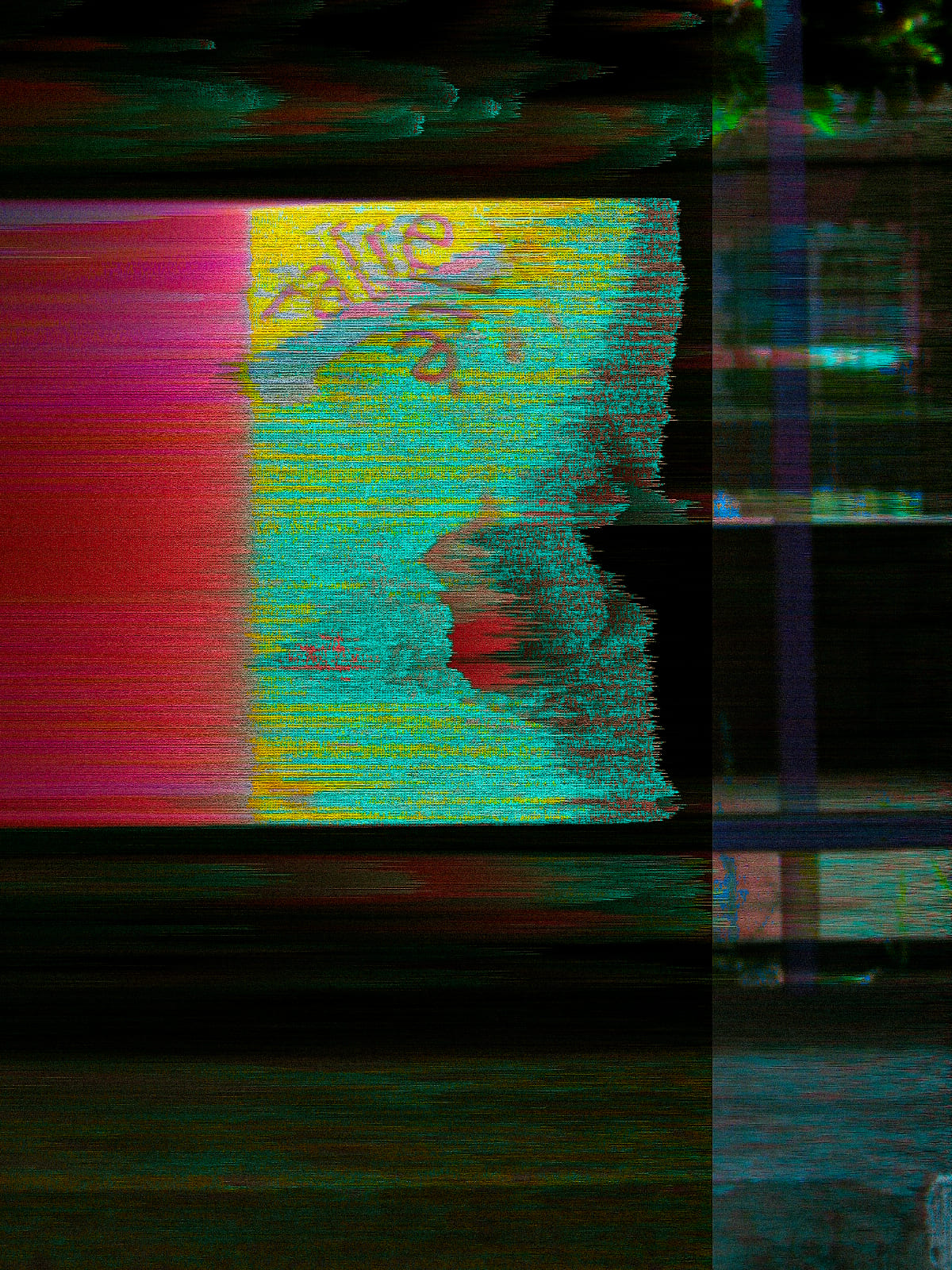
To remain as faithful as possible to the concept of the trash bin, an alternative series composed of failed photos from an outdoor shoot is featured. The artistic direction surrounding this book sets the tone for its content. All the more so since these photos were taken with a defective digital camera from the 2000s. The unpredictability of the errors adds character to the entire photographic series.
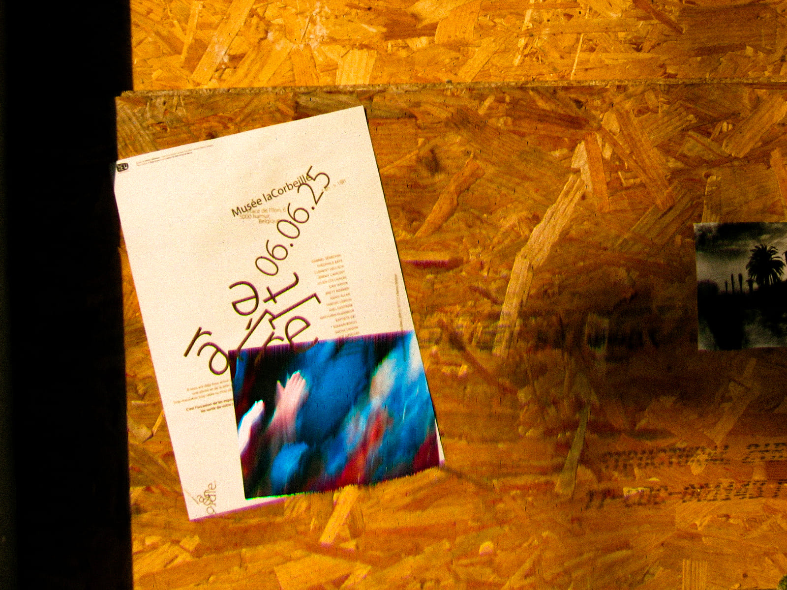
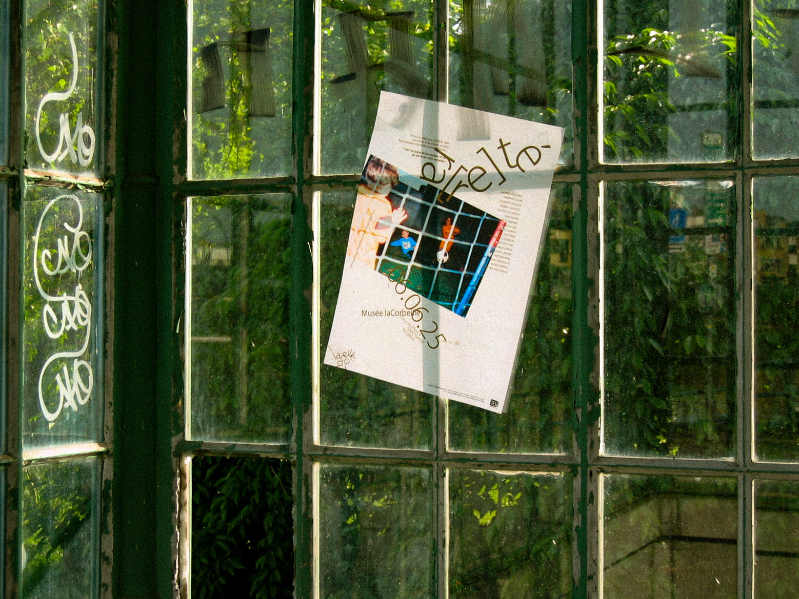
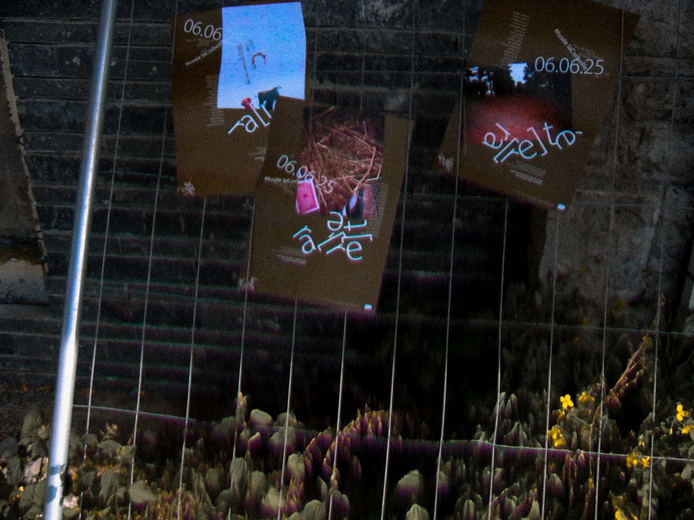
Like the exhibition, this series of posters reflects the duality of the two phases. Here, the three light-colored posters share a nostalgic feel, while the three darker ones convey a more brutal, unfiltered emotion. This further accentuates and anchors these posters in the photographic universe they promote.
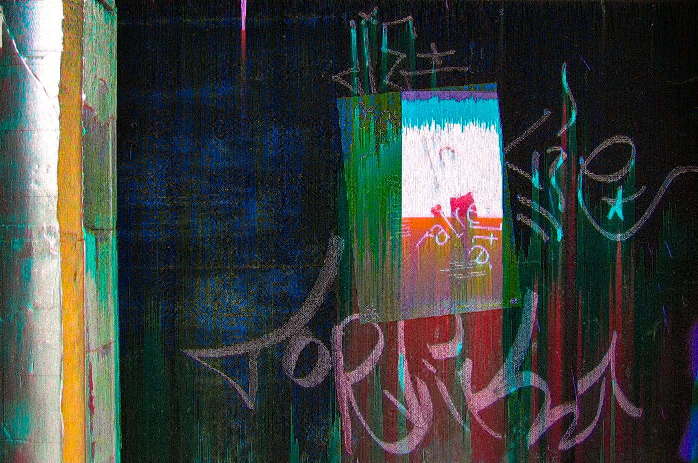
This logo echoes the aesthetic of crumpled paper, of a ball of paper thrown into the bin. The letters merge together thanks to the fold, just as ideas merge together in the museum. This logo is a perfect example of how a simple mistake can become the masterpiece of an identity. Like human beings, this logo transforms and changes appearance, but always retains its identity. It is in constant motion with interesting letter arrangements, making it evolutionary.
The typography used is not insignificant… it is Myriad Pro and its variants. Why? Because it is the default font used by all Adobe software. It is instantly set aside when creating an identity; it is THE unused font.
This colour palette follows the principle of the basket: using rejected colours that seem ‘flawed or unattractive’. It is taken directly from the rust of an old basket found on the street. Mordoré and Oxyde are the names of two colours in the basket.
CREDIT
- Agency/Creative: Mattéo Tabutieaux
- Article Title: Lacorbeille Museum Presents Ra[re]té as a Radical Vision of Design and Identity
- Organisation/Entity: Student
- Project Type: Graphic
- Project Status: Published
- Agency/Creative Country: Belgium
- Agency/Creative City: Namur
- Market Region: Global
- Project Deliverables: Art, Art Direction, Brand Creation, Brand Identity, Editorial Design, Exhibition Design, Logo Design, Photography
- Industry: Entertainment
- Keywords: exhibition, failed, failed photo, experimental, conceptual, museum, photography, art, rareté, raté, rarete, photo ratée, ra[re]té, threw up, lacorbeille, the bin, belgium, namur, musée des bateliers, curation, artistic direction, installation, contemporary, editorial, book, photo book, ad, poster, acvertising
-
Credits:
A.D.: Mattéo Tabutieaux
Director of the Museum: Fabrice Giot
Museum: Les Bateliers de Namur, Belgique
Photographer: Gabriel Sénéchal
Photographer: Clément Dellach
Photographer: Jérémy Camuset
Photographer: Théophile Baye
Photographer: Julien Collignon
Photographer: Emah Allag
Photographer: Dan Hayon
Photographer: Mathurin Guermeur
Photographer: Romain Boxus
Photographer: Baptiste Sid
Photographer: Enzo Harivelle
Photographer: Noé Davenas
Photographer: Samuel Lebrun
Photographer: Axel Gentinne
Photographer: Brett Mermer
Photographer: Sofia Zonfrilli
Photographer: Sacha Crispin


