Lacàph is a coffee company that carries a mission to share Vietnamese coffee and culture with curious people everywhere. In order to achieve this, we have been building a brand-centric business through designs that helps bring quality products that tell stories to our target customers in Asia Pacific and hopefully beyond. We aim to present a contemporary local style that speaks a global language.
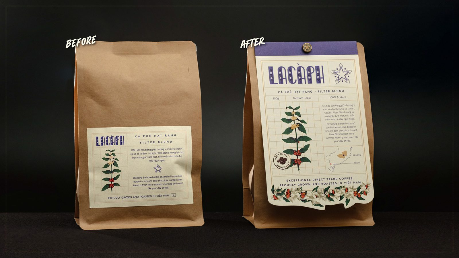
The in-house redesign of our core blends packaging went hand-in-hand with a significant upgrade to our roasting facilities, representing a new chapter in our company’s story, going from a micro producer to a small producer. Still, being able to work with environmentally responsible materials is a challenge. Using custom coffee bags produced with largely biodegradable components was not possible given our relatively small production volume per blend and large minimum order quantity requirements from far away suppliers.
And so, our goal for this project was to preserve the use of off-the-shelf more environmentally friendly packaging materials as a base but introduce a unique and highly differentiated concept that speaks directly to our target customers in retail environments and online.
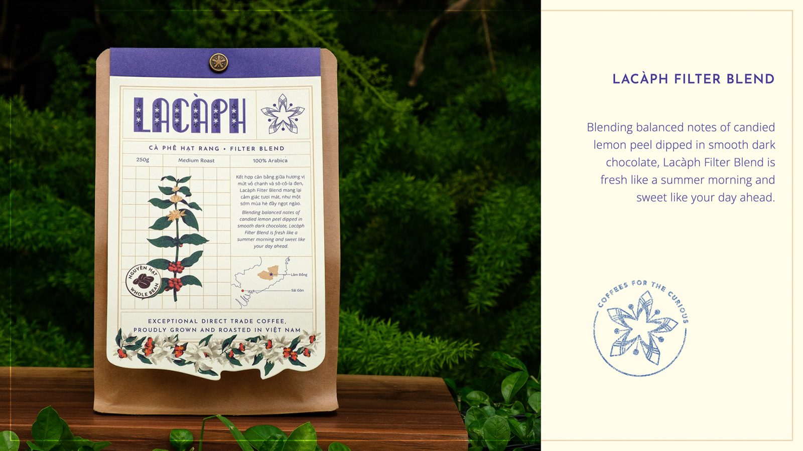
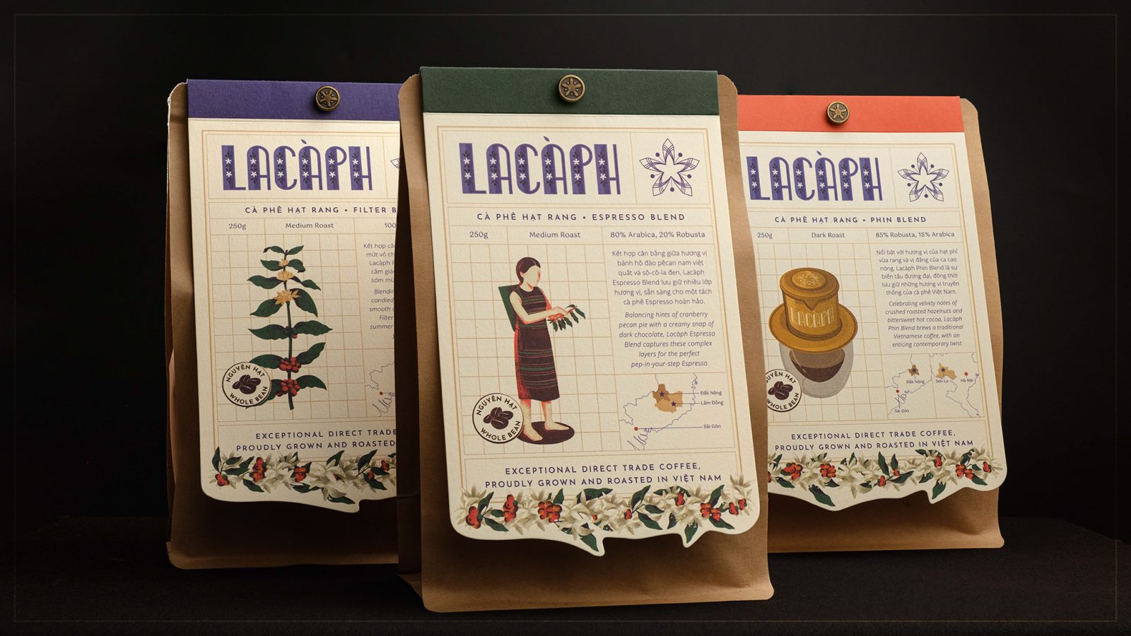
Our brand style is inspired by old Indochina Art Deco, a style originating from France, with a contemporary twist of stencil illustrations and simple vectors. The inspiration comes from a popular aesthetic during the time coffee was introduced in Việt Nam by the French.
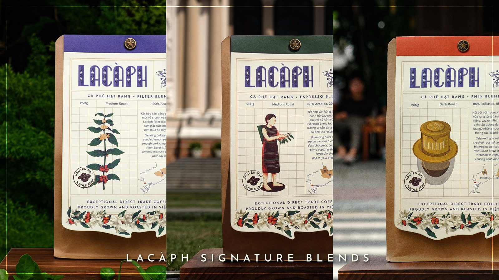
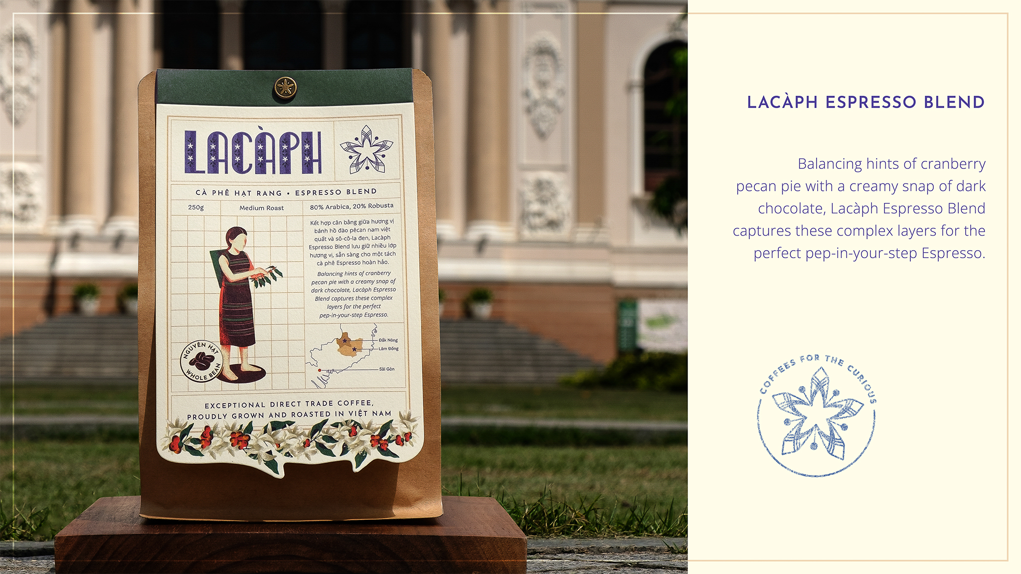
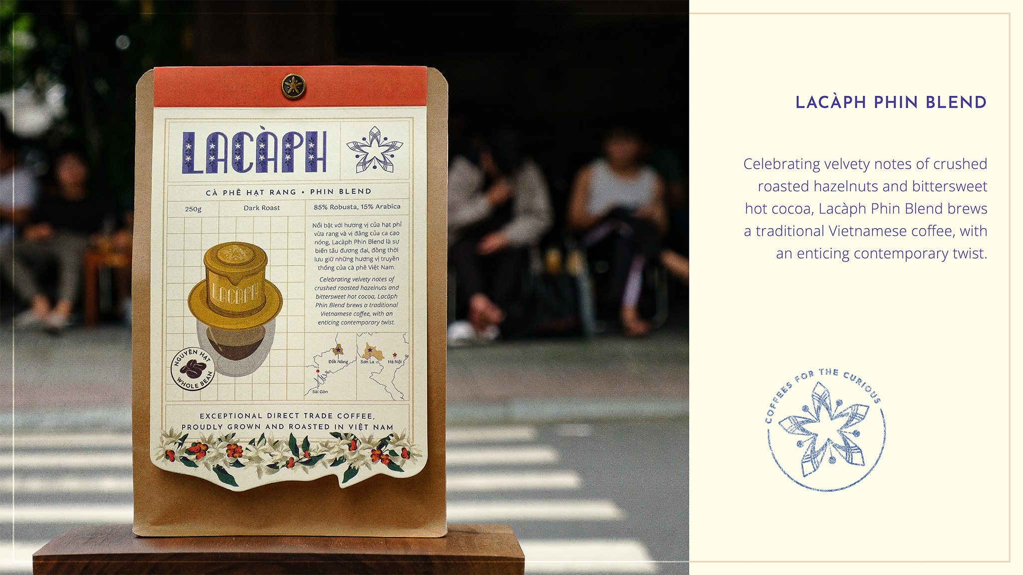
The packaging design series tells the story of a “coffee journey” from bean to cup, using symbols of the coffee branch (cultivation phase), the ethnic minority harvester (processing phase), and the Vietnamese traditional Phin (brewing phase). This is also to reflect the brand’s dedication through every stage of coffee’s life: we work directly with farmers, continuously improve roasting profiles, and provide optimum brewing recipes.
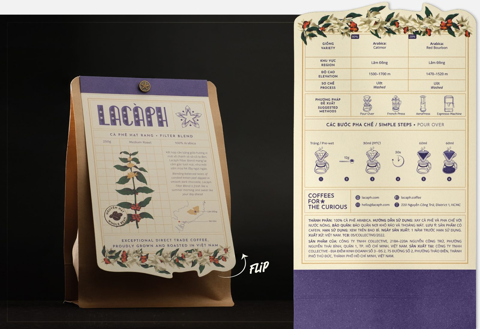
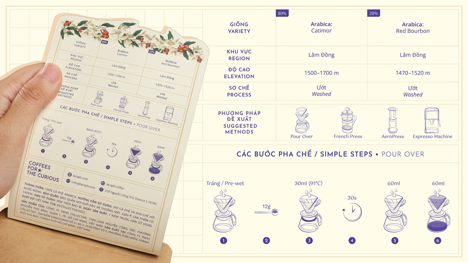
More than just the aesthetic aspect, user-experience friendliness is central to the design through the detailed and clear information on growing regions and bean traceability, whole-bean or pre-ground options, and step-by-step instructions on the label’s flipside, displayed conveniently in illustration for ultimate language-free accessibility. Informative, neat, and aesthetically balanced, every design is detail-oriented while making use of the space. Our products are designed for curious people; people who want to know more about the things they buy and hence our designs communicate plenty of information.
The product photography uses a simple black background to contrast the packaging design while the outdoor concepts express the personalities of each of the blends: Filter for clean and green, Espresso for European influences, and Phin for Vietnamese street coffee culture.
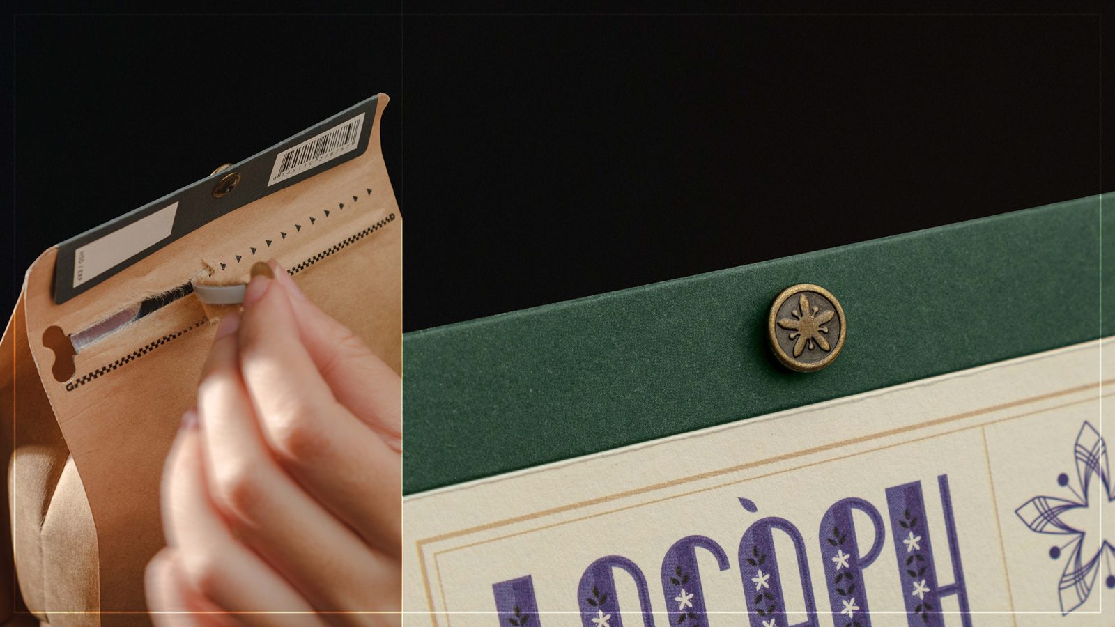
In the GIF image, we also demo the placement of instruction on the back of the label. This ‘flippability’ is an innovation from the previous version of our design. Also, with the single Lacàph Coffee Blossom rivet, we reduce the production time and environmental impact, from sticking with potentially toxic sticker glue to stapling and adding another mark of differentiation.

CREDIT
- Agency/Creative: Lacàph
- Article Title: Lacàph Coffee Core Blends Packaging Redesign
- Organisation/Entity: In-House
- Project Type: Packaging
- Project Status: Published
- Agency/Creative Country: Viet Nam
- Agency/Creative City: Ho Chi Minh City
- Project Deliverables: Packaging Design
- Industry: Food/Beverage
- Keywords: WBDS In-House Design Awards 2022/23
-
Credits:
Lead Designer: Võ Trung Minh Khang
Procurement Manager: Nguyễn Xuân Trang
Videographer/Photographer: Lương Vĩ Quyền
Managing Director: Timen Rasmus ter Meulen Swijtink


