


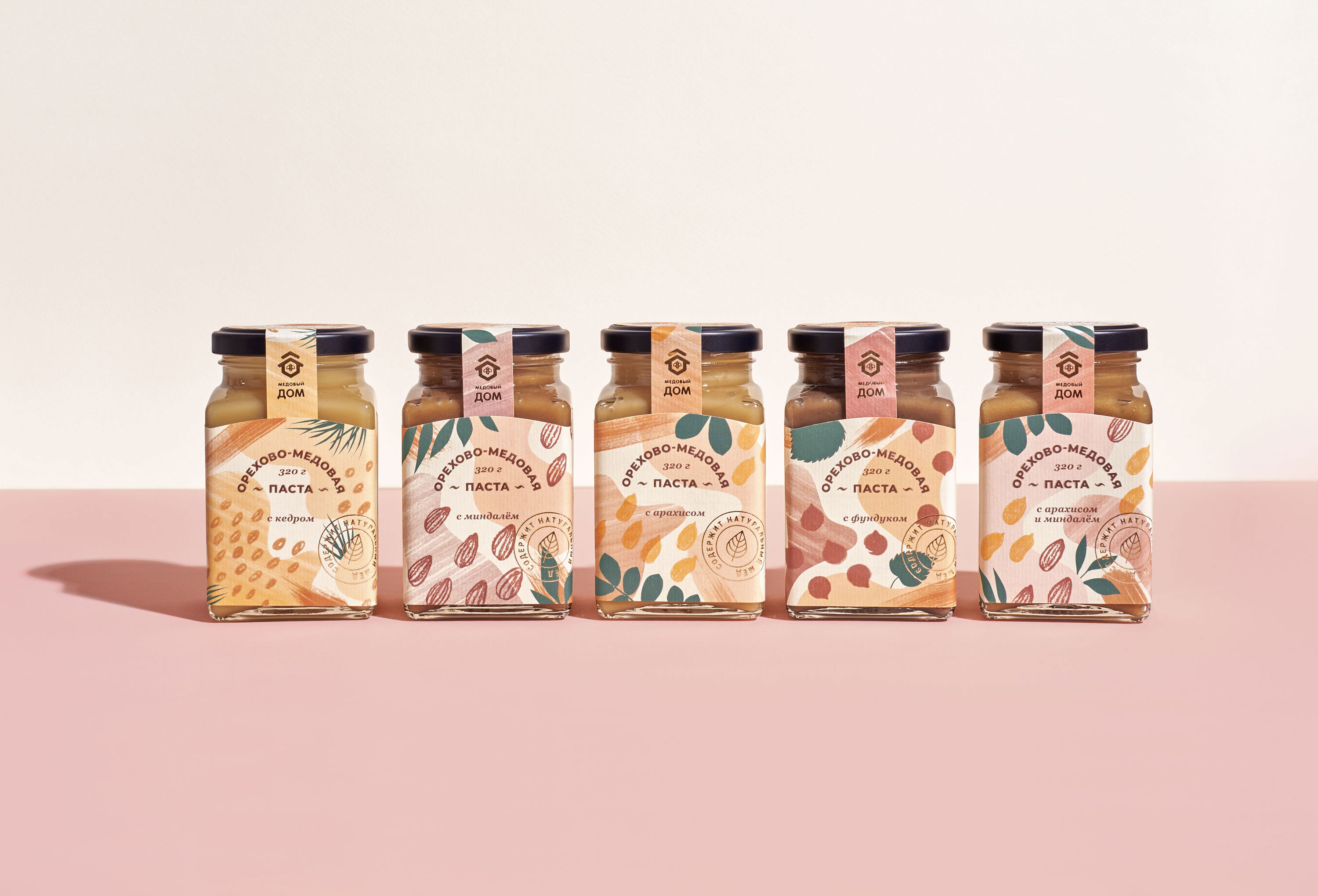
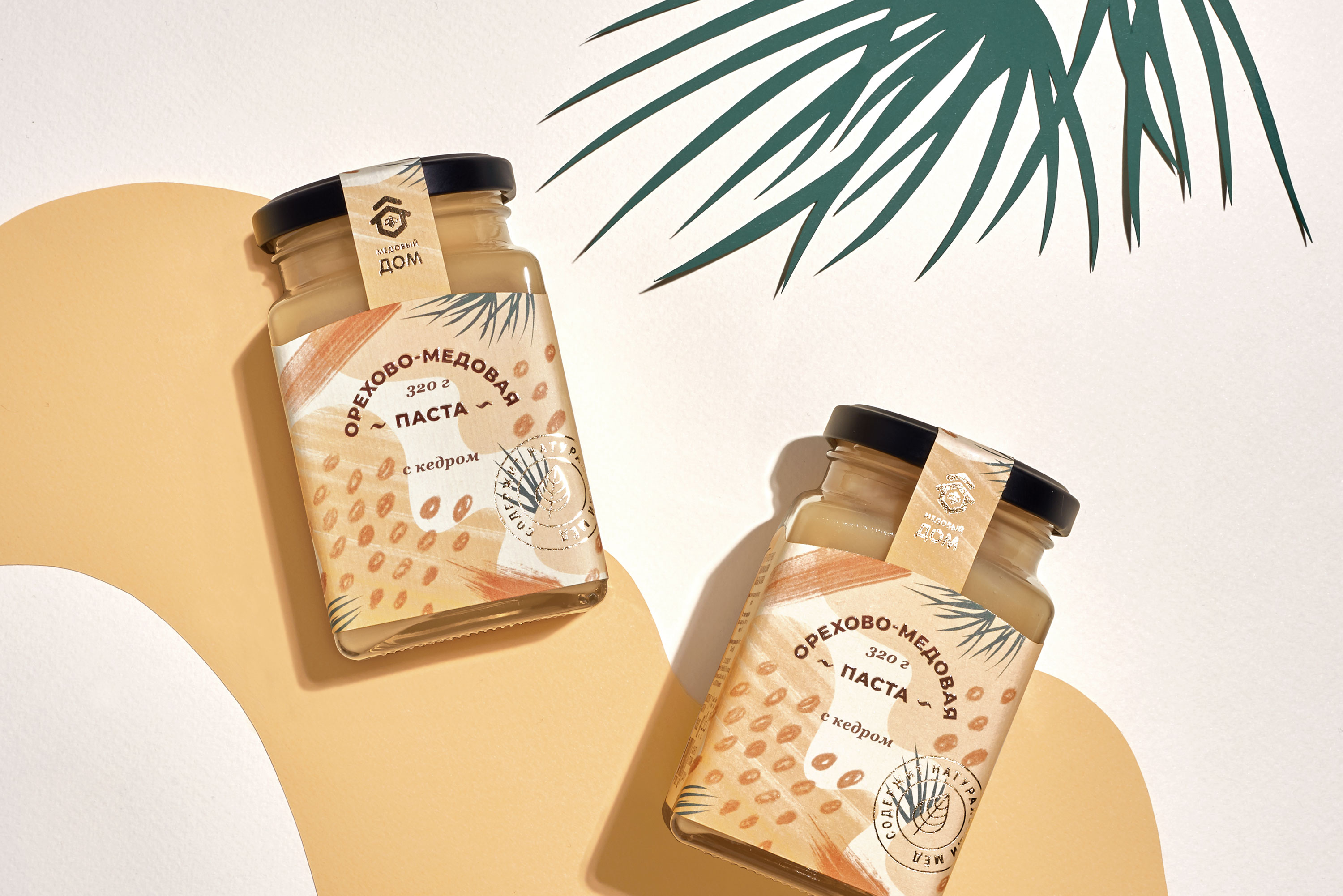
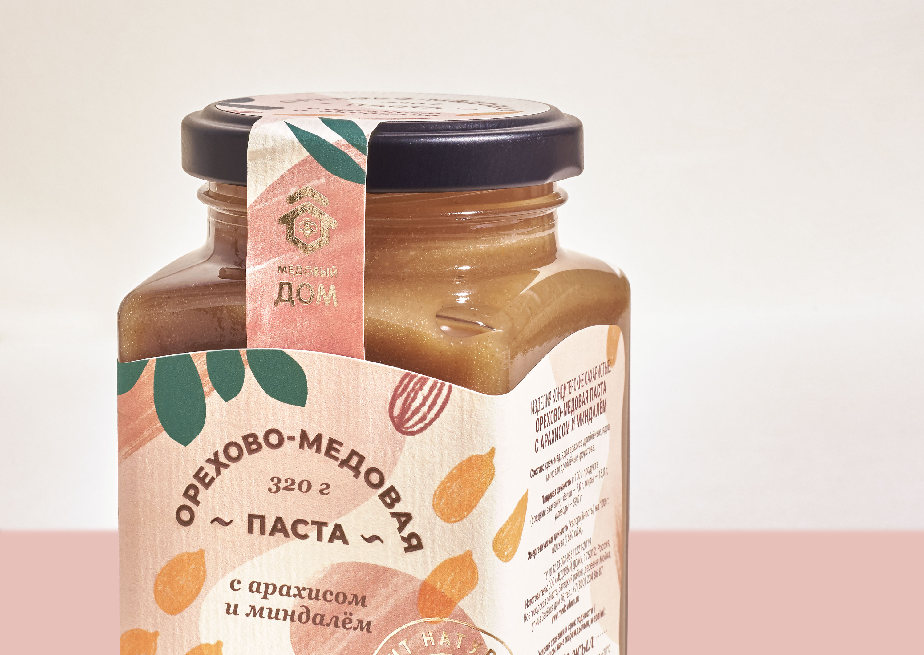
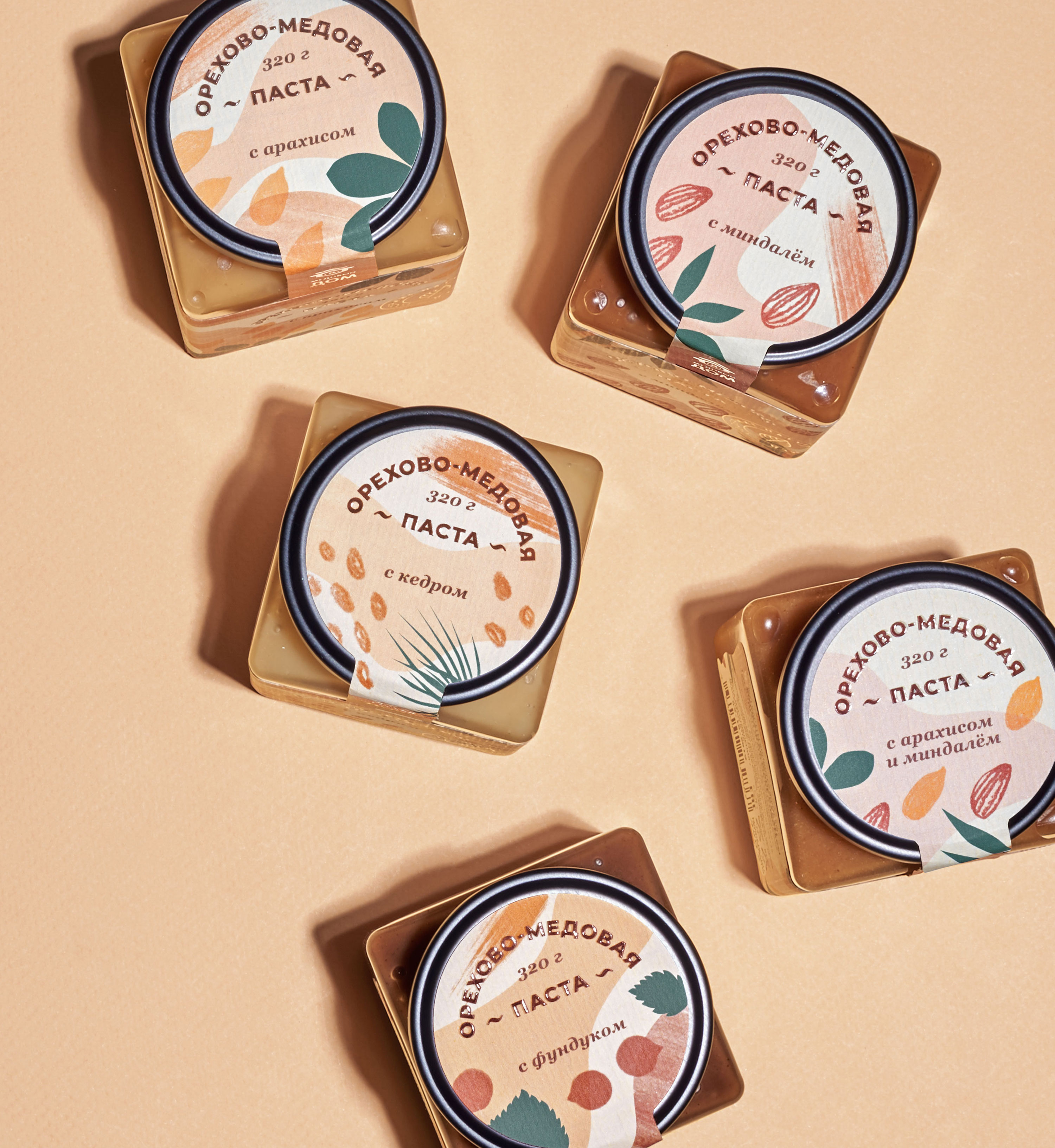
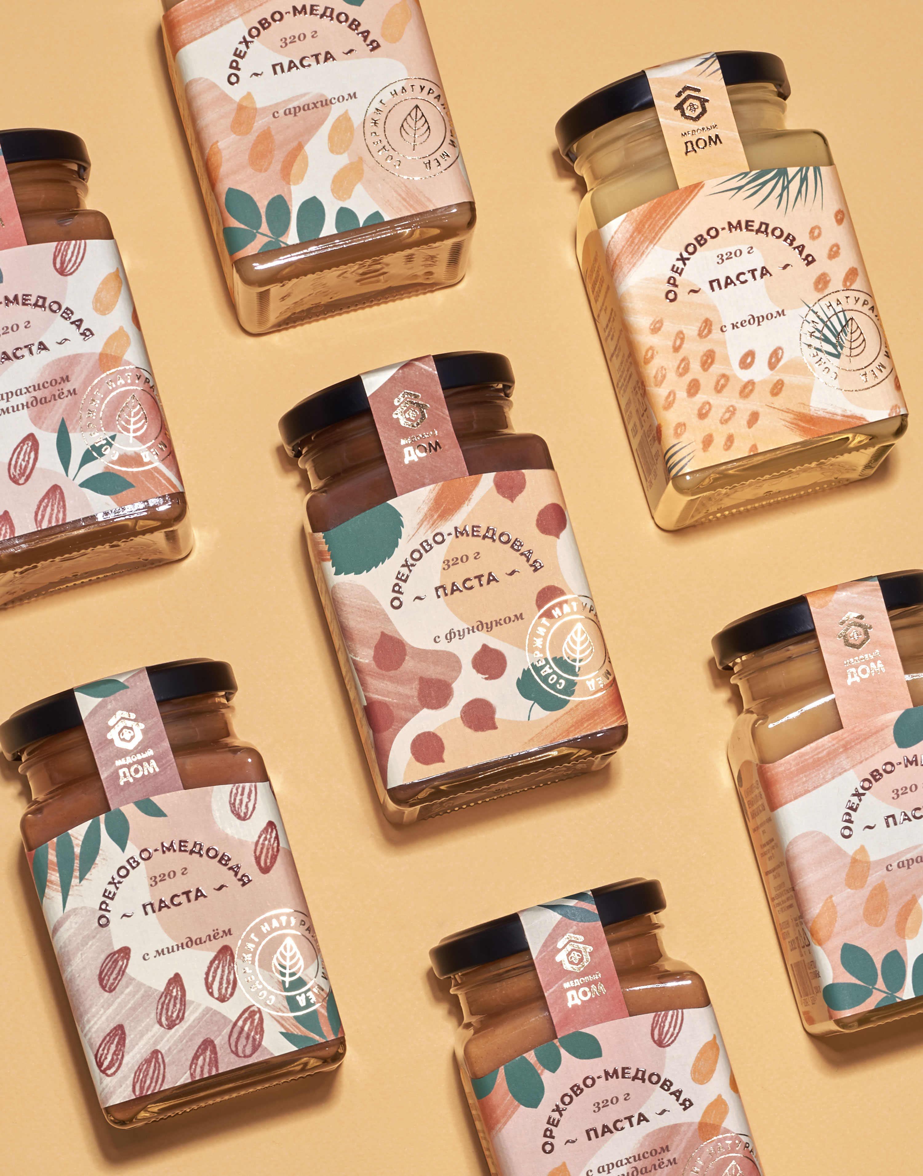
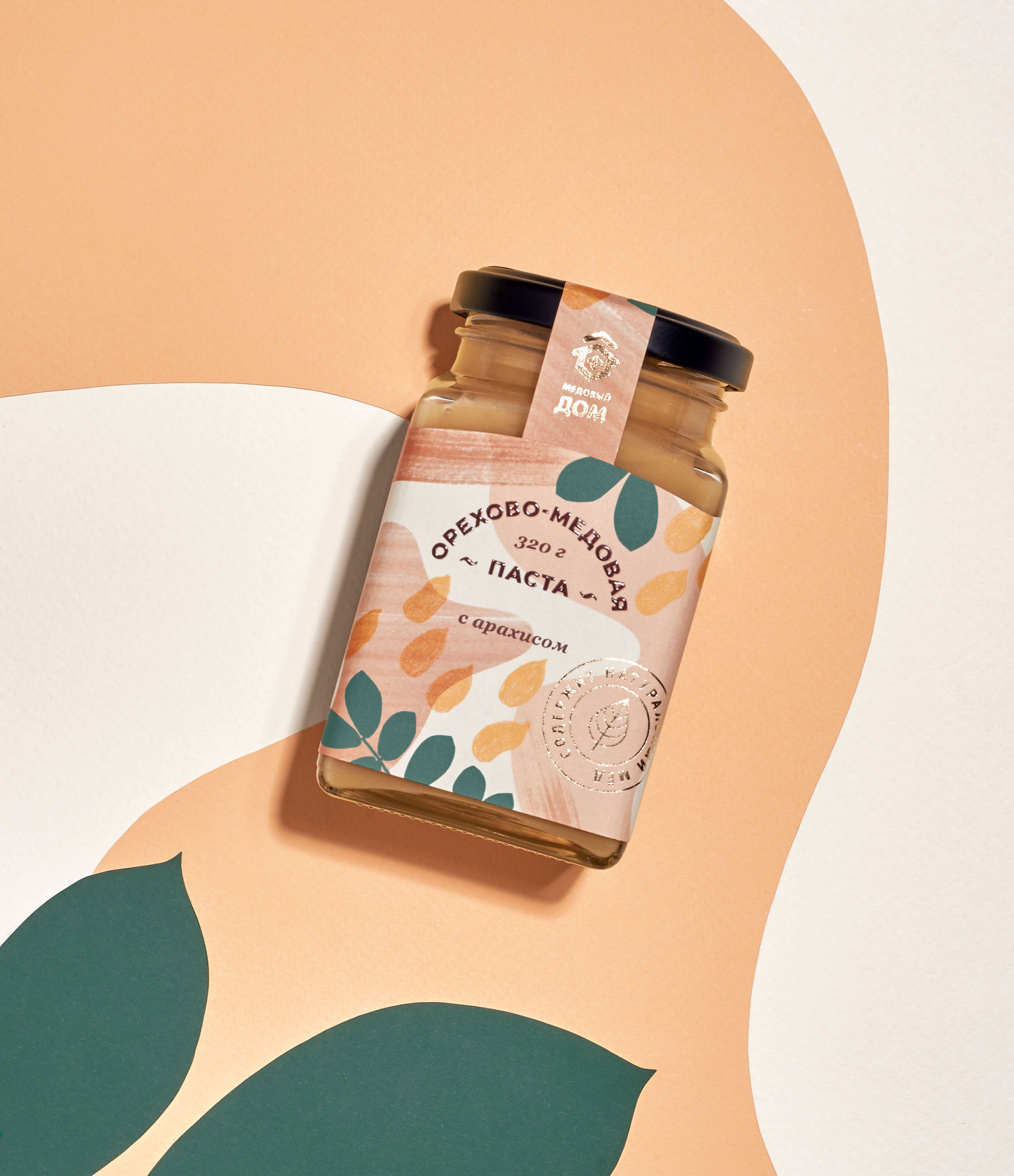
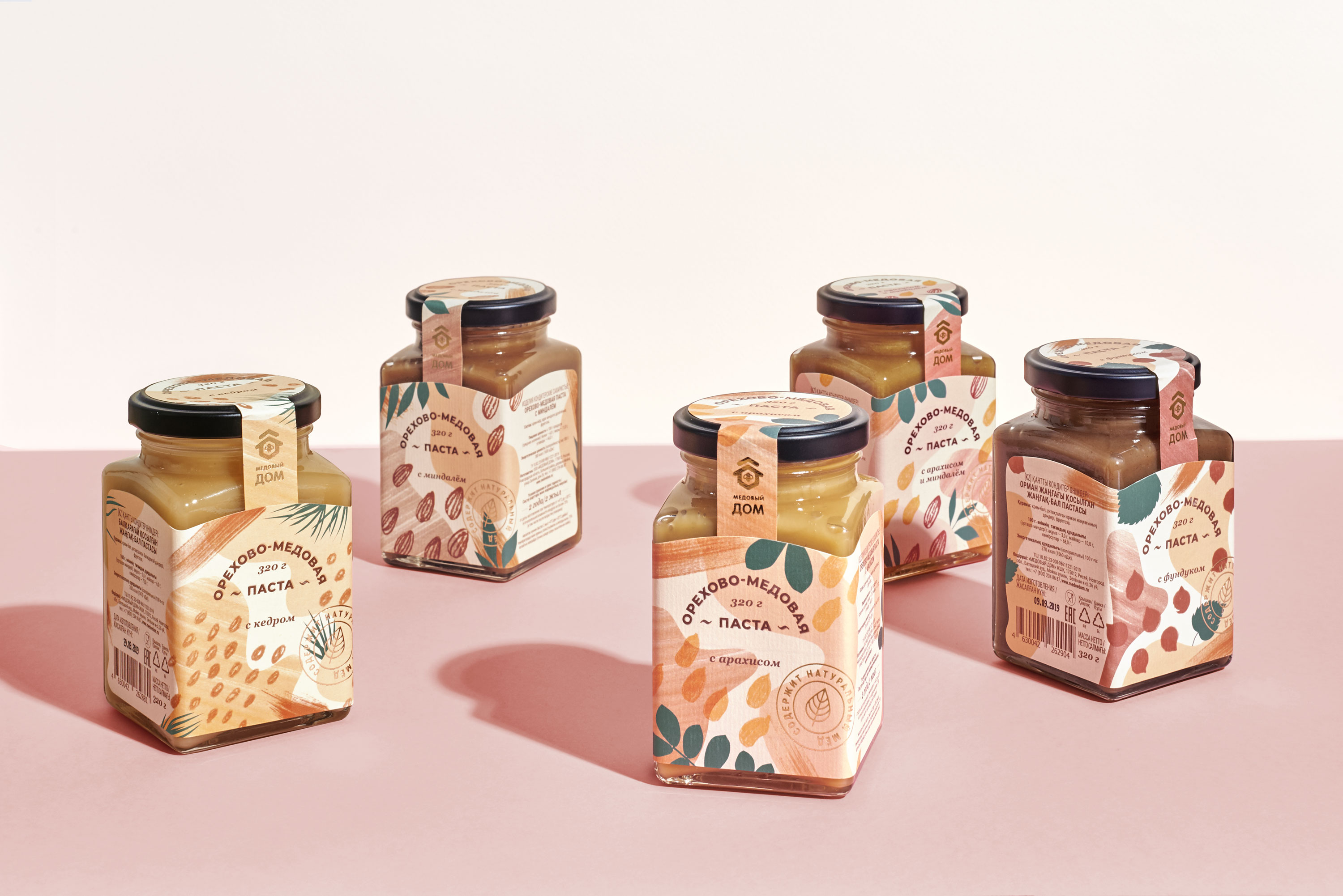
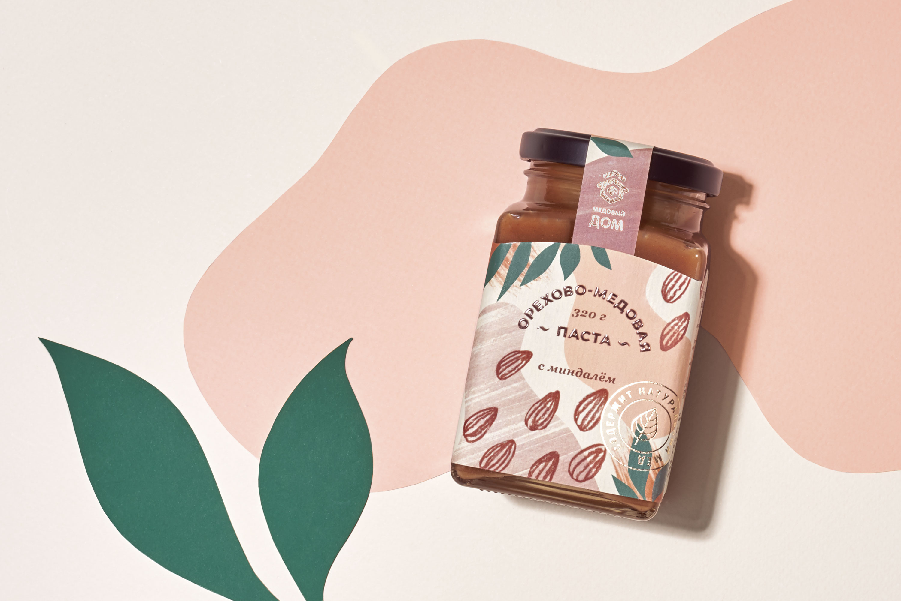
Label design for Honey House, a leader on the market of packed honey in Russia. Nuts & Honey Spread is the new healthy and tasty product line contains five tastes: pine nut, peanut and almond, peanut, hazelnut and almond.
The aim was to create a visual identity for the product line. To emphasize the natural flavours and distinguish the product line from a competitors I focused on colours, graphic arts and print solutions.
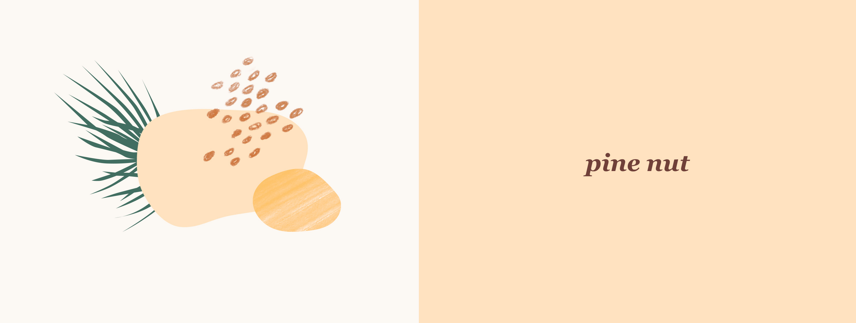
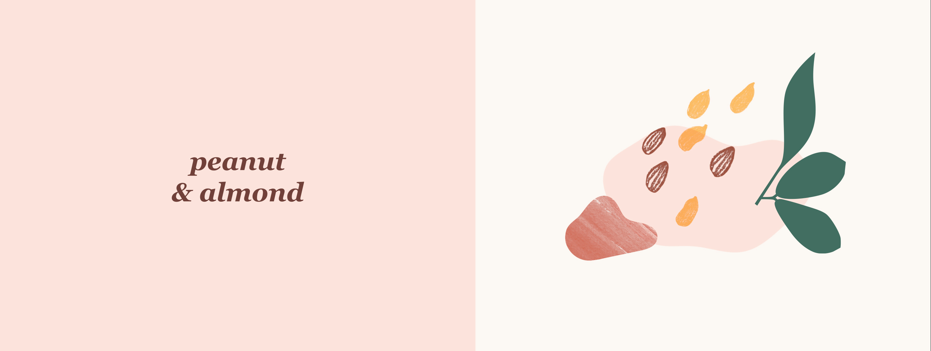
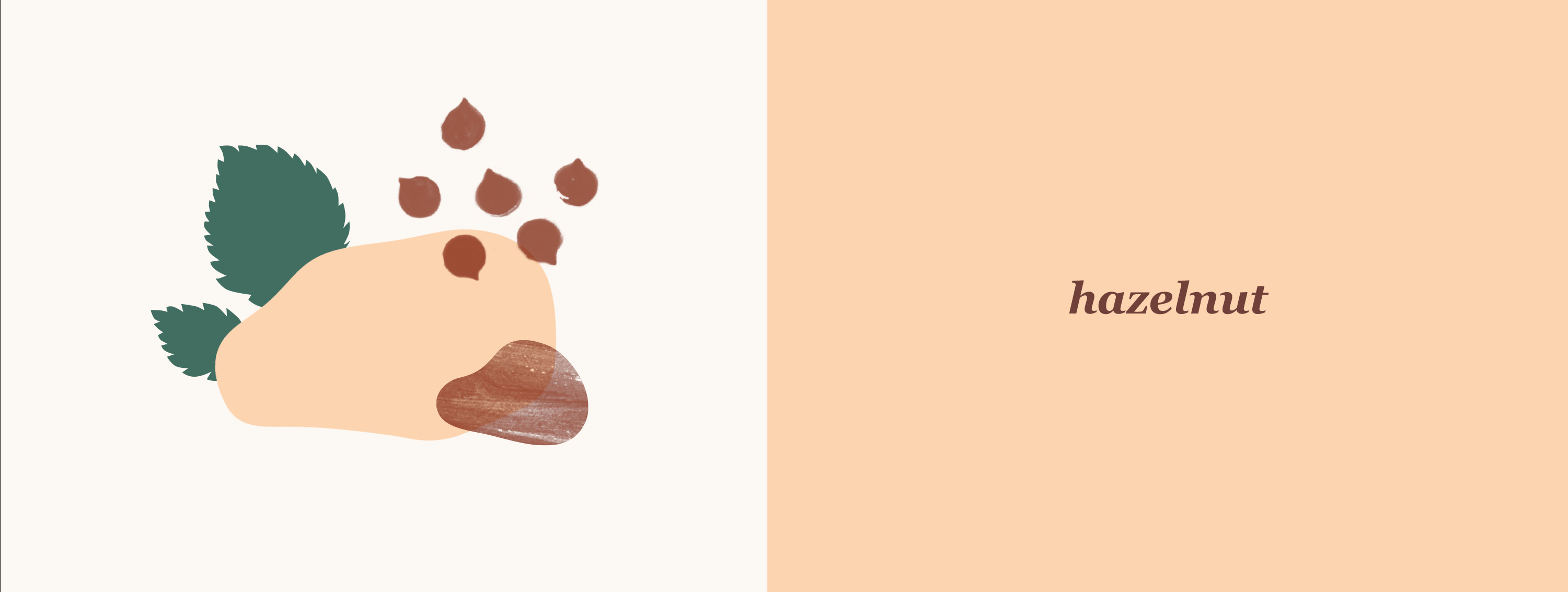
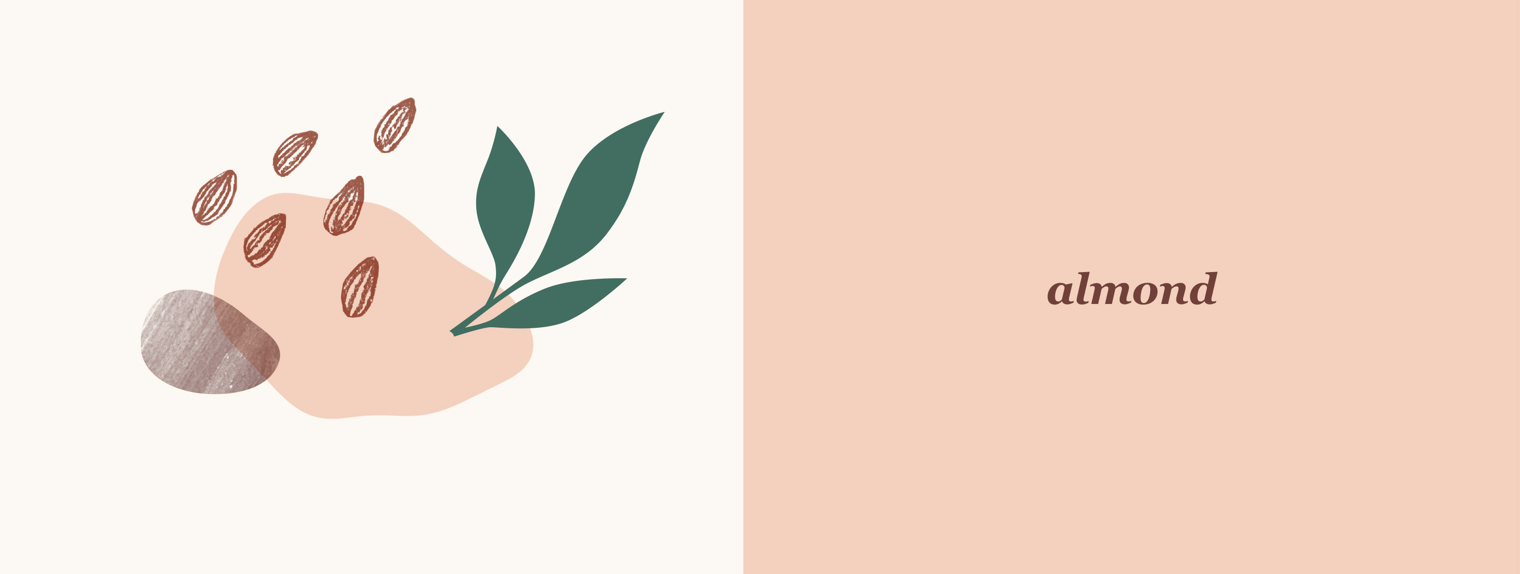
For each of the different tastes, I created a unique pattern in a pastel colour palette natural for the respective species of nuts. Uncoated textured paper with a decent touch of varnish provides an inviting tactile experience, and the play of light on the golden foil awakes images of warm summer sunsets when it’s nice to have a cup of tea with sweets like this.

CREDIT
- Agency/Creative: Tatiana Rusalovskaya
- Article Title: Label Design For The Nuts & Honey Spread
- Organisation/Entity: Freelance, Published Commercial Design
- Project Type: Packaging
- Agency/Creative Country: Russia
- Market Region: Europe
- Project Deliverables: Graphic Design, Illustration, Packaging Design, Research, Retail Brand Design, Tone of Voice
- Format: Jar
- Substrate: Glass


