


Task
The company “Agrana” launches a new product – sugar syrups with different flavors and aromas to add to coffee, cocktails or desserts. Our task was to develop a label design for the entire line of syrups. The labels had to be made bright, attractive and different.
Solution
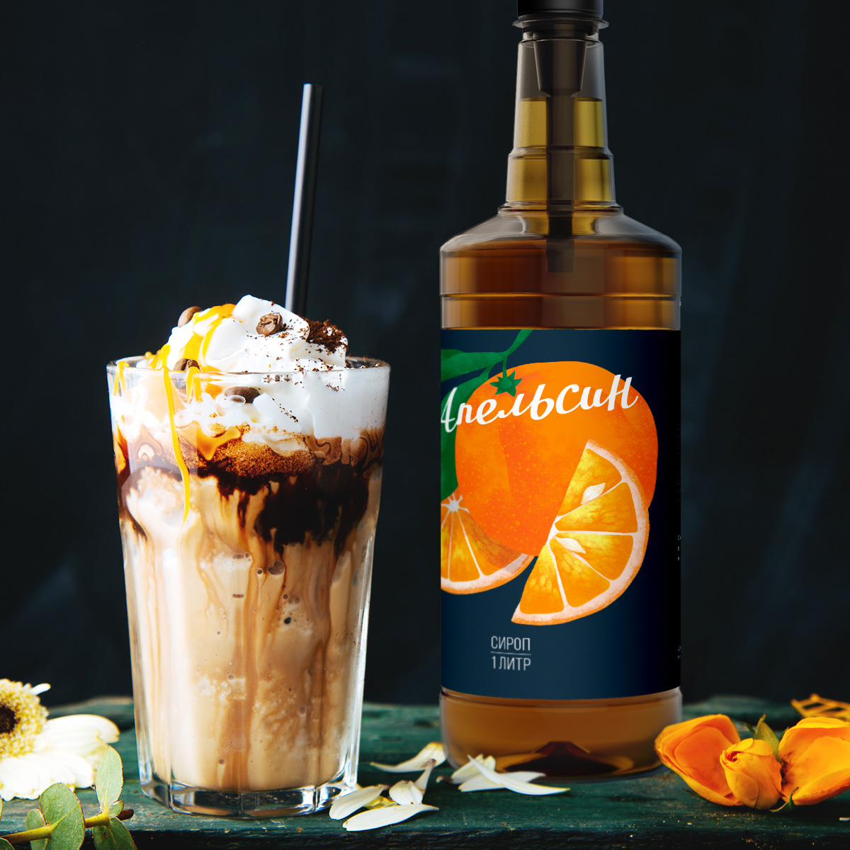
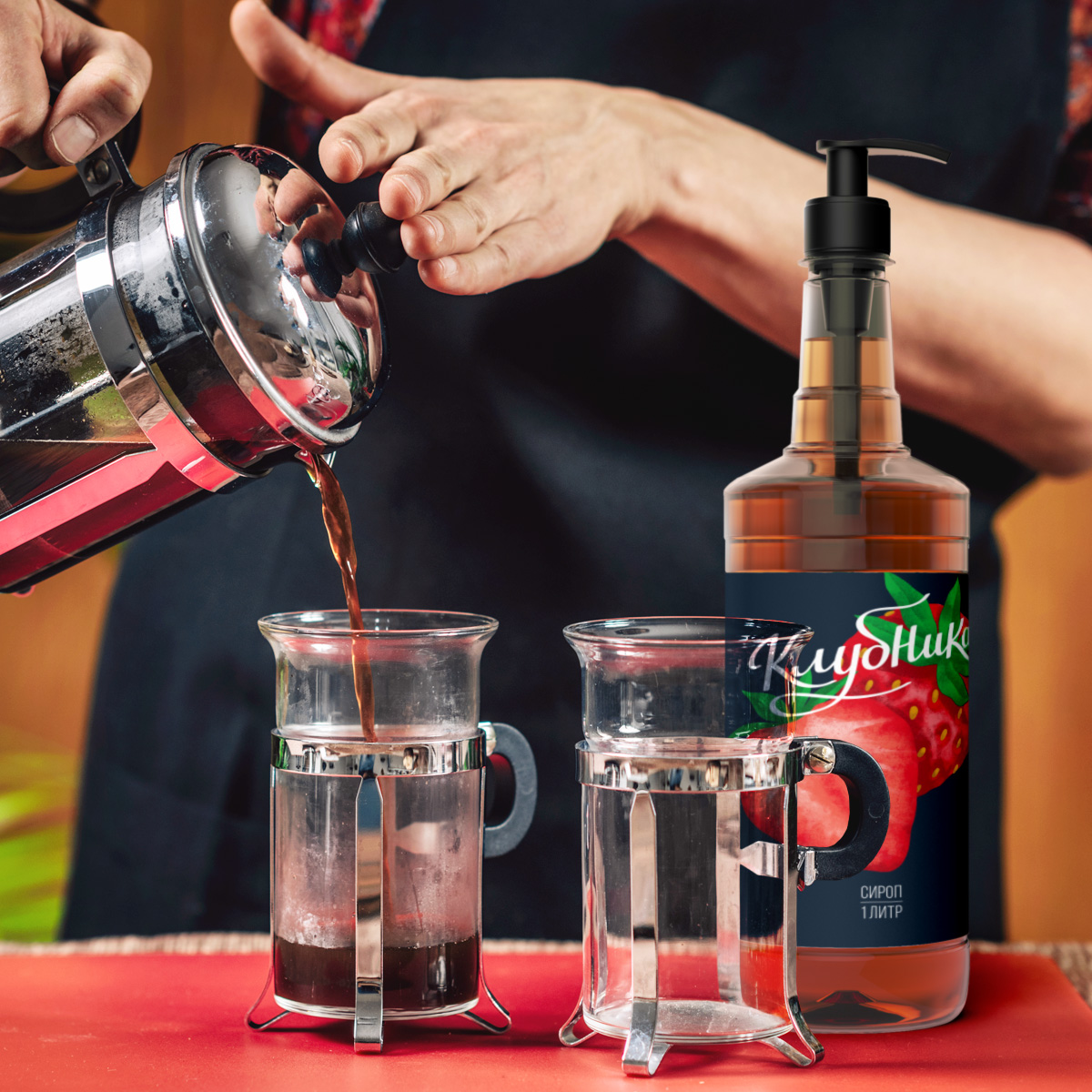
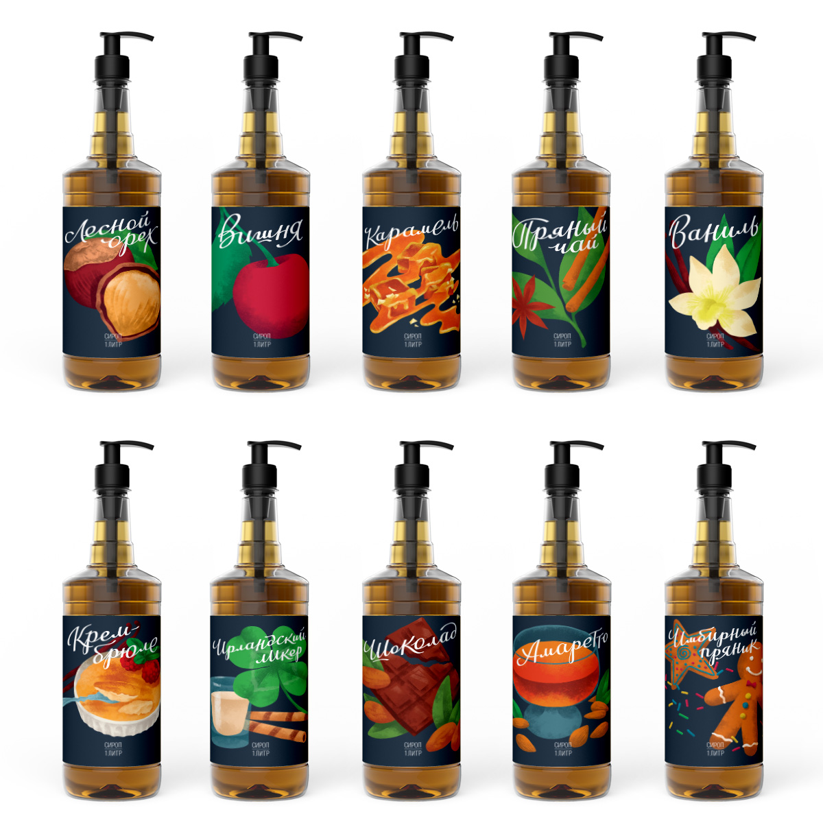
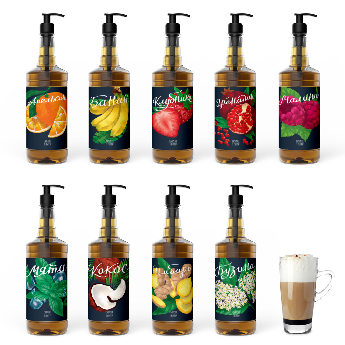
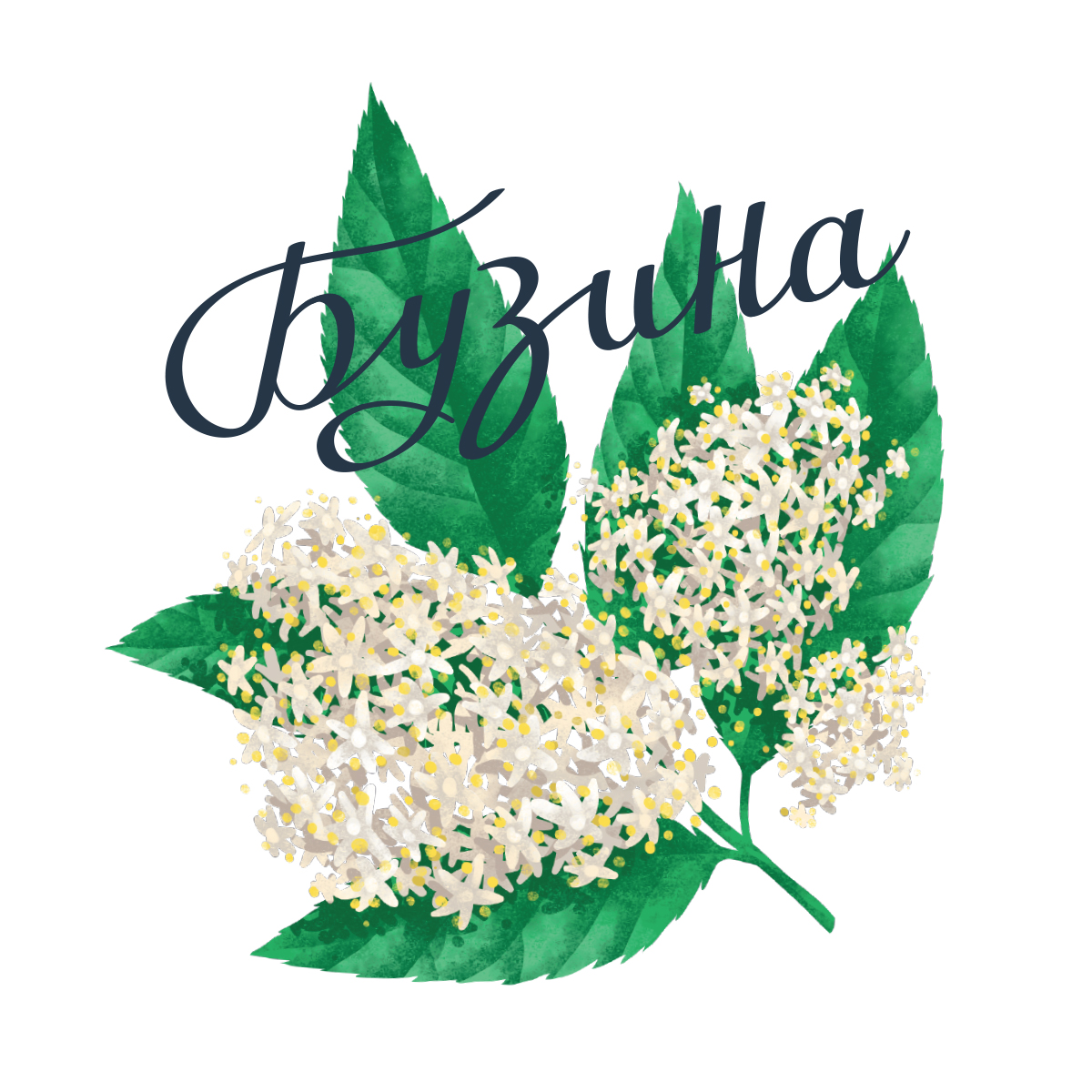
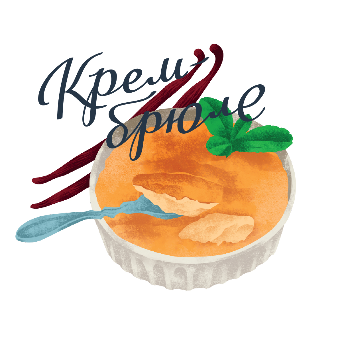
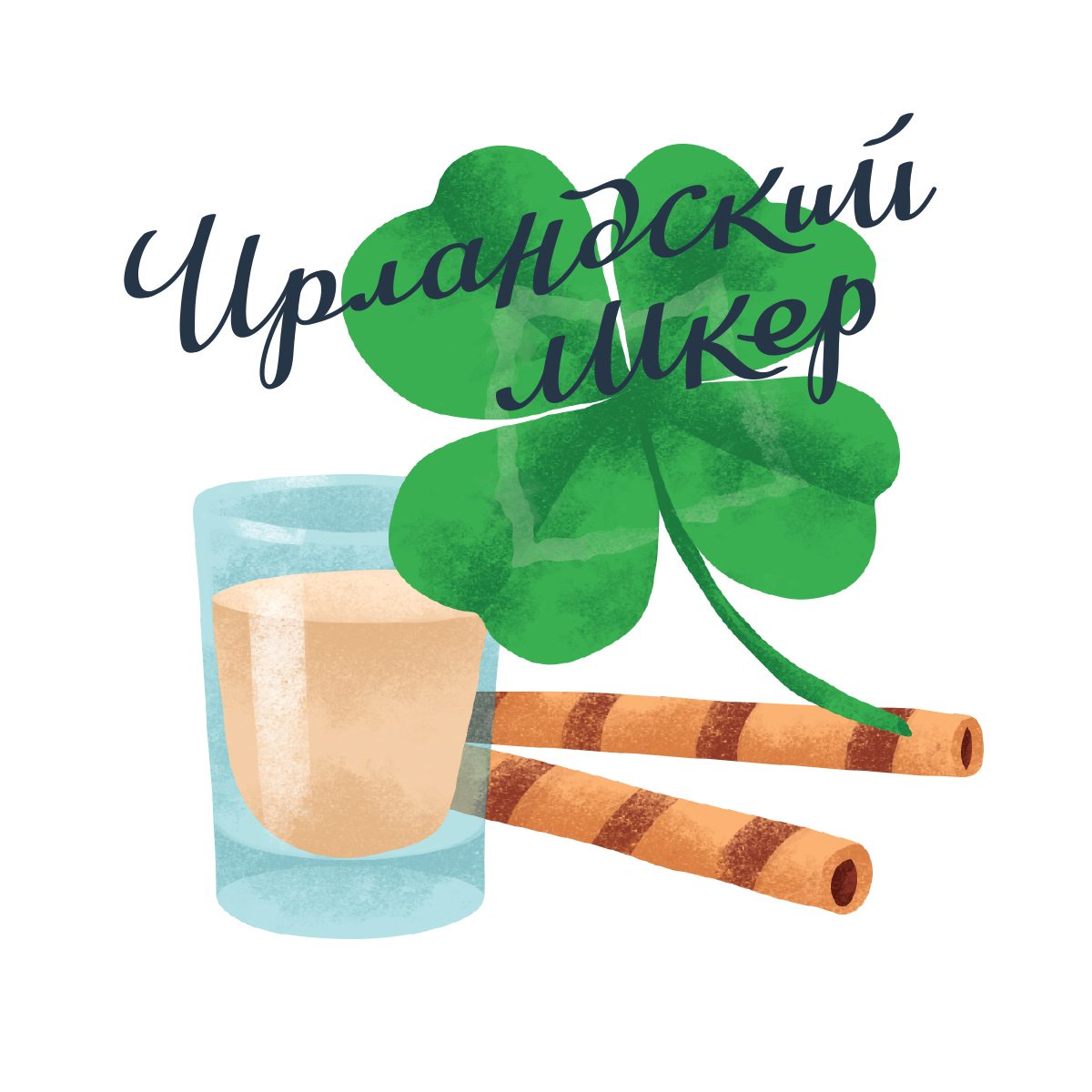
In the center of the labels we have placed the images of tasteful ingredients, decorated with a reference to pop art. We made these illustrations bright and realistic to convey the naturalness and richness of the product. The label design is complemented by a text block. Lettering style typeface strengthens the dynamics of the design and introduces a craft motive.
The background is a contrasting dark blue color, which not only adds a premium, but also visually unites the entire line, allowing it to work on the shelf as a solid and recognizable spot.
All elements of the label design are designed to attract attention and clearly indicate the taste of the product. With the new label, the product will not only stand out on the shop shelfs, but also fit organically into modern interiors of coffee shops and bars.
CREDIT
- Agency/Creative: Studio DEZA
- Article Title: Label Design for Syrups
- Organisation/Entity: Agency, Published Commercial Design
- Project Type: Packaging
- Agency/Creative Country: Russia
- Market Region: Europe
- Project Deliverables: Graphic Design, Illustration, Packaging Design, Product Architecture, Research, Retail Brand Design
- Format: Bottle
- Substrate: Glass


